, he applies the same concept to years of life, resulting in a Gini coefficient for mortality. From the graph – that shows his data – we can see that life expectancy inequality fell in countries around the world. Notably the United States still experiences higher mortality inequality than many of its similarly-developed counterparts.
Peltzman notes, that ‘the changes in life expectancy represent not only a gain in welfare, by extending life on average, but have also contributed greatly to social equality. Indeed, the numerical decline in mortality Ginis seems to have exceeded the decline of income Ginis in the last century or so, and this might hint at a larger contribution to social equality from improved longevity than from income redistribution.
We can see health inequality has decreased massively over the last 150 years or so from the following chart. Life expectancy differed massively between ages in 1845 – from 40 years for newborns to 79 for 70-year olds. Today the difference in life expectancies between these age groups is much smaller; Newborns can expect to live until age 81 to, and 70-year olds to age 86. This is because the chance of dying at a younger age has been steadily decreasing, which means that the equality of life expectancy across ages has increased.
Total life expectancy in the UK by age, 1541-2001 – Max Roser3Full screen view
Inequality by socio-economic class
In absolute terms the inequality of life expectancy has decreased massively in the UK – the visualization above showed that the Gini for life expectancy has declined from over .45 to below .1 in the beginning of the 21st century.
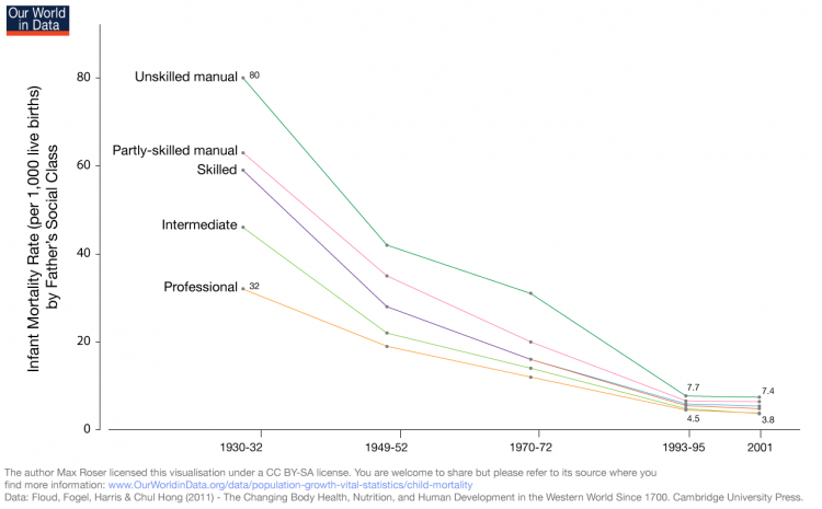
We can see below that the gap in infant mortality has narrowed significantly in absolute terms; there were 80 infant deaths per 1,000 live births for infants with fathers who were in unskilled manual fields, versus 32 deaths per 1,000 live births born to fathers with professional careers, representing a 2.5 times lower rate. Today, those absolute mortality numbers are only 7.4 and 3.8 respectively, but there is still nearly a two-fold difference in mortality rate. Absolute inequality has decreased dramatically, but the ratio between the two – a measure of relative inequality – has only decreased a little.
When considering how the inequality of child mortality has decreased, one has to take into account that the occupational structure has also changed – the share of people employed in the low-skilled sector has decreased. The authors of the data below – Floud, Fogel, Harris, Hong – add that the “differences are still apparent even after allowances have been made for the effects of changes in the occupational structure of the British population and selection effect”.4
Infant mortality rates of both sexes by father’s social class in England and Wales, 1930/2-20015
Disease Inequality
Not only is lower socioeconomic status (SES) associated with shorter life span, but it is also correlated with higher disease prevalence. Cox et al (2006) found multiple studies using various measures of SES that predominantly pointed to higher rates of incidence and mortality of stroke in lower SES categories.6
Kanervisto et al (2011) found that basic educational level was a risk factor for chronic obstructive airway disease (COPD), and low household income was a risk factor for asthma.7
Karp et al (2004) found that low education level is a risk factor for Alzheimer’s Disease, and that this risk is not mediated by adult socioeconomic mobility.8
Kington and Smith found that even after controlling for differences in education, income and wealth, African Americans report higher rates of hypertension, diabetes and arthritis than Whites, and Hispanics report higher rates of hypertension and diabetes and lower rates of heart conditions.
Correlates, Determinants & Consequences
As intuition would suggest, the healthcare system of a society affects the health of that society. There is much debate about what the best system is. One study from Gruber et al (2014) analyzes a 2001 healthcare reform in Thailand called “30 Baht”. The program increased funding to hospitals to care for the poor and decreased copays to 30 Baht, which is approximately $0.75 USD. The study suggests that the program increased healthcare utilization especially among the poorest, and infant mortality was significantly reduced. After the implementation of 30 Baht, the correlation between the wealth of the Thai province and infant mortality reduced to nearly 0.9
Data Sources
World Health Organization Global Health Observatory (WHO GHO)
Data: Many different health indicators, including mortality, health services and health equity
Geographical coverage: WHO member nations
Time span: Time series generally start in the 1990s or 2000s, but may not be annual.
Click on “Data repository” on the left side to access the data.
The Human Mortality Database (HMD) from the Max Planck Institute and UC Berkeley
Data: Live birth counts, death counts, population size, population exposed to risk of death, death rates and life tables
Geographical coverage: 37 countries
Time span: Start date depends on country. Generally ranges from mid-1800s to early 1990s, with one major outlier being Sweden, which has data beginning in 1751.