Lately, I’ve been using the analogy of a museum to describe Our World in Data. A museum offers its visitors a variety of experiences: you can book a guided tour and hear all the detailed stories behind the artworks, explore for yourself and wander around without a predetermined purpose, or maybe you’re only interested in one specific exhibition, or even just a single work of art.
Our articles are the guided tour, our data explorers (and charts, to some extent) allow for freeform discovery, and our search and navigation support quick and focused data lookups.
We are a multi-purpose publication, and we serve a large variety of visitors. We’re also a small team, so we need to be clear about our focus. Should we optimize for in-depth reading of our articles, remove all clutter, and offer a clean, distraction-free reading experience? Should we strive to offer as many interactive controls and options as possible for exploring our data, even on mobile? Or should we make it really easy and fast to look up specific data points?
Can we build one structure that offers a home to these very different user behaviors?
Our analytics data tells us which pages are popular (these days COVID-19 is at the top), where our users are coming from (mostly Google), and on which device type people are more likely to interact with our visualizations (desktop). While that is highly useful data, it doesn’t give a clear idea of who our users are, and how they use Our World in Data.
On September 8, we sent out a survey to learn more about our audience. The main questions we wanted to answer:
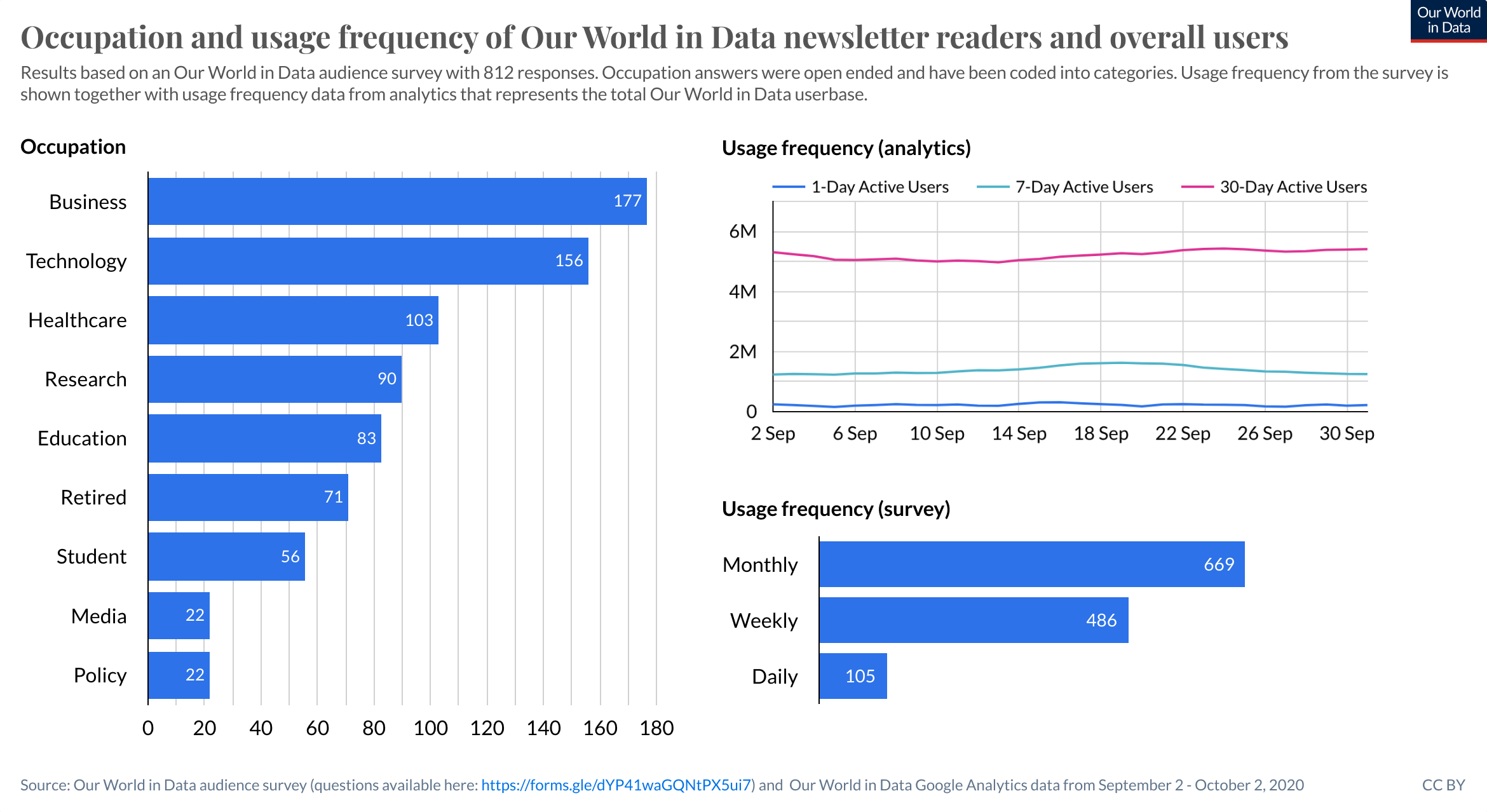
- Who is our audience? What different types of users visit us, and what does the distribution of their occupations look like?
- What do people visit us for? Do they mostly use the visualizations, or read the articles? How many of our users come to us to quickly look up information?
- What’s the relation between our users’ occupations and how they use Our World in Data? Are there any key combinations we should focus on?
We posted the survey on social media, on our website, and we featured it in our newsletter. And this is where the first interesting insight emerged: the most responses by far came from our newsletter.
This means our survey population is most likely not a representative sample of our total audience. In fact, it would be fair to assume that survey respondents are the more active part of our newsletter readers, which makes for an even more biased sample.
To see how this subset of active newsletter readers matches up to our total audience, we’ve contrasted the responses to data from our analytics, where possible.
These are they key differences between the newsletter readers and our total audience, as we know them through analytics:
- They visit us more often than average, mostly on desktop, and are mostly knowledge workers: business people, people in technology, the medical field, and educators and researchers.
- Downloading data for further analysis is up to 12 times more popular for this group than it is for the average user, especially for business people and researchers.
- Exploratory behavior and using us as a reference seem to be the most popular behaviors.
- Desktop users spend about 3 times as much time on Our World in Data as mobile users, and are more likely to interact with our visualizations. In contrast, mobile use seems mainly about using us as a quick reference, or passively reading entries and looking at charts. Not entirely surprising, but good to confirm nonetheless.
- The difference in sharing behavior of the survey respondents and our total audience is staggering: 80% vs 1% (although that 1% doesn’t include informal sharing, or sharing screenshots and links).
- The survey audience reads and explores a larger variety of our topics than the average user. This might be partly because of the particular focus right now, the “average user” at the moment is probably someone mostly interested in COVID-19.
Business people and people in technology make up the majority of newsletter readers. In part, this is due to the fact that most people in rich countries work in services. Since we always have a big focus on health it makes sense that people from the medical field are interested in our work – the fact that we live through a pandemic might have increased this further. Researchers and educators also represent a sizable group, which makes sense as these two groups would have a natural interest in the world’s data on global problems and how to make progress.
Most newsletter readers say they visit us every month, which matches analytics data from our total audience. An interesting difference is that a much larger portion of newsletter readers seem to come back to Our World in Data on a weekly basis. We roughly send a newsletter every week, so that may not be a coincidence.
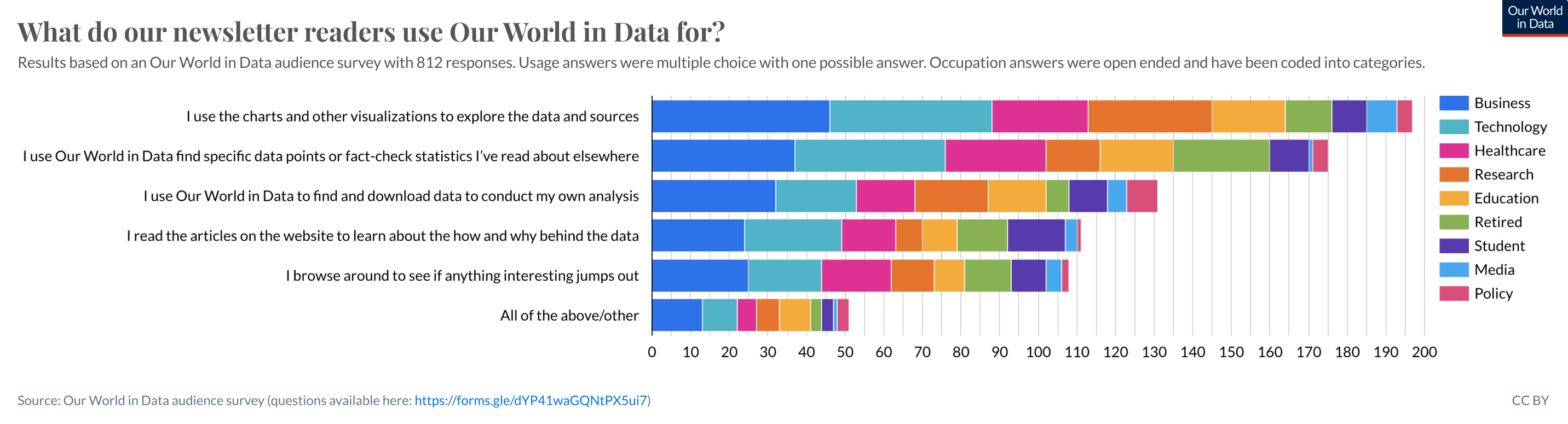
Most respondents (25%) say they explore our data using our charts and visualizations. In our total audience, about 16% of users interact with a visualization. A second popular use is fact-checking and referencing (22%).
Surprisingly, about 17.5% of respondents say they download data to conduct their own analysis, whereas among our total audience, 1.6% of sessions have a CSV download or a Github visit from our website.
Fact-checking, reading an article, and browsing are behaviors that are quite difficult to measure with analytics; is a high number of link clicks a sign of browsing around, or does it indicate someone on a mission to find a specific fact or data point? Does a short visit mean the user found what she is looking for, or that she got stuck and gave up quickly?
The survey provides us with a glimpse of how our (newsletter) audience uses Our World in Data, but to get to a more in-depth understanding, we’ll need to talk to our users in more detail (which I’m doing almost daily right now).
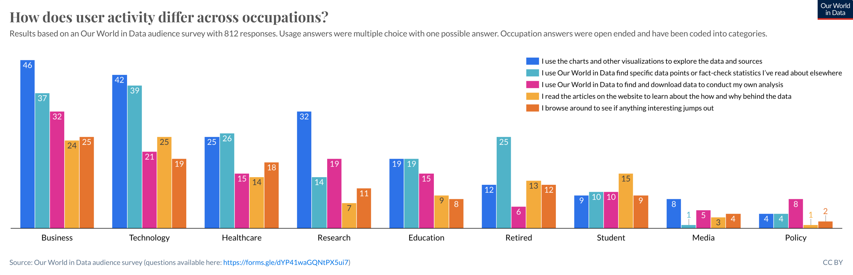
Overall, exploring our visualizations and using us as a reference seem to be similarly popular amongst the three biggest occupation categories.
- Business people like to do their own analysis, compared to other categories.
- Medical professionals and people in technology look at charts and specific data points; a difference between the two is that people in technology reportedly read more articles.
- Retirees seem to do a lot of fact-checking and specific data point look-ups, but don’t conduct their own analysis.
- Researchers mostly explore our data by using our visualizations.
- Students read our articles, possibly because they have assignments that require a deeper understanding of a topic.
- The policy and writer groups are small in numbers but potentially very high in impact and reach, respectively.
About 80% of respondents say they share our work with others, mostly to explain things to friends, family, or coworkers. Two other notable sharing behaviors are sharing on social media or embedding a chart, as well as using our material in presentations and articles.
But again, data from our analytics paints a different picture: 1% of users click on the share tab in a chart or download a PNG/SVG image of a chart. That of course doesn’t include screenshots, copying links directly from the browser address bar, and other forms of informal sharing such as word of mouth. But it’s unlikely that would add up to ~80% of users.
This again indicates our survey respondents are much more engaged than the average user.
Unsurprisingly, COVID-19 is the most popular topic among respondents right now. However, there are several other topics that are popular as well. In fact, the survey audience seems to read and explore a much more varied array of topics than our full audience. Overall, about 57% of page views are COVID-19 related currently. But for the survey audience, the share of responses in which COVID-19 is mentioned as a topic of interest, is only 19%.
The results of this survey provide some interesting avenues for further exploration. To really get to the why of a user’s visit, we need to talk to our users, ask follow up questions, and digest their answers. This is what we’re currently doing.