- How is your work copyrighted?
- Can I use or reproduce your data?
- How should I cite your work?
- Can I use your software to make my own visualizations?
- Can I use your data and visualizations in my article, blog, book, presentations?
- Can I republish your articles and posts?
- Can I use Our World in Data material for teaching?
- How can I get a static image from your interactive charts?
- Where do you get your data from?
- How do you decide what data sources to use?
- How do you decide which topics to cover?
- Do you only cover positive trends and stories of progress?
- How can I embed one of your interactive charts in my website?
- How are you funded?
- Can I contribute to Our World in Data?
- Can I translate your work into another language?
- Do you have any job openings?
- How do I stay updated with your latest work?
- What are you working on and what will be added later?
How is your work copyrighted?
All work produced by Our World in Data is free for you to take and use
All the charts, maps, data, and text produced by Our World in Data are free for you to take and use — no permission required. You just need to provide credit to Our World in Data and our underlying sources (more details below). Our work is licensed under a very permissive ‘Creative Commons’ (CC) license: the CC-BY license (the BY stands for ‘by attribution’).
Note: In early 2019 we changed our Creative Commons license from “By Attribution-Share Alike” (CC-BY-SA) to “By Attribution” (CC-BY). Some of our static charts still have the CC-BY-SA mark in the bottom right corner. You can disregard this, and consider all our work as licensed under CC-BY.
Third-party charts and data are subject to third-party license
All charts and data produced by third parties and made available by Our World in Data are subject to the license terms from the original third-party authors.
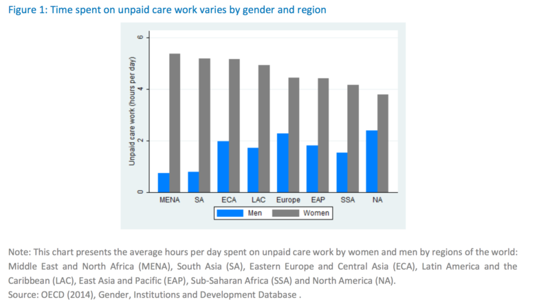
For example, the chart here on time spent on unpaid care work, from our entry on women’s employment, was produced by the OECD and is subject to the OECD’s license.
The chart on the number of deaths by cause was produced by Our World in Data and is subject to our CC-BY license — however, the chart’s underlying data was produced by the Institute for Health Metrics and Evaluation (IHME) and is subject to IHME’s license. If you wanted to download the underlying data and use it, e.g., to make a new chart or put it in a table, your use would be subject to the terms of IHME’s license.
Our visualization software is free and open source
We develop our own data visualization and database tool: The Our World in Data-Grapher. This tool is completely open source – here on GitHub – and is free to use on any other web publication. The code is licensed under the MIT License.
Average daily time spent on unpaid care work by world regions, OECD (2014)1

Can I use or reproduce your data?
All visualizations, data, and code produced by Our World in Data are completely open access under the Creative Commons BY license. You have the permission to use, reproduce, and distribute these in any medium, provided the source and authors are credited.
The data produced by third parties and made available by Our World in Data is subject to the license terms from the original third-party authors. We will always indicate the original source of the data in our documentation, so you should always check the license of any such third-party data before use and redistribution.
How should I cite your work?
Citing work produced by Our World in Data
If you are using one of our original charts (those with the Our World in Data logo and CC-BY copyright stamp) — cite the corresponding entry from Our World in Data where the chart is located.
For example, if using this chart on literacy rate, you should cite: Max Roser and Esteban Ortiz-Ospina (2019) – “Global Rise of Education”. Published online at OurWorldInData.org. Retrieved from: ‘https://nightingale-owid.netlify.app/global-rise-of-education’ [Online Resource]
We provide citation details at the bottom of each entry. For example, here you can find the citation for our entry on CO2 and Greenhouse Gas Emissions.
Citing work produced by third parties and made available by Our World in Data
If you are using the underlying data from an Our World in Data chart or entry — cite both Our World in Data and the underlying data source(s).
For example, if you downloaded the data from this chart on real GDP per capita and are using it for analysis or to redraw the chart, you should write:
- Data from Feenstra et al. (2015) Penn World Table 9.1 via Our World in Data.
- Feenstra, Robert C., Robert Inklaar and Marcel P. Timmer (2015), “The Next Generation of the Penn World Table” American Economic Review, 105(10), 3150-3182, available for download at www.ggdc.net/pwt.
- Max Roser (2013) – “Economic Growth”. Published online at OurWorldInData.org. Retrieved from: ‘https://nightingale-owid.netlify.app/economic-growth’ [Online Resource]
Additional points
If you can, send us a quick note telling us where you used our work. It is encouraging to hear that our work is helpful and we can learn from seeing how you used it.
In online publications embed interactive charts when possible. We encourage online publications to embed our interactive charts. This is easy to do and you can trust that the embedded chart won’t break — all our links are stable.
Can I use your software to make my own visualizations?
Our interactive visualizations are made through the Our World in Data Grapher, developed by us. All our software is open-source and free for everyone to use, but the code will require a relatively experienced developer to implement. If you are looking only to publish one or a few interactive visualizations on the web we recommend https://www.datawrapper.de.
The Grapher is very helpful for publications looking to bring together many different datasets and publish hundreds of visualizations based on this data. You can read more about the Grapher here: https://nightingale-owid.netlify.app/about/owid-grapher.
Can I use your data and visualizations in my article, blog, book, presentations?
All the material produced by Our World in Data, including text, interactive visualizations, and code, are completely open access under the Creative Commons BY license. You have the permission to use, distribute, and reproduce these in any medium, provided the source and authors are credited.
Please bear in mind that all other material, including data produced by third parties and made available by Our World in Data, is subject to the license terms from the original third-party authors. We will always indicate the original source of the data for every chart in our documentation, so you should always check the license of any such third-party data before use and redistribution.
Can I republish your articles and posts?
Yes, you can republish our articles online or in print for free, provided you follow these guidelines:
- In republishing our content, you must make it clear that Our World in Data is not an active author or contributor to your publication.
- You must not republish our articles and posts in a context that presents them as endorsing a position not in the intention of the original authors.
- You can’t edit our articles, except to reflect relative changes in time, location and editorial style. If you do wish to make material edits, you will need to run them by the author for approval prior to publication. Authors can be contacted via info@ourworldindata.org
- You have to credit authors, ideally in the byline.
- You have to credit Our World in Data and include a link back to either our home page or the relevant specific URL. Our preference is a credit at the top of the article and that you include our logo (available here).
- If you use a canonical url tag for your online publication, this tag must point to the original article on Our World in Data.
- In online publications you should embed our interactive charts whenever possible. This is easy to do and you can trust us that the embedded chart won’t break – all our links are stable.
Signed consent / copyright release forms are not required, providing you are following these guidelines.
Can I use Our World in Data material for teaching?
Yes, we love to see people using our work for teaching! We know – based on surveys from users – that many teachers do use our work. Surprisingly, this extends from primary school children through to postgraduate university students.
We also have a Teaching Hub where we provide resources for teaching and learning about global development. For specific topics you will find interactive teaching notes, presentation slides, charts and many other resources.
Our interactive charts are featured in the Core Econ textbooks, and in their teaching resources you find many great ideas on how to include interactive charts on courses taught online.
If you use our teaching already we’d love to hear from you and would be happy if you send us your slides or teaching material. And if something is missing for you or you have any ideas or suggestions for how to make or work more useful for teaching, please do get in touch at info@ourworldindata.org or through our Feedback page.
How can I get a static image from your interactive charts?
It is straightforward to make static versions of Our World in Data interactive visualizations. Just click the downward arrow below the visualization and then chose ‘PNG’.
In case you need to edit the chart further, you can click the downward arrow and select the option “Save as SVG”, and the chart will open as a Scalable Vector Graphic (.svg) file in a new tab in your browser. You can then save it in your browser – through “save page as” – and you will have a vector graphic of the chart that you can then edit in Inkscape (free), Adobe Illustrator or similar software.
For a step-by-step explanation with examples, see here.
Where do you get your data from?
One of our key tasks in producing this publication is to bring together the most reliable and informative data sets on a particular topic.
There are four main sources for the data that we bring together:
- Specialized institutes – like the Peace Research Institute Oslo (PRIO)
- Research articles – like Bourguignon & Morrison (2002) – ’Inequality Among World Citizens: 1820-1992’ in the American Economic Review.
- International institutions or statistical agencies – like the OECD, the World Bank, and UN institutions.
- Official data from government sources – for example, our COVID-19 vaccination and testing datasets compile the most recent official numbers published by governments and health ministries worldwide.
In every visualization we indicate clearly the source of the presented data. Where we have combined data sources or made changes to original datasets (such as regional aggregations, per capita transformations, etc.), this is also indicated.
How do you decide what data sources to use?
We have six guidelines to decide which sources to accept and which data to present.
1) As far back into the past as possible – but up to today
The goal is to give a perspective on the long-term development and therefore we always aim to find time series data that reach back as far as possible. Unfortunately the availability of data is often itself an achievement of modern development and data is not available for the more distant past. A solution for this problem is data that has later been reconstructed and we aim to give a more complete picture by taking this data into account.
At the same time the idea is also to present a ‘history of today’ and we therefore also want to ensure that the data presented reaches until today. The limitation here is often that it takes up to several years for researchers and international institutions to publish important data for the most recent period.
2) As global as possible
A second objective is to give an account of each topic that includes as many societies, countries, and world regions as possible.
3) Present data in its entirety
Shorter sample periods may mask important trends and a recent reversal of a long-term trend could be falsely interpreted as the direction of the long-term trend. The merit of taking a historical perspective that studies long-term trends is that it shows the direction in which some aspect of our world is developing. Therefore we also always ensure to present the whole dataset and we do not want to cut off the original data.
4) Comparable through time and across societies
A third objective is to ensure that the data we present is comparable across time and across societies.
When data is not comparable across countries and through time we highlight this in the text accompanying the visualisation.
5) There is no other data – or we would include this data
An important promise is that we are not withholding any data that would give a different impression of the long-term development of some aspect. If two credible sources would publish statistics that contradict each other – indicating an open debate between researchers – then we would say so.
6) Reference the original source
To make the database useful for readers and credit the important work of those who construct the data presented here we aim to always reference the original source of the data.
We take great care to follow these guidelines. Unintentional mistakes or omissions, whilst hopefully rare, are of course possible. If you find any instance where we have not followed these guidelines, or you have any other complaints, please do get in touch at info@ourworldindata.org or through our Feedback page.
How do you decide which topics to cover?
We have a list of all the topics we want to cover and have been working through this list for several years now. Our goal here is to cover all quantifiable aspects that matter for our living conditions and the earth’s environment.
In deciding which topics to cover next we take several aspects into account:
- Do we have someone in the team or can we collaborate with someone who is an expert on the topic?
- We tend to give priority to topics that are not covered well in other publications. For instance we cover plastic pollution and air pollution extensively, but have less content on the consequences of climate change. This does not reflect our view of the relative importance of these topics, but rather of where we think our work can be the most useful in filling gaps in other publications.
- Another consideration is whether we have funding to work on a particular topic. Research grants that go to the University of Oxford where the researchers are based are grants to work on specific topics. We have a lot of freedom thankfully to work on those topics that are most important, but we cannot use funding we have to work on economic inequality to work on historical analysis of agriculture. Because we receive donations from readers this constraint is not limiting us currently so that aspects 1 and 2 are most important in practice.
Do you only cover positive trends and stories of progress?
We are interested in the state of the world and how it changed. Many of the trends that we discuss in our articles are positive; and since fewer people are aware of these positive developments, these trends often get considerable attention from our audience. But it’s not that we have an editorial agenda to only study positive trends. Indeed, in our publication you will also find very worrying trends: inequality is rising in many countries, obesity is rising in all world regions, CO2 emissions have increased for many decades while they need to fall urgently).
Additionally, we are convinced that covering positive trends is not in conflict with acknowledging just how awful the world continues to be in many ways, for many people. In fact the opposite is true: charting the progress of the past helps us see just how much better the world could be in the future, if we make this our goal.
Consider a concrete example. Every tenth person in the world today lives in extreme poverty. That statistic summarises a degree of suffering that is barely comprehensible. But the fact that, since 2000, there are a billion fewer people living beneath this very low poverty line shows us that ending extreme poverty is possible, if we choose to make it happen. This is the very reason we write about extreme poverty.
How can I embed one of your interactive charts in my website?
You can embed any of the interactive visualizations from Our World In Data in your articles.
Here are three examples of articles that embed OWID visualizations:
– Politifact using OurWorldInData in fact checking claims about global poverty.
– The Brazilian website o futuro das coisas in an article about the future of global education.
– Vox.com in an article on the decline of global malaria deaths on World Malaria Day.
Let’s assume you want to write about fertility, and on our fertility entry you find an interactive map that you want to embed in your own blog. In this case all you have to do is click on the little ‘share symbol’ (one dot that connects to two dots) and then you can choose the ‘</>Embed’ option, and you will see a box popping up with the following bit of text: <iframe src=”https://nightingale-owid.netlify.app/grapher/children-per-woman-UN” width=”100%” height=”600px”></iframe>. From here you can just take this bit of html code and place it in the text of your own article.
An iframe is used to display a website within another website (w3schools has more info on iframes.) Similar to when you embed a YouTube video in your article, your article now embeds an Our World In Data visualization.
You should keep in mind that we try to make the embed tool as useful as possible, and hence the iframe code will adapt to selections that you make on the charts. For example, you can select to focus on Africa instead of World in our maps; and you can move the time slider to a particular year. If you change these selections, then when you click ‘</> Embed’ you get a bit of code that looks like this: <iframe src=”https://nightingale-owid.netlify.app/grapher/children-per-woman-UN?region=Africa&year=2015″ width=”100%” height=”600px”></iframe>. If you copy-paste this code your article will embed the map with a focus on Africa and the fertility rate for 2015.
This also applies to Maps and Chart views. You can select the Chart tab in a visualization, and select some specific countries with the option ‘ Add country ’. Then, when you click on </> Embed you get the code to embed the particular chart for those specific countries you selected.
How are you funded?
We are funded through grants and reader donations.
Reader donations are essential to our work, providing us with the stability and independence we need, so we can focus on showing the data and evidence we think everyone needs to know.
You can learn more about our funding in our How We’re Funded page, and you can help us do more by donating here – it will make a real difference.
Can I contribute to Our World in Data?
- If you want to work with us, you find available job openings in our Jobs page.
- If you are a web developer and you want to contribute to our open-source code, you find all the details in GitHub here. If you need help to get started you can get in touch with our software development team.
- And it is also very helpful if you can support us financially. You can make a donation here.
Can I translate your work into another language?
We fully support readers translating and sharing our work informally in their own personal networks. However, we do not currently have the capacity to manage any collaborations on a more official translation project.
Do you have any job openings?
Any current job openings are listed on our Jobs page.
How do I stay updated with your latest work?
You can subscribe to our newsletter.
You can follow Our World in Data on Twitter.
And all of us have a Twitter profile too – here is the list.
You can like us on Facebook.
And you can subscribe to our RSS feed.
What are you working on and what will be added later?
Our World in Data is always a work in progress. We will be working on this for many years. We have a list of all current and future data-entries that shows which topics we will cover in this publication. We will be writing 275 entries. For all entries we have started to collect material and this collection includes much more than ten thousand references to visualisations, data sources, and research papers.