Since 1751 the world has emitted over 1.5 trillion tonnes of CO2.1 To reach our climate goal of limiting average temperature rise to 2°C, the world needs to urgently reduce emissions. One common argument is that those countries which have added most to the CO2 in our atmosphere – contributing most to the problem today – should take on the greatest responsibility in tackling it.
We can compare each country’s total contribution to global emissions by looking at cumulative CO2. We can calculate cumulative emissions by adding up each country’s annual CO2 emissions over time. We did this calculation for each country and region over the period from 1751 through to 2017.2
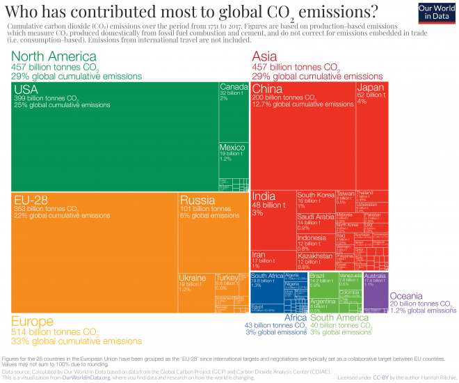
The distribution of cumulative emissions around the world is shown in the treemap. Treemaps are used to compare entities (such as countries or regions) in relation to others, and relative to the total. Here countries are presented as rectangles and colored by region. The size of each rectangle corresponds to the sum of CO2 emissions from a country between 1751 and 2017. Combined, all rectangles represent the global total.
There are some key points we can learn from this perspective:
- the United States has emitted more CO2 than any other country to date: at around 400 billion tonnes since 1751, it is responsible for 25% of historical emissions;
- this is twice more than China – the world’s second largest national contributor;
- the 28 countries of the European Union (EU-28) – which are grouped together here as they typically negotiate and set targets on a collaborative basis – is also a large historical contributor at 22%;
- many of the large annual emitters today – such as India and Brazil – are not large contributors in a historical context;
- Africa’s regional contribution – relative to its population size – has been very small. This is the result of very low per capita emissions – both historically and currently.
All of this data is also explorable by country and over time in the interactive map. By clicking on any country you can see the country’s cumulative emissions over time, and compare it with other countries.

In the visualizations above we focused on each country or region’s total cumulative emissions (1) in absolute terms; and (2) at a single point in time: as of 2017.
In the chart we see the change in the share of global cumulative emissions by region over time – from 1751 through to 2017.
Up until 1950, more than half of historical CO2 emissions were emitted by Europe. The vast majority of European emissions back then were emitted by the United Kingdom; as the data shows, until 1882 more than half of the world’s cumulative emissions came from the UK alone.
Over the century which followed, industrialization in the USA rapidly increased its contribution.
It’s only over the past 50 years that growth in South America, Asia and Africa have increased these regions’ share of total contribution.

In the final visualization you can explore the same cumulative CO2 emissions as you have seen above but now visualizes by country. Using the timeline at the bottom of the chart you can see how contribution across the world has evolved since 1751. By clicking on a country you can see an individual country’s cumulative contribution over time.
The map for 2017 shows the large inequalities of contribution across the world that the first treemap visualization has shown. The USA has emitted most to date: more than a quarter of all historical CO2: twice that of China which is the second largest contributor. In contrast, most countries across Africa have been responsible for less than 0.01% of all emissions over the last 266 years.
What becomes clear when we look at emissions across the world today is that the countries with the highest emissions over history are not always the biggest emitters today. The UK, for example, was responsible for only 1% of global emissions in 2017. Reductions here will have a relatively small impact on emissions at the global level – or at least fall far short of the scale of change we need. This creates tension with the argument that the largest contributors in the past should be those doing most to reduce emissions today. This is because a large fraction of CO2 remains in the atmosphere for hundreds of years once emitted.3
This inequality is one of the main reasons which makes international agreement on who should take action so challenging.
