New research publication on excess mortality by Janine Aron and John Muellbauer:
Summary
Excess mortality data avoid miscounting deaths from the under-reporting of Covid-19-related deaths and other health conditions left untreated. Excess mortality is defined as actual deaths from all causes, minus ‘normal’ deaths. This article assesses the comparability of data on excess mortality between countries and regions, it reviews the available data sources, and compares and contrasts different statistical measures of excess mortality. Now that the first wave of the pandemic is over for most European countries, the time has come for robust European comparisons. Our preferred measure of excess deaths relative to normal deaths, the more transparent and comparable P-score, is calculated for European countries with high rates of excess mortality during the Covid-19 pandemic. For the ‘all age’ group and especially for the working age group, ‘15-64’, England has had the highest rates of excess mortality. Spain had the highest cumulative P-score over the pandemic weeks for the ‘over 85’ age group. We address issues of international data and comparability on the extent of deaths among the care home residents. Generally, research is needed into divergent patterns of excess mortality between and within countries. Excess mortality measures can be compared in cross-tabulation and correlations controlling for common features like density by region, to propose policy hypotheses. Modellers should have ready access to transparent, comparable international data to a granular level to test such hypotheses to aid policy making for potential further waves of the pandemic. We suggest how international statistical agencies and national statistical agencies could publish improved measures of excess mortality.
1. Why is it important to examine excess mortality data?
Excess mortality is a count of deaths from all causes relative to what would normally have been expected. In a pandemic, deaths rise sharply, but causes are often inaccurately recorded, particularly when reliable tests are not widely available. The death count attributed to Covid-19 may thus be significantly undercounted. Excess mortality data overcome two problems in reporting Covid-19-related deaths. Miscounting from misdiagnosis or under-reporting of Covid-19-related deaths is avoided. Excess mortality data include ‘collateral damage’ from other health conditions, left untreated if the health system is overwhelmed by Covid-19 cases, or by deliberate actions that prioritise patients with Covid-19 over those with other symptoms.
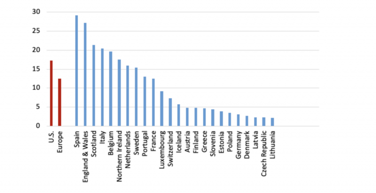
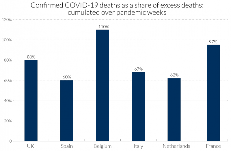
In a pandemic, measures taken by governments and by individuals also influence death rates. For example, deaths from traffic accidents may decline but suicide rates may rise. Excess mortality captures the net outcome of all these factors. Figure 1 illustrates how the degree of Covid-19 recording relative to excess deaths has varied across some European countries. In Belgium, with a broad definition of what constitutes a Covid-19 death, the excess over 100 percent might suggest that most excess deaths are due to Covid-19 and other deaths, such as those due to road accidents, may have declined.
Excess mortality data can be used to draw lessons from cross- and within-country differences and help analyse the social and economic consequences of the pandemic and relaxing lockdown restrictions.
For country comparisons (where under-recording may differ), policy-makers should examine robust measures expressed relative to the benchmarks of ‘normal’ deaths. ‘Normal’ death rates reflect persistent factors such as the age composition of the population, the incidence of smoking and air pollution, the prevalence of obesity, poverty and inequality, and the normal quality of health service delivery. Estimating the virus reproduction rate, R, is crucial for assessing the rate and nature of relaxation of lockdowns.1 Excess death figures could help to avoid the measurement biases inherent in other data typically used to estimate R in epidemiological models.2
Figure 1: Attributed Covid-19 deaths as a percentage of excess deaths for poor performers (‘all ages’): cumulated over pandemic weeks3
2. How is excess mortality measured and who measures it?
National statistical agencies publish actual weekly deaths and averages of past ‘normal’ deaths. For example, the Office for National Statistics (ONS) reports ‘normal’ deaths for England and for Wales as the average of the previous five years’ deaths. However, there are no published benchmarks for more granular or disaggregated data, such as sub-regions or cities. Using the weekly historical data, researchers could calculate such benchmarks with some effort. The ratio or percentage of excess deaths relative to ‘normal’ deaths, the P-score, is an easily understood measure of excess mortality, see Box 1. We argue that national statistical offices should publish P-scores for states and sub-regions. In the U.S., the National Centre for Health Statistics publishes data on excess deaths and a variant on P-scores (see Box 1), defining excess deaths as deviations from ‘normal’ deaths plus a margin adjusting for the uncertainty of the data.4 These data include counties and states, and are disaggregated by gender, age and ethnicity. The NCHS thus sets an international standard for statistical agencies.
However, to obtain cross-European comparisons requires data collation from individual national agencies to construct P-scores or variant P-scores, which are largely comparable, see section 4.1. Another alternative are the Z-scores compiled by EuroMOMO5 for 24 states, see Box 1. EuroMOMO’s measures of weekly excess mortality in Europe show the mortality patterns between different time-periods, across countries, and by age-groups. The Z-scores standardise data on excess deaths by scaling by the standard deviation of deaths. EuroMOMO are currently not permitted to publish actual excess death figures by country and do not publish the standard deviations used in their calculations. However, they graph the Z-scores and the estimated confidence intervals back to 2015 providing a visual guide to their variability. In contrast to the P-scores, the Z-scores are a measure that is less easily interpretable. Moreover, if the natural variability of the weekly data is lower in one country compared to another, then the Z-scores could lead to exaggeration of excess mortality compared to the P-scores. Strictly, the Z-scores are not comparable across countries, though see the caveats in section 4.1.
At least five separate journalistic endeavours have recently engaged in the time-consuming effort of collating and presenting more transparent excess mortality data, see Table 1. The Financial Times plots numbers of excess deaths, and the P-score or percentage of deaths that are above normal deaths. The Economist shows figures and graphics for excess deaths but not P-scores. However, the published estimates of P-scores in newspapers give only a recent snapshot, missing the context of historical variability provided by EuroMOMO. And we only have P-scores for some countries, regions and cities. A third measure of excess mortality is per capita excess mortality, where excess deaths (actual deaths minus ‘normal’ deaths) are divided by population, see Box 1, is used by the BBC (Table 1).
Table 1: Sources of comparative excess mortality data for Europe, the UK and the US, and other countries
Box 1: Measures of excess mortality: P-scores, per capita excess mortality and Z-scores
3. Key issues for comparing rates of excess mortality across and within nations
There are several reasons for wanting to compare excess mortality between regions or countries. The first is simply to compare the death toll of the first wave of the pandemic. Useful aggregate measures include the count of excess deaths relative to normal deaths, for example, the P-score, and excess deaths relative to population size, see Box 1. The second of these measures has the problem that older populations tend to have higher normal death counts. This measure of excess deaths will overstate the incidence of the pandemic in older compared to younger populations. For the second reason, that of evaluating the effectiveness of policy responses, one needs to dig deeper, and the simple measures above require further interpretation. Countries may differ in the size of the initial source of infection, in their age structure, in the distribution of co-morbidities in the population and the prevalence of dense urban centres, making some countries more vulnerable. Comparing age-standardised mortality can be helpful in controlling for differences in age structures. Finally, the third motivation for comparisons is a purely objective one of improving the scientific understanding of the dynamics of the spread of infections, their incidence and the death rates of those infected. Key to this last endeavour is the production of granular data, i.e. disaggregation of excess deaths data by age, gender, region, and, where possible, socio-economic categories.
A recent controversy in the UK amongst statisticians has served to reinforce the point of our paper, which is that there can be international comparability now of excess mortality with aggregate and more granular P-score data. There are already widely available granular data sets on related aspects such as inequality and urban density, which could be combined with such data for illuminating the comparisons across countries and revealing the effectiveness of different types of policy. Ideally there should be transparent definitions of data and comparability of definitions across nations which may involve coordination by existing international bodies for standards of data dissemination. This will evolve over time but does not preclude analysis now. Important is the accessibility of data to all, especially modellers in the fields of epidemiology, economics and sociology. Scientific analysis with appropriate data is needed to inform policy now because not only may there may be successive waves of the pandemic in each country, but many countries experiencing later pandemic crises have the potential to reignite infections in earlier countries when borders are open, and there may be pandemics in future years.
Turning to the controversy, Spiegelhalter (2020a) in a Guardian article on 30th April 2020 made valid points about data definitional differences and poor collection of data across some countries of Covid-19 infection and mortality rates. We are in agreement on this, but although he discusses the more reliable data on excess mortality, he argues that we will have to wait for months if not years before we can begin making useful comparisons across countries. However, given that the first wave of the pandemic in Europe has neared its end in most countries, now is a good time to make international comparisons at least within Europe. Indeed, on 4 May 2020, a letter9 from three statistics professors, Philip Brown, James Smith and Henry Wynn disputed Spiegelhalter’s claims saying: “Yes, there are inconsistencies, underreporting and heterogeneity within countries, but the policies adopted by different countries show very large differences in effects that would seem to dwarf such worries.” Their concern was that the article would deflect criticism of the political handling of the crisis (and indeed it had already in their view). They argue that comparisons combined with careful modelling are needed now to explain variations in mortality rates and infection rates across locations toward improved policy. They cite for instance a U.S. modelling endeavour, Rubin et al. (2020), the latest version of which analyses and forecasts US county level data on death rates, taking into account local factors across US counties including population density, incidence of smoking and social distancing as measured by cell phone movement data. The statisticians suggest that such modelling tools are appropriate to apply to country comparisons, and critical for modelling testing and tracing to the community level. We emphasise this modelling point more broadly in section 8.
To interpret large differences in excess mortality between nations requires consideration of several factors, and the within-nation deviations in these factors: the average infection rates in preceding weeks, average mortality risk from Covid-19 for those infected (the case fatality rate) and constraints on Covid-19-specific health capacity.
Turning to the first of the factors, consider differences in infection rates. Compare two countries or regions with the same average Covid-19 mortality risk where 1 percent of all adults are infected in A, while 5 percent are infected in B. Then the rate of excess deaths for adults measured by the P-score will be about 5 times as large in B in the weeks following the incidence of the infection. Countries that locked down early and had effective test, trace and isolate procedures kept down the average infection rate and hence the excess death rate.10
Within countries, infection rates can differ. London’s higher excess mortality was influenced by higher initial imports of infections and a higher virus reproduction number given its high density and hard-to-avoid close physical contact on public transport and at work. Thus, countries that have a higher fraction of adults in locations or occupations where the virus can more easily spread will tend to have higher excess death rates.
Mortality risks for infected adults, the second of the factors mentioned above, can differ between and within countries. For example, the percentage increase in mortality risk may be greater for some ethnic groups, or for some co-morbidities such as diabetes or pre-existing lung conditions. Then country differences in the prevalence of obesity and smoking will influence comparative excess mortality. Lastly, a country’s excess mortality is further driven up, and potentially much further, by limited Covid-19-specific health capacity. The death rate among infected adults depends on capacity constraints on numbers of hospital beds and staff, numbers of ventilators, PPE, testing and logistical failures in delivery, e.g. to care homes. Given similar initial capacities, a country with a higher average infection rate will be more likely to run into these constraints. By the same logic, given the same high infection rate, a country with lower health capacity would have a higher rate of excess mortality. This is why there is such a focus on ‘flattening the pandemic curve’. Different capacity constraints can have different implications for different groups. For example, lack of PPE and testing facilities in care homes will have disproportionately larger effects on mortality for the oldest individuals and this could affect country comparisons.
Covid-19, therefore, interacts with the age distribution, the nature of health service delivery, poverty and inequality, ethnic and occupational structures, air pollution, the relative size of major conurbations and so on. Comparing rates of excess mortality statistics within countries by age groups, by city size and by occupational, social and ethnic groups should generate important insights for future pandemic policy.
Finally, it should be considered whether excess mortality statistics alone are sufficient to measure the impact of a pandemic. The health economics literature has given attention to Quality Adjusted Life Expectancy (QALY) as a criterion for expenditure on health-improving policies. QALYs measure the number of reasonably healthy years a person might expect to live. The number of QALYs lost could supplement the increased death count resulting from the pandemic as a measure of its impact. However, detailed actuarial and medical information is entailed in the complex estimation of the number of QALYs lost. QALYs and the attachment of monetary values to QALYs have long been controversial, see Loomes and Mackenzie (1989), but the concept of a QALY does focus attention on the relative value (by age group) of expected years lost in a pandemic. The excess mortality of working age adults with a normal life expectancy of 30 years might be weighed against the excess mortality of 85-year olds with a life expectancy of 5 years. If the choice is to attach more weight to excess mortality for working age adults this will affect comparisons of countries with different age-specific mortality rates, see section 7.
4. Comparability of statistical measures of excess mortality and other data issues to consider
Comparisons between relatively homogeneous countries with moderate population sizes (such as European countries, Japan and Korea) and large countries such as China and the U.S., which span very diverse regions with potentially very different timings and incidence of the pandemic, are necessarily difficult. For the latter, it makes far more sense to compare populous regions or states with nation states of comparable scale.
P-scores, per capita measures of excess deaths and Z-scores use the concept of ‘normal deaths’ in their numerator by comparing raw death figures with what would normally have been expected. Assuming that the data definitions for the death counts, such as the definition of the week, type of death count data collected (registration versus occurrence data, see below) and timeliness of the collection, are identical across countries (which they are not, see the next sub-section), we consider the relative comparability of the statistical measures described in section 2. For any measure, it is clear that cumulating actual deaths and normal deaths over the period of the first wave of a pandemic gives a more robust summary of its impact, as compared to examining only the peak week.
Comparability of P-scores and variant P-scores
The P-scores are robustly comparable across countries, with the caveat that the measure of ‘normal deaths’ is likely to be only approximate (see below). However, the underlying death count data do need to be transparent and fully comparable to make the comparisons valid, see section 4.2.
Normal death rates already reflect persistent factors such as the age composition of the population, the incidence of smoking and air pollution, the prevalence of obesity, poverty and inequality, and the normal quality of health service delivery. This makes P-scores particularly attractive even if age compositions and other persistent factors differ. Since they measure the percentage deviation compared to what is normal, these persistent differences will already be incorporated in the definition of the ‘normal’ death rate.
Variant P-scores add an allowance for historic data variability to the normal number of deaths to define an upper threshold (supposedly based on the 95 percent confidence interval around normal deaths). They define excess deaths relative to that threshold and scale by the same threshold to compute a percentage. The variant P-score is therefore always a bit below the simple P-score but tracks it closely. Because the variant is more complex, the simple P-score is preferable. It can always be accompanied by an indication of the margin of uncertainty around estimated normal deaths. When cumulated over a number of weeks, that margin of uncertainty falls so that there is then even less difference between the simple and variant measures (see Figure 3).
Comparability of the per capita excess mortality measure
Scaling excess deaths by population is obviously better than attempting to compare crude excess death counts for countries with vastly different populations. However, countries with older populations will tend to have higher normal death rates. This automatically means that countries like Italy with an older population will have higher measures of per capita excess mortality than countries with younger populations, such as England. Therefore, comparisons of per capita excess mortality need to be made with caution. A possible argument in favour of per capita excess mortality is that total population could be regarded as a rough proxy for the ability of the society to absorb excess deaths. However, on that logic, dividing excess deaths by the working age population would make more sense.
Comparability of Z-Scores
As explained in Box 1, Z-scores deflate excess deaths by the standard deviation of normal deaths. In principle, given the assumption of the Poisson distribution, see Box 1, Z-scores should not be compared across countries of very different sizes, though they are useful for comparing the profile of weekly excess deaths for an individual country. The reason is, that countries with small populations and therefore more noisy weekly counts of mortality, have higher standard deviations relative to normal deaths than the more populous countries. In practice, due to the inappropriate assumption of the Poisson distribution (see Appendix 1), the excess mortality rankings between countries are more similar to the P-scores than expected.
The Poisson is likely to be poor approximation to the stochastic process for number of deaths, even in what EuroMOMO call normal seasons. EuroMOMO exclude Winter and Summer because of systematic shifts in mean deaths due to ‘flu, bad weather or heat waves. But it seems extreme to assume there are no systematic shifts in mean deaths throughout Spring and Autumn. If there are excess deaths due to a bad ‘flu in Winter, then in Spring below-average excess deaths should result. There are other examples, such as a measles outbreak, or changes in support for the homeless or for care homes (e.g. from fiscal austerity measures), that may affect mortality rates. There could also be time-varying clusters of different influences – such as a varying previous exposure to risks such as smoking – among the most vulnerable age groups. Thus, the constant mean assumption is almost certainly wrong. Turning to the weekly standard deviation for ‘normal’ seasons used by EuroMOMO to deflate the Z-score (see Box 1), variations in systematic factors such as these which shift the mean will be included in the measure, as well as random noise (see Box 2). Hence, Z-scores include these systematic features in the denominator and numerator. The paradox is that this makes the Z-scores somewhat more comparable for countries of different sizes (see Appendix 1). The Z-scores indicate approximately (given the Poisson assumption) in which weeks excess deaths were statistically significant; hence they can in principle distinguish those countries with few, if any, weeks of excess deaths (e.g. Germany), from countries with many weeks of excess deaths (e.g. Belgium), irrespective of their large population size differences.
Another major defect of Z-scores, compared to P-scores and per capita excess death measures, is that their cumulation over multiple pandemic weeks is problematic. While excess deaths can be cumulated, the standard deviation of normal deaths cannot, and, in any case, EuroMOMO do not report either excess deaths or these standard deviations. This makes it hard to obtain a comprehensive summary of the pandemic’s impact from the Z-scores.
Box 2: Two pieces of evidence against the Poisson assumption used in EuroMOMO Z-scores
Even if we deem the P-scores and the population-deflated statistics to be comparable across countries, underlying measurement issues of the death count, strongly affect the comparability across countries. These definitional differences need to be highlighted and made transparent across country data providers and international organisations reporting excess mortality statistics. The transparent reportage of the Human Mortality Database is exemplary in this regard.
The accuracy of the basic data collected
Perhaps the biggest single pitfall for comparability may arise from the accuracy of the raw mortality data. In our VoxEU article (Aron and Muellbauer, 2020a) we highlighted the advantages of excess mortality data over recorded Covid-deaths, see also section 1, assuming that the collection of data on deaths from all causes would be relatively up-to-date and complete.
Yet countries differ in the efficiency of their death registration systems, particularly where those systems are devolved to regional or local administrations. Then, problems in one location can affect or delay the nationaI data, and sometimes the national recording system can be slow to absorb regional information. In a pandemic, it can happen that the capacity of systems is temporarily overwhelmed, most of all in hotspots, often in urban areas. Occasionally the recording methods may be so weak overall, that the observers resort to data on burials.11
The most striking recent example of revisions in the raw mortality figures is that for Spain announced on May 27th. Raw deaths were suddenly revised up by around 12,000, back to early March. Catalonia, whose capital is Barcelona, accounted for well over half of these increases, followed by the regions of Madrid and Castilla La Mancha. A closer look at the data revisions by age shows that the bulk of the revisions were for those aged 75 or more. This is consistent with news reports of the many deaths in care homes.12 As we shall see, the upward revision in the Spanish data currently places Spain neck and neck with England as the European country with the highest cumulative P-score for the ‘all ages’ group (Table 2), whereas previous data put England’s all-age P-score well ahead.
Lag between occurrences versus registration data on death counts
Another difference is between the death counts by week of registration of the death and week of actual occurrence of the death. The registration data occur later than the occurrence data. EuroMOMO Z-scores apparently use data by occurrence for all reporting countries, see Table 1.13 HMD use occurrence data for most countries, with the exception of England and Wales.14
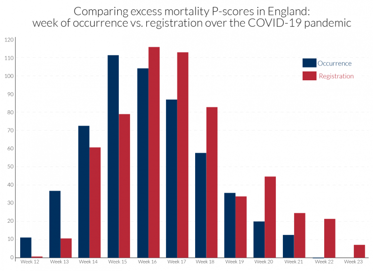
The occurrence-data are particularly prone to revision, and with the lags of registration data behind occurrence data often increasing during the height of a pandemic. Comparability in dating the peak week of mortality is sensitive to how the data are recorded. For example, in the UK, the peak week for all underlying regions is week 15 using occurrence data, as for the EuroMOMO Z-scores in Table 2. By contrast, death counts based on registration data for the UK show peak weeks of week 17 for N. Ireland, week 16 for England and Wales and week 15 for Scotland, see Table 2. Figure 2 compares for England the occurrence and registration data in calculated P-scores.
It is also important to be cautious when comparing cumulative P-scores across countries if the pandemic has not yet run its full course in some countries.
Figure 2: Peak of pandemic occurred earlier than when registrations were recorded: contrasting ‘all age’ excess mortality P-scores for England by registration or occurrence data15
Measurement of ‘normal deaths’
The 5-year average could be a crude estimate of normal deaths, e.g. if there are time trends in mortality. If mortality is on an improving trend, normal deaths would be over-estimated by the 5-year average. On the other hand, where populations are increasing or are ageing, the count of normal deaths could also be rising. EuroMOMO use statistical models to adjust for such trends but do not provide their estimates of ‘normal’/expected deaths.
If spring is especially warm as has been the case in Europe in 2020, it is possible that the 5-year average overestimates expected deaths, taking the weather into account. In the latter case, the simple P-score would then underestimate the impact of the pandemic. Also note that not just the effects of the pandemic but of societal reactions, whether driven by government regulation or private behaviour, will be reflected in the death count. Greater social distancing, lower rates of traffic accidents and of deaths due to alcohol abuse as well as ‘collateral damage’ will all affect the death count.
Definition of the week
Countries differ in how they define the week. The mostly widely accepted international definition starts the week on Monday and ends on Sunday. However, of the countries we compare, England, Wales and Northern Ireland start the week on Saturday and ends it on Friday, while all the others, including Scotland follow international practice. This is a relatively minor issue and largely washes out when cumulating excess deaths over multiple weeks, e.g. eleven weeks.
5. Why the age distribution matters
Differences in the age distribution between countries would be irrelevant if mortality risk increased in the same proportion for all. This can never be the case because children have a far lower mortality risk. In countries where children make up a high proportion of the population, the P-scores and excess mortality relative to the total population for the all ages group will be lower.
Looking only at the adult part of the population in a pandemic, there is strong empirical evidence against the hypothesis of a proportionate increase in mortality risk at all adult ages. We cannot be sure to what extent this is due to differences in rates of infection or differences in mortality risk once infected.16 The evidence in section 7 for six countries is for a more than proportionate increase for older adults, i.e. the group of older adults (85+) has a higher P-score than the group of younger adults (15-64). Comparing two countries with the same age-specific P-scores, the country with the higher proportion of older adults would then have a higher all-age adult P-score.
Countries also differ in the age-profile of P-scores. One can see this when comparing the ratio of the P-score for the group of working age adults to that of the group of older adults, e.g. those over 65 or over 85. This ratio is less than 1 everywhere, but some countries have far lower P-scores for working-age adults relative to older adults. To see the implications, take a simple example of two countries with the same age-structure of young and old adults. Suppose the P-score is 1 for the old in both countries, but that country A has a P-score of 0.1 for young adults while that for country B is 0.3. The overall P-score for country B will clearly be higher than for country A. However, if country B also has a higher fraction of young adults, that will attenuate the difference in the overall P-scores between the two countries. Thus, differences in age distributions between countries will affect the measured all-age P-scores and this should be recognised when comparing P-scores.
One could envisage an ‘age-standardised P-score’, adapting the ‘age-standardized mortality rate’, sometimes used to examine the impact of a pandemic. The latter is a weighted average of the age-specific mortality rates per 100 000 persons, where the weights are the proportions of persons in the corresponding age groups of a standard population. The WHO explains the rationale: “Two populations with the same age-specific mortality rates for a particular cause of death will have different overall death rates if the age distributions of their populations are different. Age-standardized mortality rates adjust for differences in the age distribution of the population by applying the observed age-specific mortality rates for each population to a standard population.”17 A theoretical population, the European Standard Population (ESP), is widely used in Europe to compute age-standardised death rates. This has a particular distribution by age, averaging data from across Europe. The current version from Eurostat was introduced in 2013. The ONS in the UK has also used age-standardised death rates to compare mortality risk from Covid-19 between the UK regions or between locations with different levels of economic and social deprivation.18
However, the ‘age-standardized mortality rate’ unfortunately conflates variations in normal mortality risk with variations in risk of death during a pandemic. Thus, if the age-standardised mortality rate in 2020 is higher in region A than in region B, this does not necessarily indicate that the Covid-19 mortality risk is higher in A. It may be that normal mortality risk, e.g. based on the average of the previous 5 years, is higher in region A than in B. Age-standardisation removes that part of the difference due to differing age structures of the two populations; but it does not remove from normal mortality risk the socio-economic differences, and differences in the incidence of obesity or smoking and in health provision.
An ‘age-standardised P-score’ would give a better grasp of the increased mortality risk due to Covid-19 than the ‘age-standardized mortality rate’. The P-scores for each age group could be computed and the weighted average taken using the age structure of the reference population, rather than of the region or country being considered. It is a better concept because it compares the age-standardised mortality rates during the pandemic period with those normally expected. This type of P-score would provide a provisional answer to the question: ‘how different would the overall mortality rate have been with a different age structure of the population?’
There are also potentially other ways of standardising aggregate P-scores (or mortality per 100,000 of population) to remove part of the source of between-region or between-country variation. For example, one could standardise by proportions of the population resident in towns and cities classified by common size categories.
The simple aggregate P-score (which weights the age-specific P-scores by the fraction of the population in each age group) and these various standardised aggregate P-scores (which weight the age-specific P-scores by the fraction of the population in each age group in a hypothetical population) have intuitive appeal and can be informatively compared across countries. However, one has to be aware of the limitation of any single measure of comparability between countries. Subsumed within the aggregates are implicit value judgements. For example, crucially in the case of a pandemic, there is an implicit assumption that the toll of an older life lost is the same as that of a younger life. However, when a younger life is lost, many more years of life expectancy are lost, and one might want to attach a larger weight to deaths of the young, see section 3. An important argument of the lockdown sceptics is an extreme version of this last point: “the virus is mainly killing off those that were on their way out anyway”, see Kelly (2020). This article quotes a major downward revision of his estimates by British statistician, David Spiegelhalter, who initially suggested that a large number of those dying of Covid-19 would have died in the coming year in any case, but now suggests about 5-15 percent but less than a quarter.19 On the 11th June, cancer specialist Karol Sikora stated for the Telegraph that at least half of those dying of Covid-19 would have died anyway by the end of the Summer of 2020. To try to get a clear position on the issue, Tim Harford (who should be credited for his contribution to the public understanding of data, probability and risk), invited actuary Stuart McDonald20 to comment in the BBC programme “More or Less”.21 McDonald disagreed with the assertion that a majority would have died in the next 3 months as it was neither supported by the data nor his own research. While it is true that three-quarters of the excess deaths were of people aged 75 and above, and that the majority had one or more pre-existing medical conditions (co-morbidities), in practice, life expectancy is quite high. For example, at the age of 80, life expectancy is 9 years for males and 10 years for females. Co-morbidities add little to this, in his opinion, since four-fifths of this cohort has two or more co-morbidities, and 90 percent have one or more (there is of course variation around the average). He stated that it was hard to find examples of less than two years’ life expectancy. From detailed data in the insurance industry, he suggested that an obese male smoker aged 80, and even with heart or pulmonary disorders, would still have a life expectancy of at least 5 years. This suggests that the pandemic had a huge impact not just on the death count but on life-years lost, properly measured.
Granular data, disaggregating by region, age and gender, as beginning to be provided by Eurostat (see Table 1), allows the observer to apply their own value judgements. These data, combined with medical information at the country level, would be a crucial input in estimates of life-years lost, alongside counts of excess mortality. Granular data are more informative for evaluating the effectiveness of the policy response and for enhancing scientific understanding to inform policies on ending lock-downs and reducing the risk of a second wave of infections.
6. What can we learn from a comparison of the P-scores from the ‘all ages’ data
Cumulation of the P-scores over time is required to get a comprehensive summary measure of the impact of the pandemic. Looking at comparisons over a single week or two, for example, is insufficiently reliable as there is much variation over individual weeks. Different observers choose different periods to define the beginning and end of the pandemic, for instance beginning with the day when the first Covid-19 deaths or first 50 such deaths were registered. In contrast, we frame our comparisons using the same length of period for each country that we are comparing. We use 11 weeks, which is a comprehensive period to measure the extent of the first wave of the pandemic in European countries (not long enough for the US). The actual weeks chosen differ by country: the timing matches the P-scores. Cumulating the P-scores for ‘all ages’ data shows, see Figure 3, that England is slightly ahead of Spain, but that they are ‘neck and neck’. There is also little difference between the two types of P-scores (ordinary and variant) in terms of ranking. Italy, Belgium, the Netherlands and France follow Spain, while within the UK, Scotland, Wales and N. Ireland follow England.
One caveat is that the English data are from registration data and not occurrence data (see section 4.2). Therefore, the timing of the England peak cannot be compared with the timing of the peak for the other European countries which use occurrence data, since registration of death follows after occurrence of death, with a lag.
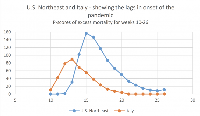
Examining the detailed P-scores by week for England and the rest of the UK, and the other European countries, it is clear that the peak incidence in Spain is more severe, but more protracted at high levels of deaths in England (Figures 4a and 4b). The same comparison applies to Belgium and Italy, with the latter more protracted. The incidence is quite a bit lower in N. Ireland, which follows Wales and Scotland, behind the England.
The detailed numbers behind the pictures are contained in Table 2. The Z-scores from EuroMOMO are also presented. Since Z-scores are based on occurrence data they provide a more comparable picture for England with the other European countries of the timing of the peak week.
Figure 3: Cumulative P-scores of excess mortality for poor performers for all ages22
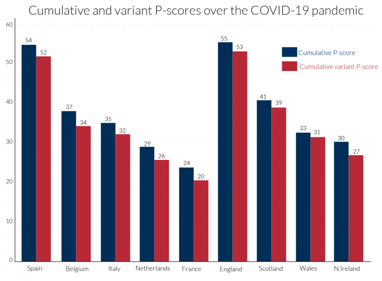
Figure 4a: Recent weeks of P-scores for poor performers showing peak weeks of excess mortality for ‘all ages’23
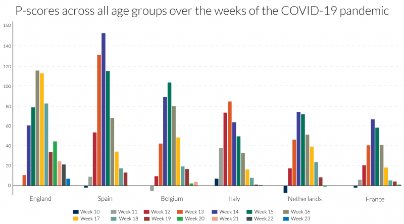
Figure 4b: Recent weeks of P-scores for the UK for ‘all ages’: England, Scotland, Wales and N. Ireland24
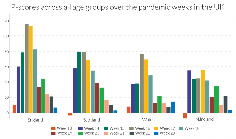
Table 2: Our P-scores/variant P-scores and EuroMOMO’s Z-scores for poor performers showing peak weeks of excess mortality in the first wave of the pandemic
7. Excess mortality for other age groups: 15-64 and 85+
Here, we focus on two age groups, those aged 15-64, containing most of the working age population, and the elderly, those aged 85 or more, many of whom will have been residents in care homes. The evidence here confirms the point made in section 5, that the percentage increase in mortality risk due to the pandemic, measured by the P-score, was higher for older ages. As in section 6, we present the cumulated P-scores over time to get a comprehensive summary measure of the impact of the pandemic for the two age groups. We use the same length of period, 11 weeks, for each country, sufficient to measure the extent of the first wave of the pandemic, though the actual weeks chosen will differ by country as before (see Table 2). What differs from section 6 is that for reasons of data access, ‘England and Wales’ as an entity are examined here, rather than England alone and other regions of the UK. Cumulating the P-scores for both age groups in Figure 5, shows that in all countries, P-scores are lower for the 15-64 age group than for the 85+ age group. ‘England and Wales’ lies slightly below Spain for the 85+ age group but is well above it for the working age group of 15-64. In ranking, Belgium, Italy, France and the Netherlands follow Spain and ‘England and Wales’ for the older age group. But Belgium, France and the Netherlands seem to have sustained far lower deaths than Spain and Italy, and especially ‘England and Wales’, amongst the working age population group.
It is unclear to what extent these striking differences are due to differences in rates of infection or differences in mortality risk once infected. Over the 11 pandemic weeks, the cumulative P-score for the 15-64 age group in France was negative, though in the middle of the period there were some weeks when it was positive, see Figure 6. This suggests that social distancing and related measures in France may have reduced deaths from other causes for the working age population, which actually saved lives over the first-wave pandemic period. The Netherlands and Belgium also have remarkably low cumulative P-scores for the 15-64 age group and a number of weeks with negative P-scores.
The increase in expected years of life lost, is another measure of the pandemic’s impact (section 3). Average life expectancy in the 15-64 age group is obviously substantially higher than the average for the 85+ age group, so many more expected years of life are lost in each excess death among the younger group than among the older. From the higher incidence of deaths among the working age population in England (which dominates the ‘England and Wales’ figures), it is obvious that England is easily the worst in Europe in terms of expected years of lives lost.
Turning to the timing of the pandemic’s incidence, the ‘England and Wales’ data are from registration data and not occurrence data (see section 4.2). Since registration of death follows after occurrence of death, with a lag, the timing of the England and Wales’ peak occurs around one week after its occurrence data, which in turn is later than the peak in most European countries. The timing of the peak week is mostly the same for the two age groups. It is led by Italy in week 13, followed by Spain and France in week 14, the Netherlands in weeks 14-15, Belgium in week 15 and England and Wales in weeks 16-17 (but week 15 according to the occurrence data in section 4.2).
Turning to the detail in Figure 6, the peak incidences for the 85+ age group in Spain and in Belgium are more severe, but for ‘England and Wales’ the pattern is more protracted at a high level of deaths. The same comparison applies to France and the Netherlands versus Italy, with the last more protracted. Italy initially dominated the headlines for Covid-19-related deaths but ranked fourth for peak excess mortality figures for the over-85s, below Spain, ‘England and Wales’ and Belgium.
Most disturbing, as noted above, is the comparative story for the 15-64 age-group, where England’s relative record in excess mortality in the Covid-19 era is strikingly higher than in the European countries. The 15-64 age-group includes the mass of the working age population. For this age group, the weekly pattern is rather different than for the over-85s, with ‘England and Wales’ displaying both a high peak incidence and protracted high level of deaths, followed by Spain and then Italy. Figure 6 shows that not only is England distinctive in the rate of excess mortality in the peak week for the working age group, but the same is true in comparisons of the two weeks before the peak and the subsequent week.
The EuroMOMO graphic visualisations by finer age categories can offer further clues, comparing the 15-44 and 45-64 age groups. Section 3 suggested that comparisons of Z-scores for comparably populous countries and those with larger populations yields reasonable approximations in ranking. England and Spain were the only countries with significant excess mortality in the 15-44 age group according to Z-scores, with England far ahead of Spain. Comparisons of Z-scores with less populous states tend to understate excess mortality in the latter, but evidence from the large countries France and Italy suggest that England is a European outlier. While Z-score comparisons with Wales, Scotland and Northern Ireland understate their excess mortality, the differences compared with England are so large that the conclusion that England was exceptional cannot be avoided. For the 45-64 age group, there is evidence of significant levels of excess mortality, at least in the peak weeks of the pandemic, for all the countries in our comparison group of countries with the exception of Northern Ireland. The Z-score evidence is consistent with the patterns in Figure 6 for the 15-64 age group, even if the Z-scores for the smaller countries, Belgium and the Netherlands slightly understate their relative excess mortality. While the Z-scores also understate excess mortality for the 45-64 age group in Scotland, Wales and Northern Ireland, the figures for England are so much higher, that its outlier status is confirmed for this age group as well as the 15-44 age group.
These country differences call for further analysis, especially by age and by regional differences within countries (contrasting, for example, regions with large urban centres and those without). It would be interesting to know to what extent working age excess mortality in London dominated the data for England. It is also possible that cramped housing conditions in London, especially for poorly paid workers, accounts for some of the exceptionalism of the data for England. Regional and country differences by occupational categories should also be illuminating. Aron and Muellbauer (2020b) drew attention to evidence for England and Wales of major occupational differences in the incidence of deaths attributed to Covid-19 and in age-standardised death rates. Of the countries in our comparison group, England and Wales (and Scotland) have the highest ratios of prison population to total population, followed by Spain.26 Further analysis is needed of excess mortality in the prison population as it is possible that failures to protect inmates from infection in countries with high infection rates could help explain some of the country differences of excess mortality for those of working age.
One of the stark differences between countries is how well protected were residents in the care homes. The main elements of what happened in care homes in the UK, France, Italy and in Spain is, by now, well-known. Care home staff had inadequate personal protective equipment (PPE) and inadequate access to Covid-19-tests and residents were not well-shielded from potential infection from visitors and staff. Yet, many elderly patients with the Covid-19 infection were released from hospitals to the care homes to reduce the pressure on hospitals from the volume of new cases, and therefore spread the infection to other residents. It is important to explore comparisons between countries of their excess deaths in care homes, for example at the least, the percentage of cumulative Covid-19 deaths that occurred in care homes. The clues in the rate of excess deaths for the 85+ age group, which show the largest increase in Spain, are consistent with newspaper reports of the disaster that befell many care homes in Spain.
We were not able to find comparable data at this stage for excess deaths of those normally resident in care homes across the European countries. However, considerable strides have been made in improving international comparability through the pioneering work of the International Long-Term Care Policy Network, e.g. Comas-Herrera et al. (2020). For international comparability, counts of deaths of those resident in care homes, plus those normally resident in care homes but dying elsewhere (e.g. in hospital), would have to be regularly published. Few if any countries currently do this. To compute the percentage of excess deaths in care homes or for the comprehensive definition which includes deaths of care home residents outside the care homes, requires data for the previous five years to be able to estimate ‘normal’ deaths.27 Another issue for international comparability concerns differences in definitions of what constitutes a care home. A focus on those over 65 or 75 years of age to exclude some of the other groups, such as refugees, sometimes included in the care home definition, could help international comparability.
It is interesting that England and Wales have some of the most comprehensive data on mortality in care homes internationally, see Comas-Herrera et al. (2020). They cite ONS data showing that from early March to 12 June 2020, excess deaths in care homes in England and Wales numbered 26,745, where total excess deaths for England and Wales were 59,138. Thus, about 45 percent of total excess deaths took place in care homes. The ONS have not produced data on excess deaths among those normally resident in care homes, however, clearly a higher percentage as some may have died elsewhere. We would like to know what fraction of excess deaths were of care home residents (within the home or out of it, say in hospital). The Care Quality Commission (CQC) estimates that 84 percent of total care home residents’ deaths took place in care homes in the same period. But this includes normal deaths that would have occurred in the absence of the pandemic, as well as the deaths induced by the pandemic (Covid-19 attributed deaths, mis-measured, unattributed Covid-19 deaths and those caused indirectly by Covid-19, through being untreated, for example). To correct the estimate of 84 percent for normal deaths included in it, and to include deaths of care home residents outside the homes, we consider CQC data on Covid-19-attributed deaths as follows. For the period from early March until the 1 May, the CQC estimate that 72 percent of Covid-19-attributed deaths of care home residents occurred in care homes. They give figures for England alone, from 2 May to 12 June, of and 77 percent. Scaling up the above figure of 45 percent of total excess deaths that took place in care homes for England and Wales, by the 84 percent figure, i.e. 45.2/0.84, would give an estimate of 54 percent for the percentage of all excess mortality accounted for by care home residents in England and Wales (whether inside or out of the care home at time of death). This would almost certainly be an underestimate, since the 84 percent is an over-estimate, but the 54 percent estimate gives a lower bound.
To potentially correct the estimate of 84 percent for the normal deaths included in it, and to include deaths of care home residents outside the homes, we consider the specific CQC data on Covid-19-attributed deaths as follows. For the period from early March until the 1 May, the CQC estimate that 72 percent of Covid-19-attributed deaths of care home residents in England and Wales occurred in care homes. Their equivalent figure for England alone, for the later period of 2 May to 12 June, is 77 percent. However, if the CQC estimate of 77 percent better represented the fraction of excess deaths of care home residents that took place in care homes than the 84 percent figure used above, then 58 percent (i.e. 45.2/0.77), would be the estimate of the fraction of all excess deaths accounted for by residents of care homes (whether inside or out of the care home at time of death).
Although Comas-Herrera et al. (2020) examine data sources for 27 countries outside the UK, the only other two countries found with data on excess deaths in care homes are Belgium and France. In Belgium the attribution of deaths to Covid-19 is so widely-defined that the count of Covid-19 attributed deaths actually exceeds the count of excess deaths, see Figure 1 above. For Belgium, Comas-Herrera et al. (2020) report that care home residents accounted for 64 percent of all deaths linked to Covid-19. This suggests that the percentage of excess deaths accounted for by care home residents in Belgium is not far from the 64 percent figure. They report for France that care home residents accounted for 49 percent of Covid-19 deaths. However, since the count of Covid-19 deaths understates excess deaths in France, see Figure 1, it seems likely that a higher percentage of excess deaths occurred among care home residents. For Canada, estimates suggest 81 percent of Covid-19 deaths were among residents in long-term care, but comparable estimates for excess deaths are not available.
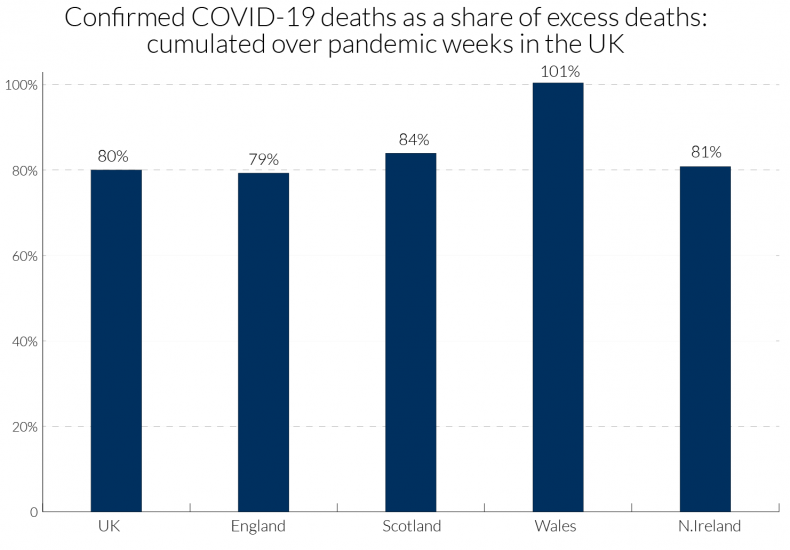
We can obtain a little more information for the UK by examining data in Table 4 for the four nations comparing the total excess death count in each with information on the location of Covid-19 attributed deaths. The period covered is weeks 13-23 of the pandemic (for dates, see Table 2). For the UK as a whole, 80 percent of excess deaths have been attributed to Covid-19, though for Wales the percentage was far higher.28 For the UK nearly half of excess deaths attributed to Covid-19 occurred in hospital and one quarter in care homes, though many of the hospital deaths were of patients who were resident in care homes. The remaining 20 percent may also be related to Covid-19, as unrecorded or mis-recorded deaths, and those indirectly affected by Covid-19 through other health conditions, such as heart conditions and cancer, being left untreated due to implied capacity constraints in the health service.
The percentage of excess deaths that took place in care homes from Covid-19 in England, at about a quarter, matches the overall UK figure, but in Scotland and N. Ireland this was sharply higher at 39 and 35 percent, respectively, and in Wales about 30 percent. Concerning the number of Covid-19 deaths, 30 percent of these occurred in care homes in England and in Wales, with 47 percent in Scotland and 43 percent in Northern Ireland. These percentages of Covid-19 deaths are an underestimate of those normally resident in care homes, because some died in hospital. Hopefully, the compilation of those data will be undertaken by the ONS and the regional health authorities, so that the scale of excess deaths in care homes and its regional variation is properly appreciated.
Figure 5: Cumulative P-scores of excess mortality for poor performers by two age groups29
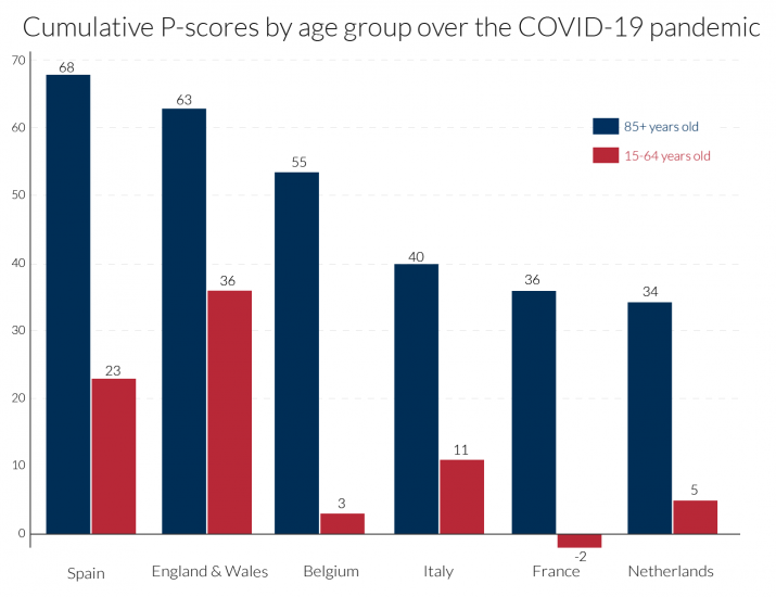
Figure 6: Recent weeks of P-scores for poor performers showing peak weeks of excess mortality by age-group30
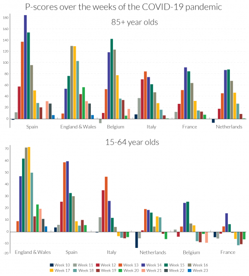
Figure 7: Total COVID deaths as a share of excess deaths for the UK (‘all ages’): cumulated over pandemic weeks.31
8. International/national statistical agencies should publish improved measures of excess mortality
Even if we deem the P-scores and the population-deflated statistics to be comparable across countries, underlying measurement issues of the death count strongly affect the comparability across countries. These definitional differences need to be highlighted and made transparent across country data providers and international organisations reporting excess mortality statistics. The transparent reportage of the Human Mortality Database (HMD) is exemplary in this regard.
The impact of the pandemic on deaths has been very strongly related to age and co-morbidity. The proportions of people with one, two or more co-morbidities is highly related to age. The discussion in the previous section highlighted striking differences between countries in age-related P-scores. Publication of P-scores for different age groups in a standard format should therefore be a high priority for international comparability, and HMD is a good source for such data. The evidence is that Covid-19 death rates are substantially higher for men than for women, and how this gender issue varies across countries and over time remains to be explored.
The international NUTS classification of regions provides another comparable frame for international comparisons. As regions differ in their urban/rural structure, comparing regional data can give important insights into risk factors for death rates. Moreover, as the incidence of the pandemic differs in timing and intensity, regional comparisons can throw light on the dynamics of the spread of infections. Eurostat has embarked on a major expansion of regional mortality data according to the NUTS classification, which should greatly aid research.
Another important source of variation across countries has been in the incidence of Covid-19 deaths in care homes. Countries undoubtedly differ in the proportion of older citizens resident in care homes. It would be highly desirable to develop an international standard frame to define what constitutes a care home, perhaps by the size-distribution of the number of residents. Then, comparisons of excess mortality in care homes would be possible. At present, there are limited internationally comparable data on deaths attributed to Covid-19 that occurred in care homes, see Table 4 for a UK comparison, but almost none on excess deaths of those in care homes or normally resident there.
Within countries such as the UK, there have now been several studies comparing the incidence of deaths attributed to Covid-19 by local measures of economic deprivation, occupation and ethnicity. It would highly desirable for parallel studies of excess deaths to be carried out. International comparability is harder in these dimensions given difficulties in standardising categories in measures of deprivation, occupational classification (sometimes not recorded on death certificates, but recoverable from census records) and missing data for some countries on the sensitive issue of ethnicity.
Considerable benefits can be reaped from tabulation, cross-tabulation and correlations, trying to control for common features like density by region, in proposing hypotheses. It is important to allow modellers ready access to transparent, comparable international data to a granular level to be combined with other granular data already available (e.g. on inequality) to test such hypotheses in models. Forecasting P-scores from epidemiological models for different scenarios on ending lockdown measures should be an important aid to formulating policy.32 Granular data by location within and between countries must be produced and made accessible for research and forecasting. An example using granular Italian death registry data is Ciminelli and Garcia-Mandicó (2020).33 Belloc et al. (2020) caution against drawing simplistic conclusions from cross-country correlations; they too stress the need for granular, comparable data.
National statistical offices should publish weekly P-scores of excess mortalities for the constituent countries, regions and broad social groupings such as care home residents, to help understand the pandemic and inform policy.34 We also argue that EuroMOMO should be mandated to produce P-scores as well as Z-scores to aid comparability across countries and be far more transparent on sources and methods EuroMOMO’s five-year graphs of Z-scores visualise the natural weekly variability, helping to interpret the confidence intervals. Similar practice should be followed for published P-scores, including at national statistical agencies.
To end on a cautionary note, excess mortality should also be examined in a longer-term perspective. Spiegelhalter (2020) argues the main impact of Covid-19 may be to shift forward the date of death by a few months for those close to death because of underlying poor health. However, as discussed in section 6, expert actuaries strongly dispute his claim. Moreover, total years of life lost, see section 3, is an alternative indicator of the pandemic’s social toll. Even in the extreme and improbable case envisaged by Spiegelhalter, total years of life lost could still show a large upturn. As we saw in section 6, record excess mortality of those of working age in England, making this a particularly telling issue in comparing with other European countries.
If national statistical agencies regularly published monthly, 3-month, 6-month and 12-month moving averages, and weekly P-scores, this would greatly assist our ability to interpret the pandemic data.35 Provision of timely, regularly updated and comparable granular data on excess mortality by national and international statistical agencies should be high on the agenda. It is not enough to leave this to hard-working journalists.
Acknowledgements
We take responsibility for interpretations of data and analysis but are grateful for advice on data and other matters to Jose Manuel Aburto (Dept of Sociology, Oxford University), Ainhoa Alustiza Galarza (HMD), Nick Andrews (Public Health England), Gabriele Ciminelli (Asia school of Business), Adelina Comas-Herrera (Care Policy and Evaluation Centre, Department of Health Policy, London School of Economics and Political Science), Laurie Davies (Mathematics Department, University Duisburg-Essen), Francesca De’ Donato (Department of Epidemiology, Lazio Regional Health Service, Rome, Italy), Mark O’Doherty (Public Health Agency, Northern Ireland), Faisal Islam (Economics Editor, BBC), Dmitri Jdanov (HMD), Gareth John (NHS Wales Informatics Service), Ridhi Kashyap (Nuffield College), Amparo Larrauri (Departamento de Enfermedades Transmisibles, Centro Nacional de Epidemiología, CIBER Epidemiología y Salud Pública, Spain), Diogo Marques (Public Health Scotland), Bent Nielsen (Nuffield College), Justine Pooley (ONS), Max Roser (Our World in Data, Oxford University), Charles Tallack (Health Foundation), and Lasse Skafte Vestergaard (Faculty of Health and Medical Sciences and Statens Serum Institut, University of Copenhagen.)
Appendix 1
Bibliography:
ACN. 2020a. “Coronavirus crisis shines spotlight on elderly care homes.” Catalan News, Barcelona, 1 April 2020.
ACN. 2020b. “Prosecutor investigating handling of Covid-19 in seven Catalan care homes.” Catalan News, Barcelona, 19 April 2020.
Aron, J. and J. Muellbauer. 2020a. “Measuring excess mortality: England is the European outlier in the Covid-19 pandemic.” VOXEU, Centre for Economic Policy Research, London, 18 May, 2020.
Aron, J. and J. Muellbauer. 2020b. “Measuring excess mortality: the case of England during the Covid-19 Pandemic.” INET Oxford COVID-19 Research, Economics Department, Oxford University.
Belloc, M., P. Buonanno, F. Drago, R. Galbiati and P. Pinotti. 2020. “Cross-country correlation analysis for research on Covid-19.” VOXEU, Centre for Economic Policy Research, London, 28 March 2020.
Burn-Murdoch, J., V. Romei and C. Giles. 2020. “Global coronavirus death toll could be 60% higher than reported.” Financial Times, 26 April 2020.
Ciminelli, G. and S. Garcia-Mandicó. 2020. “COVID-19 in Italy: An analysis of death registry data.” VOXEU, Centre for Economic Policy Research, London, 22 April 2020.
Comas-Herrera, A. and J-L. Fernandez. 2020. “England: Estimates of mortality of care home residents linked to the COVID-19 pandemic.” Report available at LTCcovid.org, International Long-Term Care Policy Network, CPEC-LSE, 17 May 2020.
Comas-Herrera A., J. Zalakaín, C. Litwin, A. T. Hsu, E. Lemmon, D. Henderson and J-L Fernández. 2020. “Mortality associated with COVID-19 outbreaks in care homes: early international evidence.” Report available at LTCcovid.org, International Long-Term Care Policy Network, CPEC-LSE, 26 June 2020.
Denaxas, S., H. Hemingway, L. Shallcross, M. Noursadeghi, B. Williams, D. Pillay, L. Pasea, A. González-Izquierdo, C. Pagel, S. Harris, A. Torralbo, C. Langenberg, W. Wong, and A. Banerjee. 2020. “Estimating excess 1- year mortality from COVID-19 according to underlying conditions and age in England: a rapid analysis using NHS health records in 3.8 million adults.” 10.13140/RG.2.2.36151.27047.
The Economist. 2020. “Tracking Covid-19 excess deaths across countries,” The Economist, 16 April, 2020,
Edwards, M. and S. McDonald. 2020. “The co-morbidity question.” The Actuary, Institute and Faculty of Actuaries, 7th May 2020.
Farrington, C.P., N.J Andrews, A.D. Beale and M.A. Catchpole. 1996. “A statistical algorithm for the early detection of outbreaks of infectious disease.” Journal of theRoyal Statistical Society A 159: 547-563.
Kelly, J. 2020. “Spiegelhalter says majority of Covid deaths would not have occurred in coming year.” Financial Times, 22 May 2020.
Krelle, H., C. Barclay and C. Tallack. 2020. “Understanding excess mortality. What is the fairest way to compare COVID-19 deaths internationally?” The Health Foundation, 6 May 2020.
Loomes, G. and L. McKenzie. 1989. “The use of QALYs in health care decision making.” Social Science and Medicine, Elsevier 28(4): 299-308, January.
Rubin, D., G. Tasian and J. Huang. 2020. “COVID-19 Outlook: Ringing the Alarm Bell for Epicenters, Waving the Caution Flag for Hotspots.” Article, Children’s Hospital Philadelphia Policy Lab, 24 June 2020.
Santaeulalia, I, F. Peinado, E. Sevillano and J. Mateo. 2020. “Scandal over Covid-19 deaths at Madrid nursing homes sparks fierce political row.” El País, Madrid, 10 Jun 2020.
Spiegelhalter, D. 2020b. “Coronavirus deaths: how does Britain compare with other countries?” The Guardian, 20 April 2020
Spiegelhalter, D. 2020b. “How much ‘normal’ risk does Covid represent?”, Winton Centre for Risk and Evidence Communication, Cambridge, 21 March, 2020.
Tallack, C. D. Finch, N. Mihaylova, C. Barclay and T. Watt. 2020. “Understanding excess deaths: variation in the impact of COVID-19 between countries, regions and localities.” The Health Foundation, 4 June 2020.
Tozer, J. 2020. “Measuring the true toll of the pandemic”, The Economist, 24 April, 2020.
Wu, J., A. McCann, J. Katz and E. Peltier. 2020. “46,000 Missing Deaths: Tracking the True Toll of the Coronavirus Outbreak”, The New York Times, 30 April, 2020.