This post draws on data and research thoroughly discussed in our entry on Global Extreme Poverty.This post was updated February 26, 2017
In the World Bank estimates of global extreme poverty, high-income countries are not accounted for. But how well does this simplifying omission capture the reality of people living there?
A simple look at the reality of homelessness in high-income countries shows that we need to take this question seriously.
The short answer is that the real rates of extreme poverty in high-income countries, as measured by the World Bank in low-income countries, are not zero, but are very low. In what follows we discuss the evidence in more detail.
Importantly, the evidence presented here should not lead one to conclude that “there is no poverty in rich countries,” but rather that the standard used to measure extreme poverty is indeed extreme. So extreme, that governments in high-income countries do not use it as a guideline to assess the living standards of their own citizens. Measurement instruments in these countries are simply not designed to capture such levels of extreme deprivation.
What do we know about poverty in the rich world before it became rich?
Martin Ravallion (2015)1 tries to answer precisely this question. He estimates poverty by relying on National Accounts. This involves calculating changes in the distributions of income by drawing on academic studies that reconstruct historical levels of economic output and inequality. You can read more about how researchers reconstruct poverty estimates from macro data in our related post here.
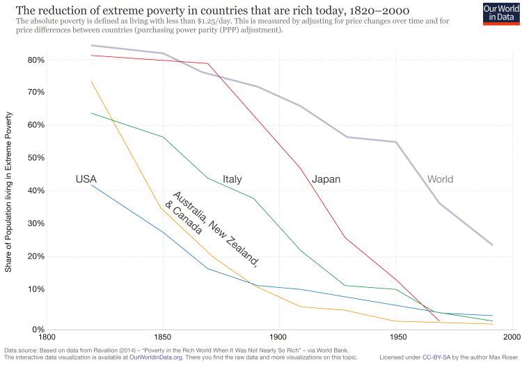
The chart below plots Ravallion’s estimates, showing how extreme poverty declined in today’s high-income countries. Two points are worth noting.
First, extreme poverty was very common in today’s rich countries until fairly recently; in fact, in most of these countries the majority of the population lived in extreme deprivation only a couple of centuries ago. These huge improvements show that extreme poverty can be reduced very quickly.
And second, we can also see that despite the remarkable improvements mentioned above, in some rich countries – notably the United States – what appears to be a sizable fraction of the population still lives in extreme poverty (visible here for the year 2000, when Ravallion’s estimates end).
Let’s now explore the second point in more detail.
According to official estimates, the poverty rate in the US was 13.5 percent in 2015. This figure, however, is not really informative about extreme poverty relative to the International Poverty Line used by the World Bank. This is because there are important differences between the US and World Bank methodologies, both in the way monetary welfare is measured and in the thresholds used to define absolute deprivation.
To be more precise, the World Bank figures on extreme poverty refer to individuals living in a household with per capita consumption or income below $1.90. The official US poverty estimates, on the other hand, refer to individuals living in households with incomes below a much higher threshold. Allowances are made for the size and composition of households so that, for example, in a household with 2 adults and 2 children, the poverty line is roughly equivalent to $16.5 per person per day.
So, can we make official US poverty estimates comparable to global estimates by simply applying a lower per capita poverty line? As it turns out, the answer is no. Whether poverty is measured via consumption surveys (as the World Bank does for most countries) or income surveys (as the US does), has significant implications. Several issues play a role here.
First, each type of survey has particular weaknesses regarding measurement error – for example, expenditure surveys are known to be particularly sensitive to the choice of reference period (both memory and willingness to maintain a diary impose limits on the period that can be selected to record consumption accurately). Second, survey design affects the particular incentives that respondents have to participate and report accurately – for example, some studies have found that respondents in the US are least likely to respond to income surveys in tax-filing months, when it would make most sense to ask about incomes.2 And third, there are valid differences between income and consumption that are not ‘errors’, but that stem from conceptual inconsistencies between the two – for example, restrictive definitions of ‘income’ might not account for the consumption that occurs out of ‘non-income’ resources such as savings and assets, borrowing, and some kinds of government welfare benefits.
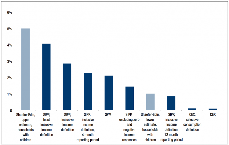
The following chart from Chandy and Smith (2014)3 shows a number of different poverty-rate estimates, keeping the poverty line fixed at $2 a day, but changing the underlying definition of monetary welfare. Here is a summary of what characterizes each estimate.
- The bars labeled ‘Shaefer-Edin’ correspond to poverty estimates as reported by Shaefer and Edin (2013).4 These estimates come from measuring welfare via income. The lower-poverty estimate includes tax credits and some forms of in-kind government benefits such as food stamps and housing benefits. The higher-poverty estimate excludes these benefits. Both estimates use the Survey of Income and Program Participation as their source, focusing only on households with children. 5
- The bars labeled ‘SIPP’ also correspond to estimates of poverty based on income using data from the Survey of Income and Program Participation. In this case, the different bars indicate different definitions of income – some more inclusive than others – and take into account the general population, including households without children. You can read the appendix in Chandy and Smith (2014) to see how these definitions compare to those from Shaefer and Edin (2013).
- The bars labeled as ‘SPM’ correspond to estimates of poverty using the source used for official poverty estimates (the Census Bureau’s Current Population Survey Annual Social and Economic Supplement) but applying yet another definition of income, called the Supplementary Poverty Measure (SPM). The SPM definition of income seeks to capture the impact of government policies intended to fight poverty and to exclude necessary expenses such as medical contributions and childcare. 6
- The bars labeled as ‘CEX’ correspond to estimates of poverty based on consumption. These estimates use data from the Consumer Expenditure Survey.7
As we can see from the chart below, different sources of data give substantially different estimates. And different sources have different limitations. So what can we learn from these numbers?
Chandy and Smith analyze all of the sources, in an attempt to faithfully replicate the the World Bank’s treatment of country data for the compilation of global poverty aggregates. Their approach consists of treating the US “as if it were an anonymous developing country whose source data were submitted to the Bank”. As a result of this exercise, they prioritize the Consumer Expenditure Survey, and obtain an estimate for the extreme poverty rate that is lower than 1%. This is a figure that is statistically indistinguishable from zero.
Recently, the World Bank started publishing estimates of extreme poverty in PovcalNet (an interactive computational tool for poverty measurement developed by the Development Research Group of the World Bank). According to these figures, which were published after Chandy and Smith published their estimates, 1% of the population in the US lived with disposable incomes below the International Poverty Line in 2013.
This means that, although consumption expenditure data is available for the US, the World Bank uses disposable income data to calculate extreme poverty figures that are not included in the global poverty estimates, due to lack of comparability.
That an estimate is ‘statistically indistinguishable from zero’ – rather than ‘exactly zero’ – simply reflects the fact that there is a margin of error involved in the estimation process. But what this exercise is telling us is that the margin is substantial.
Different estimates of $2 a day poverty rate – Chandy and Smith (2014)8
In Europe, poverty is not typically measured in absolute terms. Instead, most European countries rely on relative measures of poverty. This means that people are considered poor if they have less income and opportunities than other individuals living in the same society.9
In most cases, relative poverty is measured with respect to the median income in the corresponding country (i.e. people are poor if their income is below a certain fraction of the income of the person in the middle of the income distribution). Because of this, relative poverty is actually a metric of inequality – it measures the distance between those in the middle and those at the bottom of the income distribution.
Relative poverty estimates are clearly not comparable to absolute poverty estimates published by the World Bank for low income countries. So we need to look beyond official statistics for evidence on extreme poverty in Europe.
Here, once again, we can rely on the estimates published in PovcalNet. The following visualization shows the available data for high-income countries. The map shows Western Europe, but you can choose the ‘chart’ tab to see all available series.
As mentioned above, these estimates show the share of population living with disposable incomes below the International Poverty Line (1.90 international dollars); and again, the World Bank does not include these figures in the global estimates of extreme poverty.
As we can see, the share of people living in ‘World Bank type’ extreme poverty in high-income European countries is very small.
This is the same result that Bradshaw and Mayhew (2011)10 find in a study commissioned by the European Commission, using data on per capita household incomes from the EU-SILC survey to measure absolute poverty rates, using a poverty line of $2.15 PPP-dollars per person per day.11 In this visualization you can see their results; and in this scatter plot you can see how PovcalNet estimates below compare to those by Bradshaw and Mayhew.
Given all the evidence, we can conclude that ‘World Bank type’ extreme poverty is likely to be very low in rich countries, but poverty measurement instruments in these countries are not designed to capture such extreme levels of deprivation; so it is hard to know exactly how low it is.
