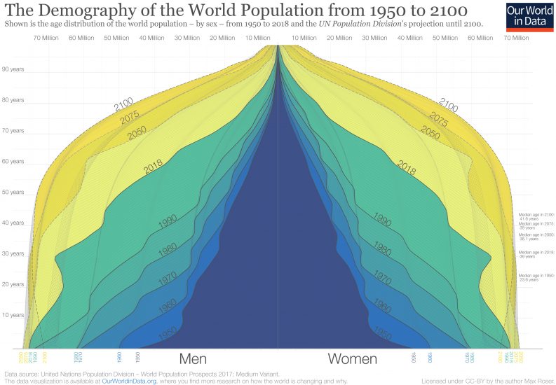
In 1950 there were 2.5 billion people on the planet. Now in 2019, there are 7.7 billion. By the end of the century the UN expects a global population of 11.2 billion. This visualization of the population pyramid makes it possible to understand this enormous global transformation.
Population pyramids visualize the demographic structure of a population. The width represents the size of the population of a given age; women on the right and men to the left. The bottom layer represents the number of newborns and above it you find the numbers of older cohorts. Represented in this way the population structure of societies with high mortality rates resembled a pyramid – this is how this famous type of visualization got its name.
In the darkest blue you see the pyramid that represents the structure of the world population in 1950. Two factors are responsible for the pyramid shape in 1950: An increasing number of births broadened the base layer of the population pyramid and a continuously high risk of death throughout life is evident by the pyramid narrowing towards the top. There were many newborns relative to the number of people at older ages.
The narrowing of the pyramid just above the base is testimony to the fact that more than 1-in-5 children born in 1950 died before they reached the age of five.1
Through shades of blue and green the same visualization shows the population structure over the last decades up to 2018. You see that in each subsequent decade the population pyramid was fatter than before – in each decade more people of all ages were added to the world population.
If you look at the green pyramid for 2018 you see that the narrowing above the base is much less strong than back in 1950; the child mortality rate fell from 1-in-5 in 1950 to fewer than 1-in-20 today.
In comparing 1950 and 2018 we see that the number of children born has increased – 97 million in 1950 to 143 million today – and that the mortality of children decreased at the same time. If you now compare the base of the pyramid in 2018 with the projection for 2100 you see that the coming decades will not resemble the past: According to the projections there will be fewer children born at the end of this century than today. The base of the future population structure is narrower.
We are at a turning point in global population history. Between 1950 and today, it was a widening of the entire pyramid – an increase of the number of children – that was responsible for the increase of the world population. From now on is not a widening of the base, but a ‘fill up’ of the population above the base: the number of children will barely increase and then start to decline, but the number of people of working age and old age will increase very substantially. As global health is improving and mortality is falling, the people alive today are expected to live longer than any generation before us.
At a country level “peak child” is often followed by a time in which the country benefits from a “demographic dividend” when the proportion of the dependent young generation falls and the share of the population in working age increases.3
This is now happening at a global scale. For every child younger than 15 there were 1.8 people in working-age (15 to 64) in 1950; today there are 2.5; and by the end of the century there will be 3.4.4
Richer countries have benefited from this transition in the last decades and are now facing the demographic problem of an increasingly larger share of retired people that are not contributing to the labor market. In the coming decades it will be the poorer countries that can benefit from this demographic dividend.
The change from 1950 to today and the projections to 2100 show a world population that is becoming healthier. When the top of the pyramid becomes wider and looks less like a pyramid and instead becomes more box-shaped, the population lives through younger ages with very low risk of death and dies at an old age. The demographic structure of a healthy population at the final stage of the demographic transition is the box shape that we see for the entire world for 2100.
The Demography of the World Population from 1950 to 21002