It is well known that health insurance coverage in the US is lower than in other developed countries. But what does this imply in terms of inequality in healthcare expenditure? Below I borrow the material from our entry on Financing Healthcare to discuss how health insurance and expenditure have changed over the last century in the US, and what this has implied in terms of inequality.
In the second half of the 20th century, most industrialised countries saw healthcare expenditure grow rapidly with the discovery of powerful new treatments – including, notably, the discovery of penicillin and other antibiotics. The following visualization summarizes the experience of the US: expenditure on healthcare as a share of GDP started climbing around 1960, both in the public and private sector. If you switch to the ‘relative’ view in this visualization, you can see that the public sector grew faster than the private sector. The public sector went from accounting for 13% of expenditure in 1929 to 47% in 2013 – today the US spends more government money per person on healthcare than many countries that fund universal programs.
The lion’s share of the increase in healthcare expenditure in the US during the second half of the 20th century took place without an underlying increase in health insurance coverage. The following visualization shows the percentage of individuals in the US without health insurance during the years 1963-2015. A large period of remarkable stability is observed between two major policy reforms: the creation of Medicare and Medicaid in 1965, and the introduction of the Affordable Care Act in 2012. Growth in expenditure during the second half of the 20th century really seems to have been the result of new treatments, rather than expansion of access to healthcare. And it also seems the Affordable Care Act reforms are having the intended effect of increasing insurance coverage.
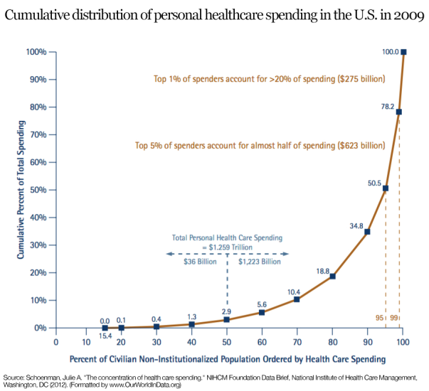
The fact that insurance coverage remained stable while spending was increasing rapidly, implied that healthcare in the US grew highly concentrated. The following graph, produced by the National Institute for Health Care Management (NIHCM), shows the cumulative distribution of personal healthcare spending in the US using data from the 2009 Medical Expenditure Panel Survey. This graph should be read similarly to a Lorenz curve: the fact that the cumulative distribution of spending bends sharply away from the 45% degree line is a measure of high inequality (this is the intuition of the Gini coefficient). As it can be seen, the top 5% of spenders account for almost half of spending, and the top 1% account for more than 20%. While some concentration in expenditure is to be expected – because it is in the nature of healthcare that some individuals will require large expenditure –, these figures seem remarkably large. They suggest important inequality in access, over and above inequality in need.