You can reproduce all interactive visualizations from Our World In Data in presentations and other documents, such as PowerPoint or LaTeX slides. This is possible because all our material is permissively licensed under CC-BY-SA.
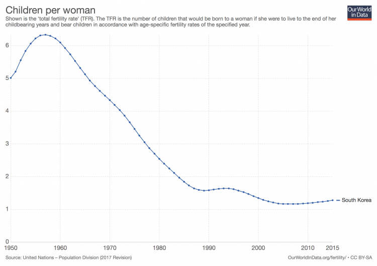
Let us explain with a concrete example. Suppose you are a teacher and you want to use the following map on fertility for a lecture on population growth.
At the bottom right of the chart, you will find a little icon showing a hard disk with a downward arrow on top. This is a ‘download’ button.
If you click on it, you will see two options, as shown below:
- If you click on the first option, labeled “Save as .png“, you will download a snapshot of the chart in the ‘Portable Network Graphics’ format, which is supported by most word-processing and presentation-making programs (i.e. you can use the downloaded file in programs such as LyX, or Microsoft PowerPoint and Word).
- If you click on the second option, labeled “Save as .svg” you will download a snapshot of the chart in the ‘Scalable Vector Graphics’ format, which is supported by most graphic design programs (i.e. you can use the downloaded file in programs such as Inkscape, or Adobe Illustrator).
That’s it!
One nice option to bear in mind is that you can download maps for various years. Just move the time-slider below the map to a different year and you can export a map for that point in time.
And you can switch to the time-series view for particular countries and export an image for all the countries you are interested in. One way to switch to the country-specific trend is to simply click on a country in the map.
Once again, in the example above, suppose you would like to include a slide in your lecture discussing the experience of South Korea. All you need to do is click South Korea in the map, and then select the ‘download’ option as described above. This is what’ll you get: