Datadata descriptionLuxembourg Income Study (LIS) Database.LIS: Cross-National Data Center in Luxembourg
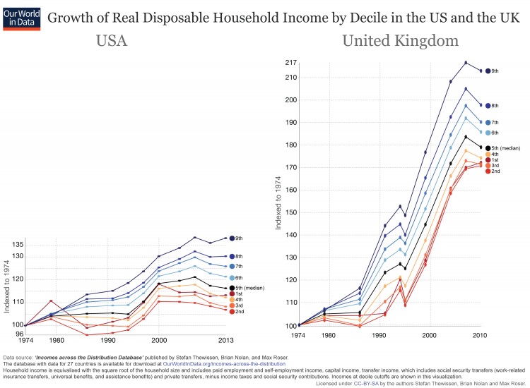
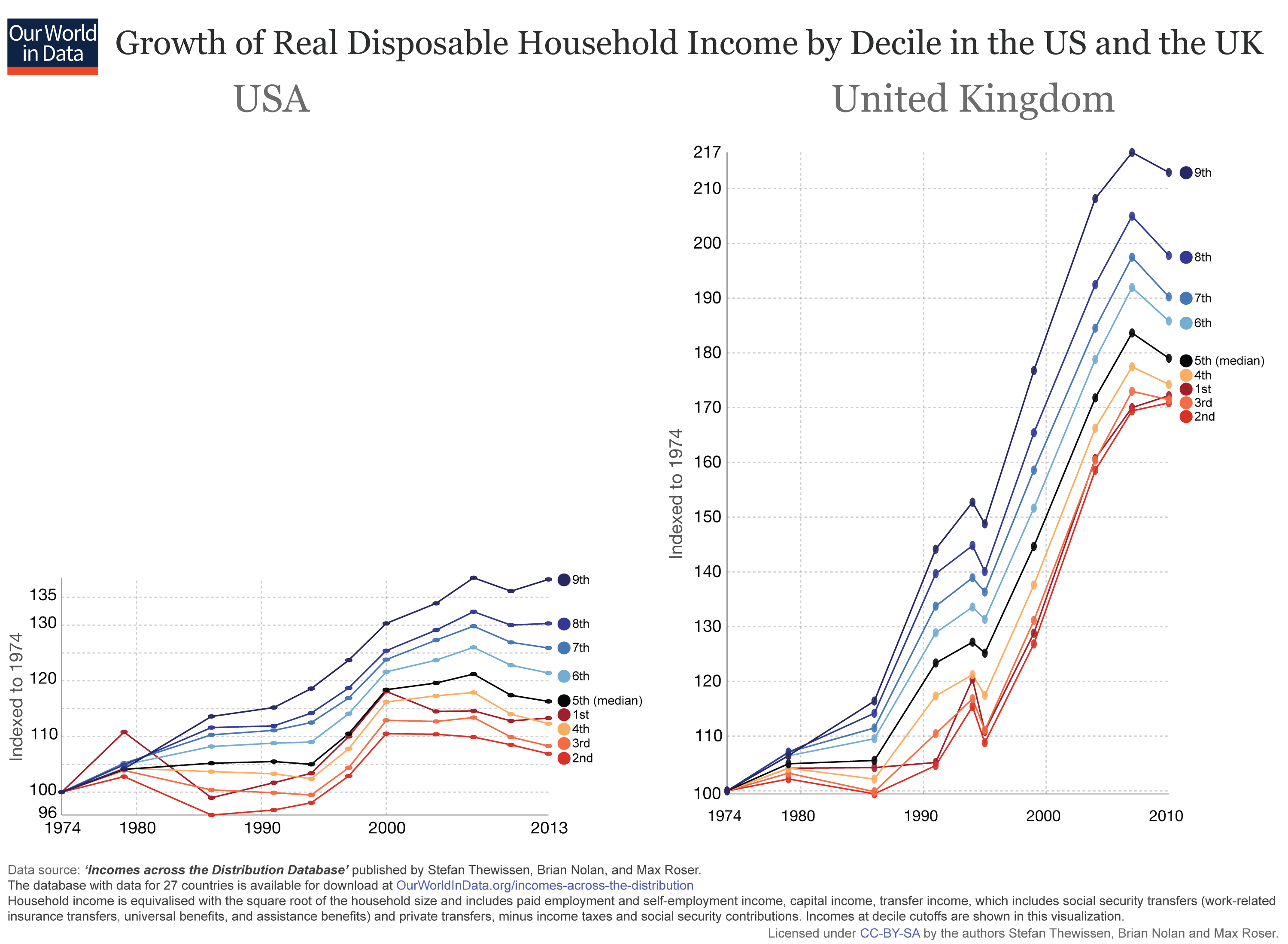
The UK – increasing inequality in the 80s followed by strong growth for all households
The interactive chart offers a more detailed look at the evolution of incomes in the UK. Inequality has evolved differently in different countries; it is not one story that would be the same everywhere. Inequality is determined by the complex interactions of the tax system, government policy, education, growth cycle and many other factors. The UK experienced a large increase in inequality during the 80s but has since stabilized. The early 80s saw a period of rising inequality caused by stagnation of the middle and lower income groups and growth at the higher end. Uneven growth in the years leading up to 1991 meant further rises in inequality. Throughout the 90s and 00s, more even growth across the distribution has meant little change to inequality. In comparison with other countries it is worth pointing out that income growth in the UK was remarkably strong in the two decades leading up to the crisis.Income inequality and growth of living standards across the income distribution in the UK, 1974-2010 – Brian Nolan, Stefan Thewissen, and Max Roser
Full screen view Download DataThe US – incomes for most households stagnate & inequality increases constantly
Inequality in the US has increased dramatically over time. During the 80s, we can see that the living standards of the poorest half fell while they increased for the richest. Throughout the 90s there was a sustained period of improvement at all levels of society, but without any real reduction in inequality. From the year 2000 onwards we observe a period of stagnation for the lower income groups accompanied by increased inequality as the richest capture most of the gains from growth. In 2013, approximately 60% of the population were better off in than the year 2000.Income inequality and growth of living standards across the income distribution in the USA, 1974-2013 – Brian Nolan, Stefan Thewissen, and Max Roser
Full screen view Download DataAustralia – rising inequality but everyone is better off
Australia has also seen an increase in inequality, but in contrast to the US, the incomes of all households increased substantially. This contrast is a good example that makes clear that we cannot rely on aggregate measures – like mean GDP growth and inequality measures – alone. We have to study incomes across the entire distribution to be able to see what is happening.Income inequality and growth of living standards across the income distribution in Australia, 1974-2010 – Brian Nolan, Stefan Thewissen, and Max Roser
Full screen view Download DataGreece – inequality is falling, yet everyone is losing
A last example makes clear that we should not focus on economic inequality alone: Greece has seen substantial reductions in inequality, yet the fall in incomes outweighs this development. In the period 1974-86, inequality fell sharply, as the poorest in society saw the largest improvements in living standards and the richest saw the weakest. Throughout the period displayed, the poorest parts of the income distribution experienced the largest gains. The economic crisis in Greece has meant a severe drop in living standards, incomes for the poorest are back to where they were in the 1980s. The data shown for Greece are taken from the OECD.Income inequality and growth of living standards across the income distribution in Greece, 1974-2011 – Brian Nolan, Stefan Thewissen, and Max Roser
Full screen view Download DataIncomes across the distribution in 27 countries
The visualization presents the Incomes across the Distribution Database (available below) for 27 countries. (To see the growth by decile – indexed to the first year – you can access this chart here.)
Click to open interactive version
Median income growth
These visualizations show median income growth over time. The static chart shows, that while median incomes in the US have been almost stagnant over 3 decades, the populations of other rich countries have experienced substantial income gains. The median households in Spain, the UK and Norway in particular are much better off than 3 decades earlier.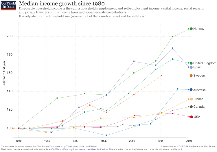 The interactive version of this chart allows you to compare the median incomes of even more countries. Median household incomes – adjusted for price differences between countries (PPP-adjustment) – can be added by the ‘
Add country
’ option.
If you are interested to see income growth at the bottom end of the income distribution you can access the visualization here.
The interactive version of this chart allows you to compare the median incomes of even more countries. Median household incomes – adjusted for price differences between countries (PPP-adjustment) – can be added by the ‘
Add country
’ option.
If you are interested to see income growth at the bottom end of the income distribution you can access the visualization here.

Click to open interactive version
Median vs mean incomes
This last visualization in this entry compares median and mean incomes.
Click to open interactive version
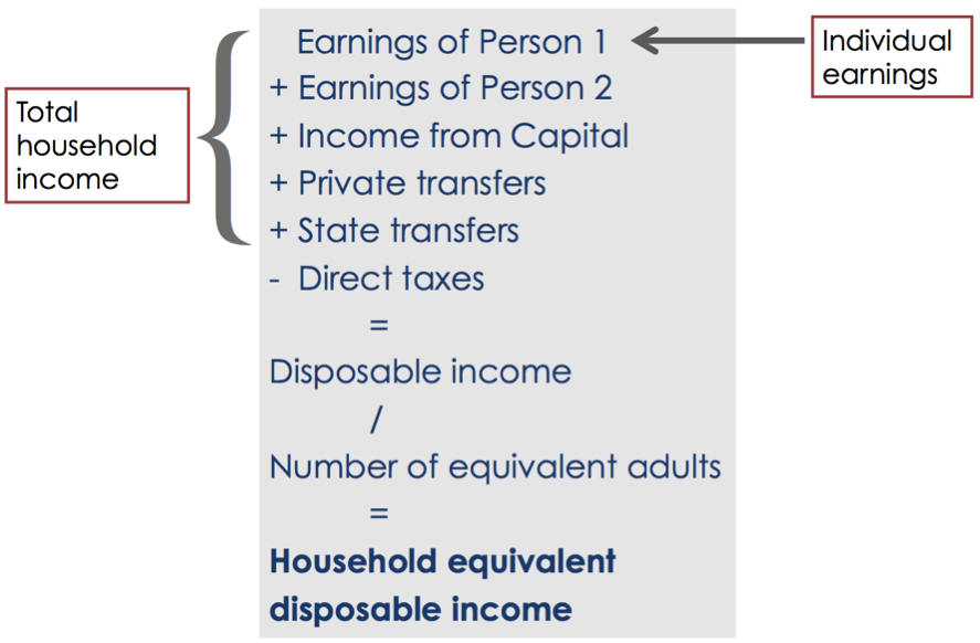
Income definition
The equivalence scale
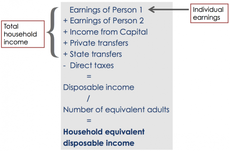
Two households on the same income but one comprising a single individual and another a couple with two children will have differing living standards, because a household with several individuals benefits from economies of scale in consumption. We include both equivalised and per capita decile information in the database. For per capita income, we calculate household income and divide it by the number of household members. For equivalised income, we assume economies of scale by applying the square root of the household size as the equivalence scale. Both per capita and equivalised income assume equal sharing of income across individuals within a household.Data on CPI and deflators
To use income levels to measure living standards, the income measures are corrected for changes in price levels over time and in purchasing power across countries. We use the consumer price index (CPI, from OECD Consumer Prices (MEI), all items) to deflate household income. To convert to a common currency we apply Purchasing Power Parities for actual individual consumption to household incomes sourced from OECD National Accounts. We express all PPP-adjusted figures in 2011 international dollars. We provide all incomes in both nominal terms and in inflation-adjusted 2011 international dollars in the full database that is directly available here.Gini index
The gini index is the most commonly used inequality measure and is explained here.- Data: Household disposable income by income decile for the working-age population and for the entire population. Equivalised household incomes and per capita incomes. Summary inequality measures (including Gini Indices).
- Geographical coverage: 27 high-income countries (most OECD countries)
- Time span: Data coverage differs by country – for some countries data goes back to 1978 while coverage is shorter for some other countries. Data is currently available until 2013.
- Available at:
- This data set was developed at the Institute for New Economic Thinking at the Oxford Martin School in the Employment, Equity, and Growth Programme.
- The data source for the Incomes Across the Distribution Database is LIS microdata: Luxembourg Income Study (LIS) Database, http://www.lisdatacenter.org (multiple countries; Micro data runs for multiple countries completed in September 2015.). Luxembourg: LIS.
- Data: Information on the distribution and growth of household income across countries.
- Geographical coverage: 23 countries.
- Time span: Data coverage differs by country – for some countries data goes back to 1979 while coverage is shorter for some other countries. Data is currently available for some countries until 2013.
- Available at: It is also available via the website of the Luxembourg Income Study Database (here).
- This database was assembled by Janet Gornick (LIS), Thierry Kruten (LIS), Branko Milanovic (LIS), David Leonhardt (NYT), and Kevin Quealy (NYT).