Summary
Earth is home to millions of species. Monitoring how biodiversity is changing is an incredibly difficult task. The Living Planet project provides an essential resource to help us do this: it brings together the data on more than 20,000 animal populations across the world to understand how they are changing.
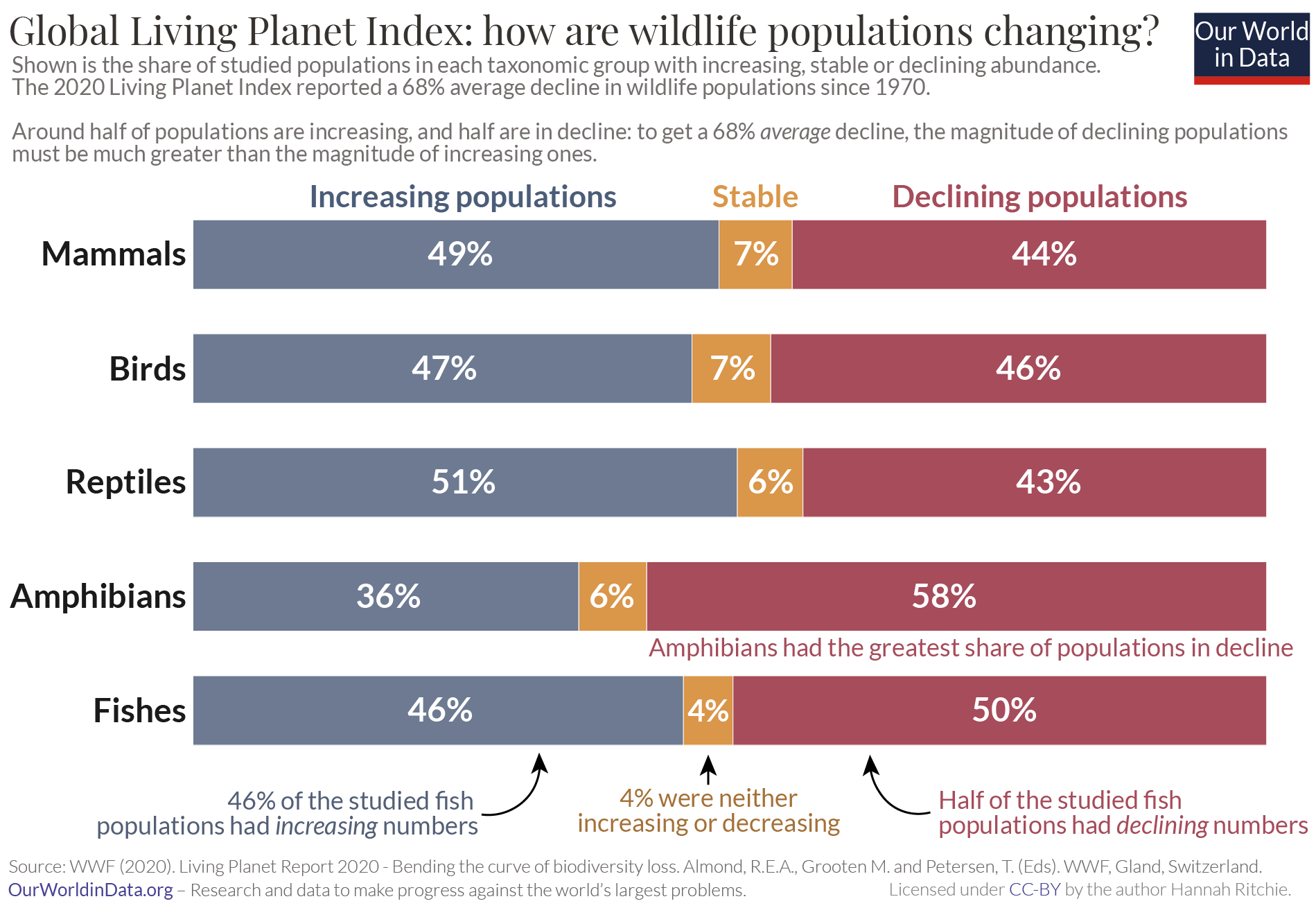
Most people know of this work from the Living Planet Index which reports the average change as a single figure. But beneath this headline lies more than 20,000 individual stories. Half of these populations are increasing in abundance, while half are declining. The Living Planet database helps us understand where and what animals are in deep trouble. But it also helps to illuminate the success stories: where things are going right. This more nuanced and focused approach is what we need if we’re to prioritize conservation efforts towards the populations that need it the most.
We need data to understand the world around us. There are few areas where gathering this data is more difficult than biodiversity.
There are millions of species on Earth. We don’t even know exactly how many species there are – the most-cited estimates are between 5 to 10 million.1 We have identified and described just over 2 million of them. And of course, species do not just live in one place: there are many populations of a single species spread across the world. That’s before we even get to the really challenging part of counting all of the individuals in each. Trying to understand what’s happening to an Amazonian frog species, almost too small to see with the naked eye, is no easy task. This work is really hard.
One project that I think deserves an immense amount of credit is the Living Planet Report, led by the Zoological Society of London (ZSL) and World Wildlife Fund (WWF).2 You might know it from the infamous Living Planet Index [which I cover here] which often hits the headlines. I’m going to distinguish the underlying project from the index because I think the index, and how it is interpreted, does a disservice to the incredible amount of work that they do.
The Living Planet project painstakingly brings together published data on the state of more than 20,000 wildlife populations from across the world. This captures everything from frogs to elephant species, rhinos to owls, from every continent on Earth. Better yet, they publish it freely as a downloadable database for everyone to use. I wish more people knew about the database itself, and not just the Living Planet Index headline.
For those working in conservation or environmental research and protection, digging into the specifics of the database is essential. For the more casual observer who just wants to understand what’s happening to the world’s wildlife we need to find some way of summarising the 20,000 stories that it contains. The most popular way of doing this is by using the Living Planet Index: this reports the average decline across all of the populations as a single figure. The headline result is that we saw an average decline of 68% across wildlife populations since 1970.
I’m not a fan of the index because of how easily it is misinterpreted. In a related article I look at what the misconceptions are, and what the index actually means.
I much prefer the summary shown in the chart here. It shows us what share of the 20,000 populations is declining, increasing, or is stable. Across all of the taxonomic groups, there is almost a 50-50 split: around half of populations are in decline, and half are growing. This tells us a very different story from the single index figure. Many extrapolate the “average decline of 68%” to assume that most, if not all, of the world’s wildlife is struggling. This more nuanced summary shows us that this is not the case.
This perspective has shaped a lot of my thinking around biodiversity loss. I don’t prefer it because it tells a more ‘positive’ story than the index itself. I prefer it because I think that understanding this improves our chances of saving the populations that are more endangered. There’s a couple of reasons why.
First, understanding what populations are most threatened is how we prioritize our conservation efforts. There’s no point in misplacing resources towards populations that are flourishing at the expense of populations on the brink of extinction. We can only direct our attention towards the most endangered populations if we know what they are in the first place. Looking at the red segment – the declining populations – already cuts our sample by half. We still need to narrow it down further by looking at the populations that are seeing the most drastic declines. The underlying data in the Living Planet database allows researchers to do this.
Second, it shows us that the loss of wildlife is not inevitable. Despite the gloomy headlines, the biodiversity story is not all bad news –and thank goodness. Imagine if, after decades of conservation efforts, all of our wildlife was in decline. We might see it as futile to even try. Support for conservation relies on there being wildlife that needs saving. But it also relies on the belief that interventions can actually make a difference. If we didn’t see any positive trends we would have nothing to learn about what we can do. The stories of each of the populations that are increasing give us insights into what is going right. If we can understand it, we might be able to replicate it.
This chart captures both of these aspects. It shows us that much of our wildlife is in trouble. But it also shows us that this is not inevitable: we can turn things around if we want to.
The Living Planet project provides an essential resource to get us started on this. The database lets us dig deeper to see exactly which populations are most endangered, and where they are. The researchers and authors that bring this resource together deserve a lot of credit. I personally would like to thank them for shaping my thinking on biodiversity; for giving us the data-driven stories we need to understand the animals we share the planet with.