Over the past few months I’ve been working on the visual and technical structure of articles in order to improve the reading experience. In this short article I summarize one of the key changes I’ve made to the Our World in Data infrastructure: shifting from a one-column to two-column layout.
Reading with “always on” visualizations
One of the most visible improvements is the shift from a single multi-purpose column to two specialized content columns, where the left column contains the text and any related visualizations are shown in the right-hand column.
With a single column layout, the reader jumps back and forth between text and visualization; this can make it hard to keep track of progress in the article, often across several paragraphs. The two-column layout instead allows authors to bind visualizations to their respective content, and keep them visually in place. Whether the content is one paragraph or several pages long, the visualization is always accessible on the right, reducing the cognitive load of alternating between text and visual content.
Incidentally, this visual transformation triggered a large manual updating effort from authors who had to make references to charts where there was no specific location on the page; for example, “chart below” would no longer be accurate on larger screens since text and charts were now shown in side-by-side view.
Comparing the natural way
Another instance where the two-column layout proves useful is the comparison view.
Individual charts already do a pretty good job at presenting several layers of information. But it’s sometimes not possible or desirable to superimpose the dimensions to be compared in one single place, and two charts need to be created. In those instances, a two-column layout makes for a more intuitive comparison than when charts are sitting on top of each other.
Although the two-column view and the comparison view both rely on a similar two-column structure, their width distribution is not identical. We will shortly see why.
Leveraging indempotent layout rules for serene and automatic conversions
Setting up columns initially required a substantial effort from authors, who had to manually create two-column blocks and move content around in the editor in order to use the new layout.
Despite the improved usability of Gutenberg – WordPress’s block editor – it quickly became apparent that this work was both tedious and prone to mistakes. Luckily, this manual work also turned out to be unnecessary as layout rules could be created to automate it. Thanks to the technical architecture laid out by former Our World in Data developer Jaiden Mispy, building this automatic layout engine was achieved with very little additional code.
To understand the technical basis of that automation, let’s take a closer look at how content goes from authors to readers:
- Authors create content on WordPress.
- When content is saved, a background process – referred to as baking – is triggered. Its goal is to render every page on the site and save them in their respective HTML files, ready to be served by our static host. During rendering, a series of operations transforms the markup from its authored source to its final HTML source, extracting footnotes, parsing headings for the table of contents, preparing charts, adding “open full size version” links for images, and more.
- When a page is requested by a visitor, it is statically served, and subsequently enhanced by front-end React components (sometimes through post SSR hydration).
With the technical architecture in place for HTML parsing and pre-render transformations, adding automatic layout rules becomes an integral part of step 2.
Practically speaking, these rules allow authors to write content in the usual single column format, mixing illustrations with text, while the layout engine takes care of transforming it into a two-column view. The original content remains untouched as it is only altered at render time and never saved back into the database. This eliminates the risk of corruption (at the source level at least) and increases confidence in the system around its most precious assets: our writing and our visualizations.
How is the layout affected as the screen size increases?
How you view the layout of Our World in Data depends on your screen size. Larger screens will see all of the features listed above: two-column text and visualization, side-by-side visualizations, and a permanently visible table-of-contents. On smaller screens some of these features may not be visible.
Expanding from one to two columns made us deeply rethink the layout and content prioritization strategies across devices. A lot of work went into specifying and implementing the upgraded responsive breakpoints, which define the relationship between screen sizes and layout variations. Our main intention here is to lower the screen size necessary to experience the articles in their full presentational format, including the table of contents, the two-column view (text + visualization) and the comparison view (visualization + visualization).
This is not necessarily an all-or-nothing approach. In fact, it makes sense to gradually incorporate elements as the screen size increases, which is done according to the following hierarchy:
- two-column view
- comparison view
- (permanently visible) table of contents
The reason for the table of content appearing last is that points 1 and 2 create larger improvements in terms of understanding the content at hand, and there are no other good alternatives than consuming screen real estate. This is not the case for the table of contents, which can be folded away and expanded on demand when horizontal space is scarce.
An early prototype of the new layout offered a less conventional comparison view, where both charts would be presented in their maximum size, thus stepping over the left edge of the narrower text column. The point of this was to align the two-column and comparison views along the same middle gutter while honoring their otherwise irreconcilable column ratios, respectively ~ 40/60 and 50/50. (see https://codepen.io/mlbrgl/pen/gOOwEae).
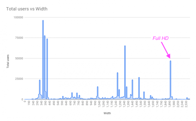
This approach turned out to be impractical as it required difficult compromises on the design front or an increase in code complexity in order to offer the full article view on Full HD screens, where a significant portion of our readership lands. Further iterations of that prototype thus discarded this design option in favour of a simpler alternative where the comparison view is contained within the boundaries of the two-column view (the current design at the time of writing).