What’s new?
Though much of our tech team’s work in the recent months has focused on building tools to present the data on the coronavirus pandemic as clearly as possible, we strive for most of what we build to be applicable across all of our tools and visualizations.
Here is an overview of the features that we built in the last two months:
A new coronavirus page
Max recently rewrote the coronavirus page. The idea was to find a structure that we can use for ourworldindata-entries on other global problems as well. The structure is the following:
- What is the global situation now?
- Is it possible to make progress against the pandemic?
- Which countries are making progress against the pandemic?
- How can we make progress against the pandemic?
On these overview pages for big topics, we try to balance the need for first time visitors to get acquainted with and explore the topic, with the need for returning visitors to get a quick update on the current situation. This is why you’ll find the Data Explorer fairly close to the top of the page, after which we dive deeper into whether, who, and how we can make progress against the pandemic.
When you click on a related link below one of the charts on a country profile, we now remember any countries that you selected in the floating country selector, so you don’t have to select them again. Just make sure to use the floating country selector at the top of the country profile page.

A better Data Explorer
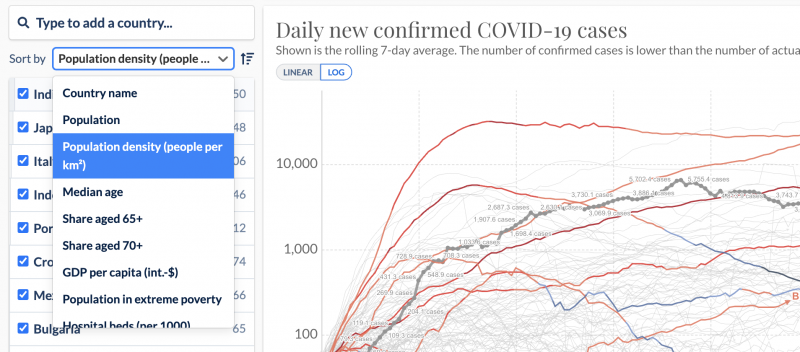
The new “Sort by” dropdown in our Data Explorer allows for a more informed comparison between countries. Compare countries based on population (density), age, GDP, hospital beds and more.

One of many useful improvements by Breck Yunits: embed the Data Explorer without controls and country selector. This is useful if you have limited space and want to highlight one particular visualization. Look for the ☑️ Hide controls option below the embed code for a Data Explorer. Read more on how to embed our charts.
Case fatality rate, Tests per confirmed case, and Share of positive tests are now available in the Data Explorer. We’ve also added aggregate data for regions and continents to the country selector.
Countries with small populations can sometimes make a visualization very busy and hard to read, for example in this chart:
Small countries filter to the rescue! Hide all countries with a population under 1 million people to focus on the larger countries only.
All about charts
A good chart immediately provides an indication of the difference between countries. Charts are also great for visualizing change over time. But if you want to see exact numbers, a table is often more suitable.
Thanks to Shahid Ahmad, you can now switch our charts to a new table view. As you see, you can control it with the time-slider and sort by beginning and end value as well as the change over time.
Our table is smart: it automatically selects a time interval for which at least 50% of the rows have a value for both the start and end date.
Scatterplots and trajectory charts, which are essentially scatterplots on a timeline, now support coloring lines by numeric values, thanks to Daniel Gavrilov. This allows us to visualize how cases and testing changed over time for multiple countries simultaneously.
A low number of tests for each confirmed case suggests that the true number of actual infections may be far higher than the number of confirmed cases. In other words, the more testing is done, the more likely it is that the number of confirmed cases is closer to the true total number of cases.
One of the main things we aim to do at Our World in Data, is to provide context and background to the data we visualize. While a chart can be a very powerful tool, there’s often more to the story. You’ll notice some of our charts will now feature a link at the bottom that directs you to a related article.
We like to offer a lot of functionality in our charts, sometimes at the expense of the chart itself. In a quest to win back some of the pixels needed to display the related links mentioned above, Matthieu Bergel condensed the tabs on the bottom of the chart.
This also proved an opportunity to make the timeline slightly easier to use: the cursor changes based on which part of the timeline you hover. It’s easy to skip over these small details, but they are important. After all, what is a cake without icing?

We tried to make it a bit clearer that you can switch chart axes from a linear to a logarithmic scale and back.

The “Download” tab in a chart is the new home for the PNG and SVG versions of the chart, as well as the CSV with the underlying data.
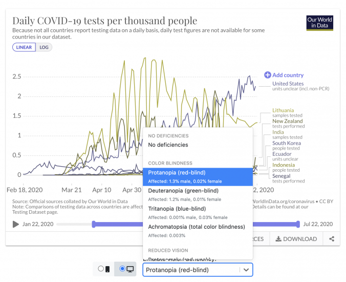
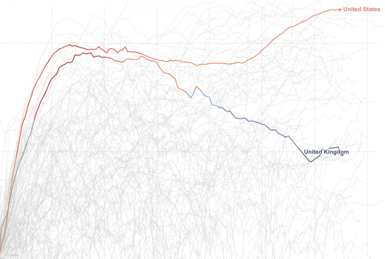
Inspired by a Datawrapper article, Marcel Gerber made it possible to simulate vision deficiencies directly in the Grapher admin, where our authors create the charts for their articles:

This helps us produce charts that are useful and readable for as many people as possible.
We’d like to know what you think
Many of these updates are a direct result of feedback we get from you.
If you have ideas, suggestions, or encounter any problems when you visit our website, don’t hesitate to let us know. Though we can’t promise to respond to all requests, we do read and take into consideration all feedback we receive.
