Introduction
In almost every country in the world, men are more likely to participate in labor markets than women. However, these gender differences in participation rates have been narrowing substantially in recent decades. In this post we discuss how and why these changes are taking place.
The first section in this article provides an overview of the ‘stylized facts’, including an overview of women’s participation in the informal economy and unpaid care work. The second section provides an overview of the key factors that have been driving the broad trends (these factors are further discussed in a companion blog post).
Before we move on to the details, here is a preview of the main points:
- In most countries men tend to participate in labor markets more frequently than women.
- All over the world, labor force participation among women of working age increased substantially in the last century.
- In some parts of the world, the historical increase in female labor force participation has slowed down or even regressed slightly in recent years.
- Women all over the world allocate a substantial amount of time to activities that are not typically recorded as ‘economic activities’. Hence, female participation in labor markets tends to increase when the time-cost of unpaid care work is reduced, shared equally with men, and/or made more compatible with market work.
Stylized Facts
Around the world men tend to participate in labor markets more frequently than women. However, it only takes a glimpse of the data to see that there are huge differences across societies.
The following visualization provides a picture of how men and women compare today in terms of participation in labor markets, country by country. Shown is the female-to-male ratio in labor force participation rates (expressed in percent). These figures show estimates from the International Labor Organization (ILO). These are ‘modelled estimates’ in the sense that the ILO produces them after harmonizing various data sources to improve comparability across countries.

As we can see, the numbers for most countries are well below 100%, which means that the participation of women tends to be lower than that of men. Yet differences are outstanding: in countries such as Syria or Algeria, the ratio is below 25%. In contrast, in Laos, Mozambique, Rwanda, Malawi and Togo, the relationship is close to, or even slightly above 100% (i.e. there is gender parity in labor force participation or even a higher share of women participating in the labor market than men).
Female labor force participation is highest in some of the poorest and richest countries in the world. And it is lowest in countries with average national incomes somewhere in between. In other words: in a cross-section, the relationship between female participation rates and GDP per capita follows a U-shape. This is shown in the scatter plot below.

To highlight continents, you can click on the continent name tags on the right panel. If you do this you will see that some interesting patterns emerge. Within Africa there is a negative correlation (the poorest countries have the highest participation rates), while in Europe there is a positive correlation (the richest European countries have the highest participation rates). Indeed, these correlations within high and low income countries seem to explain a big part of the U-shape that appears in the cross-section.
In the last section of this blog post we provide an overview of the forces that drive this correlation, borrowing from our companion blog post on the determinants of female labor force participation.
In terms of changes across time, the female labor force participation rate today is higher than three decades ago. This is true in the majority of countries, across all income levels. The chart below shows this, comparing national estimates of female participation rates in 1980 (vertical axis) and 2016 (horizontal axis).1
The grey diagonal line in this scatter plot has a slope of one, so countries that have seen positive changes in female labor force participation rates appear below the line. As we can see, most countries lie on the bottom right. Indeed, in some cases, countries are very far below the diagonal line—in Qatar, for example, there was a six-fold increase over the period.

On the aggregate, what does this imply for the global trend? The answer is not obvious, since some countries have missing data, and global trends are particularly sensitive to changes in large countries, such as India. In a recent exercise using statistical assumptions to impute missing data, the World Development Report (2012) estimates that in the period 1980-2008, the global rate of female labor force participation increased from 50.2 to 51.8 percent, while the male rate fell slightly from 82.0 to 77.7 percent. So the gender gap narrowed from 32 percentage points in 1980 to 26 percentage points in 2008.
An important point to note is that the chart above includes all women above 15 years of age. This means that the trends conflate changes across different population sub-groups (e.g. young women, married women, older women above retirement age, etc.). Indeed, group-specific trends do not always follow the overall trends. Specifically, trends in labor force participation among younger women are often different to the aggregate trends, notably in rich countries where participation expanded mostly among the older, often married female population. In many countries the historical increase in female labor force participation took place together with a reduction in participation among younger women, because expansion was driven by women entering labor markets only after attending higher education. We discuss this in more detail below.
The 20th century saw a radical increase in the number of women participating in labor markets across early-industrialized countries. The following visualization shows this. It plots long-run female participation rates, piecing together OECD data and available historical estimates for a selection of early-industrialized countries.

As we can see, there are positive trends across all of these countries. Notably, growth in participation began at different points in time, and proceeded at different rates; nonetheless, the substantial and sustained increases in the labor force participation of women in rich countries remains a striking feature of economic and social change in the 20th century.2
However, this chart also shows that in many rich countries – such as, for example, the US – growth in participation slowed down considerably or even stopped at the turn of the 21st century.3
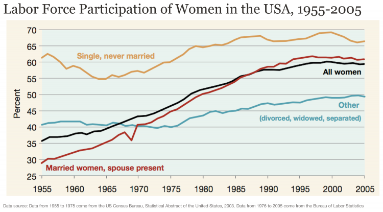
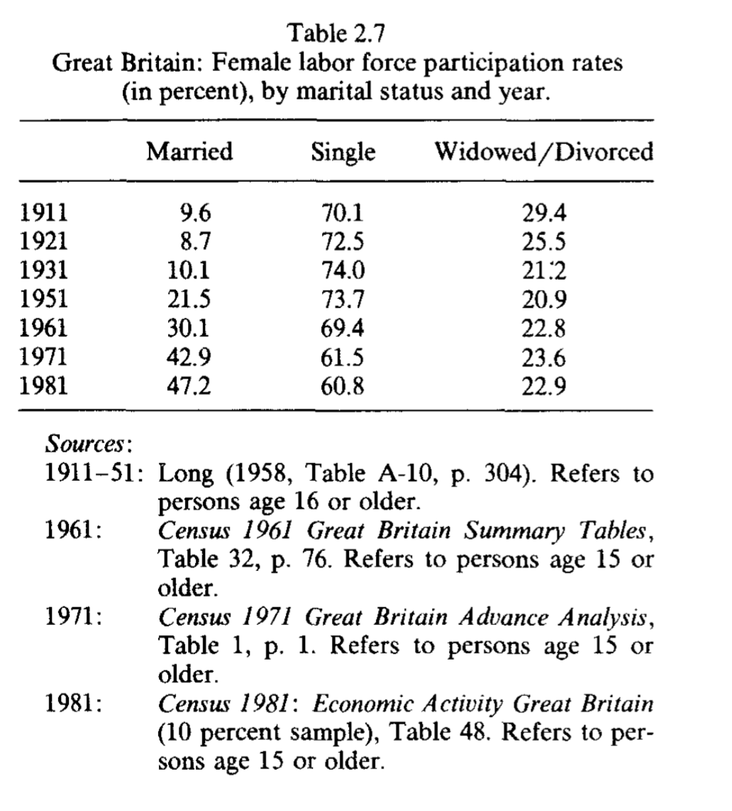
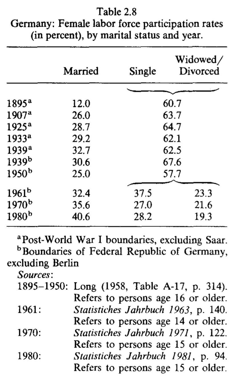
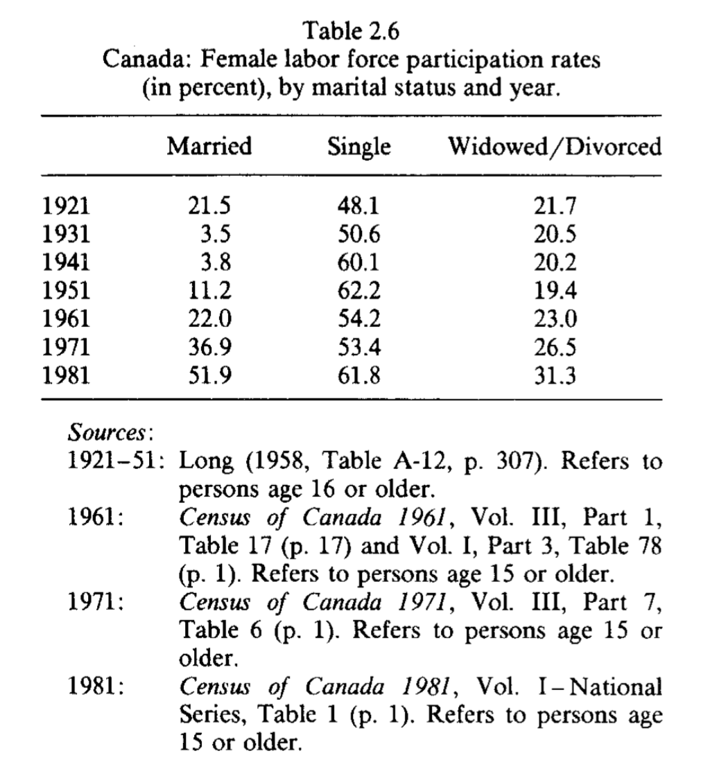
What do we know about the characteristics of the women who drove this remarkable historical expansion of female labor force participation in rich countries? As it turns out, the evidence shows that most of the long-run increase in the participation of women in labor markets throughout the last century is attributable specifically to an increase in the participation of married women.
As an example, the following visualization shows female labor force participation rates in the US, differentiated by marital status. As we can see, the marked upward trend observed for the general female population is mainly driven by the trend among married women. Heckman and Killingsworth (1986) provide evidence of similar historical trends for the UK, Germany and Canada.4
Labor force participation of women in the US, by marital status – Engemann & Owyang (2006)5
The charts above provide evidence regarding the expansion of female labor supply via higher participation rates. But this is of course only one way of measuring market supply. What about the number of hours worked? This is a relevant question since working hours for the general population decreased substantially in rich countries as they increased their productivity throughout the 20th century.
The following chart provides some clues. It shows several decades of changing average weekly hours worked for women in a selection of OECD countries. As we can see, most countries show negative trends, which is consistent with the trends for the population as a whole. However, some of these trends are still remarkable if we take into account the substantial increase in female participation taking place at the same time.

Consider the case of Spain: in the period 1987-2016, weekly work in a main job decreased from about 39 hours, to about 35 hours; while participation rates for women increased from 32% to 54% in the same period.
This is an important pattern: at the same time as more women in rich countries started participating in labor markets, there was often a reduction in the average number of hours that women spent at work. In economics lingo: the 20th century witnessed a large increase in supply of female labor along the extensive margin (number of workers), together with some reductions along the intensive margin (hours worked per worker).
Available evidence shows that the effect along the extensive margin was much stronger. So in these countries there was an increase in the sum of female worker hours – that is, the total yearly hours worked per female worker increased across all female workers.6
In the beginning of the post we point out that since 1980, female participation in labor markets has increased in most countries; yet according to the 2012 World Development Report the global trend only increased slightly over the same period – from 50.2% to 51.8%.
If we focus on more recent developments, the ILO estimates show that the global trend is actually negative, mainly because of important reductions in some world regions. This is shown in the chart here.
As we can see, regional trends in recent years go in different directions. Notably, there have been large reductions in South and East Asia, and large increases in Latin America. In the Middle East and North Africa there have also been positive trends, but this remains the region where female participation rates are lowest.
You can add countries and regions to the chart by clicking on the option ‘ Add country ’. Or you can click on the ‘Map’ tab for an overview across all countries and continents.

A taxonomy of labor supply
Before we move on to explore the determinants of female participation in labor markets, it is important that we dig deeper into the concepts. We have already said that labor force participation is defined as being ‘economically active’. But what does that actually mean? Being able to answer this question is crucial to understanding changes in female participation in labor markets, since women typically invest time on productive activities that do not count as ‘market labor supply’.
From a conceptual point of view, people who are economically active are those who are either employed (including part-time employment starting from one hour a week) or unemployed (including anyone looking for job, even if it is for the first time). Students who do not have a job and are not looking for one, are not economically active.
In the guidelines stipulated by the ILO, ’employment’ also includes self-employment, which means that in principle, the labor force includes anyone who supplies labor for the production of economic goods and services, independently of whether they do so for pay, profit or family gain. This chart from the ILO shows an overview of what counts and what doesn’t towards producing ‘economic goods and services’.7
Loosely speaking, the guidelines stipulate that unpaid activities should be excluded if they lead to services or goods produced and consumed within the household (and they are not the prime contribution to the total consumption of the household).8 This often means excluding unpaid work on things like “Preparation and serving of meals”; “Care, training and instruction of children”; or “Cleaning, decorating and maintenance of the dwelling”. The implication, then, is that even if the guidelines are followed closely to include all possible forms of economic activities, even in the informal sector, there will still be an important number of ‘working women’ who are excluded from the labor force statistics. And these exclusions are even more salient if we consider that in many countries actual measurement deviates from the guidelines.
In many countries with poor capacity to produce national statistics, labor force participation is measured from population censuses, rather than from labor force surveys especially designed for that purpose.9 The consequence of this is that labor force statistics often exclude individuals who should be covered by the definitions above. Among the most important exclusions are workers engaged in unpaid work.10
Given all of this, it is natural to wonder if the ‘key facts’ would look different if we used an alternative definition of labor supply. Let’s try to break down the figures to understand any relevant differences between ‘labor supply’ and other notions of ‘work’.
Breaking down the numbers
The first and most obvious line splitting the economically active population in a country is employment. The chart below plots female employment-to-population ratios across the world (national estimates before ILO corrections). These figures show the number of employed women as a share of the total female population (in both cases, for women ages 15 or older).

To emphasize, here we are leaving aside unemployment, and we are focusing on trends for employed women – who are, by definition a subset of the whole economically active population.
As we can see, the trends are consistent with those for labor force participation: In the period 1980-2016, the majority of countries saw an increase in the share of women who are employed. This is what we would expect – it means that, by and large, the participation of women in the labor market was driven by employment, rather than unemployment.
(This chart shows the same variable but using ILO modeled estimates. These provide a shorter time perspective, but are more accurate and complete.)
Let us turn now to informal employment. As we mentioned above, the ILO guidelines stipulate that labor participation should include informal employment. So this is another important line that, in principle, cuts across the economically active population.
The first point to note is that, despite the guidelines, in practical terms work in the informal sector is not always reflected in labor statistics due to measurement issues. So an empirical study of economically active women in the informal sector remains a challenge. Nevertheless, some progress has been made on this front, and today many countries do report disaggregated figures for some forms of informal employment, mainly those relating to paid work in non-agricultural economic activities. (You can read more about measurement and definitions of informal employment in the ILO report “Women and Men in the Informal Economy: A Statistical Picture”.) The chart below shows these estimates.

The bars corresponds to the share of women employed in the informal economy, as a share of all women who are employed in non-agricultural economic activities. Years differ from country to country, and there is unfortunately still insufficient data to explore time trends. However, as we can see, the data does show that a large part of female employment around the world takes place in the informal economy. In fact, in many low and middle income countries, the vast majority of women engaged in paid work are in the informal economy. For women in Uganda, for example, almost 95% of paid work outside agriculture is informal. In Greece, the corresponding figure is close to 4%.
In this interactive data visualization you can see how the figures for women compare to those for men. The data suggests that in the majority of countries, women tend to work in the informal economy more often than men. And it is likely that this gender difference would be larger if we accounted for the informal agricultural economy, for which data is not available. This is important because national sources of protection and support – as well as legal and policy frameworks – tend to favor formal workers.11
Let us now have a look at unpaid work. As we have noted, domestic unpaid care work is an important activity which women tend to spend a significant amount of time on – and it is an activity that is typically unaccounted for in labor supply statistics. In the following chart we show just how skewed the gender distribution of unpaid care work in the household is.

The bars show the female-to-male ratio of time devoted to unpaid services provided within the household, including care of persons, housework and voluntary community work. You can add countries using the button labeled ‘ Add country ’. And you can click on the ‘Map’ tab to get a cross-country overview.
As we can see, gender differences in time devoted to unpaid care work cut across societies: All over the world, women spend more time than men on these activities. Yet there are clear differences when it comes to the magnitude of these gender gaps. At the low end of the spectrum, in Uganda women work 18% more than men in unpaid care activities at home. While at the opposite end of the spectrum, in countries such as India, women work 10 times more than men on these activities.
This chart provides a sense of perspective on the levels. In the MENA region, where the gap tends to be largest, women spend on average over 5 hours on unpaid care work per day, while men spend less than one hour.12
The forces driving change
To recap: women all over the world allocate a substantial amount of their time to activities that are not typically recorded as ‘economic activities’. What does this tell us about time allocation and labor supply more generally? The answer is perhaps unsurprising. Female participation in labor markets tends to increase when the time-cost of unpaid care work is reduced, shared equally with men, and/or made more compatible with market work.
You can find more details about the determinants of female labor supply in our companion blog post. Here we provide a quick overview of the key ‘drivers’.
Maternal health
- The various aspects related to maternity impose a substantial burden on women’s time. And this is of course a biological burden uniquely borne by women. Moreover, maternity is not only a burden in terms of time. It is also risky, and often imposes on women a substantial burden in terms of health. Improved maternal health alleviates the adverse effects of pregnancy and childbirth on women’s ability to work, and is hence a key driver of female labor force participation.
- Estimates suggest that the historical decline in the burden of maternal conditions and the introduction of infant formula can account for approximately 50 percent of the increase in married women’s labor force participation between 1930 and 1960 in the US.
- Here is a chart that shows long-run trends in maternal mortality and female labor supply in the US. You can read more about maternal mortality here, and you can read more about its link to female labor supply here.
Fertility
- Lower rates of fertility can, in principle, free up a significant amount of women’s time, hence allowing them to enter the labor force more easily. And this is of course independent of health complications – having children is very time consuming even when enjoying perfect health.
- Indeed, there is strong evidence of a causal link between fertility (having children) and labor market outcomes (participation, employment, wages, etc.). In a recent study Lundborg, Plug and Rasmussen (2017)13 show that women who are successfully treated by IVF (in vitro fertilization) in Denmark earn persistently less because of having children. They explain the decline in annual earnings by women working less when children are young and getting paid less when children are older.
- There are many other studies that find similar effects on female labor supply when there are exogenous shocks to fertility. And interestingly, there is evidence that women’s control over their own fertility is linked to career investments and subsequent changes in labor market outcomes (see, for example, Goldin and Katz 2002).14
- Here is a chart that shows the correlation between fertility and labor supply. Here you can read more about the evidence supporting a causal link. And here you can read more about fertility in general.
Childcare and other family-oriented policies
- The fact that fertility reductions lead to higher labor force participation for women is certainly important from an empirical point of view. But it is obviously contradictory to promote female agency while suggesting women should have fewer children. So it is helpful to consider other factors that make employment compatible with childbearing, and thus broaden the choices available to women. Childcare and other family-oriented policies are prime examples here.
- A cross-sectional analysis of data on public spending on family benefits shows that female employment tends to be higher in countries with higher levels of public spending on family benefits.
- Here you can read more about the evidence behind family-oriented policies and female labor supply.
Labor-saving consumer durables
- The consumer goods revolution, which introduced labor-saving durables such as washing machines, vacuum cleaners, and other time-saving products, is another factor that contributed to the rise in married female labor force participation in the last century.
- Here is a brief discussion of the correlation between hours worked in domestic activities and the availability of basic electrical appliances. And here you can find more details about an academic study that estimates the associated effect on female labor supply.
Social norms and culture
- Social norms and culture circumscribe the extent to which it is possible or desirable for women to enter the labor force. It is therefore not hard to see why they play an important role.
- Socially assigned gender roles have often been institutionally enforced. And this is still the case today: In most countries around the world there are restrictions on the types of work that women can do.
- From a historical point of view, there is evidence that social norms regarding economic gender roles have long been around, and they are very persistent (see, for example, Alesina, Giuliano and Nunn 2013).15
- And yet, despite social norms being persistent, there is also evidence that large and sometimes sudden changes are possible. Research in this area shows that social norms and culture can be influenced in a number of non-institutional ways, including through intergenerational learning processes, exposure to alternative norms, and activism such as that which propelled the women’s movement.16
Structural changes in the economy
- Social barriers affecting female labor supply operate differently in different contexts. In particular, income levels and macroeconomic variables play an important role. As we show above, there is a U-shaped relationship between GDP per capita and female labor force participation.
- In low-income countries, where the agricultural sector is particularly important for the national economy, women are heavily involved in production, primarily as family workers. Under such circumstances, productive and reproductive work are not strictly delineated and the two can be more easily reconciled.
- With technological change and market expansion, however, work becomes more capital intensive and is often physically separated from the home, thus contributing to a decrease in women’s labor force participation. Hence, in middle income countries, where there is often a social stigma attached to married women working in blue-collar industries, “women’s work is often implicitly bought by the family, and women retreat into the home, although their hours of work may not materially change.”17
- With sustained development, women make educational gains and the value of their time in the market increases alongside the demand-side pull from growing service industries. This means that in high income countries, the rise in female labor supply is characterized by women gaining the option of moving into paid, often white-collar work, while the opportunity cost of exiting the workforce for childcare rises.18