This is an appendix providing further detail on the data and methods used in our historical reconstructions of global poverty from national accounts data, as presented in Roser and Hasell (2021).
The paper will be available online at the publisher’s website.
Note that:
- All dollar figures below are expressed in international-$ in 2011 prices (adjusted to account for price differences across countries and for inflation).
- You can download the data of each interactive chart shown below using the download tab found at the bottom of each chart.
1) Baseline estimates
First we present the baseline poverty estimates presented in the paper.
This is an interactive version of the charts included as figure 11 in the main paper.
Here we provide interactive versions of figures 12 and 13 of the main paper.
This is an interactive version of figure 14 of the main paper.
It joins recent World Bank estimates of the share of people globally living below $1.90 a day from 1980, with our own historical national accounts estimates using a poverty line of $5.20. For a discussion of these two approaches to estimating poverty and how they relate to one another see the main paper.
2) Data sources
As explained in the paper, the estimates above are based on three inputs:
- data on inequality, as measured by Gini coefficient,
- data on average incomes, as measured by GDP per capita
- population data
Here we discuss the sources used for each of these inputs.
Our baseline estimates are based on a combination of two datasets:
- The historical inequality dataset gathered and published in van Zanden and others (2014)1 and, made available online by the authors at clio-infra.
- From 1960, an interpolated dataset of income Ginis produced by the Global Consumption and Income Project (GCIP).
Alternative estimates (presented below) combine the historical data from van Zanden and others (2014) with two other datasets for more recent decades respectively:
- GCIP’s dataset of consumption Ginis
- the World Bank’s Povcal dataset
All population data and almost all data on GDP per capita is derived purely from the 2020 release of the Maddison Project Database.
For Sub-Saharan African countries, estimates for GDP per capita for most countries prior to 1950 were obtained by applying the growth rates estimated by Prados de la Escosura (2012)2 to extend the Maddison estimates backwards (see next section on extrapolation).
3) Imputation of missing data points
The inequality, GDP per capita and population datasets listed above do not provide complete coverage. In order to produce global poverty estimates for a set of benchmark years, estimates for these three variables had to first be interpolated or extrapolated where missing for all countries for each benchmark year.
The process was as follows.
For GDP per capita and population data:
- Where no observation for a given benchmark year was available, but an earlier and later observation was provided in the dataset, a datapoint was interpolated assuming a constant annual rate of growth between the available data points.
- Where no observation prior to the benchmark year was available, a data point was extrapolated by applying an assumed growth rate. The growth rate applied was calculated as follows:
- If the country was formerly part of either the USSR or Yugoslavia, growth rates observed in the aggregate bloc (available within the Maddison dataset) were applied, where available.
- For other countries, or for periods where data for the aggregate blocs of USSR or Yugoslavia were not available or applicable, the growth rate applied was the average rate observed within the region (according Maddison region definitions).
- For Sub-Saharan African countries, the growth rates estimated by Prados de la Escosura (2012) were applied as mentioned above.
For the Gini coefficient, missing values were replaced with the average observed across either the bloc (former Yugoslavia or USSR countries) or the region (according Maddison region definitions) in the given benchmark year.
For the purposes of replication, the fully interpolated dataset is shown in the two charts below. Both charts show the same data points: GDP per capita along the horizontal axis, Gini coefficient along the vertical axis and population as bubble size. The colour indicates the source and treatment used to arrive at the GDP per capita data points and the Gini data points respectively.
It should be noted that the objective of the interpolation was to provide a complete dataset of country-benchmark year observations that fall within plausible bounds, in order to derive global poverty estimates. To understand trends in particular countries, we refer you to the original data sources, listed above.
4) Deriving poverty estimates from a fitted parametric distribution
Poverty estimates for each country and benchmark year were derived by fitting a lognormal income distribution.
A lognormal distribution is defined by two parameters,
These are the expected value (or mean) and standard deviation of the variable’s natural logarithm. These can be obtained from average incomes (GDP per capita) and the Gini coefficient as follows:
is obtained from the Gini coefficient given the following relationship (see for instance Jorda, Sarabia, Jäntti (2018)):3
whereis the Gini coefficient, the cumulative standard normal distribution, and its inverse. Rearranging, we find
- Assuming incomes,
, are distributed lognormally, the average income is given by:
Rearranging we find
In our approach, the average income is given by GDP per capita. - Poverty rates are then calculated, for a given poverty line,
, using the cumulative lognormal distribution defined by these two parameters:
This yields the poverty estimates for individual countries, shown in the chart. (You can change the country in the visualization or download the data for all countries). As discussed above, the data for many countries relies on extensive interpolation or extrapolation and should not be relied on to understand trends in particular countries without consulting the underlying data sources. - World and regional poverty rates are then calculated as the population-weighted average rates across countries.
4) Alternative specifications and robustness checks
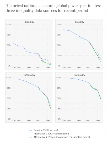
Here we show global poverty estimates for four poverty lines, constructed in the way described above, using different data sources for the Gini coefficient for more recent decades.
The blue lines show again our baseline estimates which use GCIP data for income inequality. The red lines recalculate the estimates using the GCIP data for consumption inequality instead. The green lines show poverty estimates using instead data taken from the World Bank’s Povcal database, which is a mix of consumption and income inequality figures. In all three cases the historical estimates from van Zanden are used for earlier periods (in the case of the Povcal data iteration, data points from van Zanden are also used in more recent decades to increase the coverage prior to imputation).
The different inequality data sources yield very similar trends.

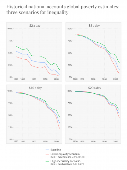
In this comparison chart, the green lines now plot global poverty rates where the estimates of the Gini coefficients used in our baseline figures have been replaced by much higher levels: the maximum of either the original value increased by one third or the highest value observed across the original dataset. The red lines plot global poverty rates where the Gini coefficients have been replaced by much lower levels: the minimum of either the original value reduced by one third or the lowest value observed across the original dataset.
As we see from the chart, and as discussed in the main paper, different assumptions concerning the level of inequality have relatively little impact on the long-run poverty trends given the large growth seen in average incomes over this period. Where the average income falls close to or below the poverty line, reducing inequality has a negligible effect on the poverty rate (perversely, the poverty rate may rise if it results in even fewer ‘rich’ people with incomes high enough to fall above the poverty line). This demonstrates that the major trends are not sensitive to uncertainty in the historical distributional data we have used.

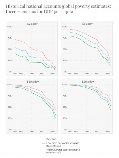
Here we show a similar check on the sensitivity of our global poverty estimates to different assumptions concerning the level of GDP per capita.
The green lines plot global poverty rates where the estimates of GDP per capita have been replaced by much higher levels: the original value increased by one third. The red lines plot global poverty rates where the estimates of GDP per capita have been replaced by much lower levels: the original value reduced by one third.
The fall in poverty shown in these estimates is driven by economic growth – with average income per person globally increasing by roughly a factor of ten over this period. As such, the overall trends are robust to a wide degree of uncertainty concerning the level of income in any given year.

5) Code availability
R was used to interpolate the data missing from the original sources and estimate global and regional poverty rates. All code is available to download here.