What does income inequality by gender look like at the very top of the income distribution? Is there a ‘glass ceiling’ preventing women from reaching the top? How has this changed over time?
Looking at income data from a number of high-income countries we find that:
- Women are very underrepresented at the top of the income distribution. For the nine countries for which we have data, roughly 4 out of 5 among the top 1% are men.
- The proportion of women is lower the higher you look up the income distribution.
- Women are now better represented in top income groups than they were in 2000.
Despite having fallen in recent decades, there remains a substantial pay gap between the average wages of men and women.
But what does gender inequality look like if we focus on the very top of the income distribution? Do we find any evidence of the so-called ‘glass ceiling’ preventing women from reaching the top? How did this change over time?
Answers to these questions are found in the work of Atkinson, Casarico and Voitchovsky (2018). Using tax records, they investigated the incomes of women and men separately across nine high-income countries. As such, they were restricted to those countries in which taxes are collected on individual basis, rather than as couples.1
In addition to wages they also take into account income from investments and self-employment.
Whilst investment income tends to make up a larger share of the total income of rich individuals in general, the authors found this to be particularly marked in the case of women in top income groups.
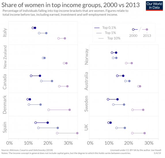
The two charts present the key figures from the study.
One chart shows the proportion of women out of all individuals falling into the top 10%, 1% and 0.1% of the income distribution. The open circle represents the share of women in the top income brackets back in 2000; the closed circle shows the latest data, which is from 2013.
The other chart shows the data over time for individual countries. You can explore data for other countries using the “Change country” button on the chart.
The two charts allow us to answer the initial questions:
- Women are greatly under-represented in top income groups – they make up much less than 50% across each of the nine countries. Within the top 1% women account for around 20% and there is surprisingly little variation across countries.
- The proportion of women is lower the higher you look up the income distribution. In the top 10% up to every third income-earner is a woman; in the top 0.1% only every fifth or tenth person is a woman.
- The trend is the same in all countries of this study: Women are now better-represented in all top income groups than they were in 2000.
- But improvements have generally been more limited at the very top. With the exception of Australia, we see a much smaller increase in the share of women amongst the top 0.1% than amongst the top 10%.
Overall, despite recent inroads, we continue to see remarkably few women making it to the top of the income distribution today.