Rising female labor force participation has been one of the most remarkable economic developments of the last century. In this entry we present the key facts and drivers behind this important change.
Here is an overview of some of the main points we cover below:
Summary
- In most countries men tend to participate in labor markets more frequently than women.
- All over the world, labor force participation among women of working age increased substantially in the last century.
- Women all over the world allocate a substantial amount of time to activities that are not typically recorded as ‘economic activities’.
- Female participation in labor markets tends to increase when the time-cost of unpaid care work is reduced, shared equally with men, and/or made more compatible with market work.
- What “labor force participation” means and how it is measured, is discussed in the section on ‘Definitions & Measurement’.
All our charts on Women’s employment
While this entry focuses on visualizing key data with concise explanations, our two-part blog series on this topic delves into more detailed commentary and a literature review of relevant academic research. These blog posts can be read here:
The 20th century saw a radical increase in the number of women participating in labor markets across early-industrialized countries. The following visualization shows this. It plots long-run female participation rates, piecing together OECD data and available historical estimates for a selection of early-industrialized countries.
As we can see, there are positive trends across all of these countries. Notably, growth in participation began at different points in time, and proceeded at different rates; nonetheless, the substantial and sustained increases in the labor force participation of women in rich countries remains a striking feature of economic and social change in the 20th century.1
However, this chart also shows that in many rich countries – such as, for example, the US – growth in participation slowed down considerably or even stopped at the turn of the 21st century.2

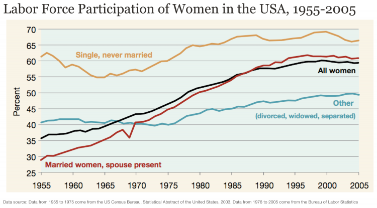
Most of the long-run increase in the participation of women in labor markets throughout the last century is attributable specifically to an increase in the participation of married women.
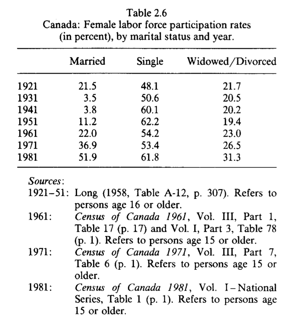
The following visualization shows the experience of the US. It plots female labor force participation rates, differentiating by marital status. As can be seen, the marked upward trend observed for the general female population is mainly driven by the trend among married women. Heckman and Killingsworth (1986) provide evidence of similar historical trends for the UK, Germany and Canada.3
Labor force participation of women in the US, by marital status – Engemann & Owyang (2006)4
The following chart shows average weekly hours worked for women in a selection of OECD countries. As we can see, most countries show negative trends, which is consistent with the trends for the population as a whole. However, some of these trends are still remarkable if we take into account the substantial increase in female participation taking place at the same time.
This is an important pattern: At the same time as more women in rich countries started participating in labor markets, there was often a reduction in the average number of hours that women spent at work. Estimates suggest that in virtually all cases, the effect along the extensive margin (participation) was much stronger, so total amount of female work in labor markets (Hours per female worker x Number of female workers) went up.5

Labor force participation
The following visualization shows female labor force participation rates, across world regions.
By clicking Add country you can add data for specific countries and regions.
And you can see the change over time by using the time slider below the chart.

In the majority of countries, across all income levels the participation of women in labor markets is today higher than several decades ago. The chart shows this, comparing national estimates of female participation rates in 1980 (vertical axis) and the latest available year (horizontal axis).
The grey diagonal line has a slope one, so countries that have seen positive changes towards women appear on the bottom right. As we can see, most countries lie on the bottom right, and some are very far below the diagonal line.
The chart shows ILO’s ‘non-modelled’ estimates, which have a higher margin of error but are available for a longer period. Whenever a country had missing data for 1980 or the latest available year, the closest year with available data is shown (within a 5-year window). For reference, this slope chart plots the same dataset, but only for countries with observations on 1980 and the latest available year.


Despite recent growth in female participation rates, men still tend to participate in labor markets more frequently than women. The following visualization shows this. It plots the female-to-male ratio in labor force participation rates (expressed in percents). These figures correspond to estimates from the International Labour Organization (ILO). These are ‘modelled estimates’ in the sense that the ILO produces them after harmonising various data sources to improve comparability across countries.
As we can see, the numbers tend to be well below 100%, which means the participation for women tends to be lower than participation for men. Yet differences are outstanding: In countries such as Syria or Algeria, the relationship is below 25%. In contrast, in Laos, Mozambique, Rwanda, Malawi and Togo, the relationship is close or even slightly above 100% (i.e. there is gender parity in labor force participation in these countries).
Since men tend to participate in labor markets more frequently than women, the gender composition of the labor force is skewed in most countries. This is shown in the following chart.


The next chart compares labor force participation among younger and older women. To be specific, among women ages 25-34 and 45-54.
As we can see, very few countries lie on the diagonal line, so in most cases female labor force participation is not constant across age groups.
In some countries participation is higher for younger women, and in some countries it is higher for older women. However, there is an interesting pattern: In countries where female participation in labor markets is generally low (those at the bottom left), it tends to be the case that participation is much higher among younger women.
Consider Kuwait: The female participation rate is about 48% if we consider all women; yet the rates for younger and older women are 68% and 34% respectively.

The visualization shows the age distribution of women who are economically active. This chart allows you to explore countries and regions (use the option labelled ‘Change country’), as well as relative and absolute figures (use the option labelled ‘relative’ to change between percentage and number of workers).
As we can see, today the number of women in the global labor force who are younger than 25 is slightly less than what it was fifteen years ago. However, the global female labor force grew by almost 50% over the same period.
This shows that the global expansion of female labor supply has gone together with a increase in the average age of women in the labor force.
In rich countries there has been a steeper increase in the age of women in the labor force, partly because participation among younger women has actually gone down. The next chart shows this: most rich countries are above the diagonal line, which means that female labor force participation rates among younger women declined in the period 1980-2016.


Employment
Labor force participation comprises both employed and unemployed people searching for work. The chart plots female employment-to-population ratios across the world (national estimates before ILO corrections). These figures show the number of employed women as a share of the total female population.
As we can see, the trends are consistent with those for labor force participation: In the period 1980-2016, the majority of countries saw an increase in the share of women who are employed. This is what we would expect – it means that, by and large, the participation of women in the labor market was driven by employment, rather than unemployment.
The chart shows the same variable plotted above, but using ILO modeled estimates. These provide a shorter time perspective, but are more accurate and complete.


The following chart plots the share of women in different economic sectors, country by country.
As we can see, in most countries there is ‘occupational segregation’: Women tend to be disproportionately concentrated in certain types of jobs. And in some cases (e.g. Italy in the chart), these patterns of segregation have become more pronounced in recent decades.
As we discuss in another blog post, this also has important consequences for pay differences between men and women.

The chart above shows the gender distribution of sectoral employment. As we point out above, this allows us to explore ‘occupational segregation’. Another way to explore segregation patterns is to cut the data the other way around, and look at the distribution of female employment across sectors. That is, the sectoral composition of female employment, rather than the gender composition of sectoral employment.
This is shown in the three charts, for industry, services and agriculture.
As we can see, all over the world men are more likely to work in industry than women (most countries lie below the diagonal line). And women tend to work more often than men in services.
The patter for services is also interesting because it shows some important regional differences: In many low-income countries where the service sector is small in relative terms (i.e. countries in the bottom left, where both male and female employment in services is low), the pattern is reversed, and men tend to work more often in services than women. India is an important case in point.


Informal work & unpaid care work
The following chart shows the share of women employed in the informal economy, as a share of all women who are employed in non-agricultural economic activities.
As we can see, a large part of female employment around the world takes place in the informal economy. In fact, in many low and middle income countries, the vast majority of women engaged in paid work are in the informal economy. For women in Uganda, for example, almost 95% of paid work outside agriculture is informal. In Greece, the corresponding figure is close to 4%.
In the following visualization you can see how the figures above compare to those for men. The data shows that in the majority of countries women tend to work more often in the informal economy than men. And it is likely that this gender difference would be larger if we accounted for the informal agricultural economy, for which data is not available.


Unpaid care work at home is an important activity in which women tend to spend a significant amount of time – and, as we discuss below, it is an activity that is typically unaccounted for in labor supply statistics. In the next chart we show just how skewed the gender distribution of unpaid care work in the household is.
The bars show the female-to-male ratio of time devoted to unpaid services provided within the household, including care of persons, housework and voluntary community work. You can add countries using the button labeled ‘ Add country ’. And you can click on the ‘Map’ tab to get a cross-country overview.
As can be see, gender differences in time devoted to unpaid care work cut across societies: All over the world, women spend more time than men on these activities. Yet there are clear differences when it comes to the magnitude of these gender gaps. At the low end of the spectrum, in Uganda women work 18% more than men in unpaid care activities at home. While at the opposite end of the spectrum, in countries such as India, women work 10 times more than men on these activities.
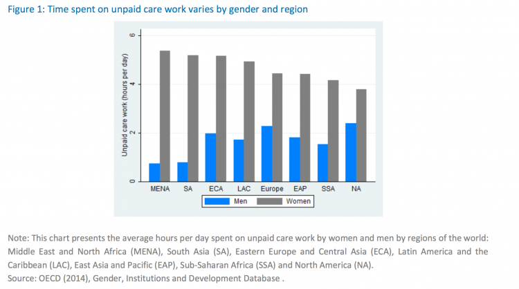
The next chart provides a sense of perspective on the levels above. In the MENA region, where the gap tends to be largest, women spend on average over 5 hours of unpaid care work per day, while men spend less than one hour.

Average daily time spent on unpaid care work by world regions, OECD (2014)6
Unemployment
The scatter plot compares unemployment rates among men and women. As we can see, in most countries unemployment rates are higher for women than for men.
But the difference of the unemployment rates depends on the overall unemployment rate in the country:
On the left-hand side of the chart we can see that most countries lie close to the diagonal line marking gender parity. This means that in countries with generally low unemployment rates, the gender differences in unemployment are not very large.
However, on the right-hand side of the chart, most countries lie significantly above the diagonal line – so in countries where unemployment is more common, women tend to be disproportionately affected.

The map shows unemployment rates for women across the world. As we can see, the highest female unemployment rates correspond to the countries with the lowest female labor force participation, notably in North Africa and the Middle East.
Closely related to this is the fact that in many countries with low female labor force participation, people think that whenever jobs are scarce, men should have more right to a job. This is shown in the chart.
Strikingly, in India, 84% of the survey respondents agreed with the statement: “When jobs are scarce, men should have more right to a job than women”.


As we have already mentioned above, women all over the world tend to spend a substantial amount of time on unpaid care work, which work falls outside of the traditional economic production boundary. In other words, women often work but are not regarded as ‘economically active’ for the purpose of labor supply statistics. This type of non-market work can be time consuming. It is therefore not surprising that the factors driving an increase in female labor supply – whether they are improvements in maternal health, reductions in the number of children, childcare provision, or gains in household technology – all affect unpaid care work. Below we discuss each of these factors, the underlying importance of social norms, and a ‘larger picture’ view of long-term structural change.
Maternal health
Maternity – pregnancy, childbirth, and the period after childbirth – imposes a substantial burden on women’s health and time. This, in turn, can have a significant impact on women’s ability to participate in the labor force. Researchers Alabanesi and Olivetti (2016)7 estimate that in 1920, an American woman could lose on average 2.31 years per pregnancy due to disabilities associated with maternal conditions. By 1960, that figure had declined to 0.17. The researchers show that the historical decline in the burden of maternal conditions and the introduction of infant formula contributed to the rise in married women’s labor force participation between 1930 and 1960 in the US.
The chart illustrates the relationship between maternal mortality and female labor force participation in the US. As we can see, falling maternal mortality is accompanied by rising female labor force participation.

Fertility
On average, mothers around the world continue to spend more time on childcare than fathers. Because of this, lower fertility – fewer children per woman – can free up women’s time and contribute to an increase in female labor force participation.
A number of studies have established causal evidence of this by considering exogenous changes in family size and their impact on labor market outcomes.8
Even more importantly, research by Goldin and Katz (2002)9 shows that increasing women’s control over their reproductive choices contributes to altering their career and marriage choices by eliminating the risk of pregnancy and encouraging career investment.
The visualization shows fertility and female labor force participation across the world. For each country, the arrows compare observations for 1960 and 2015. Despite some outliers and some clear differences by region, we can see that most arrows point north-west – that is, in most countries female labor force participation has gone up at the same time that fertility has gone down.

Childcare policies
Because women on average still spend more time on childcare than men, family oriented policies – such as childcare support – can make employment more compatible with motherhood.
A natural experiment from Canada provides causal evidence for this. In 1997, the provincial government of Quebec introduced a generous subsidy for childcare services. Researchers Lefebvre and Merrigan found that this policy had substantial labor supply effects on the mothers of preschool children, increasing participation both among well-educated and less well-educated mothers.10
In the chart we show that female employment, measured as the employment-to-population ratios for women 15+, tends to be higher in countries with higher levels of public spending on family benefits (i.e. child-related cash transfers to families with children, public spending on services for families with children, and financial support for families provided through the tax system, including tax exemptions).

Labor-saving consumer durables
The introduction of labor-saving consumer durables such as washing machines, vacuum cleaners, and other time-saving products has reduced the amount of time required for household chores – something that women on average spend more time than men on.
Greenwood et al. (2005)11 present evidence for this, arguing that such innovations can help explain the rise in married female labor force participation in the US between 1900 and 1980.
The chart provides a sense of perspective on the impact that consumer durables can have on the domestic work done by women all over the world.

Social norms
Social norms and culture influence the way we see the world and our role in it. To this end, there is little doubt that the gender roles assigned to men and women are in no small part socially constructed.12
Recently, scholars have taken an interest in trying to determine when and how gender roles first emerged historically. And while theories about the origin of gender roles are certainly an interesting strand of research, our recent and even current practices show that these roles continue to persist with the help of institutional enforcement.13 Goldin (1988)14, for example, shows that “marriage bars” in the 1800s and 1900s prohibited married women from working in teaching and clerical jobs – occupations that would become the most commonly held among them after 1950.
As we see in the map, barriers to women entering the labor force continue to exist across many countries today. The data in this map, which comes from the World Bank’s World Development Indicators, provides a measure of whether there are any specific jobs that non-pregnant and non-nursing women are not allowed to perform. So, for example, a country might be coded as “No” if women are only allowed to work in certain jobs within the mining industry, such as health care professionals within mines, but not as miners.
But even after explicit barriers are lifted and legal protections put in their place, discrimination and bias can continue to exist in less overt ways. Goldin and Rouse (1997)15, for example, look at the adoption of “blind” auditions by orchestras, and show that by using a screen to conceal the identity of a candidate, impartial hiring practices increased the number of women in orchestras by 25% between 1970 and 1996.
The chart illustrates public opinion in the US on whether married women should work. At the end of World War II, only 18% of people in the US thought so. Female labor supply started to increase in the US alongside changing social norms: as more people approved of married women working, female labor force participation grew – and as approval stagnated in the 90s, so did labor force participation.


Structural changes of the economy
The chart plots female labor force participation rates by national income. As we can see, female labor force participation is highest in some of the poorest and richest countries in the world, while it is lowest in countries with incomes somewhere in between. In other words: in a cross-section, the relationship between female participation rates and GDP per capita follows a U-shape.
In low-income countries, where the agricultural sector is particularly important for the national economy, we see that women are heavily involved in production, primarily as family workers. Under such circumstances, productive and reproductive work is not strictly delineated and can be more easily reconciled. With technological change and market expansion, however, work becomes more capital intensive and is often physically separated from the home. In middle income countries, there is an observed social stigma attached to married women working and “women’s work is often implicitly bought by the family, and women retreat into the home, although their hours of work may not materially change.”16
With sustained development, women make educational gains and the value of their time in the market increases alongside the demand-side pull from growing service industries. This means that in high income countries, the rise in female labor force participation is characterized by women gaining the option of moving into paid, often white-collar work, while the opportunity cost of exiting the workforce for childcare rises.17
For some high-income countries, this U-shape pattern has also been observed over time. For example, long-run evidence from Italy shows that female labor force participation was actually lowest around 1960, and is today still lower than in the period before the Second World War.18

Throughout this entry, labor force participation is defined as being ‘economically active’. But what does that actually mean? Being able to answer this question is crucial to understanding female labor supply, since women typically invest time on productive activities that do not count as ‘market labor’.
From a conceptual point of view, people who are economically active are those who are either employed (including part-time employment starting from one hour a week) or unemployed (including anyone looking for job, even if it is for the first time). Students who do not have a job and are not looking for one, are not economically active.
In the guidelines stipulated by the ILO, ’employment’ also includes self-employment, which means that in principle, the labor force includes anyone who supplies labor for the production of economic goods and services, independently of whether they do so for pay, profit or family gain. This chart from the ILO shows an overview of what counts and what doesn’t towards producing ‘economic goods and services’.19
Loosely speaking, the guidelines stipulate that unpaid activities should be excluded if they lead to services or goods produced and consumed within the household (and they are not the prime contribution to the total consumption of the household).20 This often means excluding unpaid work on things like “Preparation and serving of meals”; “Care, training and instruction of children”; or “Cleaning, decorating and maintenance of the dwelling”. The implication, then, is that even if the guidelines are followed closely to include all possible forms of economic activities, even in the informal sector, there will still be an important number of ‘working women’ who are excluded from the labor force statistics. And these exclusions are even more salient if we consider that in many countries actual measurement deviates from the guidelines.
There is an ongoing debate concerning the omission of unpaid care work from official labor statistics. The 2009 Stiglitz-Sen-Fitoussi Commission on the Measurement of Economic Performance And Social Progress puts it this way: “There have been large changes in the functioning of households and the society. For example, many of the services that people received from their family in the past are now purchased on the market. This shift translates into a rise of income, as measured in the national account, and this may give a false impression of a change in living standards, while it only reflects a shift from non-market to market provision of services. A shift from private to public provision of a particular product should not affect measured output. By the same token, a shift of production from market to household production or vice versa, should not affect measured output. In practice, this invariance principle is not assured by current conventions on the measurement of household services.” (Pg. 125, available here).
A 2014 OECD publication titled “Unpaid Care Work: The missing link in the analysis of gender gaps in labour outcomes”, echoes the findings of the 2009 Stiglitz-Sen-Fitoussi Commission, and recommends introducing Household Satellite Accounts, which could measure unpaid care work via Time Use Surveys. They stress that disregarding unpaid care work can significantly misestimate households’ material well-being. According to some studies, if included, unpaid care work would constitute 40% of Swiss GDP and 63% of Indian GDP.21
In many countries with poor capacity to produce national statistics, labor force participation is measured from population censuses, rather than from labor force surveys especially designed for that purpose. The consequence of this is that labor force statistics often exclude individuals who should be covered by the definitions above.
Indeed, the statistical series labeled as “ILO modelled” try to overcome some of these limitations by harmonizing the national estimates, to ensure comparability across countries and over time by accounting for differences in data source, scope of coverage, methodology, and other country-specific factors. The modelled estimates are based mainly on nationally representative labor force surveys, with other sources (population censuses and nationally reported estimates) used only when no survey data are available.22
Unpaid work is one of the most important exclusions that arise from measurement limitations. Here, the key point to bear in mind is that the ILO standards do recommend including informal workers, both paid and unpaid, under the economically active population. In practice, however, data collection typically focuses on paid informal employment, mainly outside agriculture. This means that labor force statistics often do include self-employed workers in their own informal enterprises (e.g. street food vendors), as well as persons in informal employment relationships in formal enterprises (e.g. workers hired by formal enterprises without a formal contract). But they often fail to include unpaid work on activities such as subsistence farming.
Data from the following three sources is combined to piece together a dataset looking at the long-run perspective on female labor force participation rates.
- Data Source: Long, C. D. (1958) ‘The labor force under changing income and employment’. Princeton University Press.
- Description of available measures: The measure used in this entry is ‘proportion of the female population ages 14 and over that is economically active’, however there are various other breakdowns available in the source.
- Time span: Available time series vary by country, but roughly 1890-1950
- Geographical coverage: Multiple countries (i.e.
US, Great Britain, Canada, Germany, New Zealand) - Link: The data used here is found in Appendix A: table A-2, table A-11, table A-16 https://econpapers.repec.org/bookchap/nbrnberbk/long58-1.htm
- Data Source: Heckman J. and Killingsworth M. (1986) ‘Female Labor Supply: A Survey. in Handbook of Labor Economics, Volume I’, Edited by O. Ashenfelter and R. Layard (based on: Dept of Employment and Productivity; Census 1971: Great Britain; Census 1981: Great Britain General Tables)
- Description of available measures: Female labor force participation rates (in percent) by age over time.
- Time span: Available time series vary by country, but roughly 1890-1981
- Geographical coverage: Multiple countries (i.e.
US, Great Britain, Canada, Germany) - Link: The data used here is found in Table 2.3: http://public.econ.duke.edu/~vjh3/e262p/readings/Killingsworth_Heckman.pdf
- Data Source: OECD.Stat
- Description of available measures: Proportion of the female population ages 15 and older that is economically active.
- Time span: 1960-2016
- Geographical coverage: OECD countries
- Link: http://stats.oecd.org/
- Data Source: ILO (International Labor Organization) modeled estimates – ‘modeled’ meaning that the ILO harmonizes various data sources such as labor force surveys, censuses, etc., in order to improve comparability across countries.
- Description of available measures: Ratio of female to male labor force participation rates (%) – defined as proportion of the population ages 15+ that is economically active.
- Time span: 1990-2016
- Geographical coverage: Global by country
- Link: https://data.worldbank.org/indicator/SL.TLF.CACT.FM.ZS
- Data Source: ILO (International Labor Organization) modeled estimates – ‘modeled’ meaning that the ILO harmonizes various data sources such as labor force surveys, censuses, etc., in order to improve comparability across countries.
- Description of available measures: Proportion of the female population ages 15 and older that is economically active.
- Time span: 1990-2016
- Geographical coverage: Global by country
- Link: https://data.worldbank.org/indicator/SL.TLF.CACT.FE.ZS
- Data Source: ILO (International Labor Organization) national estimates – meaning that the ILO has not harmonized national data sources, thus there is a higher margin of error while making estimates available for a longer period.
- Description of available measures: Proportion of the female population ages 15 and older that is economically active.
- Time span: 1960-2016
- Geographical coverage: Global by country
- Link: https://data.worldbank.org/indicator/SL.TLF.CACT.FE.NE.ZS
- Data Source: OECD.Stat
- Description of available measures: Average usual weekly hours worked on the main job, for women ages 15+. Estimates correspond to total declared employment. This includes part-time and full-time employment, as well as self-employment and dependent employment.
- Time span: 1976-2016
- Geographical coverage: OECD countries
- Link: http://stats.oecd.org/Index.aspx?DatasetCode=AVE_HRS#)
- Data Source: ILO (International Labor Organization) national estimates – meaning that the ILO has not harmonized national data sources, thus there is a higher margin of error while making estimates available for a longer period.
- Description of available measures:Proportion of a country’s women 15+ who are employed.
- Time span: 1960-2016
- Geographical coverage: Global by country
- Link: https://data.worldbank.org/indicator/SL.EMP.TOTL.SP.FE.NE.ZS
- Data Source: ILO (International Labor Organization)
- Description of available measures: % women in informal employment (For a definition of what is considered ‘informal employment’ see here.
- Time span: 2004-2016
- Geographical coverage: Global by country
- Link: https://data.worldbank.org/indicator/SL.ISV.IFRM.FE.ZS
- Data Source: OECD
- Description of available measures: Female to male ratio of time devoted to unpaid care work. Unpaid care work refers to all unpaid services provided within a household for its members, including care of persons, housework and voluntary community work.
- Time span: The data is based on national time-use surveys from the latest available year/s
- Geographical coverage: OECD countries
- Link: https://stats.oecd.org/Index.aspx?DataSetCode=GIDDB2014#
- Data Source: The World Bank
- Description of available measures: Non-pregnant and non-nursing women can do the same jobs as men indicates whether there are specific jobs that women explicitly or implicitly cannot perform except in limited circumstances. Both partial and full restrictions on women’s work are counted as restrictions. For example, if women are only allowed to work in certain jobs within the mining industry, e.g., as health care professionals within mines but not as miners, this is a restriction.
- Time span: 2009-2015
- Geographical coverage: Global, by country
- Link: https://data.worldbank.org/indicator/SG.JOB.NOPN.EQ