Global poverty is one of the very worst problems that the world faces today. The poorest in the world are often hungry, have much less access to education, regularly have no light at night, and suffer from much poorer health. Is the world making progress against this problem?
The International Poverty Line that international organizations like the UN rely on corresponds to 1.90 international-dollars (int.-$) per person per day. By any standard this is an extremely low poverty line – the term “extreme poverty” is more than appropriate. Because of this it is important to measure poverty not just by one very low poverty line, but many other poverty lines as well.
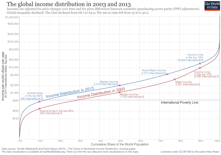
The visualization shows the global income distribution in 2003 and 2013 (below we will look at a longer time period). It is measured in international-$ which means it is adjusted for price differences between countries, as we explain here. It is of course also adjusted for price changes over time (inflation).
An income over 14,500 int-$ in 2013 meant that person was part of the global top 10%, and in the world’s richest countries the majority of people have an income that is often much higher than than.
What this distribution shows is that global income inequality is extremely high. The top 10% cut-off is 30-times higher than the cut-off for the poorest 10%. Here the data is plotted on a logarithmic y-axis to focus on the change of incomes between the majority of the world’s population, here is the same data plotted on a linear axis.
To read the chart below, choose a level of annual income on the y-axis and then use the blue 2013-line and the red 2003-line to find the corresponding share of the world population living with less than that income on the x-axis.
The first thing that this chart shows is that a large share of the world population lives on very low incomes. The median income in 2013 was 2,010 int.-$.
If you want to consider a poverty line higher than the International Poverty Line, you could chose a line of int.-$1,000 per year instead and see that in 2003, 48% of the world population was below this poverty line; ten years later, in 2013, 29% were below this line. This was a decline of 20 percentage points in one decade relative to this higher poverty line.
If you think the international poverty line should be much higher and should instead be 4,000 int.-$, then you see that in 2003, 80% of the world population was below that poverty line. 10 years later: 67%. A decline of 13 percentage points in a decade.
There is absolutely no reason to be complacent about poverty today – it remains one of the world’s very worst problems. But it is clear that the world has made progress against it. What this chart shows is that, no matter what global poverty line you choose, the share of people below that poverty line has declined.
The global income distribution in 2003 and 20131
The study by Mauro and Hellebrandt2 on which the above chart is based only has data from 2003 onwards. But there is some good data that allows us to go further back in time, as well as looking at absolute numbers of people in poverty (rather than shares).
The visualization shows a breakdown of the population by per capita household consumption.
After seeing the data for 2003 to 2013, the data shown here should not be surprising: Globally the share of people below any poverty line – $1.90, $3.20, $5.50, $10 – is declining.
Progress against a poverty line of int.-$ 10 per day is a very recent achievement. More than a third of the world population now live on more than 10 dollars per day. Until a decade decade ago it was only a quarter.
The majority of the world population is still very poor. What the cutoff for extreme poverty is helpful for is to focus the attention to those who are the very poorest. This would not be possible if we would only rely on much higher poverty thresholds. A poverty line of int.-$ 10 per day would include the very poorest (on less than $2) and those that are 5-times richer and would thereby hide important differences.

The chart below answers the question of how the number of people below different poverty lines is changing.
The number of people living on less than $1.90 per day has declined. And the number of people above the poverty line has increased rapidly.
When we look at higher poverty lines we see a different picture: From 1990 to 2005 we see that the number of people living on less than $10 per day increased. But since then, the number living on less than $10 stagnated whilst the number above this poverty line increased rapidly. The number of people who live on more than 10 dollars per day increased by 900 million in the last 10 years. On any average day in the last decade the number of people living on more than $10 increased by almost a quarter of a million (246,500).3
Half a billion projected to live in extreme poverty in 2030
The world is making progress against all poverty lines and with rapid growth in many middle income countries we can hope that this progress against poverty relative to high poverty lines will continue.
But our focus should be on those in the very worst poverty. As the previous chart shows, there are still 730 million people living on less than int-$1.90 per day. And the bad news is that we cannot expect this progress to continue: As I have recently written, because the world’s very poorest economies are stagnating half a billion are expected to be in extreme poverty in 2030.
