→ Open the Data Explorer in a new tab.
All our charts on Crop Yields
In the charts we see the average agricultural yield of particular crops over the long-term in the United Kingdom, from 1885 onwards. In the first chart, we have plotted cereal crops (wheat, barley and oats). Overall, we see that improvements in cereal yields from the 19th century into the first half of the 20th century were relatively slow– by the 1940s, yields were typically in the range of 2-2.5 tonnes per hectare. Productivity gains between the 1950s and 1990s was rapid, growing 2-3 fold over this period. Since the turn of the millennium however, cereal yields in the UK have been relatively stagnant.
We see UK yields in sugar beet and potatoes tend to have much higher yields than cereal crops by mass (although they are likely to have a much higher percentage of water weight). Similarly to cereal yields, productivity gains in sugar beet and potatoes have been most impressive over the latter half of the 20th century. Since 1960, yields in sugar beet have more than doubled, rising from 30 tonnes to more than than 80 tonnes per hectare. Potato yields have also almost doubled, increasing from just over 20 tonnes in 1960 to more than 40 tonnes per hectare in 2014.


In the chart we have plotted average corn (maize) yields in the United States from 1866-2014, based on data from the United States Department of Agriculture (USDA) and UN FAO. As we see, average corn yields in the United States remained relatively flat throughout the 1800s until the 1930s. In the period since 1940, yields have increased more than five-fold.
What caused this significant drive in yield improvements? There are a number of factors which are likely to have contributed to sustained yield gains: fertilizer application, irrigation, increased soil tillage, and improved farming practices. However, a key driver in the initial rise in yield is considered to be the adoption of improved corn varieties from plant breeding developments. The initial period of yield gains in the late 1930s-early 1940s coincides with the transition period of farmers from open-pollinated varieties to hybrids. This process of cross-breeding between open-pollinated varieties, combined with improved breed selection practices is thought to define the key turning point in US corn yields.1

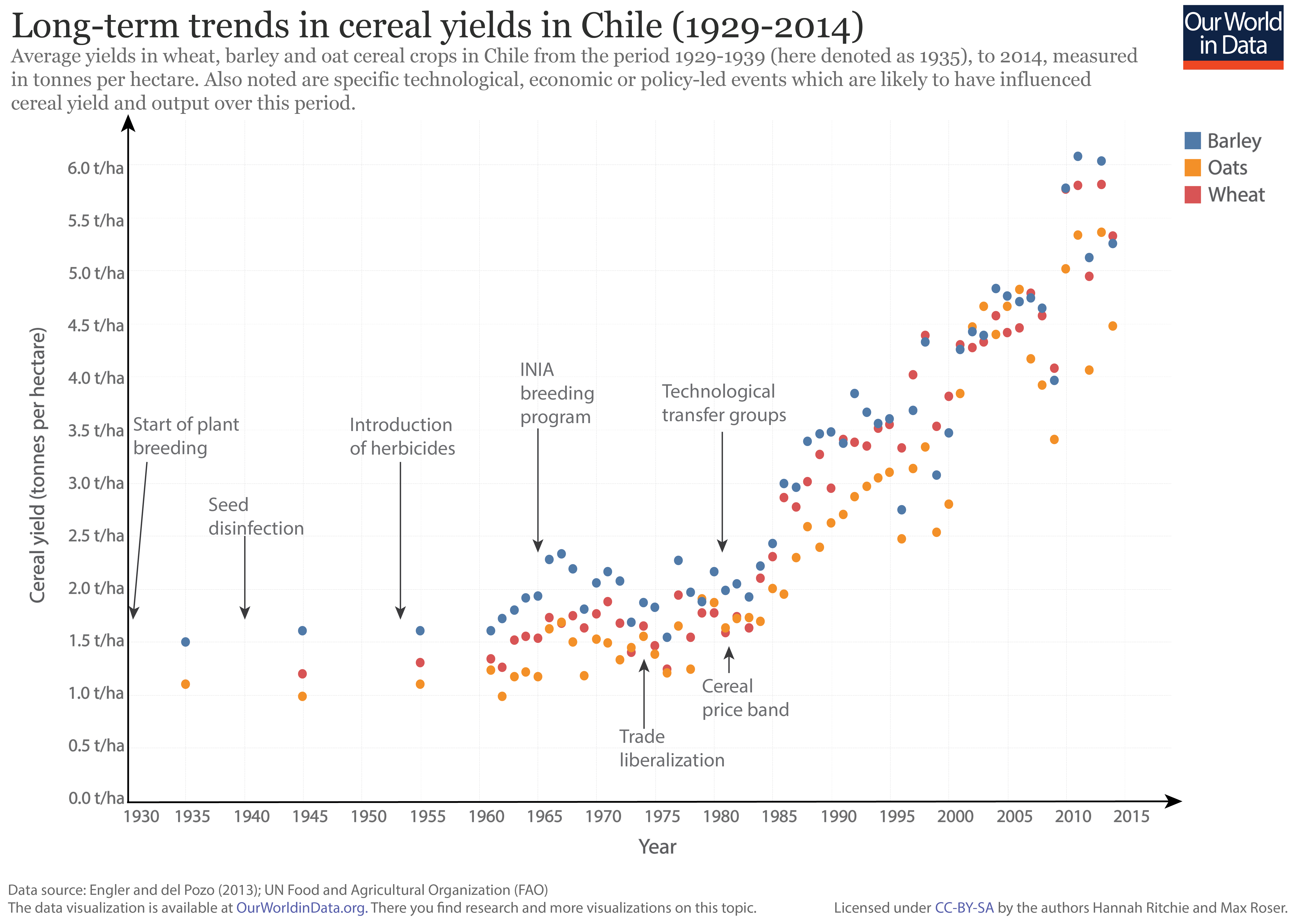
In the chart we see the average yields in key cereal crops (wheat, barley and oats) in Chile from 1929-2014. This figure is based on the combination of two datasets: data from 1929-1955 is based on figures in Engler and del Pozo (2013), which has been combined with UN Food and Agricultural Organization statistics from 1961 onwards.2
Also shown on this figure are specific technological, economic or policy events which are likely to have influenced the change in cereal yields over this period–these events have been highlighted by Engler and del Pozo (2013).
Our data on agricultural yields across crop types and by country are much more extensive from 1960 onwards. The UN Food and Agricultural Organization (FAO) publish yield estimates across a range of crop commodities by country over this period. The FAO report yield values as the national average for any given year; this is calculated by diving total crop output (in kilograms or tonnes) by the area of land used to grow a given crop (in hectares). There are likely to be certain regional and seasonal differences in yield within a given country, however, reported average yields still provide a useful indication of changes in productivity over time and geographical region.
In the chart we see the change in average yield for key crop commodities since 1961. In this visualisation, you can select/deselect which crops you wish to see and compare, and you can also view these trends across any country or region using the “change country” wheel.

Cereals


Roots and tubers


Legumes and nuts


Sugar crops


Oilcrops


Fruits and vegetables


Cocoa, coffee and tea


Fertilizer use

Tractor use

This visualization shows the index of the arable land area needed to produce an equivalent aggregate of crop production, relative to the land area needed in 1961 i.e. values in 1961 are equal to 1.0. For example, globally in 2014, the index value was 0.3; this means only 30% of the arable land area was needed to produce the same quantity of crops relative to 1961. 70% less land was needed.
This data can be viewed for other countries and regions by selecting ‘
Add country
’ on the chart.
The crop production index (PIN) is the sum of crop commodities produced (after deductions of quantities used as seed and feed). It is weighted by the commodity prices. The FAO explains the construction of the PIN in detail here.
The idea for this chart is taken from Ausubel, Wernick, and Waggoner (2013).3
The authors write: ‘A combination of agricultural technologies raised yields, keeping downward pressure on the extent of cropland, sparing land for nature.
Countering the global rise of population and affluence by parents and workers, consumers and farmers restrained the expansion of arable land by changing tastes and lifting yields. The noticeable shrinkage in the extent of cropland as a function of the Crop Production index since 1990 provides encouragement that farmers will continue sparing land.’

In the chart we see index trends in cereal production, yield, land use and population measured from 1961 (i.e. 1961 = 100). From 1961 to 2014, global cereal production has increased by 280 percent. If we compare this increase to that of total population (which increased only 136 percent over the same period), we see that global cereal production has increased at a much faster rate than that of population. If distributed equally, cereal production per person has increased despite a growing population.
Have we achieved this through land expansion or improved yields? A bit of both. In 2014, we used 16% more land for cereal production than we did in 1961 (approximately equivalent to double the area of Germany). Overall, this means we use less land per person than we did fifty years ago. Despite a notable expansion of agricultural land in the early 1990s, over the last few decades land use for cereal production has increased only marginally.
Most of our improvements in cereal production have arisen from improvements in yield. The average cereal yield has increased by 175 percent since 1961. Today, the world can produce almost three-times as much cereal from a given area of land as it did in 1961.

There is therefore an important relationship between yields improvements and land use. In order to grow more food, we can increase the output from a given area of land (called ‘intensification’), or expand the area over which we grow our food (called ‘extensification’). Increasing yields reduces the pressure of expanding agricultural land.
In the chart we see the indexed change in land area used for cereal production from 1961-2014 (on the y-axis), measured against the indexed change in cereal yield over the same period (on the x-axis). In these trends we see large regional differences in this yield-land use trade-off.
Most European, American (both North and Latin American), Asian and Pacific countries have seen a much larger increase in cereal yields relative to area used for production. For many, changes in the arable land have been minimal (or have declined). This is an important contrast to Africa where results are more mixed. Some countries, including Ethiopia, Nigeria and Algeria have followed the rest of the world in yield increases. However, a failure to increase agricultural productivity in many Sub-Saharan countries has led to large increases in land used for cereal production.

This trade-off between land use for agriculture and yields is very clearly exemplified in a comparison between cereal production in Asia and Sub-Saharan Africa. Expansion of cereal production has followed very different paths in Sub-Saharan Africa and Asia.
Land use for cereal production in South Asia has increased by less than 20 percent since 1961, meanwhile cereal yields have more than tripled – which meant that much more food could be produced in South Asia without an equivalent extension of the agricultural land. This is in strong contrast to Sub-Saharan Africa where the area of land used for cereal production has more than doubled since 1961 and yields have only increased by 80 percent.

Although there are a few exceptions–notably across Sub-Saharan Africa, the continued increase in cereal yields across the world has been the major driver of total cereal production. This has inevitably allowed us to ‘spare’ land we would have otherwise had to convert for cereal production.
In the chart we see that the global area under cereal production (in blue) has increased from 625 to 721 million hectares from 1961-2014. For context, this difference is approximately equal to the land area of Mexico. However, if global average cereal yields were to have remained at their 1961 levels, we see the amount of additional land (in blue) which we would have had to convert to arable land if we were to achieve the same levels of cereal production. This ‘spared’ land amounts to 1.26 billion hectares in 2014– roughly equal to the area of Mexico and Europe combined.
We currently use approximately 50 percent of global habitable land for agriculture; without cereal yield increases, this may have risen to 62 percent. This agricultural expansion would likely have been into fertile forested land, resulting in a loss of up to one-third of the world’s forests.

The definition for ‘crop yield‘ given by the FAO is ‘Harvested production per unit of harvested area for crop products. In most of the cases yield data are not recorded but obtained by dividing the production data by the data on area harvested. Data on yields of permanent crops are not as reliable as those for temporary crops either because most of the area information may correspond to planted area, as for grapes, or because of the scarcity and unreliability of the area figures reported by the countries, as for example for cocoa and coffee.'4
Attainable yields are defined as feasible crop yields based on high-yielding areas of similar climate. They are more conservative than biophysical ‘potential yields’, but are achievable using current technologies and management (e.g. fertilizers and irrigation).
Yield gaps are defined as the different between the actual crop yield and the attainable yield.
- Data: Cereal yields, production and land use data
- Geographical coverage: Global – by country and world region
- Time span: Since 1961
- Available at: online here.
- Data: Attainable yields across key crops
- Geographical coverage: Global – by country
- Time span: Estimates for the year 2000
- Available at: online here.
- Data: Agricultural output, policy and support
- Geographical coverage: Latin America – by country
- Time span: 2004-2014
- Available at: online here.