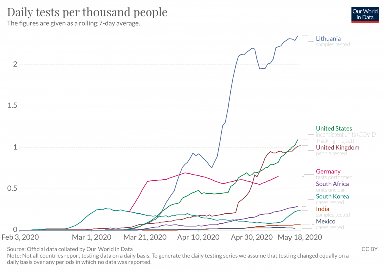
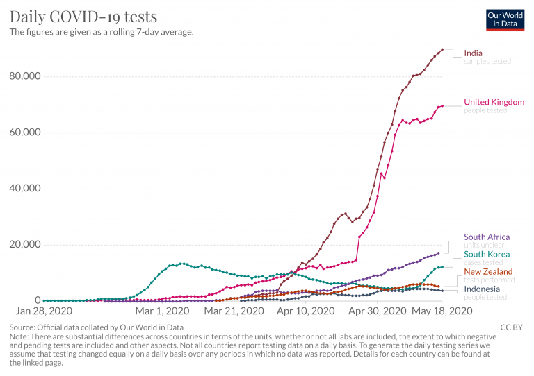
The purpose of this page here is simply to lists all our visualizations on the pandemic.
Data sources and how to use these charts
The data on confirmed cases and confirmed deaths shown in these visualizations is updated daily and is published by Johns Hopkins University, the best available global dataset on the pandemic.
The data on testing was collected by us – more detail can be found here.
- On many charts it is possible to add any country by clicking on ‘ Add country ’.
- Other charts can only show the data for one country at a time – these charts have a ‘change country’ option in the bottom left corner of the chart.
- Many charts have a blue adjustable time-slider underneath the charts.
This page has a large number of charts on the pandemic. In the box below you can select any country you are interested in – or several, if you want to compare countries.
All charts on this page will then show data for the countries that you selected.
Related chart:
Increase of deaths
Increase of cases
For an analysis in mid-March we compared available global data sources. While all of the above will be updated and maintained by us we will not maintain this source comparison.

