Build on top of our work freely
- All our code is open-source
- All our research and visualizations are free for everyone to use for all purposes
- What is the daily number of confirmed cases?
- Daily confirmed cases: how do they compare to other countries?
- What is the cumulative number of confirmed cases?
- Cumulative confirmed cases: how do they compare to other countries?
- Biweekly cases: where are confirmed cases increasing or falling?
- Global cases in comparison: how are cases changing across the world?
Australia: What is the daily number of confirmed cases?
Related charts:

This chart shows the number of confirmed COVID-19 cases per day. This is shown as the seven-day rolling average.
What is important to note about these case figures?
- The reported case figures on a given date do not necessarily show the number of new cases on that day – this is due to delays in reporting.
- The actual number of cases is likely to be much higher than the number of confirmed cases – this is due to limited testing. In a separate post we discuss how models of COVID-19 help us estimate the actual number of cases.
→ We provide more detail on these points in our page on Cases of COVID-19.
Five quick reminders on how to interact with this chart
- By clicking on Add country you can show and compare the data for any country in the world you are interested in.
- If you click on the title of the chart, the chart will open in a new tab. You can then copy-paste the URL and share it.
- You can switch the chart to a logarithmic axis by clicking on ‘LOG’.
- If you move both ends of the time-slider to a single point you will see a bar chart for that point in time.
- Map view: switch to a global map of confirmed cases using the ‘MAP’ tab at the bottom of the chart.
Australia: Daily confirmed cases: how do they compare to other countries?
Differences in the population size between different countries are often large. To compare countries, it is insightful to look at the number of confirmed cases per million people – this is what the chart shows.
Keep in mind that in countries that do very little testing the actual number of cases can be much higher than the number of confirmed cases shown here.
Three tips on how to interact with this map
- By clicking on any country on the map you see the change over time in this country.
- By moving the time slider (below the map) you can see how the global situation has changed over time.
- You can focus on a particular world region using the dropdown menu to the top-right of the map.
Australia: What is the cumulative number of confirmed cases?
Related charts:
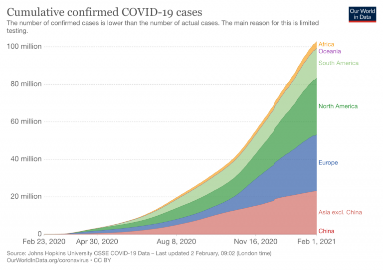

The previous charts looked at the number of confirmed cases per day – this chart shows the cumulative number of confirmed cases since the beginning of the COVID-19 pandemic.
In all our charts you can download the data
We want everyone to build on top of our work and therefore we always make all our data available for download. Click on the ‘Download’-tab at the bottom of the chart to download the shown data for all countries in a .csv file.
Australia: Cumulative confirmed cases: how do they compare to other countries?
This chart shows the cumulative number of confirmed cases per million people.
Australia: Biweekly cases: where are confirmed cases increasing or falling?
Why is it useful to look at biweekly changes in confirmed cases?
For all global data sources on the pandemic, daily data does not necessarily refer to the number of new confirmed cases on that day – but to the cases reported on that day.
Since reporting can vary significantly from day to day – irrespectively of any actual variation of cases – it is helpful to look at a longer time span that is less affected by the daily variation in reporting. This provides a clearer picture of where the pandemic is accelerating, staying the same, or reducing.
The first map here provides figures on the number of confirmed cases in the last two weeks. To enable comparisons across countries it is expressed per million people of the population.
And the second map shows the growth rate over this period: blue are all those countries in which the case count in the last two weeks was lower than in the two weeks before. In red countries the case count has increased.


Australia: Global cases in comparison: how are cases changing across the world?
- What is the daily number of confirmed deaths?
- Daily confirmed deaths: how do they compare to other countries?
- What is the cumulative number of confirmed deaths?
- Cumulative confirmed deaths: how do they compare to other countries?
- Biweekly deaths: where are confirmed deaths increasing or falling?
- Global deaths in comparison: how are deaths changing across the world?
Australia: What is the daily number of confirmed deaths?
Related charts:

This chart shows the number of confirmed COVID-19 deaths per day.
Three points on confirmed death figures to keep in mind
All three points are true for all currently available international data sources on COVID-19 deaths:
- The actual death toll from COVID-19 is likely to be higher than the number of confirmed deaths – this is due to limited testing and problems in the attribution of the cause of death. The difference between reported confirmed deaths and actual deaths varies by country.
- How COVID-19 deaths are recorded may differ between countries (e.g., some countries may only count hospital deaths, whilst others also include deaths in homes).
- The death figures on a given date do not necessarily show the number of new deaths on that day, but the deaths reported on that day. Since reporting can vary significantly from day to day – irrespectively of any actual variation of deaths – it is helpful to view the seven-day rolling average of the daily figures as we do in the chart here.
→ We provide more detail on these three points in our page on Deaths from COVID-19.
Australia: Daily confirmed deaths: how do they compare to other countries?
This chart shows the daily confirmed deaths per million people of a country’s population.
Why adjust for the size of the population?
Differences in the population size between countries are often large, and the COVID-19 death count in more populous countries tends to be higher. Because of this it can be insightful to know how the number of confirmed deaths in a country compares to the number of people who live there, especially when comparing across countries.
For instance, if 1,000 people died in Iceland, out of a population of about 340,000, that would have a far bigger impact than the same number dying in the United States, with its population of 331 million.1 This difference in impact is clear when comparing deaths per million people of each country’s population – in this example it would be roughly 3 deaths/million people in the US compared to a staggering 2,941 deaths/million people in Iceland.
Australia: What is the cumulative number of confirmed deaths?
Related charts:


The previous charts looked at the number of confirmed deaths per day – this chart shows the cumulative number of confirmed deaths since the beginning of the COVID-19 pandemic.
Australia: Cumulative confirmed deaths: how do they compare to other countries?
This chart shows the cumulative number of confirmed deaths per million people.
Australia: Biweekly deaths: where are confirmed deaths increasing or falling?
Why is it useful to look at biweekly changes in deaths?
For all global data sources on the pandemic, daily data does not necessarily refer to deaths on that day – but to the deaths reported on that day.
Since reporting can vary significantly from day to day – irrespectively of any actual variation of deaths – it is helpful to look at a longer time span that is less affected by the daily variation in reporting. This provides a clearer picture of where the pandemic is accelerating, staying the same, or reducing.
The first map here provides figures on the number of confirmed deaths in the last two weeks. To enable comparisons across countries it is expressed per million people of the population.
And the second map shows the growth rate over this period: blue are all those countries in which the death count in the last two weeks was lower than in the two weeks before. In red countries the death count has increased.


Australia: Global deaths in comparison: how are deaths changing across the world?
- How many COVID-19 vaccine doses are administered daily?
- How many COVID-19 vaccine doses have been administered in total?
- What share of the population has received at least one dose of the COVID-19 vaccine?
- What share of the population has been fully vaccinated against COVID-19?
- Global vaccinations in comparison: which countries are vaccinating most rapidly?
Australia: How many COVID-19 vaccine doses are administered daily?

Related charts:


This chart shows the daily number of COVID-19 vaccine doses administered per 100 people in a given population. This is shown as the rolling seven-day average. Note that this is counted as a single dose, and may not equal the total number of people vaccinated, depending on the specific dose regime (e.g., people receive multiple doses).
Australia: How many COVID-19 vaccine doses have been administered in total?

Related charts:


This chart shows the total number of COVID-19 vaccine doses administered per 100 people within a given population. Note that this is counted as a single dose, and may not equal the total number of people vaccinated, depending on the specific dose regime as several available COVID vaccines require multiple doses.
Australia: What share of the population has received at least one dose of the COVID-19 vaccine?

Related charts:


This chart shows the share of the total population that has received at least one dose of the COVID-19 vaccine. This may not equal the share that are fully vaccinated if the vaccine requires two doses. If a person receives the first dose of a 2-dose vaccine, this metric goes up by 1. If they receive the second dose, the metric stays the same.
Australia: What share of the population has been fully vaccinated against COVID-19?

Related charts:


The following chart shows the share of the total population that has been fully vaccinated against COVID-19. This represents the share that have received all doses prescribed by the vaccination protocol. If a person receives the first dose of a 2-dose vaccine, this metric stays the same. If they receive the second dose, the metric goes up by 1.
This data is only available for countries which report the breakdown of doses administered by first and second doses.
Australia: Global vaccinations in comparison: which countries are vaccinating most rapidly?
No country knows the total number of people infected with COVID-19. All we know is the infection status of those who have been tested. All those who have a lab-confirmed infection are counted as confirmed cases.
This means that the counts of confirmed cases depend on how much a country actually tests. Without testing there is no data.
Testing is our window onto the pandemic and how it is spreading. Without data on who is infected by the virus we have no way of understanding the pandemic. Without this data we cannot know which countries are doing well, and which are just underreporting cases and deaths.
To interpret any data on confirmed cases we need to know how much testing for COVID-19 the country actually does.
Because testing is so very crucial to understanding the spread of the pandemic and responding appropriately, we have focused our efforts on building a global dataset on COVID-19 testing.
- The testing dataset is updated around twice a week. The latest version is always available on our page on COVID-19 testing.
- And as with all our work, it is freely accessible for everyone. The data can be downloaded here on GitHub.
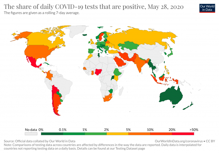
Australia: Are countries testing enough to monitor their outbreak?

To be able to properly monitor the spread of the virus, countries with more widespread outbreaks need to do more testing.
So one important way to understand if countries are testing sufficiently is to ask: What share of the tests confirm a case? What is the positive rate? This is what the map here shows.
If you are interested in the development over time you can simply click on the country in the map (or switch to the Chart-tab at the bottom of the visualization).
We see enormous differences across countries.
- Some countries, like Australia, South Korea and some European countries, have a positive rate around 1% or lower – they do hundreds, or even thousands of tests for each case they find.
- Others, such as Mexico, several South American countries, and Nigeria, only do a handful of tests – five or fewer – for every confirmed case. This results in a positive rate around 20% or even higher.
Countries that do very few tests per confirmed case are unlikely to be testing widely enough to find all cases. The WHO has suggested a positive rate lower than 10% – but better is lower than 3% – as a general benchmark of adequate testing.2
The countries that have a positive rate below 3% are shown in shades of blue. Those that have a positive rate higher than 3% are shown in shades of orange and red.
In countries that test very little in relation to their outbreak – shown in shades of red in the chart – many cases are likely to go unreported. In these countries, the number of confirmed cases indicated may represent only a fraction of the total number of cases.
Australia: The scale of testing compared to the scale of the outbreak


This scatter chart provides another way of seeing the extent of testing relative to the scale of the outbreak in different countries.
The chart shows the daily number of tests (vertical axis) against the daily number of new confirmed cases (horizontal axis), both per million people.
Looking downward on the chart, we see some countries doing ten or a hundred times fewer tests than other countries with a similar number of new confirmed cases.
Conversely, looking to the right, we see some countries find ten or a hundred times more cases than others out a similar number of tests.
Where the number of confirmed cases is high relative to the extent of testing, this suggests that there may not be enough tests being carried out to properly monitor the outbreak. In such countries, the true number of infections may be far higher than the number of confirmed cases. In a separate post we discuss how epidemiological models of COVID-19 help us estimate the true number of infections.
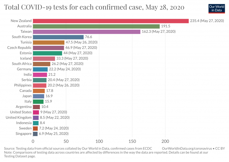
Australia: How many tests are performed each day?

This chart shows the number of daily tests per thousand people. Because the number of tests is often volatile from day to day, we show the figures as a seven-day rolling average.
What is counted as a test?
The number of tests does not refer to the same thing in each country – one difference is that some countries report the number of people tested, while others report the number of tests (which can be higher if the same person is tested more than once). And other countries report their testing data in a way that leaves it unclear what the test count refers to exactly.
We indicate the differences in the chart and explain them in detail in our accompanying source descriptions.
To understand the risks and respond appropriately we would also want to know the mortality risk of COVID-19 – the likelihood that someone who is infected with the disease will die from it.
We look into this question in more detail on our page about the mortality risk of COVID-19, where we explain that this requires us to know – or estimate – the number of total cases and the final number of deaths for a given infected population. Because these are not known, we discuss what the current data can and can not tell us about the risk of death.
Australia: How did confirmed deaths and cases change over time?

So far we’ve focused on confirmed deaths and on confirmed cases.
This chart shows both metrics.
How you can interact with this chart
- By now you know that in these charts it is always possible to switch to any other country in the world by choosing Change Country.
- You can also see the data in a ‘TABLE’ view by clicking that tab on the bottom of the chart. You can sort the table by any of the columns by clicking on the column header.
Australia: The case fatality rate

The case fatality rate is simply the ratio of the two metrics shown in the chart above.
The case fatality rate is the number of confirmed deaths divided by the number of confirmed cases.
This chart here plots the CFR calculated in just that way.
During an outbreak – and especially when the total number of cases is not known – one has to be very careful in interpreting the CFR. We wrote a detailed explainer on what can and can not be said based on current CFR figures.
To understand how governments have responded to the pandemic, we rely on data from the Oxford Coronavirus Government Response Tracker (OxCGRT), which is published and managed by researchers at the Blavatnik School of Government at the University of Oxford.
This tracker collects publicly available information on 17 indicators of government responses, spanning containment and closure policies (such as school closures and restrictions in movement); economic policies; and health system policies (such as testing regimes).
Australia: Government Stringency Index

The chart here shows how governmental response has changed over time. It shows the Government Stringency Index – a composite measure of the strictness of policy responses.
The index on any given day is calculated as the mean score of nine policy measures, each taking a value between 0 and 100. See the authors’ full description of how this index is calculated.
A higher score indicates a stricter government response (i.e. 100 = strictest response).
The OxCGRT project calculates this index using nine specific measures, including:
- school and workplace closures;
- restrictions on public gatherings;
- transport restrictions;
- and stay-at-home requirements.
You can see all of these separately on our page on policy responses. There you can also compare these responses in countries across the world.