Health is fundamental for a good quality of life. Being free from illness or injury directly affects our capacity to enjoy life.
In this entry we provide an overview of the available empirical evidence on aggregate health outcomes, focusing on long-run cross-country data from mortality and morbidity tables; and then provide an analysis of available evidence on health determinants, focusing specifically on the returns to macro healthcare investments.
Life expectancy is the most commonly used measure used to describe a population’s health. Historical data shows that global life expectancy has increased drastically over the last couple of centuries, with substantial long-run improvements in all countries around the world. In fact, recent life expectancy gains in developing countries have been particularly important. However, despite recent progress towards long-run cross-country convergence, there are still huge differences that have to be addressed: in several countries in Sub-Saharan Africa the average life expectancy is still less than 60 years, compared to more than 80 years in countries in Europe or in Japan.
Historical reductions in child mortality and maternal mortality have been crucial to improving life expectancy around the world. But also for these two measures of health we observe large remaining inequalities: low-income countries still have, on average, child mortality rates that are more than ten times higher than those in high-income countries. We show that similarly large gaps remain for other measures of health, including recent burden-of-disease estimates.
A growing body of empirical research suggests that, at a macro level, health outcomes are highly responsive to healthcare investments. Moreover, as one would expect, the evidence suggests large health returns to healthcare expenditure at low levels of baseline expenditure. This implies that international resources channeled through development assistance for health, if suitably targeted and managed, have the potential of drastically reducing global inequalities in living standards.
This is a ‘meta-entry’. All visualizations and data discussed here are also discussed in more detail in other, more specific data entries on the topic of health. In what follows we provide links to these other entries, as we cover the corresponding topics. These include Life Expectancy, Child Mortality, Healthcare Provision, Health Inequality, among other.
Life expectancy
One way to assess health in a population is by looking at mortality data. Life expectancy is the most commonly used measure to aggregate mortality data in order to describe a population’s health. It measures how many years, on average, a person is expected to live based on current age and sex-specific death rates.
Further in-depth information on life expectancy, including definitions, data sources, historical trends and much more, can be found in our dedicated entry on Life Expectancy.
The visualization summarises available life expectancy data over the last few centuries. The estimates from the UK – the country for which we have the longest time-series – show that life expectancy before 1800 was very low, but since then it has increased drastically. We can see that in less than 200 years the UK doubled life expectancy at birth. And the data shows that similarly remarkable improvements also took place in other European countries during the same period.
The chart also shows large historical changes in life expectancy estimates for other countries. Notice, for example, that a century ago life expectancy in India and South Korea was as low as 23 years – and a century later, life expectancy in India almost tripled, and in South Korea almost quadrupled.
You can switch to the map view in this visualization by clicking on the corresponding tab, in order to compare life expectancy across countries. The map shows that, despite long-run cross-country convergence, there are still huge differences between countries: people in some sub-Saharan African countries have a life expectancy of less than 50 years, compared to 80 years in countries such as Japan.
The increase in life expectancy happened to a significant extent because of changing mortality patterns at a young age, but this was not the only reason: life expectancy increased for people at all ages.
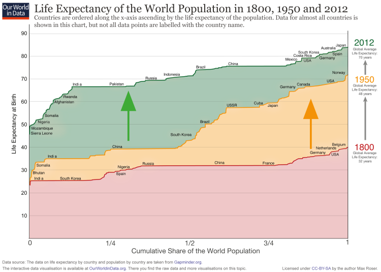
The visualization here shows the cumulative share of the world population (horizontal axis) against the corresponding life expectancy (vertical axis) at different points in time (colored lines). You can think of this as a bar-chart of life expectancy by country, but where countries have been ordered by life expectancy, and the width of each bar has been drawn proportional to each country’s share of the world population.
For 1800 (red line) we see that the countries on the left – including India and also South Korea – have a life expectancy of around 25 years. And on the very right we see that in 1800 no country had a life expectancy above 40 (Belgium had the highest life expectancy with just 40 years).
In 1950 life expectancy in all countries was higher than in 1800, but we can see that inequality grew substantially. This happened because very large improvements in health outcomes took place in some countries (mainly the richer countries in Europe and North America), while others (notably India and China) made only little progress.
In 2012 (green line), we can see again an improvement in life expectancy across all countries; yet interestingly, improvements in this last period implied a reduction in inequality. This happened through very large recent improvements in life expectancy across developing countries.
The conclusion is that the world developed from equally poor health in 1800, to great inequality in 1950, and back to more equality today – but equality at a much higher level.
Life expectancy of the world population, 1800, 1950 and 20121
The inequality in years of life between people within the same country can be measured in the same way that we measure, for example, the inequality in the distribution of incomes. The idea is to estimate the extent to which a small share of a country’s population concentrates a large ‘stock of health’, hence living much longer than most of the population in the same country.
The following visualization presents estimates of the inequality of lifetimes as measured by the Gini coefficient. A high Gini coefficient here means a very unequal distribution of years of life – that is, large within-country inequalities of the number of years that people live. These estimates are from Peltzman (2009)2, where you can find more details regarding the underlying sources and estimation methodology.
As can be seen in the chart, inequality in health outcomes has fallen strongly within many countries.
Child mortality
In the preceding section we studied life expectancy at birth as a key measure of aggregate health in a population. This measure provides an overview of health outcomes for the average person in a country. In this section we focus on health outcomes specifically for children.
An analysis of mortality for children provides important information regarding aggregate health in a country, because the first years of life are characterised by important health-related challenges. Consequently, life expectancy increases substantially conditional on surviving the first years of life. Indeed, as we shall show, an important part of the gains in life expectancy at birth are precisely due to large reductions in child mortality.
Child mortality is usually measured as the probability per 1,000 live births that a newborn baby will die before reaching age five under current age-specific mortality patterns.
Further in-depth information on child mortality, including definitions, data sources, historical trends and much more, can be found in our dedicated entry on Child Mortality.
The interactive time-series plot shows how child mortality has changed over the long run. As we can see, child mortality in industrialised countries today is below 5 per 1,000 live births – but these low mortality rates are a very recent development. In pre-modern countries child mortality rates were between 300 and 500 per 1,000 live births. In developing countries the health of children is quickly improving – but child mortality is still much higher than in developed countries.
A second interesting feature of the trends depicted in this chart is that there are many sharp ‘spikes’ in the 19th century. This is partly because the data quality is improving over time, but also because health crises were more frequent in pre-modern times. The decline of crises is an important aspect of improving ‘living standards’. In our entry on food price volatility you find empirical evidence of how frequent food crises were. In the following plot you can see what these and other crises – epidemics or wars, for example – meant for the health of the population.
You can switch to the map view in this visualization by clicking on the corresponding tab, in order to compare child mortality estimates across countries and time. The map reinforces what we already noted: all countries have reduced child mortality in the long run, but there are still large differences between developed and developing countries.
The fact that developing countries have made particularly fast improvements to reduce child mortality in the last fifty years, has meant that cross-country gaps have been closing. The following visualization shows child mortality estimates by income level of countries for the period 1960-2012. We can see a clear downward trend across all groups. And since high-income countries have seen the slowest progress (due to their already high health outcomes) we can see that the gap between these countries and the rest of the world has been narrowing. Upper middle income countries are in fact close to catching up.
Nevertheless, the latest figures show the important challenges that remain: low-income countries have, on average, child mortality rates that are still more than ten times higher than in high-income countries. The remaining gap is still large.
The chart focuses on the five most lethal infectious diseases. It shows the number of child deaths caused by these diseases from 1990 onwards.
Deaths caused by malaria and HIV/AIDS were rising over the 1990s. From 2005 onwards the deaths caused by each of these diseases is declining.
The most important disease referred to as ‘lower respiratory infections‘ in the visualization is pneumonia.
Maternal mortality
Similarly to child mortality, maternal mortality provides important information regarding the level of health in a country.
Maternal mortality is usually defined as the number of women dying from pregnancy-related causes while pregnant, or within 42 days of pregnancy termination (typically expressed as a ratio per 100,000 live births).
Further in-depth information on maternal mortality, including definitions, data sources, historical trends and much more, can be found in our dedicated entry on Maternal Mortality.
The visualizations above highlight the drastic long-term improvements that countries have made to reduce child mortality. But have these health improvements also materialized for mothers?
The chart shows long-run maternal mortality estimates for a selection of mainly high income countries. We can see that a hundred years ago, out of 100,000 child birth, between 500 and 1,000 ended with the death of the mother. This means every 100th to 200th birth led to the mother’s death. Since women gave birth much more often than today, the death of the mother was a common tragedy. Today, these countries have maternal mortality rates close to 10 per 100,000 live births.
The decline of maternal mortality to around 10 per 100,000 births can be attributed to our modern scientific understanding of the causes leading to maternal mortality. In fact, a common reason for mothers to die was puerperal fever (or childbed fever), which was caused by unhygienic conditions leading to infections in the mothers’ genital tract during childbirth. It was the physician Ignaz Semmelweis who first noticed the link between hygiene and the survival of mothers in the middle of the 19th century, but it was only until the germ theory of disease became known that appropriate practices became widely adopted.
The same chart also shows that different countries have achieved progress in maternal mortality at different points in time. The decline of maternal mortality in Finland, for example, began in the middle of the 19th century and didn’t reach today’s low level until more than a century later. Malaysia in contrast achieved this progress in only a few decades.
Recent data on maternal mortality shows improvements around the world. The following interactive visualization presents a world map of maternal mortality rates for the period 1990-2013. You can switch to the chart view to explore country-specific trends.
As before, the conclusion here is that despite recent widespread improvements in the developing world, there are huge challenges ahead: in sub-Saharan Africa more than 500 mothers die per 100,000 live births. This is more than 60 times higher than the figure for countries in the European Union.
Burden of disease
In the preceding sections we discussed health outcomes, as measured only from data on mortality. This does not take the morbidity from disease and disability into account.
The burden of disease is a related, but different measure of health outcomes that accounts for both the mortality and the morbidity of disease.
The most common way to measure the burden of disease is to estimate the number of ‘lost’ years due to poor health – the so-called loss in Disability Adjusted Life Years, or DALYs.
This variable is calculated as the sum of years of potential life lost due to premature mortality, and the years of healthy life lost due to disease and disability. As such, the measure of a country’s DALYs extends the notion of life expectancy, in the sense that it incorporates both the prevalence of different diseases or risk factors, and the relative harm they cause. One DALY lost can be thought of as one lost year of ‘healthy’ life. You can read more about the definition and calculation of DALYs in the technical report WHO methods and data sources for global burden of disease estimates.
Further in-depth information on burden of disease can be found in our dedicated entry on Burden of Disease.
This map shows DALYs per 100,000 people of the population. It is thereby measuring the distribution of the burden of both mortality and morbidity around the world.
We see that rates across the regions with the best health are below 20,000 DALYs per 100,000 individuals. In 2017 this is achieved in many European countries, but also in Canada, Israel, South Korea, Taiwan, Japan, Kuwait, the Maldives, and Australia.
In the worst-off regions, particularly in Sub-Saharan Africa, the rate is higher than 80,000 DALYs per 100,000.
Infectious diseases
The data from the Global Burden of Disease Project, discussed above, shows that there are still important challenges regarding certain diseases, notably HIV/AIDS and malaria. Here we discuss trends showing how the fight against these diseases is evolving.
The most common way of measuring the evolution of diseases is to estimate the number (and frequency) of deaths caused by the diseases; as well as the number of new people suffering from them.
Further in-depth information can be found in our entries dedicated to HIV/AIDS and Malaria.
The 1990s saw a substantial increase in the number of people infected with HIV and dying of AIDS.
Between 1996 and 2001 more than 3 million people were infected with HIV ever year. Since then the number of new infections began to decline and in 2017 it was reduced to below 2 million. The lowest number of new infections since 1990.
The number of AIDS-related deaths increased throughout the 1990s and reached a peak in 2005, 2006 when in both years close to 2 million people died. Since then the annual number of deaths from AIDS declined as well and was since halved. 2017 was the first year since the peak in which fewer than 1 million people died from AIDS.
The chart also shows the continuing increase in the number of people living with HIV. The rate of increase has slowed down compared to the 1990s, but the absolute number is at the highest ever with more than 36 million people globally living with HIV.
The ‘production’ of health outcomes
Economists often think of health as a ‘stock’ variable relating to the absence of illness or injury. As such, health is often thought of as an individual characteristic beginning with inherited conditions (e.g. genetics) and evolving over time as a function of other inputs, such as environmental conditions and medical care.3 In general, the inputs for ‘producing health’ fall under the following broad categories:
- Biology and genetics (e.g. inherited conditions)
- Public policy and regulation (e.g. vaccination campaigns)
- Healthcare (e.g. timely treatment and diagnosis of disease)
- Habits (e.g. smoking)
- Social and environmental factors (e.g. exposure to crime, pollution)
Health returns to healthcare investment
More information about the provision of healthcare can be found in our entry on Financing Healthcare.
One of the most important inputs to health is healthcare. Here we study cross-country evidence of the link between aggregate healthcare consumption and production, and health outcomes.
One common way of measuring national healthcare consumption and production is to estimate aggregate expenditure on healthcare (typically expressed as a share of national income).
This visualization shows the cross-country relationship between life expectancy at birth and healthcare expenditure per capita.
The chart shows the level of both measures at two points in time, about a generation apart (1995 and 2014 respectively). The arrows connect these two observations, thereby showing the change over time of both measures for all countries in the world. As it can be seen, countries with higher expenditure on healthcare per person tend to have a higher life expectancy. And looking at the change over time, we see that as countries spend more on health, life expectancy of the population increases.
Notice that the relationship in this chart seems to follow a pattern of ‘diminishing returns’: the increase in life expectancy associated with an increase in healthcare expenditure decreases as expenditure increases. This means the proportional highest gains are achieved in poor countries with low baseline levels of spending. This pattern is similar to that observed between life expectancy and per capita income.
The countries are color-coded by world region, as per the inserted legends. Many of the green countries (Sub-Saharan Africa) achieved remarkable progress over the last 2 decades: health spending often increased substantially and life expectancy in many African countries increased by more than 10 years. The most extreme case is Rwanda, where life expectancy has increased from 32 to 64 years since 1995 — which was one year after the Rwandan genocide. The graph also shows that the African countries that suffered the most under the HIV/AIDS epidemic — Lesotho, Eswatini, and South Africa — experienced a decline of life expectancy from which they have not yet recovered.
The two most populous countries of the world – India and China – are emphasized by larger arrows. It is interesting to see that in 1995 China achieved already relatively good health outcomes at comparatively low levels of health spending.
The association between health spending and increasing life expectancy also holds for rich countries in Europe, Asia, and North America in the upper right corner of the chart. The US is an outlier that achieves only a comparatively short life expectancy considering the fact that the country has by far the highest health expenditure of any country in the world.
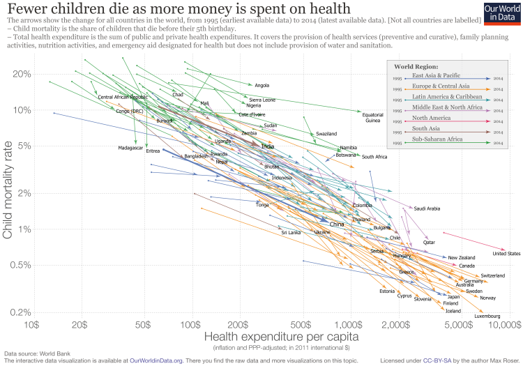
The following visualization presents the relationship between child mortality and healthcare expenditure per capita. Global data on health expenditure per capita is available since 1995 and in this chart we show the level of both measures in the first and last year for which data is available. The arrows connect these two observations, thereby showing the change over time for all countries in the world. We can see that child mortality is declining as more money is spent on health.
Focusing on changes over time, we can see a particularly striking fact: while there is huge inequality in levels – child mortality in the best-performing countries is almost 100-times lower than in the worst – inequality in trends is surprisingly stable. Specifically, if you look at the paths over time it is surprising how little heterogeneity there is between very different countries in the world. No matter whether it is a rich country in Europe or a much poorer country in Africa, the proportional decline in child mortality associated with a proportional increase in health expenditure is remarkably similar.
The visualization also shows the very high global inequality in health spending per capita that is still prevalent today. In the Central African Republic only 25 international-$ are spent per capita while on the other end of the distribution, in the US, 9,403 international-$ are spent. The ratio between the two countries is 376; on average Americans spent more on health per day than a person in the Central African Republic spends in an entire year. This is a very large gap, considering that International-$ are adjusted for price differences between countries – if price differences were not taken into account, and the spending would have been expressed in US-$ by simply using the exchange rate between the different currencies, the difference would be even larger.
You can also explore this relationship between healthcare spending and child mortality in this interactive visualization.
At a cross-country level, the strongest predictor of healthcare spending is national income (you can find more about measures of national income in our entry on GDP data). The following visualization presents evidence of this relationship. The correlation is striking: countries with a higher per capita income are much more likely to spend a larger share of their income on healthcare. In a seminal paper, Newhouse (1977)4 showed that aggregate income explains almost all of the variance in the level of healthcare expenditure (specifically, Newhouse (1977) showed that among a group of 13 developed countries, GDP per capita explained 92 percent of the variance in per capita health expenditure). Other studies have confirmed that this strong positive relationship remains after accounting for additional factors, such as country-specific demographic characteristics.5
Although in strict sense this result cannot be interpreted causally – since countries differ in many unobservable aspects that relate both to income and healthcare spending –, more sophisticated econometric models dealing with the issue of ‘omitted variables’ seem to confirm that the effect of per capita GDP on expenditure is clearly positive and significant (for a technical discussion of this conclusion see Culyer and Newhouse (2000)).6
The finances of healthcare
In the preceding section we provide evidence supporting the fact that there are potentially large health returns to healthcare investments. Here we explore empirical evidence regarding how healthcare investments are financed around the world.
In depth information on healthcare expenditure and finances, including definitions and data sources, can be found in our entry on Financing Healthcare.
The earliest data on financing of healthcare dates back to the late 19th century – this is when many European countries began officially establishing healthcare systems through legislative acts. The following visualization presents public expenditure on healthcare as a percent of GDP for a selection of high-income countries for the period 1880-1994 using data from Tanzi and Schuknecht (2000)7and Lindert (1994)8. We’ve included eight countries for reference, but you can add other countries to the same chart by clicking on the corresponding option. As it can be appreciated, public expenditure on healthcare in all of these countries followed roughly similar paths; and this is despite early differences in their healthcare regimes (for a detailed account of the institutional evolution of healthcare regimes in these countries see the report prepared by CESifo DICE).
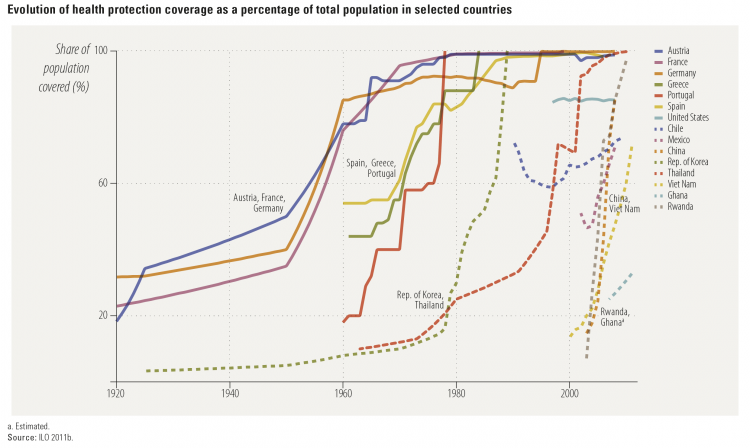
As noted above, european countries pioneered the expansion of healthcare systems in the first half of the twentieth century. The following visualization, from the Human Development Report (2014), places the achievements of these countries in perspective. Specifically, the following graph plots healthcare protection coverage for a selection of countries during the period 1920-2010. As we can see, France, Austria and Germany increased healthcare coverage in the years 1920-1960, while Spain, Portugal and Greece did it later, in the years 1960-1980. Interestingly, however, this graph also shows some notable examples of countries that expanded healthcare coverage much later, but much more quickly. In particular, China, Rwanda and Vietnam built health protection systems in the 21st century, almost from scratch, achieving near universal coverage in only a decade. These examples show that healthcare protection can be expanded very quickly, and not only at low baseline levels of coverage.
Evolution of health protection coverage as a percentage of total population, selected countries – Figure 4.2 in the Human Development Report (2014)9
In the last two decades total aggregate global expenditure on healthcare has been relatively stable, albeit with a slow steady increase. The following visualization uses data from the World Health Organisation (published in the World Development Indicators) to show this. Total healthcare spending as a percent of GDP has seen an overall increase of roughly 1.5 perceptual points over the last two decades, with a relatively constant share of resources coming from the public sector.
Global trends in healthcare expenditure mask a great deal of heterogeneity. The following map shows how total expenditure on healthcare has changed across the world. Clicking on the ‘chart’ tab in this visualization allows you to plot country-specific series. Although trends are not very pronounced for most countries, there are clear exceptions (e.g. Ecuador). And there are strong differences in levels.
World-wide cross-country data also shows that, while the public share of resources used to finance healthcare has been stable in the aggregate, there is substantial underlying heterogeneity in this respect.
The visualization presents public spending on healthcare as a share of total healthcare spending by country (again, with our usual ‘chart’ and ‘map’ views) – it shows large differences even among relatively homogeneous industrialized market economies.
This visualization presents the same variable (public spending on healthcare as a share of total healthcare) but aggregating countries by income levels (World Bank classification) – this shows that there have been substantial underlying shifts across regions. More specifically, in countries in the low-income and upper-middle-income brackets, there has been a marked increase in the share of public resources used to finance healthcare; in high-income countries there is no clear trend.
In many countries an important part of the private funding for healthcare takes the form of ‘out-of-pocket’ spending. This refers to direct outlays made by households, including gratuities and in-kind payments, to healthcare providers. The following visualization presents out-of-pocket expenditure on healthcare by country (as percent of total healthcare expenditure). As it can be seen, in high-income countries these outlays tend to account for only a small fraction of expenditure on healthcare (e.g. France, where the share was always below 8% in the entire series 1995-2013); while in low-income countries, they account for the majority of funding (e.g. Afghanistan, where the share of out-of-pocket expenditure reached 87.7% in 2002). Many countries have followed a clear path in the direction of reducing this type of expenditures (particularly in the developing world), yet some countries have moved in the opposite direction (Russia is a notable case in point, with a threefold increase in the share of out-of-pocket expenditure in the last decade).
Public policy and regulation
Public policy has the scope for affecting health outcomes. We provide here some concrete examples.
Further in-depth information can be found in our entries dedicated to Vaccination, Eradication of Disease, and Healthcare Finances.
In June 2012 the US introduced the Affordable Care Act (ACA) – a legal reform aiming to improve the accessibility, affordability, and quality of healthcare.10
This was, to a great extent, motivated by the fact that the share of uninsured individuals in the US is large and has remained virtually constant during decades of substantial growth in expenditure. The following visualization shows the percentage of individuals in the US without health insurance for the period 1963-2015. As we can see there are two marked changes in the trends separated by a long period of remarkable stability: there is a sharp drop in the number of uninsured in 1965 with the creation of Medicare and Medicaid, then relatively little change for decades, and then another sharp drop in 2012 with the introduction of the ACA. Disaggregated data shows that those states that decided to expand their Medicaid programs saw larger reductions in their uninsured rates from 2013 to 2015, especially when those states had large uninsured populations to start with (see Obama (2016).11 for further discussion of these figures). While strictly speaking this is only descriptive evidence – we cannot know what would have happened to the trends without the introduction of the ACA –, it seems reasonable to assume that the observed improvements in healthcare coverage are indeed a consequence of the ACA.
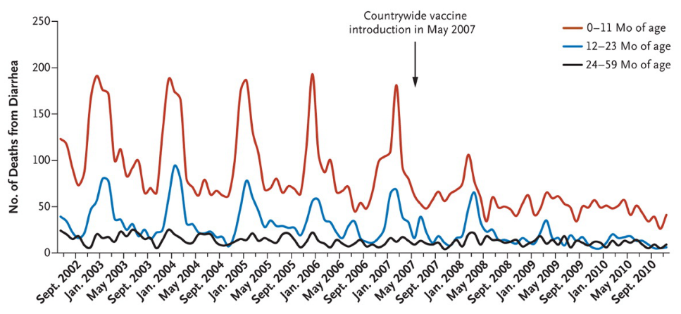
The rotavirus is the most common cause of diarrhea and causes 527,000 childhood deaths annually (2011 estimates). Many more become sick and are hospitalized.12
Mexico introduced the rotavirus vaccination between 2006 and 2007, and the following graph shows how quick and successful the countrywide vaccination was. According to the study, diarrhea mortality for children under the age of 5 fell by 56% over three years.
The graph shows the seasonal pattern of the disease and how the lifesaving effect of the vaccine affected different age groups.
Data comparing the prevalence of diseases before and after the introduction of different vaccinations in the US can be found in Roush and Murphy (2007)14. Here we provide a table summarizing their findings. As it can be seen, in most cases the reduction of cases has been close to 100%.
Number of diarrhea-related deaths among children 59 months of age or younger in Mexico by age group, July 2002 to December 2010 – Richardson, Parashar, and Patel (2011)13
Reduction of number of cases for vaccine-preventable diseases in the United States before and after the introduction of the vaccine – Roush and Murphy (2007)15
Disease Number of Prevaccine Cases Reduction of Cases after Vaccine Introduction Number of Prevaccine Deaths Reduction of Deaths after Vaccine Introduction
Diphteria 21,053 100% 1,822 100%
Measles 530,162 99.90% 440 100%
Mumps 155,760 95.90% 39 100%
Pertussis 185,120 92.20% 4,007 99.30%
Poliomyeltis, acute 19,794 100% 1,393 100%
Poliomyeltis, paralytic 16,316 100% 1,879 100%
Rubella 47,734 99.90% 17 100%
Congenital rubella syndrome 151 99.30% – –
Smallpox 29,005 100% 337 100%
Tetanus 539 92.90% 468 99.20%
Hepatitis A 102,035 87% 119 86.90%
Acute hepatitis B 53,063 80.10% 190 80.20%
Invasive (Haemophilus influenza type b) 19,950 > 99.8% 995 > 99.5%
Invasive (pneumococcal disease) 21,517 34.10% 1,650 25.4%
Varicella 3,472,352 85% 86 81.9%
| Disease | Number of Prevaccine Cases | Reduction of Cases after Vaccine Introduction | Number of Prevaccine Deaths | Reduction of Deaths after Vaccine Introduction |
|---|---|---|---|---|
| Diphteria | 21,053 | 100% | 1,822 | 100% |
| Measles | 530,162 | 99.90% | 440 | 100% |
| Mumps | 155,760 | 95.90% | 39 | 100% |
| Pertussis | 185,120 | 92.20% | 4,007 | 99.30% |
| Poliomyeltis, acute | 19,794 | 100% | 1,393 | 100% |
| Poliomyeltis, paralytic | 16,316 | 100% | 1,879 | 100% |
| Rubella | 47,734 | 99.90% | 17 | 100% |
| Congenital rubella syndrome | 151 | 99.30% | – | – |
| Smallpox | 29,005 | 100% | 337 | 100% |
| Tetanus | 539 | 92.90% | 468 | 99.20% |
| Hepatitis A | 102,035 | 87% | 119 | 86.90% |
| Acute hepatitis B | 53,063 | 80.10% | 190 | 80.20% |
| Invasive (Haemophilus influenza type b) | 19,950 | > 99.8% | 995 | > 99.5% |
| Invasive (pneumococcal disease) | 21,517 | 34.10% | 1,650 | 25.4% |
| Varicella | 3,472,352 | 85% | 86 | 81.9% |
Today smallpox is a disease of the past. The following map shows when smallpox was eradicated from each country. Parts of Africa, Southeast Asia, the Middle East and Brazil were the last places to have smallpox eradicated. But smallpox was eradicated from other parts of the world, especially Europe, far earlier. This suggests that slow eradication in some parts of the world was due primarily to weaker control systems and ineffective vaccination strategies.
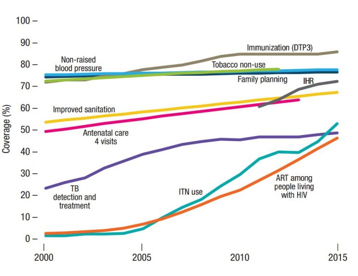
Essential health services cover a range of basic health provisions, such as detection and treatment of tuberculosis (TB), HIV treatment, family planning, sanitation and DTP3 immunization. The following chart from the WHO shows global coverage trends across the key tracer indicators of essential health services from 2000-2015.
In general, we see an overall increase in global coverage since 2000. However, some health services see a much steeper rise—these are often strongly linked to particular funding and resource efforts stemming from large public policies and coordinated civil-society interventions. Global coverage in tracer interventions against HIV, TB and malaria have shown the most significant increase—this is a strong reflection of the large increase in resources supplied through The Global Fund and the President’s Emergency Plan for AIDS Relief (PEPFAR).
Immunization (DTP3) coverage has also seen a considerable increase since 2000. This rise has been even more significant across particular regions. In Africa, for example, DTP3 coverage has increased by almost 50 percent since 2000—again, this is a strong reflection of increased funding in these areas from the global vaccine alliance (GAVI), the United Nations agency and additional donor funds.
Increases in coverage of maternal and child health services have typically been slower than that of HIV, TB, malaria and DTP3, but have still shown a steady increase since 2000. Like DTP3, this level of increase varies substantially by region; the World Bank reports that antenatal care coverage has increased by 30–60 percent in regions outside of Europe and the Americas.16
Trends in global coverage of tracer indicators of essential health services, 2000–2015.17
There are several factors necessary in ensuring everyone has access to essential medicines—first, they must be available, and secondly they must be affordable.
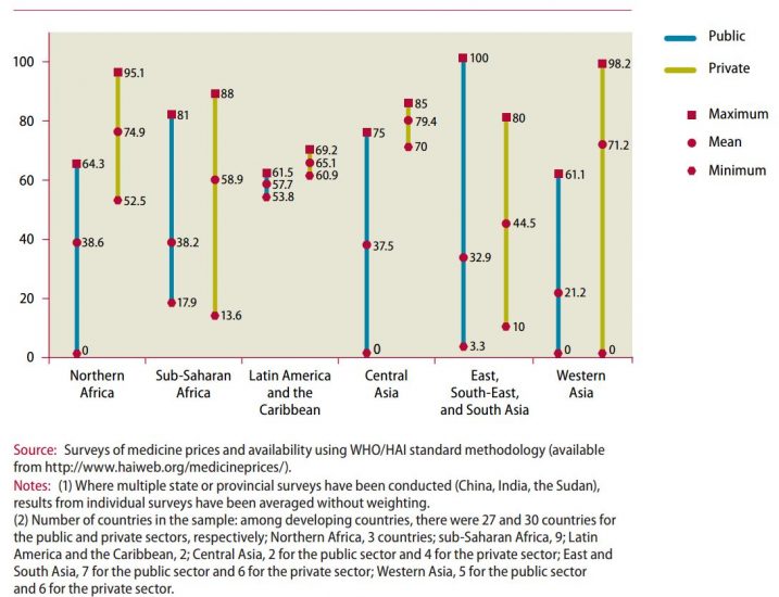
In the chart we see levels of medicine availability (from 2001-2007) within the public sector (blue line), and private sector (yellow line) across thirty developing countries. These are shown as the mean availability by region, with minimum and maximum values also shown.
There are several important trends to highlight. Firstly, medicine availability within the public sector in developing countries is low—only 35 percent on average across the 27 countries reported here. Availability within the private sector is consistently higher, however, this is also not guaranteed—on average, more than one-third of private providers had adequate access to essential medicines.18
This has important implications for access to essential medicines—especially for the poorest. Most health facilities in the public sector offer medicines at low-cost or free of charge, so are essential in healthcare provision for the poor. When medicines are not available in the public sector, individuals must try to access them privately; these are typically more expensive and unaffordable for many. As we discuss in our entry on Financing Healthcare, price-sensitivity is so critical in low-income countries, that small costs for important healthcare products make a vast difference in demand.
Availability of selected medicines in public and private health facilities between 2001 and 2007 (%)19
The World Development Indicators (WDI), published by the World Bank, are the main source of up-to-date cross-country data on life expectancy, child mortality and maternal mortality. Other more specialised data sources are listed and discussed in our entries on Life Expectancy and Child Mortality.
The main source of data on international healthcare expenditure is the World Health Organisation (WHO), more specifically the global health expenditure database. This is the same data published by the World Bank (World Development Indicators) and Gapminder. It is also the source of the health expenditure tables in the World Health Statistics Report and the WHO Global Health Observatory; and it is used as an input to the Development Assistance for Health Database from the IHME.20 You can read more about measurement, data quality and further details about available sources in the last two sections of our entry on Financing Healthcare.