In this entry we are giving an overview of the mortality of infants and children. In demography, child mortality refers to the death of children under the age of five while infant mortality refers to the death of those under the age of one.
Summary
- 15,000 children die every day – Child mortality is an everyday tragedy of enormous scale that rarely makes the headlines
- Child mortality rates have declined in all world regions, but the world is not on track to reach the Sustainable Development Goal for child mortality
- Before the Modern Revolution child mortality was very high in all societies that we have knowledge of – a quarter of all children died in the first year of life, almost half died before reaching the end of puberty
- Over the last two centuries all countries in the world have made very rapid progress against child mortality. From 1800 to 1950 global mortality has halved from around 43% to 22.5%. Since 1950 the mortality rate has declined five-fold to 4.5% in 2015. All countries in the world have benefitted from this progress
- In the past it was very common for parents to see children die, because both, child mortality rates and fertility rates were very high. In Europe in the mid 18th century parents lost on average between 3 and 4 of their children
Based on this overview we are asking where the world is today – where are children dying and what are they dying from?
- 5.4 million children died in 2017 – Where did these children die?
- Pneumonia is the most common cause of death, preterm births and neonatal disorders is second, and diarrheal diseases are third – What are children today dying from?
This is the basis for answering the question what can we do to make further progress against child mortality? We will extend this entry over the course of 2020.
All our charts on Child and Infant Mortality
Related research entries:
Causes of deaths – What are people dying from?
Fertility rate – How many children are born?
Life expectancy – What is the impact of child mortality for life expectancy? And how is mortality at later stages of life changing?
Maternal mortality – How many mothers are dying when giving birth to children?
Malaria – most malaria victims are children and it is one of the main causes of death of children
Related writing:
- The world is much better; The world is awful; The world can be much better
- Child mortality is an everyday tragedy of enormous scale that rarely makes the headlines
- Mortality in the past – around half died as children
- From commonplace to rarer tragedy – declining child mortality across the world
- The number of children dying each year has more than halved since 1990
- Child mortality: achieving the global goal for 2030 would be a huge achievement – but we are currently far away
- Net Results: We are winning the fight against malaria and you can help
- Malaria was common across half the world – since then it has been eliminated in many regions
- Where are children dying in the world?
- What are children dying from and what can we do about it?
- Global child mortality: it is hard to overestimate both the immensity of the tragedy, and the progress the world has made
Global Health – See where the world stands on Goal 3 in our Sustainable Goals Tracker
Child mortality today is the lowest it has ever been. In less than three decades child mortality has more than halved — from 12.5 million in 1990 to 5.2 million in 2019. This is a huge accomplishment that should not be overlooked.

Of course, the death of every child is an enormous tragedy, and in many countries far too many children die because of causes we know how to prevent and treat. As the map here shows, today the highest child mortality rates are in Sub-Saharan Africa, where we still have countries with child mortality rates greater than 10% — this means that one out of 10 children born never reach their 5th birthday.

Child mortality is an everyday tragedy of enormous scale that rarely makes the headlines
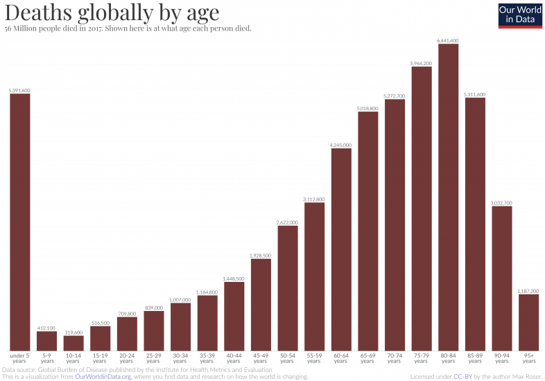
56 million people in the world died in 2017. How old were they when their lives ended?
The answer can be seen in the bar chart. It shows all deaths in the world by age in five-year age groups, starting with the youngest on the left towards the oldest age group (95+ years) on the right.
What stands out is the death toll for the very youngest age-group. 5.4 million children died before they had their fifth birthday. On any average day, that’s 15,000 young children.
The suffering and dying of children remains immense, yet these daily tragedies continue without receiving the attention this injustice deserves. A comparison of the tragedy of child deaths with those tragedies that do receive public attention puts it in perspective. A large jumbo jet can carry up to 620 passengers.1
The number of child deaths is that of 24 jumbo jet crashes, with only children on board, every single day.
Single events – such as plane crashes – always make the headlines. Daily tragedies – even the worst ones like the deaths of thousands of children – never make the headlines.
Every case of a family losing a child is a tragedy, regardless of how common or uncommon the cause. Spectacular events that grab global attention in the media are not more important than everyday human suffering. But unfortunately this is not how our minds and our media work. What we focus our attention on are either the spectacular tragedies (natural disasters, terrorist attacks, crime) or new problems (fake news, risks from automation). The first category keeps the breaking news cycle running, the second category keeps the op-ed writers employed. But in many aspects the biggest threats to our lives are the same threats that all the generations that came before us have faced. And this seems unfortunately to be true for what kills children around the world; it’s neither new nor spectacular.
A newspaper that would cover the most important facts about the last 24 hours would cover the 15,000 child deaths on its cover page every day.
Child mortality: achieving the global goal for 2030 would be a huge achievement – but we are currently far away
Every country in the world agreed to reach the UN’s Sustainable Development Goals (SDGs).2
Goal 3.2 is to reduce the child mortality rate to at least as low as 2.5% in all countries by 2030. This would mean that more than 97.5% of all newborns would survive the first five years of their life no matter where they are born.
We are currently far away from the goal for 2030. Globally 3.9% of all children die before reaching the age of five, which means that on average 15,000 children die every day.3
And the visualization shows that while the child mortality rate declined around the world there are still many countries in which the mortality rate is higher than 2.5%.

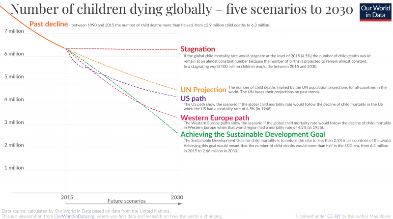
The visualization shows five scenarios for the 15-year period of the SDG era to answer this question.
Stagnation in child health would mean 100 million child deaths in the SDG era. The number of births in the world is expected to stagnate between 2015 and 2030 at around 140 million births per year. If we assume the global child mortality rate to remain at the level it was at the beginning of the SDG era (4.5%) then we would live in a world with 6.3 million child deaths every year – 100 million child deaths until 2030.4
Stagnation, however, is not what global health researchers expect. Based on past trends and levels in 2015 the UN Population Division made projections for the number of births and the mortality rate of children in all countries of the world. According to these projections the number of child deaths will be almost two million lower in 2030 than in a stagnating world: 4.5 million child deaths. This improvement of child health would still mean terrible suffering: 86 million child deaths in the SDG era.
And while these UN projections expect a further improvement of global child health this trajectory would fall short of reaching the SDG. The scenario in green shows what it would mean to reach the SDGs. In this scenario I made a projection in which all countries would reduce child mortality to at least 2.5% and meet goal 3.2.5 Reaching the SDG would mean again almost 2 million fewer child deaths when compared with the UN projections.
Some suggest that the UN goals are set in a way that makes them easy to achieve. The motivation is supposedly that the UN defined goals which are easy to reach so that the international organization looks good after achieving them. This is not true. Just how ambitious the child mortality goal is becomes clear when you see it in historical context: The scenario called ‘US path’ shows what would happen to the global child mortality rate if it would follow the decline of child mortality in the US when the US had a mortality rate of 4.5% (in 1946). And the ‘Western Europe path’ plays out what would happen if the world would follow the path Western Europe took when it was at that level.
The SDG goal is much more ambitious than what the richest regions in the world have achieved when they had the same level of child health.
We know that it is possible to change the world. Two hundred years ago the child mortality rate was extremely high around the world – more than 40% of all children died. Since then the child mortality rate has declined more than 10-fold. In ‘The world is much better; The world is awful; The world can be much better‘ I’ve written about how we can think about the big gap between the current state of the world and what we know is possible and the big gap between the terrible living conditions in the past and the improvements since then. Because we need to further reduce child deaths we are studying the causes of death of children today and how it was possible to improve child health so very substantially in the past in our entry on child mortality.
We are currently far away from reaching the global goal for child mortality. Achieving it, however, is tremendously important – it would spare millions of families one of the most horrible tragedies anyone can imagine.
Mortality in the past – around half died as children
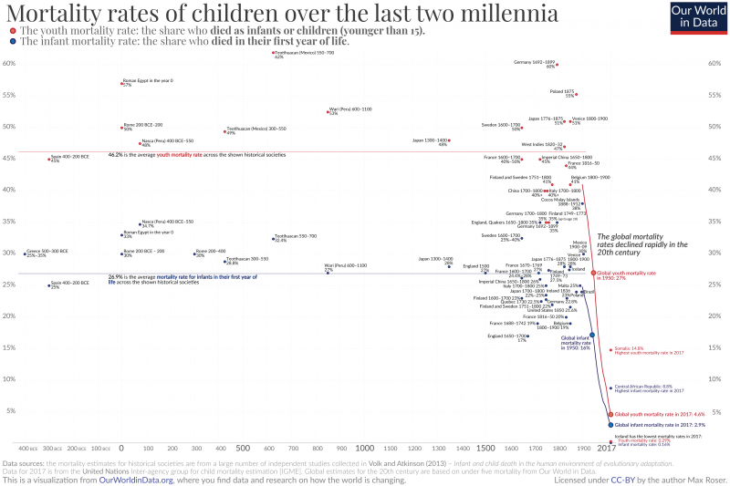
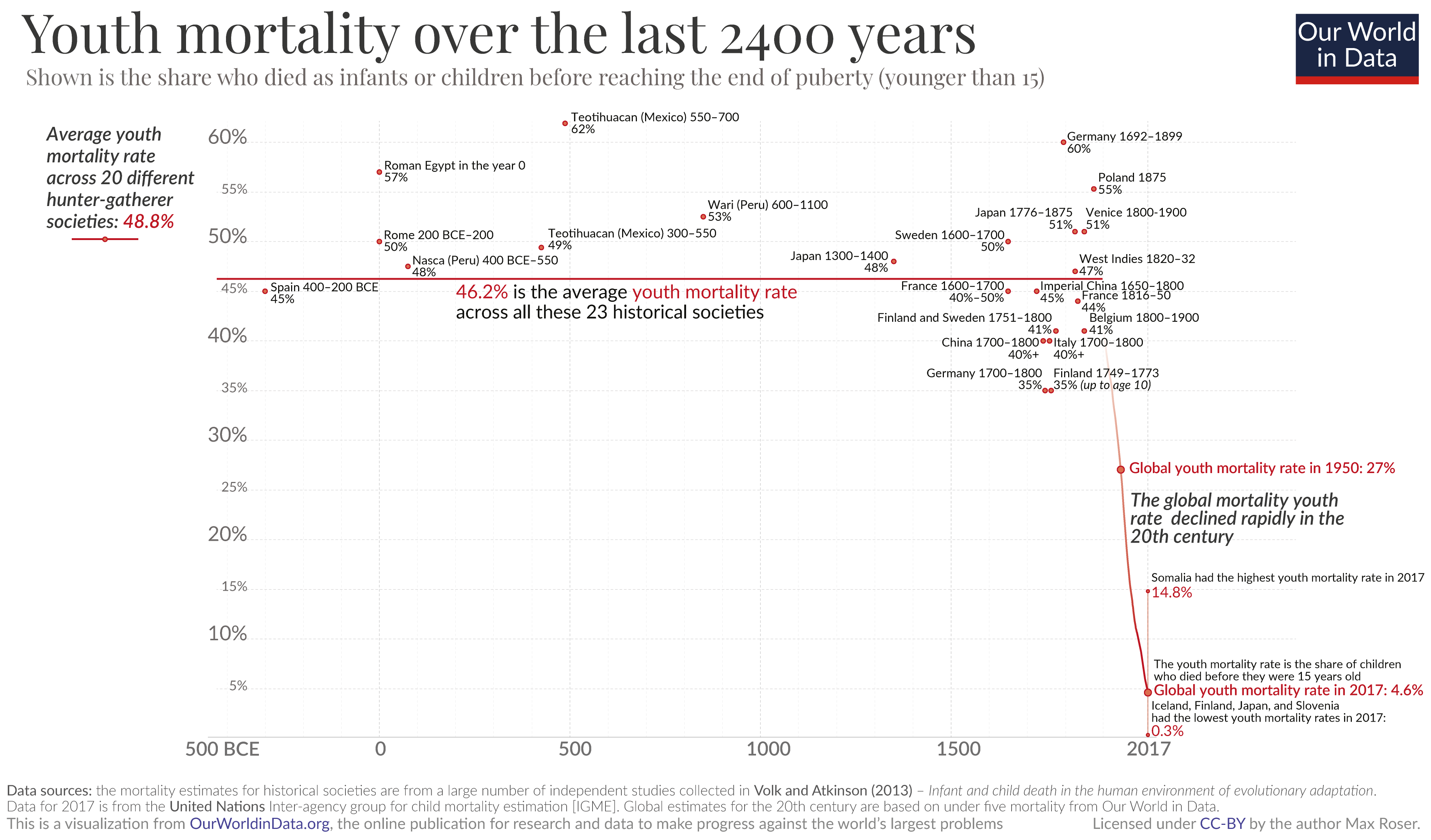
What was the mortality rate in the past? Anthony Volk and Jeremy Atkinson6 set out to answer this question. They brought together quantitative estimates on mortality at a young age from a wide range of geographic locations and cultures, going back many centuries.
The authors report mortality rates relative to two different age cut-offs:
– The infant mortality rate measures the share who died in their first year of life.
– The youth mortality rate measures the share who died before reaching “approximate sexual maturity at age 15”.7
This visualization shows the historical estimates Volk and Atkinson brought together from a large number of different studies. Shown with the blue marks are estimates of the share of newborns that died in the first year of life – the infant mortality rate. And shown with the red marks you see different estimates of the share that never reached adulthood – what we here refer to as the ‘youth mortality rate’.
Across the entire historical sample the authors found that on average, 26.9% of newborns died in their first year of life and 46.2% died before they reached adulthood. Two estimates that are easy to remember: Around a quarter died in the first year of life. Around half died as children.
What is striking about the historical estimates is how similar the mortality rates for children were across this very wide range of 43 historical cultures. Whether in Ancient Rome; Ancient Greece; the pre-Columbian Americas; Medieval Japan or Medieval England; the European Renaissance; or Imperial China: Every fourth newborn died in the first year of life. One out of two died in childhood.
The available evidence for the mortality rates of children in hunter-gatherer societies and also for our closest relatives – Neanderthals and primates – I summarize at the end of this post.
On the very right of the chart you see the statistics on child health in the world today: The global infant mortality rate is now 2.9%. And 4.6% die before reaching the age of 15.
The global mortality rates over the course of the 20th century are also shown in the chart. Just as recently as 1950 the global mortality rates were five times higher. We have seen a very steep decline during our lifetimes.
The chances of survival for a newborn today are around 10-times higher than the past. But in some countries mortality rates are still much higher than the world average. The country with the highest infant mortality rate is the Central African Republic where close to 9% of all infants die.
The country with the lowest infant mortality rate today is Iceland at 0.16%. The chances of an infant surviving there are 170-times higher than in the past.
Even on the basis of many dozen studies we only have some snapshots of the long history of our species. Could they all mislead us to believe that mortality rates were higher than they actually were?
There is another piece of evidence to consider that suggests the mortality of children was in fact very high in much of humanity’s history: birth rates were high, but population growth was close to zero.
The fertility rate was commonly higher than 6 children per woman on average, as we discuss here. A fertility rate of 4 children per woman would imply a doubling of the population size each generation; a rate of 6 children per woman would imply a tripling from one generation to the next. But instead population barely increased: From 10,000 BCE to 1700 the world population grew by only 0.04% annually. A high number of births without a rapid increase of the population can only be explained by one sad reality: a high share of children died before they could have had children themselves.
Volk and Atkinson also explain that their historical mortality rates “should be viewed as conservative estimates that generally err toward underestimating actual historic rates”. A first reason is that death records were often not produced for children, especially if children died soon after birth. A second reason they cite is that child burial remains, another important source, are often incomplete “due to the more rapid decay of children’s smaller physical remains and the lower frequency of elaborate infant burials”.8
And lastly, we find that a large number of independent studies for very different societies, locations, and times come to surprisingly similar assessments: all point to very high mortality rates for children. For societies that lived thousands of kilometers away from each other and were separated by thousands of years of history, mortality in childhood was terribly high in all of them. The researchers find that on average a quarter of infants died before their first birthday and half of all children died before they reached puberty.
How does the historical data compare with the world today? Globally 95.4% of all children survive the first 15 years of life.
This is a dramatic change from the past. As we’ve seen above: The research suggests that in our long history the chances for a child to survive were about fifty-fifty.
The map shows the mortality up to the age of 15 in every country today. By clicking on any country in this map you see the change over time. You will find that the mortality rate declined in every country around the world.
But you also see that in some parts of the world, youth mortality is still very common. Somalia – on the Horn of Africa – is the country with the highest rate at 14.8%.
And the map also shows the regions with the best health. In the richest parts of the world deaths of children became very rare. In Iceland, the country with the lowest youth mortality, the chances a child survives their first 15 years of life are 99.71%.
The second metric we studied above was the infant mortality rate in the first year of life. Across the historical societies this rate was around a quarter; the global rate today is 2.9%. In our map for infant mortality you find the data for every country in the the world.
Today’s mortality rates of children are still unacceptably high, but the progress that humanity has achieved is substantial. Our ancestors could have surely not imagined what is reality today. And for me this progress is one of the greatest achievements of humanity.

Additional information
Mortality at young ages in hunter gatherer societies
The historical record the authors investigated goes back 2500 years. What about prehistory when our ancestors lived as hunter-gatherers?
Good evidence here is much harder to come by. To study mortality at a young age in prehistoric societies the researchers need to mostly rely on evidence from modern hunter-gatherers. Here, one needs to be cautious of how reflective modern societies are of the past. This is because recent hunter-gatherers might have been in exchange with surrounding societies and “often currently live in marginalized territories”, as the authors say. Both of these could matter for mortality levels.
To account for this, Volk and Atkinson have attempted to only include hunter-gatherers that are best representative for the living conditions in the past; they limited their sample “only to those populations that had not been significantly influenced by contact with modern resources that could directly influence mortality rates, such as education, food, medicine, birth control, and/or sanitation.”
Again, the researchers find very similar mortality rates across their sample of 20 different studies on hunter-gatherer societies from very different locations: The average infant mortality rate (younger than 1) was 26.8% and the average mortality before puberty, 48.8%. Almost exactly the same as the historical sample discussed above.
All but one of these studied societies are modern hunter-gatherers. The one study on mortality rates of paleolithic hunter-gatherers investigates the famous Indian Knoll archaeological site from around 2,500 BCE, located in today’s area of Kentucky.9
For this community the estimates suggest that mortality at a young age was even higher than the average for modern-day hunter-gatherers: 30% died in their first year of life, and 56% did not survive to puberty.
Neanderthals and primates – the mortality of our closest relatives
Going beyond our own species (homo sapiens), researchers have also attempted to measure the mortality rates at young ages for our closest relatives.
Studies that focussed on the Neanderthals, our very closest relatives who lived within Eurasia from circa 400,000 until 40,000 years ago, suggest that they suffered infant mortality rates similar to our species before modernization: it is estimated that around 28% died in the first year of life.10
Atkinson and Volk also compared human child mortality rates across species with other primates. Bringing together many different sources the authors find the mortality rates of young chimpanzees and gorillas to be similar to the mortality rates of humans of the past, while other primates differ: orangutans and bonobos appear to have somewhat lower mortality rates and baboons, macaques, colobus monkeys, vervet monkeys, lemurs and other primates suffer from higher mortality rates.
Child mortality around the world since 1800
Since the beginning of the age of the Enlightenment the mortality of children has declined rapidly. Child mortality in rich countries today is much lower than 1%. This is a very recent development and was only reached after a hundredfold decline in child mortality in these countries. In early-modern times, child mortality was very high; in 18th century Sweden every third child died, and in 19th century Germany every second child died. With declining poverty and increasing knowledge and service in the health sector, child mortality around the world is declining very rapidly: Global child mortality fell from 19% in 1960 to just below 4% in 2017; while 4% is still too high, this is a substantial achievement.
One reason why we do not hear about how global living conditions are improving in the media is that these are the slow processes that never make the headlines: A century ago every third child died before it was five years old, almost a century later the child mortality rate has fallen to 4%. We will not learn about this development from the news as such a slow development is never fast enough to make a headline. The headline that could have been published on every average day in the last century is “The global child mortality rate fell by 0.0008 percentage points since yesterday”.11
Big countries like Brazil and China reduced their child mortality rates 10-fold over the last 4 decades. Other countries – especially in Africa – still have high child mortality rates, but it’s not true that these countries are not making progress. In Sub-Saharan Africa, child mortality has been continuously falling for the last 50 years (1 in 4 children died in the early 60s – today it is less than 1 in 10). Over the last decade this improvement has been happening faster than ever before. Rising prosperity, rising education and the spread of health care around the globe are the major drivers of this progress.

There are few events more tragic than the loss of a child. It’s therefore hard to grasp just how common child deaths were for almost all of our history.
In the map here we’ve visualized the estimated child mortality rate – the share of children (born alive) who died before reaching their 5th birthday – in 1800, 1950 and 2015.
1800: Demographic research suggests that through to at least the year 1800 more than one-third of children failed to reach the age of five. Despite estimates in 1800 coming with substantial uncertainty, it’s expected that in some countries rates could have been as high as every 2nd child. Let’s think about what this meant for parents of this period. The average woman in 1800 had between 5 to 7 children.12
Parents probably lost 2 or 3 of their children in the first few years of life. Such loss was not a rare occurrence but the norm for most people across the world.
1950: By 1950, the outlook has changed dramatically — but only for some. For the richest countries at the time — across Europe, Australasia, North America, and some parts of South America — child mortality had fallen to less than 5 percent (1-in-20). The fertility rate across these countries had also fallen to around 2 to 3 children per woman. Major improvements in living standards, medical knowledge and care, nutrition, water and sanitation, and treatment of disease had transformed outcomes for mothers and children. For the first time in millennia, most parents would not lose a child. Child mortality was still fairly common, but no longer the norm.
But 1950 was also a divided world. Child mortality rates across the rest of the world were still unimaginably high. With one-in-three children (sometimes higher) dying in their first few years, most parents across Africa, Asia and much of South America were probably still losing several children.
2015: If we fast-forward to 2015 we see how far the world has progressed. Child mortality continued to fall across Europe, North America and Australasia; in 2015 around 1-in-200 children died before their 5th birthday. But the rest of the world has also seen dramatic improvements. Many countries across South America, Asia and Africa have reduced child mortality to 1 to 2 percent (between 1-in-50 and 1-in-100). China reduced child deaths from 1-in-3 to 1-in-100; India from 1-in-4 to 1-in-20; Kenya from 1-in-3 to 1-in-20; and Tanzania from greater than 1-in-3 (40 percent) to 1-in-20. The countries where child mortality is highest today have comparable rates to many countries across Europe in 1950.
Many of us are not aware that child mortality has declined substantially everywhere and still imagine the divided world as it was in 1950. A divided world where progress in the richest countries was dynamic, but static and persistently bad elsewhere.
As the chart shows, substantial declines in child mortality have occurred across all regions. Average rates in Africa are now lower than the European average in 1950.
- global rates fell five-fold from 22.5 percent to 4.5 percent;
- European rates from 11 to 0.6 percent;
- North American rates from 3.8 to 0.6 percent;
- Oceania rates from 9 to 2.5 percent;
- Latin American rates almost ten-fold from 20 to 2.4 percent;
- Asian rates from 1-in-4 children (25 percent) to below 1-in-20 (3.5 percent);
- African rates from 1-in-3 children (32 percent) to below 1-in-12 (8 percent).
The frequency of child deaths today (as high as 1-in-7 in the handful of poorest cases) is still tragically high. We must do better. But we also know that we can do better. History has shown that no country is an exception to this.

Child mortality from the parents perspective
Here ends the joy of my life’ ends the diary entry of John Evelyn after the writer’s son Richard died on January 27,1658. Evelyn describes in moving words the “inexpressible grief and affliction” that he and his wife Mary suffered. Richard was their first-born child “5 years and 3 days old onely, but at that tender age a prodigy for witt and understanding; for beauty of body a very angel; for endowment of mind of incredible and rare hopes.”13
Mary and John Evelyn continued to have children together. They had another son, also named Richard, who died at an even younger age, as a newborn. Again they were heartbroken; but it wasn’t the end of it. Of their eight children, seven died.
The diary records of other parents tell us of similar hardship. The English politician and barrister William Brownlow and his wife Elizabeth Duncombe had 19 children together. Thirteen of them died. Some periods of their life were particularly tragic: in just eight years between 1638 and 1646 they had seven children. All of them – Thomas, Francis, Benjamin, George, James, Maria, and Anne – died in a row. The parents’ heartbreak is obvious from William’s diary records: when George, their fifteenth child, died in 1842 his father wrote “Thou O God hast broken me asunder and shaken me to pieces”.14
The death of a child has always been the most tragic calamity mothers and fathers could experience.15 How common was it that parents saw their children die?
The visualization presents the best estimates available.16 Shown is the data for Sweden, but you can switch the view to any other country in the world using the option ‘Change country’. I am showing Sweden because it is a country for which we have particularly good long-run demographic data. Sweden was the first country to establish an office for population statistics: the Tabellverket, which was founded in 1749.17
The total height of the orange and purple area shows the average number of children born per woman – the fertility rate – up to the present.
The area in purple shows the answer to our question; it is the average number of children who died within the first five years of life, per woman. I calculated this by multiplying the number of children per woman by the mortality rate of children under five.
Throughout most of the 19th century Swedish women gave, on average, birth to more than four children. Child mortality in this period was around one-in-four, and at times much higher, so that on average every woman lost one child under the age of five.
Every woman losing one child on average is terrible, but in fact this number underestimates the average mother’s experience for three reasons: First, many children died when they were older than five – just as the Evelyn’s son, Richard; second, this data presents the average number of children per woman, but not every woman was a mother meaning many mothers had (and lost) more children; and third, the data presented here is restricted to the period for which we have better data and these are mostly periods in which the mortality of children had already declined (this is certainly the case for Sweden where the mortality rate was higher than one-in-four in the 18th century).18
Going further back in time is possible for some countries – I’ve done some calculations using estimates from a number of sources. In Sweden, in the mid 18th century, the fertility rate for married women was 7.6 children and the share of children who died before the age of 15 was 44%.19 This means that at the time, the average Swedish mother lost around 3.3 children. For other countries the estimates for the 18th century are similar. In France the average married woman had 8 children and saw around 3.6 of them die; and in the region that is Germany today the average married woman probably saw more than 4 of her children die.20
With the decline of child mortality and fertility over the last couple of centuries this has changed dramatically, and in rich countries like Sweden these tragic events have become very rare. As the data in the chart shows, for Sweden the average has gone down to 0.006 child deaths per woman. An experience that just a few generations ago was so common, and that almost every woman suffered through it, is now so rare that today it is only a reality for 1-in-180 Swedish women.
In this visualization you can change the country for which this data is shown and explore the trends in countries around the world. To compare the number of children lost per woman for several countries – and see the data on a world map – you can use this visualisation. In most world regions it has become rare for parents to lose a child, but this is unfortunately not true everywhere.

The experience of Mary and John Evelyn, and Elizabeth Duncombe and her husband William Brownlow are heartbreaking, but in our long past seeing children die was part of almost all parents’ experience and often not only once.
When I write about child mortality some commentators respond by speculating that in times and places where many children die the loss of a child does not hurt parents as much. The mortality that these two couples experienced was higher than the average – which was likely between two and four dead children – and show that parents did not, in any circumstances, find it bearable to lose a child. There is no reason to suppose – no evidence anywhere, including that of common sense – that parents were ever, at any point in the past, indifferent to the happiness and well-being of their children.
Losing a child has always been terrible for parents, whether it was as common as it was in the past or much rarer as it is today.
Global picture of child mortality from 1800 until today
The chart shows the child mortality rate for the entire world population at 4 different points in time.
How to read the following graph: On the x-axis you find the cumulative share of the world population. The countries are ordered along the x-axis descending by the country’s child mortality rate. This makes it possible to see the child mortality rate for each country. Some countries are labelled, but not all. It is also possible to see which share of the world population had a child mortality rate lower than a given level. For the orange line – referring to data from 1950-60 – we see that close to 70% of the world population have a child mortality rate of higher than 10% back then.
For 1800 (red line), you see that the countries on the very left – Yemen, India, and others that are not labelled – had a child mortality rate higher than 50%. Every second child died before the age of 5. On the very right of the red line you see that in 1800 the best-off countries in the world had a child mortality rate higher than 30%: Every third child died in the countries with the best health.
Looking at the orange line, you see that in the following 150 years some countries substantially reduced their child mortality rate: 30% of the world population has a child mortality under 10%. Other countries were stuck in poor health: More than half of the world (57%) had child mortality that were still higher than 20%. The world was clearly divided into developed and developing countries. The rapid progress of the industrialized countries had the consequence that the distribution of global health was hugely unequal.
The latest data refers to 2013. Global health has improved hugely. Particularly those countries that had the worst health in the 1950s experienced the most dramatic improvements. China for example reduced its child mortality from 28.4% to now 1.3%. The consequence of the faster progress in former developing countries is that global health inequality has fallen since the 1950s.
The global average child mortality rate (weighted population) was 43.3% in 1800 and now fell to 3.4%. Focusing at global inequality we see that in 1800 health was bad around the world, in the 1950s the world became unequal, and today we are back to higher equality but on a much higher level.
Comparing the position of countries on the red, orange, green and blue lines also makes it possible to see the change in a single countries: In 1800 every second child in South Korea died, in the 1950s the rate was halved (26%), and today it is down to 2.7%.
World population by level of child mortality over time, 1800-201321
In the chart we compare the period over which it took a range of countries to reduce child mortality from one-third (1-in-3) of children dying before their 5th birthday, down to 1-in-20 (5%). Also noted here is the start and end date by which this was achieved.22
Here we see that countries which industrialized rapidly during the 19th century (many countries across Europe), it took more than century (as high as 148 years in the case of the UK) for child mortality to fall from 1-in-3 to 1-in-20. If we look at countries who achieved this in the late 20th or early 21st century, we see that this reduction was much faster. Many (across all regions) achieved this in under 50 years. South Korea achieved it in only 25 years.
Whilst progress may at times seem persistently slow, we see that fast catch-up improvements are possible. What it took today’s rich countries centuries to achieve, many are now achieving within decades.
Where in the world are children dying?
5.4 million children under five years old died in 2017. The fact that in those countries with the best health, child mortality rates are 10-times lower than the global average suggests that most of these child deaths are preventable.
To reduce the number of children dying we need to know two things: where they’re dying and what they’re dying from. Here we take a look at the first question: where in the world are children dying?
We mapped the global distribution of child deaths in the somewhat unusual visualization. This type of visualization is called a treemap. Each rectangle’s size corresponds to the number of child deaths in a particular region.
The treemap shows the distribution of child deaths in 1990 and 2017:
- The number of child deaths declined in all but 14 countries from 1990 to 2017: for these countries, the outer box represents 1990 and inner box marks 2017.
- There are 14 countries where the number of child deaths increased: in this case only a single box is shown, representing deaths in 2017.23
At a time during which the number of births increased globally, the number of child deaths fell. In 1990, 12.6 million under-5s died; this more than halved to 5.4 million until 2017. Every world region also saw a decline.
Some countries have achieved a dramatic reduction:
- In India, the number of child deaths fell from 3.4 million to one million;
- In China it fell nine-fold from 1.4 million to less than 160,000;
- In Bangladesh more than five-fold from over 500,000 to 100,000;
- In Ethiopia from 439,000 to 189,000;
- And in Brazil from 235,000 to 43,000.24
But, some of the countries which have seen the greatest progress are still those where most children are dying today. India has suffered the most child deaths: one million in 2017. This was followed by Nigeria (714,000); Pakistan (400,000); the Democratic Republic of Congo (300,000); Ethiopia (189,000); and China (156,000).
The total number of children dying depends on two factors: the likelihood a newborn will die in the first years of life and the number of children born. Countries where the most children die are not necessarily those where a child’s chances of dying are highest. Here is the map of the mortality rate of children. India has a child mortality rate of around 4% – the same as the global average – and three times lower than some of the highest countries in the world. But it has, by far, the largest number of children under five years old.
This matters for the possibility to make progress in the future. India – for example – doesn’t only have a falling child mortality rate, but has also passed ‘peak child’. The number of children under five years old has already peaked and is now falling: in the coming decades, its under-5 population will decline. Fewer children and a lower likelihood of child mortality means we’d expect the total number of children dying in India to fall quickly.
Our concern will then turn towards countries where the chances of child mortality is high, and the number of births increasing. Countries where children are most likely to die – Somalia, Chad, Central African Republic, Sierra Leone, Nigeria, and Mali – will all have an increasing number of children in the coming decades. Progress on reducing child deaths will here therefore become a race between declining child mortality rates and an increasing number of children.
But the two runners in the race are not independent: one of the reasons couples have many children is because they do – or expect to – lose some of them early in life. Our progress on reducing child deaths can therefore be amplified if falling child mortality leads to falling fertility rates.
We know that most child deaths today are preventable. They result from causes we know we can tackle. How do we know this? Because we already averted many millions of child deaths in the past few decades. Between 1990 and 2017 the number of children dying each year fell by 7.2 million. By stopping those we know are preventable, we could save at least another 5 million children every year. We can reach a world with many fewer child deaths than ever before.
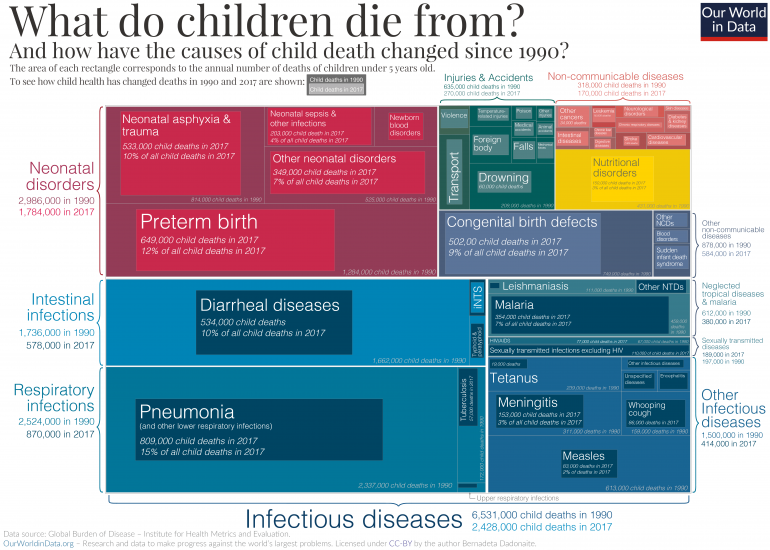
What are children dying from?
In the chart presented here we see the major causes of death of children under 5 in 2017 compared to 1990. This type of chart is called a treemap, where the area of each box represents the total number of child deaths for each specific cause. The total colored area represents the total number of child deaths in 1990: 11.8 million children died back then, according to the Institute for Health Metrics and Evaluation.25
As the treemap shows, the boxes representing the numbers for child deaths in 2017 are almost always smaller – reflecting the fact that deaths from almost all causes have fallen significantly.26
There are two major exceptions: the number of deaths from AIDS and the deaths caused by invasive non-typhoidal salmonella (iNTS) has increased. Although those numbers were higher in 2017 than 1990, the deaths from both causes have been decreasing since their peak in 2005.
While the total number of child deaths has more than halved from 11.8 million in 1990 to 5.4 million in 2017, the major causes of child deaths have largely remained the same.
15% of all child deaths in 2017 – Pneumonia and other lower respiratory diseases
Almost every seventh child who died in 2017 died of a lower respiratory infection (LRI), which has remained the leading cause of mortality over the past three decades. Pneumonia is the leading LRI. It is caused primarily by bacterial infections.27
12% of deaths – Preterm births and neonatal disorders
When we talk about child mortality we usually refer to mortality of children under the age of 5. But of all children who die, most do not come close to their fifth birthday: the younger a child is, the higher the risk of mortality. Three times as many children die in the first year of their lives than in the next four years. And the majority of children who die in their first year die in the neonatal period, the first 27 days after birth.
Premature birth (being born before the 37th week of gestation) is one of the major determinants of neonatal mortality and therefore complications arising from preterm birth are usually grouped with the neonatal disorders, as we did in our chart.28
Children born prematurely are at high risk of having birth injuries, underdeveloped organ failures, and attracting infectious diseases.29
10% of deaths – Diarrheal diseases
Every tenth child that died in 2017 died because of some diarrheal disease – rotavirus infection, cholera, shigellosis and other infectious diseases that result in diarrhea. The World Health Organisation (WHO) says that diarrheal diseases are “both treatable and preventable”.30
Clearly, the fact that diarrheal diseases are the third leading cause of child mortality is simply inexcusable. As we will discuss in another post in this series, an increased coverage of oral rehydration therapy – an incredibly simple treatment for diarrhea – could help to prevent many of these deaths.
9% of deaths – Congenital defects
While classed separately from neonatal disorders, congenital birth defects are significant contributors to infant mortality as well.31 Congenital defects are defined as physical or genetic abnormalities present at birth and include neural tube defects, heart defects, Down syndrome, microcephaly and others.
45% of deaths – Infectious diseases
Infectious diseases have always been one of the major causes of child deaths, but the success of vaccination campaigns and antibiotic availability has done a great deal to reduce mortality from infectious diseases. Measles vaccination is a perfect example: the number of measles cases has shrunk by 86% since 1990. The WHO has estimated that between 2000 and 2017 measles vaccination has prevented 21.1 million deaths across Africa.32
Today we also have vaccines available for tuberculosis, meningitis, hepatitis, and whooping cough. The best way to protect children against malaria today is to provide insecticide treated bednets, but a new malaria vaccine implementation program is also underway. 33
The chart shows the annual change in the number of child deaths from leading causes from 1990 onwards. Note that you can view this data for any country using the “change country” button on the interactive chart.
Here we see a dramatic decline in deaths from several causes: lower respiratory infections (pneumonia); preterm birth complications; and diarrheal diseases saw dramatic declines globally in recent decades. Vaccine coverage also saw a dramatic decline in deaths from measles.
Child deaths from malaria and HIV/AIDS increased over the 1990s and into the 21st century. However, more effective prevention for malaria in the form of bednets; and progress on prevention of mother-to-child transmission of HIV (PMCT) means these are now also in decline.

In the following sections we take a closer look at the leading causes of child mortality one-by-one. In doing so, we also try to understand how can we reduce the number of children dying from each cause using treatments and interventions which are already available at our disposal.
Pneumonia is the leading cause of child mortality
In the visualization here we see the global number of deaths from pneumonia34 by age group.
15% of all child deaths in 2017 were caused by pneumonia and it is therefore the leading cause of death of children (see our discussion here).
The number of children dying from pneumonia has decreased substantially over the past three decades. In 1990, more than two million children died from pneumonia every year. By 2017, this number had fallen by almost two-thirds.
Improvements in the major risk factors such as childhood wasting, air pollution, and poor sanitation, falling global poverty, and a better availability of health technology such as pneumococcal vaccines and antibiotics have all contributed to this decline.
While the death rate for old people fell slightly, the number of deaths of people who are 70 years and older increased. 1.13 million, who died from pneumonia where in this age group. This is because the number of people who reached the age of 70 increased very strongly globally as we show in our entry on the changing global age structure.

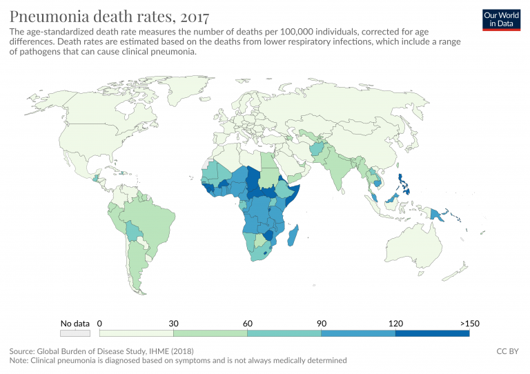
Where are children dying from pneumonia?
The map shows the number of child deaths due to pneumonia per 100,000 children per year.
It shows that children are most likely to die from pneumonia across Sub-Saharan Africa and South Asia. The deaths in just 5 countries — India, Nigeria, Pakistan, the Democratic Republic of Congo, and Ethiopia – accounted for more than half of all deaths from childhood pneumonia in 2017.
For this reason Kevin Watkins and Devi Sridhar called pneumonia “the ultimate disease of poverty” in a 2018 comment in the journal The Lancet.35 There is a very strong correlation between a country’s income and the child mortality rate from pneumonia as the scatter plot shows.
Pneumonia is not a disease that easily spreads across borders, its transmission is generally restricted to local communities and it can be controlled if basic health measures are available. The disease is therefore most common in poor places where healthcare infrastructure is lacking and people are least able to afford the treatment.36


Why are children still getting pneumonia?
To understand how we can reduce the number of children dying from pneumonia we need to understand both prevention and treatment.
In the chart we show the number of child deaths from pneumonia which are attributed to various risk factors.
Undernutrition is the major contributor to pneumonia mortality
Here we see that childhood undernutrition, especially so called ‘child wasting’ (children who have a weight too low for their height), is the biggest risk factor for pneumonia in children.37 It contributed to 53% of pneumonia deaths in 2017. Without sufficient energy intake the body cannot cope with increased energy demands required to fight off the infection.
A literature review of pneumonia in malnourished children by Mohammod Jobayer Chisti and colleagues found that undernourished children are between two and four times more likely to be admitted to hospital due to pneumonia and up to 15 times more likely to die from it.38
Air pollution and second-hand smoke increase the risk of getting pneumonia
Indoor air pollution was the risk factor that is estimated to have lead to 29% of pneumonia deaths in 2017. Outdoor air pollution was responsible for another 18% of all deaths.
Studies have shown that high indoor air pollution in households can double the chances a child develops pneumonia and makes recovery less successful.39 One of the underlying reasons for why this is the case is that the small polluting particles impair the immune system’s ability to fight and clear the infection.
Laura Jones et al. (2011) reviewed studies which assessed the impact of secondhand smoke on children, and concluded that children who live in households with smoking parents are more likely to acquire pneumonia as well as other respiratory illnesses. A Global Burden of Disease study by Mattias Öberg et al. has estimated that in 2004, globally around 40% of children lived in households where at least one close relative smoked.40 The data shown here suggests that the exposure to secondhand smoke led to 61,000 deaths among children under 5 from lower respiratory diseases in 2017.
The risk of pneumonia is higher for children with HIV
Exposure to other pathogens such as measles and HIV also increases the risk of pneumonia in children.
When children who are infected with HIV develop AIDS – which weakens their immune system – their chances of dying from pneumonia increase significantly. A study by Evropi Theodoratou et al., published in Lancet Infectious Diseases, found that children with HIV have a seven times greater risk of dying from pneumonia compared to those without it.41
The same study also showed that the proportion of child deaths from pneumonia that can be attributed to HIV varies widely between countries: in 2010 only 1% of all child deaths from pneumonia in India could be directly attributed to HIV, compared to 64% in Eswatini and 62% in Lesotho. In Africa, a total of 3% of cases and 17% of all childhood deaths from pneumonia was attributable to HIV. These regional differences are important to know so that interventions that can save most lives can be prioritized.
Overcrowding facilitates pneumonia transmission
Pneumonia is not an easily transmittable disease, it requires close contact for the pathogens to be transmitted to another person via air droplets. Therefore overcrowding – too many people living in one space – also increases the risks of pneumonia. This is yet another reason why pneumonia is a disease of poverty: in 2015, 47% of children in low and middle-income countries were living in overcrowded households.42
Despite progress against it, more than 800,000 children still die from pneumonia each year. We know where children are dying, and the factors that make them vulnerable to the disease. The key question is how we continue to make progress against it.

How can we reduce the number of children dying from pneumonia?
When we understand what risks can lead to pneumonia, we can find ways to reduce them. Furthermore, because a number of risks factors for pneumonia overlap with risk factors for other diseases, especially diarrheal diseases, interventions that target pneumonia have the additional benefit of helping to limit other diseases and saving more lives.
There are several versions of pneumococcal conjugate vaccine (PCV), which target different serotypes of S. pneumoniae — the bacterium responsible for most cases of pneumonia.
The PCV vaccine is given to children younger than 24 months. According to a study by Cheryl Cohen et al. (2017), PVC13 – the currently recommended PCV vaccine version – has 85% effectiveness against invasive infections caused by the specific strains the pneumococcal strains included in the vaccine formulation.43
It has been estimated that if PCV13 coverage in low income countries would reach the coverage of the DTP3 vaccine, then PCV13 could prevent 399,000 child deaths and 54.6 million pneumonia episodes annually when compared with a world in which no pneumococcal vaccination was available.44 India – which has the highest number of child deaths from pneumonia – only introduced PCV13 in 2017 and the coverage is still very low — clearly the pneumococcal vaccine still has a lot of potential.45
Another vaccine widely used to protect children against both pneumonia is the Hib vaccine.
Hib immunizes children against Haemophilus influenzae type b, a leading cause of meningitis in children that is also responsible for around 2% of pneumonia deaths of children younger than five years. In 2015 there were around 0.9 million cases of Hib-related pneumonia globally. The Hib immunization provides around 70% protection against Hib-related pneumonia and 84% protection against meningitis in children.46
Encouraging mothers to breastfeed during the first 6 months of a child’s life has a positive impact on reducing child undernutrition, which in turn protects from infectious diseases such as pneumonia.
According to Laura Lamberti et al. (2013), pneumonia mortality of children in developing countries who are not breastfed in the first 5 months of their lives is 15 times greater than those who exclusively received their mother’s milk.47 As the map shows, the number of infants who are exclusively breast fed is still low in many countries. Globally, an estimated 41% of infants were exclusively breastfed in 2017.48

There has been a significant progress in reducing air pollution levels in recent decades, particularly of indoor air pollution.
Death rates from indoor air pollution fell as a result of improved access to cleaner fuels for heating and cooking. But there is still much progress to be made, especially in Sub-Saharan Africa, where in most countries less than 10% of households have access to clean fuels for cooking. And, whilst progress has been made against indoor air pollution, high levels of outdoor pollution remain a problem across many countries. Reducing air pollution levels would have many other benefits: it would not only reduce the number of cases of pneumonia but also limit the incidence of asthma in children for example.49
A child with a suspected case of pneumonia – with symptoms of difficulty in breathing and coughing – should be taken to a healthcare provider so that the correct and immediate treatment can be provided. Delay in seeking treatment can increase the chances of a child dying.50 However, as the map shows, seeking healthcare is still not as common as it should be. Globally, less than two-thirds of children with symptoms of pneumonia were taken to a healthcare provider in 2016. This figure is even lower in places where healthcare is most needed — just 47% in Sub-Saharan Africa.51
As the map shows, the share of children with symptoms of pneumonia that are take to a health provider is still low in many countries.

Given that most cases of pneumonia are of bacterial origin, antibiotics are the general course of treatment.
Due to the lack of resources, in places where pneumonia cases are most common, a quick diagnosis for the cause of disease is not always possible. Given the potential high risk of death from untreated pneumonia, the World Health Organisation (WHO) recommends antibiotic treatment depending on the disease symptoms and its severity before the cause of disease is known. Amoxicillin, ampicillin and gentamicin are the most commonly used antibiotics to treat pneumonia.52 Antibiotics are a relatively cheap and effective treatment, a course of amoxicillin costs less than 50 cents. 53 54
During pneumonia, alveoli in the lungs get filled with pus and fluid, which prevents oxygen from being transferred to the blood. Consequently, a condition known as hypoxaemia – a lack of oxygen – can develop.
When a child with pneumonia develops hypoxaemia the risk of dying increases five-fold.55 Treatment with oxygen therapy (supplying oxygen-enriched air to the patient)56 is one way to mitigate hypoxaemia.57
A study from Papua New Guinea has shown that oxygen therapy can reduce the risk of death from severe pneumonia by 35%. However, the need for a specialist equipment to diagnose and treat hypoxaemia still poses a substantial barrier in low-resource settings. Since 2017, the WHO includes oxygen in its List of Essential Medicines.58 Improved access to oxygen could save the lives of 120,000 children annually.59
Diarrheal diseases are one of the biggest killers of children worldwide
In 2017, almost 1.6 million people died from diarrheal diseases globally.
This is more than all deaths from all ‘intentional injuries’ combined in the same year: almost 800,000 died from suicide, 405,000 from homicide, 130,000 in conflict, and 26,500 from terrorism – in total 1,355,000.60
As the visualization shows, one-third of all who died from diarrheal diseases were children under five years old. For most of the past three decades under-5s have accounted for the majority of deaths from diarrheal diseases – back in 1990 it killed 1.7 million children.
Diarrheal disease was the cause of every tenth child’s death in 2017 – more than half a million of the 5.4 million children that died in 2017 died from diarrheal disease.
Diarrheal diseases are the third leading cause of child mortality globally, falling just behind pneumonia and preterm birth complications.

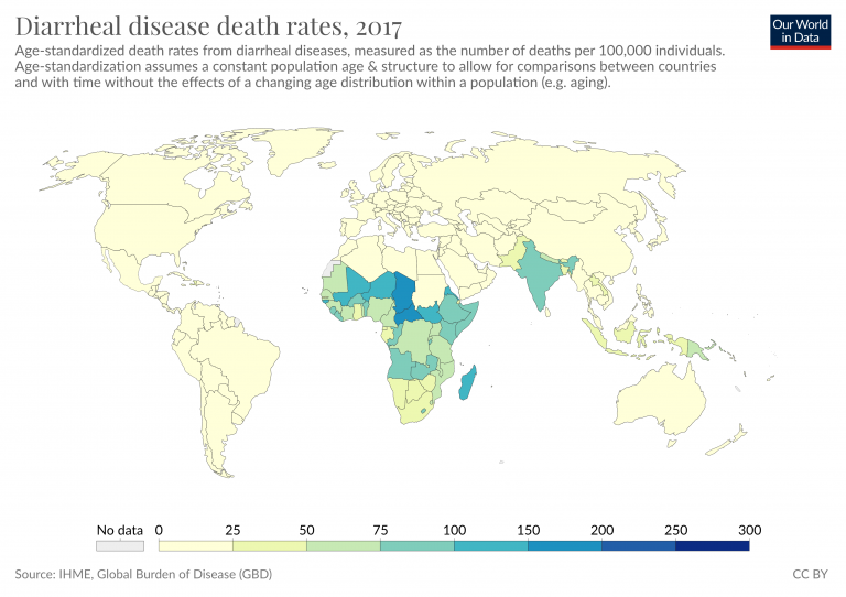
Where are children dying from diarrheal diseases?
The death rate from diarrheal diseases is highest in the world’s poorest countries: this chart shows the relationship between the death rate from diarrheal diseases and the country’s average income.
The death rate from diarrheal diseases in many of the poorest countries is higher than 100 annual deaths per 100,000 children. In those countries with the worst health – including Madagascar, Chad and the Central African Republic – the rate is higher than 300 per 100,000.
In high-income countries the death rate is very low. In many European countries, but also some rich Asian countries the rate is below 1 per 100,000 per year.
At lower levels of income risk factors for diarrheal diseases such as lack of access to clean water, rotavirus vaccine availability, undernutrition, stunting and others are the most prevalent.61

Why are children still dying from diarrhea?
There are two main reasons why the number of children dying from diarrhea is still so large – the prevalence of diarrhea-associated risk factors and the lack of access to essential treatment.
The figure shows the number of deaths associated with the major risks factors for diarrheal diseases: unsafe drinking water, poor sanitation and malnutrition are responsible for the largest portion of deaths.
Since 1990 we have made a lot of progress in reducing these major risks; you can read more in our research entries on Hunger and Undernourishment, Extreme Poverty and Water Use and Sanitation. But continued progress is still needed.
In addition to reducing exposure to risks factors, increasing access to oral rehydration therapy (ORT), therapeutic zinc use and the coverage of rotavirus vaccines were all shown to be essential for reducing the burden of diarrheal diseases in children.62

How can we stop child deaths from diarrhea?
Diarrheal diseases are both ‘preventable and treatable’, as the WHO says, because we already know how to deal with many of the risk factors that may lead to diarrhea and, if diarrhea cannot be avoided, we know how to treat it.
The table below lists the range of interventions available for the treatment of diarrhea we have today.63
Some of these interventions, such as ORS, breastfeeding and improvements in sanitation broadly target all-causes of diarrhea, whereas, vaccination and antibiotic use are specifically directed against the causative agents of the disease.
Water, sanitation and hygiene (WASH) interventions are the best way to prevent diarrheal diseases. Hand washing with soap, better water quality and better sanitation have been shown to reduce the risk of diarrheal infections by 47%, 17% and 36%, respectively.64
Educating mothers about the importance of breastfeeding is also important. Breastfeeding allows for the transfer of maternal immunity to the child – in developing countries infants that are not breastfed are six times more likely to die from infectious diseases, such as those causing to diarrhea, in the first 2 months of their lives.65
Another way to prevent diarrheal diseases is vaccination. Until relatively recently, there were few vaccines available to prevent diarrheal diseases. Cholera vaccine has been licensed since 1991 but it is primarily given to travelers and used as an outbreak control measure. This is because targeted immunization combined with other sanitary measures is more cost-effective than immunizing every individual with a vaccine that only provides a few years of protection.66
In 2006, however, new vaccines against rotavirus – the leading cause of childhood diarrhea as the treemap above shows – have been introduced. The most recent studies show that, while the effectiveness of the new rotavirus vaccines vary across different countries, it works well in protecting children against rotavirus disease.67
We will explore the success, potential and limitations of rotavirus vaccines in an upcoming post.
When preventative measures fail, several options for the treatment of diarrheal diseases are available, including nutritional interventions and antibiotic use when necessary. But the single best treatment for diarrheal diseases is a surprisingly simple mixture of water, salt and sugar: otherwise known as the oral rehydration solution.68
The estimates of ORS effectiveness vary by source, with some suggesting that the current use of ORS helps to prevent 69% of diarrheal deaths and, if its coverage would be increased close to 100%, 93% of diarrheal deaths could be prevented.69
Potential of interventions to prevent the burden of diarrheal diseases in childhood70
| Intervention | Estimate of the effect size |
|---|---|
| Handwashing with soap | 48% risk reduction |
| Improved water quality | 17% risk reduction |
| Excreta disposal (improved sanitation) | 36% risk reduction |
| Breastfeeding education | 43% increase in exclusive breastfeeding rates at day 1, 30% increase until 1 month, and 90% increase from 1-6 months |
| Preventive zinc supplementation | 13% reduction in diarrhea incidence, but no effect on mortality |
| Therapeutic zinc supplementation | 46% reduction in all-cause mortality and 23% reduction in hospitalization due to diarrhea |
| Rotavirus vaccines | 74% effectiveness against very severe rotavirus infection; 61% against severe; 47% reduction in hospitalization |
| Cholera vaccines | 52% effective against cholera infection |
| Oral rehydration solution (ORS) | 69% reduction in diarrhea-specific mortality |
| Dietary management for diarrhea | 47% reduction in diarrhea treatment failure and 47% reduction in treatment failure |
| Antibiotics for cholera | 63% reduction in clinical failure rates |
| Antibiotics for Shigella | 82% reduction in clinical failure rates |
| Antibiotics for cryptosporidiosis | 52% reduction in clinical failure rates |
| Community-based interventions (home visits and healthcare promotion) | 160% increase in ORS use and 80% increase in zinc use. 9% increase in seeking care for diarrhea and 75% reduction in inappropriate antibiotic use |
The majority of deaths from malaria are among children under-5
At a global level, the most vulnerable age group to malaria deaths are children under five years old — in 2017 they accounted for 57 percent of total deaths. The number of deaths from malaria tends to decrease with age; with those over 70 years old accounting for around five percent. When age categories are combined, children under 14 years old account for more than two-thirds of mortality.

Where are children dying from malaria?
In the map here you see the number of childhood deaths from malaria by country.
Of the more than 350,000 deaths from malaria in children under-5 in 2017, almost half of them have occurred in just two countries — Nigeria and the Democratic Republic of Congo.71
The highest mortality rates from the disease are in Burkina Faso and Sierra Leone, where 563 and 622 children per 100,000 died of the disease in 2017.

How can we reduce childhood deaths from malaria?
Even after a century of progress against malaria, the disease remains devastating for millions. The World Health Organization estimates that 216 million suffered from the disease in 2016.72
Fortunately only a small fraction of malaria victims die of the disease. But those who die are the very weakest; three out of four malaria victims are children younger than 5 years old making it one of the leading causes of child mortality in the world today.73
The world is making progress against malaria
In the history of improving population health, the most important progress is made in the prevention of disease; for infectious diseases this means interrupting its transmission. But humanity’s most ingenious and successful way of transmission interruption – immunization through vaccines – is not yet available for malaria. However, very recent developments are encouraging; at the time of writing the WHO has rolled out a first large-scale trial of a vaccine.74
But we have other weapons in our arsenal.
One line of humanity’s attack on the mosquito-borne fever is to progressively reduce the area in which malaria is prevalent. A second one is to prevent the transmission of the parasite where it is still prevalent. It is a surprisingly simple technology that stopped transmission and saved the lives of millions in the last few years alone.
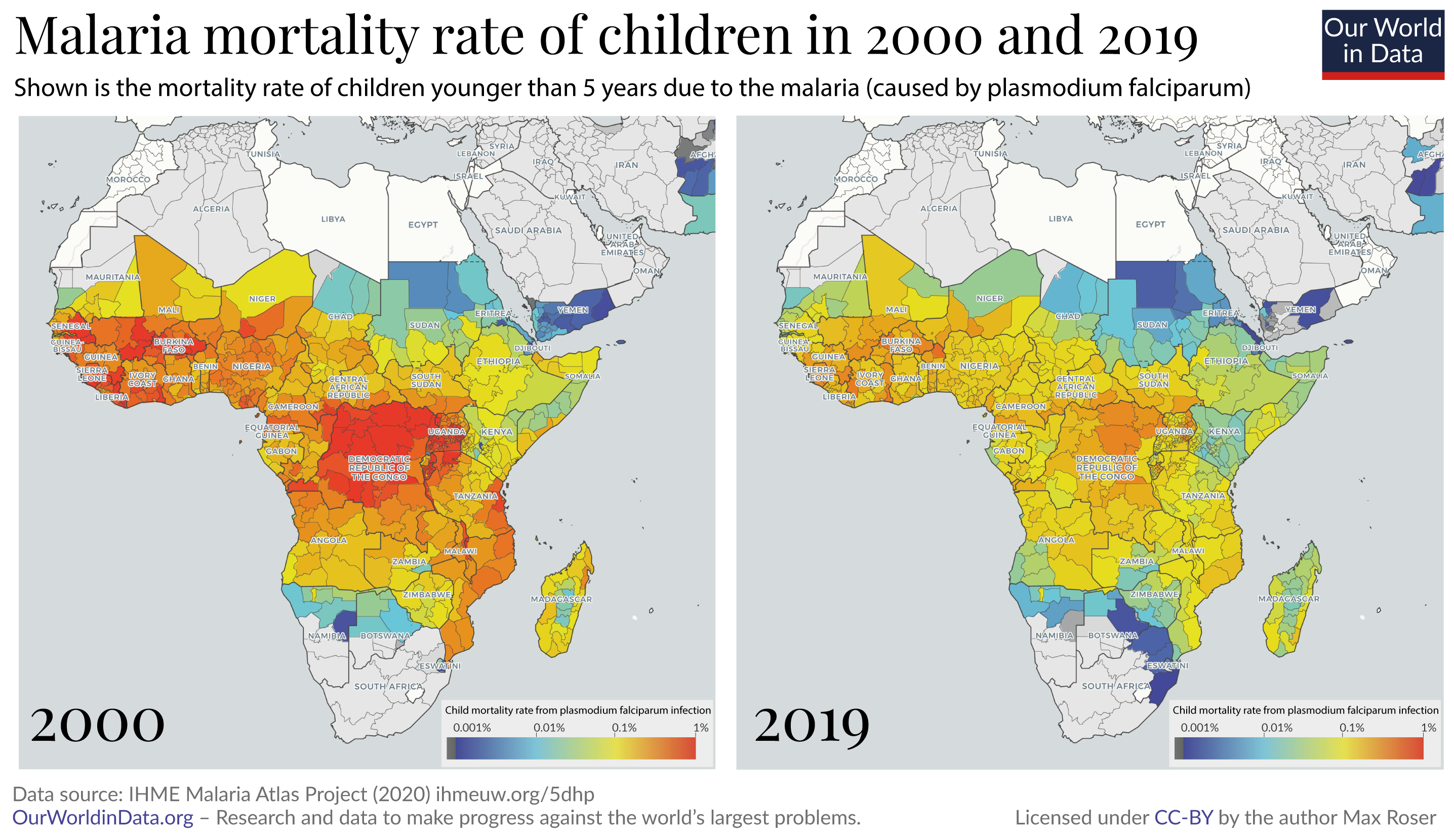
The years since the turn of the millennium were an extraordinarily successful era in the fight against malaria. The two maps shows the change of malaria mortality for children in the region where the disease causes the highest death toll.
From 2000 to 2015 the number of malaria deaths has almost halved, from 840,000 deaths per year to 440,000, according to the World Health Organization.75
A recent publication in Nature76 studied what made this success possible. The focus of the study was Africa, where – as the chart shows – most of the recent reduction was achieved. The researchers found that the single most important contributor to the decline was the increased distribution of insecticide-treated bed nets. The bed nets protect those who sleep under them.
The insecticide used on the bed nets kills the mosquitoes. So a community where a sufficiently high number of people sleep under bed nets the entire community is protected, regardless of whether they themselves use the bed nets. This is similar to the positive externality effect that vaccination has on communities.
The authors of the Nature study estimate that bed nets alone were responsible for averting 451 million cases of malaria in Africa between 2000 and 2015. The other two interventions that were important for the reduction in the disease burden of malaria were indoor residual spraying (IRS) and the treatment of malaria cases with artemisinin-based combination therapy (ACT). The study’s authors estimate that the three interventions averted 663 million cases of malaria in the 15 year period. Insecticide-treated bed nets were by far the most important intervention of the three, preventing 68% of the averted cases.
We can do more
Progress never happens by itself. For millennia our ancestors were exposed to the malaria parasite without defense; the fact that this changed is the achievement of the scientific and political work of the last few generations.
Today we are in the fortunate situation that we have some decades of progress behind us: We can study what worked and use this knowledge to go further.
To continue the improvement in global health more has to be done, and more can be done. Some of the most important research in global development asks the question where donations can do the most good. It’s not always the case that donations do much good. Often it is unfortunately not possible to achieve much progress by donating money because funding is not the limiting constraint or the proposed solution does not actually work. But in some areas we can achieve extraordinary progress by making funding available. A charity evaluator that is doing very rigorous work is ‘GiveWell’ and on the very top of their recommended charities are two organizations that are fighting malaria – the Against Malaria Foundation and the Malaria Consortium.
The diseases many children die from are preventable – we therefore know that we can continue this reduction of child mortality, if we choose to do so. What is different from the past and what makes the deaths of children so appalling today is that we now know how to prevent them.
The evidence shows that the fight against malaria is still underfunded; it will depend on this funding and work whether it is possible to continue our progress against it.78
It requires the commitment from governments around the world, but it is also something where each of us individually can contribute. Every one of us can contribute so that we continue to reduce the number of children that die in the world.
- If you want to know more before you donate, GiveWell’s information on malaria can be found here.
- And if you want to donate right away to help the successful fight against malaria you can do so via the page of GiveWell’s recommended charities.

Children living with AIDS
In children with HIV, transmission has typically occurred from the mother (mother-to-child-transmission; MTCT) either during pregnancy or childbirth, or through breastfeeding. The chart shows the total number of children aged 14 years old and under who are living with HIV. Globally the number of children living with HIV peaked in 2005 at approximately 2.1 million. This has since declined to 1.8 million in 2017.

‘Orphaned’ children are defined as those who have lost either one or both parents from AIDS. This does not necessarily imply that children orphaned by AIDS have HIV themselves (although in some cases HIV has been transmitted from mother-to-child). The chart shows the number of children (aged 17 and under) orphaned from AIDS deaths.

Where do most new cases of AIDS in children occur?
The map shows the total number of children newly infected with HIV each year. Globally — with similar trends at national levels — the number of new infections in children peaked around the early 2000s (globally at 420,000 new infections per year) followed by a rapid decline over the last decade. In 2017 an estimated 180,000 new children were infected with HIV.

How do we prevent children from dying from AIDS?
Given that majority of AIDS cases in children are due to the virus transmission from mother to child during pregnancy, stopping the mother-to-child transmission is key to preventing children from getting newly infected with HIV.
The chances of HIV positive mother transmitting the virus to a child are between 15% and 45%. Effective prevention of mother-to-child transmission (PMTCT) services can reduce the chances of virus transmission to newborn to 5%.79
PMTCT services include preventative measures such as providing antiviral therapy for mother and newborn, correct breastfeeding practices, and early child testing for HIV infection.
The visualization shows the number of child infections averted from coverage of ART in mothers.
You can explore the number of new HIV infections prevented from PMTCT as a result of antiretroviral therapy across the world, here.

What children die from in the first few days or weeks of life is very different to the months and years that follow. So, too, are the interventions to prevent these deaths. Understanding the age at which children die is therefore critical if we’re to focus on interventions that will save the most lives.
Children are most likely to die in the first few days of life
In the visualization we see the total number of child deaths by life stage. More than one-third — 1.86 million (34.5%) — died in the first week of their lives. This is a devastatingly large number: it means that, on average, 5,096 children younger than one week die every day.80
In fact, if we look at the probability of death is the highest in the first 24 hours of life. Newborns are four times more likely to die in the first 24 hours of life than in the next 24 and nine times more likely than on their 7th day of life.81
Child mortality rates have fallen dramatically, but the progress has not been even across all child ages
While child mortality has fallen across all age groups, the rate of reduction has not been even.
The world has been much more successfully in preventing deaths of older children than young infants. Since 1990, mortality has fallen by:
- 65% for children aged 1 to 4 years old;
- 58% for infants (younger than one year);
- 49% for neonates (younger than four weeks); and
- 39% for babies younger than one week.
Why have we made greater progress in saving older children?
Older children tend to die from diseases such as diarrhea, pneumonia, measles, and meningitis. These can now be prevented through vaccination. Over the last decades, the world has made rapid progress in the fight against these vaccine-preventable diseases. And when a disease can’t be prevented, we can also treat children with interventions, such as oral rehydration therapy.82
But the causes of death in the youngest children are very different. Pre- and post- birth complications – which are the major cause of death in the early days of life – cannot be directly prevented by these types of interventions.
More focus is needed on mortality in the first days of life
This means that as child mortality rates decline across the world, our attention must turn increasingly towards saving babies in the first days of life. We need to make much faster progress in addressing neonatal causes of death.
Neonatal deaths can be prevented by provision of basic care for mothers and newborns. Over the past decades the coverage of many of these interventions has increased: more women receive antenatal care, more births are attended by a skilled healthcare worker, more newborns are exclusively breastfed.
But the coverage of these and other interventions is still far from sufficient. In 2014 the coverage of simple thermal care for newborns was just 11%; coverage of syphilis detection and treatment in neonates was just 23%; only 49% of births were delivered using clean birth practices; and just 8% of newborns with infections received oral antibiotics.83
If we’re to continue the progress against childhood mortality we need to increase our focus on interventions that can protect the youngest among us.

What are neonates dying from?
The chart here shows the major causes of death during the first month of child’s life.
More than 600,000 neonates died in 2017 due to complications arising as a result of preterm birth. Premature birth is common globally, around 1 in 10 newborns is born prematurely every year.84 However, there is a large gap between mortality rates due to preterm complications between high and low income countries as we discuss below.
Neonatal encephalopathy due to birth asphyxia and trauma is the second leading cause of death in the first month of child’s life. Close to half a million newborns died due to this condition in 2017. Neonatal encephalopathy is defined by abnormal neurological function in the first days of life and is often a result of complications during the child’s delivery.

Preterm birth complications is the leading cause of death among neonates
In the map you see child mortality rates due to complications arising as a result of preterm birth.
Globally, preterm birth mortality rates have been falling since 1990. 1.28 million children died as a result of premature birth complications three decades ago. In 2017 that number has halved to 0.65 million. Some countries have made impressive progress in recent decades: Brazil, Peru and Egypt, for example, now see close to five times fewer deaths from premature births compared to almost 30 years ago.
But huge disparities between countries still exist. The highest mortality rate due to preterm birth complications is in Sudan, where 288 out of 100,000 preterm babies die. Contrast that to Japan, which has the lowest preterm birth mortality rates in the world of only 4 — that’s more than 70-fold difference.

What we can do to reduce preterm mortality rates?
There are two ways to reduce preterm mortality rates: trying to reduce the prevalence of preterm births and providing better care for babies who are born prematurely.
Approximately 70% of preterm births are spontaneous.85 While the list of factors associated with spontaneous preterm delivery is long,86 the literature provides relatively few interventions that have been reliably assessed for their effectiveness in reducing preterm birth rates. A recent systemic review of the literature by the Cochrane Library has identified four interventions that had a positive effect on reducing preterm births:87
- Providing a regular midwife-led care during pregnancy 88
- Screening for genital tract infections89
- Zinc supplementation90
- Cervical stitch for women at high-risk of preterm delivery91
We should note that zinc supplementation was found to be effective in studies based on low-income populations. Therefore, the study authors suggest that this may be a consequence of a general maternal undernutrition. Indeed, multiple observational studies have indicated that maternal nutrition may have an impact on the length of pregnancies.92 This factor is particularly important in Africa and Southeast Asia, where both the mortality due to preterm complications and undernutrition are most common.
In the right settings, most premature babies can be taken care of with simple interventions.
According to a study by Saifon Chawanpaiboon and others, the majority (85%) of premature births fall into moderate or late preterm period, defined as being born between 32 and less than 37 weeks of gestation.93 These are the babies for whom availability of minimal interventions will be the most effective.
A 2014 study published in the journal The Lancet has estimated that if available interventions would reach high coverage rates (90-99%), by 2025, we could reduce deaths due to prematurity by 58% from their levels in 2012.94 This means reducing the total number of deaths from prematurity from more than 900,000 in 2012 to below 400,000 by 2025.
Here you see a table of interventions from the same study, which summarises the measures which would help us to reach the 58% reduction. The simplest intervention — hospital and kangaroo care — would be responsible for 50% of averted deaths. Providing mothers with antenatal steroids,95 would be responsible for additional 31% of reduction.
The key care required for preterms is provision of thermal insulation and feeding, both of which can usually be provided by the mother through kangaroo care. Kangaroo care involves early breastfeeding and 24-hour skin-to-skin contact between the mother and newborn. Research reviews have shown that kangaroo care can reduce neonatal mortality risk by as much as 51%.96 However, globally, the current predicted coverage of kangaroo care is expected to be extremely low.97
Effect of interventions that can reduce neonatal mortality due to preterm complications. Expressed as percentage reduction in child mortality due to preterm complications.98
| Intervention | Effect size (%) |
|---|---|
| Hospital care of preterm babies including kangaroo mother care | 50 |
| Antenatal steroids for preterm labour | 31 |
| Neonatal resuscitation | 8 |
| Labour and delivery managenment | 5 |
| Balanced energy supplementation | 2 |
| Micronutrient supplementation | 2 |
| Antibiotics for premature rupture of membranes | 2 |
Child mortality by sex
From life expectancy to mental health; substance use to cancer rates; there are important differences in health outcomes between the sexes. In a related post, my colleague Esteban Ortiz-Ospina looks at the evidence to answer the question “Why do women live longer than men?“
Here we focus on the youngest, asking, why do young boys die more often than girls?
Child mortality measures the share of newborns who die before reaching their 5th birthday. In the chart below we see the comparison of child mortality by sex.
Here, the mortality rate for boys is shown on the y-axis, and the mortality rate for girls on the x-axis. The grey line running diagonally across the chart marks where the mortality rate for both sexes is equal. In countries which lie above the grey line, the rate for boys is higher than for girls.
What’s striking is that with exception of two countries – India and Tonga – child mortality is more common for boys in all countries of the world. This is also true for infant mortality, which is the share of newborns who die within their 1st year of life. We study why India and Tonga are outliers here.
Over the past half-century in particular, child mortality has been falling rapidly across the world. This has been true for boys and girls alike.
It has been known for a long time that the mortality of boys is higher. As early as 1786 the physician, Dr Joseph Clarke, read a paper to the Royal Society of London on his observations that “mortality of males exceeds that of females in almost all stages of life, and particularly the earliest stages”.99

Why is it the case that boys die more often than girls? First of all, it’s important to understand what young children die from.
In this chart we see global mortality rates in infants across different causes in 2017. This data comes from the IHME’s Global Burden of Disease study, which provides estimates by sex – on the y-axis I have plotted mortality rates in boys, and on the x-axis for girls. Just like the charts above, causes which lie above the grey line are more common in boys.
The chart shows that for all major causes of death, mortality is higher in boys. The sex differences in the causes of infant deaths were already documented almost a century ago: in an impressive paper published in 1929, Bawkin explores the mortality sex ratio of specific diseases from countries across the world.100
There are some causes – HIV/AIDS, nutritional deficiencies, whooping cough, among others – for which the mortality rates are higher in girls. But overall, infant boys are more likely to die in childhood than girls.101102103
Boys are more vulnerable in two key ways: they are at higher risk of birth complications, and infectious disease. We explore the possible reasons for this below.

From comparison of mortality rates in infant boys and girls, it becomes clear that boys are at higher risk of complications in the first few days of life: preterm births, asphyxia, birth defects and heart anomalies. But why?
First of all, boys are more likely to be born prematurely: the share of boys born before full-term pregnancy is higher than for girls.104 This occurs naturally, but is exacerbated by the rate of induced preterm births. Boys tend to have a higher birthweight than girls – which can increase the risk of waiting to term to deliver – meaning that more boys are induced before the end of the pregnancy term.105 The chart above shows that more boys die from preterm births. The fact that preterm births are more common for boys contributes to this.
Although boys are, on average, heavier than girls at birth, they are less physiologically mature at birth. This means they are at higher risk of having delayed physiological function (such as lung function) and adverse neurological outcomes.106107 For example, poorer lung function in newborn boys has been shown for both term and preterm infants.108109 Studies have suggested that even in the case of straightforward pregnancies, lung maturation in boys lags that of girls by approximately one week.110 These differences in maturity at birth are not restricted to lung function.111
The reason for this difference has been an important question for decades – the answer is still not clear. But there are some leading hypotheses: surfactant production for lung function has been observed earlier in female fetuses, leading to improved airway flow in the lungs; estrogen has been shown to affect lung development positively in females; males, on average, have a higher birthweight meaning they may trade-off increased size for functional development; and the uterus may be less hospitable to male fetuses – the introduction of a Y chromosome in females can create and immunoreactive response to the central nervous system.112113
This, combined with a higher risk of premature birth may explain why boys have higher rates of asphyxia, respiratory infections and birth defects.
Boys are also at higher risk of infectious diseases such as syphilis, malaria, respiratory infections, tetanus and diarrheal diseases. This is more generally true for a broad range of infections, spanning person-to-person, vector-borne, blood-borne, and food and water borne diseases.114
We see this clearly when we compare mortality rates for boys and girls in the earlier chart. But why are boys more susceptible to infection?
Overall, boys have weaker immune systems. There are two key hypotheses for why.
The Y-chromosome in boys increases their vulnerability. Biologically, males and females are differentiated by chromosomes: females have two X chromosomes (XX) and males one X and one Y chromosome (XY). Having two X chromosomes means that the newborn has a stronger immune system because X chromosomes contain a larger number of immune-related genes.115116 This means that, since females have two X chromosomes, they have a stronger immune response; boys on the other hand, are more vulnerable to X-linked infections.117
This makes males more vulnerable to many infectious diseases. They are also more susceptible to specific genetic diseases where the defective genes are carried on either the X or Y chromosomes; this is because boys have only one X chromosome so a single recessive gene on that X chromosome results in the disease.
But the stronger immune response of females comes with a cost. It’s the reason why women are more susceptible to autoimmune disorders such as HIV/AIDS.118
Sex hormones may be another key reason for weaker immune systems in males. Males have much higher amounts of testosterone which seem to inhibit two major parts of the immune system – B and T-lymphocytes.119
Estrogen, on the other hand, acts as an effective regulator of this. Overall, male hormones weaken the immune system relative to females.
The male disadvantage
The fact that boys are more susceptible than girls to a range of health conditions is often summarized as the “male disadvantage”. This is not restricted to childhood: the female advantage carries into adulthood. It’s part of the reason why women tend to live longer than men.
The leading explanations for the “male disadvantage” lie in the biological differences between the sexes. More specifically, differences in maturity, sex chromosomes, and hormones.
In circumstances where both sexes are treated equally, we would therefore expect infant and child mortality rates to be slightly higher for boys.
Child mortality and income level
As one would expect, income level of the country is extremely correlated with child mortality rate. The poorest countries have the highest levels of child mortality, and the countries with the highest income have the lowest rates. This relationship has remained the same even as child mortality has decreased around the world, as demonstrated in the chart.
The following scatter plot shows that child mortality is higher in countries in which a higher share of the population lives in extreme poverty.


Inequality by socio-economic class
Taken the UK as an example here, we can see from the chart that the gap in infant mortality has narrowed significantly in absolute terms; there were 80 infant deaths per 1,000 live births for infants with fathers who were in unskilled manual fields, versus 32 deaths per 1,000 live births born to fathers with professional careers, representing a 2.5 times lower rate. Today, those absolute mortality numbers are only 7.4 and 3.8 respectively, but there is still nearly a two-fold difference in mortality rate. Absolute inequality has decreased dramatically, but the ratio between the two – a measure of relative inequality – has only decreased a little.
When considering how the inequality of child mortality has decreased, one has to take into account that the occupational structure has also changed – the share of people employed in the low-skilled sector has decreased. The authors of the data used to make the the chart – Floud, Fogel, Harris, Hong – add that the “differences are still apparent even after allowances have been made for the effects of changes in the occupational structure of the British population and selection effect”.120
Infant mortality rates of both sexes by father’s social class in England and Wales, 1930/2-2001 121
Better education of women reduces child mortality
There is a substantial literature on the effects of women’s education for child health. 122 A more educated female population is strongly associated with lower rates of child mortality as well as both human and economic development. Some of the suggested reasons for this relationship are summarised in the figure below.
The linkages between female education, human development and economic development – Brown and Barrett123
An important correlate of child mortality is maternal age: children of very young and old mothers are at higher risk. One study of maternal-child outcomes across 55 countries found that poor health was highest for the youngest mothers, and continued to improve with age until 27 years old.124
The relationship between child mortality and the prevalence of teenage pregnancy is shown in the chart: countries with low child mortality tend to have fewer teenage mothers.
There are both biological and social factors which affect why health outcomes are poorest for the youngest mothers. This can be the direct result of more challenging pregnancy, childbirth or poor physical development of an infant; but can also be associated with other determinants. Maternal education plays an important role here: educational and employment opportunities may be important mechanisms for women delaying the age of first birth. Delaying childbirth until the early 20s is expected to greatly reduce the risk of child mortality or other adverse health outcomes.125

We can see the overall relationship between education improvements and child mortality in the chart. This shows the mean years of schooling for those aged 15 and older, versus, the share of children who die before reaching the age of five. Overall we see that as the average years of education increase, child mortality declines.
The next chart here from is from Emmanuela Gakidou et al., who find that over half the decline seen in child mortality globally between 1970-2010 can be explained by improvements in the education of women. What is more, they find that economic growth (GDP) can only explain a very small amount of the reduction in child mortality.
An explanatory note from the authors says: “The lines represent the actual child mortality rate (blue); estimated child mortality rate if GDP for each country had remained at the level it was in 1970 or 1990 (green); estimated child mortality rate if education of reproductive-age women for each country had remained at the level it was in 1970 or 1990 (red); and estimated child mortality rate if both GDP and education of reproductive-age women had remained at their 1970 or 1990 levels (purple).”
Higher educational attainment by mothers is associated with lower child mortality rates within countries. This is shown in the final chart in this section. For instance, Niger has the highest national average of child mortality, but within the country, mothers with a secondary school education or higher experience child mortality rates that are lower than the national averages of the next 16 countries listed.
The effect of education on child mortality is huge. Especially in places with relatively little education, the prospects for extending education are promising. In 2008, 4.4 million children younger than 5 years died in sub-Sahran Africa. The UNESCO estimates that an extension of secondary education for all women would save 1.8 million children per year.127

Counterfactual analysis of effect of education and gross domestic product (GDP) on child mortality globally with 1970 (A) and 1990 (B) as base years – Gakidou et al. 126
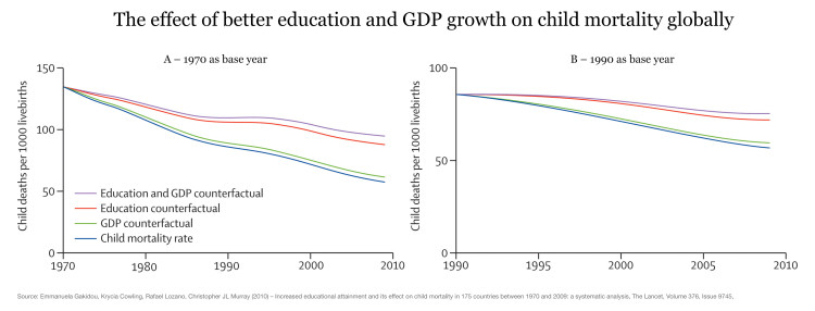
Under-5 mortality rate by mother’s education and wealth, selected countries, 2003—2009 – UNESCO (2011)128
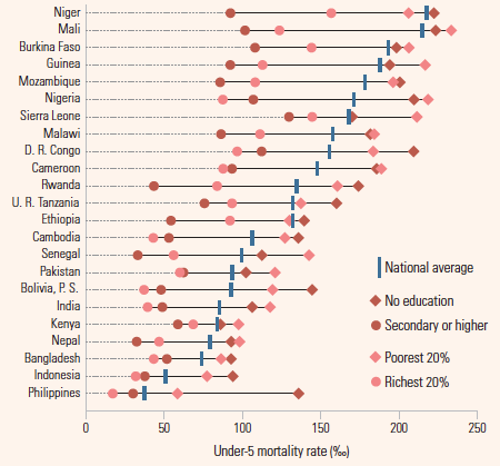
Health care and child mortality
In a publication in the American Economic Journal the authors report that Thailand’s 2001 healthcare reform led to significant reductions in child mortality, especially among the poor.129
The following graph shows for a large cross-section of countries that high expenditure on health more generally comes along with lower levels of child mortality.

When more infants survive – fertility goes down
On the y-axis we measure the number of annual live births per 1,000 people. On the x-axis we measure how many infants, who were born alive, survive their 1st year of life – this is the infant survival rate.
The chart shows how these two aspects changed over the course of the 20th century: At the beginning of the century all 4 countries can be found in the upper left corner – they are characterized by high fertility and an infant survival rate below 85%. If we follow the 4 lines we are taken to the bottom right corner and see that women have fewer children when the mortality rate of babies goes down.
The causal link between infant survival and fertility is established in both directions: Firstly, increasing infant survival reduces the parents’ demand for children. And secondly, a decreasing fertility allows the parents to devote more attention and resources to their children.
This link between fertility and child mortality is an immensely important insight and tells us what drives the acceleration and slowdown of population growth: In the initial stage of the transition, when fertility rates are still high but health is already improving, the population starts to grow. But then, a bit later, we see that this transition works to decrease population growth since improving health of the children leads to lower fertility. It is an important part of the mechanism behind the demographic transition.
A very cynical view is that a decrease in child mortality is bad for the world since it would contribute to the overpopulation of the planet. The chart above shows that this opinion is not just contemptuous of human life but plainly wrong: When more infants survive fertility goes down and the temporary population growth comes to an end. If we want to ensure that the world’s population increase comes to an end soon we must work to increase child survival.
Infant survival and fertility through time130
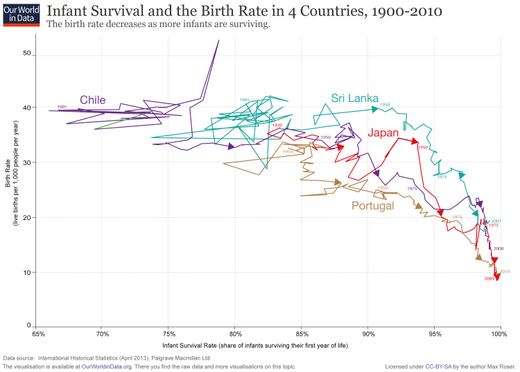
Definitions
Child mortality is the probability per 1,000 live births that a newborn baby will die before reaching age five under current age-specific mortality patterns.
Infant mortality is defined as the number of deaths of children under 1 year of age per 1,000 live births.
A neonatal death is defined as a death during the first 28 days of life (0-27 days).
The neonatal mortality rate is defined as the number of neonatal deaths per 1000 live births.
Data Quality
The uncertainty associated with the estimates of child mortality can be understood if one compares different data sources. The UN Inter-agency Group for Child Mortality Estimation does this for each country of the world. Here is the chart on the child mortality of Brazil as one example. On the same website the differences between various data sources can be studied for a large number of countries.
Country averages of infant mortality sometimes obscure the variation in infant mortality between regions within the country. Storeygard, Balk, Levy and Deane (2008) assembled a data-set that looks at the sub-national distribution of infant mortality.131
The data set covers over 10,000 national and subnational units worldwide. It is benchmarked to the year 2000. Understandably, many of the countries with the highest national infant mortality averages have lots of subnational variation in these rates, but even some of the most highly developed nations still see massive variation in infant mortality at the regional level. The most extreme example is China, which experiences an infant mortality rate near 0 in some regions but a rate around 325 at the other extreme.
The following map visualizes the subnational variation in infant mortality rates from the previous chart.
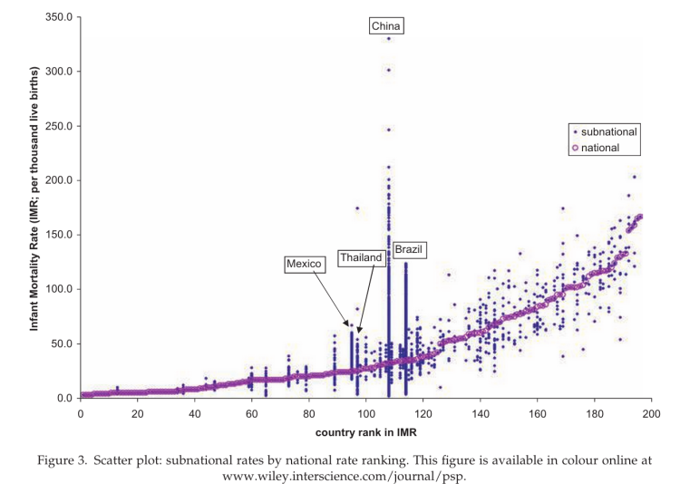
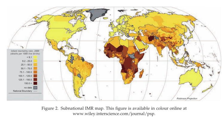
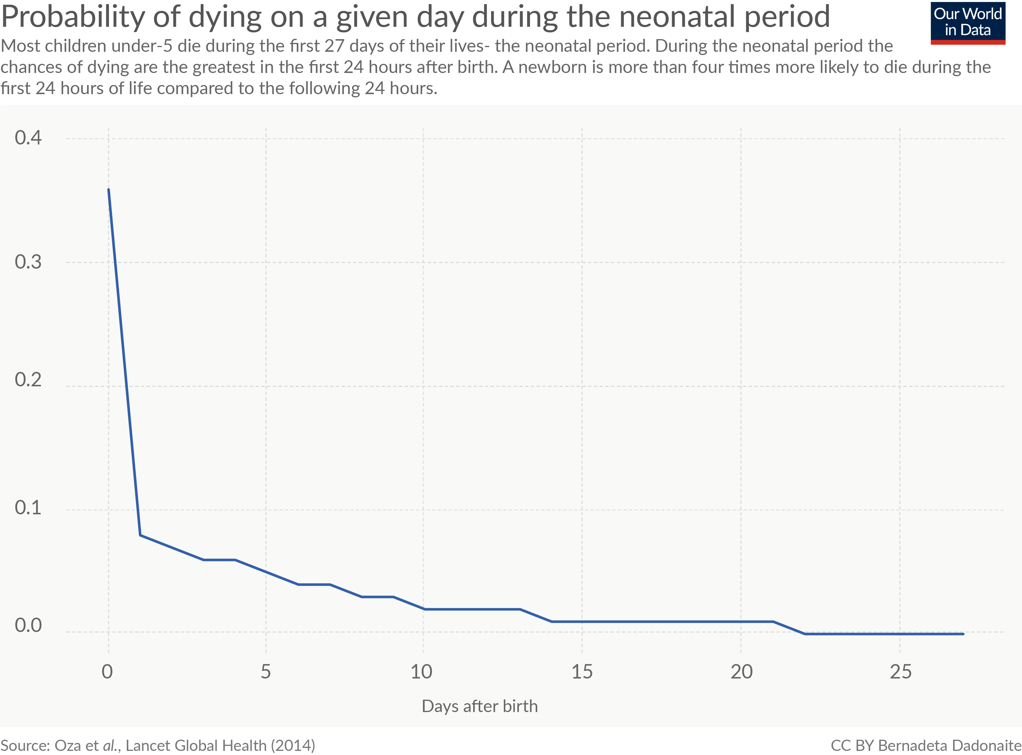
A still often cited early text is Acsádi and J. Nemeskéri (1970) – History of human life span and mortality.134 Other texts on early cultures and hunter gatherers are:
- Andrew T. Chamberlain (2006) – Demography in Archaeology-Cambridge University Press (Cambridge Manuals in Archaeology)
- Gurven, H Kaplan (2007) – Longevity Among Hunter‐Gatherers: A Cross‐Cultural Examination. Population and Development Review. Volume 33, Issue 2, pages 321–365, June 2007.
- Preston (1995) – Human mortality throughout history and prehistory. In Simon (1995) – The State of Humanity. Wiley.
- Johnston, F. E., and C. E. Snow (1961) – The Reassessment of the Age and Sex of the Indian Knoll Skeletal Population: Demographic and Methodological Aspects, American Journal of Physical Anthropology, vol. 19.
- Brothwell, D. (1975) – Paleodemography, in Biological Aspects of Demography, ed. W. Brass. London: Taylor and Francis.
- Hopkins, M. K. (1966) – On the Probable Age Structure of the Roman Population, Population Studies, 20, 2.
- Howell, N. (1979) – The Demography of the Dobe !Kung. New York: Academic Press.
- Data: Child mortality estimates and more mortality data
- Geographical coverage: More than 35 countries. Mostly European but also Taiwan and USA.
- Time span: For some countries data is available since the 19th century. Few data available for the 18th century.
- Available at: Online at www.mortality.org.
- This very comprehensive source is maintained by the University of California, Berkeley (USA), and the Max Planck Institute for Demographic Research (Germany).
- Data: Child mortality estimates
- Geographical coverage: Global – by country
- Time span: From 1800 onwards (data on Sweden go back to 1751)
- Available at: Online at Gapminder.org
- The sources of Gapminder are the Human Mortality Database and Child Mortality Estimates Info. Some of the data on child mortality is estimated from data on infant mortality (see the documentation which is online here).
- Data: The latest estimates based on the research of the UN Inter-agency Group for Child Mortality Estimation: Under-five mortality estimates, Infant mortality estimates, Neonatal mortality estimates (for all three rates and deaths) Estimates of: Sex-specific under-five mortality rate, Sex-specific infant mortality rate, Annual rate of reduction of under-five mortality.
- Geographical coverage: Global – by country.
- Time span: Data availability varies, but for some countries it goes as far back as the 1930s.
- Available at: Online at www.childmortality.org
- This very good source is published by UNICEF. It is possible to explore the trends country by country and to visualize the data on a map.
- Data: ‘Mortality rate, under-5 (per 1,000 live births)’
- Geographical coverage: Global – by country and world region
- Time span: Annual data since 1960
- Available at: Online here
- The World Bank data is based on the estimates developed by the UN Inter-agency Group for Child Mortality Estimation (UNICEF, WHO, World Bank, UN DESA Population Division) at childmortality.org.
- Data: Infant mortality rate
- Geographical coverage: Global – by country
- Time span: Data since 1810. Data are presented as decadal averages (1810 means 1810-19, etc.)
- Available at: Online here.
- Various sources are used (well documented online at Clio Infra). The main source is: Aboubarb, M.R. and A.L.. Kimball. “A New Dataset on Infant Mortality Rates, 1816-2002.” Journal of Peace Research 44 (2007):743. This dataset is available for download at prio here (it is called: M. Rodwan Abouharb & Anessa L. Kimball – A New Dataset on Infant Mortality Rates, 1816-2002).
- Main data collectors of the Clio Infra data are Joerg Baten and Mathias Blum.
- Data: Infant mortality rate
- Geographical coverage: Global – by country
- Time span: Annual data from 1750 onwards
- Available at: The books are published in three volumes covering more than 5000 pages.135
At some universities you can access the online version of the books where data tables can be downloaded as ePDFs and Excel files. The online access is here.
- Data: Infant mortality rate
- Geographical coverage: Global – by country
- Time span: The data goes back to 1800 but is relatively sparse during the 19th century.
- Available at: Data and documentation are online here.
- Data: Infant mortality rate
- Geographical coverage: Global – by countries and world regions
- Time span: 5-year intervals and interpolated annual data since 1950
- Available at: Online here.
- An advantage of this data set is that there are no gaps in the data since 1950 (for all countries and world regions).
- Data: The latest estimates based on the research of the UN Inter-agency Group for Child Mortality Estimation
- List of available data: Under-five mortality estimates, Infant mortality estimates, Neonatal mortality estimates (for all three rates and deaths)
Estimates of: Sex-specific under-five mortality rate, Sex-specific infant mortality rate, Annual rate of reduction of under-five mortality.
- List of available data: Under-five mortality estimates, Infant mortality estimates, Neonatal mortality estimates (for all three rates and deaths)
- Geographical coverage: Global – by country.
- Time span: Data availability varies but for some countries it goes as far back as the 1930s.
- Available at: Online at www.childmortality.org
- This very good source is published by UNICEF. It is possible to explore the trends country by country and to visualize the data on a map.
- Data: Infant mortality rate – “mortality rate, infant (per 1,000 live births)”
- Geographical coverage: Global – by country and world region
- Time span: Annual data since 1961
- Available at: Online here.
- The data is based on estimates developed by the UN Inter-agency Group for Child Mortality Estimation (UNICEF, WHO, World Bank, UN DESA Population Division) at www.childmortality.org.