This entry presents the empirical evidence of how inequality between incomes has changed over time, and how the level of inequality varies between different countries. We also present some of the research on the factors driving the inequality of incomes.
A related entry on Our World in Data presents the evidence on global economic inequality. That entry looks at economic history and how global inequality has changed and is predicted to continue changing in the future.
All our charts on Income Inequality
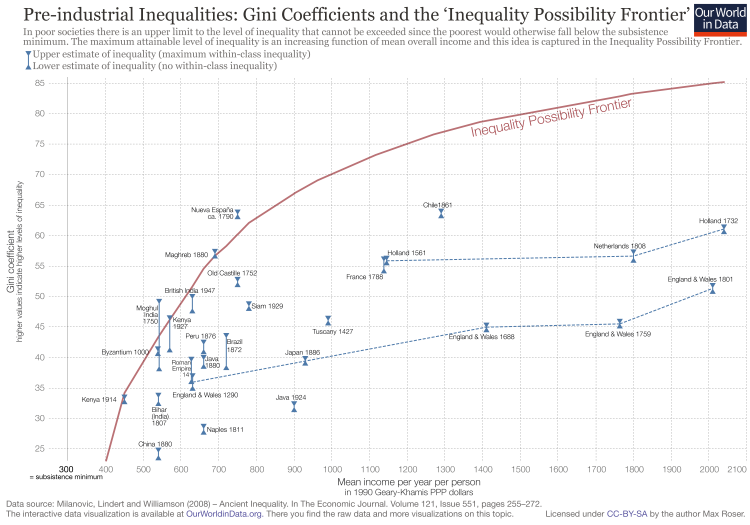
How unequal were pre-industrial societies?
In an effort to answer this question Milanovic, Lindert and Williamson investigated the estimates for levels of pre-industrial inequality in their 2008 paper ‘Ancient Inequality’. Most of their estimates (18 of the 28) of pre-industrial inequalities are based on so-called ‘social tables’. In these tables, social classes (or groups) ‘are ranked from the richest to the poorest with their estimated population shares and average incomes’.1
The following graph demonstrates the level of economic inequality in pre-industrial societies in relation to the levels of prosperity in those same societies. Inequality is measured with the Gini index (explained below) and prosperity is measured by the gross domestic income per capita, adjusted for price differences to make comparisons in a common currency possible.
The graph also shows a curve labelled IPF; this is the Inequality Possibility Frontier. The idea behind this curve is that in a very poor society inequality cannot be very high: Imagine if the average level of income were just the bare minimum to survive, in such an economy there could not possibly be any inequality as this would necessarily mean that some people have to be below the minimum income level on which they could survive.
When average income is a little higher it is possible to have some small level of inequality, and the IPF shows how the maximum possible inequality increases with higher average income. The authors found that many pre-industrial societies are clustered along the IPF. This means that in these societies, inequality was as high as it possibly could have been.
In the cases of Holland and England, we see that during their early development they moved away from the IPF and the level of inequality was no longer at the maximum.
Pre-industrial inequalities: Gini coefficients, and the Inequality Possibility Frontier2
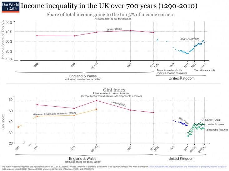
How has inequality in the UK changed over the very long run?
The United Kingdom is the country for which we have the best information on the distribution of income over the very long run. This information is visualized in this chart. The top panel shows the share of total income going to the top 5% of income earners, and the bottom panel shows the Gini coefficients.
The early estimates are based on social tables, and as with most estimates from the more distant past, there is some concern about how accurate these estimates are. Holmes published a detailed ciritique for one of the most famous tables: Gregory King’s Social Table for England in 1688. Holmes (1977) showed King’s limitations as a social analyst and criticized his social table, arguing that various biases “beguiled him (1) into underestimating the number of families in some of the wealthiest, and fiscally most productive classes; and (2) into underestimating (sometimes grossly) income levels at many rungs above the poverty line.”3
However, there are ways to take into account these biases, and the estimates shown in the graph are based on a revision of King’s original estimates conducted by Lindert and Williamson. The authors say that they use “Holmes’ penetrating critique (1977) to guide our modification of King’s tables”.4
The estimates presented in this visualization suggest that inequality in the UK was very high in the past, and did not change much until the onset of industrialization. As we can see, incomes used to be remarkably concentrated: up to 40% of total income went into the pockets of the richest 5%.
Starting in the late 19th century, income inequality began to decrease dramatically and reached historical lows in the late 1970s. However, during the 1980s inequality increased substantially in the UK and both the Gini and the top income share increased sharply. From the early 1990s onwards, we see that the UK experiences a divergence between what the Gini and the top income shares tell us about inequality. The Gini remained flat over these two decades and, if anything, fell somewhat during this period. This tells us that inequality across the bulk of the distribution has not increased further in the UK. At the very top, however, the evidence shows a different story. We observe that income growth at the very, very top of the income distribution has outstripped the strong growth of incomes across the rest of the distribution.5
More than 700 years of income inequality in the UK measured via income share of the top 5% and Gini, 1980-20106
Within-country inequality in rich countries
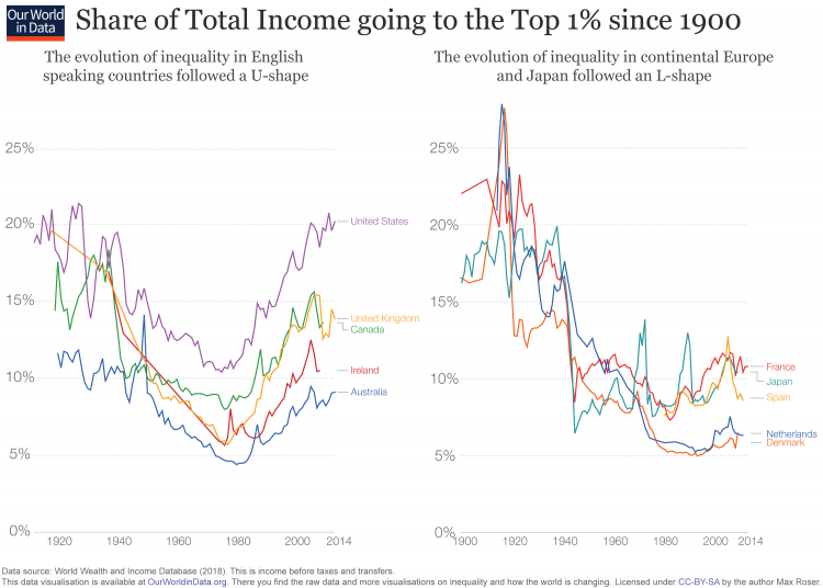
Researchers have a much better understanding of the long run evolution of income inequality thanks to the recent wave of research on top income shares.
Top income inequality is measured as the share of total income that goes to the income earners at the very top of the distribution. Usually the top 1%.
Historical top income inequality estimates are reconstructed from income tax records, and for many countries these estimates give us insights into the evolution of inequality over more than 100 years. This is much longer than other estimates of income inequality allow (as is the case with estimates that rely on income survey data).
The fact that income shares are measured through tax records implies that these estimates measure inequality before redistribution through taxes and transfers.7
What we can learn from this long-term perspective is summarized in this visualization. Consider the case of the USA, in the left panel. Before the Second World War up to 18% of all income received by Americans went to the richest 1%. After that point, and up until the early 1980s, the share of the top 1% dropped substantially (first quickly, and then more slowly in the 1970s)
After the 1980s inequality in the USA started increasing, and eventually returned to the level of the pre-war period. We see that this U-shaped long-term trend of top income shares is not unique to the USA. In fact the development in other English-speaking countries, also shown in the left panel, follows the same pattern.
However, it would be wrong to think that increasing top income inequality is a universal phenomenon. In the right panel we see that in equally rich European countries, as well as in Japan, the development is in fact quite different. The income share of the rich has decreased over many decades, and just like in the English-speaking countries, it reached a low point in the 1970s. In contrast to the English-speaking countries, however, top income shares have not returned to earlier high levels; they have instead remained flat or increased only modestly. The evolution of top income inequality followed an L-shape here. Income inequality in Europe and Japan is much lower today than it was at the beginning of the 20th century.
A lesson that that we can take away from this empirical research is that political forces at work on the national level are likely important for how incomes are distributed. A universal trend of increasing inequality would be in line with the notion that inequality is determined by global market forces and technological progress. The reality of different inequality trends within countries suggests that the institutional and political frameworks in different countries also play a role in shaping inequality of incomes. This means that rising inequality is most likely not inevitable.
It is important to emphasize that the top income measures of inequality that we discuss above refer to inequality in the distribution of market incomes. And market incomes are not the same as disposable incomes, because most people pay taxes and receive transfers from the government.
In many countries governments have progressive tax systems. In the US, for example, estimates suggest that 37% of the total sum of income-tax revenues come from the top 1%, while less than 3% comes from the bottom 50%.8
The consequence of progressive taxation is that the inequality of disposable incomes (the incomes that actually reach people’s pockets) is much lower than the pre-tax income that is considered in the research that focusses on top incomes.
This visualization shows the difference in Gini coefficients before and after redistribution in the USA. You can add other countries by selecting the option ‘Add countries’. Below we discuss this data in more detail.
The two income measures are defined as follows:
- Market household income is defined as the sum of labor income (paid employment and self-employment income) and capital income.
- Disposable household income is the sum of labor income (paid employment and self-employment income), capital income, transfer income — social security transfers (work-related insurance transfers, universal benefits, and assistance benefits) and private transfers — minus income taxes and social security contributions.
Bear in mind that in this chart inequality is measured with the Gini index, an inequality measure that not only looks at the top of the income distribution, but captures the whole distribution as explained below.

Inequality of disposable incomes over the long run
Research and discussion of inequality unfortunately suffers from the availability and use of estimates for inequality that combine datasets which cannot and should not be combined. As we explain below there are many different definitions of income, and combining estimates based on different definitions is incorrect.
The Chartbook of Economic Inequality presents empirical estimates that are comparable over time for each particular country. This data is shown in this visualization.
It is important to note, however, that these estimates are not fully comparable between countries. Thus it is necessary to refer to the ‘sources’ tab of the chart (where definitions of income measures are listed) before making such comparisons.

- High-income countries tend to have lower inequality
- Top income shares
- Income shares
- Inequality in the US has been growing substantially in recent decades
- Inequality in different world regions
- Relative poverty
- How are the incomes of the rich changing relative to the incomes of the poor?
- How does income inequality differ from consumption inequality?
High-income countries tend to have lower inequality
Income inequality estimates are usually not fully comparable across countries in different world regions. The best source for distributional data with global coverage is the World Bank’s PovcalNet. But even for this source, global coverage comes at the cost of comparability. Crucially, the PovcalNet data relies on consumption surveys for some countries and income surveys for other countries. As we point out below, this is problematic.
Notwithstanding these limitations, it is interesting to consider the world map of economic inequality. Both the southern part of Africa and Latin America stand out as regions with very high inequality. South-East Asia and most rich countries on the other hand have relatively low levels of inequality.
You can click on countries with available data to explore detailed country-specific trends.

Top income shares
This chart shows the share of total income going to the top income earners.
Shown is for each country what share of total incomes goes to the top 10%.

Income shares
This chart shows, country by country, the evolution of shares of total income going to the richest 20% (and subsequent quintiles).
You can switch between countries with the ‘change country’ option.

Inequality in the US has been growing substantially in recent decades
In the US, income inequality has been on the rise in the last four decades, with incomes for the bottom 10% growing much slower than incomes for the top 10%. This is different to the experience of other OECD countries. The US is an exception when it comes to income inequality.
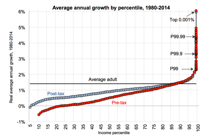
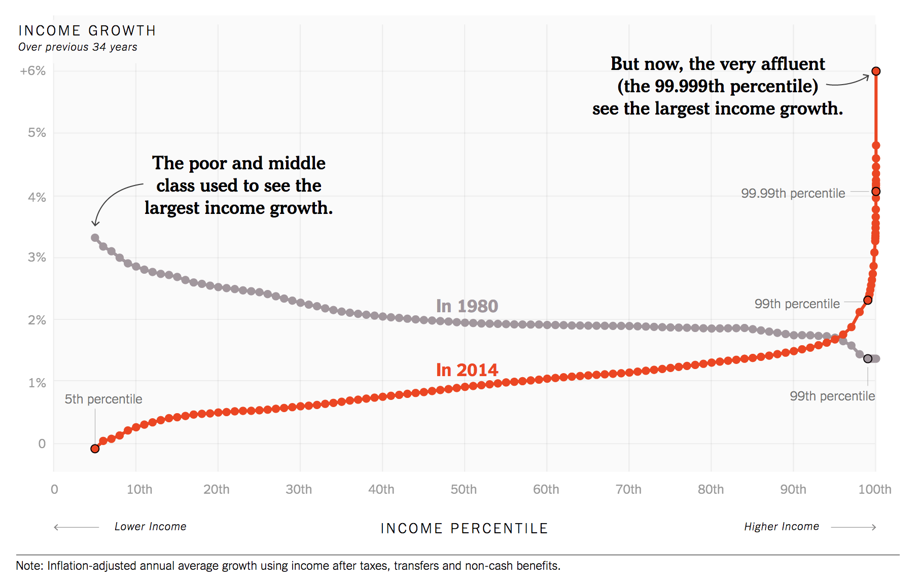
Research shows that in the US the ‘ultra-rich’ are the group that has experienced the largest income growth in the recent period of growing income inequality. This is shown in the following chart. Each dot along the horizontal axis represents a different percentile in the income distribution, with the height marking the corresponding average level of income growth in the period 1980-2014 (after adjusting for inflation). Red and blue, respectively, show changes in incomes before and after taxes.
The chart comes from Piketty, Saez and Zucman (2016) and it has received substantial media coverage.9
As we can see, the poorest individuals in the US have seen no real income growth in the period 1980-2014; while at the very top, the ultra-rich have enjoyed an average annual growth of about 6%. Without taxes and transfers, those at the bottom have actually seen their incomes shrinking.
Another striking fact is that the relationship is monotonically increasing: independently of where you are in the US income distribution, those who are richer have seen larger income growth. This doesn’t need to be the case. In fact, as Piketty and co-authors point out, in the US the relationship used to be monotonically decreasing: independently of where you were in the income distribution, those who were poorer used to enjoy larger income growth.
Average annual income growth in the US over the period 1980-2014 – Piketty, Saez and Zucman (2016)10
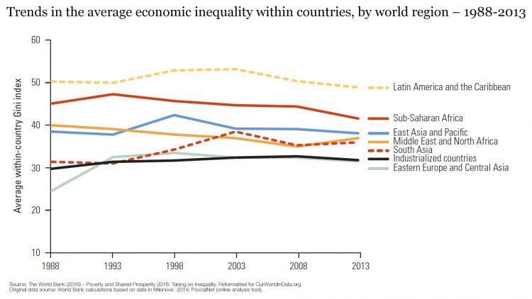
Inequality in different world regions
This visualization shows a comparison of income inequality across different world regions. Shown is the simple cross-country average of Gini coefficients—as per the estimates presented in the world map here—without weighting countries by population. In other words, the series in this plot show the evolution of regional averages of inequality levels (Gini coefficients).
As we can see, Latin America is the region with by far the highest cross-country average inequality levels. And this has been the case for decades. At the turn of the 20th century Latin America was, on average, almost 65% more unequal than the industrialized (high-income) countries.
Another important point to notice in this chart is that variations across world regions are much larger than variations across time.
This is also true for countries: the differences in inequality levels between countries tend to be much larger than the differences in inequality for any given country at different points in time (you can check this by clicking on the ‘Chart’ tab in the Gini world map). Keeping this in mind is important to contextualize the debate on increasing inequality in high-income countries. Although average inequality in Latin America is going down—and in high-income countries it is going up—the differences in levels remain substantial.
We have already noted that Latin America is the world region with the highest income inequality. Here we focus on how different countries in this region have reduced inequality over the last couple of decades.
The following visualization shows recent trends in Gini coefficients across different Latin American countries. As we can see, there has been a generalized downward trend (although levels remain very high).
The fact that inequality reductions have been widespread is remarkable given the underlying differences between countries. As Lopez-Calva and Lustig (2010)11 point out, inequality declined in countries with high baseline levels of inequality (e.g. Brazil) as well as in countries with regionally low baseline levels of inequality (e.g. Argentina). It declined in fast-growing countries (e.g. Chile and Peru) and slow-growing countries (e.g. Brazil and Mexico). It declined in macro-economically stable countries (e.g. Chile and Peru) and countries recovering from economic crisis (e.g. Argentina). It declined in countries governed by what analysts often consider to be left-leaning political regimes (e.g. Brazil and Chile) and in countries governed by regimes considered to be ‘non-leftist’ (e.g. Mexico and Peru).
Lopez-Calva and Lustig (2010) suggest that the main factors contributing to declining inequality in these countries are (i) a decrease in the earnings gap between skilled and low-skilled workers and (ii) an increase in government transfers to the poor. Below we explore in more detail these and other commonly cited drivers of within-country inequality.

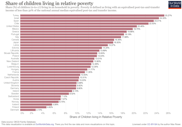
Relative poverty
Economic poverty is captured by two distinct concepts: absolute poverty and relative poverty. Absolute poverty is measured with respect to an income level that is fixed in time and across countries. The measure of extreme global poverty that we discuss in our entry on World Poverty is the most important example relating to this concept.
The concept of relative poverty, on the other hand, is defined with respect to an income level that may change over time and across countries. Most often, relative poverty in a country is measured with respect to the median income in the same country (i.e. the income of the person in the middle of the income distribution). Because it is defined in relative terms, it is a measure of economic inequality.
The visualization shows relative childhood poverty. That is, the share of children living in relative poverty. The OECD defines childhood poverty as the share of children living in a household with a post-tax-and-transfer income of less than 50% of the national annual median income (i.e. half of the disposable income of the person in the middle of the distribution).
How are the incomes of the rich changing relative to the incomes of the poor?
Income inequality in a country is affected by the relative growth of incomes at different points in the income distribution. This is intuitive: inequality will shrink if the incomes of the poor tend to grow faster than the incomes of the rich.
Studying how income levels evolve across the entire distribution is crucial to understanding how the benefits of economic growth are shared in the population. Are some people getting richer while others are getting poorer? Or is economic growth raising the incomes of all?
This visualization tracks income levels in the UK at different points in the income distributions. Each line shows the cutoff-incomes for the 10 deciles of the income distribution (i.e. 1st shows you the income that separates the poorest 10% from the next 10% in the income distribution).
You can see how incomes in the UK have changed across the distribution. The UK experienced a large increase in inequality during the 1980s—the incomes of the highest deciles increase while everyone else was left behind. Uneven growth in the years leading up to 1991 meant further increases in inequality. Throughout the 1990s and 2000s, more even growth across the distribution has meant little changes in inequality, with rising incomes for everybody.
By clicking on ‘Change Country’ you can visualize the same data for 26 other countries. The experience of the USA is worth discussing. The bottom half of the income distribution in the USA has not seen any income gains for almost the entire period since 1979 (the short exception are the late 1990s). This makes the USA an extreme case in terms of inequality, and really an outlier in what is happening to incomes across the distribution over time.
You can find more empirical data and research in our entry dedicated to incomes across the distribution.

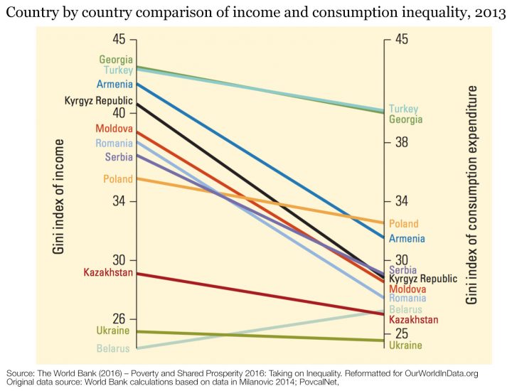
How does income inequality differ from consumption inequality?
The visualization provides a comparison of inequality in consumption and inequality in incomes for a number of middle-income countries.
As we can see, consumption inequality in almost all countries is lower than income inequality. This is intuitive, since consumption can be smoothed over time, for example, by saving earned income. In principle, saving and borrowing allows agrarian societies to have consumption levels that are less volatile—and less reliant on seasonal variation—than incomes.12
Saving and borrowing is usually harder at low income levels; so consumption and income measures of inequality tend to be closer for poor populations. But as opportunities for saving and borrowing increase, important differences emerge. The following visualization shows that in middle-income countries differences are indeed substantial.
Country by country comparison of income and consumption inequality13
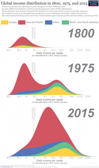
We have an entry dedicated to global economic inequality—here we want to summarize the most important points.
The chart shows estimates of the distribution of annual income among all world citizens over the last two centuries.
To make incomes comparable across countries and time, daily incomes are measured in international-$ — a hypothetical currency that would buy a comparable amount of goods and services that a U.S. dollar would buy in the United States in 2011 (for a more detailed explanation, see here).
The distribution of incomes is shown at 3 points in time:
- In 1800, few countries had achieved economic growth. The chart shows that the majority of the world lived in poverty with an income similar to the poorest countries today. Our entry on global extreme poverty shows that at the beginning of the 19th century the huge majority—more than 80%—of the world lived in material conditions that we would refer to as extreme poverty today.
- In the year 1975, 175 years later, the world had changed—it had become very unequal. The world income distribution was ‘bimodal’, with the two-humped shape of a camel: one hump below the international poverty line and a second hump at considerably higher incomes. The world had divided into a poor, developing world and a developed world that was more than 10-times richer.
- Over the following 4 decades the world income distribution has again changed dramatically. There has been a convergence in incomes: in many poorer countries, especially in South-East Asia, incomes have grown faster than they have in rich countries. Whilst enormous income differences remain, the world no longer neatly divides into the two groups of ‘developed’ and ‘developing’ countries. We have moved from a two-hump to a one-hump world. And at the same time, the distribution has also shifted to the right—the incomes of many of the world’s poorest citizens have increased and extreme poverty has fallen faster than ever before in human history.
Global inequality in 1800, 1975, and 201515
The above visualization is based on estimates of inflation-adjusted average incomes per country (GDP per capita) and single-point estimates of within-country income inequality. While this gives us a rough idea of how the distribution of incomes changed, it is neither very detailed nor very precise.
This visualization shows the distribution of incomes between 1988 and 2011 using a different, more precise source of data. The estimates come from Milanovic and Lakner (2015).16 In contrast to the previous figure, these estimates rely on data measuring household incomes at each decile of the income distribution. The downside of this approach is that we can only go as far back in time as household surveys were conducted.
If you want to use this visualization for a presentation or for teaching purposes etc. you can download a zip folder with an image file for every year and an animated .gif here.
Global Income Distribution 1988 to 201117
Globalization and technology
In our entry on International Trade we point out that globalization may have important implications for the distributions of incomes, because it often creates ‘winners and losers’.
The hypothesis supporting the negative effect of globalization on income inequality can be easily explained in terms of wage differences between high-skilled and low-skilled individuals: if globalization means that a country can import basic manufactured goods more cheaply, paid for by exporting more valuable high-tech services, then wages for high-skilled workers are likely to rise relative to unskilled wages in that country. Under this line of reasoning, one could argue that globalization increases inequality in rich countries because ‘losers’ are more likely to be those with low incomes in the first place.
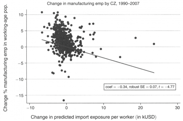
The available empirical evidence on the causal link between globalization and inequality is not definitive, but does suggest that we might want to take this hypothesis seriously. Autor, Dorn and Hanson (2013)18, for example, study the consequences of rising Chinese imports for the US in the period 1990-2007. The visualization shows a scatter plot of cross-regional exposure to rising imports, against changes in employment. Each dot on this graph corresponds to a different area within the US (‘commuting zones’, CZs); the vertical axis shows the percent change in manufacturing employment for working age population; and the horizontal axis shows what the authors predict to be the per-worker exposure of the different areas to rising imports (depending on industrial composition, etc.). As we can see, there is a negative correlation. In fact, the authors go further and suggest that rising Chinese imports in the period 1990-2007 caused higher unemployment, lower labor force participation, and reduced wages in local labor markets that house import-competing manufacturing industries (see the paper for details on the empirical strategy used to determine causality).
Change in manufacturing employment by commuting zones in the US, 1990-2007 – Figure 2b in Autor, Dorn and Hanson (2013)19
Economists often argue that changes in productive technologies increase inequality. The intuition behind this claim is that technical change favors more skilled workers, replacing tasks previously performed by the unskilled. Atkinson (2015)20 provides a simple discussion of the economic theory supporting this hypothesis.21
The view that productive technologies increase inequality is supported by descriptive evidence from the past decades, when high-income countries witnessed both major changes in technology—including the rapid spread of computers in workplaces—and a sharp increase in wage inequality.
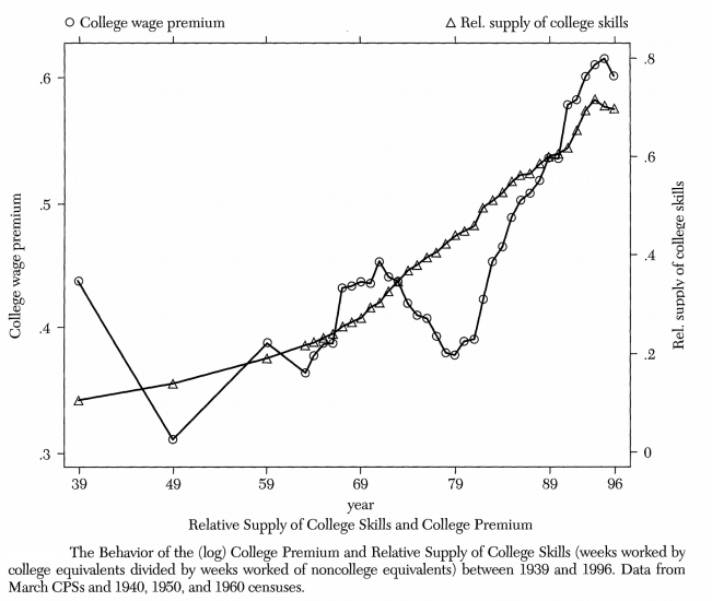
The following graph from Acemoglu (2002)22 shows the evolution of the relative supply of college skills, as well as the returns to those skills (the college wage premium).23
This graph shows that in the US there was a large increase in the supply of more educated workers during the second half of the 20th century. Since the returns to education increased while supply was also increasing, we can interpret this as evidence in support of the hypothesis that technological change was biased in favour of skilled workers.
The above remark implies a positive correlation between skill-biased technological change and wage inequality. As always, a correlation does not imply causation—we do not know if it was skill-biased technology that specifically caused more inequality. However, the fact that this correlation has been observed in other countries suggests that technology is likely part—although only part—of the explanation for growing inequality in high-income countries.
Relative Supply of College Skills and College Premium, US, 1939-1996 – Figure 1 in Acemoglu (2002)24
Social norms and bargaining
In the textbook case of employment in efficient markets, wages are determined exclusively by productivity—so income inequality follows from differences in productivity.
Economists usually agree on the fact that the supply and demand forces from the textbook case are important in the real world. Indeed, in the preceding section we argued that trade and technology may increase income inequality precisely by making the skills of some individuals less valuable relative to others.
However, economists also tend to agree that, while relevant, differences in productivity are not sufficient to explain differences in incomes. Social conventions, for example, also play a crucial role. In the words of Atkinson (2015)25 “supply and demand determine a range of possible pay, and social conventions determine the location within that range – the extent of pay dispersion depends on both elements.”
The implication is that market forces provide only bounds on outcomes, and there is scope for notions of fairness to affect inequality.
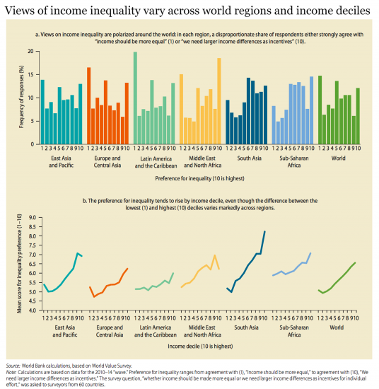
As the charts show, inequality is not universally viewed as inherently undesirable. The estimates come from the World Values Survey, where people are asked to locate their preferences for inequality in a range from 1 to 10 (where 1 implies agreement with the statement “Income should be more equal”, and 10 implies agreement with the statement “We need larger income differences as incentives for individual effort.”) These estimates have been calculated at the global level, as well as at the regional level.26
The top panel here represents the frequency of responses at each point in the 1-10 scale explained above. As a global average, we see substantial polarization: most people picked one of the extremes (either a high preference for equal incomes, or strong opposition to a reduction in inequality).
Notice that this polarization is even more pronounced in particular regions. While trends across Europe, Asia and Sub-Saharan Africa tend to be roughly similar to the average global pattern of responses; results are more polarized in Latin America & the Caribbean, and the Middle East and North Africa. Latin Americans tended to be much more supportive of more equal incomes, whereas the opposite was true in the Middle East.
In the bottom panel we see how these responses correlate with income. To be specific, we see average responses by income deciles (where 1 on the x-axis is the lowest income decile and 10 the highest). Across all regions, we see that richer individuals tend to be less inclined to favour a reduction in inequality (i.e. they see it as an important incentive); whereas those on lower incomes favour greater equality.
Regional differences, however, are still significant. In particular, in comparison to global averages, the correlation in Europe & Central Asia, Latin America and Sub-Saharan Africa is less pronounced; while in East Asia, and most notably South Asia, the correlation is stronger.
Views on inequality, by world region and relative income position27
We have already pointed out that differences in productivity are not generally sufficient to explain differences in incomes. This is partly reflected in the fact that worker salaries are often the result of bargaining between unions and firms.
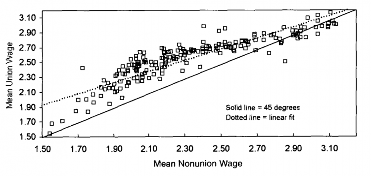
Card et al. (2004)28 use data from the US to compare the average wages of unionized and nonunionized workers with similar skills. The following scatter plot shows their results. The estimates correspond to 1993 data on the hourly earnings of males. Each dot corresponds to a different age-education group (the ‘skill levels’), and the units on both axes are mean log wages in 2001 dollars.
By construction, if union and nonunion workers in a given skill group have the same average wages, the points in this graph will lie on the 45-degree line.
As we can see, there is a ‘union wage gap’, reflected in the fact that most groups are above the 45-degree line. Moreover, this union wage gap appears to be larger for low-wage workers: the points are further above the 45-degree line for low-wage skill groups (those on the left). This is consistent with the hypothesis that unions tend to “flatten” wage differentials across skill groups.
As usual, we have to be careful in interpreting these results. As Card et al. (2004) point out, “there may be unobserved skill differences between union and nonunion workers in different age-education groups that tend to exaggerate the apparent negative correlation between wages in the nonunion sector and the union wage gap.”
Union Relative Wage Structure in the United States, 1993 – Figure 4a in Card et al. (2004) 29
Redistribution through tax-and-transfer policies
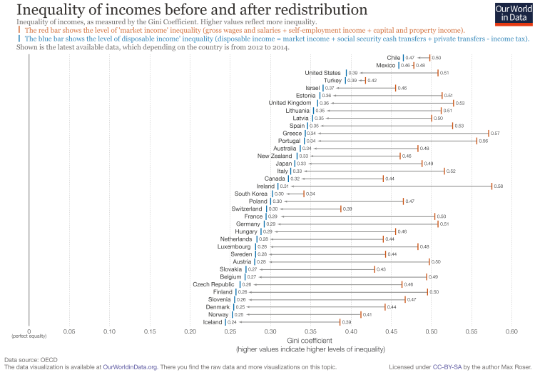
One way to gauge the extent to which taxation and public spending contribute to redistributing resources among individuals in a country is by looking at how the distributions of incomes change before and after taxes and transfers. The following two visualizations show this, by comparing the degree of income inequality (Gini coefficients), before and after taxes and transfers.
The static chart gives an overview across all OECD countries using the available estimates from 2012-2014. The interactive chart relies on the same definitions and data sources.
In both charts income before redistribution refers to market earnings before taxes and transfers (wages and salaries, self-employment income, capital and property income). Income after redistribution, on the other hand, corresponds to disposable income after taxes and transfers (market income, plus social security, cash transfers and private transfers, minus income taxes). In the 2008 OECD report Growing unequal? you can find further details regarding how incomes are measured.
As we can see, taxes and transfers do reduce inequality significantly: in all countries there is less inequality after redistribution takes place via taxes and transfers. Interestingly, however, the achieved reductions in inequality vary considerably between countries, and substantial cross-country heterogeneity in inequality remains after redistribution.
In Northern Europe, for example, within-country Gini coefficients after taxes and transfers are below 0.28. In the US and Latin America, Gini coefficients after redistribution are above 0.39. As a benchmark, 0.39 is the Gini coefficient in Iceland before redistribution.
The interactive visualization presents the same idea in a different view. The horizontal and vertical axis shows, respectively, Gini coefficients before and after redistribution. Along the diagonal line, incomes do not change after redistribution. Hence, the countries further below the diagonal line are those where taxes and transfers have the largest effect on incomes.
As we can see, European countries (shown in blue) tend to achieve more redistribution than other OECD countries. And this is true across different levels of staring inequality in market incomes.

We noted above that taxes and transfers reduce inequality in all OECD countries. Here we focus on the proportional magnitude of such reductions.
The following visualization shows the percentage point reduction in Gini coefficients that OECD countries achieve through redistribution. Here, the definitions of incomes before and after taxes and transfers is the same as in the previous two graphs.
These estimates show that across the 24 countries covered, taxes and transfers lower income inequality by around one-third on average (equivalent to around 0.15 Gini points). Yet cross-country differences are substantial, with declines ranging from about 45% in Denmark and Sweden, to about 8% in South Korea. The US—a country with high baseline levels of inequality—achieves a reduction of around 17%, which is almost half of the OECD average.
Generally speaking, countries that achieve the largest inequality reductions through taxes and transfers tend to be those with the lowest after-tax inequality.
While informative for the purpose of cross-country comparisons, these results have to be interpreted carefully, since the before-tax distribution of incomes is already the result of choices made by individuals who take taxes and transfers into consideration. Put simply, the before-tax distributions of incomes are likely to be different to the actual distributions of incomes that would be in place if there were no taxes or transfers. This can be clearly explained in the context of pensions: individuals receiving state pensions appear in the data as poor before transfers; but many of them would of course have private pensions if they lived in a country without state transfers.
Another point to keep in mind when studying these estimates is that inequality is not only reduced by redistribution between individuals at a given point in time, but also by achieving redistribution over the course of life. Indeed, pensions have scope for reducing within-country inequality by allowing redistribution of incomes between generations. The estimates in the chart reflect this.

What is the link between economic growth and inequality?
Over the last decades, a large body of theoretical and empirical research has attempted to determine whether inequality is good or bad for economic growth.
From a theoretical point of view there are arguments in both directions. It is for example possible that inequality leads to less economic growth via political instability and social unrest. But it is also possible that it leads to more economic growth via higher incentives for people to make productive investments.
Available OECD data shows that there is a negative correlation between inequality and economic growth across different subnational regions, within Europe, and also within OECD countries in the Americas. The visualization shows this as well, focusing on Europe.
This chart is a scatter plot, where each dot represents a different sub-national region. France, for example, is divided here in 22 different regions. For each of these sub-national regions, the vertical axis measures the average annual growth rate of GDP per capita in the period 2008-2012, and the horizontal axis measures inequality in 2007 (Gini coefficients). As we can see, there is a clear negative correlation: regions with more inequality in 2007 experienced less average growth in the subsequent years.
The above correlation does not imply causation. Indeed, the empirical literature on the causal effect of inequality on economic growth is largely inconclusive. A recent and mainly non-technical review of the literature can be found in OECD (2015), In It Together: Why Less Inequality Benefits All.

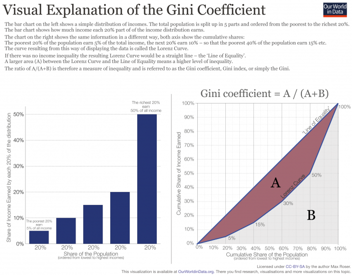
The Gini coefficient, or Gini index, is a measure of the income distribution of a population. It was developed by Italian statistician Corrado Gini (1884-1965) and is named after him.
This figure illustrates the definition of the Gini index: in a population in which income is perfectly equally distributed, the distribution of incomes would be represented by the ‘line of equality’ as shown in the chart – 10% of the population would earn 10% of the total income, 20% would earn 20% of the total income and so on.
The ‘Lorenz curve’ shows the income distribution in a population where income is not equally distributed. In the example you see that the bottom 60% of the population earn 30% of the total income.
The Gini coefficient captures the deviation of the Lorenz curve from the ‘line of equality’ by comparing the areas A and B:
Gini = A / (A + B)
This means a Gini coefficient of zero represents a distribution where the Lorenz curve is just the ‘Line of Equality’ and incomes are perfectly equally distributed. A value of 1 means maximal inequality – one person has all income and all others receive no income.
Graphical representation of the Gini coefficient
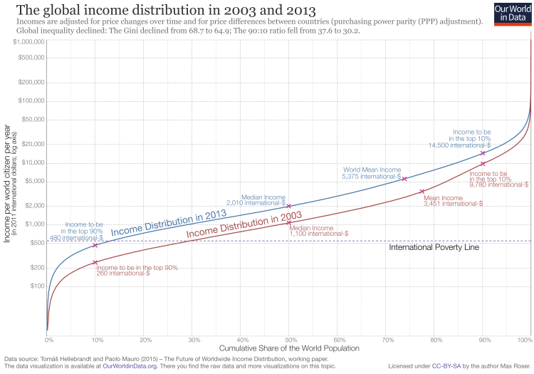
Another interesting way to study distributions is Pen’s Parade, named after Dutch economist Jan Pen (1921-2010).
This visualization shows an example of Pen’s Parade. It is the global distribution of incomes in 2003 and in 2013 as estimated by Hellebrandt and Mauro.31
The metaphor of a parade works well. The idea is that you order the people in a population by the level of their income. The first people in the parade are those with the lowest incomes, and the people with higher incomes make their appearance successively in the parade. Once half of the parade is over we see the person who earns the median income. In a typical distribution, it is only far into the second half of the parade that we see the person with the mean income appear. At the very end of the parade we see the individuals with the highest incomes.
- Data: Data on inequality of earnings, inequality of household disposable income, top income shares, poverty and inequality of wealth.
- Geographical coverage: 25 countries
- Time span: More than 100 years – 1900 to today
- Authors: Tony Atkinson, Joe Hasell, Salvatore Morelli, and Max Roser
- Available at: www.ChartbookOfEconomicInequality.com
- Data: LIS publishes harmonized microdata for the cross-country study of inequality. Based on this microdata LIS makes some inequality measures directly available in their ‘Key Figures’: the Gini coefficient, Atkinson coefficients, percentile ratios, data on relative poverty for different demographic groups, and mean and median income. Data referring to pre- and post-tax incomes are available.
- Geographical coverage: Around 50 countries
- Time span: Depending on the country data are available for different time periods. The LIS data are available in several waves typically starting in 1980 – but for a few countries data for the 1970s or 1960s is available.
- Available at: www.lisdatacenter.org – the website of the Luxembourg Income Study.
- Data: Poverty and inequality measures across the world – mix of consumption and income data.
- Geographical coverage: Global by country
- Time span: Going back to 1981 for some countries.
- Available: The Gini data is available through the World Bank’s World Development Indicators here. PovcalNet can be accessed at http://iresearch.worldbank.org/PovcalNet/home.aspx
- The global coverage of PovcalNet comes at a cost of lower comparability, such as in the use of both income and consumption surveys. PovcalNet is based on microdata for almost all countries.
The World Bank warns “PovcalNet was developed for the sole purpose of public replication of the World Bank’s poverty measures for its widely used international poverty lines, including $1.90 a day and $3.10 a day in 2011 PPP. The methods built into PovcalNet are considered reliable for that purpose. However, we cannot be confident that the methods work well for other purposes, including tracing out the entire distribution of income. We would especially warn that estimates of the densities near the bottom and top tails of the distribution could be quite unreliable, and no attempt has been made by the Bank’s staff to validate the tool for such purposes.”
- Data: Household disposable income by income decile for the working-age population and for the entire population. Equivalized household incomes and per capita incomes. Summary inequality measures (including Gini Indices).
- Geographical coverage: 27 high-income countries (most OECD countries)
- Time span: Data coverage differs by country – for some countries data goes back to 1978 while coverage is shorter for some other countries. Data is currently available until 2013.
- Authors: Stefan Thewissen, Brian Nolan and Max Roser (Institute for New Economic Thinking at the Oxford Martin School, University of Oxford).
- Available at:
- This data set was developed at the Institute for New Economic Thinking at the Oxford Martin School in the Employment, Equity, and Growth Programme.
- Data: The data set contains a lot of data of the income structure of the countries, including median income and incomes by deciles. Some ratios between income deciles are already calculated (P9/P1, P5/P1 and P9/P5 are frequently used in the empirical literature). Also, data on the incidence of low pay (2/3 of the median income), which is often referred to as relative poverty is included.
- Geographical coverage: OECD member states.
- Time span: The maximum time covered starts in 1950. Mostly, however, the individual time series are much shorter and go back only to around 1975.
- Website: The OECD publishes their cross-country inequality statistics in the Income Distribution Database (IDD) here.
- Underlying sources: The OECD regularly publishes a Metadata document detailing the underlying sources. The overview shows that the underlying source is very often the EU Survey of Income and Living Conditions (EU-SILC), but for some countries and especially for earlier years, the original sources are other country-specific surveys.
- Data: Gini-coefficients, share of income by different deciles, mean and median incomes, and some others (among them Gini coefficients reconstructed from the panel data set of incomes by deciles).
- Geographical coverage: 159 countries.
- Time span: The earliest data are from 1867 but most data are available for the period after 1960.
- Available at: Available on the website of the United Nations University here.
- The Standardized World Income Inequality Database (SWIID) is a revision of the WIID published by Frederick Solt on his website here.
- Data: Gini coefficients and Theil measure.
- Geographical coverage: 154 countries.
- Time span: Since 1963
- Available at: Available at the website of the University of Texas Inequality Project (UTIP).
- The University of Texas Inequality Project (UTIP) released the Estimated Household Income Inequality (EHII) data set that combines information from a UNIDO data set and the Deininger-Squire data set. The data set is is described in detail in Galbraith and Kum (2005) and Galbraith (2009).
- The EHII record is a revision and correction of the Deininger-Squire data set. The Deininger-Squire data were regressed on the UNIDO data described above, and of this adjustment, a model was calculated to construct comparable data from the Deininger – Squire data. In the regression model, the authors considered various control variables, the share of employment in the industrial sector, the definition of income recipients and the definition of income, and were able to control for the different income definitions of the Deininger – Squire data. Using this model and UNIDO data, the authors then constructed the EHII record. The current EHII 2008 data set contains 3513 observations. The data measure the inequality of gross household income and lie in the interval from 1 to 100. The dimensions correspond Gini indices and higher values represent a higher income inequality.
- Data: Gini coefficients and some data on various income deciles.
- Geographical coverage: Many countries. But often very few – sometimes only one – observations.
- Time span: 1947 to 1995. Most data are available for the time approximately between 1965 and 1985.
- Available at: The data set is available at the website of the World Bank here.
- The data set is a pioneering work in the field. Today the original data set is, however, rarely used. This is because the data are out of date, and the measures are very heterogeneous: First, some data refer to the income side, others to the expenditure side. Second, some data refer to the income before taxes, while others relate to the after-tax income. And thirdly, some data refer to household incomes, while other refer to individual incomes. For a criticism see Atkinson and Brandolini (2001).
The EHII data set of the University of Texas Inequality Project is a revised version of this data set (see above).
- Data: Gini coefficients – more than 2000 observations.
- Geographical coverage: 164 countries
- Time span: 1950 to today
- Available at: Available at the website of the World Bank here.
- The author of this data set is Branko Milanovic.
- Data from five sources are brought together in this data set:
1. Luxembourg Income Study (LIS)
2. Socio-Economic Database for Latin America
3. World Income Distribution
4. World Bank Europe and Central Asia
5. WIDER data set
In addition to these extensive data sets there are a number of more specialized panel data sets that contain only information for certain countries continents.
Transmonee Database (UNICEF)
The Transmonee record of UNICEF presents data on income distribution in transition countries.32
The Transmonee statistics include other socio-economic indicators. They can be accessed on the website of UNICEF here.
Socio-Economic Database for Latin America and the Caribbean (CEDLAS)
The website of the CEDLAS contains data on poverty and income distribution in 25 Latin American and Caribbean countries. The data have micro statistical surveys in each country as a basis. Data are available here.
National Poverty and Inequality Data by National/Sub-national Level (SEDAC)
This data set provides measurements of economic inequality and poverty for many countries in Africa, Asia, Europe and Latin America. The measures do not refer to incomes but to expenditures and measure the inequality of consumption. The data set contains various inequality measures: The measures of poverty by Foster, Greer and Thorbecke and inequality measures, such as the Atkinson index and Gini coefficient.
In addition to the above-mentioned panel data sets there are also country specific data sets – mostly based on survey data. Country-specific data are available for some industrial countries but usually do not go far back into the past.
USA: Panel Study of Income Dynamics (PSID). Panel published at Ann Arbor (Michigan) since the 1960s.
Princeton Working Group on Inequality: This data set includes measures of the income distribution for the individual U.S. states. The data set is created at the University of Princeton, based on census and survey data, ranging from 1963 to 2002.
Germany: Das Sozio-ökonomische Panel (SOEP) “Leben in Deutschland” published by the Deutschen Institut für Wirtschaftsforschung (DIW) in Berlin. It is a representative repeated survey of 12,000 private households in Germany carried out since 1984.
Great Britain: British Household Panel Survey (BHPS). Since 1991, this panel data set is being published by the University of Essex.
Australia: Household, Income and Labour Dynamics in Australia Survey (HILDA)
Italy: Survey on Household Income and Wealth (SHIW). The data is collected by the Banca d’Italia, the central bank of Italy
South Korea: Korea Labor and Income Panel Study (KLIPS)
Switzerland: Swiss Household Panel (SHP)
Canada: Canadian Survey of Labour and Income Dynamics (SLID)
European Union: European Community Household Panel. The EU data set summarizes the records of the individual panel data surveys of certain member states.