At Our World in Data we recently opened a public survey to understand how people use our work for teaching. To date, 92 educators based at institutions across the world have taken our survey. In this short blog post we want to share with you what we’ve learned so far from this exercise, and what we plan to do to improve.
What we seem to be doing right
It is exciting to see that the list of institutions where our work is being used for teaching is long and varied. The spectrum spans primary and secondary schools through to higher education institutions across the world, including Harvard, Oxford, Stanford, and Berkeley, and many more in Europe, Oceania, Asia, Africa, and the Americas.1
In terms of courses, our work is used in a similarly wide range of fields. Educators use our work to teach many different courses, from physics, medicine, psychology and biology; to sustainable development, economics, politics and public policy.
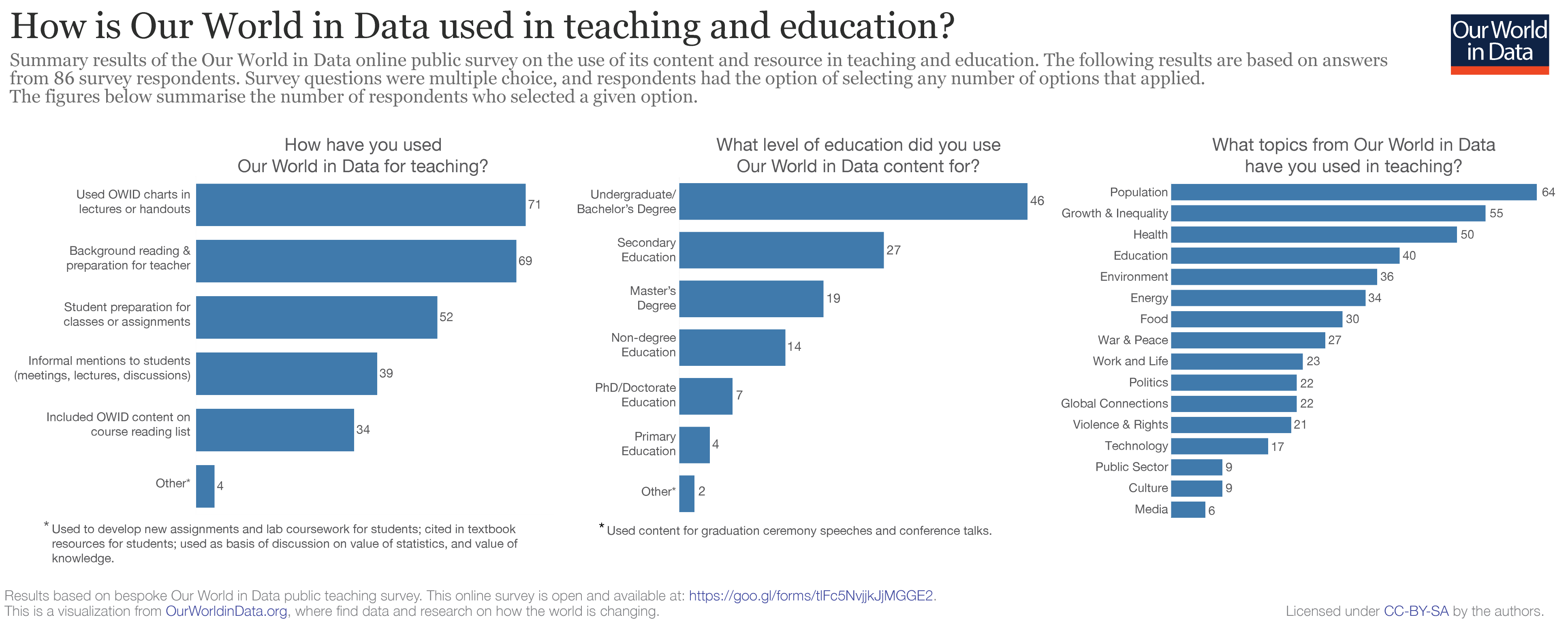
In the figure below we provide an overview of how this diverse group of educators is using our work. Here are some highlights:
- Teachers and professors use our work in many different ways. Taking charts for in-class presentations is common, but many teachers also use our work to enhance their reading list, set homework exercises or to prepare classes.
- Our work is very often used by students without any background knowledge on the topics. Indeed, we were positively surprised to see that many primary and secondary-school teachers use our work with their students.
- Teachers often rely on material across multiple topics. Many teachers combine material from poverty, inequality, demography, health, education, or the environment.
In the survey we ask educators why they prefer using our work over alternative sources. The answers here are also very encouraging: Many of you wrote that you find our charts simple and effective; while you find that our articles explaining the patterns in the data are well-documented and easy to understand.
What we can do to improve
Many educators have given us great ideas to develop new material and improve our resources. Some suggestions are very specific and straightforward, and we are working on these. For example, we will provide support on some aspects that still seem confusing, such as the fact that all our page links are permanent and stable (which is already the case!), so they can be used for citing in academic documents.
Some other suggestions are more ambitious and general. One particular such request that has come up often, is that we should provide teaching plans, exercises and sample lecture notes, in order to make it easier for students and teachers to navigate the by now quite large content of Our World in Data. This seems like a great idea and I got to work on this right away. In a couple of weeks we expect to be launching a ‘teaching hub’ – a page where we will collect resources (from us and from others) for teaching and learning about global development. For updates on this, subscribe to our newsletter here.
The survey is still open – if you have more feedback, we’d love to hear from you. To take our survey click here.