When and why did the world population grow? And how does rapid population growth come to an end? These are the big questions that are central to this research article.
The world population increased from 1 billion in 1800 to 7.7 billion today.
The world population growth rate declined from 2.2% per year 50 years ago to 1.05% per year.
Other relevant research:
Future population growth – This article focuses on the future of population growth. We explain how we know that population growth is coming to an end, and present projections of the drivers of population growth.
Life expectancy – Improving health leads to falling mortality and is therefore the factor that increases the size of the population. Life expectancy, which measures the age of death, has doubled in every region in the world as we show here.
Child & infant mortality – Mortality at a young age has a particularly big impact on demographic change.
Fertility rates – Rapid population growth has been a temporary phenomenon in many countries. It comes to an end when the average number of births per woman – the fertility rate – declines. In the article we show the data and explain why fertility rates declined.
Age Structure – What is the age profile of populations around the world? How did it change and what will the age structure of populations look like in the future?
All our charts on World Population Growth
How is the global population distributed across the world?
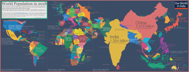
One way to understand the distribution of people across the world is to reform the world map, not based on area but according to population.
This is shown here in a population cartogram: a geographical presentation of the world where the size of the countries are not drawn according to the distribution of land, but according to the distribution of people. The cartogram shows where in the world the global population was at home in 2018.
The cartogram is made up of squares, each of which represents half a million people of a country’s population. The 11.5 million Belgians are represented by 23 squares; the 49.5 million Colombians are represented by 99 squares; the 1.415 billion people in China are represented by 2830 squares; and the entire world population of 7.633 billion people in 2018 is represented by the total sum of 15,266 squares.
As the size of the population rather than the size of the territory is shown in this map you can see some big differences when you compare it to the standard geographical map we’re most familiar with. Small countries with a high population density increase in size in this cartogram relative to the world maps we are used to – look at Bangladesh, Taiwan, or the Netherlands. Large countries with a small population shrink in size (look for Canada, Mongolia, Australia, or Russia).
You can find more details on this cartogram in our explainer: ‘The map we need if we want to think about how global living conditions are changing‘.
[click on the cartogram to enlarge it. And here you can download the population cartogram in high resolution (6985×2650).]
Which countries are most densely populated?
Our understanding of the world is often shaped by geographical maps. But this tells us nothing about where in the world people live. To understand this, we need to look at population density.
In the map we see the number of people per square kilometer (km2) across the world.
Globally the average population density is 25 people per km2, but there are very large differences across countries.
- Many of the world’s small island or isolated states have large populations for their size. Macao, Monaco, Singapore, Hong Kong and Gibraltar are the five most densely populated. Singapore has nearly 8,000 people per km2 – more than 200 times as dense as the US, and 2000 times that of Australia.
- Of the larger countries1, Bangladesh is the most densely-populated with 1,252 people per square kilometer; this is almost three times as dense as its neighbour, India. It’s followed by Lebanon (595), South Korea (528), the Netherlands (508) and Rwanda (495 per km2) completing the top five.
- If you hover the mouse on the bracket from 0 to 10 on the legend then you see the world’s least densely populated countries. Greenland is the least dense, with less than 0.2 people per square km2, followed by Mongolia, Namibia, Australia and Iceland. In our population cartogram these are the countries that take up much less space than on a standard geographical map.
If we want to understand how people are distributed across the world, another useful tool is the population cartogram: a geographical presentation of the world where the size of the countries are not drawn according to the distribution of land, but according to the distribution of people.
Here we show how the world looks in this way. When we see a standard map we tend to focus on the largest countries by area. But these are not always where the greatest number of people live. It’s this context we need if we want to understand how the lives of people around the world are changing.

How has world population growth changed over time?
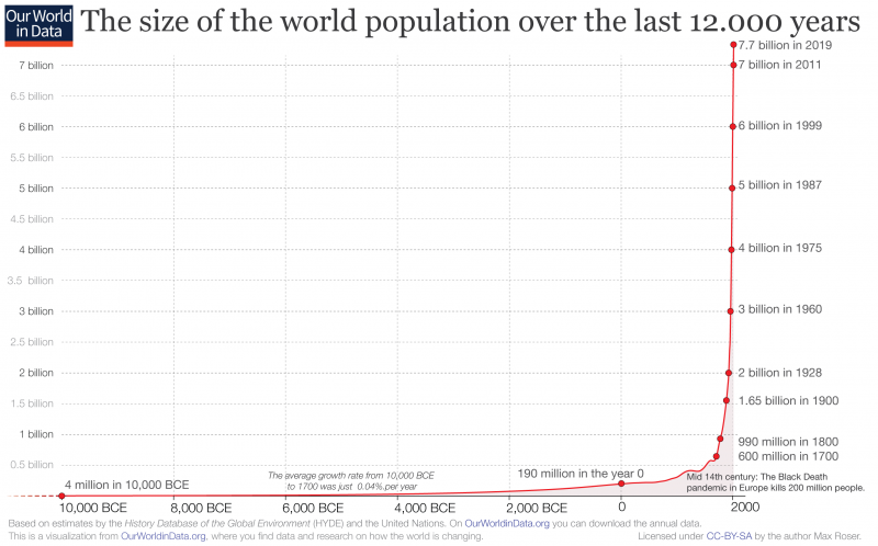
The chart shows the increasing number of people living on our planet over the last 12,000 years. A mind-boggling change: The world population today that is 1,860-times the size of what it was 12 millennia ago when the world population was around 4 million – half of the current population of London.
What is striking about this chart is of course that almost all of this growth happened just very recently. Historical demographers estimate that around the year 1800 the world population was only around 1 billion people. This implies that on average the population grew very slowly over this long time from 10,000 BCE to 1700 (by 0.04% annually). After 1800 this changed fundamentally: The world population was around 1 billion in the year 1800 and increased 7-fold since then.
Around 108 billion people have ever lived on our planet. This means that today’s population size makes up 6.5% of the total number of people ever born.2
For the long period from the appearance of modern Homo sapiens up to the starting point of this chart in 10,000 BCE it is estimated that the total world population was often well under one million.3
In this period our species was often seriously threatened by extinction.4
The interactive visualization is here. And you can also download the annual world population data produced by Our World in Data.
A number of researchers have published estimates for the total world population over the long run, we have brought these estimates together and you can explore these various sources here.
In terms of recent developments, the data from the UN Population Division provides consistent and comparable estimates (and projections) within and across countries and time, over the last century. This data starts from estimates for 1950, and is updated periodically to reflect changes in fertility, mortality and international migration.
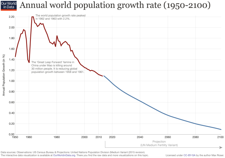
In the section above we looked at the absolute change in the global population over time. But what about the rate of population growth?
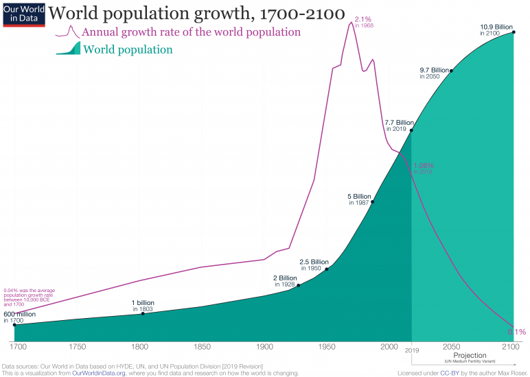
The global population growth rate peaked long ago. The chart shows that global population growth reached a peak in 1962 and 1963 with an annual growth rate of 2.2%; but since then, world population growth has halved.
For the last half-century we have lived in a world in which the population growth rate has been declining. The UN projects that this decline will continue in the coming decades.
A common question we’re asked is: is the global population growing exponentially? The answer is no. For population growth to be exponential, the growth rate would have be the same over time (e.g. 2% growth every year). In absolute terms, this would result in an exponential increase in the number of people. That’s because we’d be multiplying an ever-larger number of people by the same 2%. 2% of the population this year would be larger than 2% last year, and so on; this means the population would grow exponentially.
But, as we see in this chart, since the 1960s the growth rate has been falling. This means the world population is not growing exponentially – for decades now, growth has been more similar to a linear trend.
The previous section looked at the growth rate. This visualization here shows the annual global population increase from 1950 to today and the projection until the end of this century.
The absolute increase of the population per year has peaked in the late 1980s at over 90 million additional people each year. But it stayed high until recently. From now on the UN expects the annual increase to decline by around 1 million every year.

There are other ways of visually representing the change in rate of world population growth. Two examples of this are shown in the charts below.
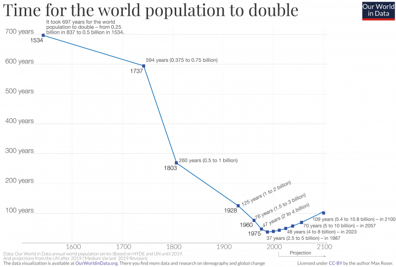
The visualization shows how strongly the growth rate of the world population changed over time. In the past the population grew slowly: it took nearly seven centuries for the population to double from 0.25 billion (in the early 9th century) to 0.5 billion in the middle of the 16th century. As the growth rate slowly climbed, the population doubling time fell but remained in the order of centuries into the first half of the 20th century. Things sped up considerably in the middle of the 20th century.
The fastest doubling of the world population happened between 1950 and 1987: a doubling from 2.5 to 5 billion people in just 37 years — the population doubled within a little more than one generation. This period was marked by a peak population growth of 2.1% in 1962.
Since then, population growth has been slowing, and along with it the doubling time. In this visualisation we have used the UN projections to show how the doubling time is projected to change until the end of this century. By 2100, it will once again have taken approximately 100 years for the population to double to a predicted 10.8 billion.
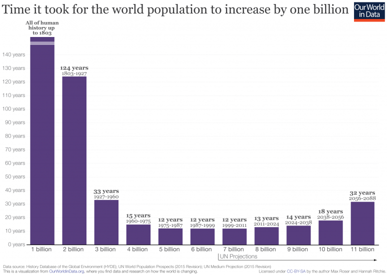
This visualization provides an additional perspective on population growth: the number of years it took to add one billion to the global population. Also shown in this figure is the number of years projected up to 11 billion based on the UN’s ‘medium variant’ projection.
This visualisation shows again how the population growth rate has changed dramatically through time. It wasn’t until 1803 that the world reached its first billion; it then took another 124 years to reach two billion. By the third billion, this period had reduced to 33 years, reduced further to 15 years to reach four. The period of fastest growth occurred through 1975 to 2011, taking only 12 years to increase by one billion for the 5th, 6th and 7th.
The world has now surpassed this peak rate of growth, and the period between each billion is expected to continue to rise. It’s estimated to take approximately 13 years to reach eight billion in 2024; a further 14 years to reach 9 billion in 2038; 18 years to reach 10 billion in 2056; and a further 32 years to reach the 11th billion in 2088.
Population growth by world region
Two hundred years ago the world population was just over one billion. Since then the number of people on the planet grew more than 7-fold to 7.7 billion in 2019. How is the world population distributed across regions and how did it change over this period of rapid global growth?
In this visualization we see historical population estimates by region from 1820 through to today. These estimates are published by the History Database of the Global Environment (HYDE) and the United Nations Population Division from 1950 onwards.
Most people always lived in Asia: Today it is 60% two hundred years ago it was 68%. If you want to see the relative distribution across the world regions in more detail you can switch to the relative view.
The world region that saw the fastest population growth over last two centuries was North America. The population grew 31-fold. Latin America saw the second largest increase (28-fold). Over the same period the population Europe of increased 3-fold, in Africa 14-fold, and in Asia 6-fold.
The distribution of the world population is expected to change significantly over the 21st century. We discuss projections of population by region here.

Population growth by country
What are the most populous countries in the world?
Over the last century, the world has seen rapid population growth. But how are populations distributed across the world? Which countries have the most people?
In the map, we see the estimated population of each country today. To see how this has changed since 10,000 BCE, you can use the ‘play’ button and timeline in the bottom-left of the chart. By clicking on any country, you can also see how its population has evolved over this period.
Here we see that the top five most populous countries are:
(1) China (1.44 billion)
(2) India (1.39 billion)
(3) United States (333 million)
(4) Indonesia (276 million)
(5) Brazil (214 million)
For several centuries, China has been the world’s most populous country. But not for long: it’s expected that India will overtake China within the next decade. You can learn more about future population growth by country here.

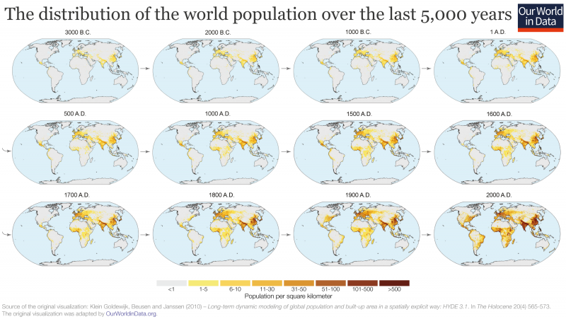
The distribution of the world population over the last 5000 years
This series of maps shows the distribution of the world population over time. The first map – in the top-left corner – shows the world population in 3000 BC.
Population centers have stayed remarkably stable over this long period.
Population growth rate by country and region
Global population growth peaked in the early 1960s. But how has population growth varied across the world?
There are two metrics we can use to look at population growth rates:
(1) ‘Natural population growth’: this is the change in population as determined by births and deaths only. Migration flows are not counted.
(2) Population growth rate: this is the change in population as determined by births, deaths plus migration flows.
Both of these measures of population growth across the world are shown in the two charts. You can use the slider underneath each map to look at this change since 1950. Clicking on any country will show a line chart of its change over time, with UN projections through to 2099.
We see that there are some countries today where the natural population growth (not including migration) is slightly negative: the number of deaths exceed the number of births. When we move the time slider underneath the map to past years, we see that this is a new phenomenon. Up until the 1970s, there were no countries with a negative natural population growth.
Worldwide, population growth is slowing—you can press the play arrow at the bottom of the chart to see the change over time.
Overall, growth rates in most countries have been going down since the 1960s. Yet substantial differences exist across countries and regions.
Whilst Western Europe’s growth rates are currently close to zero, sub-Saharan Africa’s rates remain higher than 3% — that is, still higher than the peak growth rates recorded for the world at the beginning of the 1960s. Moreover, in many cases there has been divergence in growth rates. For instance, while India and Nigeria had similar growth rates in 1960 (around 2%), they took very different paths in the following years and thus currently have populations that grow at very different rates (about 0.98% for India compared to 2.53% for Nigeria).


Two centuries of rapid global population growth will come to an end
One of the big lessons from the demographic history of countries is that population explosions are temporary. For many countries the demographic transition has already ended, and as the global fertility rate has now halved we know that the world as a whole is approaching the end of rapid population growth.
This visualization presents this big overview of the global demographic transition – with the very latest data from the UN Population Division.
As we explore at the beginning of the entry on population growth, the global population grew only very slowly up to 1700 – only 0.04% per year. In the many millennia up to that point in history very high mortality of children counteracted high fertility. The world was in the first stage of the demographic transition.
Once health improved and mortality declined things changed quickly. Particularly over the course of the 20th century: Over the last 100 years global population more than quadrupled. As we see in the chart, the rise of the global population got steeper and steeper and you have just lived through the steepest increase of that curve. This also means that your existence is a tiny part of the reason why that curve is so steep.
The 7-fold increase of the world population over the course of two centuries amplified humanity’s impact on the natural environment. To provide space, food, and resources for a large world population in a way that is sustainable into the distant future is without question one of the large, serious challenges for our generation. We should not make the mistake of underestimating the task ahead of us. Yes, I expect new generations to contribute, but for now it is upon us to provide for them. Population growth is still fast: Every year 140 million are born and 58 million die – the difference is the number of people that we add to the world population in a year: 82 million.
Where do we go from here?
In red you see the annual population growth rate (that is, the percentage change in population per year) of the global population. It peaked around half a century ago. Peak population growth was reached in 1968 with an annual growth of 2.1%. Since then the increase of the world population has slowed and today grows by just over 1% per year. This slowdown of population growth was not only predictable, but predicted. Just as expected by demographers (here), the world as a whole is experiencing the closing of a massive demographic transition.
This chart also shows how the United Nations envision the slow ending of the global demographic transition. As population growth continues to decline, the curve representing the world population is getting less and less steep. By the end of the century – when global population growth will have fallen to 0.1% according to the UN’s projection – the world will be very close to the end of the demographic transition. It is hard to know the population dynamics beyond 2100; it will depend upon the fertility rate and as we discuss in our entry on fertility rates here fertility is first falling with development – and then rising with development. The question will be whether it will rise above an average 2 children per woman.
The world enters the last phase of the demographic transition and this means we will not repeat the past. The global population has quadrupled over the course of the 20th century, but it will not double anymore over the course of this century.
The world population will reach a size, which compared to humanity’s history, will be extraordinary; if the UN projections are accurate (they have a good track record), the world population will have increased more than 10-fold over the span of 250 years.
We are on the way to a new balance. The big global demographic transition that the world entered more than two centuries ago is then coming to an end: This new equilibrium is different from the one in the past when it was the very high mortality that kept population growth in check. In the new balance it will be low fertility keeps population changes small.
The past future of the global age structure
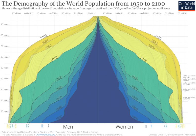
In 1950 there were 2.5 billion people on the planet. Now in 2019, there are 7.7 billion. By the end of the century the UN expects a global population of 11.2 billion. This visualization of the population pyramid makes it possible to understand this enormous global transformation.
Population pyramids visualize the demographic structure of a population. The width represents the size of the population of a given age; women on the right and men to the left. The bottom layer represents the number of newborns and above it you find the numbers of older cohorts. Represented in this way the population structure of societies with high mortality rates resembled a pyramid – this is how this famous type of visualization got its name.
In the darkest blue you see the pyramid that represents the structure of the world population in 1950. Two factors are responsible for the pyramid shape in 1950: An increasing number of births broadened the base layer of the population pyramid and a continuously high risk of death throughout life is evident by the pyramid narrowing towards the top. There were many newborns relative to the number of people at older ages.
The narrowing of the pyramid just above the base is testimony to the fact that more than 1-in-5 children born in 1950 died before they reached the age of five.5
Through shades of blue and green the same visualization shows the population structure over the last decades up to 2018. You see that in each subsequent decade the population pyramid was fatter than before – in each decade more people of all ages were added to the world population.
If you look at the green pyramid for 2018 you see that the narrowing above the base is much less strong than back in 1950; the child mortality rate fell from 1-in-5 in 1950 to fewer than 1-in-20 today.
In comparing 1950 and 2018 we see that the number of children born has increased – 97 million in 1950 to 143 million today – and that the mortality of children decreased at the same time. If you now compare the base of the pyramid in 2018 with the projection for 2100 you see that the coming decades will not resemble the past: According to the projections there will be fewer children born at the end of this century than today. The base of the future population structure is narrower.
We are at a turning point in global population history. Between 1950 and today, it was a widening of the entire pyramid – an increase of the number of children – that was responsible for the increase of the world population. From now on is not a widening of the base, but a ‘fill up’ of the population above the base: the number of children will barely increase and then start to decline, but the number of people of working age and old age will increase very substantially. As global health is improving and mortality is falling, the people alive today are expected to live longer than any generation before us.
At a country level “peak child” is often followed by a time in which the country benefits from a “demographic dividend” when the proportion of the dependent young generation falls and the share of the population in working age increases.7
This is now happening at a global scale. For every child younger than 15 there were 1.8 people in working-age (15 to 64) in 1950; today there are 2.5; and by the end of the century there will be 3.4.8
Richer countries have benefited from this transition in the last decades and are now facing the demographic problem of an increasingly larger share of retired people that are not contributing to the labor market. In the coming decades it will be the poorer countries that can benefit from this demographic dividend.
The change from 1950 to today and the projections to 2100 show a world population that is becoming healthier. When the top of the pyramid becomes wider and looks less like a pyramid and instead becomes more box-shaped, the population lives through younger ages with very low risk of death and dies at an old age. The demographic structure of a healthy population at the final stage of the demographic transition is the box shape that we see for the entire world for 2100.
The Demography of the World Population from 1950 to 21006
How many people die and how many are born each year?
The world population has grown rapidly, particularly over the past century: in 1900 there were fewer than 2 billion people on the planet; today there are 7.7 billion.
The change in the world population is determined by two metrics: the number of babies born, and the number of people dying.
The stacked area chart shows the number of births by world region from 1950 to 2015.
In 2015, there were approximately 140 million births – 43 million more than back in 1950
The line chart shows the same data, but also includes the UN projection until the end of the century. It is possible to switch this chart to any other country or world region in the world.


The first chart shows the annual number of deaths over the same period.
In 2015 around 55 million people died. The world population therefore increased by 84 million in that year (that is an increase of 1.14%).
The line chart shows the same data, but also includes the UN projection until the end of the century. Again it is possible to switch this chart to any other country or world region in the world.


How do we expect this to change in the coming decades? What does this mean for population growth?
Population projections show that the yearly number of births will remain at around 140 million per year over the coming decades. It is then expected to slowly decline in the second-half of the century. As the world population ages, the annual number of deaths is expected to continue to increase in the coming decades until it reaches a similar annual number as global births towards the end of the century.
As the number of births is expected to slowly fall and the number of deaths to rise the global population growth rate will continue to fall. This is when the world population will stop to increase in the future.
Why is rapid population growth a temporary phenomenon?
Population growth is determined by births and deaths and every country has seen very substantial changes in both: In our overview on how health has changed over the long run you find the data on the dramatic decline of child mortality that has been achieved in all parts of the world. And in our coverage of fertility you find the data and research on how modern socio-economic changes – most importantly structural changes to the economy and a rise of the status and opportunities for women – contributed to a very substantial reduction of the number of children that couples have.
But declining mortality rates and declining fertility rates alone would not explain why the population increases. If they happened at the same time the growth rate of the population would not change in this transition. What is crucial here is the timing at which mortality and fertility changes.
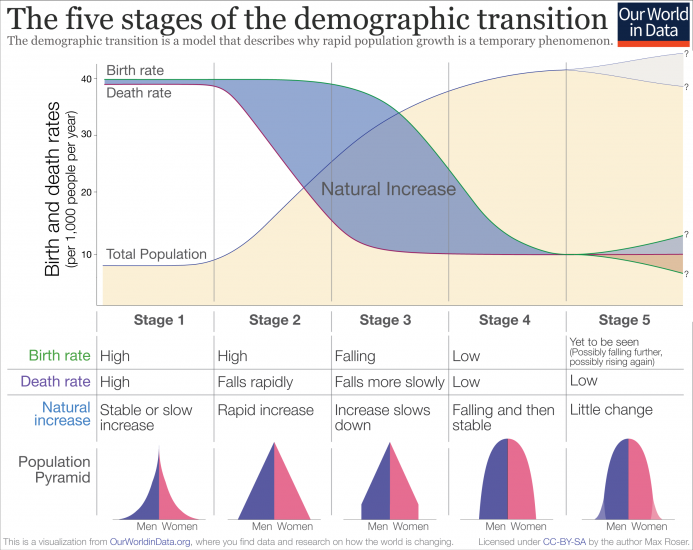
The model that explains why rapid population growth happens is called the ‘demographic transition’. It is shown in the schematic figure. It is a beautifully simple model that describes the observed pattern in countries around the world and is one of the great insights of demography.9
The demographic transition is a sequence of five stages:
- Stage 1: high mortality and high birth rates. In the long time before rapid population growth the birth rate in a population is high, but since the death rate is also high we observe no or only very small population growth. This describes the reality through most of our history. Societies around the world remained in stage 1 for many millennia as the long-run perspective on extremely slow population growth highlighted. At this stage the population pyramid is broad at the base but since the mortality rate is high across all ages – and the risk of death is particularly high for children – the pyramid gets much narrower towards the top.
- Stage 2: mortality falls but birth rates still high. In the second phase the health of the population slowly starts to improve and the death rate starts to fall. Since the health of the population has already improved, but fertility still remains as high as before, this is the stage of the transition at which the size of the population starts to grow rapidly. Historically it is the exceptional time at which the extended family with many (surviving) children is common.
- Stage 3: mortality low and birth rates fall. Later the birth rate starts to fall and consequentially the rate at which the population grows begins to decline as well. Why the fertility rate falls is a question that we answer here. But to summarize the main points: When the mortality of children is not as high as it once was parents adapt to the healthier environment and choose to have fewer children; the economy is undergoing structural changes that makes children less economically valuable; and women are empowered socially and within partnerships and have fewer children than before.
- Stage 4: mortality low and birth rates low. Rapid population growth comes to an end in stage 4 as the birth rate falls to a similar level as the already low mortality rate. The population pyramid is now box shaped; as the mortality rate at young ages is now very low the younger cohorts are now very similar in size and only at an old age the cohorts get smaller very rapidly.
- Stage 5: mortality low and some evidence of rising fertility. The demographic transition describes changes over the course of socio-economic modernization. What happens at a very high level of development is not a question we can answer with certainty since only few societies have reached this stage. But we do have some good evidence – which we review here – that at very high levels of development fertility is rising again. Not to the very high levels of pre-modern times, but to a fertility rate that gets close to 2 children per woman. What level exactly the fertility rate will reach is crucial for the question of what happens to population growth in the long run. If the fertility rate stays below 2 children per woman then we will see a decline of the population size in the long run. If indeed the fertility rate will rise above 2 children per woman we will see a slow long-run increase of the population size.
Empirical evidence for the demographic transition
If fertility fell in lockstep with mortality we would not have seen an increase in the population at all. The demographic transition works through the asynchronous timing of the two fundamental demographic changes: The decline of the death rate is followed by the decline of birth rates.
This decline of the death rate followed by a decline of the birth rate is something we observe with great regularity and independent of the culture or religion of the population.
The chart presents the empirical evidence for the demographic transition for five very different countries in Europe, Latin America, Africa, and Asia. In all countries we observed the pattern of the demographic transition, first a decline of mortality that starts the population boom and then a decline of fertility which brings the population boom to an end. The population boom is a temporary event.
In the past the size of the population was stagnant because of high mortality, now country after country is moving into a world in which the population is stagnant because of low fertility.
Demographic transition in 5 countries, 1820-201010
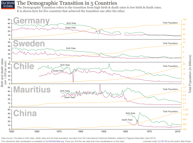
Perhaps the longest available view of the demographic transition comes from data for England and Wales. In 1981, Anthony Wrigley and Roger Schofield11 published a major research project analyzing English parish registers—a unique source that allowed them to trace demographic changes for the three centuries prior to state records. According to the researchers, “England is exceptionally fortunate in having several thousand parish registers that begin before 1600”; collectively, with their early start and breadth of coverage, these registers form an excellent resource. As far as we know, there is no comparable data for any other country up until the mid-eighteenth century (see the following section for Sweden, where recordkeeping began in 1749).
The chart shows the birth and death rates in England and Wales over the span of nearly 500 years. It stitches together Wrigley and Schofield’s data for the years 1541-1861 with two other sources up to 2015 (click on the chart’s ‘sources’ tab for details). As we can see, a growing gap opens up between the birth and death rate after 1750, creating a population explosion. Around the 1870’s, we begin to see the third stage of the demographic transition. As the birth rate starts to follow the death rate’s decline, that gap between the two starts to shrink, slowing down the population growth rate.

Zooming in on one of these countries, we take a look at Sweden’s demographic transition. The country’s long history of population recordkeeping—starting in 1749 with their original statistical office, ‘the Tabellverket’ (Office of Tables)—makes it a particularly interesting case study of the mechanisms driving population change.
Statistics Sweden, the successor of the Tabellverket, publishes data on both deaths and births since recordkeeping began more than 250 years ago. These records suggest that around the year 1800, the Swedish death rate started falling, mainly due to improvements in health and living standards, especially for children.12
Yet while death rates were falling, birth rates remained at a constant pre-modern level until the 1860s. During this period and up until the first half of the 20th century, there was a sustained gap between the frequency of deaths and the frequency of births. It was because of this gap that the Swedish population increased. The following visualization supports these observations.

The visualization presents the birth and death rate for all countries of the world over the last 5 decades. You can see the change over by moving the slider underneath back and forth or by pressing the “play” button. Countries per continent can also be highlighted by hovering and clicking on them in the legend on the right side of the chart.
By visualising this change we see how in country after country the death rate fell and the birth rate followed – countries moved to left-hand-side first and then fell to the bottom left corner.
Today, different countries straddle different stages of the model. Most developed countries have reached stage four and have low birth and death rates, while developing countries continue to make their way through the stages.

How development affects population growth
There are two important relationships that help explain how the level of development of a country affects its population growth rates:
- Fertility rate is the parameter which matters most for population changes – it is the strongest determinant;
- As a country gets richer (or ‘more developed’), fertility rates tend to fall.
Combining these two relationships, we would expect that as a country develops, population growth rates decline.
Generally, this is true. In the visualization, we see how the population growth rate has changed for ‘more developed’, ‘less developed’ and ‘least developed’ countries (based on UN categorization), and how they are projected to change through 2099.
Here we see that population growth rates are lowest in the most developed regions – starting at just over 1% in the 1950s and falling to just 0.19% today. ‘Less developed’ regions peaked later, at a higher growth rate (2.55%) and have declined more slowly. ‘Least developed’ regions did not peak in growth rate until the early 1990s.
Over the last two decades we have seen declining population growth rates in countries at all stages of development.

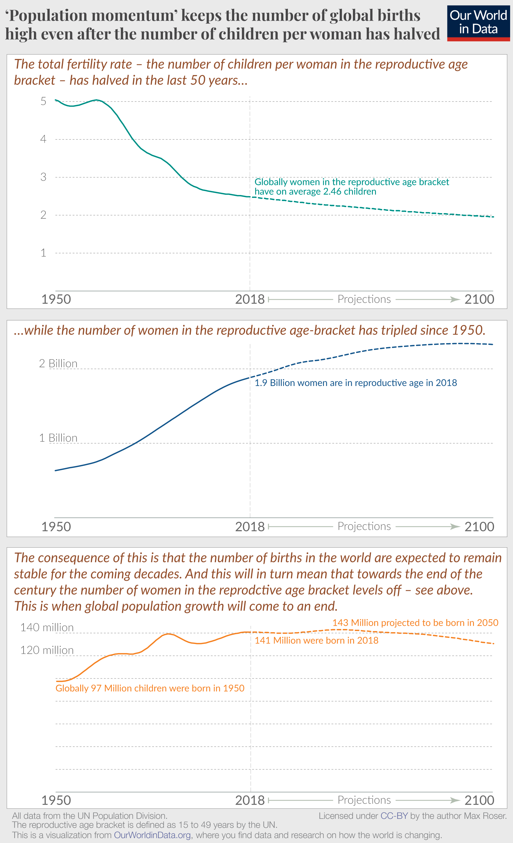
Population momentum
In 1965 the average woman on the planet had 5 children. 50 years later this statistic – called the total fertility rate – has fallen to less than half. The first panel in this chart shows this fundamental change.
The total fertility rate at which a population replaces itself from one generation to the next is called the replacement fertility rate. If no children died before they grew up to have children themselves the replacement fertility rate would be 2. Because some children die, the global replacement fertility rate is currently 2.3 and therefore only slightly lower than the actual global fertility rate. Why then is global population growth not coming to an end yet?
The number of births per woman in the reproductive age bracket is only one of two drivers that matter here. The second one is the number of women in the reproductive age bracket.
If there were few women in the reproductive age bracket the number of births will be low even when the fertility rate is high. At times when an increasing share of women enter the reproductive age bracket the population can keep growing even if the fertility rate is falling. This is what demographers refer to as ‘population momentum’ and it explains why the number of children in the world will not decline as rapidly as the fertility rate.
The second chart in this panel shows that the population growth over the last decades resulted in increasingly larger cohorts of women in the reproductive age bracket. As a result, the number of births will stay high even as the number of births per woman is falling. This is what the bottom panel in the chart shows. According to the UN projections, the two drivers will cancel each other out so that the number of births will stay close to the current level for many decades.
The number of births is projected to change little over the course of this century. In the middle of the 21st century the number of births is projected to reach a peak at 143 million and then to decline slowly to 131 million births by 2100. The coming decades will be very different from the last. While the annual number of births increased by 43 million since 1950 we are now close to what the late Hans Rosling called “the age of peak child” – the moment in global demographic history at which the number of children in the world stops increasing. How close we are to peak child we looked at in a more detailed post.
Population momentum is one important driver for high population growth. But it of course also matters that all of us today live much longer than our ancestors just a few generations ago. Life expectancy is now twice as long in all world regions.
In all of this it is important to keep in mind that these are projections and how the future will actually play out will depend on what we are doing today.
Population momentum is driven by the increasingly large cohorts of women in the reproductive age bracket. It’s only when both the fertility rate and the number of women level off that population momentum stops. And this is when global population growth will come to an end. Hans Rosling explained it better than anyone, with the help of toilet rolls.
How does migration affect country populations?
At the global level, population changes are determined by the balance of only two variables: the number of people born each year, and the number who die.
At regional or country levels there is a third variable to consider: migration into (immigration) or migration out of (emigration) the region/country. How large of an impact does migration have on population changes across the world?
In this chart we see the annual population growth rate under two scenarios:
- population growth rate with migration – this includes the balance of births, deaths plus migration;
- a hypothetical population growth rate if there was zero migration (i.e. it is based only on the balance of births and deaths).
The example shown here is the United States but you can explore this data for any country or region using the “change country” button on the interactive chart.
In the United States we see that since the early 1950s, migration into the USA has exceeded emigration out of the country. This means net migration has been positive, and resulted in a higher population growth rate than would have occurred in the scenario with zero migration. In 2015, for example, the actual population growth rate was 0.68%. With zero migration, this would have been 0.38%.
This is also true for most countries across Europe. In fact, population growth would have been negative (i.e. the population would have been in decline) in Europe since the early 1990s without migration. In 2015, the European population increased by 0.17%; with no migration, it would have decreased by 0.02%.
The opposite is of course true for countries where emigration (out of the country) is higher than immigration. Take Nepal as an example: in the mid-1990s its actual population growth rate has been lower than it would have been in the absence of migration. In 2015, its growth rate was 0.66%. With zero migration it would have been 1.43%.

Population age structure
This article previously covered aspects of population age structure; you now find this material in our entry on Age Structure.
The track record of the UN projections
We evaluate the track record of the UN projections in the entry on future population growth.
How much do population estimates differ?
It’s expected that sources will differ in their projections for future populations: although the UN projections to date have been remarkably accurate, they are based on a number of assumptions regarding the change in fertility, mortality and migration over time.
But historic and current population estimates between sources are also not identical. The UN Population Division publishes the most-widely adopted figures, but there are a few other key data sources including the US Census Bureau and Population Reference Bureau (PRB).
How do these sources compare? In the chart we see the comparison between the UN (shown in red) and US Census Bureau (in blue) estimates globally and by region. Global estimates have varied by around 0.5-1.5%.
The largest variation comes from estimates of Asia, Africa and Latin America – where census data and underlying data sources will be less complete and lower quality. This means some interpretation and judgement is necessary from expert demographers within each organization. It’s in this process of expert interpretation that most of the difference will arise.
A comparison of 2015 estimates between the UN, US Census Bureau and PBS are shown in this table.13,14,15
Here we see that the UN and PBS estimates are very similar at around 7.34 to 7.35 billion. US Census Bureau estimates are around 1-2% lower at 7.25 billion.
With known gaps in census data and underlying sources, it’s recommended that population estimates are given to only 3 to 4 significant figures. Quoting them to more gives a false sense of precision. Across the sources, we can say that there were 7.25 to 7.4 billion people in the world in 2015.

| Source | World population (2015) |
|---|---|
| United Nations Population Division (2017 Revision) | 7,383,009,000 |
| US Census Bureau (2017) | 7,247,892,788 |
| Population Reference Bureau (2015) | 7,336,435,000 |
How are population revisions created?
The most discussed estimates of world population from the last century are those from the UN Population Division. These estimates are revised periodically and aim to be consistent and comparable within and across countries and time.
The methodology used by the UN to produce their estimates and projections is explained extensively in the World Population Prospects’ Methodology Report.
In short, estimates of the population in the past (i.e. 1950-2015) are produced by starting with a base population for 1 July 1950 and computing subsequent populations based on the components that drive population change (fertility, mortality, and international migration). The estimates of these components are taken directly from national statistical sources or—where only partial or poor-quality data exists—are estimated by the Population Division staff. Population counts from periodic censuses are used as benchmarks. This calculation is called the “cohort-component” method because it estimates the change in population by age and sex (cohort) on the basis of the three afore-mentioned demographic components: fertility, mortality, and international migration.
One of the main implications of using the cohort-component method is that it sometimes leads to marked inconsistencies with official country statistics. The process of ‘revising’ the estimates involves incorporating new information about the demography of each country.
What is the quality of birth and death registration?
The standard methodology used for producing population estimates relies on the so-called cohort-model. Providing high-quality estimates requires reliable and up-to-date census data.
Crucial to population estimates are birth and mortality rates: this census data therefore relies birth registration and death reporting.
The two maps show the completeness of birth and death reporting across the world. Many countries, particularly those in the least developed regions of the world, have limited census data.
For countries with no data in one or two decades before each revision, the UN relies on other methodologies. One is to derive estimates by extrapolating trends from countries in the same region with a socio-economic profile considered close to the country in question.


Estimates of ancient population
As discussed in the previous section, there are a number of studies providing historic population data. The most commonly cited source is McEvedy and Jones (1978).
- Data Source: McEvedy, Colin and Richard Jones (1978), “Atlas of World Population History,” Facts on File, New York, pp. 342-351; relying on archeological and anthropological evidence, as well as historical documents such as Roman and Chinese censuses
- Description of available measures: Population
- Time span: 400BCE-2,000CE
- Geographical coverage: Global by country and regions
This above source is an input used in producing the HYDE project data, as well as other datasets. Further references to this source are available in Goldewijk, K. K., Beusen, A., & Janssen, P. (2010). Long-term dynamic modelling of global population and built-up area in a spatially explicit way: HYDE 3.1. The Holocene.
- Data Source: History Database of the Global Environment project, using estimates from McEvedy and Jones (1978), Livi-Bacci (2007)16, Maddison (2001)17, and Denevan (1992)18
The data from the HYDE project is in turn the basis for the population series published by the ‘Clio-Infra’ project
- Data Source: HYDE project and UN Population Division
- Description of available measures: Population
- Time span: 1,500-2,000CE
- Geographical coverage: Global by country
- Link: www.clio-infra.eu/
Estimates of population in recent history and projections
- Data Source: UN Population Division based on ‘cohort-component’ framework by demographic trends (see Data Quality section)
- Description of available measures:
◦ Population, by Five-Year Age Group and Sex
◦ Population Sex Ratio (males per 100 females)
◦ Median Age
◦ Population Growth Per Year
◦ Crude Birth Rate
◦ Crude Death Rate
◦ Net Reproduction Rate
◦ Total Fertility Rate
◦ Life Expectancy at Birth by Sex
◦ Net Migration Rate
◦ Sex ratio at birth
◦ Births
◦ Births by Age-group of Mother
◦ Age-specific Fertility Rates
◦ Women Aged 15-49
◦ Deaths by Sex
◦ Infant Mortality
◦ Mortality Under Age 5
◦ Dependency Ratios
◦ Population by Age: 0-4, 0-14, 5-14, 15-24, 15-59, 15-64, 60+, 65+, 80+ - Time span: 1950-2015
- Geographical coverage: Global by country
- Link: http://esa.un.org/unpd/wpp/
- Data Source: Center for International Earth Science Information Network (CIESIN), published by the Socioeconomic Data and Applications Center (SDAC) based on census data
- Description of available measures: Population
- Time span: 1990-2010
- Geographical coverage: Global at a 2.5 arc-minute spatial resolution
- Link: http://sedac.ciesin.columbia.edu/data/collection/gpw-v3
- Notes: Within the CIESIN, the Anthropogenic Biomes map the distribution of the world population at different points in time: 1700, 1800, 1900, 2000. These maps focus on the varying impact of humans on the environment.
- Data Publisher: University of Iowa (originally developed by the Oak Ridge National Laboratory (ORNL) for the Department of Defense, U.S.)
- Data Source: Annual mid-year national population estimates from the Geographic Studies Branch, US Bureau of Census
- Description of available measures: Population and ‘ambient population’ (a measure of person-hours accounting for varying presence throughout the day in commercial areas)
- Time span: 1998-2012, but authors warn of inter-temporal comparability issues
- Geographical coverage: Global at 30 arc-second grid spatial resolution (highest population resolution available)
- Link: http://sedac.ciesin.columbia.edu/data/collection/gpw-v3
- Data Publisher: World Bank
- Data Source: UN Population Division
- Description of available measures: Population growth (annual %)
- Time span: 1981-2015
- Geographical coverage: Global by country
- Link: http://data.worldbank.org/indicator/
Compilations of census data and other sources
Historical population data on a sub-national level – including their administrative divisions and principal towns – is collected by Jan Lahmeyer and published at his website www.populstat.info.
The Minnesota Population Center publishes various high-quality datasets based on census data beginning in 1790. At the time of writing this source was online at www.pop.umn.edu/index.php. It focuses on North America and Europe.
The Data & Information Services Center (DISC) Archive at University of Wisconsin-Madison provides access to census data and population datasets (mostly for the Americas). At the time of writing this source was online at http://www.disc.wisc.edu.
The International Database published by the U.S. Census Bureau provides data for the time 1950-2100. At the time of writing this source was online at https://www.census.gov/data-tools/demo/idb/informationGateway.php.
The Atlas of the Biosphere publishes data on Population Density. At the time of writing this source was online at www.sage.wisc.edu/atlas/maps.