Summary
Workers in richer countries tend to work fewer hours than workers in poorer countries. This is because in richer countries workers are able to produce more with each hour of work, which translates into higher incomes and the ability to work less. The large differences in working hours across countries have important implications for the way we think about the economic progress made in the last two centuries and the nature of inequality between countries today.
Economic prosperity in different places across our world today is vastly unequal. People in Switzerland, one of the richest countries in the world, have an average income that is more than 20-times higher than that of people in Cambodia.1 Life in these two countries can look starkly different.2
When considering such differences in prosperity, a natural question is: who works more, people in richer countries like Switzerland or in poorer ones like Cambodia?
Looking at the available data, the answer is clear: workers in poorer countries actually tend to work more, and sometimes much more.
We see that in the chart here, with GDP per capita on the horizontal axis and annual working hours per worker on the vertical axis.
Countries like Cambodia (which is the country in the very top-left corner) or Myanmar have some of the lowest GDP per capita but highest working hours. In Cambodia the average worker puts in 2,456 hours each year, nearly 900 more hours than in Switzerland (1,590 hours) at the bottom-right of the chart. The extra 900 hours for Cambodian workers means longer work days and many fewer days off.
There is a link between national income and average working hours, not only across countries at a given point in time — as shown in the chart above — but also for individual countries over time.
Since the Industrial Revolution people in many countries have become richer, and working hours have decreased dramatically over these last 150 years.
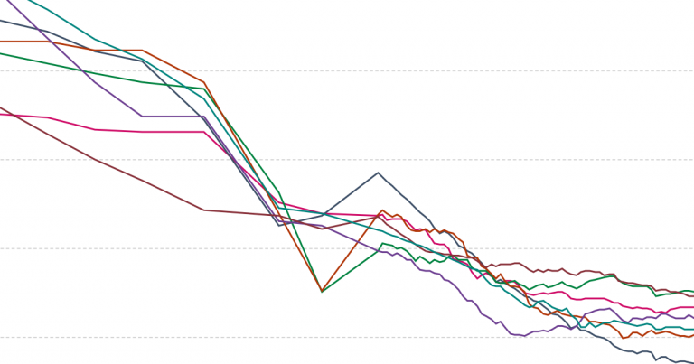
In the chart here we show this association between incomes and working hours over time, country by country. It is the same chart as above, except now countries’ single data points have become lines, connecting observations over time from 1950 until today.
The four highlighted countries exemplify how working hours have decreased at the same time that average incomes have increased. Germany, for example, moved far to the right as its GDP per capita increased more than 10-fold (from $4,644 to $47,556), and far to the bottom as working hours decreased by nearly half (from 2,427 hours to 1,354 hours each year).3
This makes sense: as people’s incomes rise they can afford more of the things they enjoy, including more leisure and less time spent working.
You can explore this association for other countries by clicking “Select countries” on the chart.
The key driver of rising national incomes and decreasing working hours is productivity growth.
Productivity refers to the rate at which inputs are turned into outputs. To understand working hours the key metric is labor productivity: the economic return for one hour of work.
At the most concrete level, labor productivity captures things like the number of breads that a baker bakes in an hour, or the number of cars factory workers assemble in an hour. At the most comprehensive level, it relates the total output of the economy (GDP) to the total labor input (total annual hours worked), giving us the aggregate measure of labor productivity, GDP per hour of work.
Higher labor productivity is associated with fewer working hours, as shown in the chart here with labor productivity on the horizontal axis and annual working hours on the vertical axis. The chart currently shows data for the latest available year, but you can explore this relationship over time since 1950 by using the blue time slider at the bottom of the chart.
We see that the same richer countries with lower working hours we noted before — like Germany and Switzerland — have very high labor productivity, both at nearly 70$/h. If workers can produce more with each hour of work, it becomes possible for them to work less.
Though this doesn’t necessarily mean they actually do work less — workers in the US and Singapore, for instance, work many more hours than their counterparts in countries with similar productivity.4
In contrast, the countries toward the top-left of this chart have far lower labor productivity — Cambodia, for example, is at only 2$/h — and thus workers there need to work many more hours to compensate.
Technological innovation — defined broadly here to include physical machines as well as ideas, knowledge, and processes — makes it possible for each worker to become much more productive. And increases in productivity in turn help drive both increases in incomes and decreases in working hours.5
A prime example of how tech innovation drives productivity growth is agriculture. As we show in detail in our entry on Crop Yields, innovations like better machinery, crop varieties, fertilizers, and land management have enabled farmers to be much more productive. In the US, for example, farm production per labor hour increased nearly 16-fold from 1948–2011.6 This increased productivity enables us to feed a rapidly growing population, even while the fraction of people working in agriculture is smaller than ever.7
The chart here shows the growth in labor productivity, not just for agriculture but for the entire economy. The technological, economic, and social structures in richer countries have enabled workers there to produce more while working less.
Besides tech innovation, there is evidence that working fewer hours can itself keep productivity higher, making the link between working hours and productivity self-reinforcing. For example, economist John Pencavel (2015) studied munitions workers in war-time Britain and found that their productivity stayed high up to a certain threshold of hours, but declined markedly above that threshold.8 We’ve probably all experienced the drop in productivity that comes at the end of a very long day of work.
The data show that it is workers in poorer countries who tend to work more, and sometimes a lot more, than those in richer countries.
This has large implications for the way we think about the economic progress made in the last two centuries and the nature of inequality between countries today.
It means that residents of today’s poorer countries like Cambodia and Myanmar — and also of today’s richer countries in the past when they were poor — are not just consumption poor, often unable to afford necessities like food and medicine. It means they are also leisure poor: because productivity is low and they must work so much just to scrape by, they can’t afford to spend much time improving their condition, becoming educated, or simply enjoying leisure time.
That people in poorer countries work so much more than in richer countries shows that differences in prosperity are not due to differences in work ethic — they are largely due to differences in circumstance and opportunity. As we ask in another post, “what would have been the chances for Steve Jobs if he was born in the Central African Republic?” No matter how hard he worked or how smart he was, it is difficult to imagine that Steve Jobs would’ve been able to realize his potential with such a steep mountain of inequality to climb.
We also see what the world misses out on when exceptionally talented people, including all the brilliant but underprivileged people in today’s poorest countries, don’t have the opportunity to realize their potential.9
Finding ways to raise productivity is therefore not just key to increasing production, but also to the reduction in working hours that is necessary for a society to flourish.
Continue reading Our World in Data:

