Economic growth describes an increase in the quantity and quality of the economic goods and services that a society produces and consumes.
While the definition of economic growth is straightforward, it is extremely difficult to measure it. Growth is often measured as an increase in household income or inflation-adjusted GDP, but it is important to keep in mind that this is not the definition of it – just like life expectancy is a measure of population health, but certainly not the definition of population health. Income measures are merely one way to understand the economic inequality between countries and the changing prosperity over time. The Gross Domestic Product (GDP) of an economy is a measure of total production. More precisely, it is the monetary value of all final goods and services produced within a country or region in a specific time period. Comparisons over time and across borders are complicated by price, quality and currency differences, as explained below.
From the long-term perspective of social history, we know that economic prosperity and lasting economic growth is a very recent achievement for humanity. In this entry we will also look at this more recent time and will also study the inequality between different regions – both in respect to the unequal levels of prosperity today and the unequal economic starting points for leaving the poverty of the pre-growth past.
All our charts on Economic Growth
From poverty to prosperity: The UK over the long run
The UK is particularly interesting as it was the first economy that achieved sustained economic growth and thereby previously unimaginable prosperity for the majority of the population.
The chart below shows the reconstructed GDP per capita in England and the UK over the last 7 centuries.
Economic history is a very simple story. It is a story that has only two parts:
The first part is the very long time in which the average person was very poor and human societies achieved no economic growth to change this.
Incomes remained almost unchanged over a period of several centuries when compared to the increase in incomes over the last 2 centuries. Life too changed remarkably little. What people used as shelter, food, clothing, energy supply, their light source stayed very similar for a very long time. Almost all that ordinary people used and consumed in the 17th century would have been very familiar to people living a thousand or even a couple of thousand years earlier. Average incomes (as measured by GDP per capita) in England between the year 1270 and 1650 were £1,051 when measured in today’s prices.
The second part is much shorter, it encompasses only the last few generations and is radically different from the first part, it is a time in which the income of the average person grew immensely – from an average of £1051 incomes per person per year increased to over £30,000 a 29-fold increase in prosperity. This means an average person in the UK today has a higher income in two weeks than an average person in the past had in an entire year. Since the total sum of incomes is the total sum of production this also means that the production of the average person in two weeks today is equivalent to the production of the average person in an entire year in the past. There is just one truly important event in the economic history of the world, the onset of economic growth. This is the one transformation that changed everything.
As this chart of total GDP in the England over seven centuries shows, the increase of the total output of the UK economy grew by even larger extent, because not only average incomes increased since the onset of the Industrial Revolution, but the number of people in the country increased as well.

The economy before economic growth: The Malthusian trap
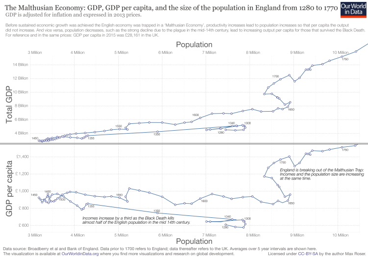
In the previous chart we saw that it was only after 1650 that living standards in the UK did start to increase for a sustained period. Before the modern era of economic growth the economy worked very differently. Not technological progress, but the size of the population determined the standards of living.
If you go back to the chart of GDP per capita in the England you see that early in the 14th century there was a substantial spike in the level of incomes. Incomes increased by around a third in a period of just a few years. This is the effect that the plague – the Black Death – had on the incomes of the English. The plague killed almost half(!) of the English population. The population declined from 8 million to 4.3 million in the three years after 1348. We even see it in the chart for the world population.
But those that survived the epidemic were materially much better off afterwards. The economy was a brutal zero-sum game and the death of your neighbour was to the benefit for those that did survive.
This happened primarily because farmers now achieved an higher output. While farmers before the plague had to use agricultural land that was less suited for farming, after the population decline they could farm on the most productive areas of the island.
In the very long time in which humanity was trapped in the Malthusian economy it was births and deaths that determined incomes. More births, lower incomes. More deaths, higher incomes.
We see this coupling of income and population in the chart below that plots the size of the population (on the x-axis) against the total output of the English economy (top panel) and against the income per person (bottom panel). Looking at the bottom panel we see the spike of incomes that was associated with the killing of half of the population in the Black Death. After this the population and the income per person stagnate until around 1500. In the following period we see the economy growing – total GDP increases by more than 280% from 1500 to 1650 – but this increase in output is not associated with an increase in income per person, but only an increase of the total population of the UK.
It is only after 1650 that the English economy breaks out of the Malthusian Trap and that incomes are not determined by the size of the population anymore. For the period after 1650 we see that both the population and the income per person are growing. The economy is not a zero-sum game anymore; economic growth made it a positive-sum game.
When Malthus raised the concerns about population growth in 17981 he was wrong about his time and the future, but he was indeed right in his diagnosis of the dynamics of his past. The world before Malthus was Malthusian and population increases were associated with declining nutrition, declining health, and declining incomes. The world after Malthus became increasingly less Malthusian. What Malthus did not foresee was that the increasing output of the economy will decouple from the change of the population so that the output available for all will increase over a long period. This decoupling of income and population is shown in the chart.
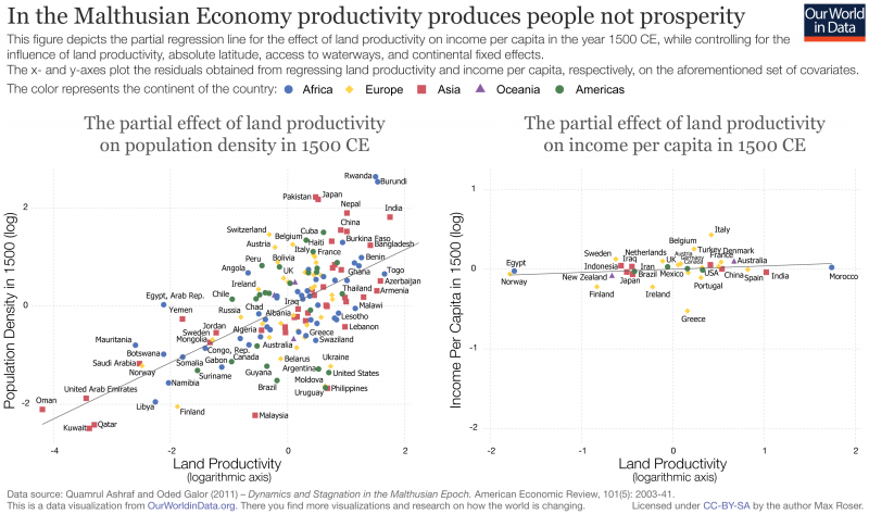
Technological innovation that increases productivity is the key to increased prosperity. But there were technological breakthroughs before the 17th century. Windmills, irrigation technology, and also non-technical novelties especially the new crops from the New World. Why did these not lead to sustained economic growth?
What happened as a consequence of these innovations were indeed increases in productivity, and the output increases led to increased prosperity. But only for a short time. Improvements in technology had a different effect in the Malthusian pre-growth economy. They raised living standards only temporarily and instead raised the size of the population permanently. The economic historian Gregory Clark sums it up crisply: “In the preindustrial world, sporadic technological advance produced people, not wealth.”2
Technological improvements lead to larger, but not richer populations. If this analysis of the pre-growth economy is true than we would expect to see a positive correlation between productivity and the density of the population.
Ashraf and Galor (2011)3 studied the Malthusian economy theoretically and empirically in a paper published in the American Economic Review. The chart below is taken from their publication and confirms the theoretical prediction for the pre-growth economies in the year 1500.
All the data is reported in the current borders of the world. On the x-axis of both charts you find the same metric: The productivity of the agricultural land as measured by the quality of the soil and the climate.
On the chart on the left we see that those world regions with a low productivity of agriculture had very low population density. The regions with the highest population density on the other hand are all regions with very productive land.
And on the chart on the left we see that the higher productivity of the land did not matter for people’s living standards. The agricultural sector in Spain, India, or Morocco was much more productive than in Finland, Egypt, and Norway, but the people were not better off. The more productive regions were the more populous regions and the people there had to share with so many so that everyone remained at dismal levels of prosperity.
In the long history before modern economic growth, higher productivity lead to larger, but not richer populations.
In the Malthusian Economy productivity produces people not prosperity4
Throughout history there were several episodes in which certain economies achieved economic growth, but in contrast to the sustained growth since the Industrial Revolution these episodes were all short-lived. What is new about modern times is that the growth of incomes lasted for a very long time – until today – and that this growth did not only increase the incomes in one economy, but instead spread to other economies as well.
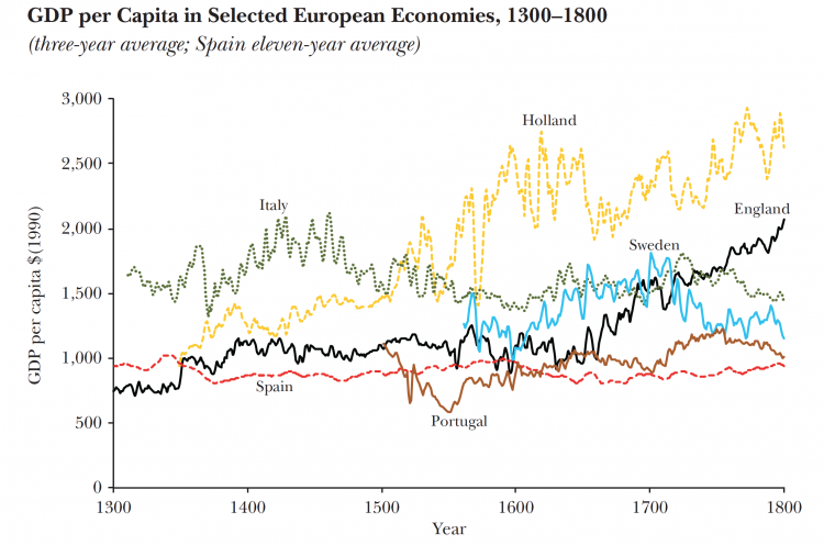
The origin of this transformation is North-Western Europe. It was in England (and Holland) in the early 17th century where it became first possible to grow incomes over a sustained period of time.
The chart shows this. In the long time before sustained economic growth incomes never exceeded $3.50 per day [3.50*365=1277.5] in prices of 1990.5 For the UK this changes in the 17th century, the fluctuation of incomes that we see in the four preceding centuries give way to a steady increase of average incomes.
GDP per capita in European economies6
Economic growth over the long run
Data on economic growth is now routinely published by statistical offices, but researchers have had to reconstruct accounts of the economic productivity for the past.
There are several reconstructions of GDP per capita over the last centuries; most widely used were for a long time the reconstructions by the British economist Angus Maddison. Maddison was working in Groningen in the Netherlands and after his death in 2010 the Groningen Growth and Development Centre is continuing this work.
Maddison attempted to reconstruct economic growth in all regions of the world and some of the estimates, especially in early publications, were more crude than others. In recent years several research teams have produced several much more detailed reconstructions of economic growth over the long run. These researchers put extensive work in these reconstructions and typically focused on one particular region or country only. An example are the long-run reconstructions of the economy of Great Britain at the beginning of this entry.
The successors of Maddison in Groningen have then extended his original work by combining them with the many new reconstructions that were published in recent years. This project is referred to as the Maddison Project Database and this is the main source of long-run reconstructions of economic growth used today.
The two charts below present the estimates of economic prosperity over the long run, as they were published by the Maddison Project Database in their 2020 update. 7
The first chart shows the the economic growth of different world regions since 1820.
The dataset also includes estimates of GDP per capita for individual countries – some of which extend even further back in history, as shown in the second chart. You can add further countries by selecting ‘ Add country ’.
What we learn from these charts is that on average the people of the past were many times poorer than we are today. In 1820 the global GDP per capita is estimated to have been around 1,102 international-$ per year and this is already after some world regions had achieved some economic growth. For all the hundreds, and really thousands, of years before 1820, the average GDP per capita was even lower.
Prosperity is a very recent achievement that distinguishes the last 10 or 20 generations from all of their ancestors. In 2018, the average GDP per capita was 15,212 international-$ – almost 15-times the average of the past.
If we compare the economic prosperity of every region today with any earlier time we see that every single region is richer than ever before in its history. Economic growth, however, has not happened equally as fast in all regions. This has created substantial inequalities globally, which we study in more detail in our entry on global income inequality.
Economic growth is a very recent phenomenon – we already saw this in the data that we discussed earlier in this entry. It is true that in the pre-growth era some people were very well off – but this was the tiny elite of the tribal leaders, pharaohs, kings and religious leaders. Whilst global inequalities were lower in a world where sustained economic growth had yet to occur anywhere, economic inequality within pre-modern societies was extremely high and the average person was living in conditions that we would call extreme poverty today.
The destitution of the common man only changed with the onset of economic growth. The time when this change happened in various countries can be seen in these two charts. Economic prosperity was only achieved over the last couple of hundred years. In fact, it was mostly achieved over the second half of the last hundred years. The rise of global average incomes – global GDP per capita – shows that the world economy has moved from a zero-sum game to a positive-sum game. This made it possible that when people in one place became richer, other people in other places could become richer at the same time.


The world economy over the last two millennia
And finally I have included one reconstruction of global total GDP over the last two millennia.
For this I have used recent data from the World Bank for the period from 1990 onward and for the historical estimates before 1990 I rely on the historical estimates constructed by the economic historian Angus Maddison.8

Growth at the technological frontier and catch-up growth
The following chart shows economic growth in the USA adjusted for inflation.
GDP per capita in the USA at the eve of independence was still below $2,500 – adjusted for inflation and measured in prices of 2011 it is estimated to $2,419.
In 2018 – roughly 240 years after independence – GDP per capita has increased by more than 20 times to $55,335. This means that the output per person in one year in the past was less than the output of the average person in three weeks today.
It is remarkable how steady economic growth was over this very long period. From 1870 to 2018 GDP per person in the U.S. economy has grown on average at 1.67 percent per year with only very short deviations from this very steady trend.

The chart below compares the economic growth at the technological frontier with the growth of countries that are further away from the technological frontier.
In this chart the steepness of the growth path corresponds to the growth rate as GDP per capita is plotted on a logarithmic axis. Economies that are far away from the technological frontier can grow very rapidly. Catch up growth can be much faster than growth at the technological frontier.

Which countries achieved economic growth? And why does it matter?
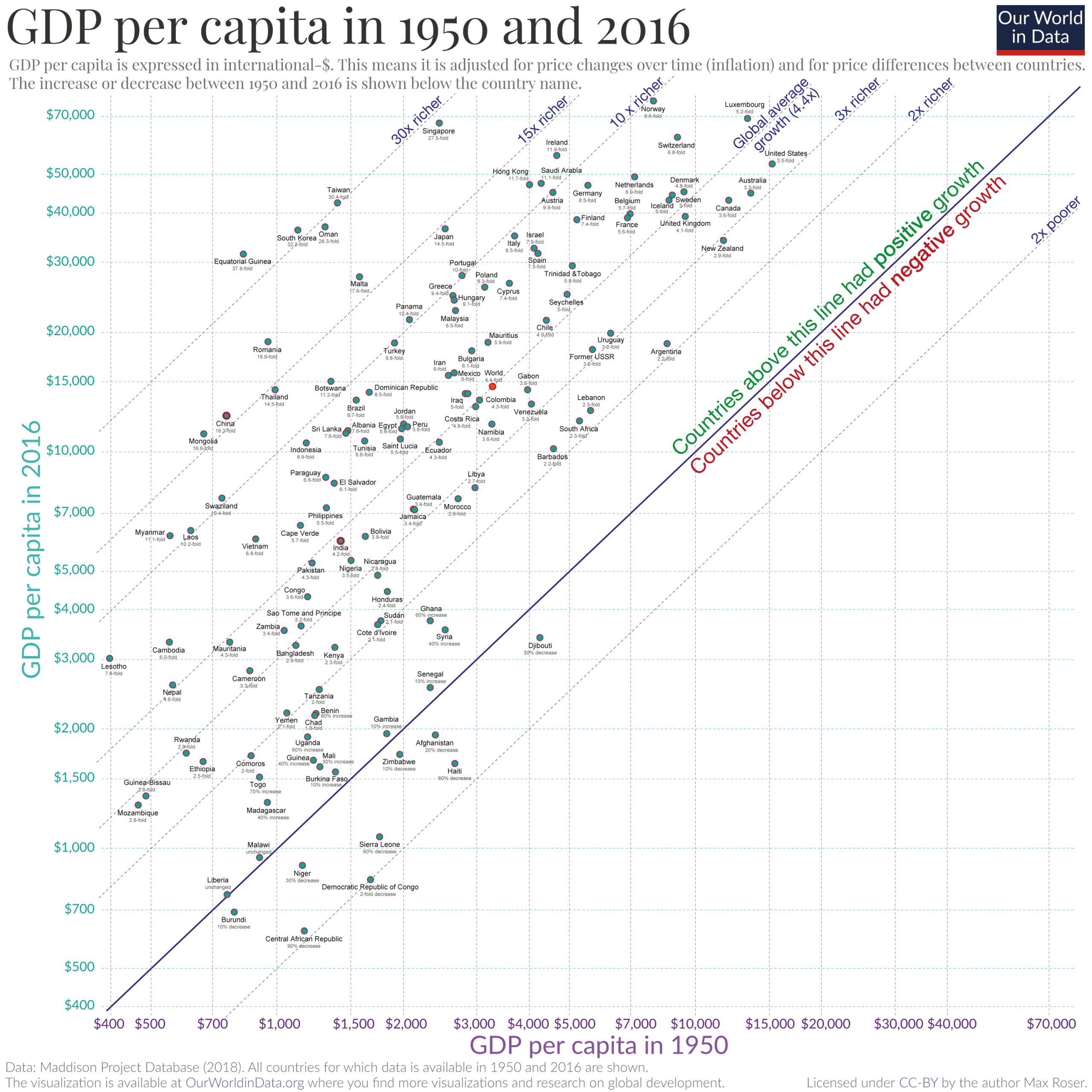
The average person in the world is 4.4-times richer than in 1950. But beyond this global average, how did incomes change in countries around the world? Who gained the most, who gained the least? And why should we care about the growth of incomes? These are the questions I answer in this post.
The chart below shows the level of GDP per capita for countries around the world between 1950 and 2016. On the vertical axis you see the level of prosperity in 1950 and on the horizontal axis you see it for 2016.
GDP – Gross Domestic Product – measures the total production of an economy as the monetary value of all goods and services produced during a specific period, mostly one year. Dividing GDP by the size of the population gives us GDP per capita to measure the prosperity of the average person in a country. Because all expenditures in an economy are someone else’s income we can think of GDP per capita as the average income of people in that economy. Here at Core-Econ you find a more detailed definition.
Look at the world average in the middle of the chart. The income of the average person in the world has increased from just $3,300 in 1950 to $14,574 in 2016. The average person in the world is 4.4-times richer than in 1950.
This takes into account that the prices of goods and services have increased over time (it is adjusted for inflation; otherwise these comparisons would be meaningless). Similarly, to allow us to compare prosperity between countries, all incomes are adjusted for differences in the cost of goods between different countries (using purchasing power parity conversion factors). As a consequence of these two adjustments incomes are expressed in international-dollars in 2011 prices, which means that the incomes are comparable to what you would have been able to buy with US-dollars in the USA in 2011.
While the global average income grew 4.4-fold, the world population increased 3-fold, from around 2.5 billion to almost 7.5 billion today.9
It’s easy to miss what this means: Had the world economy not grown, a 3-fold increase of the world population would have meant that on average everyone in the world would now be 3-times poorer than in 1950. The average income in the world would have fallen to $1,100. Before economic growth the world was exactly this: a zero-sum game in which more people meant less for everyone else, and if one person is better off in a stagnating economy then that means that someone else needs to be worse off (I wrote about it here).
What economic growth makes possible is that everyone can become better off, even when the number of people that need to be served by the economy increases.10 An almost 3-fold increase of the population multiplied by a 4.4-fold increase in average prosperity means that the global economy has grown 13-fold since 1950.11
The worst off today are those that lagged behind and remained in poverty
Incomes did not grow everywhere in the world. If you look at the poorest countries in the world today you’ll see that these countries did not stand out back in 1950; their incomes were as low as the incomes of many other countries in the world. But today they do – while many economies achieved strong growth some stagnated around their level from 1950. These are the countries that remained at the bottom of the chart. The difference between stagnation or even decline in some places and rapid growth in other places lead to a dramatic increase in inequality in the world. Norwegians are now on average more than 100-fold richer than people in Liberia, Burundi, and the Central African Republic.
This failure to grow the economy and to provide the goods and services that they need is one of the largest failures in recent decades. It means that populations in these places are now much worse off than people in the rest of the world – they are less healthy and die sooner, education is poorer, and many suffer from malnutrition.12
In most places people today are much richer than our ancestors
Economic growth has allowed us to break out of the conditions of the past when everyone was stuck in poor health, hard and monotonous work, and malnutrition. The chart below shows all economies that have achieved growth since 1950 above the diagonal 45°-line.
Taiwan is one of the most impressive examples. The Taiwanese had an income of $1,400 in 1950. All countries directly below Taiwan – Malta, Bolivia, Sierra Leone, and the Democratic Republic of Congo for example – were similarly poor in 1950. By 2016 GDP per capita in Taiwan had increased to $42,300. The Taiwanese are now among the richest people in the world, 30-times richer than they were in 1950. It is hard to imagine what this meant for living conditions in the country. To take just one example. Every sixth child born in Taiwan in 1950 died before it was five years old (13%). Today the child mortality rate has declined to half a percent (1-in-200 children).
Another way to look at it is to start with the richest people in the past – shown furthest to the right in the chart below. In 1950 the country with the highest average income was the USA with a GDP per capita of $15,241 (and they had just became prosperous in the few decades before; before some economies achieved sustained economic growth, income differences between different regions were very small and the vast majority of people were extremely poor).
If you look at incomes today then you find that the income in the richest country in 1950 is very close to the average income of the average person in the world today ($14,570). Today the average person on the planet is as rich as the the average person in the richest country in 1950. And all those countries that have an income higher than the global average today are more prosperous than the US in 1950: Iran, Mexico, Bulgaria, … Have a look at that list.
The same is true for health globally. The average life expectancy in the world today is 71 years, just 1 year less than the life expectancy in the very best off places in 1950. I wrote about it here.
In this post I looked at the population-wide average income. But, the question of how prosperity is shared among the population is an important one and it has been central to my research over the last years:If you are interested in this question, have a look at the short article on Vox.com that I have written with my colleague Stefan Thewissen here or other recent research of mine.13
Brian Nolan has edited two books on the question which were published just recently.
What this research shows is that it very much differs between countries and over time who is benefiting from economic growth. While in the US, for example, most of the income gains went to the richest members of society this is not true of other countries where economic growth was widely shared among all.
The data visualized in these two charts shows that the world is not the zero-sum economy that it was in our long past. It is not the case anymore that one person’s or one country’s gain is automatically another one’s loss. Economic growth transformed the world into a positive sum economy where more people can have access to more goods and services at the same time.
It would be wrong to focus on economic growth only. That is the reason why Our World in Data does not only look at this metric, but at hundreds of aspects – including health, education, humanity’s impact on the environment, and human and political rights. And there are alternatives to GDP per capita as a key metric and we’ve written about some of them before (here and here).
Economic growth has to be achieved at a time when we urgently have to reduce our impact on the environment. This means that it is not only the rate of growth that matters. As Mariana Mazzucato says “economic growth has not only a rate but also a direction”. And many paths for growth point in a direction that does not increase our environmental damage and instead can often reduce the impact (better care for the sick and elderly, better educational institutions, alternatives to meat, care for mental health, improved solar technology; all these improvements would mean more growth).
Economic growth is not the only thing that matters, but it does matter. In contrast to many of the other metrics on Our World in Data, economic growth does not matter for its own sake, but because rising prosperity is a means for many ends. It is because a person has more choices as their prosperity grows that economists care so much about growth. Rising prosperity gives people access to a wide range of things they value: food, healthcare, access to education, entertainment, holidays, free time, and more. The concern with GDP per capita is based on the idea that rising prosperity makes for a richer life. I find the metric important because it is a measure of means only and thereby respects the freedom of everyone to choose for themselves. It is because of this that is so important to track how incomes have changed around the world.
Different data sets on growth in the last decades
For recent decades several international datasets on GDP are available. The two most widely used are the ‘Penn World Table’ and the estimates published by the World Bank.
The Penn World Table (PWT) is a database on the level of incomes, output, input, and productivity over time. It is now covering more than 180 countries and data is available from 1950 onwards.
The database is produced by a group of researchers from around the world and published by the ‘Groningen Growth and Development Centre’ at the University of Groningen – the website is here.
The map below shows the PWT estimates of inflation-adjusted GDP per capita.
The World Bank also publishes estimates of GDP per capita for countries around the world. The World Bank data in constant 2011 international-dollars is available from 1990 onwards.
This scatter plot shows the comparison between the World Bank and PWT data.

Adjusting for the different price levels in different countries is necessary if one wants to compare living standards of people. The international-dollar – used in the maps above – makes these comparisons possible.
But if one is interested in comparing the per capita output of different economies it is useful to consider the output by simply using the exchange rates of the different currencies. This is done for the data that is shown in the map below, the GDP per capita is converted to one single currency: the US-$.

Total output of economies
The discussion above focussed mostly on output per capita, the map below shows the total output by country.

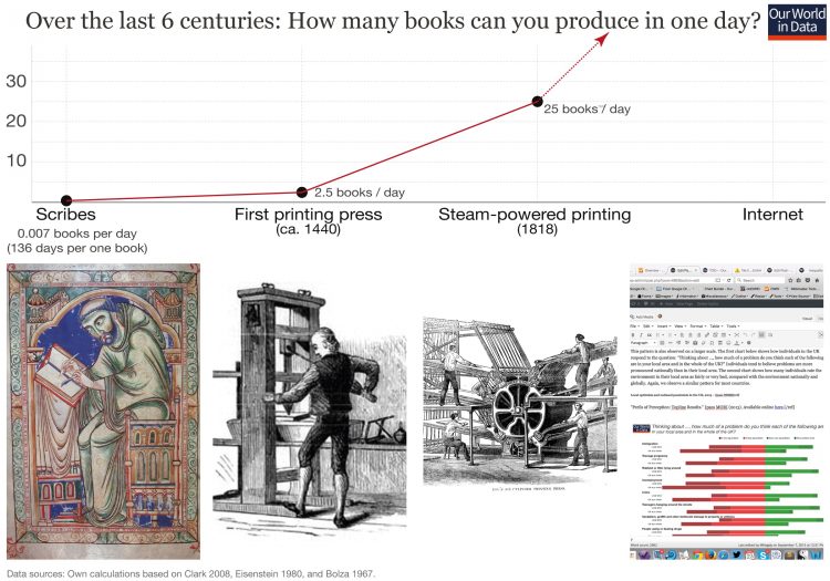
There are two ways to increase output over time: Increase inputs or to increase productivity, the ratio of output to input. How it is possible to raise productivity can be most clearly seen when one considers a single industry only. Think about the production of books: Before the printing press was invented the only way to copy a book was for a scribe to copy it. Gregory Clark14 estimates that the scribes who were doing this work back then were able to copy 3,000 words of plain text per day. This implies that the production of one copy of the Bible meant 136 days (4.5 months) of work.
This changed fundamentally when Johannes Gutenberg adopted the technology of the screw-type wine presses of the Rhine Valley where he was from to develop a printing press. The hours of work a printer had to put in was now measured hours rather than months. Estimates are that a worker was able to produce around 2.5 books in a day. Over time printing presses were improved and during the Industrial Revolution they were mechanized and productivity of workers increased further. The Internet stands in this long tradition and as texts can now be seen by millions in an instant the productivity in the business of making texts available is off the charts.
This visualization shows labor productivity per hour.
Switching to the map view shows the large differences between countries.

Rising productivity by sector
The visualization below shows the rising output of the economy by industry. Each time-series is indexed to the year 1700 so that the focus here is on the change over time as all changes are relative to that year.
The rising output of key industrial and service sectors is shown here.

Urbanization and prosperity
Urbanization and economic prosperity are strongly correlated as the following visualization shows. In most countries with a GDP per capita higher than 30,000 international-$ more than 60% of the population lives in cities.

Religiosity and prosperity
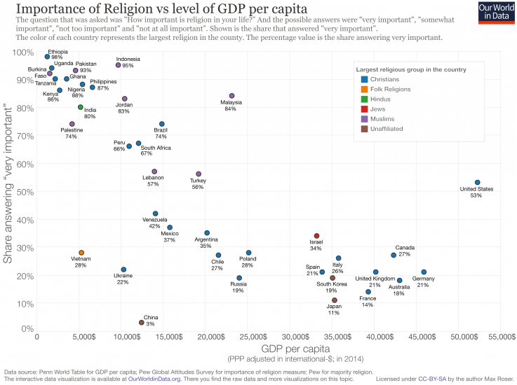
A survey asked the question “How important is religion in your life?” and the possible answers were “very important”, “somewhat important”, “not too important” and “not at all important”. The following chart plots the share that answered “very important” against the average prosperity of the population for each country in the survey.
There is a clear correlation between poverty and religiosity. In poor countries the huge majority say that religion is very important in their life: in countries like Uganda, Pakistan, and Indonesia it is the answer of more than 90%. In Ethiopia it is the answer of 98% of the population.
In richer countries the share of the population for whom religion is very important is much lower. In the UK, South Korea, Germany, or Japan it is less than 1 in 5 for whom religion is very important.
The big outlier in this correlation is the USA, a very rich country in which more than 50% answer that religion is very important in their life.
The visualization shows the very substantial decline in the labor force participation of men of 65 years and older in the USA since the end of the 19th century.

To allow saving and facilitate transactions access to financial services is important. We know that in poorer countries this access is often very limited.
We don’t know much about how this access has changed over time and to understand this change better we have attempted to combine different sources – the result of which is shown in the world map below.
The World Bank Global Financial Inclusion data is available for 2011 and 2014. The data is very scarce on this pre-2011, but World Bank estimates provide an additional single point for countries. This has been represented as a point for 2005, however it’s important to note that this varies between 2000-2005 across countries.
The challenge is that it is not exactly the same measure as the 2011 and 2014 data, but instead a composite measure of access to a bank account and financial services. The World Bank define this composite indicator as measuring “the percentage of the adult population with access to an account with a financial intermediary. The indicator is constructed as follows: for any country with data on access from a household survey, the surveyed percentage is given. For other countries, the percentage is constructed as a function of the estimated number and average size of bank accounts as discussed in Honohan (2007). These numbers are subject to estimation error.”
The use of composite measures is, of course, not ideal. However, we think it should still give a fairly reasonable basis of the early 2000s to use as an earlier estimate and the direction of progress trends.
We have combined this composite measure with 2011 and 2014 data in the following chart.

The most common measure for economic prosperity is the Gross Domestic Product or GDP for short. It measures the monetary value – the price – of all goods and services produced in a country. To allow for comparisons between countries and over time, the total economic output of a country is put in relation to the number of citizens in that country. This is GDP per capita.
The change from one year to the next is referred to as economic growth.
As everyone who had a beer or a haircut ten years ago will remember the price of goods and services usually increases over time, this is called inflation and is most commonly measured with the consumer price index (CPI). Comparisons of prosperity over time are therefore only meaningful when these price changes are taken into account so that the growth rate does not capture mere changes in prices. Measures of incomes are only meaningful when they are put in relation to measures of prices that these income receivers face. When incomes are adjusted for prices economists speak of the real value of a good or service. (But since comparisons only make sense when one adjusts for price changes, it is usually the case that adjustments for inflation have been made even when it is not explicitly said.)
GDP is published in a country’s National Accounts. These statistics comply to protocols laid down in the 1993 version of the Systems of National Accounts, SNA93.
The SNA93 established the ‘production boundary’, a crucial definition of what is and is not included in GDP figures:
- included are all goods and services that are exchanged,
- included are all goods that are not exchanged (for example food produced for home consumption)
- but excluded are services that are not exchanged. Among these excluded services are food preparation, education of children at home, and minor home repairs.
- An important exception to the services that are included is the housing services consumed by owner-occupiers. This service is imputed (imputed rent) and included in the GDP figure.
GDP per capita and average incomes
In principle there are three equivalent ways to calculate GDP:
- Production: the value of final outputs produced in an economy less the value of all the inputs used in their production
- Expenditure: the expenditure on final goods and services produced in an economy by households, corporations and governments
- Income: the income earned by individuals and businesses from the production of goods and services in the economy
It theory these three measures should be equal; they constitute an accounting identity. A company’s revenue is the income it generates from selling the goods and services it produces to consumers; yet that same revenue is also the expenditure of consumers on those goods and services. Paul Krugman makes the point that “our income mostly comes from selling things to each other. Your spending is my income, and my spending is your income.”15
This symmetry allows us to use GDP to approximate average incomes by dividing GDP by the total population. In reality, average incomes and GDP per capita will not be equal.16
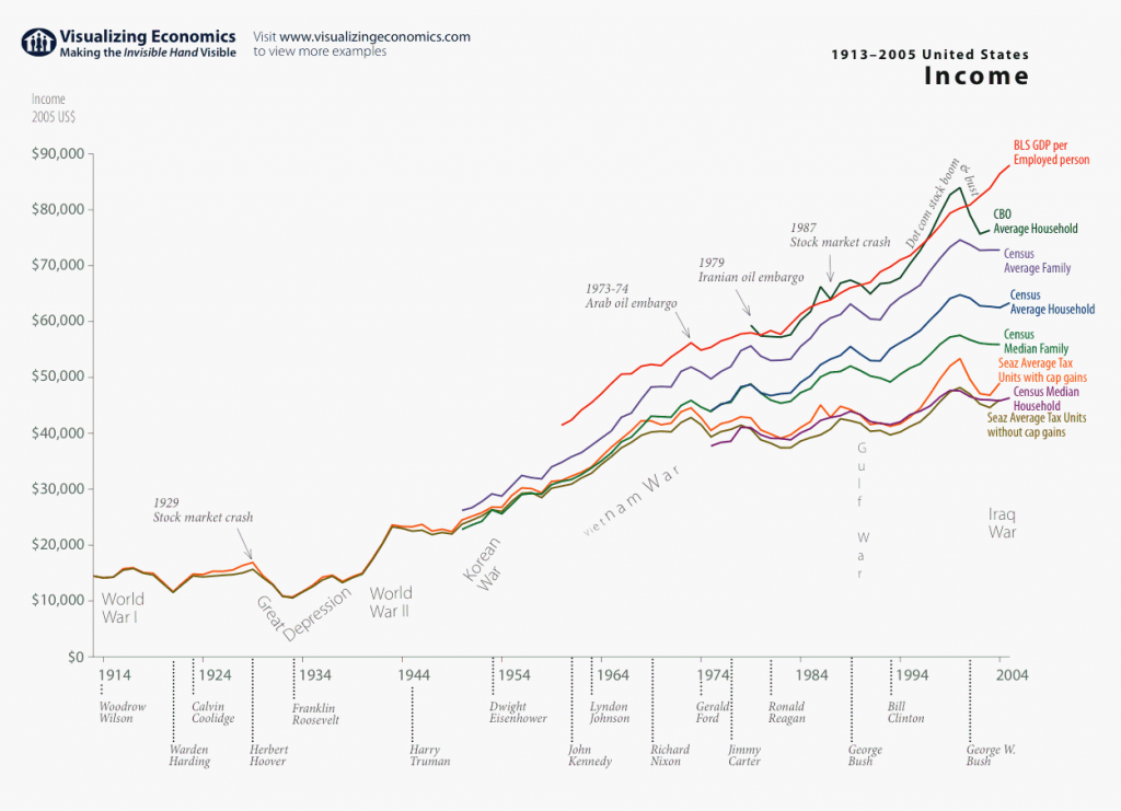
Different measures of average income in the US 1914-2004 – Visualizing Economics17
How are incomes adjusted for inflation?
To make meaningful comparisons of prosperity over time it is necessary to adjust for inflation. But how is this actually done?
A simple possibility would be to take a product that is commonly purchased – let’s say a loaf of bread – and to note down the price changes of this product over time. If you then find that the price of bread doubled over a period, but your employer still pays you the same income, then you can only buy half as many breads from your income and your income in terms of bread has halved. A halving of your income in terms of bread is your income adjusted for the inflation of bread prices.
But to measure prices by relying on one product only has the obvious problem that you could end up picking a product that was not representative of the price changes of all the other products and services that consumers want to buy. While the price of bread may have increased, the prices of the majority of other goods could have decreased.
The idea for inflation adjustment for incomes is therefore to instead rely on a commodity bundle of goods and services that are representative of the consumption of the average household. By relying on a representative commodity bundle instead of bread alone allows you to adjust incomes not only for bread, but for the cost-of-living more broadly.
The basket used is chosen to reflect the expenditure of the typical household, so that changes of this bundle measure the changes to prices the typical consumer faces. What we are interested in is the price change of this bundle of good over time and the history of prices is then expressed in an index called the Consumer Price Index, which is indexed to 100 for a chosen base year.
As consumption differs in different countries, these household consumption baskets vary from country-to-country and over time as new technologies emerge which make new goods and services available and because consumption preferences change.18
Only incomes in relation to prices gives us an idea about how the prosperity of a population changes. Incomes on their own or prices on their own cannot give us an idea about changing prosperity. The prices that we see on the price tags in the shop are the nominal prices and since we almost always have some inflation these prices tend to go up.
Nominal prices and incomes are expressed in terms of money, in this case British Pound, and in income statistics nominal incomes are reported as incomes in ‘current prices’.
The inflation adjustment of income is done by expressing income relative to the price of a commodity bundle such as the one described before. The nominal income relative to the nominal price level as measured by the CPI is the real income. Real incomes measure the change to income, adjusted for the fact that nominal prices have increased (or decreased) and in income statistics real incomes are therefore reported as incomes in ‘constant prices’.
The chart below shows two series in current prices, nominal weekly wages and nominal prices in the UK, and a third series, which is constructed from the information in the nominal series: ‘inflation adjusted wages’ or ‘real wages’.
Let’s look at nominal prices first. The index that measures the typical consumption bundle of goods and services in the UK has a value of 100 in 2015 and a value of 0.66 in 1750. The ratio between these two observations is 100/0.66 = 152, which tells us that the nominal prices that consumers face have increase 152-fold in these 265 years.
But over the same period the nominal weekly wages paid in the UK economy increased as well. From £0.29 to £492 per week. This is a 1695-fold increase.
To calculate the real increase in wages we need to look at the nominal wage increase in relation to the nominal price increase.
1695 divided by 152 is 11.2. This tells us that average real wages are 11.2-times higher today than for the average wage earner back in 1750. If their great-great-grandfathers in 1750 had to work for a year to buy a representative consumption bundle, Brits today have to work for only a bit more than a month to buy the comparable bundle of goods and services.

It is not just prices that change over time. The very products and services that we produce and buy change. Technological progress has meant that the goods and services available today are invariably superior to those available several hundred years ago, with almost no example to the contrary. The introduction of new goods and services creates serious problems for intertemporal comparisons of wealth that are most relevant today; it is less of a problem for the long pre-modern world when almost all economic production consisted of food, shelter and clothing.
To emphasize this point consider the following example: In 1836 the richest man in the world was probably Nathan Rothschild. Rothschild could afford whatever he wanted – every good and service available in the world of 1836. Yet in that same year, the 56 year old died of an infection that is curable today by antibiotics, which are available around the world for even the poorest people today.20
The Stiglitz, Sen, Fitoussi report explains “Quality change can be very rapid in areas like information and communication technologies. There are also products whose quality is complex, multi-dimensional and hard to measure, such as medical services, educational services, research activities and financial services. Difficulties also arise in 1. Evidence and references in support of the claims presented in this Summary are presented in a companion technical report. 22 SHORT NARRATIVE ON THE CONTENT OF THE REPORT collecting data in an era when an increasing fraction of sales take place over the internet and at sales as well as discount stores. As a consequence, capturing quality change correctly is a tremendous challenge for statisticians, yet this is vital to measuring real income and real consumption, some of the key determinants of people’s well-being. Under-estimating quality improvements is equivalent to over-estimating the rate of inflation, and therefore to underestimating real income. For instance, in the mid-1990s, a report reviewing the measurement of inflation in the United States (Boskin Commission Report) estimated that insufficient accounting for quality improvements in goods and services had led to an annual overestimation of inflation by 0.6%. This led to a series of changes to the US consumer price index.”21
Instead of looking at price adjustment for incomes, we can also look at price adjustments for output.
Nominal GDP is a measure of the value of output produced in a country or region over a specified period (usually one year). The value of output is composed of two factors: the volume produced and the price,
The two most common price indices used to deflate incomes and nominal GDP are:
- Consumer Price Index (CPI): The basket is used measure the price changes of the goods and services consumed by the typical household. The typical household consumption basket will vary from country-to-country due to different preferences and income levels as well as over time as new technologies emerge and preferences change. CPI indices are produced by national statistical agencies, with one major exception being the European Union’s Harmonised CPI (HCPI). The HCPI uses consistent definitions for all Eurozone members to aid comparability.The CPI used to adjust household incomes tracks changes to the price of a basket of goods that the typical household purchases. It is measuring the price changes of consumption.
- GDP deflator: The GDP deflator also called National Accounts deflator measures the purchasing power relative to the prices of all domestically produced final goods and services in an economy. It is measuring the price changes of domestic production.
The CPI index measures price changes of consumption whereas the GDP deflator measures price changes of domestic production.
Consequently there are several important differences of the two price indices:22
- Unlike the CPI, the GDP deflator does not adjust for changes of goods that are imported from other countries and the price changes of import prices are not directly taken into account.
- Secondly, the GDP deflator covers capital goods, goods that are not bought by consumers.
- The CPI is also available monthly for most countries, while the GDP deflator is mostly available only quarterly.
International GDP Comparisons: market vs. PPP exchange rates
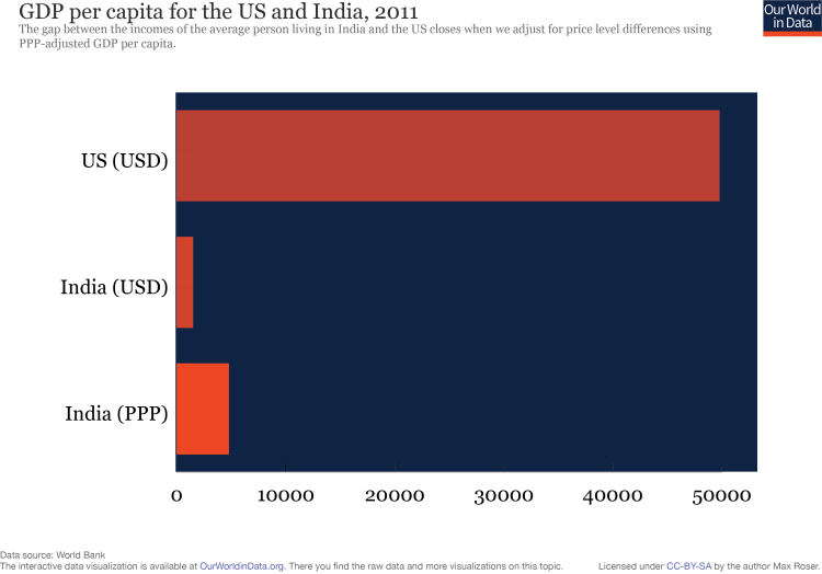
In order to highlight the difficultly of making international comparisons between countries, consider the average income of somebody living in India compared with the US.
In 2011 the average Indian earned 72,000 rupees, while the average American earned $50,000. Since the average incomes are stated in different currencies, comparing the numerical value is meaningless and does not help us determine who is richer and by how much. Converting the rupee amount into US dollars using market exchange rates gives us an average income of $1,500 in India. This number is over 33 times smaller than the income of the average American!
However, it is obvious that the cost of living in the US is much higher than in India, which implies that the comparison of incomes made at market exchange rates is also not a fair comparison of how rich or poor the people really are in comparison.23
A solution is to convert the amounts using the Purchasing Power Parity (PPP) exchange rate. This conversion takes into account differences in the price levels of both countries. Making the PPP-adjustment reveals that the average income of someone living in India is $4,800 (international dollars), only 10 times smaller than in the US. The precise nature of PPP adjustments is explained in the section below.
This does not mean that comparisons of GDP evaluated at market exchange rates are uninformative. In fact, when comparing financial flows, PPP-adjustments are meaningless and GDP evaluated at the market exchange rate is the most appropriate measure. When comparing development and living standards, the converse is true since we need to eliminate price effects.
PPP-adjusted GDP: spatial comparisons
GDP comparisons made using market exchange rates fail to reflect differences in the purchasing power of different currencies. In general, prices are higher in developed economies,24 and so exchange rate adjusted GDP measures will underestimate the size of low income economies.
In a simplified world, the prices of traded goods are determined by global demand and supply forces, while the prices of non-traded goods are determined by local demand and supply forces. Since wages and salaries are lower in developing countries, the prices of non-traded goods also tend to be lower. This feature is missed by exchange rate adjusted GDP calculations as no distinction is made between traded and non-traded goods. In a world where all goods are traded, exchange rate adjusted GDP would be a more informative way to make international comparisons. Nevertheless, another complicating factor is that exchange rates are highly volatile and determined by currency speculation, interest rates and international capital flows.
Purchasing Power Parity (PPP) adjustments to GDP are an attempt to isolate differences in the volume of output of two economies. That is, they eliminate disparities in the price levels of different economies. A PPP exchange rate can be thought of as the cost ratio of a comparable (but not identical) basket of goods in two countries. Hence, the methodology is analogous to that used in computing CPI inflation to calculate real GDP, except that here the comparisons are made between countries rather than over time. More precisely, PPP-adjusted GDP is a spatial measure and not a temporal one like real GDP: a base country is used as opposed to a base year. The US dollar is the most common unit of currency used to make international comparisons and, for clarity, PPP-adjusted quantities are quoted in international or Geary-Khamis dollars.25
We can decompose the GDP ratio of two economies into
where
The PPPs that are used in international comparisons today are created by the International Comparisons Programme (ICP) conducted by the World Bank. The latest round of the ICP was completed in 2014 and has estimated PPPs for 2011. The study covers 199 countries and is the most extensive study of PPPs ever conducted.
Since the research is highly intensive and requires cooperation with many different countries and statistical agencies, the existing PPP data is sparse (8 benchmark years since the first ICP study in 1970). What is more, the methodology used and the group of participating countries has differed between each round of the ICP. There are six years separating the most recent ICP estimates (2011 and 2005). Her is a detailed explanation of the methodology and findings of the 2011 ICP.
Computing PPP-adjusted GDP for years where ICP data is available is straightforward, however, in years where there is no data, there is no consensus regarding the best way to produce estimates.
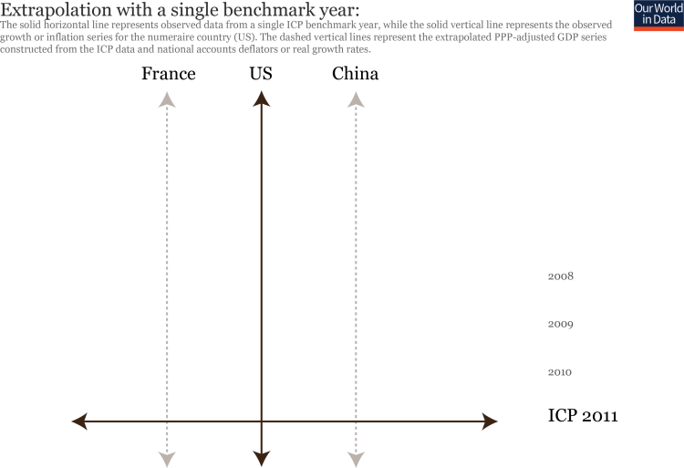
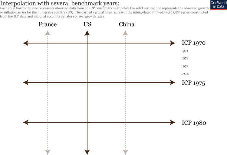
Since PPP is a spatial measure, each ICP estimate is indexed to a benchmark year. Producing PPP-adjusted GDP estimates for non-benchmark years requires either extrapolation of PPP-estimates from a single round of ICP data, interpolation between different rounds or a combination of the two. Extrapolation takes the PPP-adjusted GDP in a single year and assumes that it evolves according to real GDP growth rates or the inflation ratio of the country of interest with the US. Interpolation attempts to “fill-in the gaps” using observed ICP rounds in conjunction with inflation or growth data according to some statistical model. The two figures presented below are designed to aid understanding of these two methods.
Understanding the methodology and purpose of each dataset is important when conducting data analysis. The four most important data sets for PPP-adjusted GDP data have the following methodology:
- World Bank data: Extrapolates from the most recent ICP round using national accounts deflators. The data and a brief description of the methodology can be found at http://data.worldbank.org/indicator/PA.NUS.PRVT.PP.
- Since the data is extrapolated from the 2011 ICP, data is only presented for the years 1990-2014 as any further extrapolation is likely to give unreliable estimates. This dataset is most useful when considering the very recent past as the 2011 ICP round uses the most sophisticated methodology to date. It also has the advantage of being extrapolated forward in time to 2014.
- Notes from the documentation: “For most economies PPP figures are extrapolated from the 2011 International Comparison Program (ICP) benchmark estimates or imputed using a statistical model based on the 2011 ICP.”
- Penn World Tables: Interpolates and extrapolates using national accounts deflators. The methodology used can be found in the documentation available at http://www.rug.nl/research/ggdc/data/pwt/pwt-8.1.
- This dataset is most commonly used for statistical analysis by economists and covers the years 1950-2011. It is arguably the most reliable, long-run data available on PPP-adjusted GDP.
- Gapminder: Interpolates and extrapolates using real growth rates. The methodology used can be found in the documentation.
- Gapminder aims to give the widest coverage possible at the expense of robust estimates. Much of the historic data has been estimated from trends and other For this reason, we present the data here for the purposes of graphical presentation and not as fact.
- Notes from the documentation: “The main purpose of the data is to produce graphical presentations that display the magnitude of income disparities in the world over time… Hence we discourage the use of this data set for statistical analysis… The observations for the period before 1950 are, in the majority of cases, based on rough estimates within a range of likely values. In many cases we have no information, what-so-ever, on the relative ranking of countries.”
- Maddison Project: Data is drawn from various sources. A complete list of sources can be found in the documentation available at http://www.ggdc.net/maddison/maddison-project/home.htm.
- This dataset has many different sources and is curated by the project team. Although the long-run data is much less reliable than more recent estimates, the more rigorous nature of the estimates allows for better spatial comparisons.
- Notes from the documentation: “The Maddison Project database places the emphasis more on the international comparability of the estimates than on their consistency over time.”
This discrepancy reflects several factors:
– GDP includes items such as depreciation, retained earnings of corporations, and government revenues that are not distributed back by the government or corporations to households as cash transfers.
– Particularly incomes at the very top of the income distribution are not fully accounted and this contributes to the gap between the National Account figure (GDP) and household survey figures.
– Particularly in developing countries – where this discrepancy tends to be larger – a large share of government revenue may firstly end up in sovereign wealth funds or secondly represents profits of foreign multinationals that are repatriated but taken into account in the GDP calculation.26
Historical reconstructions of national accounts – the case of the UK
How do economic historians go about estimating incomes in the distant past?
In broad terms, the strategy is to extend back to earlier periods the system of national income accounting that countries use today to estimate the total output of the economy. The main objective is to apply a methodology that reconstructs this metric consistently over time and across countries. In the absence of data collected at the time, researchers have to bring together what evidence they can from historical sources, but the basic principles are the same.
Because Great Britain’s economy was the first to achieve persistent economic growth it is the economy that historians have studied in most depth.
The visualization shows the output of the English economy per person since the Middle Ages. As explained below, it is not only capturing the production of workers paid in the labor market, but also the production of subsistence farmers and other producers which were not paid a monetary salary. As such it gives us a perspective on the history of material living conditions of the English population over the last 746 years.
The data in the chart is taken from the seminal book on the history of material living conditions in Britain – British Economic Growth 1270-1870 by Broadberry, Campbell, Klein, Overton, and van Leeuwen. It presents a fantastic overview of this work and is very much recommended for anyone who wants to study the origins of economic growth in detail.27
When interpreting these reconstructions it is important to bear in mind the fundamental identity in this historical accounting: “Within the methodological framework provided by national income accounting, the estimation of GDP can be approached in three different ways, via income, expenditure and output, all of which ought to yield broadly similar results.”28 For the important case of the subsistence farmer for example, the value of the food they produce represents both the economic output of the activity and the income received by the farmer. Consumption of that produce then represents a form of expenditure, as it is using up part of the farmer’s income.
Because of this identity the measurement of GDP can be approached from any one of these three angles: output, income, or expenditure. For historical estimates, the output approach is often considered the more reliable in practice given the available evidence, though information on incomes and expenditure still provide benchmarks to cross-check the plausibility of estimates.
Firstly, it’s important to get clear from the outset that historical reconstructions of poverty and prosperity do not just concern the amount of money people had in the past. This is a common misunderstanding that is often at the heart of misinformed critiques of historical research. For instance, in a discussion of our global extreme poverty chart on reddit, one user suggested that it was “indicative of the fact that quite a lot of the world […] did not use fiat currency.”
This interpretation is incorrect. Yes, over the last two hundred years, there has been a major shift from people farming for their own consumption towards people working for a wage and purchasing goods in the market. But historians know about history and where non-market sources of income make up a substantial part of total income, it is very obvious that money would represent a rather silly indicator of welfare.
Just as we need to adjust for price inflation, accounting for non-market sources of income is an essential part of making meaningful welfare comparisons over time. Estimates of poverty and prosperity account for both market and non-market sources of income, including the value of food grown for own consumption or other goods and services that enriched the lives of households without being sold in a market.
This issue is not just of importance for historical estimates, but it is also of central relevance for poverty measurement today, given the importance that food produced at home, or otherwise received in-kind, continues to play in the incomes of the rural poor, especially in low-income countries. Accordingly, these flows are accounted for in household surveys of both consumption and income, and in the historical estimates.
It is straightforward to compare material prosperity over time relative to all those goods which remained relatively unchanged over the course of history – economic historians can track the affordability of products like bread, shirt, beer, nails, meat, books or candles over time.
This however is not easily possible when entirely new products were introduced or when the quality of products and services changed very much.
The fact that some of the most important goods and services very much changed in quality or did not exist at all in the past represents the biggest problem of any long-term comparisons of poverty and prosperity because it makes price adjustments difficult.
Many of the most valuable goods today were not available at all: no king or queen had access to antibiotics, they had no vaccines, no comfortable transport in trains or planes, and no electronic devices – no computer and no light at night.
Historians of course attempt to take this into account as much as possible29 but this caveat should be kept in mind: no matter how high someone’s income might have been, some of the goods you might value the most – or would value, when you get sick – were not available at all.30
The simple structure of how this economic history is presented – as a single line that is flat for most of the time and very steep for the recent period – should not fool us into believing that it is only a loose and approximate historical analysis. The amount of work that went into the reconstruction of this history is extraordinary: it is the culmination of decades of tedious and extremely careful academic work by large teams of dedicated researchers.
The level of detail that goes into such estimates although this is hard to do in a short overview like this one. Whilst, there are indeed many sources of uncertainty in such a process, it would be very wrong to think that historical GDP estimates are based on flimsy evidence. It is recommended to read this work in full length, but a passage on agricultural output gives some insight already:
“[The output method] has entailed, first, estimating the amounts of land under different agricultural land uses… and, then, deriving valid national trends from spatially weighted farm-specific output information on cropped areas and crop yields and livestock numbers and livestock yields… The latter task is further complicated by the need to correct for data biases towards particular regions, periods and classes of producer.”
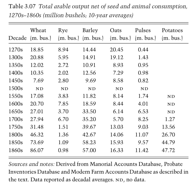
And below is one of the many tables from this book, showing the authors’ estimates of output of just one part of the agricultural sector of England. This is one of hundreds of datasets that are required to construct the time series in the chart above. And this table – and all others – in turn build upon a substantial body of historical research, as is suggested by the list of sources it cites.
There are two key takeaways: First, that historical reconstructions of GDP are the outcome of very serious academic work. And second, these represent estimates of total output, not just that part of production sold on markets.
It would be wrong to believe that these GDP series do not account for the value of non-market production, including domestic production for households’ own use.
A table from Broadberry et al. (2015) showing estimates of historical arable output in England
Long-run datasets
- Data: GDP per capita and total GDP (+ population data)
- Geographical coverage: Global – by countries & world regions
- Time span: 1-2008 CE (5 observations before 1820 and then annual if possible)
- Available at: Online at the Groningen Growth & Development Centre here
- Founded by the economic historian Angus Maddison and later updated. An updated version – available through the CLIO Infra project – is described below. Another correction of the Maddison data is the ‘Barro-Ursua Macroeconomic Data’, which is available at Robert Barro’s website here.
- Data: GDP per capita
- Geographical coverage: Global coverage – by country
- Time span: Between 1500 and 2010
- Available at: Online here
- This database builds on the work of Angus Maddison. The database and the accompanying paper31
are a product of The Maddison Project and are partly a revision of the earlier work. The authors are Jutta Bolt and Jan Luiten van Zanden. The many sources are very well documented at the website of the CLIO project.
- Data: Nominal GDP
- Geographical coverage: Many world regions (including Africa, Asia and Oceania)
- Time span: Varies by world region – long for some (e.g. Italy since 1310) but mostly since the 19th century
- Available at: Online here
- Well documented, readily available in Excel spreadsheets. Includes many other datasets
Wikipedia’s ‘list of regions by past GDP (PPP) per capita’ includes Maddison’s estimates for countries and world regions between 1CE and 2003CE. It also includes Bairoch’s estimates for Europe between 1830–1938. And some estimates for the prosperity of the Roman and Byzantine empires.
- Data: GDP per capita
- Geographical coverage: Britain, Italy, Spain and Holland 1270-1870 and Europe for 1870-2000
- Time span: 1270-1870 and 1870-2000
- Available at: The early data is published in research papers by Broadberry and others. An overview is given in Broadberry (2013)32
The data for several European countries for the time period 1870–2000 is available online at Broadberry’s website here.
Post-1800
- Data: GDP per capita and some other National Accounts data
- Geographical coverage: Global – by country
- Time span: Varies by country. Often since the early 19th century (US since 1789)
- Available at: The statistics are published in three volumes covering more than 5000 pages.33
At some universities you can access the online version of the books where data tables can be downloaded as ePDFs and Excel files. The online access is here.
- Data: National account data & other relevant data (e.g. average age and experience of the workforce)
- Geographical coverage: Global by country
- Time span: Mostly since 1880 – observations at every even decade
- Available at: Online here. Downloadable as an excel-file
- Data: National Account data with many interesting measures
- Geographical coverage: (Mostly but not only) Early industrialized countries
- Time span: Since the early 19th century
- Available at: It is online here.
Post-1950
- Data: GDP and many measures related to relative levels of income, output, inputs and productivity.
- Geographical coverage: Global – by country
- Time span: Since 1950
- Available at: It is online here.
- The documentation can be found in Feenstra, Inklaar and Timmer (2015),34 in which the validity of these measures is also discussed.35
- Data: GDP and GNI (gross national income) constructed and corrected for price differences (across time and countries) in different ways
- Geographical coverage: Global – by country and world region
- Time span: The earliest data is available for 1960.
- Available at: The different measures are published as part of the World Development Indicators. The data on current GDP in US-$ is here.
- Data: GDP, population, employment, hours, labor quality, capital services, labor productivity, and total factor productivity
- Geographical coverage: Global – by country
- Time span: Since 1950
- Available at: It is online here.
Other GDP-related data
Nicola Gennaioli, Rafael La Porta, Florencio Lopez-de-Silanes, and Andrei Shleifer present subnational data of income in their publication36
The data covers 1,569 subnational regions from 110 countries covering 74% of the world’s surface and 97% of its GDP.
Geographically based Economic data (G-Econ) by William Nordhaus and Xi Chen. The dataset covers “gross cell product” for all regions for 1990, 1995, 2000, and 2005 and includes 27,500 terrestrial observations. The basic metric is the regional equivalent of gross domestic product. Gross cell product (GCP) is measured at a 1-degree longitude by 1-degree latitude resolution at a global scale.