Our mission here at Our World in Data is to make the big global problems understandable.
To show global data it is convenient to use a map. But despite the popularity and familiarity of world maps, they can mislead our understanding of global living conditions.
Maps are made for a different purpose; they show us where the world’s land masses are. They don’t show us where the people are.
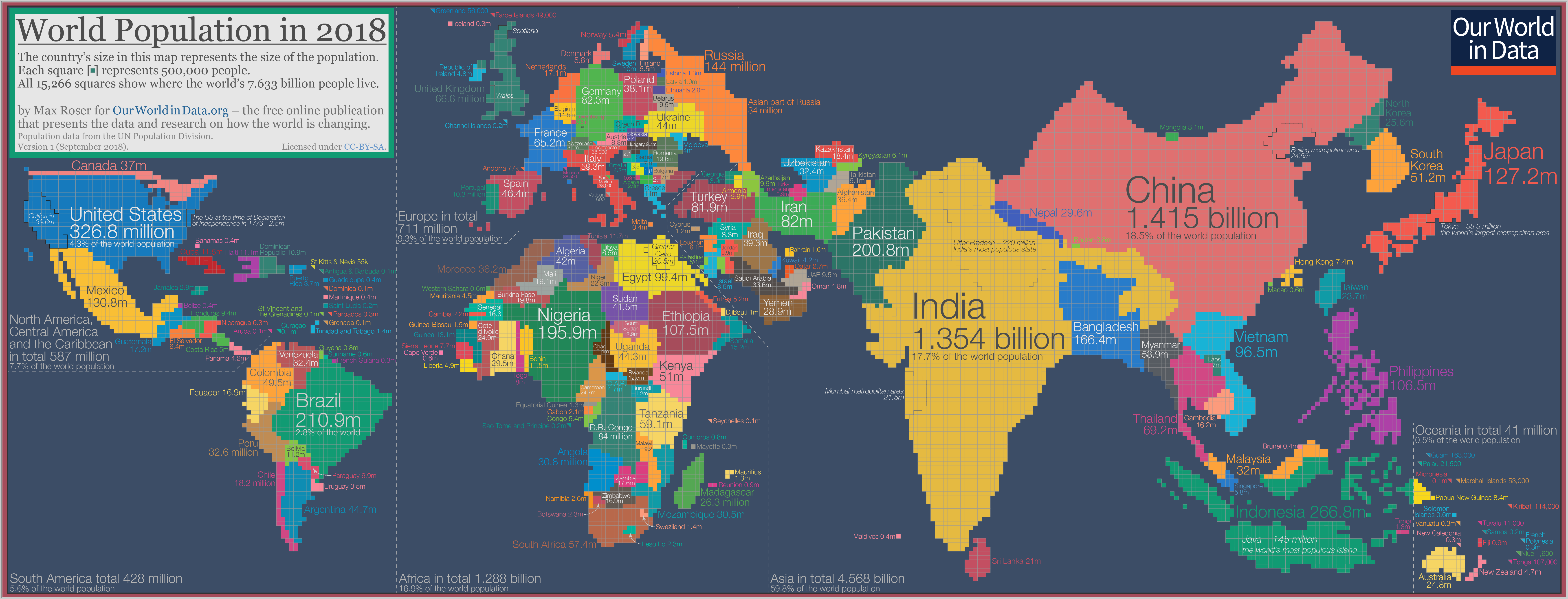
If we want to show where the world’s people are we need a population cartogram, a geographical presentation of the world where the size of the countries are not drawn according to the distribution of land, but according to the distribution of people.
So I spent the last few weekends making this cartogram for the world population in 2018.
The cartogram is made up of squares, each of which represents half a million people of a country’s population. The 11.5 million Belgians are represented by 23 squares; the 49.5 million Colombians are represented by 99 squares; the 1.415 billion people in China are represented by 2830 squares; and this year’s entire world population of 7.633 billion people is represented by the total sum of 15,266 squares.
As the size of the population rather than the size of the territory is shown in this map, you can see some big differences when you compare it to the standard geographical map we’re most familiar with. Small countries with a high population density increase in size in this cartogram relative to the world maps we are used to – look at Bangladesh, Taiwan, or the Netherlands. Large countries with a small population shrink in size – talking about you Canada, Mongolia, Australia, and Russia.
We should keep this cartogram in mind when we are looking at charts that show country-by-country data, because we have to remember that the number of people that these charts speak about is very different from one country to the next: An increase of the life expectancy in Denmark means that the average health of 5.8 million people is increasing, while an increase for India means that the health of 1,354 million people is improving. And a line chart that shows improvements in all African countries or across all of the American countries refers to fewer people than a chart with a single line that shows an improvement in China. The two largest countries in Asia – China or India – are the home of more people than any other entire continent.
My models
When I made this visualization I built upon the work of others that made cartograms of the world population at earlier points in time: From cartograms from more than a century ago, to recent ones that emphasize the split between continents, to more recent ones like this one for 2005, and this one for 2015.1
[click on the cartogram to enlarge it and download it in high resolution.]
Some perspectives on the distribution of the world population
The cartogram offers us many more perspectives that we can keep in mind if we want to keep an overview of the world. Here are some that stand out for me:
- The area of Russia takes up 11% of the world’s land, and the gigantic country borders both Norway and North Korea. But Russia is home to only less than 2% of the world population and is therefore shrunken in this cartogram to the size of Bangladesh, a country that is smaller than Florida.3
- 13 countries in the world are home to more than 100 million people: China (1.415 billion), India (1.354 billion), United States (326.8m), Indonesia (266.8m), Brazil (210.9m), Pakistan (200.8m), Nigeria (195.9m), Bangladesh (166.4m), Russia (144m), Mexico (130.8m), Japan (127.2m), Ethiopia (107.5m), Philippines (106.5m).
- A 14th country is very close though, Egypt is expected to reach 100 million next year.
- Together these 13 countries are the home of 4.75 billion people, 62% of the world population.
Cartogram of Asia and Oceania
The cartogram below focusses on Asia and Oceania where 6 out of 10 people in the world live.
- Within this world region the population is very unequally distributed. South-East Asia is densely populated while large countries such as Mongolia, Australia, Kazakhstan, and the Asian part of Russia are home to relatively few people. And again within countries we see a very high concentration. The metropolitan area of Beijing has the same population as all of Australia. Tokyo’s population almost equals the population of all of Oceania.
- China and India are by far the most populous countries in the world. If you want to follow what is happening to the world you have to keep track of these two countries:
- More than a third of the world population – 36.2% – live in India and China.
- 60% of all Asians live in China or India.4
- Today, both India and China have a larger population than the entire world population in 1850 (when the world population was around 1.26 billion people).
- But while China and India dominate, other Asian countries are also very populous: Seven of the world’s 13 countries with more than 100 million inhabitants are in Asia.
- Population growth in Asia has been rapid in the last decades: The population of Asia has tripled in size since 1950.
- And while some countries in Asia have already reached the last stage of the demographic transition, some others still have rapid population growth ahead. The fertility rate in India has fallen from more than 5 children per woman in the 1960s to 2.22 children in 2018, but population momentum means that population growth will continue for another 4 decades. According to the UN’s population projection the population of India is expected to reach 1.65 billion in 2060, and the country is by then expected to be the most populous country in the world.
Cartogram of the Americas
The population of the Americas is roughly one billion (1.015 billion). 428 million live in South America and 587 million are at home in North America, Central America, and the Caribbean.
- The USA – the third most populous country in the world – is by far the most populous country on the American continent. Its population is roughly as large as the population of the two runner-ups – Brazil and Mexico – combined.
- Canada has a population density of just 4 people per km² – in the cartogram the second largest country in world – by area – is reduced to not much more than a slim line of squares.
- The shape of the South American countries stays similar to what we would see on a geographical map. This is because the population density across the different South American countries is relatively similar.
- The population of the American continents has increased very rapidly over the course of the last few generations. Historical estimates suggest that in 1820 the population was only around 35.5 million. At the time this made up just 3.4% of the world population.
- Over the last two centuries the population growth rate in the Americas (28-fold) was much faster than in Europe (3-fold), Africa (14-fold), or Asia (6-fold).5
- And some countries in the Americas had even faster population growth. The size of the US population in the 13 founding states at the time of the Declaration of Independence in 1776, for example, is estimated to have been only 2.5 million.6
Cartogram of Africa
1-in-6 people in the world live in Africa. The second most-populous continent is home to almost 1.3 billion people.
- Two countries have a population of more than 100 million: Nigeria with 195.9 million and Ethiopia with 107.5 million.
- Population density varies hugely on the African continent. The largest African country by land area is Algeria, but it is relatively sparsely populated. At the other end of the spectrum are Rwanda and Burundi. The two neighboring countries are densely populated and are both home to around 12 million people.7
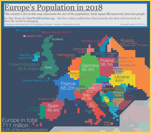
Cartogram of Europe
711 million people live in Europe, less than 10% of the world population.8
- Five European countries have a population that is larger than 50 million: The European part of Russia (110 m), Germany (82.3 m), the UK (66.6 m), France (65.2 m), and Italy (59.3 m).
- Some regions of Europe are very densely populated. The Netherlands has a population density of 505 people per km² (compared, for example, to the US with 35 people per km² – see below for the map).
- The population of China is almost exactly twice as large as the population of Europe.
- While the population of Europe is small, the continent is economically very powerful and much richer than most other parts of the world. The per capita output and income of the Swedes for example is 30-fold higher than the per capita output and income of the Indians, and 8-times higher than the per capita output or income of the Chinese.9
Population density
Another way to show where the world population lives is to show the population density of each country on a geographical world map, as you see below. The world’s densely populated countries in Middle America, Europe, and South East Asia stand out – Bangladesh is the most densely-populated large country in the world, with 1,252 people per square kilometer. If you hover the mouse on the bracket from 0 to 10 on the legend then you see the world’s least densely populated countries.

While a geographical map is helpful if you want to find your way around the world, a population cartogram is the representation that we need if we want to know where our fellow humans are at home.
If you are interested in what is happening to the world population and you are following our work on Our World in Data, I hope these cartograms are helpful to you. If you want to print it you can get it in high resolution here.