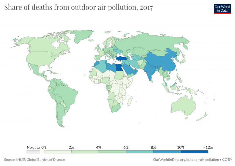
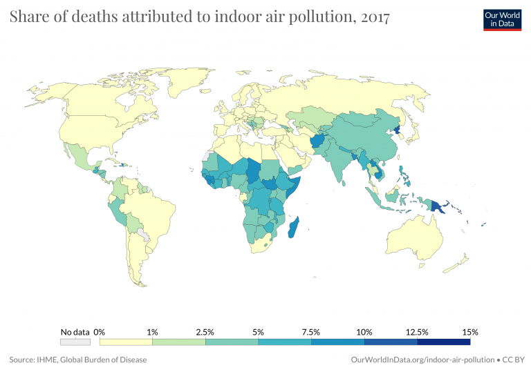
Air pollution is one of the world’s largest health and environmental problems. It develops in two contexts: indoor (household) air pollution and outdoor air pollution.
We look in detail at the data and research on the health impacts of Indoor Air Pollution, attributed deaths, and its causes across the world in our full entry: Indoor Air Pollution.
We look in detail at how exposure to Outdoor Air Pollution, its health impacts and attributed deaths across the world in our full entry: Outdoor Air Pollution.
In this entry we look at the aggregate picture of air pollution – both indoor and outdoor.
Summary
- Air pollution is one of the world’s leading risk factors for death, attributed to 5 million deaths each year.
- Air pollution is attributed to 9% of deaths globally.
- It is also one of the leading risk factors for disease burden.
- Death rates from air pollution are highest in low-to-middle income countries, with more than 100-fold differences in rates across the world.
- Globally, death rates from air pollution have been falling. This has mainly been the result of progress on tackling indoor pollution.
All our charts on Air Pollution
Related research entries
Outdoor air pollution – attributed to 3.4 million deaths each year, outdoor air pollution is one of the world’s largest health problems. How do the health impacts of outdoor air pollution vary across the world?
Indoor air pollution – indoor air pollution is a major health problem, especially for poorer households across the world.
Energy access – how does access to electricity and clean cooking fuels compare across the world?
Fossil fuels – how is the production and consumption of fossil fuels changing?
Causes of death – what are people across the world dying from?
Air pollution – the combination of outdoor and indoor particulate matter, and ozone – is a risk factor for many of the leading causes of death including heart disease, stroke, lower respiratory infections, lung cancer, diabetes and chronic obstructive pulmonary disease (COPD).
The Institute for Health Metrics and Evaluation (IHME) in its Global Burden of Disease study provide estimates of the number of deaths attributed to the range of risk factors for disease.1
In the visualization we see the number of deaths per year attributed to each risk factor. This chart is shown for the global total, but can be explored for any country or region using the “change country” toggle.
Air pollution is one of the leading risk factors for death. In low-income countries it tops the list. In 2017, it was responsible for an estimated 5 million deaths globally. That means it contributed to 9% – nearly 1-in-10 – deaths.
Globally, air pollution contributed to 9% of deaths in 2017.2
In the map shown here we see the share of deaths attributed to air pollution across the world. In 2017, this ranged from a low of 2% across high-income countries, to close to 15% across many countries in South and East Asia.
Air pollution is one of the leading risk factors for death. But its impacts go even further, also being one of the main contributors to global disease burden.
Global disease burden takes into account not only years of life lost to early death, but also the number of years lived in poor health.
In the visualization we see risk factors ranked in order of DALYs – disability-adjusted life years – the metric used to assess disease burden. Again, air pollution is near the top of the list making it one of the leading risk factors for poor health across the world.
Air pollution not only takes years from peoples’ lives, but also had large effect on quality while they’re still living.
Air pollution is a health and environmental issue across all countries of the world, but with large differences in severity.
In the interactive map we show death rates from air pollution across the world, measured as the number of deaths per 100,000 people of a given country or region.
We see that the death rates tend to be highest across Sub-Saharan Africa and South Asia. This highlights the large differences globally: death rates in the highest burden countries are more than 100 times greater than across much of Europe and North America.
The burden of air pollution tends to be greater across both low and middle income countries for two reasons: indoor pollution rates tend to be high in low-income countries due to a reliance on solid fuels for cooking; and outdoor air pollution tends to increase as countries industrialize and shift from low-to-middle incomes.
A map of the number deaths from air pollution by country can be found here.
In the visualization we show global death rates from air pollution over time – shown as the total air pollution, in addition to the individual contributions from outdoor and indoor pollution.
Globally we see that in recent decades the death rates from total air pollution has declined: since 1990 the number of deaths per 100,000 people have nearly halved. But, as we see from the breakdown, this decline has been primarily driven by improvements in indoor air pollution.
Death rates from indoor air pollution have seen an impressive decline, whilst improvements in outdoor pollution have been much more modest.
You can explore this data for any country or region using the “change country” toggle on the interactive chart.
- Data: Annual deaths, death rates and disease burden
- Geographical coverage: Global – by country
- Time span: 1990 onwards
- Available at: http://www.healthdata.org/results/data-visualizations
- Data: National average PM2.5 and ozone (O3) concentrations, 1990-2015
- Geographical coverage: Global – by country
- Time span: 1990 onwards
- Available at: https://www.stateofglobalair.org/data
- Data: Age-standardized death rates, DALY rates, absolute number of deaths, and absolute DALY from PM2.5 exposure
- Geographical coverage: Global – by country
- Time span: 1990 onwards
- Available at: https://www.stateofglobalair.org/data

