56 million people died in 2017.1 What caused their death? How did the causes of death change over time and differ between different countries and world regions? And what are the risk factors that lead to early death? These are the big questions we are answering here.
Summary
- Cardiovascular diseases are the leading cause of death globally. The second biggest cause are cancers.
- In this section you can see the causes of death for all countries in the world.
- Causes of death vary significantly between countries: non-communicable diseases dominate in rich countries, whereas infectious diseases remain high at lower incomes.
- The world is making progress against infectious diseases. As a consequence more people are dying from non-communicable diseases.
- Fewer people die at a young age. Almost half of all people who die are 70 years and older.
- Leading risk factors for premature death globally include high blood pressure, smoking, obesity, high blood sugar and environmental risk factors including air pollution.
- There is a large difference between what people die from and which causes of death receive news coverage.
All our charts on Causes of Death
Definitions: Cause of death vs risk factors
It is important to understand what is meant by the cause of death and the risk factor associated with a premature death:
In the epidemiological framework of the Global Burden of Disease study each death has one specific cause. In their own words: ‘each death is attributed to a single underlying cause — the cause that initiated the series of events leading to death’.2
This is different from the deaths that happened due to risk factors. These deaths are an estimation of the reduction of the number of deaths that would be achieved if the risk factors to which a population is exposed would be eliminated (in the case of tobacco smoking, for example) or reduced to an optimal, healthy level (in the case of body-mass index).
Below, in our section on Measurement, you find a more detailed explanation.
56 million people died in 2017.3 What did they die from?
The Global Burden of Disease is a major global study on the causes of death and disease published in the medical journal The Lancet.4 These estimates of the annual number of deaths by cause are shown here.
This is shown for deaths worldwide. But you can explore data on the annual number of deaths by cause for any country or region using the “change country” toggle.
Non-communicable diseases (NCDs) not only dominate mortality figures at a global level, but also account for the majority of deaths in high-income countries.
Deaths from causes such as infectious disease, malnutrition, nutritional deficiencies, neonatal and maternal deaths are common – and in some cases dominant – across low- and middle-income nations. In Kenya, for example, the leading cause of death remains diarrheal diseases. In South Africa and Botswana, the leading cause of death is HIV/AIDS. In high-income countries however the share of deaths caused by these is very low.
Using the timeline on the chart you can also explore how deaths by cause have changed over time.
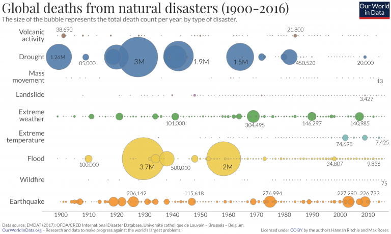
Death rates related to disease, illness and other health factors tend to change relatively slowly over time. Whilst death rates may fall or decline from year-to-year as part of a general trend, dramatic changes in such deaths are typically rare. Natural disaster and terrorism-related deaths are an important exception to this rule, as they can vary significantly between countries. This can make the annual comparison of deaths and death rates between health-related factors and volatile events more challenging. Understanding the relative risk of these events can require a longer-term overview of high and low-mortality years. We cover discussion and analysis on this topic in a post here.
Related chart – Share of deaths by cause. This chart shows the breakdown of global deaths by cause, given as the share of annual deaths, rather than the absolute number.
Related research: We study the major differences in mortality across the world using country examples in our post here.

In the visualization we see the distribution of global deaths broken down by three broad categories:
- 1 – in yellow: Injuries caused by road accidents, homicides, conflict deaths, drowning, fire-related accidents, natural disasters and suicides.
- 2 – in blue: Non-communicable diseases. These are often chronic, long-term illnesses and include cardiovascular diseases (including stroke), cancers, diabetes and chronic respiratory diseases (such as chronic pulmonary disease and asthma, but excluding infectious respiratory diseases such as tuberculosis and influenza).
- 3 – In red: Communicable diseases (i.e. infectious diseases) such as HIV/AIDS, malaria, and tuberculosis together with maternal deaths, neonatal deaths and deaths from malnutrition.
This is shown for global deaths as the default, but can be viewed for any country or region using the “change country” toggle on the interactive chart.
At a global level we see that the majority of deaths are caused by non-communicable diseases (NCDs). Collectively NCDs account for more than 73% of global deaths. As the world is making progress in the fight against many infectious diseases, and as populations age, we expect that NCDs will become increasingly dominant as the cause of death.
Related chart – the death rate from causes of death. This chart shows the death rate from infectious diseases, non-communicable diseases and injuries over time.

Breakdown of deaths by age
In this chart we see the breakdown of deaths by age bracket. Globally fewer and fewer people die at a young age.
In 2017, there were 56 million deaths globally; nearly half of these (49%) were people who were 70 years or older; 27% were between 50 and 69 years old; 14% were between 15 and 49; only 1% were older than 5 and younger than 14; and almost 10% were children under the age of 5.
The age at which people die has changed significantly since 1990. Fewer people die at a young age. In 1990 nearly one-quarter of all deaths were in children younger than 5. In 2017, this had declined to just under 10%. In contrast, the share of deaths in the over-70s age bracket has increased from a third to half of all deaths over this period.
It is possible to change this chart to any other country or region in the world. In countries with good health the share dying at a young age is very low. In Japan more than 83% are 70 years or older.

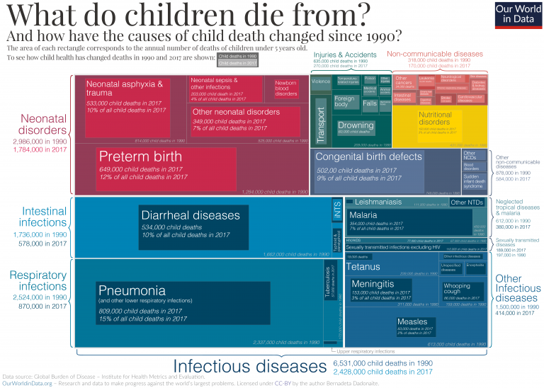
This chart shows the number of deaths in children under 5 years old by cause.
Through the combination of neonatal (newborn infants less than 28 days old) disorders, infections and congenital (from birth) defects, we see that the largest share of deaths in under-5s arises from complications at birth or in the first few weeks of life. Under-5s are also highly susceptible to lower respiratory infections, infectious diseases, diarrheal infections, malnutrition and nutritional deficiencies.
This is shown for deaths worldwide. But you can explore data on the annual number of deaths by cause for any country or region using the “change country” toggle.
Death rates in under-5s are typically much lower in high-income countries, and the nature of these deaths is different from lower incomes. In the United Kingdom, for example, child deaths tend to be highly dominated by neonatal complications. Deaths from infectious and diarrheal diseases and malnutrition is very low. In contrast, infectious diseases and nutritional deficiencies are large causes of death in lower-income countries.

This visualization shows the causes of deaths of children who died between the age of 5 and 14 year.
Globally, deaths in the 5-14 year old age bracket account for a small percentage of the total (1-2%).
There are six dominant causes of deaths in this age category. The leading causes globally in 5-14 year olds are road accidents, cancers and malaria. Lower respiratory infections, HIV/AIDS, diarrheal diseases, and drowning are all dominant causes typically in the range of 40,000-50,000 deaths in 2017.
Again, this distribution varies by country. In the United States, for example, cancers are the leading cause of death. In India, it’s diarrheal diseases; in Bangladesh and China it’s drowning; and in South Africa HIV/AIDS.

This visualization shows the causes of deaths of those who died between the age of 15 and 49.
In the 15 to 49 years old category, we see that non-communicable diseases (NCDs) begin to become dominant. Globally the leading cause of death in this age group is cardiovascular disease, followed cancers which both account for more than one million deaths. Road accidents, HIV/AIDS and suicide are all significant within this group.
For some countries, such as South Africa, by far the dominant cause of death is HIV/AIDS in 15 to 49 year olds. In a number of countries (in particular across Latin America, including Brazil and Mexico), homicide is the dominant cause for 15-49 years old.

This visualization shows the causes of deaths of those who died between the age of 50 and 69.
In 50 to 69 year olds, non-communicable diseases (NCDs) are strongly dominant — here cardiovascular disease, cancers, respiratory disease and diabetes are the top causes. With the exception of HIV/AIDS and tuberculosis which for some countries climb into the top causes, the global variability in death causes for 50-69 year olds is much lower than that of younger age categories.

This visualization shows the causes of death of people who were 70 years and older at the time of their death.
For the oldest age category (70 years and older), non-communicable diseases (NCDs) still dominate, however other death causes including Alzheimer’s/dementias, and diarrheal diseases also become dominant. Diarrheal diseases remain within the few leading causes of deaths in 70+ year olds for many low-income countries, despite being relatively low at higher incomes.

It is important to understand what is meant by the cause of death and the risk factor associated with a premature death:
In the epidemiological framework of the Global Burden of Disease study each death has one specific cause. In their own words: ‘each death is attributed to a single underlying cause — the cause that initiated the series of events leading to death’.
This is different from the deaths that happened due to risk factors. These deaths are an estimation of the reduction of the number of deaths that would be achieved if the risk factors to which a population is exposed would be eliminated (in the case of tobacco smoking, for example) or reduced to an optimal, healthy level (in the case of body-mass index). Risk factors can be grouped into four broad categories: behavioral risks, environmental risks, occupational risks, and metabolic risks.
All of these estimates are developed independently. This means that we cannot sum all ‘attributed deaths’ and conclude that this is the actual number of deaths. The attributed number of deaths by risk factor in many cases exceeds that of those by cause of death.
Below, in our section on Measurement, we describe in more detail how the epidemiologists of the Global Burden of Disease study attribute risk factors to mortality.
The estimates shown in this visualization show the numbers of deaths attributed to specific risk factors in 2017.
Here we see that there are several dominant risk factors for death: notably, those related to dietary and activity lifestyle factors (including blood pressure, physical activity, body-mass index, blood sugar, and dietary intake); smoking; air pollution (both outdoor and indoor); environmental factors including clean water and sanitation; and safe sex (for the prevention of HIV/AIDS).
This is shown for deaths worldwide. But you can explore data on the annual number of deaths by cause for any country or region using the “change country” toggle. The contribution of specific risk factors varies significantly by country.
For most high-income countries, the dominant risk factors are those related to healthy diets, smoking and alcohol intake. Other risk factors such as clean water, sanitation, and child wasting or stunting are very low. In low-income countries the inverse is true: in Sierra Leone for example, the top risk factors include child wasting, household air pollution, unsafe water source, poor sanitation, and the lack of access to handwashing facilities. For countries where HIV/AIDS is a major health burden, such as South Africa and Kenya, unsafe sex is the top risk factor.
The data here is measured across all age groups and both sexes — figures for specific age groups are detailed below.

Risk factors for death by age


Cardiovascular diseases
Cardiovascular disease (CVD) is a term used to refer to the range of diseases which affect the heart and blood vessels. These include hypertension (high blood pressure); coronary heart disease (heart attack); cerebrovascular disease (stroke); heart failure; and other heart diseases.
Cardiovascular disease is the top cause of death globally.
In the map we see death rates from cardiovascular diseases across the world.
Overall we see a strong East-West divide in CVD death rates. Rates across North America and Western/Northern Europe tend to be significantly lower than those across Eastern Europe, Asia and Africa. Across most of Latin America, these rates are moderate. In France, for example, the age-standardized rate was around 86 per 100,000 in 2017; across Eastern Europe this rate was around 5 times higher at 400-500 per 100,000. At the highest end of the scale, Uzbekistan had a rate of 724 per 100,000.

Additional information


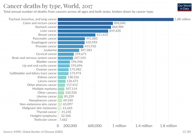
Cancers
Cancers are defined by the National Cancer Institute as a collection of diseases in which abnormal cells can divide and spread to nearby tissue. Cancers can arise in many parts of the body – leading to a range of cancer types, as shown below – and in some cases spread to other parts of the body through the blood and lymph systems.
In the map we see cancer death rates across the world.

Dementia
Dementia comprises several forms — the most common being Alzheimer’s disease — is an illness which results in a deterioration of cognitive capacity and function beyond what is expect from the normal ageing process. It can occur either in a chronic or progressive form. It affects several cognitive functions including memory, comprehension, judgement, language and learning capacity.
In the map we see death rates from dementia across the world. Note that these rates have been age-standardized which aims to correct for differences in the age structure of a population (which are different between countries and change over time). This therefore allows us to compare the likelihood that any given individual will die from dementia across countries and through time.
Across most countries, the death rate from dementia-related illness is below 55 per 100,000 individuals. Dementia rates in some countries have changed slightly since 1990, but significantly less so than other disease burdens.

Additional information

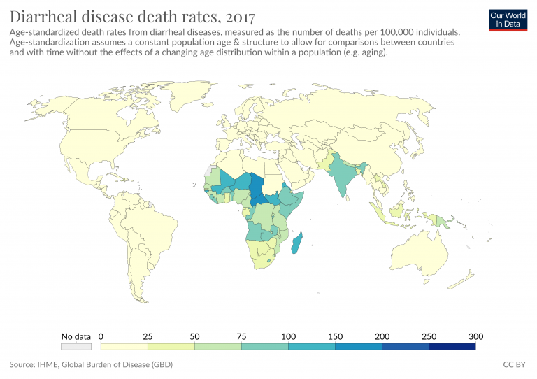
Diarrheal diseases
Diarrheal diseases are caused primarily by viral and bacterial pathogens. They are particularly dominant at lower incomes where there is poor access to safe sanitation, drinking water and hygiene facilities. Diarrheal diseases are a leading cause of death in children.
In the map we see death rates from diarrheal diseases across the world.

Tuberculosis
Tuberculosis (TB) is an illness caused by the ingestion of bacteria (Mycobacterium tuberculosis) which affects the lungs. The World Health Organization (WHO) estimate that up to one-quarter of the global population has latent TB, meaning they have been infected with the disease but are not ill with the disease (although this does not inhibit it from becoming active in the future).
People with compromised immune systems, such as those suffering from malnutrition, diabetes, or are smokers are more likely to become ill with TB. There is a strong link between HIV/AIDS and TB: those infected with HIV are 20-30 times more likely to develop active tuberculosis.
In the map we see death rates from tuberculosis across the world.
Across most countries, the death rate from TB is below 5 per 100,000. Rates in 2017 across Eastern Europe were slightly higher, between 5-10 per 100,000. Across South Asia, these reach 25-50 per 100,000, with highest rates across Sub-Saharan Africa ranging from 50 to over 250 per 100,000.

Additional information


Malnutrition
Malnutrition arises in various forms, with the broad definition capturing undernourishment, micronutrient deficiencies and obesity. In this case, we refer to ‘protein-energy malnutrition‘ (PEM) which refers to energy or protein deficiency caused by insufficient food intake. Protein-energy deficiency can also be exacerbated by infection or disease, which can have the effect of increasing nutritional needs, and/or reducing the body’s ability to retain energy or nutrients. You can find more information on hunger and undernourishment in our entry.
In the map we see death rates from protein-energy malnutrition across the world.
The highest rates are seen across across Sub-Saharan Africa, which are typically in the range of 10-100 per 100,000 individuals. For most countries, this rate is below 5 per 100,000. In North Korea during its famine period, rates reached over 400 per 100,000.

Additional information


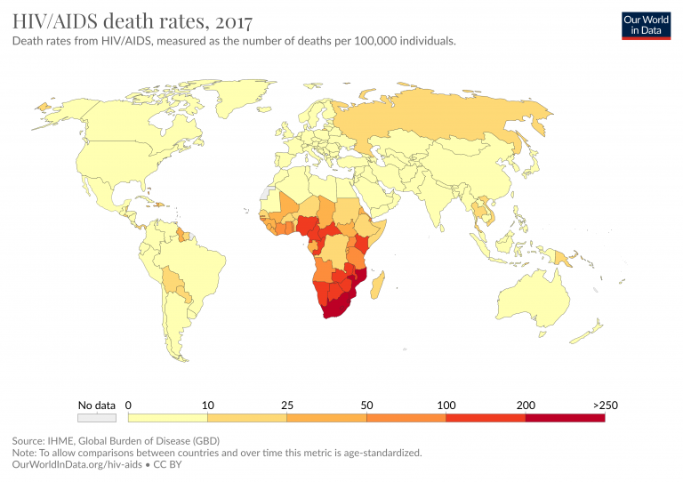
HIV/AIDS
An infection with HIV (human immunodeficiency virus) can lead to AIDS (acquired immunodeficiency syndrome). AIDS results in a gradual and persistent decline and failure of the immune system, resulting in heightened risk of life-threatening infection and cancers.
In the majority of cases, HIV is a sexually-transmitted infection. However, HIV can also be transmitted from a mother to her child, during pregnancy or childbirth, or through breastfeeding. Non-sexual transmission can also occur through the sharing of injection equipment such as needles.
In the map we see death rates from HIV/AIDS across the world.
Most countries have a rate of less than 10 deaths per 100,000 – often much lower, below 5 per 100,000. Across Europe the death rate is less than one per 100,000.
Across Sub-Saharan Africa the rates are much higher. Most countries in the South of the region had rates greater than 100 per 100,000. In South Africa and Mozambique, it was over 200 per 100,000.

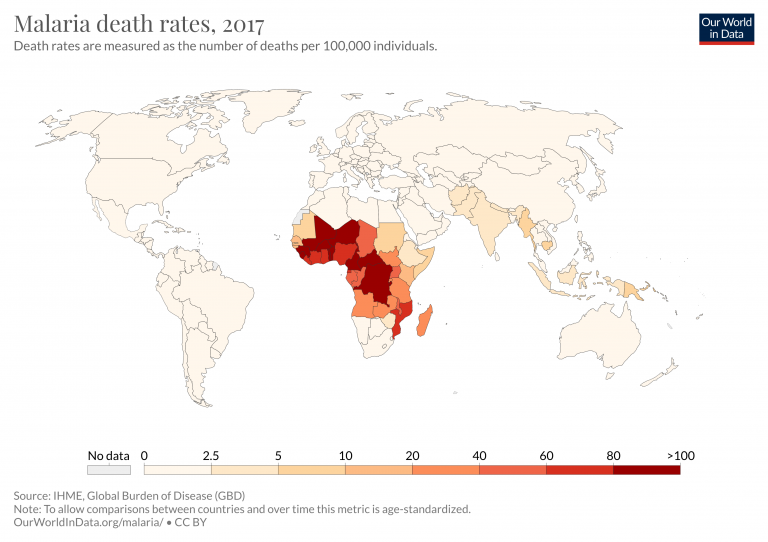
Malaria
Malaria is a disease that is transmitted from person to person by infected mosquitoes. The bite of an infected Anopheles mosquito transmits a parasite that enters the victim’s blood system and travels into the person’s liver where the parasite reproduces. There the parasite causes a high fever that involves shaking chills and pain. In the worst cases malaria leads to coma and death.
In the map we see death rates from malaria across the world.

Smoking
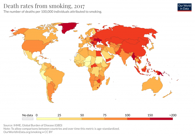
Tobacco smoking is not a direct cause of death, but it nonetheless one of the world’s largest health problems.
Smoking is one of the world’s leading risk factors for premature death. Tobacco a risk factor for several of the world’s leading causes of death, including lung and other forms of cancer, heart disease, and respiratory diseases.
In the map we see death rates from tobacco smoking across the world.

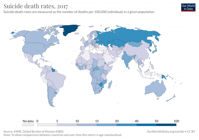
Suicide
Every suicide is a tragedy. With timely, evidence-based interventions, suicides can be prevented.6
In the map we see death rates from suicide across the world.

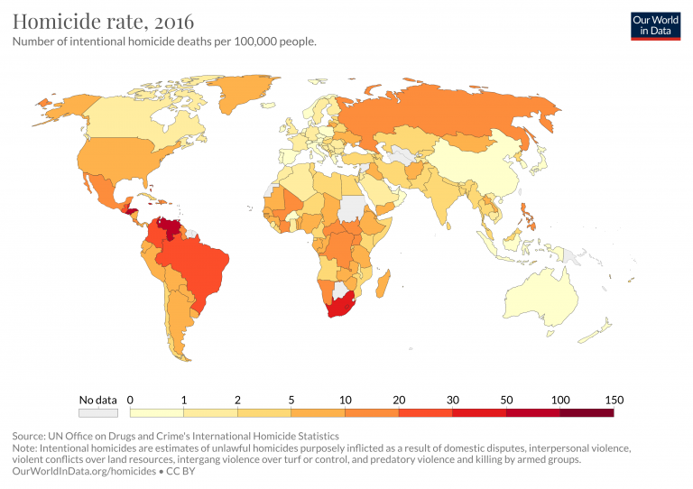
Homicides
Intentional homicides are defined as “an unlawful death deliberately inflicted on one person by another person”.7 Civilian and military deaths during interstate wars, civil wars and genocides are not counted as homicides – but Our World in Data presents the evidence on deaths in the linked articles.
In the map we see homicide rates across the world.

Natural disasters
Natural disasters can occur in many forms – ranging from earthquakes and tsunamis, to extreme weather events, and heatwaves.
The largest disaster events are often infrequent, but high-impact meaning there is significant variability in deaths from year-to-year.
In the the map we see death rates from natural disasters across the world.

Road incidents
Road incident deaths include those of drivers – motor vehicles and motorcyclists – in addition to cyclists and pedestrian deaths.
In the map we see death rates from road incidents across the world.
Death rates are typically lowest across Western Europe and Japan, with less than 5 deaths per 100,000 individuals. Across the Americas, rates are typically slightly higher at 5 to 20; most countries in Asia lie between 15 and 30; and rates are typically highest across Sub-Saharan Africa with over 25 per 100,000.

Additional information


Drowning
The World Health Organization (WHO) emphasises that drowning is one of the most overlooked, preventable causes of death across the world.8 For every country in the world, drowning is among the top 10 killers for children. In some countries, such as Bangladesh, it is the top mortality cause for children under 15 years old.
In the map we see death rates from drowning across the world.
In 2016, death rates were highest in Papua New Guinea and Seychelles, between 10 to 16 deaths per 100,000. Rates were also high in countries such as Bangladesh, Central African Republic, Vietnam, and Haiti.
If we look at death rates we see a significant decline since 1990 — especially in low to middle-income countries. In Bangladesh and China, for example, rates have fallen by more than two-thirds over this period.

Additional information


Fire
In the map we see death rates from fire across the world.
Most countries across the Americas, Western Europe, East Asia and Oceania average death rates below 2 per 100,000. Rates across other regions are typically higher at 2-6 per 100,000. When viewed through time we see a notable decline in fire death rates, particularly across Sub-Saharan Africa and Eastern Europe.

Additional information


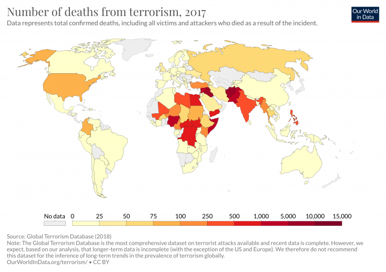
Terrorism
Terrorism is defined in the Oxford Dictionary as “the unlawful use of violence and intimidation, especially against civilians, in the pursuit of political aims.” We quickly see that this definition is unspecific and subjective.9 In our full article on Terrorism we look at adopted definitions, and how it’s distinguished from other forms of violence.
In the map we see death rates from terrorism across the world.

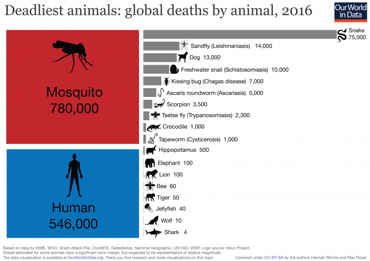
Deaths by animal
Around 1.5 million people are killed by animals every year.
More than half a million are killed by other humans – in war, homicides, and terrorism. And close to a million people are killed by other animals in any given year.10
Mosquitoes are, by far, the world’s deadliest animal for humans: at estimated 780,000 died from the transmission of disease from mosquitoes in 2016. Mosquito deaths are the sum of deaths (in order, highest to lowest) from: Malaria, Dengue fever, Japanese encephalitis, Yellow fever, Zika virus, Chikungunya, West Nile virus, and Lymphatic filariasis, for which it is the vector.
One of the primary motivations for our work at Our World in Data is to provide a fact-based overview of the world we live in — a perspective that includes the persistent and long-term changes that run as a backdrop to our daily lives. We aim to provide the complement to the fast-paced reporting we see in the news. The media provides a near-instantaneous snapshot of single events; events that are, in most cases, negative. The persistent, large-scale trends of progress never make the headlines.
But is there evidence that such a disconnect exists between what we see in the news and what is reality for most of us?
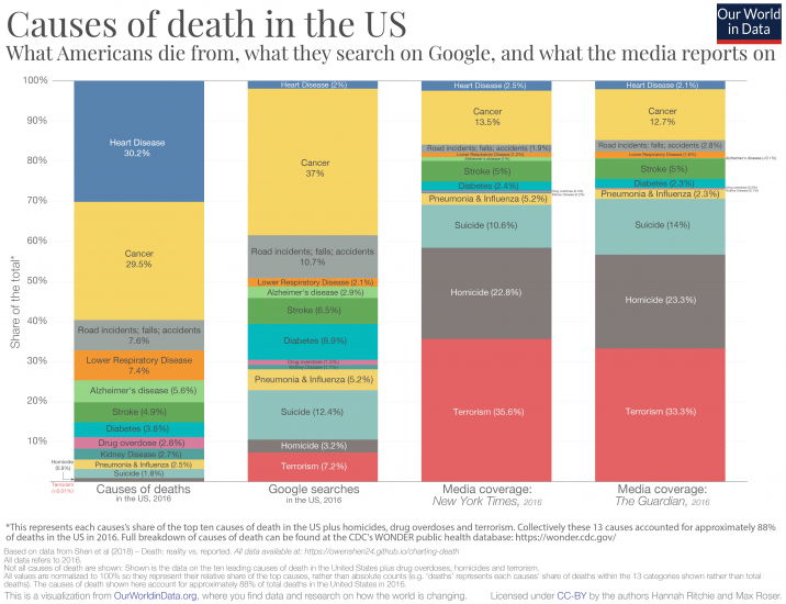
One study attempted to look at this from the perspective of what we die from: is what we actually die from reflected in the media coverage these topics receive?11
To answer this, Shen and his team compared four key sources of data:
- the causes of deaths in the USA (statistics published by the CDC’s WONDER public health database)
- Google search trends for causes of deaths (sourced from Google Trends)
- mentions of causes of deaths in the New York Times (sourced from the NYT article database)
- mentions of causes of deaths in The Guardian newspaper (sourced from The Guardian article database)
For each source the authors calculated the relative share of deaths, share of Google searches, and share of media coverage. They restricted the considered causes to the top 10 causes of death in the US and additionally included terrorism, homicide, and drug overdoses. This allows for us to compare the relative representation across different sources.12
So, what do the results look like? In the chart below I present the comparison.
The first column represents each cause’s share of US deaths; the second the share of Google searches each receives; third, the relative article mentions in the New York Times; and finally article mentions in The Guardian.
The coverage in both newspapers here is strikingly similar. And the discrepancy between what we actually die from and what we get informed of in the media is what stands out:
- around one-third of the considered causes of deaths resulted from heart disease, yet this cause of death receives only 2-3 percent of Google searches and media coverage;
- just under one-third of the deaths came from cancer; we actually Google cancer a lot (37 percent of searches) and it is a popular entry here on our site; but it receives only 13-14 percent of media coverage;
- we searched for road incidents more frequently than their share of deaths; however, they receive much less attention in the news;
- when it comes to deaths from strokes, Google searches and media coverage are surprisingly balanced;
- the largest discrepancies concern violent forms of death: suicide, homicide and terrorism. All three receive much more relative attention in Google searches and media coverage than their relative share of deaths. When it comes to the media coverage on causes of death, violent deaths account for more than two-thirds of coverage in the New York Times and The Guardian but account for less than 3 percent of the total deaths in the US.
What’s interesting is that what Americans search on Google is a much closer reflection of what kills us than what is presented in the media. One way to think about it is that media outlets may produce content that they think readers are most interested in, but this is not necessarily reflected in our preferences when we look for information ourselves.
[Clicking on the visualization will open it in higher resolution; The chart shows the summary for the year 2016, but interactive charts for all available years are available at the end of this blog.13]
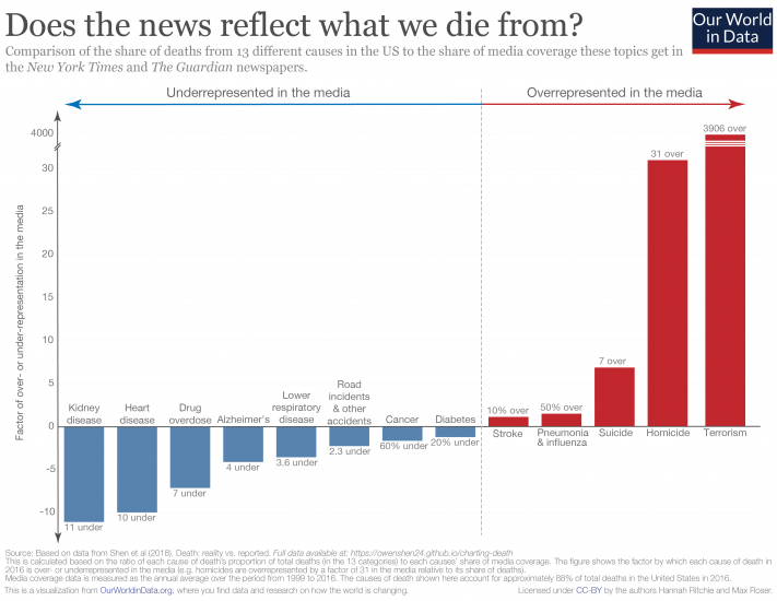
As we can see clearly from the chart above, there is a disconnect between what we die from, and how much coverage these causes get in the media. Another way to summarize this discrepancy is to calculate how over- or underrepresented each cause is in the media. To do this, we simply calculate the ratio between the share of deaths and share of media coverage for each cause.
In this chart, we see how over- or underrepresented each cause is in newspaper coverage.14 Causes shown in red are overrepresented in the media; those in blue are underrepresented. Numbers denote the factor by which they are misrepresented.
The major standout here – I had to break the scale on the y-axis since it’s several orders of magnitude higher than everything else – is terrorism: it is overrepresented in the news by almost a factor of 4000.
Homicides are also very overrepresented in the news, by a factor of 31. The most underrepresented in the media are kidney disease (11-fold), heart disease (10-fold), and, perhaps surprisingly, drug overdoses (7-fold). Stroke and diabetes are the two causes most accurately represented.
[Clicking on the visualization will open it in higher resolution].
From the comparisons above, it’s clear that the news doesn’t reflect what we die from. But there is another important question: should these be representative?
There are several reasons we would, or should, expect that what we read online, and what is covered in the media wouldn’t correspond with what we actually die from.
The first is that we would expect there to be some preventative aspect to information we access. There’s a strong argument that things we search for and gain information on encourages us to take action which prevents a further death. There are several examples where I can imagine this to be true. People who are concerned about cancer may search online for guidance on symptoms and be convinced to see their doctor. Some people with suicidal thoughts may seek help and support online which later results in an averted death from suicide. We’d therefore expect that both intended or unintended exposure to information on particular topics could prevent deaths from a given cause. Some imbalance in the relative proportions therefore makes sense. But clearly there is some bias in our concerns: most people die from heart disease (hence it should be something that concerns us) yet only a small minority seek [possibly preventative] information online.
Second, this study focused on what people in the USA die from, not what people across the world die from. Is media coverage more representative of global deaths? Not really. In another blog post, ‘What does the world die from?‘, I looked in detail at the ranking of causes of death globally and by country. The relative ranking of deaths in the USA is reflective of the global average: most people die from heart disease and cancers, and terrorism ranks last or second last (alongside natural disasters). Terrorism accounted for 0.06 percent of global deaths in 2016. Whilst we’d expect non-US events to feature in the New York Times, global news shouldn’t substantially affect representative coverage of causes.
The third relates to the very nature of news: it focuses on events and stories. Whilst I am often critical of the messages and narratives portrayed in the media, I have some sympathy for what they choose to cover. Reporting has become increasingly fast-paced. As news consumers, our expectations have quickly shifted from daily, to hourly, down to minute-by-minute updates of what’s happening in the world. Combine this with our attraction to stories and narratives. It’s not surprising that the media focuses on reports of single (inadvertently negative) events: a murder case or a terrorist attack. The most underrepresented cause of death in the media was kidney disease. But with an audience that expects a minute-by-minute feed of coverage, how much can possibly be said about kidney disease? Without conquering our compulsion for the latest unusual story, we cannot expect this representation to be perfectly balanced.
Media and its consumers are stuck in a reinforcing cycle. The news reports on breaking events, which are often based around a compelling story. Consumers want to know what’s going on in the world — we are quickly immersed by the latest headline. We come to expect news updates with increasing frequency, and media channels have clear incentives to deliver. This locks us into a cycle of expectation and coverage with a strong bias for outlier events. Most of us are left with a skewed perception of the world; we think the world is much worse than it is.15
The responsibility in breaking this cycle lies with both media producers and consumers. Will we ever stop reporting and reading the latest news? Unlikely. But we can all be more conscious of how we let this news shape our understanding of the world.
And journalists can do much better in providing context of the broader trends: if reporting on a homicide, for example, include context of how homicide rates are changing over time.16
As media consumers we can be much more aware of the fact that relying on the 24/7 news coverage alone is wholly insufficient for understanding the state of the world. This requires us to check our (often unconscious) bias for single narratives and seek out sources that provide a fact-based perspective on the world.
This antidote to the news is what we try to provide at Our World in Data. It should be accessible for everyone, which is why our work is completely open-access. Whether you are a media producer or consumer, feel free to take and use anything you find here.
Additional information


In this article we rely largely on the estimates presented in the Global Burden of Disease (GBD) studies that are produced under the leadership of the Institute for Health Metrics and Evaluation. The study is published in The Lancet at TheLancet.com/GBD and is the most regularly updated; comprehensive; and most in-depth analysis and synthesis of the causes and risk factors of death worldwide.
Estimating the causes of death
The IHME’s Global Burden of Disease (GBD) has developed a standardized approach to the attribution of deaths to specific causes.17
Their methodology states that “each death is attributed to a single underlying cause — the cause that initiated the series of events leading to death—in accordance with ICD principles”.18 Data to estimate the causes of deaths is far from complete, particularly in poorer countries, and for this estimation the researchers therefore need to rely on various sources. These sources include vital registration (VR); verbal autopsy (VA); surveillance, census and survey data; cancer registries; and police records. GBD then develops a data standardization and processing methodology within which they define data quality and completeness scores, and where necessary adjust completeness to 100% using cause fractions for a given location-age-sex-year and estimated all-cause mortality for that location-age-sex-year.
The GBD assessment is strongly tied to the mortality cause categories as defined within the International Classification of Diseases (ICD) codes, as used by the World Health Organization (WHO).
An important step in the GBD methodology standardization is in reallocating deaths attributed within ICD classifications without an underlying cause of death (for example, senility) which can be an intermediate but not final cause of death. These categories are termed as ‘garbage codes’. GBD redistribute these garbage codes using a methodology explained in detail in Naghavi et al. (2010).19 Note that this redistributing of ‘garbage codes’ in some cases explains the difference in estimates between IHME and WHO, such as for road accident deaths (compared here).
Death and death rate analyses are then carried out by the GBD researchers across all locations, all ages, both sexes and for the period from 1990 onwards based on its Cause of Death Ensemble model (CODEm). The full description of GBD methodology can be found here.
Estimating the deaths attributed to risk factors
Estimating the risk factors associated with millions of deaths around the world is a complex task — particularly when risk factors can compound and collectively influence the likelihood of disease and, eventually, death.
The Global Burden of Disease (GBD) studies – on which we largely rely on in this article – provide one of, if not the, most in-depth analysis and synthesis of relative risk factors.20
The GBD groups risk factors into four broad categories: behavioral risks, environmental risks, occupational risks, and metabolic risks.
The central tool to estimate the impact of various risk factors is the Comparative Risk Assessment (CRA) conceptual framework21 which details how various risk factors affect health outcomes and ultimately death. For example, there is evidence of links between a higher body mass index (BMI) and the risk of multiple non-communicable diseases (NCDs) including cardiovascular disease, ischemic stroke and some cancers.22
Such risk-outcome pairs (e.g. high BMI and ischemic stroke) are formed based on evidence from cohort studies, randomized trials, and case-control studies.
A key point to emphasise is that attributing deaths to risk factors necessarily implies making assumptions about the magnitude of the causal impact that each factor has on the probability of death, everything else equal. Establishing causal impacts this way is difficult. The GBD studies rely on state-of-the-art evidence from cohort, case studies and trials, but extrapolating from this evidence still requires making assumptions, with an implied margin of error. As scientific research advances, new evidence becomes available – the estimates from the GBD studies adapt, and become more precise when new academic research emerges.
Once a risk-outcome pair has been identified, how does IHME begin to quantify the disease burden or number of deaths attributed to each risk?
The CRA can be used for two different types of assessment, attributable burden and avoidable burden:
- The avoidable burden represents the potential burden avoided in the future if population exposure to a risk factor was to shift to a counterfactual level of exposure (for example, from its current level to a future scenario where tobacco smoking was eliminated).
- The attributable burden is an estimation of the reduction of the number of deaths that would have been achieved if the risk factors to which a population is exposed had been eliminated (in the case of tobacco smoking, for example) or reduced to an optimal, healthy level (in the case of body-mass index). It estimates the number of deaths associated with a risk factor as the difference between a hypothetical ideal world with no exposure to relevant risk factors with the actual exposure to risk factors. This methodology can be applied for the current number of deaths associated with different risk factors and in historical analyses of the past. The data presented in this article here is that of the attributable burden.
The estimation of the attributable burden effectively answers the question: “What would be the number of deaths from a specific cause of death – e.g. stroke or a specific cancer – if everyone’s body-mass index (BMI) was reduced to a optimal, healthy level?” This healthy/optimal level is defined as the ‘theoretical minimum risk exposure level (TMREL)‘. Cohort, case studies and trials of established risk-exposure relationships between BMI and ischemic stroke allow for the calculation of the reduction in deaths which would have occurred if BMI was reduced to a healthy level across the population distribution. This relationship can be established by specific demographic groups, such as by sex or age. The difference between the number of deaths from ischemic stroke which would have occurred at the TMREL and at the actual BMI distribution is given as the number of deaths attributed to high BMI from ischemic stroke.
By completing this process for all risk-outcome pairs, IHME can sum to estimate the total number of deaths attributed to high BMI, and replicated for all risk factors using their individual risk-outcome exposure curves.
Note that this process of estimation is not additive; in other words, these risk-specific relationships do not account for the compounding effects of multiple risk factors. High BMI, for example, may likely be present with other lifestyle factors such as low physical activity levels, high blood pressure, low fruit and vegetable intake. All of these estimates are developed independently. We cannot therefore sum all ‘attributed deaths’ and conclude that this is the actual number of deaths. The attributed number of deaths by risk factor in many cases exceeds that of those by cause of death.
For example, the chart here shows the risk factors for cardiovascular diseases. 18 million people died from cardiovascular diseases in 2017. However, if you sum the deaths attributable to individual risk factors they will add up to more that 18 million. The reason is because these risk factors are calculated individually and the measurement does not account for the compounding effects of multiple risk factors. E.g. people who eat less grains and fruits are also likely to have diets with higher proportion of processed fatty acids and lower proportion of fiber.
The full methodological explanation of the IHME’s approach to risk factor attribution can be found here.
The map shows the share of total deaths reported by national statistics authorities to the UN Statistic Division divided by the number of total deaths estimated by the UN Population Division.

- Data: Death rates, absolute number of premature deaths and DALYS across all risk factors and causes
- Geographical coverage: Global, across all regions and countries
- Time span: Most metrics available from 1990 onwards
- Available at: Online here
- Data: Causes-specific mortality by age and sex
- Geographical coverage: Global, by region and by country
- Time span: Most metrics available from 2000 onwards in 5-year incrememnts
- Available at: Online here
- Data: Terrorist attacks with 45-120 variables for each, including number of fatalities, injuries, weapons used, and perpetrators
- Geographical coverage: Global by country
- Time span: 1970 onwards
- Available at: http://www.start.umd.edu/gtd/
- Data: International reports of executions
- Geographical coverage: Global by country
- Time span: 2007 onwards
- Available at: https://www.amnesty.org/en/what-we-do/death-penalty/