In most countries basic education is nowadays perceived not only as a right, but also as a duty – governments are typically expected to ensure access to basic education, while citizens are often required by law to attain education up to a certain basic level.1
This was not always the case: the advancement of these ideas began in the mid 19th century, when most of today’s industrialized countries started expanding primary education, mainly through public finances and government intervention. Data from this early period shows that government funds to finance the expansion of education came from a number of different sources, but specifically taxes at the local level played a crucial role. The historical role of local funding for public schools is important to help us understand changes – or persistence– in regional inequalities.
The second half of the 20th century marked the beginning of education expansion as a global phenomenon. Available data shows that by 1990 government spending on education as a share of national income in many developing countries was already close to the average observed in developed countries.2
This global education expansion in the 20th century resulted in a historical reduction in education inequality across the globe: in the period 1960-2010 education inequality went down every year, for all age groups and in all world regions. Recent estimates of education inequality across age groups suggest that further reductions in schooling inequality are still to be expected within developing countries.3
Recent cross-country data from UNESCO tells us that the world is expanding government funding for education today, and these additional public funds for education are not necessarily at the expense of other government sectors. Yet behind these broad global trends there is substantial cross-country – and cross-regional – heterogeneity. In high-income countries, for instance, households shoulder a larger share of education expenditures at higher education levels than at lower levels – but in low-income countries this is not the case. Malawi is a stark example: tertiary education is almost completely subsidised by the state, yet household contribute almost 20% of the costs of primary education.
Following the agreement of the Millennium Development Goals, the first decade of the 21st century saw an important increase in international financial flows under the umbrella of development assistance. Recent estimates show that development assistance for education has stopped growing since 2010, with notable aggregate reductions on flows going to primary education. These changes in the priorization of development assistance for education across levels and regions, can have potentially large distributional effects, particularly within low income countries that depend substantially on this source of funding for basic education.4
When analysing correlates, determinants and consequences of education consumption, the macro data indicates that national expenditure on education does not explain well cross-country differences in learning outcomes. This is indicative of a complex ‘education production function’ whereby for any given level of expenditure, output achieved depends crucially on the input mix.
Available evidence specifically on the importance of school inputs to produce education, suggests that learning outcomes may be more sensitive to improvements in the quality of teachers, than to improvements in class sizes. Regarding household inputs, the recent experimental evidence suggests that interventions that increase the benefits of attending school (e.g. conditional cash transfers) are particularly likely to increase student time in school; and that those that incentivise academic effort (e.g. scholarships) are likely to improve learning outcomes.
Policy experiments have also shown that pre-school investment in demand-side inputs leads to large positive impacts on education – and other important outcomes later in life. The environment that children are exposed to early in life, plays a crucial role in shaping their abilities, behavior and talents.
All our charts on Financing Education
Governments around the world are nowadays widely perceived to be responsible for ensuring the provision of accessible quality education. This is a recent social achievement. The advancement of the idea to provide education for more and more children only began in the mid 19th century, when most of today’s industrialized countries started expanding primary education. The following visualization, plotting public expenditure on education as a share of Gross Domestic Product (GDP) for a number of early-industrialized countries, shows that this expansion took place mainly through public funding.5 Our entry on Primary Education and Schools provides details regarding how this expansion in funding materialized in better education outcomes for these countries.

Public schools in the US currently educate more than 90% of all children enrolled in elementary and secondary schools.6
This is the result of a process of education expansion that relied heavily on public funding, particularly from local governments. The visualization shows the sources of revenues for public schools in the US over the last 120 years. As it can be seen, states and localities are – and have always been – the main sources of funding for public primary education in the US. In fact, we observe three broad periods in this graph: there is first a period of stable revenues until 1920, then a period of sharp growth and decline during the interwar years, and then a period of substantial growth since the second world war, slowing down in the 1970s. In all these periods, federal funding was always very small, as can be seen when changing the visualisation from ‘absolute’ to ‘relative’. Disaggregated data from the last couple of decades gives further insights into the specific sources of local revenues for schools in the US: the largest part comes from property taxes (about 80% of local revenues came from property taxes in 2013), while only a very small part comes from fees and donations (private funding for public schools, which is considered a local revenue, amounted to less than 2% of total public school revenues in 2013). This heavily decentralised system relying on property taxes has the potential of creating large inequalities in education, since public schools in affluent urban areas are able to raise more funding from local revenues. Indeed, a significant part of the debate on education inequalities in the US today focuses on the importance of increasing progressive federal spending to reduce inequalities in public school funding.7

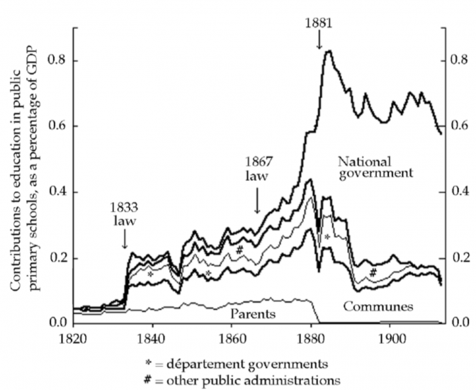
The case of the US above shows that funding for public schools has been historically a responsibility of local governments. In other countries, such as France, the expansion of public education also took place initially with resources from local governments, but relatively quickly the fiscal burden was shifted to the national level. In France this transition was associated with a sharp jump towards universal access and a concomitant reduction in regional inequalities. The following visualization from Lindert (2004)8 provides evidence of the French experience. As we can see there are three distinct periods: education spending was initially low and mainly private, then in 1833 funding began growing with local resources after the introduction of a law liberating communes to raise more local taxes for schools, and finally in 1881 the national government took over most of the financial responsibility after the introduction of a new law that abolished all fees and tuition charges in public elementary schools. In the source book, Lindert (2004) provides further evidence of how this transition towards centrally funded public education reduced north-south inequalities in France.
Sources of funds for France’s public primary schools, 1820–1913 – Figure 5.5 in Lindert (2004)9
A comparison of expenditure between public and private education institutions is helpful to contextualize the role the public sector played in the process of education expansion in industrialized countries. The following graph does this using data from the National Center for Education Statistics in the US. It shows that during the years 1950-1970 – a period of substantial growth in education expenditure in the US – expenditure grew specifically in the public sector.10

The second half of the 20th century marked the beginning of education expansion as a global phenomenon. The visualization, using data from Szirmai (2005)11, shows government expenditure on education as a share of national income for a selection of low and middle-income countries, together with the corresponding average for high-income countries, for the period 1960-2010. As it can be seen, by 1990 government spending on education in many developing countries was already close to the average observed in developed countries.
It is important to point out that the remark above makes reference to convergence in expenditure relative to income. To the extent that low-income countries remain poorer than high-income countries, gaps in levels of expenditure per pupil are persistently large. Indeed, cross-country heterogeneity in education expenditure per pupil is currently much higher than heterogeneity in expenditure as share of GDP.12 One factor contributing to the slower convergence of expenditure per pupil in real terms is the fact that teachers’ salaries – the main component of education expenditure – are much higher in high-income countries, because labour has a higher opportunity cost in these countries. In general, the opportunity cost of labour is a key variable that governments in developing countries should factor in when deciding whether to expand education now, rather than later.

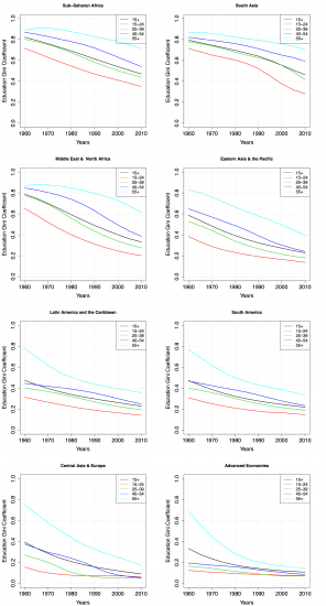
An important consequence of the global education expansion is a reduction in education inequality across the globe. The following visualization shows this through a series of graphs plotting changes in the Gini coefficient of the distribution of years of schooling across different world regions. The Gini coefficient is a measure of inequality and higher values indicate higher inequality – you can read about the definition and estimation of Gini coefficients in our entry on income inequality. The time-series chart shows inequality by age group. It can be seen that as inequality is falling over time, the level of inequality is higher for older generations than it is for younger generations. We can also see that in the reference period education inequality went down every year, for all age groups and in all world regions.
Have gains from historical education expansion fully materialized? The breakdown by age gives us a view into the future: as the inequality is lower among today’s younger generations, we can expect the decline of inequality to continue in the future. Thus, further reductions in education inequality are still to be expected within developing countries; and if the expansion of global education can be continued, we can speed up this important process of global convergence.
Education Gini coefficients by world region for selected age groups, 1960- 2010 – Figure 4 in Crespo Cuaresma et al. (2013)13
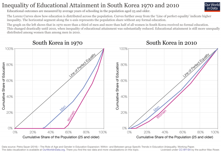
The experience of South Korea shows that it is possible to reduce education inequality rapidly across all levels of education. The following visualization show two graphs comparing the concentration of years of education in South Korean between the years 1970 and 2010. To be precise, each of these graphs shows an education Lorenz curve: a plot showing the cumulative percentage of the schooling years across all levels of education on the vertical axis, and the cumulative percentage of the population on the horizontal axis. As it can be seen, in 2010 education was much less concentrated than in 1970, not only because there was a smaller share of individuals without schooling (shown along the bottom of the chart), but also because there was a smaller share of individuals concentrating large proportions of school-years at higher levels of education. Indeed, in only 40 years South Korea was able to double the mean years of schooling (from 6 to 12 years) and at the same time get remarkably close to the 45-degree line marking the hypothetical scenario of perfect equality of schooling. In other entries we show that in this same period South Korea increased drastically its GDP per capita while significantly improving health outcomes, such as child mortality.
Inequality of Educational Attainment in South Korea 1970 and 201014
The last two decades have seen a small but general increase in the share of income that countries devote to education. The following chart plots trends in public expenditure on education as a share of GDP. As usual, a selection of countries is shown by default, but other countries can be added by clicking on the relevant option at the top of the chart. Although the data is highly irregular due to missing observations for many countries – an issue we discuss in more detail in our section on Data Quality below –, we can still observe a broad upward trend for the majority of countries. Specifically, it can be checked that of the 88 countries with available data for 2000/2010, three-fourths increased education spending as a share of GDP within this decade. As incomes – measured by GDP per capita – are generally increasing around the world, this means that the total amount of global resources spent on education is also increasing in absolute terms.
You can explore the trends by education level in these interactive charts:

The above-mentioned growth in overall government expenditure on education as a share of GDP cannot be entirely attributed to a wide-spread change in the prioritization of education spending within domestic budgets. The following visualization shows government expenditure on education as a share of total government expenditure. In this case the available data does not suggest a discernible global pattern. For instance, of the 36 countries with available data for 2000 to 2010, only around half increased spending on education relative to the other sectors. The data does suggest, however, that there is large and persistent cross-country heterogeneity in the relative importance of education vis-a-vis other sectors, even within developing countries. For example, in 2011 education accounted for about 8% of government spending in the Central African Republic, while it accounted for about 30% in Ghana.

Generally speaking, countries that spend a large share of their income on education also tend to prioritize education highly within their budgets. The following visualization presents a snapshot of government spending on education around the world for the year 2016. Specifically, this graph plots government expenditure on education as a share of GDP in the vertical axis, and government expenditure on education as a share of total government expenditure in the horizontal axis. Each dot on this chart represents a different country, with the assigned colors denoting different world regions. As we can see, there is a positive correlation, but regional differences are stark: for almost every level of spending as a share of GDP along the horizontal axis, European countries (marked in light orange) spend a smaller budget share on education.

In comparison to countries where education started expanding later, European countries tend to assign relatively more of their government education budgets to the secondary and tertiary levels, while at the same time devoting relatively less of their general government budgets to education as a whole. This can be appreciated in the following visualization, where the priorization of primary education (i.e. the share of primary education within the education budget) is plotted against the overall priorization of education (i.e. the share of education within the entire government budget). It can be seen that European countries (marked again in light orange) are mostly located in the bottom-left. And there is a weak positive correlation between the variables, both across all countries and across European countries.15

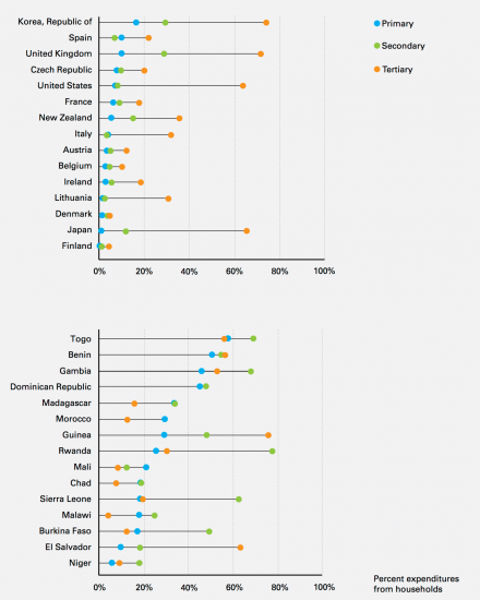
The following visualization shows the percentage of total education expenditures contributed directly by households in 15 high income countries and 15 low/middle income countries (most recent data available on 2014). The top chart in this figure, corresponding to high income countries, shows a very clear pattern: households contribute the largest share of expenses in tertiary education, and the smallest share in primary education. Roughly speaking, this pattern tends to be progressive, since students from wealthier households are more likely to attend tertiary education, and those individuals who attend tertiary education are likely to perceive large private benefits (more on this in our entry on Skill Premium).16 In contrast, the bottom chart shows a very different picture: in several low-income countries households contribute proportionally more to primary education than to higher levels. Malawi is a notable case in point – tertiary education is almost completely subsidised by the state, yet household contribute with almost 20% of the costs in primary education. Such distribution of private household contributions to education is regressive.
Percentage of total education expenditures contributed directly by households in 30 countries, grouped by country income – Figure 32 in The Investment Case for Education and Equity (UNICEF – 2015)
We have already mentioned that those countries that pioneered the expansion of primary education in the 19th century – all of which are current OECD member states – relied heavily on public funding to do so. Today, public resources still dominate funding for the primary, secondary and post-secondary non-tertiary education levels in these countries. While in the last decade the share of public funding for these levels of education has decreased slightly, the broad pattern is remarkably stable. The visualization presents OECD-average expenditure on education institutions by source of funds.17 By clicking on the option labeled ‘relative’ you can see the corresponding share of each source: private funding went up from 7.9% in 2000, to 9.4% in 2012. The role of public funding for other levels of education is however quite different. At the tertiary level public sources account for less than 70% of funding on average (2012 figures). Below we provide evidence of the pre-school level.

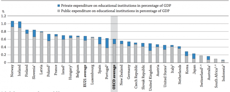
High-income countries tend to have better developed pre-primary education systems than lower-income countries. However, within high-income countries there is substantial heterogeneity in the extent to which pre-primary education is publicly financed. The visualization presents expenditure on pre-primary educational institutions as a share of GDP across the OECD. As it can be seen, publicly funded pre-primary education tends to be more strongly developed in the European than the non-European countries of the OECD. In fact, the OECD reports that in Europe the concept of universal access to education for 3-6 year-olds is generally accepted: most countries in this region provide all children with at least two years of free, publicly funded pre-primary education in schools before they begin primary education.
Expenditure on pre-primary educational institutions (% of GDP), OECD, 2012 – Figure C2.4 in Education at a Glance (2015)
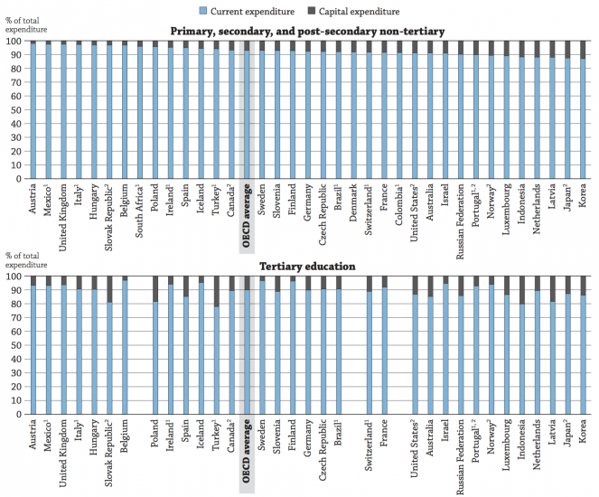
The largest part of funding devoted to education in OECD countries goes to finance current expenditures, mainly compensation of staff – specifically, teachers. The following two charts, taken from the OECD’s report Education at a Glance (2015), highlight the labour-intensive nature of education. In the lower levels of education (i.e. primary, secondary and post-secondary non-tertiary) the share of current expenditure is very large and exhibits little cross-country variation – between 90 and 97 percent of total expenditure corresponds to current expenditure across all of the OECD countries. In higher levels of education (i.e. tertiary) there is more cross-country variation, but current expenditure still dominates by a large margin across all countries.
Distribution of current and capital expenditure on educational institutions – Figure B6.2 in Education at a Glance (2015)
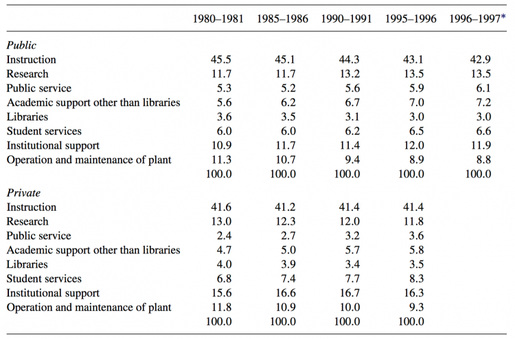
In the figures above we noted the importance of current expenditure in the production of education. The following table provides further details regarding the type of expenditures that comprise current spending. Specifically, this chart shows a breakdown of expenditure for tertiary-level institutions in the US (public and private), during the period 1980-1997. It shows that instruction accounts for almost half of expenditure; and while there are some small differences across sectors, there is a fair amount of stability in expenditures across time. This serves as a benchmark for lower education levels, where instruction takes an even larger share of expenditure.18
Percent distribution of college and university current expenditures in the US, by control over time – Table 8 in Welch and Hanushek (2006)19
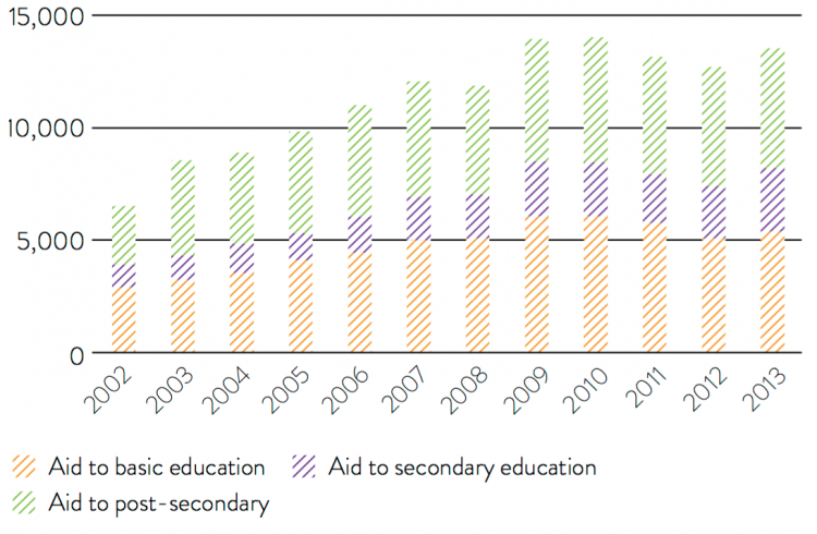
Following the agreement of the Millennium Development Goals, the first decade of the 21st century saw an important increase in international financial flows under the umbrella of development assistance (often also called development aid, or simply ‘aid’). The following chart shows total OECD development assistance flows for education by level, in constant 2013 US dollars, for the period 2002-2013. As it can be seen, there are two distinct periods: in 2003-2010 flows for education increased substantially, more than doubling in real terms across all levels of education; and in the years 2010-2013 funding for basic education decreased, while funding for secondary and post-secondary education remained relatively constant. For many low income countries, where development assistance contributes a substantial share of funding for education, this marked change in trends is important. As a reference, in 2012 development assistance accounted for more than 20 percent of all domestic spending on basic education in recipient low-income countries.20
Total development assistance for education by level, 2003-2013 – Figure 5 in the report Education Aid Watch 2015
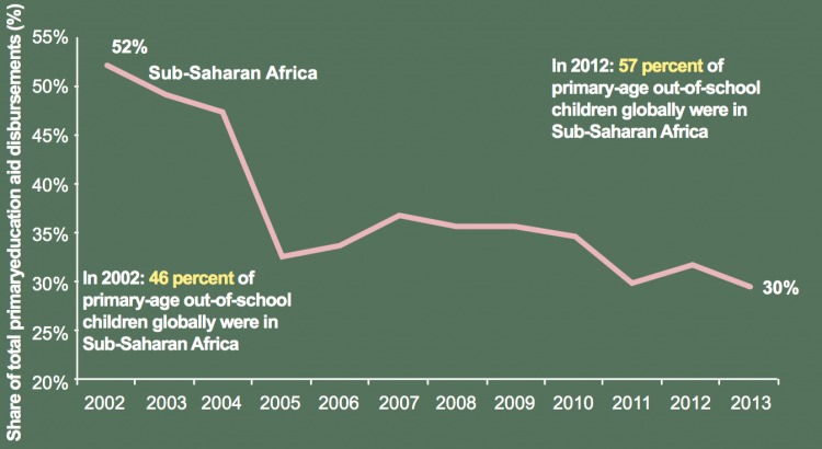
The recent reductions in development assistance funds for primary education have been coupled with important changes in regional priorities. Specifically, the share of development assistance for primary education going to sub-Saharan Africa has been decreasing sharply since the agreement of the Millennium Development Goals. The following chart shows this: sub-Saharan Africa’s share in total aid to primary education declined from 52 percent in 2002 to 30 percent in 2013, while the continent’s share in the total number of out-of-school children rose from 46 percent to 57 percent. This pattern is something specific to the education sector within the broader development assistance landscape: in the healthcare sector the overall slowdown of flows started a couple of years later, was less abrupt, and affected proportionally less the sub-Saharan countries.21 Indeed, recent studies further highlight that development assistance for education is significantly different to assistance for healthcare in other ways: the education sector attracts less earmarked funding through multilaterals, and includes a smaller proportion of resources that developing governments can directly control for programming.22
You can read more about development assistance for healthcare in our entry on Financing Healthcare.
Share of primary education disbursements from development assistance going to Sub-Saharan Africa, 2002-2013 – Figure 2.6 in Steer and Smith (2015)23
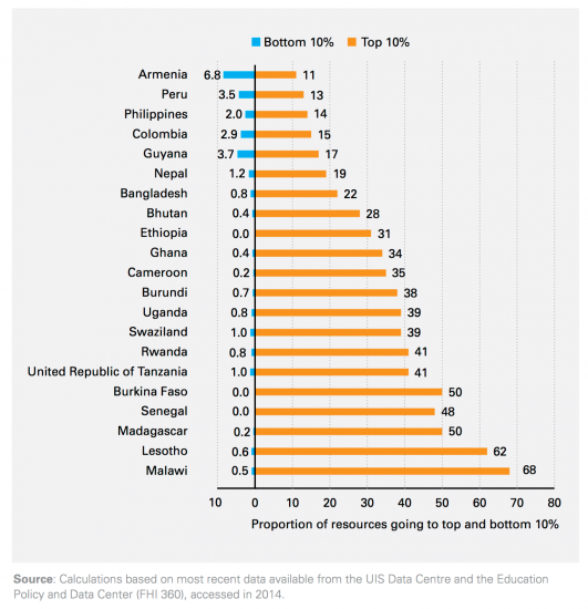
In the Historical Perspective section above, we mentioned that public spending on education has translated, in the long run, into lower inequality in education outcomes across most of the world. But for any given country, with a determined income distribution and demographic structure, the extent to which public spending on education contributes to reduce inequality depends crucially on the way in which spending is focused across education levels. The recent UNICEF report The Investment Case for Education and Equity shows that in low income countries, on average 46 percent of public resources are allocated to the 10 percent of students who are most educated – while this figure goes down to 26 and 13 percent in lower-middle and upper-middle income countries respectively. The following visualization shows further details on the concentration of public spending across different countries. The vertical axis shows the percentage of public education resources going to the 10% most educated or 10% least educated students – as we can see expenditure is heavily concentrated at the top in many low income countries.
The earlier remarks about trends in international education financing flows (namely that aid is very important in low-income countries, and that a relatively low and shrinking share of aid is going to primary levels), suggest that inequality in public spending will worsen in low income countries. Yet development assistance priorities have a scope for changing this.24
Percentage of public education resources going to the 10% most educated or 10% least educated students – Figure 29 in The Investment Case for Education and Equity (UNICEF – 2015)
The big picture
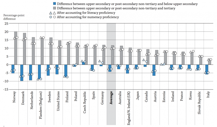
One of the reasons to justify government intervention in the market for education, is that education generates positive externalities.25 This essentially means that investing in education yields both private and social returns. Private returns to education include higher wages and better employment prospects (as we discuss in our entry on Returns to Education). Social return include pro-social behaviour (e.g. volunteering, political participation) and interpersonal trust. The following chart uses OECD results from the Survey of Adult Skills to show how self-reported trust in others correlates with educational attainment. More precisely, this chart plots the percentage-point difference in the likelihood of reporting to trust others, by education level of respondents. Those individuals with upper secondary or post-secondary non-tertiary education are taken as the reference group, so the percentage point difference is expressed in relation to this group. As we can see, in all countries those individuals with tertiary education were by far the group most likely to report trusting others. And in almost every country, those with post-secondary non-tertiary education were more likely to trust others than those with primary or lower secondary education. The OECD’s report Education at a Glance (2015) provides similar descriptive evidence for other social outcomes. The conclusion is that adults with higher qualifications are more likely to report desirable social outcomes, including good or excellent health, participation in volunteer activities, interpersonal trust, and political efficacy. And these results hold after controlling for literacy, gender, age and monthly earnings.
Likelihood of reporting to trust others, by educational attainment, OECD 2012 – Figure A8.4 in Education at a Glance (2015)26
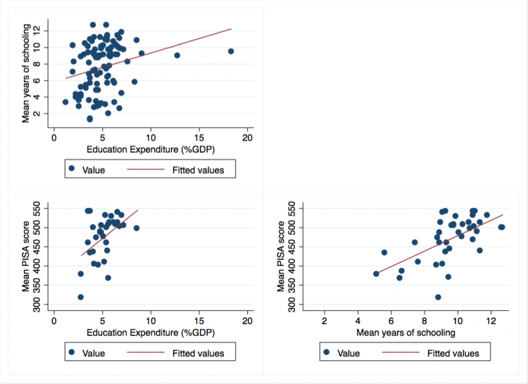
Education outcomes are typically measured via ‘quantity’ output (e.g. years of schooling) and ‘quality’ output (e.g. learning outcomes, such as test scores from the Programme for International Student Assessment – PISA). The following visualization presents three scatter plots using 2010 data to show the cross-country correlation between (i) education expenditure (as a share of GDP), (ii) mean years of schooling, and (iii) mean PISA test scores. At a cross-sectional level, expenditure on education correlates positively with both quantity and quality measures; and not surprisingly, the quality and quantity measures also correlate positively with each-other. But obviously correlation does not imply causation: there are many factors that simultaneously affect education spending and outcomes. Indeed, these scatterplots show that despite the broad positive correlation, there is substantial dispersion away from the trend line – in other words, there is substantial variation in outcomes that does not seem to be captured by differences in expenditure.
Correlation between education outcomes and education expenditure (2010 data)27
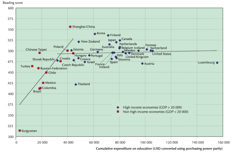
The following visualization presents the relationship between PISA reading outcomes and average education spending per student, splitting the sample of countries by income levels. It shows that income is an important factor that affects both expenditure on education and education outcomes: we can see that above a certain national income level, the relationship between PISA scores and education expenditure per pupil becomes virtually inexistent. Several studies with more sophisticated econometric models corroborate the fact that expenditure on education does not explain well cross-country differences in learning outcomes.28 You can read more about test scores and learning outcomes in our entry on Quality of Education.
Average reading performance in PISA and average spending per student from the age of 6 to 15 – Figure 1 in OECD (2012)29
The fact that expenditure on education does not explain well cross-country differences in learning outcomes is indicative of the intricate nature of the process through which such outcomes are produced. Borrowing the terms from the economics literature, the following ‘production function’ provides a conceptual framework to think about the determinants of learning outcomes30:
where A is skills learned (achievement), s is years of schooling, Q is a vector of school and teacher characteristics (quality), C is a vector of child characteristics (including “innate ability”), H is a vector of household characteristics, and I is a vector of school inputs under the control of households, such as children’s daily attendance, effort in school and in doing homework, and purchases of school supplies.
This conceptualization highlights that, for any given level of expenditure, the output achieved will depend on the input mix. And consequently, this implies that in order to explain education outcomes, we must rely on information about specific inputs. In the following sections we explore evidence regarding the returns to household inputs (i.e. different elements of Q) and demand-side inputs (i.e. elements of C,H and I).
School inputs
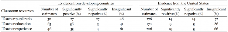
A vast number of studies have tried to estimate the impact of classroom resources on learning outcomes. The following table summarizes results from the systematic review in Hanushek (2006)31. In this table, the left-hand side summarizes results from econometric studies focusing on developing countries, while the right-hand side presents evidence from the US (where studies have concentrated extensively). We can see that for all listed inputs and across all countries, the share of studies that have found a positive effect is small – in fact, the majority of studies find either no effect, or a negative effect. This clearly does not mean that these classroom resources are not important, but rather that it is very difficult to know with confidence when and where they are a binding constraint to improve learning outcomes. A first conclusion, therefore, seems to be that context and input mix are fundamental to improving outcomes – even in developing countries where the expected returns to additional resources is large across the board.
Taking the ratio of positive to negative effects detected in the literature as a proxy for what tends to work best, we can derive a second conclusion from the table: spending more resources on better teachers (i.e. improving teacher experience and teacher education) tends to work better to improve learning outcomes than simply increasing the number of teachers per pupil. And this seems to be true both in developed and developing countries. This last conclusion is consistent with the main message from the OECD’s report Does money buy strong performance in PISA?, which points out that countries that prioritised the quality of teachers over class sizes performed better in PISA tests.32
And it is also consistent with a recent high-quality study on the impact of teacher quality on test scores using data from the US, which suggests that improvements in teacher quality can causally raise students’ test scores (evidence from Chetty et al. (2014)33 – see our entry on Quality of Education for a discussion of their results).
Percentage distribution of estimated effect of selected key resources on student performance – based on Tables 3 and 6 in Hanushek (2006)34
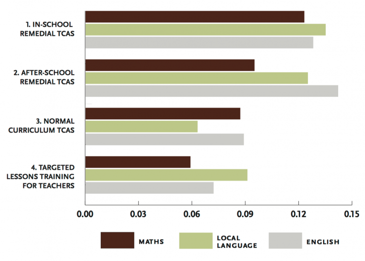
Education in low-income countries is particularly difficult because there is substantial heterogeneity in the degree of preparation that children have when they enter school – much more so than in high-income countries. Recent evidence from policy ‘experiments’ in developing countries suggests remedial teaching, in the form of assistants teaching targeted lessons to the bottom of the class, can yield substantial improvements in learning outcomes. The following visualization summarizes the effects of four different policy treatments within the so-called Teacher Community Assistant Initiative (TCAI) in Ghana – this is an initiative that evaluated four different such remedial teaching interventions.35
The units in this figure are standard deviations of test results. The first two sets of estimates correspond to the test-score impacts of enabling community assistants to provide remedial instruction specifically to low-performing children, either during school, or after school. The third set of estimates corresponds to test-score impacts of providing a community assistant and reducing class size, without targeting instruction to low-performing pupils. And the last set of results corresponds to testing the effect of training teachers to provide small-group instruction targeted at pupils’ actual learning levels.
As we can see, while all interventions had a positive effect, the lowest impacts – across all tests – come from the non-targeted ‘normal curriculum’ intervention that reduced class sizes, and from the intervention that provided training to teachers on how to engage in targeted remedial teaching themselves. This suggests that the improvements in outcomes were caused by the combination of targeted instruction and TCAs who, unlike teachers, were specifically dedicated to this purpose. These results are consistent with findings from across Africa, suggesting that teaching at the right level causes better learning outcomes in a cost-effective way (see Glewwe and Muralidharan 201636 for further details on this evidence).
Summary of treatment effects from the Teacher Community Assistant Initiative (TCAI) in Ghana (estimates by test subject in standard deviations) – Page 2 in Innovations for Poverty Action (2014)37
We have already made the point that the bulk of education expenditure goes specifically towards financing teachers. And we have also pointed out that improving teacher quality may be a particularly good instrument to improve teaching outcomes. This leads to a natural question: are pay-for-performance teacher contracts an effective instrument to improve learning outcomes? A growing body of literature in the economics of education has started using randomized control trials (i.e. policy ‘experiments’) to answer this question. Glewwe and Muralidharan (2016)38 provide the following account of the available evidence:
“Results suggest that even modest changes to compensation structures to reward teachers on the basis of objective measures of performance (such as attendance or increases in student test scores) can generate substantial improvements in learning outcomes at a fraction of the cost of a “business as usual” expansion in education spending. However, not all performance pay programs are likely to be effective, so it is quite important to design the bonus formulae well and to make sure that these designs reflect insights from economic theory.” 39
The conclusion is that well-designed pay-for-performance contracts are a cost-effective instrument to boost test scores; but this does not mean that they are necessarily effective at achieving other – perhaps equally important – objectives of time spent in school. In simple words, it is possible that pay-for-performance yields ‘teaching to the test’. Alternative incentive mechanisms, such as community-based monitoring of teachers, have been proposed as an alternative. Glewwe and Muralidharan (2016) also provide a review of the – somewhat limited – available evidence on such alternative incentive mechanisms.40
Household inputs
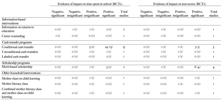
Demand-side inputs are as important as supply-side inputs to produce education. Attending school and exerting effort are perhaps the most obvious examples: without these inputs even the best endowed schools will fail to deliver good outcomes. The table summarizes information on different demand-side investments that have shown to successfully improve quality and quantity outcomes. More precisely, this table gathers evidence from randomized control trials in developing countries, as per the review in Glewwe and Muralidharan (2016). The reported figures correspond to positive/negative significant/insignificant estimates across a set of available experimental studies (bear in mind some studies estimate more than one effect – e.g. by measuring outcomes at several points in time). As we can see, the evidence suggests interventions that increase the benefits of attending school – such as conditional cash transfers – are likely to increase student time in school. And those that increase the benefits of higher effort and better academic performance – such as merit scholarships – are likely to improve learning outcomes (see Glewwe and Muralidharan 2016 for further details on the underlying policy interventions, plus further evidence and discussion of results).
Summary of impacts for selected demand-side interventions on education outcomes in developing countries – based on Tables 4 and 5 from Glewwe and Muralidharan (2016)41
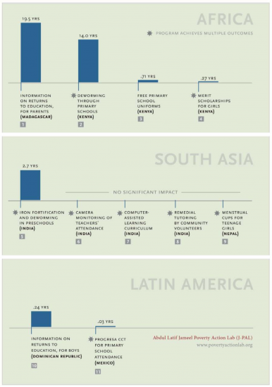
In many low-income countries, health problems are an important factor preventing children from attending school. The following visualization presents a comparison of the impact that a number of different health interventions have achieved in different countries – together with some non-health-related interventions that serve as reference. The height of each bar in this graph reflects the additional school years achieved per hundred dollars spent on the corresponding intervention; so these estimates can be interpreted as a measure of how cost-effective the different interventions are.42
We see that treating children for intestinal worms (labeled ‘deworming’ in the chart) led to an additional 13.9 years of education for every $100 spent in Kenya; while a program targeting anaemia (labeled ‘iron fortification’) led to 2.7 additional years per $100 in India. These interventions seem to be much more cost-effective to improve test scores than conditional cash transfers, free school uniforms, or merit scholarships (further details on all interventions available from Dhaliwal et al. 201243). Of course, ranking these interventions is not trivial since most programmes achieve multiple outcomes – indeed, we have already discussed that remedial teaching is generally effective to increase test-scores, although here we see a particular instance where it had no impact on school attendance. Nevertheless, health interventions seem to be particularly interesting, since they lead to substantial achievements in both education and health outcomes (for a recent analysis of the literature on the impacts of mass deworming see Croke et al. 201644).
Impact of selected demand-side interventions on school participation in developing countries (Additional years of student participation per $100) – Figure 8.1 in Dhaliwal et al. (2012)45
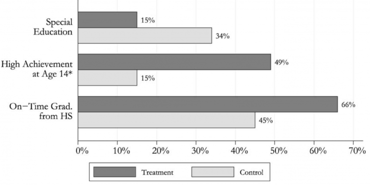
The environment that children are exposed to early in life, plays a crucial role in shaping their abilities, behavior and talents. To a great extent, this is what drives large and remarkably persistent gaps in the education achievement between individuals in the same country, but in different socioeconomic environments. Cunha et al. (2006) provide a detailed account of the theory and evidence behind this claim, and discuss its implications for the design of education policies. In the chart we see the impacts from the Perry Preschool Program – a flagship experimental intervention study, designed to test the impact of pre-school education on subsequent education outcomes.46 The chart shows disadvantaged children participating in the pre-school program (the ‘treatment group’) had higher grades and were more likely to graduate from high school than the reference control group. Moreover, they spent substantially less time in special education. Other programs have similarly shown evidence of very large and persistent returns to early education interventions.
Educational effects from participating in the Perry Preschool Program – Figure 14B in Cunha et al (2006)47
Relationship between sources
The main source of data on international education expenditure is UNESCO’s Institute for Statistics (UIS). The same data is also then published by the World Bank (World Bank EdStats and World Development Indicators) and Gapminder. It is also the main source of education data for most UN reports – such as the EFA Global Monitoring Report (UNESCO), the Human Development Report (UNDP), the State of the World’s Children report (UNICEF) and the Millennium Development Goals (UN).
The UIS database is produced mainly from yearly national reports, but it also relies on reports from international organizations.48
Specifically, countries in the European Union, or members of the OECD, have richer data, since they collect information through the UIS-OECD-Eurostat (UOE) survey, which is more detailed than the UIS survey (see more at FAQ-UIS)
Another, related but different source of education expenditure data, is the International Food Policy Research Institute (IFPRI), which publishes the Statistics of Public Expenditure for Economic Development (SPEED). This source relies primarily on data from the International Monetary Fund (IMF).
Definitions
In the UIS database, government expenditure on education includes spending by local/municipal, regional and national governments, on public and private educational institutions, education administration, and subsidies for private entities (students/households and other privates entities). This information is then reported by level of education, and typically as a share of national income (GDP) or as a share of total public expenditure. In principle, expenditure on pre-primary levels as well as expenditure sourced with transfers from international sources to government, are included. In practice, however, many countries under report these specific figures.
Measurement limitations
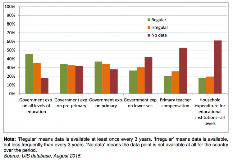
The UIS has been maintained since 1999 with the intent of providing comparable expenditure figures across countries and time, and its estimates rely on reports submitted by ministries and national statistics offices. Since reporting is delegated typically to ministries of education, in some instances data on total public expenditure on education fails to represent spending by other ministries that also have budgets for education. Additionally, since not all countries have (or update) national education accounts, the UIS attempts to generate estimates and impute missing data using information from national publications, official websites and other sources. However, the UIS dataset has several missing observations, particularly for years prior to 2010.
To gauge the extent to which UIS data is reliable, the following visualization shows the proportions of regular and irregular data that countries make available (where ‘Regular’ means data is available at least once every 3 years; and ‘Irregular’ means data is available less frequently than every 3 years). As can be seen, the picture is not particularly encouraging: less than half of the countries reported regularly data on total government expenditure on education over the reference period.
Apart from the above-mentioned issues regarding availability of data, international cross-country comparisons of education financing estimates are also problematic due to lack of consistency in classification of expenditures, especially on the borderline of education services. While this is less problematic than in other sectors, such as healthcare, there are still some difficult cases – such as classifying expenditure for teaching hospitals, or expenditure on ancillary services such as transportation. For a further discussion of these issues see the UIS data collection manual .
Availability of education financing data in the UIS database, 2005-2013, as a percentage of all (214) countries – Figure 1 in UNESCO–UIS (2016)49
Long-run estimates of education financing
As it has been mentioned, the earliest data on financing of education dates back to the late 19th century, when today’s industrialized countries began expanding their education systems. The main sources here are academic publications.
- Data Source: Lindert, Peter H. “The rise of social spending, 1880-1930.” Explorations in Economic History 31, no. 1 (1994)
- Description of available measures: Public Education Expenditure as percent of GDP
- Time span: Selected years in the late 19th century
- Geographical coverage: Selection of high-income countries
- Data Source: Flora, Peter et al. 1983. State, Economy and Society in Western Europe, 1815-1975. Frankfurt: Campus Verlag
- Description of available measures: Central government expenditure by sectors, as percent of GDP and as percent of total expenditure.
- Time span: 1815-1975
- Geographical coverage: Western Europe
- Link: Available online from http://gpih.ucdavis.edu/Government.htm/
- Data Source: Tanzi, Vito, and Ludger Schuknecht. Public spending in the 20th century: A global perspective. Cambridge University Press, 2000.
- Description of available measures:
- Public Health Expenditure as percent of GDP
- Health Insurance Coverage as percent of labour force
- Time span: 1910-1994
- Geographical coverage: Selection of high-income countries
- Data publisher: Adam Szirmai, (2015) The Dynamics of Socio-Economic Development, www.dynamicsofdevelopment.com
- Data source: Different sources, but mainly UIS after 2000, and selected UNESCO yearbooks prior 2000
- Description of available measures:
- Gross enrolment ratios by educational level, country and region
- Net enrolment ratios by region
- Highest diploma obtained (as percentage of 25+ age bracket)
- Average years of education of the population of 25 years and over
- Government expenditure per pupil in selected countries, 1965-2010
- Government expenditure on education as a percentage of gross national product
- Cognitive performance of developing countries
- Illiterates as a Percentage of the Population of 15 years and over
- Time span: Selected years in the second half of 20th century (periodic updates online)
- Geographical coverage: Selected low and middle income countries
Long-run country-specific statistics on education financing
Country-specific statistics are another important source of long-run data on education spending. Two references we used in this entry are the U.S. Bureau of the Census and the U.S. National Center for Education Statistics.
- Data Source: (a) Historical Statistics of the United States Colonial Times to 1970 (1929-1970); and (b) US Census Statistical Abstract 1990 (1970-1990). Both published by the US Bureau of the Census
- Description of available measures: Total education expenditure, disaggregated by private and public spending, with further details on specific types of expenditure (figures mainly expressed in current prices)
- Time span: 1929-1990
- Geographical coverage: U.S.
- Data Source: National Center for Education Statistics (NCES) – Digest of Education Statistics
- Description of available measures: Information on a variety of subjects in the field of education statistics, including the number of schools and colleges, teachers, enrollments, and graduates, in addition to educational attainment, finances, federal funds for education, libraries, and international education.
- Time span: Since 1970
- Geographical coverage: U.S.
Up-to-date estimates of education systems (including education finances)
The most common source of up-to-date cross-country education data is UNESCO’s Institute for Statistics (UIS). This is the source for data published by the World Bank (World Bank EdStats and World Development Indicators) and Gapminder.
- Data Source: UIS based on reports from ministries, national statistics offices and international agencies
- Description of available measures:
- Out-of-school children
- Entry
- Participation
- Progression
- Completion
- Literacy
- Educational attainment
- International student mobility in tertiary education
- Human resources
- Financial resources
- School resources and teaching conditions (Africa only)
- Adult education (Latin America and the Caribbean only)
- Disparities in teacher’s training, deployment, characteristics and working conditions at sub-national level (East and South West Asia only)
- Time span: 1970-2015 for some variables, but most variables available since 1998
- Geographical coverage: Global by Country
- Link: http://data.uis.unesco.org
Another important source is the OECD – this is arguably the most comprehensive database in terms of variables and regularity of observations. This is the source used for the OECD’s periodic report Education at a Glance.
- Data Source: OECD based on reports from member countries
- Description of available measures:
- Graduation and entry rates
- Graduates and entrants by field
- Profile of graduates and entrants
- Student-teacher ratio and average class size
- Distribution of teachers by age and gender
- Enrolment rate by age
- Share of enrolment by type of institution
- Share of enrolment by gender, programme orientation and mode of study
- Share of international students enrolled by field of education
- Share of international students enrolled by country of origin
- Transition from school to work
- Educational attainment and labour-force status
- Educational finance indicators
- Time span: 1960-2015 for some variables, though substantial missing values prior 1990
- Geographical coverage: OECD countries
- Link: http://stats.oecd.org
Yet another relevant source of internationally comparable expenditure statistics is IFPRI’s Statistics of Public Expenditure for Economic Development. This dataset relies mainly on IMF statistics.
- Data Source: IFPRI, from multiple dats sources, but mainly IMF statistics
- Description of available measures:
- Education expenditure in 2005 $ppp
- Education expenditure in 2005 US$
- percentage of education expenditure in total gdp
- per capita education expenditure in 2005 $ppp
- percentage of education expendtiure in total expenditure
- Time span: 1980-2012
- Geographical coverage: 67 countries across all continents
- Link: https://www.ifpri.org/publication/statistics-public-expenditures-economic-development-speed