Having a diet which is both sufficient in terms of energy (caloric) requirements and diverse to meet additional nutritional needs is essential for good health. Undernourishment, especially in children and mothers, is a leading risk factor for death and other health consequences.
The UN has set a global target as part of the Sustainable Development Goals to “end hunger by 2030“. Currently we are far from reaching this target.
In our research on Hunger and Undernourishment we look at how many people are undernourished; where they live; childhood undernourishment; and food insecurity across the world.
Summary
- 8.8% of the world’s population are undernourished – this means they have a caloric intake below minimum energy requirements.
- 663 million people globally are undernourished.
- 22% of children younger than five are ‘stunted’ – they are significantly shorter than the average for their age, as a consequence of poor nutrition or repeated infection.
- 9% of the world population – around 697 million people – are severely food insecure.
- One-in-four people globally – 1.9 billion – are moderately or severely food insecure.
All our charts on Hunger and Undernourishment
What share of people are undernourished?
The prevalence of undernourishment, as a share of the population, is the main hunger indicator used by the UN’s Food and Agriculture Organization.
It measures the share of the population which has a caloric (dietary energy) intake which is insufficient to meet the minimum energy requirements defined as necessary for a given population.
The global map of the prevalence of undernourishment – as a percentage of the total population – is shown from 2000 onwards. Countries with a prevalence below 2.5% are not shown.

The visualisation shows the prevalence of undernourishment by world region.
Here we see that overall, and across most regions the prevalence of hunger has fallen since the millennium. Globally this has fallen from 13.4 percent in 2001 to 8.8 percent in 2017.

How many people are undernourished?
The chart shows the total number of individuals across the world who are defined as undernourished.
Globally we see a falling – although variable – trend over the last few decades. The total number of undernourished has been steadily falling. However, over the last few years, the total number increased to around 663 million in 2017.
This increase in hunger levels are largely a result of increases in Sub-Saharan Africa (where rates have risen by several percentage points in recent years) and small increases in the Middle East & North Africa. The UN FAO have linked this increase in undernourishment in particular to the rising extent of conflict-affected countries (which is often a leading cause of famine), and compounded by climate-related factors such as the El Niño phenomenon (which can inflict both drought and flood conditions).1,2


Depth of the food deficit
The prevalence of undernourishment provides the core indicator of hunger with FAO metrics. However, this measure does not give an indication of the average severity of undernourished; it tells us how many lie below the minimum energy requirements, but not how far they lie below this line.
To provide an estimate of the intensity of undernourishment in a population, the FAO used a metric called the ‘depth of the food deficit’. This measure provides an estimate of the number of calories the average individual would need in order to balance their caloric intake with energy requirements. This is calculated by measuring the difference between the average energy requirement and average caloric consumption of the undernourished population, multiplying this food deficit by the number of undernourished individuals (to give a value of the total caloric deficit of the country), and then dividing by the total population. The average intensity of the food deficit is measured in kilocalories per person per day.
We have mapped the depth of the food deficit based on FAO data from 1992 onwards. In 2016, we see that the majority of developing countries have a food deficit below 200 kilocalories per person per day. A small selection of countries had a deficit ranging from 300-500, most in Sub-Saharan Africa. The country with the highest deficit was Haiti, at 530 kilocalories per person per day.
You can view trends of any country over time by selecting it from the map.

There are three key physiological measures of undernourishment and undernutrition in children. The measures discussed and visualised in the sub-sections below are:
- Stunting – being ‘too short for one’s age’;
- Wasting – being ‘dangerously thin for one’s height’; and
- Underweight – low weight-for-age in children.
Too little height-for-age: Stunting
Children who are stunted are determined as having a height which falls below the median height-for-age of the World Health Organization’s Child Growth Standards.
Stunting is an indicator of severe malnutrition. Unlike wasting and low weight-for-age, the impacts of stunting on child development are considered to be largely irreversible beyond the first 1000 days of a child’s life. It can have severe impacts on both cognitive and physical development throughout an individual’s life.3
Stunting can be caused by a range of compounding factors including nutritional intake of the child, as well as the mother during pregnancy, the recurrence of infectious diseases and infections from poor hygiene practices.
The global map of the prevalence of childhood stunting is shown as the share of the under-5 population who are defined as stunted. Note that many countries report stunting prevalence through periodic health and demographic surveys, meaning that this data is often not available on an annual basis. The year of the latest published estimates vary by country so you may have to use the time scrollbar to find the most up-to-date figure for a given country.

Too little weight-for-height: Wasting
Wasting is defined as being dangerously thin for one’s height, and is generally a sign (especially in children) of rapid weight loss. A child is classified as wasted if his or her weight-for-height is more than two standard deviations below the median for the international reference population ages 0-59 months. The factors which contribute to this weight loss are associated with measures related to both diet and nutrition, and infection. As a result, wasting is often compounded by conditions of poor nutrition, feeding practices as well as inadequate sanitary conditions.4
Unlike stunting, wasting can be treated through improved nutritional intakes, healthcare interventions and treatment of infection.
The global map of the prevalence of childhood wasting is shown as the share of the under-5 population. In 2015, South Sudan experienced the highest prevalence of wasting, with 22.7 percent of under-5s defined as wasted. The prevalence of wasting is typically highest across Sub-Saharan Africa and South Asia, with countries such as India, Sri Lanka, Djibouti, Sudan and Niger recording some of the highest levels (greater than 15 percent).
The share of children suffering from wasting has been declining. If we compare our global map in the early 2000s to a decade later, we see the number of countries with a prevalence greater than 15 percent has fallen. However, the nature of wasting- exemplified often by rapid weight loss- means that particular short-term events which impact food supplies can disrupt long-term trends. This is particularly prevalent in countries with poor political stability; for example, we see a large spike in childhood wasting in the Democratic Republic of Congo during the late 1990s-early 2000s during the Second Congo War.

Underweight children
Undernourishment, or the incidence of being underweight for age, can include children who are stunted, wasted or suffering from insufficient energy intake over a longer period of time.
In the chart we see the share of children under-5 who are defined as underweight for their age across world regions since 1990. Overall, we see a steady decline at the global level, falling from around 25 percent in 1990 to 15 percent in 2015.
South Asia- despite having the highest regional prevalence- has made significant progress over the last few decades, reducing undernourishment by 20 percentage points from 1990-2017. The rate of undernourishment in Sub-Saharan Africa has also fallen notably, from 30 percent in 1990 to below 20 percent in 2017. Rates in East Asia, Latin America, North Africa and the Middle East are notably lower than South Asia and Sub-Saharan Africa, but have also seen significant declines, each more than halving the prevalence of undernourishment since 1990.

As we have explored above, there are a number of indicators by which we can measure and track progress related to malnutrition. In order to effectively capture and track progress on hunger within a single metric, the International Food Policy Research Institute (IFPRI) have defined a score system termed the ‘Global Hunger Index‘ (GHI). The Global Hunger Index attempts to assess the multidimensional nature of hunger, by combining four key indicators of malnutrition into a single index score.5 These four indicators are:
- Undernourishment: the proportion of undernourished people as a percentage of the population (reflecting the share of the population with insufficient caloric intake);
- Child wasting: the proportion of children under the age of five who suffer from wasting (low weight for their height, reflecting acute undernutrition);
- Child stunting: the proportion of children under the age of five who suffer from stunting (low height for their age, reflecting chronic undernutrition); and
- Child mortality: the mortality rate of children under the age of five (partially reflecting the fatal synergy of inadequate nutrition and unhealthy environments).
The index reflects scoring by country on a 100-point scale where 0 is the best score (no hunger) and 100 the worst. A score>=50 is defined as ‘extremely alarming’; 35-50 as ‘alarming’; 20-35 as ‘serious’; 10-20 as ‘moderate’ and <10 as ‘low’.
In the map we see the global map of GHI scores, with a time range of 1992, 2000, 2008 and 2016, 2017 and 2018.6
Geographically we see that GHI scores are highest (i.e. worst) across Sub-Saharan Africa and South Asia. In 2018, most countries in South Asia and Sub-Saharan Africa received a score within the ‘serious’ or ‘alarming’ category. Most countries across Latin America, East & Central Asia, and Eastern Europe had low hunger levels within the ‘low’ or ‘moderate’ categories.
However, if we track progress in GHI scores through time, we see definitive improvements across all regions. In 1992, most countries across Sub-Saharan Africa and South Asia scored within the ‘extremely alarming’ or ‘alarming’ classification. By 2018, only one country with available data (Central African Republic) remained within the top category of ‘extremely alarming’, and most have been downgraded to the ‘serious’ category. In other regions, countries have typically shifted from moderate-to-serious in 1992 down to low-to-moderate in recent years.

Although it would be vital for our understanding of global development we are lacking historical data on hunger and malnourishment. The history of famines as the most extreme episodes of hunger gives some indication and is dealt with in a separate entry on Our World in Data.
Our most concrete and well-established sources of data on hunger and undernourishment begin in 1990. This is strongly related to the fact that our global progress indicators on hunger reduction are tracked based on the Millennium Development Goals (MDGs), and the subsequent Sustainable Development Goals (SDGs), which have a baseline year of 1990. During this period, the standard FAO methodology for the estimation of malnourishment has been revised for improved accuracy (for the correction see here). To our best knowledge, estimates of prevalence prior to 1990 have not been updated and published based on the revised methodology.
However, to provide some sense of how malnutrition has changed over a longer timeframe, we have extended the latest data on undernourishment backwards with FAO estimates, using previous methodologies, for 1970 and 1980. This series that shows the prevalence of undernourishment (in %) in developing countries is shown in the chart.
The FAO maintains a consistent definition for ‘developing countries’.7
Data for 1970 and 1980 has been sourced from two FAO State of Food Insecurity in the World (SOFI) reports, for 2006 and 2010. Estimates of the prevalence of undernourishment differ between these two reports. The 2006 report estimates a prevalence of 37 percent in 1970, reducing to 28 percent in 1980;8 the 2010 report instead estimates a reduction from 32.5 percent to 25 percent, respectively.9
This reflects a considerable uncertainty of these estimates and this aspect has to be taken into account as indicated in the subtitle of this chart.
Given the uncertainty in these earlier estimates, what can we say about how undernourishment has changed through time? Whilst specific figures for the level of undernourishment differ between sources, they do agree on the direction of change. Both sources report a consistent downward trend, with similar rates of reduction. The share of undernourished people in the developing world has been declining over this longer timeframe, but there are no confident figures on how many people were undernourished at each point in time.
This gives us estimated trends dating back to 1970 for undernourishment in developing countries; but do we have even earlier estimates? FAO figures of undernourishment date back to 1945, the year of its first international summit. The first edition of its ‘State of Food and Agriculture’ report was published in 1947 and estimated the prevalence of undernourishment in 1945 to be 50 percent10
This does give us some useful indication of the scale of malnutrition and how this has changed through time, however, we have not included this estimate in our current series for two key reasons.
Firstly, this figure is reported for the total global population, rather than specifically addressing prevalence in developing countries.11
In early editions, figures were not defined or categorised based on income level, meaning the countries included in 1945 estimates are not the same as boundaries defined in our 1970-2015 series.
Secondly, at its initiation in 1945, the FAO had only 34 member governments involved in its food security and agriculture programme.12
The small number of UN members involved in early FAO programmes may increase levels of uncertainty surrounding data collection and estimation. Poor geographical coverage of data collection on undernourishment is likely to make 1945 estimates less reliable. By 1961, the number of member countries had increased to more than 100. By the mid-1970s, the FAO’s World Committee for Food Security had 136 members. Today, the FAO has 194 member states.13

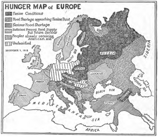
The following map shows the hunger levels in Europe at the end of World War I
Food insecurity is defined by the UN FAO as the “situation when people lack secure access to sufficient amounts of safe and nutritious food for normal growth and development and an active and healthy life.”15
Food insecurity can be caused by a number of factors, including the unavailability of food, unaffordable food, and unequal distribution of food between household members. Food insecurity is one of the major causes of poor nutrition.
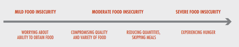
Food insecurity is measured by the FAO using its Food Insecurity Experience Scale (FIES) global reference scale. Further details on the FIES global reference scale can be found in our Data Quality & Definition section. Food insecurity can be based on inadequate quality or quantity of food. Moderate food insecurity is generally associated with the inability to regularly eat healthy, nutritious diets. High prevalence of moderate food insecurity is therefore an important indicator of poor dietary quality, and the development of health outcomes such as micronutrient deficiencies. Severe food insecurity is more strongly related to insufficient quantity of food (energy) and therefore strongly related to undernourishment or hunger.
Severe food insecurity
In the chart we see the share of the total population defined as suffering from severe food insecurity (i.e. insufficient quantity of food).
In 2018, 9.2% of the world population were defined as severely food insecure. As a share of the population, food insecurity is highest in Sub-Saharan Africa where nearly one-third are defined as severely insecure.


In the charts we see the total number of people defined as severely food insecure. Globally, around 697 million were severely food insecure in 2018.
More than half of those living with severe food insecurity were in Asia; nearly 40% were in Africa. the remaining 10% were split between the Americas, Europe and Oceania.


Moderate food insecurity
Moderate food security includes those who struggle or worry about the ability to access or afford a healthy, nutritious balanced diet, not only those who struggle to meet their energy needs. In the chart we see the share of those defined as moderately or severely food insecure.
Globally, one-in-four suffered from moderate or severe food insecurity in 2017.

In the chart we see the total number of people defined as moderately or severely food insecure.
Globally, 1.9 billion people were food insecure in 2017. Whilst the greatest number are in Sub-Saharan Africa and South Asia, moderate food insecurity is a major issue across all regions, even high-income countries. Access and affordability of diverse, nutritious diets is therefore important for all countries.

Correlation of Poverty and Undernourishment

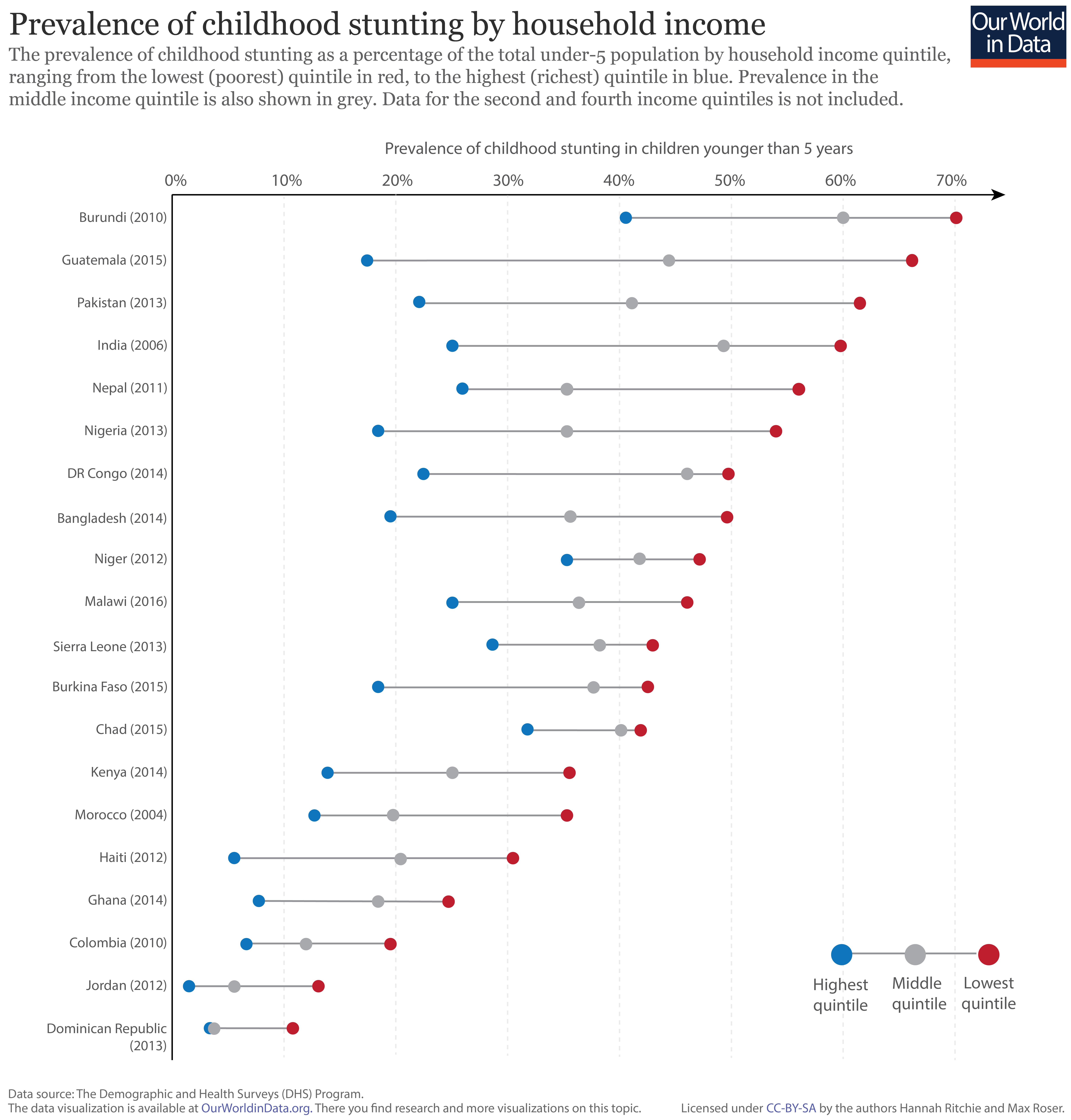
Prevalence of stunting by household income
The prevalence of childhood stunting–the key indicator of chronic malnutrition–is strongly related to household income and prosperity. In the figure we have plotted the prevalence of stunting in children under 5 years old, by household income quintile. Shown in red is the prevalence of stunting within the lowest income quintile in each country; the highest quintile is shown in blue; and the national average in grey.17 This data is based on results of the Demographic and Health Surveys (DHS) program; the date of survey collection for each country is shown in brackets.
As shown, the prevalence of stunting in the poorest households within a given country is typically higher than those with higher incomes. This inequality between rich and poor households varies in magnitude; countries with the highest levels of stunting (i.e. those at the top of the chart) tend to have the largest discrepancy between income levels. This difference in stunting prevalence can reach up to 50 percent in extreme cases.
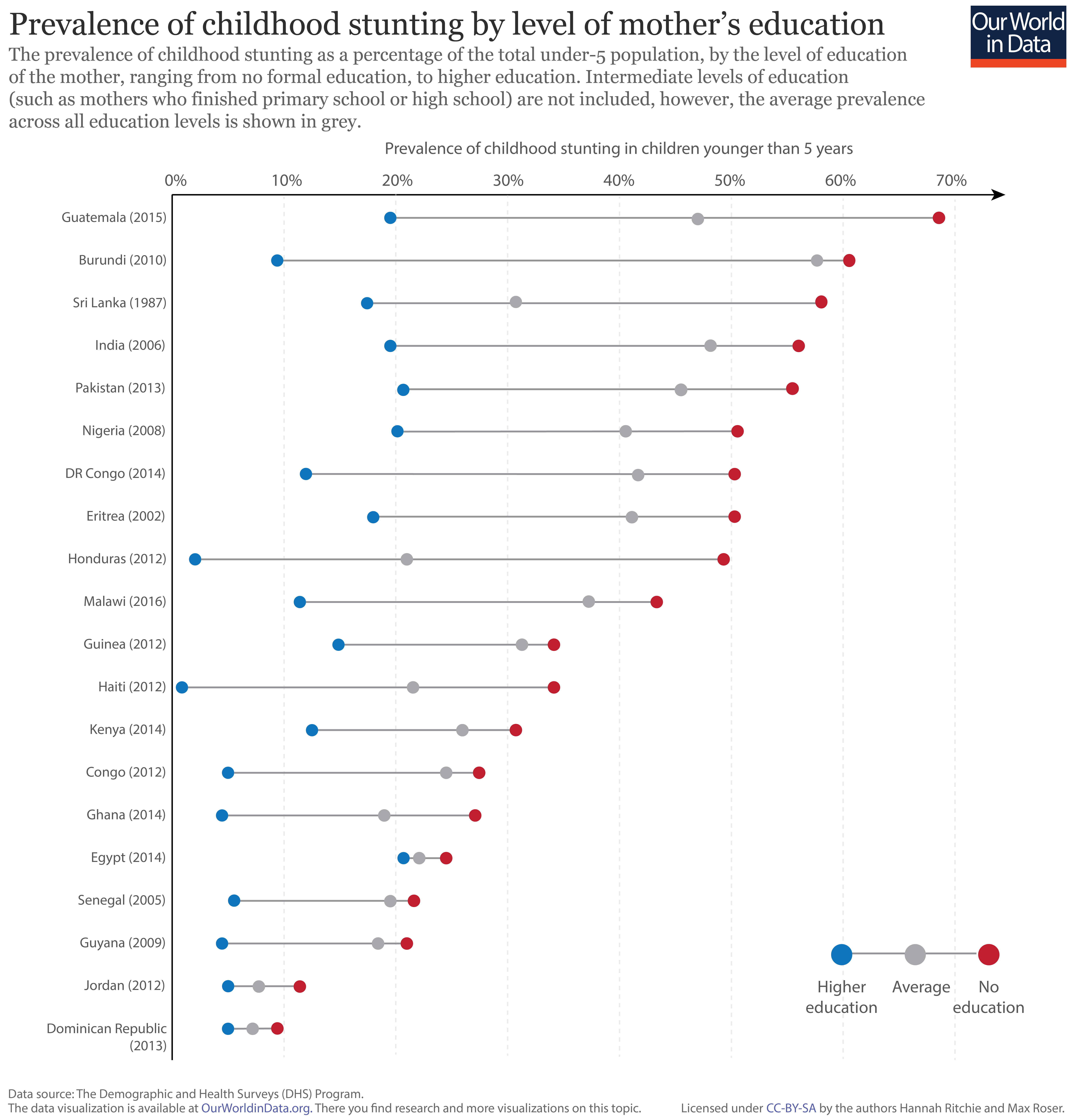
In the context of addressing malnutrition, alongside other key development measures, women’s education is often highlighted as the largest determinant of positive outcomes.18
In the figure we see the prevalence of childhood stunting by the mother’s education level. Here, we have shown the two extremes: with demographics where the mother has received no formal education in red, and those with higher education in blue. Intermediate levels of education (whereby mothers completed primary and/or high school) are not shown, however, the average across all education levels is shown in grey.
Overall, we see the level of education of the mother is a strong determinant of childhood malnutrition. Rates of stunting are highest in families where the mother has received no formal education relative to those with higher education–this variability can exceed 50 percent between these two extremes. We also see that the prevalence of stunting in families with a mother which receives higher education is consistently lower than the average across all educational levels. Continued progress in women’s educational attendance and attainment is therefore a key driver of improvements in childhood nutrition.
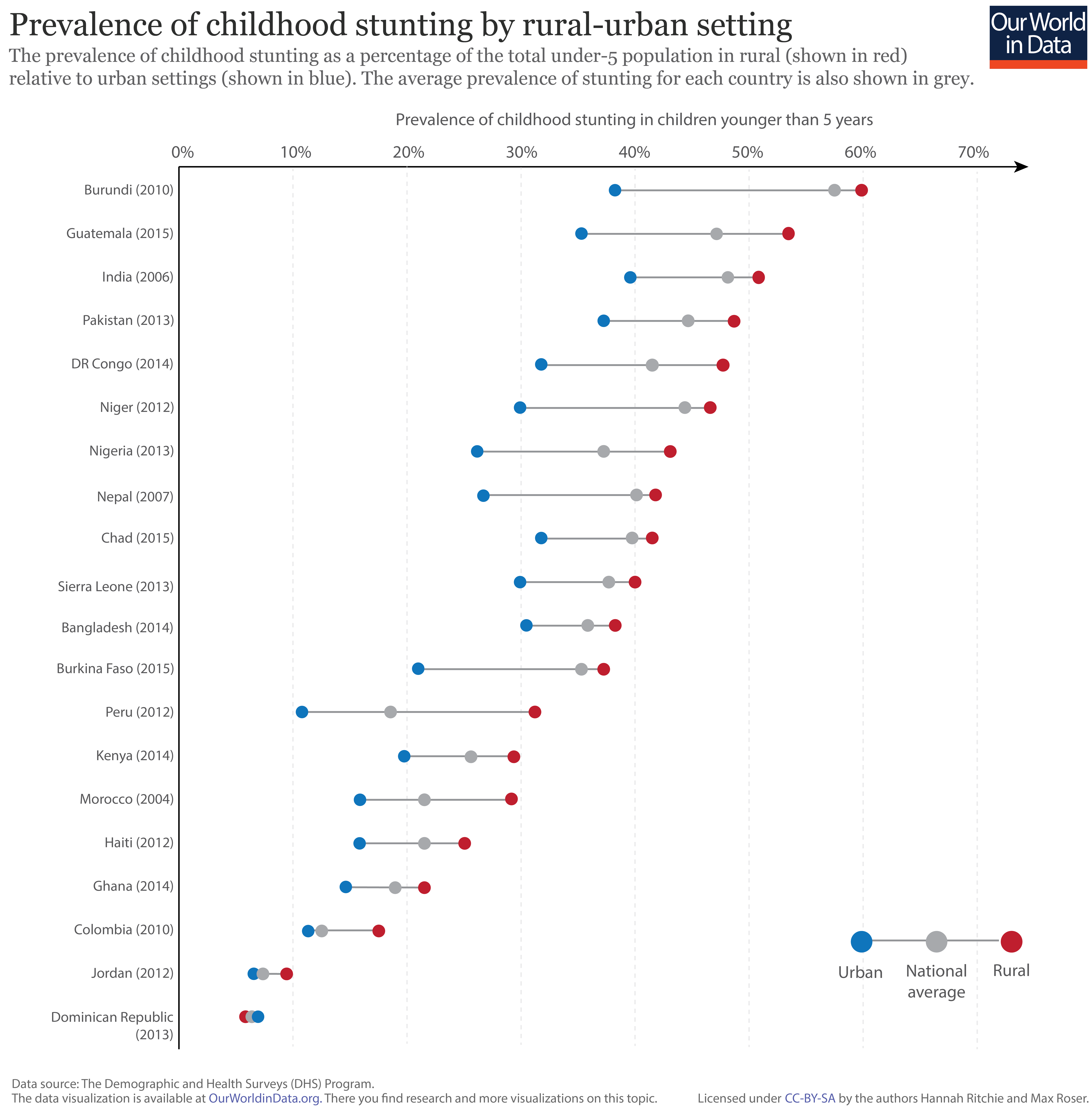
The residential setting of households can also play an important role in nutritional outcomes. In the chart we have plotted the prevalence of childhood stunting in rural (shown in red), and urban (shown in blue) settings across a number of developing countries. The national average prevalence of stunting is also shown in grey.
Overall, we see that the incidence of stunting in rural households is consistently higher than in urban settings [the exception to this trend is the Dominican Republic where rates of stunting are approximately the same across household settings]. The strength of residential setting is generally less pronounced as an indicator of stunting prevalence than household income and mother’s education levels; it is nonetheless still significant.
Definitions of measures of hunger and undernourishment
Here we present the definitions used by the FAO.19
We have specified when we have used a different definition above.
- Malnutrition is defined as an ‘abnormal physiological condition caused by inadequate, unbalanced or excessive consumption of macronutrients and/or micronutrients. Malnutrition includes undernutrition and overnutrition
as well as micronutrient deficiencies.’ - Overnourishment is defined as ‘food intake that is continuously in excess of dietary energy requirements’.
- Undernourishment is ‘a state, lasting for at least one year, of inability to acquire enough food, defined as a level of food intake insufficient to meet dietary energy requirements’.
In the FAO report ‘hunger’ is synonymous with ‘chronic undernourishment’.
Consequences of Undernourishment
The consequence of undernourishment is called Undernutrition. And the FAO names four outcomes of undernourishment, and/or poor absorption and/or poor biological use of nutrients consumed as a result of repeated infectious disease.
These are:
- Being underweight for one’s age.
- Underweight is defined as ‘low weight for age in children, and BMI of less than 18.5 in adults’.20
- For children, two consequences of undernourishment are:
- being ‘too short for one’s age’ which is called stunting,
- being ‘dangerously thin for one’s height’ which is called wasting,
- and being ‘deficient in vitamins and minerals’ which is called ‘micronutrient malnutrition‘.

Definitions of food insecurity
Food insecurity is defined by the UN FAO as the “situation when people lack secure access to sufficient amounts of safe and nutritious food for normal growth and development and an active and healthy life.”14 Food insecurity can be caused by a number of factors, including the unavailability of food, unaffordable food, and unequal distribution of food between household members. Food insecurity is one of the major causes of poor nutrition.
Food insecurity is measured by the FAO using its Food Insecurity Experience Scale (FIES) global reference scale. The FEIS measures the percentage of individuals in the population who have experienced food insecurity at moderate or severe levels during the reference period. Data at the individual or household level is collected by applying an experience-based food security scale questionnaire within a survey. The food security survey module collects answers to questions asking respondents to report the occurrence of several typical experiences and conditions associated with food insecurity. The FEIS has been carried out across 140 countries to date, but in being one of the key indicators of the Sustainable Development Goals (SDGs), is expected to be carried out across all countries.
The FEIS is based on eight questions, such as “During the last 12 MONTHS, was there a time when you (or any other adult in the household) were worried you would not have enough food to eat because of a lack of money or other resources?”. The full list of questions can be found here. Food insecurity can be based on inadequate quality or quantity of food. Moderate food insecurity is generally associated with the inability to regularly eat healthy, nutritious diets. High prevalence of moderate food insecurity is therefore an important indicator of poor dietary quality, and the development of health outcomes such as micronutrient deficiencies. Severe food insecurity is more strongly related to insufficient quantity of food (energy) and therefore strongly related to undernourishment or hunger.
The scale shows the definitions of food insecurity from mild to severe.21
- Data: Underweight children
- Geographical coverage: Global – by country and region.
- Time span: Since 1990 – with projections to 2025.
- Available at: Online here.
- This data is presented in the context of the Millenium Development Goals (MDG). The UN’s MDG website also presents data.
- Data: Global Hunger Index and single dimensions (Prevalence of undernourishment in the population, prevalence of underweight in children under five years, under-five mortality rate)
- Geographical coverage: Global – by country.
- Time span: Since 1990.
- Available at: Online here.
- The Global Hunger Index is a multidimensional measure of hunger. It was first published by the ‘Welthungerhilfe’ but is now published by IFPR. Here is the Wikipedia entry.
- Geographical coverage: Global – by country.
- Time span: Since 1960 but not annual and for some countries very scattered.
- Available at: Some of the data that are available:
- Malnutrition prevalence, weight for age (% of children under 5) (also available for males and females separately) Data available from the 60s onwards – very scattered before 1980 and also not annual for the time after. Varying by country.
- Malnutrition prevalence, height for age (% of children under 5) (also available for males and females separately) Data available from the 60s onwards – very scattered before 1980 and also not annual for the time after. Varying by country.
- Prevalence of wasting (% of children under 5) – Data available from the 60s onwards – very scattered before 1980 and also not annual for the time after. Varying by country.
- Low-birthweight babies (% of births) – Data available from 1990 onwards – very scattered. Varying by country.
- Prevalence of undernourishment (% of population) – Annual data available from 1990 onwards.