All our charts on Global Extreme Poverty
Overview of this entry
Most people in the world live in poverty. 85% of the world live on less than $30 per day, two-thirds live on less than $10 per day, and every tenth person lives on less than $1.90 per day. In each of these statistics price differences between countries are taken into account to adjust for the purchasing power in each country.
The research here is is concerned with the living conditions of the worst off: those who live in ‘extreme poverty’ as defined by the United Nations. The World Bank, which is part of the UN, is the main source for global information on extreme poverty today and it sets the ‘International Poverty Line’. The poverty line was revised in 2015—since then, a person is considered to be in extreme poverty if they live on less than 1.90 international dollars (int.-$) per day. This poverty measurement is based on the monetary value of a person’s consumption. Income measures, on the other hand, are only used for countries in which reliable consumption measures are not available.
A key difficulty in measuring global poverty is that price levels are very different in different countries. For this reason, it is not sufficient to simply convert the consumption levels of people in different countries by the market exchange rate; it is additionally necessary to adjust for cross-country differences in purchasing power. This is done through Purchasing Power Parity adjustments (explained below).
It is important to emphasize that the International Poverty Line is extremely low. Indeed, ‘extreme poverty’ is an adequate term for those living under this low threshold. Focusing on extreme poverty is important precisely because it captures those most in need. However, it is also important to point out that living conditions well above the International Poverty Line can still be characterized by poverty and hardship. Accordingly, in this entry we will also discuss the global distribution of people below poverty lines that are higher than the International Poverty Line of 1.90 int.-$. But relying only on higher poverty lines would mean that we are not keeping track of the very poorest people in the world and this is the focus of this entry.
Poverty is a concept intrinsically linked to welfare – and there are many ways in which one can try to measure welfare. In this entry we will focus mainly (though not exclusively) on poverty as measured by ‘monetized’ consumption and income, following the approach used by the World Bank. But before we present the evidence, the introductory sub-section here provides a brief overview of the relevance of this approach.
Global poverty is one of the very worst problems that the world faces today. The poorest in the world are often hungry, have much less access to education, regularly have no light at night, and suffer from much poorer health. To make progress against poverty is therefore one of the most urgent global goals.
The available long-run evidence shows that in the past, only a small elite enjoyed living conditions that would not be described as ‘extreme poverty’ today. But with the onset of industrialization and rising productivity, the share of people living in extreme poverty started to decrease. Accordingly, the share of people in extreme poverty has decreased continuously over the course of the last two centuries. This is surely one of the most remarkable achievements of humankind.
Closely linked to this improvement in material living conditions is the improvement of global health and the expansion of global education that we have seen over these last two centuries. We also discuss the link between education, health, and poverty in this entry.
During the first half of the last century, the growth of the world population caused the absolute number of extremely poor people in the world to increase, even though the share of people in extreme poverty was going down. After around 1970, the decrease in poverty rates became so steep that the absolute number of people living in extreme poverty started falling as well. This trend of decreasing poverty—both in absolute numbers and as a share of the world population—has been a constant during the last three decades. But as we highlight in the first section of this entry it is unfortunately not what we can expect for the coming decade. It is the fact that still almost every tenth person lives in extreme poverty and the slowing progress against extreme poverty that motivate this entry.
Related writing:
Economic growth – How do economies become more productive? Understanding how and when countries achieved economic growth is crucial to understand how some countries left the worst poverty behind and how other countries can follow.
Income inequality – It is not just the average income that matters for whether or not people live in poverty but how incomes are distributed.
Global economic inequality – Our entry on the global distribution of incomes.
Is the world on track to end extreme poverty by 2030?
Growth of the global middle class and falling extreme poverty
Over the course of the last generation more than a billion people left the most destitute living conditions behind. Can we expect this progress to continue over the coming decade?
The world economy is growing. In less than a generation the value of the yearly global economic production has doubled.1
Increasing productivity around the world meant that many left the worst poverty behind. More than a third of the world population now live on more than 10 dollars per day. Just a decade decade ago it was only a quarter. In absolute numbers this meant the number of people who live on more than 10 dollars per day increased by 900 million in just the last 10 years.2
This expansion of the global middle class went together with progress in reducing global poverty – no matter what poverty line you want to compare it with, the share of the world population below this poverty line declined.3 In 1990 international organizations adopted a definition of poverty in line with the poverty lines in low-income countries. In the latest adjustment the international poverty line is set to the threshold of living on less than $1.90 per day. That is a very low poverty line and focusses on what is happening to the very poorest people on the planet.4
The same international organizations that set the poverty line made it a global goal to end extreme poverty. Goal number one of the Sustainable Development Goals (SDGs), agreed on by all nations in the world, is the “eradication of extreme poverty for all people everywhere”. The deadline for achieving this goal is 2030. Can we expect to achieve this?
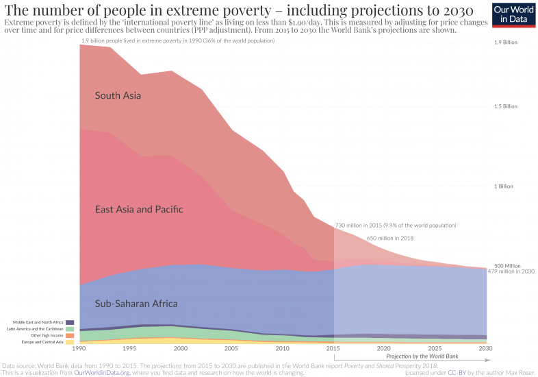
Half a billion projected to live in extreme poverty in 2030
Research teams from the World Bank, ODI, the IHME, and Brookings jointly with the World Data Lab made independent projections for what we can expect for global poverty during the SDG era.
While the projections differ in methodology and underlying assumptions, it’s striking how much they align in their projection for what to expect in the coming decade if the world stays on current trajectories. All expect some positive development – the number of people in extreme poverty is expected to continue to decline – but all also agree on the bad headline: the world is not on track to end extreme poverty by 2030.
The chart shows the projection made by the development research team at the World Bank. This projection answers the question of what would happen to extreme poverty trends if the economic growth of the past decade (2005–15) continued until 2030:5 The number of people in extreme poverty will stagnate at almost 500 million.
This is not because it is not possible to end extreme poverty. In more than half of the countries of the world the share of the population in extreme poverty is now less than 3 percent.6
In the same countries the huge majority – even in today’s richest countries – lived in extreme poverty just a few generations ago.
In fact, the big success over the last generation was that the world made rapid progress against the very worst poverty. The number of people in extreme poverty has fallen from nearly 1.9 billion in 1990 to about 650 million in 2018.7
This was possible as economic growth reached more and more parts of the world.8 In Ethiopia, India, Indonesia, Ghana, and China more than half the population lived in extreme poverty a generation ago. But after two decades of growth the share in extreme poverty more than halved in all these countries.
Poverty was not concentrated in Africa until recently. In 1990 more than a billion of the extremely poor lived in China and India alone. Since then those economies have grown faster than many of the richest countries in the world and did much to a reduction of global inequality. The concentration of the world’s poorest shifted from East Asia in the 1990s to South Asia in the following decade. Now it has shifted to Sub-Saharan Africa. The projections suggest the geographic concentration of extreme poverty is likely to continue. According to the World Bank forecasts 87% of the world’s poorest are expected to live in Sub-Saharan Africa in 2030 if economic growth follows the trajectory over the recent past.
Poverty declined during the last generation because the majority of the poorest people on the planet lived in countries with strong economic growth. This is now different.
Stagnation for the poorest
Many of the world’s poorest today live in countries that had very low economic growth in the past.9 Consider the case of Madagascar: In the last 20 years GDP per capita has not grown; and the number in extreme poverty increased almost one-for-one with total population.
Development economists have emphasized this for some time: The very poorest people in the world did not see their material living conditions improve.10 This fact is surely one of the biggest development failures of our time. Yet the stagnation of the world’s poorest countries is not as widely known as it should be – one reason is that we are not paying attention to poverty lines low enough to focus on what happens to the very poorest. This is an important reminder that one poverty line is not enough and we need to rely on several poverty lines – higher and lower than the international poverty line – to understand what is happening.
A rising global middle class and stagnation of the world’s poorest will also mean that a new divide at the lowest end of the global income distribution is opening up. We miss this if we only follow what is happening to the rapidly emerging global middle class or if we rely on global poverty lines that are not capturing what is happening to the poorest.
The projections suggest that over the coming decade the stagnation at the bottom will become very clear. The majority of the world’s poorest today live in economies that are not growing and half a billion face the prospect to remain stuck in extreme poverty.
This is terrible news.
Policy and growth
These projections describe what we have to expect on current trends. But current trends don’t have to become future trends: all countries that left extreme poverty behind had a moment at which they broke out of stagnation.
The second big lesson from the history of extreme poverty is that it is the growth of an entire economy that lifts individuals out of poverty. Key for ending extreme poverty globally will be that the poorest countries achieve the difficult task of economic growth.
But it’s not only about macroeconomic performance. Social policy and direct household-level support, too, make an important difference. Even in very poor economies there is scope for targeted policies to support the very poorest. In an analysis of how today’s richest countries left extreme poverty behind Martin Ravallion emphasizes the role the expanded social protection policies played at the time.11
The most important task in our time is to ensure that the living conditions of the world’s poorest improve and to end extreme poverty. We know that it is possible; we have done it many times in the past.
The big success of the last generation was that global extreme poverty declined rapidly. But many are still very poor and progress against extreme poverty is urgently needed. However, we are currently far off track to ending extreme poverty – we expect half a billion people to still live on less than $1.90 per day by 2030. To ensure that ‘no one is left behind’ as the SDG agenda promises, this is where we need to focus our efforts.
It’s not just a concern until 2030: without rising incomes in the worst-off places extreme poverty will remain a reality for millions.
Extreme poverty in the broader context of well-being
There are many ways in which researchers and policymakers try to measure welfare. In this entry we focus mainly on welfare as measured by ‘monetized’ consumption and income, following the approach used by the World Bank. However, as we emphasize throughout, this is only one of many aspects that we need to consider when discussing poverty. In other entries in Our World In Data we discuss evidence that allows tracking progress in other aspects of welfare that are not captured by standard economic indicators. This broad perspective on global development is at the heart of our publication.
The practice of measuring welfare via consumption and income has a long tradition in economics. Many classic textbooks and papers provide details regarding the conceptual framework behind this (for a basic technical overview see Deaton and Zaidi 2002);12 and by now there is also an extensive literature discussing various important points of contention (see Ch 2. in Atkinson 2016 for a brief recent overview).13
Alternative starting points for measuring welfare include subjective views (e.g. self-reported life satisfaction), basic needs (e.g. caloric requirements), capabilities (e.g. access to education), and minimum rights (e.g. human rights).
These alternative notions of welfare play an important role in academia and policy, and it is necessary to bear in mind that they are interrelated. Indeed, as we explain below, many of these concepts indirectly enter the methodology used by the World Bank to measure poverty; for example, by helping set the poverty lines against which monetized consumption is assessed.
This table, from Atkinson (2016) provides a comparison of the ‘money-metric approach’ used by the World Bank vis-à-vis the most common alternatives.
The most important conclusion from the evidence presented in this entry is that extreme poverty, as measured by consumption, has been going down around the world in the last two centuries. But why should we care? Is it not the case that poor people might have less consumption but enjoy their lives just as much—or even more—than people with much higher consumption levels?
One way to find out is to simply ask. Subjective views are an important way of measuring welfare.
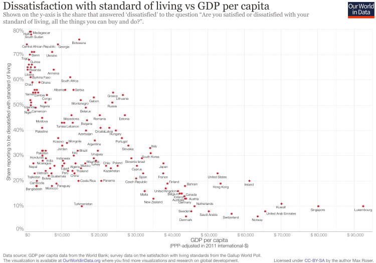
This is what the Gallup Organization did. The Gallup World Poll asked people around the world what they thought about their standard of living—not only about their income. The following chart compares the answers of people in different countries with the average income in those countries. It shows that, broadly speaking, people living in poorer countries tend to be less satisfied with their living standards.
This suggests that economic prosperity is not a vain, unimportant goal but rather a means for a better life. The correlation between rising incomes and higher self-reported life satisfaction is shown in our entry on happiness.
This is more than a technical point about how to measure welfare. It is an assertion that matters for how we understand and interpret development.
First, the smooth relationship between income and subjective well-being highlights the difficulties that arise from using a fixed threshold above which people are abruptly considered to be non-poor. In reality, subjective well-being does not suddenly improve above any given poverty line. This makes using a fixed poverty line to define destitution as a binary ‘yes/no’ problematic. Therefore, while the International Poverty Line is useful for understanding the changes in living conditions of the very poorest of the world, we must also take into account higher poverty lines reflecting the fact that living conditions at higher thresholds can still be destitute.
And second, the fact that people with very low incomes tend to be dissatisfied with their living standards shows that it would be incorrect to take a romantic view on what ‘life in poverty’ is like. As the data shows, there is just no empirical evidence that would suggest that living with very low consumption levels is romantic.
A disregard for or disinterest in poverty estimates that are calculated on the basis of low consumption and income levels is partly explained by the fact that it can be very difficult for people to imagine what it is like to live with very little. Even economists who think a lot about income and poverty find it difficult to understand what it means to live on a given income level. It is just hard to picture what life is like when all you know is a “dollar-per-day” figure.
To address this, Anna Rosling Rönnlund put together a captivating, visual project at Gapminder.org in which she portrays the living conditions of people living at different income levels. In Dollar Street you can find portraits of families and see how they cook, what they eat, how they sleep, what toilets they have available, what their children’s toys look like, and much more.
Dissatisfaction with standard of living vs GDP per capita14
The evolution of extreme poverty, country by country
The most straightforward way to measure poverty is to set a poverty line and to count the number of people living with incomes or consumption levels below that poverty line. This is the so-called poverty headcount ratio.
Measuring poverty by the headcount ratio provides information that is straightforward to interpret; by definition, it tells us the share of the population living with consumption (or incomes) below some minimum level.
The World Bank defines extreme poverty as living on less than 1.90 int.-$. In the map we show available estimates of the extreme poverty headcount ratio, country by country.
The map shows the latest available estimates by default, but with the slider (immediately below the map) you can explore changes over time. You can also switch to the ‘chart’ tab to see the change over time for individual countries or world regions; or you simply click on a country to see how the poverty headcount ratio has changed.
Estimates are again expressed in international dollars (int.-$) using 2011 PPP conversion rates. This means that figures account for different price levels in different countries, as well as for inflation.

Extreme poverty, as defined by the World Bank, is indeed extreme – living on $1.90 per day is very difficult. Hence, it is both interesting and important to measure poverty with higher poverty lines. The World Bank also reports poverty headcount ratios using a higher line at 3.20 int.-$, and the map shows these estimates.

The intensity of poverty – the poverty gap
Measuring poverty through headcount ratios does not capture the intensity of poverty—individuals with consumption levels marginally below the poverty line are counted as being poor just as individuals with consumption levels much further below the poverty line.
The most common way to deal with this is to measure the shortfall from the poverty line, the amount of money required by a poor household to reach the poverty line.
The ‘poverty gap index’—a common statistic routinely estimated by the World Bank—takes the mean shortfall from the poverty line, and divides it by the value of the poverty line. It tells us the fraction of the poverty line that people are missing, on average, in order to escape poverty.
The map here plots estimates for the poverty gap index, country by country.
There is a strong correlation between the incidence of poverty and the intensity of poverty: sub-Saharan Africa, where the share of people below the poverty line is higher, is also the region where people tend to be furthest below the poverty line.
Interestingly, the correlation is very strong, but is far from perfect. For example, Burkina Faso and Cote d’Ivoire have relatively similar poverty gaps (the mean shortfall in 2019 was around 7% of the poverty line in both countries), but they have very different poverty rates (the share of population in poverty in Burkina Faso was 32.8%, while in Cote d’Ivoire it was 22.1%).

As discussed above, the poverty gap index is often used in policy discussions because it has an intuitive unit (percent mean shortfall) that allows for meaningful comparisons regarding the relative intensity of poverty. But given that the poverty line is very low, and some countries have more poor people than others, it’s often easy to lose perspective on the actual absolute magnitude of the numbers we are dealing with.
The two visualizations show the absolute yearly monetary value of the poverty gap, for the world (top chart) and country by country (bottom chart). The numbers come from multiplying the poverty gap index, by both the poverty line and total population.
As we can see, the monetary value of the global poverty gap today is about half of what it was a decade ago. This shows that in recent years we have substantially reduced both the incidence and the intensity of poverty.


- Historical poverty around the world
- Historical poverty in today’s rich countries
- The evolution of poverty by world regions
- Global poverty relative to higher poverty lines
- How much does the reduction of falling poverty in China matter for the reduction of global poverty?
- The (mis)perceptions about poverty trends
Historical poverty around the world
Below we summarize how poverty has changed over the last two centuries. How historians know about the history of poverty is the focus of a longer text that you find here: How do we know the history of extreme poverty?
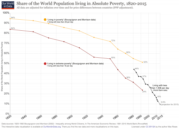
The World Bank only publishes data on extreme poverty from 1981 onwards, but researchers have reconstructed information about the living standards of the more distant past. The seminal paper on this was written by Bourguignon and Morrison in 2002.15
In this paper, the two authors reconstruct measures of poverty as far back as 1820. The poverty line of 1.90 int.-$ per day was just introduced in 2015, so the 2002 paper uses the measure of ‘one dollar per day’. This difference in the definition of poverty should be kept in mind when comparing the following graph to those discussed in other sections of this entry.
In 1820, the vast majority of people lived in extreme poverty and only a tiny elite enjoyed higher standards of living. Economic growth over the last 200 years completely transformed our world, with the share of the world population living in extreme poverty falling continuously over the last two centuries. This is even more remarkable when we consider that the population increased 7-fold over the same time. In a world without economic growth, an increase in the population would result in less and less income for everyone. A 7-fold increase in the world population would be potentially enough to drive everyone into extreme poverty. Yet, the exact opposite happened. In a time of unprecedented population growth, we managed to lift more and more people out of the extreme poverty of the past.
It is very difficult to compare income or consumption levels over long periods of time because the available goods and services tend to change significantly, to the extent where even completely new goods and services emerge. This point is so significant that it would not be incorrect to claim that every person in the world was extremely poor in the 19th century. Nathan Rothschild was surely the richest man in the world when he died in 1836. But the cause of his death was an infection—a condition that can now be treated with antibiotics sold for less than a couple of cents. Today, only the very poorest people in the world would die in the way that the richest man of the 19th century died. This example is a good indicator of how difficult it is to judge and compare levels of prosperity and poverty, especially for the distant past.
The trend over time becomes more clear if one compares the availability of necessities like food, housing, clothing, and energy. As more and more countries industrialized and increased the productivity of work, their economies started to grow and poverty began to decline. According to the estimates by Bourguignon and Morrison—shown in the visualization—only a little more than a quarter of the world population was not living in poverty by 1950.
From 1981 onwards, we have better empirical data on global extreme poverty. The Bourguignon and Morrison estimates for the past are based on national accounts and additional information on the level of inequality within countries. The data from 1981 onwards come from the World Bank, which bases their estimates on household surveys. (See below for more on where historical poverty estimates come from).
According to these household surveys, 44% of the world population lived in extreme poverty in 1981. Since then, the share of extremely poor people in the world has declined very fast—in fact, faster than ever before in world history. In 32 years, the share of people living in extreme poverty was divided by 4, reaching levels below 10% in 2015.
There is also an interactive version of this visualization here.
Share of the World Population living in Absolute Poverty, 1820-201516
We have seen that the chance of being born into extreme poverty has declined dramatically over the last 200 years. But what about the absolute number of people living in extreme poverty?
The visualization combines the information on the share of extreme poverty shown in the last chart, with the number of people living in the world. For the years prior to 1980, we use the mid-point of the estimates from Bourguignon and Morrison (2002) as shown in the previous chart; from 1981, we use the World Bank estimates.
As we can see, in 1820 there were just under 1.1 billion people in the world, of which the large majority lived in extreme poverty. Over the next 150 years, the decline of poverty was not fast enough to offset the very rapid rise of the world population, so the number of non-poor and poor people increased. Since around 1970, however, we are living in a world in which the number of non-poor people is rising, while the number of extremely poor people is falling. According to the estimates shown here, there were close to 2 billion people living in extreme poverty in the early 1980s, and there were 735 million people living in extreme poverty in 2015.
In 1990, there were 1.9 billion people living in extreme poverty. With a reduction to 735 million in 2015, this means that on average, every day in the 25 years between 1990 and 2015, 128,00 fewer people were living in extreme poverty.17
On every day in the last 25 years there could have been a newspaper headline reading, “The number of people in extreme poverty fell by 128,000 since yesterday”. Unfortunately, the slow developments that entirely transform our world never make the news, and this is the very reason why we are working on this online publication.
Recently this decline got even faster and in the 7 years from 2008 to 2015 the headline could have been “Number of people in extreme poverty fell by 192,000 since yesterday”. In the recent past we saw the fastest reduction of the number of people in extreme poverty ever.
While the reduction to 10% is a major achievement of humanity it is still absolutely unacceptable that every tenth person in the world lives in extreme poverty. What our history shows us is that it is possible to reduce extreme poverty it is on us to end extreme poverty as soon as possible.

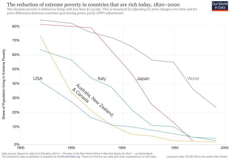
Historical poverty in today’s rich countries
We have already pointed out that in the thousands of years before the beginning of the industrial era, the vast majority of the world population lived in conditions that we would call extreme poverty today. Productivity levels were low and food was scarce—material living standards were generally very low.
The first countries in which people improved their living conditions were those that industrialized first. The chart shows the decline of extreme poverty in these countries.
These estimates come from Ravallion (2015).18 They use a poverty line of 1.25 int.-$ in 2005 prices, and they rely on incomes measured from national accounts. The ‘national accounts’ method to estimate poverty is based on academic studies that reconstruct historical income levels from cross-country macro estimates on economic output and inequality. (See below for more on the ‘national accounts’ method to estimate poverty ).
Two points are worth emphasizing.
First, we can see that extreme poverty was very common in today’s rich countries until fairly recently; in fact, in most of these countries the majority of the population lived in extreme deprivation only a few generations ago. Progress was made at a fast pace—in some cases even at a constant pace. We can definitely end extreme poverty in low income countries, and we can do it soon. Other countries have done it before.
Second, we can also see from this chart that despite remarkable progress, in some rich countries—notably the United States—a fraction of the population still lives in extreme poverty. This is the result of exceptionally high income inequality. (See below for more on extreme poverty in rich countries).
The reduction of extreme poverty in countries that are rich today, 1820-200019
The evolution of poverty by world regions
Above, we provided an overview of recent poverty trends country by country. Here we focus on trends from a regional perspective.
The first chart provides regional estimates of poverty counts – the total number of people living below the International Poverty Line in each world region. The second chart provides regional estimates of poverty rates – the share of population in each region living below the International Poverty Line.
Figures correspond to the International Poverty Line, at 1.90 int.$ in 2011 PPP prices.
As we can see, globally, the number of people living in extreme poverty fell by more than 1 billion during the period; from 1.9 billion in 1990 to 0.74 billion in 2015. On average, the number of people living in extreme poverty declined by 47 million every year since 1990. On any average day the number of people in extreme poverty declined by 130,000 people.
In Sub-Saharan Africa however the number of people in extreme poverty has increased and we explained at the beginning of this entry various projections expect that extreme poverty will be increasingly concentrated in Africa.
The following chart shows that the share of people living in extreme poverty has fallen even faster. This very positive development has been possible in part due to the remarkable improvements in East Asia and the Pacific, where poverty rates went from 81% in 1981 to 2.3% in 2015.


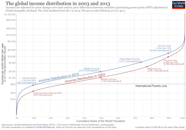
Global poverty relative to higher poverty lines
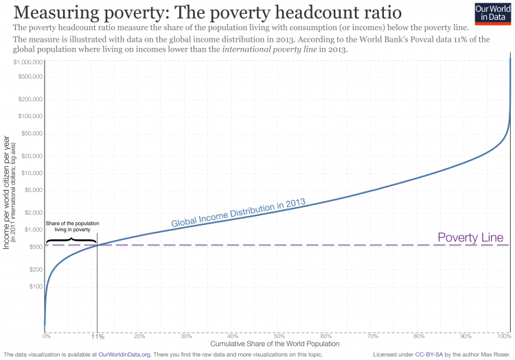
The International Poverty Line that international organizations like the UN rely on corresponds to 1.90 international-dollars (int.-$) per person per day. By any standard this is an extremely low poverty line – the term “extreme poverty” is more than appropriate. Because of this it is important to measure poverty not just by one very low poverty line, but many other poverty lines as well.
The visualization shows the global income distribution in 2003 and 2013 (below we will look at a longer time period). It is measured in international-$ which means it is adjusted for price differences between countries, as we explain here. It is of course also adjusted for price changes over time (inflation).
An income over 14,500 int-$ in 2013 meant that person was part of the global top 10%, and in the world’s richest countries the majority of people have an income that is often much higher than than.
What this distribution shows is that global income inequality is extremely high. The top 10% cut-off is 30-times higher than the cut-off for the poorest 10%. Here the data is plotted on a logarithmic y-axis to focus on the change of incomes between the majority of the world’s population, here is the same data plotted on a linear axis.
To read the chart below, choose a level of annual income on the y-axis and then use the blue 2013-line and the red 2003-line to find the corresponding share of the world population living with less than that income on the x-axis.
The first thing that this chart shows is that a large share of the world population lives on very low incomes. The median income in 2013 was 2,010 int.-$.
If you want to consider a poverty line higher than the International Poverty Line, you could chose a line of int.-$1,000 per year instead and see that in 2003, 48% of the world population was below this poverty line; ten years later, in 2013, 29% were below this line. This was a decline of 20 percentage points in one decade relative to this higher poverty line.
If you think the international poverty line should be much higher and should instead be 4,000 int.-$, then you see that in 2003, 80% of the world population was below that poverty line. 10 years later: 67%. A decline of 13 percentage points in a decade.
There is absolutely no reason to be complacent about poverty today – it remains one of the world’s very worst problems. But it is clear that the world has made progress against it. What this chart shows is that, no matter what global poverty line you choose, the share of people below that poverty line has declined.
The global income distribution in 2003 and 201320
The study by Mauro and Hellebrandt21 on which the above chart is based only has data from 2003 onwards. But there is some good data that allows us to go further back in time, as well as looking at absolute numbers of people in poverty (rather than shares).
The visualization shows a breakdown of the population by per capita household consumption.
After seeing the data for 2003 to 2013, the data shown here should not be surprising: Globally the share of people below any poverty line – $1.90, $3.20, $5.50, $10 – is declining.
Progress against a poverty line of int.-$ 10 per day is a very recent achievement. More than a third of the world population now live on more than 10 dollars per day. Until a decade decade ago it was only a quarter.
The majority of the world population is still very poor. What the cutoff for extreme poverty is helpful for is to focus the attention to those who are the very poorest. This would not be possible if we would only rely on much higher poverty thresholds. A poverty line of int.-$ 10 per day would include the very poorest (on less than $2) and those that are 5-times richer and would thereby hide important differences.

The chart below answers the question of how the number of people below different poverty lines is changing.
The number of people living on less than $1.90 per day has declined. And the number of people above the poverty line has increased rapidly.
When we look at higher poverty lines we see a different picture: From 1990 to 2005 we see that the number of people living on less than $10 per day increased. But since then, the number living on less than $10 stagnated whilst the number above this poverty line increased rapidly. The number of people who live on more than 10 dollars per day increased by 900 million in the last 10 years. On any average day in the last decade the number of people living on more than $10 increased by almost a quarter of a million (246,500).22
Half a billion projected to live in extreme poverty in 2030
The world is making progress against all poverty lines and with rapid growth in many middle income countries we can hope that this progress against poverty relative to high poverty lines will continue.
But our focus should be on those in the very worst poverty. As the previous chart shows, there are still 730 million people living on less than int-$1.90 per day. And the bad news is that we cannot expect this progress to continue: As I have recently written, because the world’s very poorest economies are stagnating half a billion are expected to be in extreme poverty in 2030.

How much does the reduction of falling poverty in China matter for the reduction of global poverty?
In recent decades, the share in extreme poverty has declined faster than ever before in human history.
A common response to this fact is ‘Yes, but this is only because of China.’
This post asks whether such remarks are true. Is the substantial decline of global poverty only due to the poverty decline in China?
First, let us look at the historical evolution of poverty in China. Shown in dark blue is the declining share of the Chinese population living below the International Poverty Line (1.90 int.-$), according to World Bank estimates.
In 1981 around 88% of the Chinese population lived in extreme poverty. According to the latest estimates, extreme poverty – measured in the same way – has declined to below 1% in China.
The declining share of people below higher poverty is also shown in this visualization.

The decline from almost every Chinese person living in extreme poverty to almost no Chinese people living in extreme poverty is of course an exceptional achievement. But is this the entire story of falling global poverty?
To find the answer we recalculated the share of people living in extreme poverty globally and disregarded China entirely – so that we compare a planet with China to a planet without China.23
The chart shows the results. In blue is the decline of global poverty, in red the decline of poverty excluding China.
We see that the reduction of global poverty was very substantial even when we do not take into account the poverty reduction in China. In 1981 almost one third (29%) of the non-Chinese world population was living in extreme poverty. By 2013 this share had fallen to 12%.
Extreme poverty declined in China and in the rest of the world.
What is also interesting to see in the chart is that until 2005, the inclusion of China increased the share of the world population living in extreme poverty; but since then, this has reversed, and the inclusion of China is now reducing the global poverty headcount ratio. This is because in 2005 China’s poverty ratio fell below the world poverty ratio.
Additionally, it is of course silly anyway to say ‘the decline of global poverty is only because of China’. We care about people – not about countries, and since more than every 5th person in the world is Chinese, it is a really important achievement for the world that extreme poverty has decreased so substantially in China.

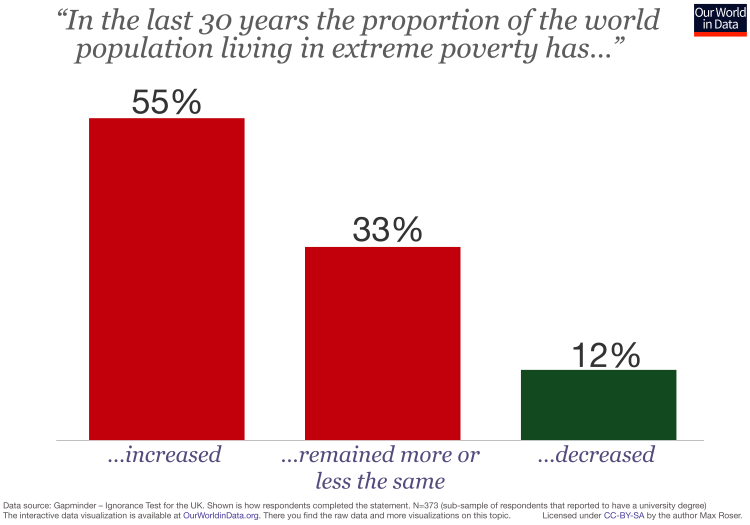
The (mis)perceptions about poverty trends
Despite the clear evidence, many people are not aware of the fact that extreme poverty is declining across the world.
The chart shows the perceptions that survey-respondents in the UK have regarding global achievements in poverty reductions. While the share of extremely poor people has fallen faster than ever before in history over the last 30 years, the majority of people in the UK thinks that the opposite has happened, and that poverty has increased.
The extent of ignorance in the UK is particularly bad if we take into account that the shown result corresponds to a population with a university degree. See the Gapminder Ignorance Project for more evidence.
Survey response in the UK to the question how global poverty has changed24
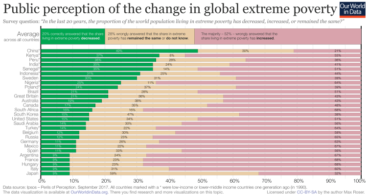
Not only in the UK are many wrongly informed about how poverty is changing globally. Across a large number of countries, the majority of people – 52% – believe that the share of people in extreme poverty is rising.
The share of correct answers differs substantially across countries. The countries I marked with a star are those that were a low-income or lower-middle-income countries a generation ago (in 1990). In these poorer countries more people understand how global poverty has changed.
People in rich countries on the other hand – in which the majority of the population escaped extreme poverty some generations ago – have a particularly wrong perception about what is happening to global poverty.
The same result was also found in a survey commissioned by Oxfam25 and Oxfam, a large charity that focuses on the alleviation of global poverty, warned that “public pessimism and misunderstanding could undermine the fight against global poverty”.
How many poor people live in each country?
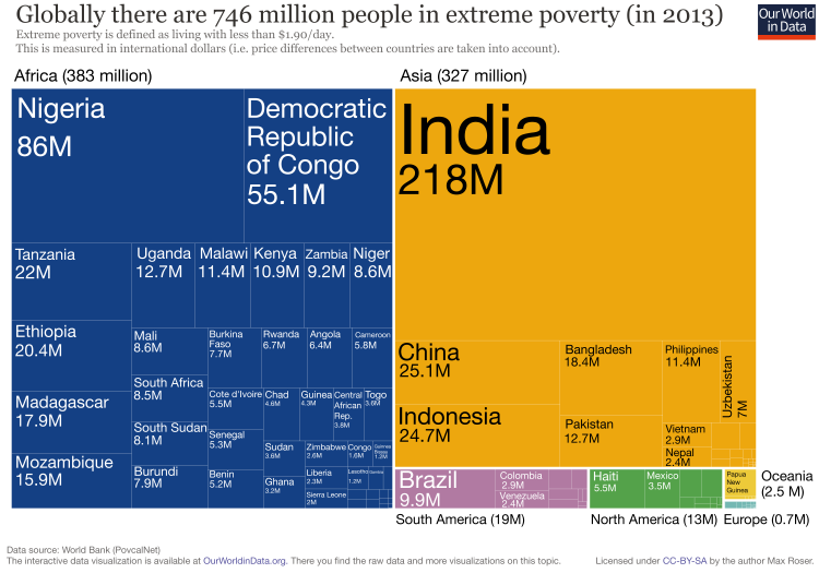
The global incidence of extreme poverty has gone down from almost 100% in the 19th century, to 10.7% in 2013. While this is a great achievement, there is absolutely no reason to be complacent: a poverty rate of 10.7% means a total poverty headcount of 746 million people.
Where do they live? The following visualization provides a breakdown of this figure by continent and country.
These figures come from multiplying estimates of poverty rates by the corresponding estimates of total population in those countries. The poverty rate estimates come from the World Bank (2016 PovCal release, using 2013 household survey data);26 and total population estimates come from the World Development Indicators.
As usual with World Bank estimates, poverty measures are adjusted to account for differences in price levels between countries. This is reflected in the ‘international dollar’ metric used to measure incomes.
As we can see, today, Africa is the continent with the largest number of people living in extreme poverty. The breakdown by continent is as follows:
- 383 Million in Africa
- 327 Million in Asia
- 19 Million in South America
- 13 Million in North America
- 2.5 Million in Oceania
- 0.7 Million in Europe
We can also see that India is the country with the largest number of people living in extreme poverty (218 million people), with Nigeria and the Congo (DRC) following with 86 and 55 million people, respectively.
These figures are the result of important changes across time. As we mentioned above in our discussion of regional trends, in 1990 Asia was the world region with the largest number of poor people (505 million in South Asia, plus 966 million in East Asia and the Pacific). However, with rapid economic growth in Asia over the past two decades, poverty in Asia fell more rapidly than in Africa.
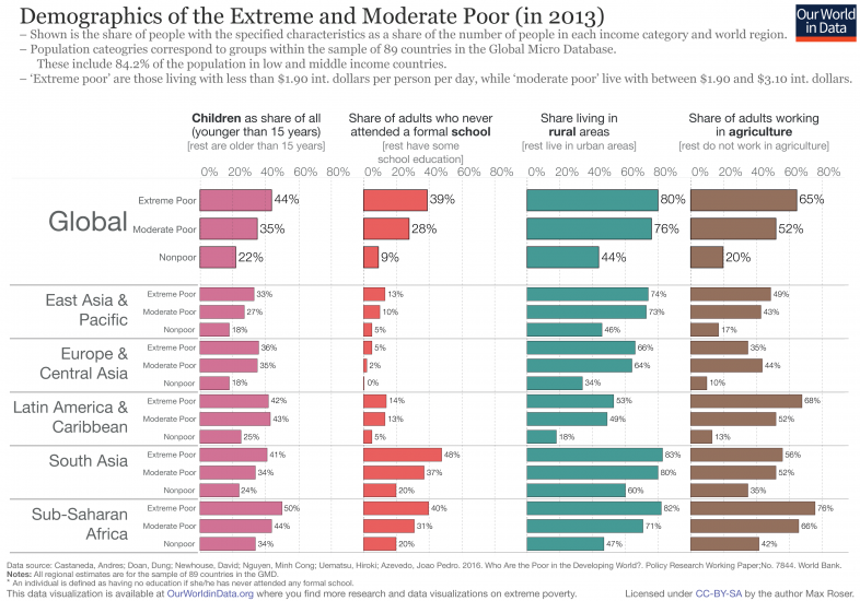
Who are the people living in extreme poverty?
The World Bank Group recently published a new set of poverty estimates, as part of their report Poverty and Shared Prosperity (2016). These estimates, explained in detail in two related background papers (Newhouse et al. 2016 and Castaneda et al. 2016)27 are consistent with the official World Bank poverty figures published in Povcal and the World Development Indicators, but they are disaggregated by key demographic characteristics such as age and educational attainment.
In order to produce disaggregated estimates, the World Bank relied on new data from the Global Micro Database that augments survey data in 89 countries, by providing a set of harmonized household characteristics, enriching the other survey instruments used by the World Bank to measure poverty.
According to the World Bank, the sample of 89 countries included in the Global Micro Database contains an estimated 84.2 percent of the population in low and middle income countries, and 82.1 percent of the child population.28 In this map you can see exactly which territories are covered. As the authors point out, while not every country is covered, this new set of estimates is the most updated and comprehensive source currently available to researchers and policymakers trying to understand the demographics of poverty.
The following visualization uses this source to provide a characterization of those who live in extreme poverty. As we can see, across all world regions the poor tend to be young and live in rural areas.
In the background paper accompanying the data, Castaneda et al. (2016) provide simple regression results and conclude that “After conditioning on other individual and household characteristics, having fewer than three children, having greater educational attainment, and living in an urban area are strongly and positively associated with economic well-being”.
Interestingly, and perhaps also surprisingly, we can see from this visualization that those with no education are now a distinct minority of the population.29 One thing this shows is that, despite improvements, the expansion of education around the world in the last decades has still not been enough to lift many households out of poverty.
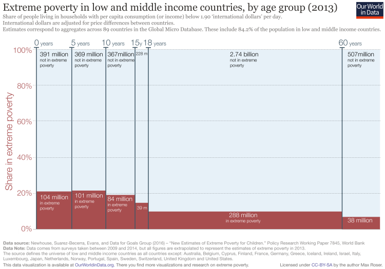
How many children live in extreme poverty around the world?
Global estimates of child poverty are unfortunately not available. However, as we mentioned above, we can have a reasonable picture of this issue by looking at the estimates recently published by the World Bank using the Global Micro Database.
For measurement purposes, children are considered to be poor if they live in a poor household (i.e. all children in poor households are assumed to be poor, while all children in non-poor households are assumed to be non-poor). A household is considered poor, in turn, if the per capita consumption of its members (or per capita income, depending on the country), falls below 1.90 int.-$. This is the standard definition of absolute extreme poverty used by the World Bank.
The following chart summarizes the available data. The height of each bar in this plot shows the share of people living in extreme poverty by age group, while the width of the bars reflects the total size of each age group in the overall population. The area of each bar (height times width) gives the number of individuals living in extreme poverty within each age bracket—these are the numbers written inside each bar.
As we can see, poverty is particularly high among children: in low and middle income countries more than 20% of children under 10 years of age live with less than 1.90 int.-$ per day. For adults, the corresponding figures are much lower: less than 10% of adults live with comparably low consumption levels.
By looking at the total number of people in extreme poverty (area of the bars) we can also see another important fact: virtually half of the people living in extreme poverty are under 18 years of age. This is a large share if we consider that those under 18 account for only around a third of the general population (as shown by the width of the bars).
Extreme poverty in low and middle income countries by age group (2013)30
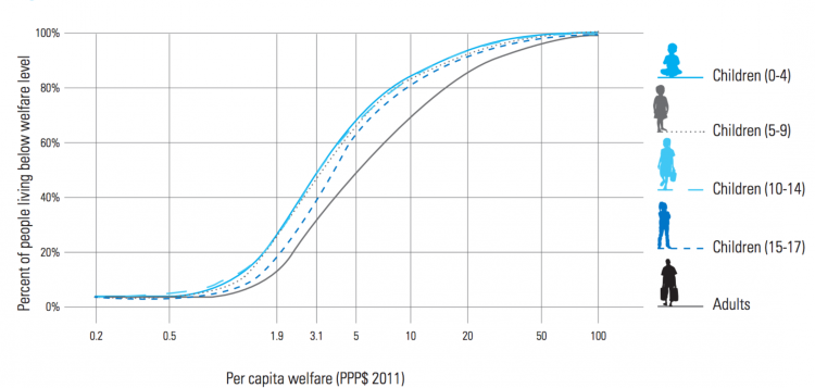
How does poverty among children compare to poverty among adults?
The above-mentioned data from the Global Micro Database allows us to study poverty across age groups for various poverty lines—not just the International Poverty Line.
The following chart shows the cumulative distribution of welfare for different age groups. Each of the lines in this plot shows, for each age group, the share of the population living below a given level of per capita daily income or consumption (after accounting for differences in prices across countries).
If you locate the vertical line passing through $1.9 in the horizontal axis, you will see that it cuts the series for adults at around 9%. This means that around 9% of the adult population lives with consumption (or income) levels below the 1.90 int.-$ poverty line. Following this logic, we can read the poverty rates at any poverty line.
As we can see, the distribution of consumption for adults is always to the right of the distribution for children. In economics lingo, what we observe is that the distribution for adults stochastically dominates that of children. This means that poverty rates for children are higher at any poverty line.
It’s important to mention that these results do not reflect the fact that adults tend to generate more income than children. Bear in mind that these are estimates of household per capita income. That means that children living in households with rich adults are also assumed to be rich.
Percent of people living below different levels of consumption or income in low and middle income countries, by age group (2013) – UNICEF (2016)31
How can we measure poverty beyond income and consumption?
The methodology used by the World Bank to measure poverty relies on income and consumption. While informative, this methodology certainly leaves out many important aspects of welfare.
At Our World in Data, we believe that it is important to track progress in dimensions of well-being spanning beyond standard economic indicators. This is why we make an effort to study a wide range of aspects, including education, health, human rights, etc. If you are interested in understanding poverty through these other lenses, you are welcome to explore our website—the content menu at the top of the page links to all of our entries on these topics.
Tracking various indicators of well-being independently can make comparisons difficult, since different indicators move in different directions across time and space. Because of this, researchers and policymakers often construct synthetic indicators that aggregate various dimensions of deprivation, by attaching welfare weights to a set of key underlying metrics of well-being.
The Multidimensional Poverty Index (MPI) published by the Oxford Poverty & Human Development Initiative (OPHI), is one such effort to aggregate various aspects of well-being into a single metric. Different from other indexes like the Human Development Index, the MPI is not aggregated at the country level, but instead at the individual level—it measures how one and the same individual is deprived in different dimensions.
OPHI’s MPI is widely used around the world, and currently covers over 100 low and middle income countries. The MPI is constructed from ten indicators across three core dimensions: health, education and living standards. This table specifies how the different indicators are defined and aggregated.
The MPI is constructed using three main datasets: the Demographic and Health Survey (DHS), the Multiple Indicators Cluster Survey (MICS), and the World Health Survey (WHS).
You can find further definitions and explanations in the MPI’s documentation. And you can find a more technical discussion of the MPI and its properties in Alkire and Foster (2011).32
The MPI is typically used to assess deprivation at the individual level: if someone is deprived in a third or more of the ten (weighted) indicators, the index identifies them as ‘MPI poor’. In the following map, we show the share of MPI poor people country by country (i.e. the multidimensional poverty headcount ratios). As we can see, this alternative metric shows that poverty is also particularly acute in sub-Saharan Africa.

As we mentioned above, poverty is multidimensional in nature, and it is therefore useful to try to measure poverty through alternative instruments that capture deprivation beyond income and consumption. The Multidimensional Poverty Index (MPI)—shown in the world map above and published by the Oxford Poverty & Human Development Initiative (OPHI)—is the most common international instrument used in this context.
The following chart plots the share of people living in extreme poverty as measured by consumption and income, against the share of people living in ‘multidimensional poverty’ according to the MPI. The former is the same metric we have discussed extensively throughout this entry. The latter is a metric based on unmet needs: the MPI’s definition stipulates that someone lives in ‘multidimensional poverty’ if they are deprived in a third or more of the ten weighted indicators (such as, for example, nutrition, electricity, or schooling) that compose the index.
As we can see, there is a positive correlation between these two measures of deprivation, but they are clearly not identical. Kenya and Chad have similar monetary poverty rates (about 35% of the population live below the International Poverty Line in 2015), but they have extremely different multidimensional poverty rates (around 40% in Kenya in 2014, compared to 87% in Chad in 2015 were living in ‘multidimensional poverty’). This highlights the usefulness of tracking deprivation across multiple dimensions of well-being, including both standard and non-standard economic indicators.

The link between economic growth and poverty
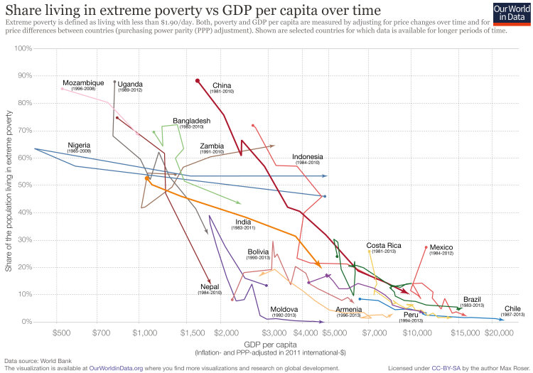
National prosperity is a strong predictor of extreme poverty at the individual level. The following graph shows this relationship between average incomes (GDP per capita) and the share of the population living in extreme poverty.
The chart shows that today there is no country with a GDP per capita higher than 15,000 int.-$ in which more than 6% of the population lives in extreme poverty. And in most countries with GDP per capita below 4,000 int.-$, between one quarter and three quarters of the population lives in extreme poverty.
The scatter plot is interactive—by moving the time slider under the plot, you can see the change over time.

How poverty changes is not only a consequence of economic growth, it also depends on the distribution of incomes and how this inequality changes during the growth process. If growth only lifts the incomes at the top, poverty levels will remain unchanged. On the other hand, if growth is inclusive and lifts all boats, the economy is able to reduce absolute poverty over time. As discussed in our entry on income inequality, income inequality has developed quite differently in different countries. In India, for example, inequality has increased, while in most Latin American countries, inequality has fallen.
Researchers have compared how much changes in inequality matter for poverty reduction relative to economic growth. David Dollar and Aart Kraay studied this link between growth, inequality and poverty reduction in a widely cited paper in 2002.33 The title of their paper is the summary of their finding: ‘Growth is good for the poor’.
The authors find that the share of income of the poorest quintile does not vary systematically with average income—or, in other words, that the incomes of the poor on average rise proportionately with average incomes—and that consequently, “growth on average does benefit the poor as much as anyone else in society”. Therefore, the authors recommend that “growth-enhancing policies should be at the center of any effective poverty reduction strategy.” The authors emphasize that their findings “do not imply that growth is all that is needed to improve the lives of the poor” or that their findings would “suggest a ‘trickle-down’ process or sequencing in which the rich get richer first and eventually benefits trickle down to the poor”.
Twelve years later the same two authors and Tatjana Kleineberg revisited the question on the consequences of growth and changes in inequality. In their newer paper, they broadened the scope of the research question to study social welfare. This approach—using the concept of social welfare—takes into account not just poverty, but also the change in living standards of individuals above the poverty line.
As in their earlier research, Dollar, Kleineberg, and Kraay (2014)34 studied a large number of countries over the past 40 years. The three authors summarize their research by confirming their finding from 2002: “Most of the cross-country and over-time variation in changes in social welfare is attributable to growth in average incomes. In contrast, the contribution of changes in relative incomes to social welfare growth is on average much smaller than growth in average incomes, and moreover is on average uncorrelated with average income growth.”
The following chart focuses on the population living in extreme poverty. It plots the change of national average income against the change in extreme poverty levels over time. Each country is shown here over a succession of points, one for each yearly observation of GDP and poverty. As countries like India, Brazil, Indonesia, and China got richer, the share of their population living in extreme poverty has fallen.
One way to think about this is to consider how low prosperity is before an economy achieves sustained economic growth that lifts the majority of the population out of poverty. India in 1983 had a GDP per capita of 1,070 int.-$. At the end of the period in the connected scatter plot, average income was more than 4-times higher at 4,560 int.-$. Over the period shown in the connected plot, Brazil’s average increased 3-fold and China’s average income increased even 6-fold. Persistent economic growth really is a very powerful force, and the findings of Dollar, Kleineberg, and Kraay and the chart make this very clear.
What is true for the recent decades is also true for the long-run perspective on a global scale. Without the increase in productivity that brought economic growth, it would not have been possible to lift hundreds of millions of people out of extreme poverty. Without large-scale economic growth, many more people would still live at the very poor levels of material well-being that characterized our ancestors’ existence for millennia. Seen from the long historical perspective, it is clear that countries have to be extraordinarily rich to have the possibility to end extreme poverty for the majority of their population.
Poverty traps
Economists use the term ‘poverty trap’ to denote a situation in which individuals are stuck in deprivation over long periods of time, and there is nothing they can do by themselves to escape their situation. The idea is simple: poverty today causes poverty in the future, so households that start poor, remain poor.
Insufficient nutrition, for example, can lead to a poverty trap. More precisely, if physical capacity to work increases nonlinearly with food intake at low levels (i.e. if the first calories that we consume are used by our body to survive, rather than to provide the strength required to work), it is possible that those in extreme poverty get stuck in a perverse equilibrium characterized by low incomes and low nutrition: poor nutrition then becomes both the cause and consequence of poor incomes.
Conceptually, poverty traps can also take place at a collective ‘macro’ level. For example, low-income countries might lack the good growth fundamentals (e.g. technology, education, infrastructure, etc.) that are necessary for the high saving rates which lead to productivity gains and rising national incomes.
The concept of poverty traps is important in the context of policy, since it implies that one-off policy efforts that make it possible to ‘escape the trap’ have permanent positive effects. This is the rationale often used to argue for ‘big push’ macro policies such as the expansion of micro-finance in low-income countries. Such policies are meant to trigger a virtuous cycle of more savings, more investment, and economic growth.
As we discuss below, although unidimensional poverty traps such as those caused by single factors are conceptually appealing (e.g. nutrition-based traps, or country-level savings traps), there is little empirical evidence supporting their practical relevance. The evidence suggests that multi-pronged interventions aimed at relieving multiple joint constraints at the household-level, are more likely to reduce poverty than ‘big push’ policies on the macro-level.
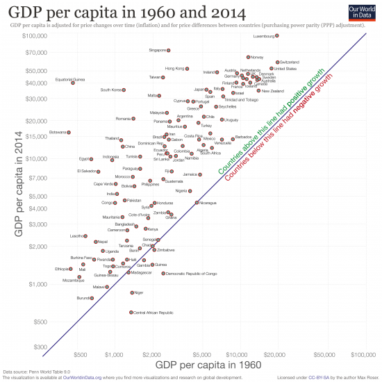
As mentioned above, a ‘poverty trap’ is a situation where incomes are stagnant over long periods, because ‘poverty today causes poverty in the future’.
The following chart provides some evidence regarding the cross-country evolution of incomes over time. It plots, for each country, the national income in 1960 against the corresponding national income in 2014. GDP per capita is used to measure national incomes, and figures are expressed in ‘real terms’, which means they are adjusted for inflation.
In this chart, countries with stagnant incomes are close to the blue 45° line, while countries with incomes that rose between 1960 and 2014 are above the 45° line. The latter are the countries which experienced income growth over these 54 years.
As we can see, some countries such as Madagascar, Chad, Senegal, and Nicaragua experienced income stagnation—they are right on the 45° degree line. And a couple of countries such as Niger and the Democratic Republic of Congo have even experienced negative growth over the reference period. But the large majority of countries, all those above the blue line, have experienced growth.
Those countries that are far above the blue line had the strongest growth. Botswana (38-fold increase), South Korea (30-fold), Romania (15-fold), China (11-fold), and Thailand (18-fold) are some of the countries with the strongest growth over these 54 years.
A closer look at the data suggests that the typical poor country grew at least as fast as the global average over this period.35
Of course, what we see in this chart is only part of the story, since the micro and macro dynamics of incomes can be very different. It is possible, for example, that country-level average incomes are not stagnant, but household-level incomes lag for particular segments of the population within those countries. Indeed, in the US there is evidence of stagnating incomes for those at the bottom of the distribution. Thus, a proper test for the existence of poverty traps requires a more sophisticated econometric analysis.
Kraay and McKenzie (2014)37 provide such an analysis in an interesting and detailed review of the available studies testing for the existence of mechanisms leading to poverty traps. They argue that there is limited evidence for most of the mechanisms when operating in isolation; except perhaps for spatial poverty traps (individuals being trapped in low-productivity locations), and behavioral poverty traps (individuals being stuck in situations where they devote the most mental effort to meeting daily needs, leaving little attentional resources for solving other problems that could raise their incomes).
The implication of this evidence should not be that there is no role for policy; but rather that traditional ‘big push’ macro policies are perhaps not the best approach to reducing poverty. Other, less traditional policies might work better. Below we discuss some examples, such as encouraging migration, and implementing multifaceted programs that relieve joint constraints at the household level.
Real GDP per capita, 1960 vs 201436
Evidence on specific strategies to reduce poverty
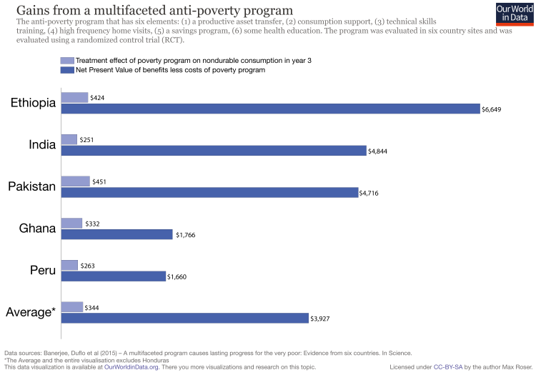
Around the world, most government programs hope to reduce poverty through short-term interventions that have lasting effects. While this is not an easy task, there is concrete evidence suggesting that it is possible. In six different countries, a multifaceted program offering short-term support along various household dimensions has been shown to cause lasting progress for the very poor.
The intervention in question consists of six elements: (1) a productive asset grant, (2) temporary cash consumption support, (3) technical skills training, (4) high frequency home visits, (5) a savings program, and (6) health education and services.
The following visualization summarizes the evidence.
The light blue bars show the impact of this intervention, measured by the yearly average increase in household consumption, three years after the productive asset transfer and one year after the end of the program intervention. The dark blue line presents the ‘net present value’ of these effects—that is, the value of the benefits assuming these gains last forever, minus the program costs (discounting the benefits and costs by how far in the future they occur).
Although the costs of this intervention are substantial, we can see that the net benefits are still positive and large—precisely because impacts are sustained into the future.
The shown results come from Randomized Controlled Trials (RCTs). This evaluation technique consists in administering the policy intervention to a random group of individuals (the ‘treatment group’) and evaluating the effect by comparing outcomes against another group of individuals who were not affected by the policy (the ‘control group’). This is also the idea behind medical trials, and has become increasingly popular in development research.
The full study and results are explained in Banerjee et al. (2015).38 They report the impacts on consumption, food security, productive and household assets, financial inclusion, time use, income and revenues, physical health, mental health, political involvement, and women’s empowerment. They find statistically significant impacts on all of these outcomes.
The evidence most consistent with poverty traps comes from poor households in remote rural regions—these are households that are trapped in low-productivity locations, but which could enjoy a rising standard of living if they were somehow able to leave (see Kraay and McKenzie 201439 for a review of the evidence).
How do poor households get ‘trapped’ in low-productivity locations? There are many possible mechanisms—one is the lack of financial resources. Bryan, Chowdhury, and Mobarak (2013)40 argue that households close to subsistence are often unwilling to take the risk of migration; but they become more willing to do so if insured against this risk. This relaxes the liquidity constraint and opens a window of possibility for policies aiming to promote migration, both within and across countries.
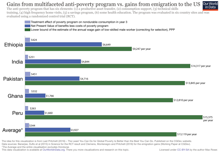
How large are the potential gains from migration to a high productivity country such as the United States? Clemens, Montenegro, and Pritchett (2016)41 offer a tentative answer. Specifically, they provide a lower bound estimate on the annual wage gain of low-skilled male workers migrating to the United States from various low-income countries. The following visualization plots their results, and compares them to the benefits from the successful multifaceted anti-poverty intervention we discussed above.
As we can see, the effect of migration for the poor is remarkably high. These figures suggest that the total lifetime value of the most successful anti-poverty program is less than a quarter of the gain every year from letting a worker work in a high productivity environment, in this case the United States.
Of course, from a social welfare point of view, these effects have to be considered in conjunction with the effects on ‘native’ workers in the new host environments. To this end, Ottaviano and Peri (2011)42 estimate that over the period 1990–2006, immigration to the United States had at most a modest negative long-run effect on the real wages of the least educated ‘natives’. As the authors explain, this is possible because there are complementarities among different types of workers: ‘natives’ and ‘immigrants’ of similar education and age have different skills, often work in different jobs and perform different productive tasks.
Targeted transfer programs have become an increasingly popular policy instrument for reducing poverty in low-income countries. They are an obvious instrument to consider, since transferring cash is perhaps the most straightforward way of raising incomes; and when coupled with well-designed conditionalities, transfers can help ‘nudge’ participants who are caught up in ‘psychological poverty traps’ (see our discussion of poverty traps above).
Gentilini et al. (2014)43 report that 119 developing countries have implemented at least one type of unconditional cash assistance program, and 52 countries have conditional cash transfer programs for poor households.
Cash transfer programs have been shown to reduce poverty across a variety of contexts. Fiszbein and Schady (2009)44 provide a comprehensive analysis of the evidence. They conclude that “By and large, [Conditional Cash Transfers] have increased consumption levels among the poor. As a result, they have resulted in sometimes substantial reductions in poverty among beneficiaries—especially when the transfer has been generous, well targeted, and structured in a way that does not discourage recipients from taking other actions to escape poverty.”
As the last part of the conclusion above notes, a common concern among policymakers is that welfare programs can potentially discourage work—in fact, this is a concern that is shared by policymakers in both low- and high-income countries.
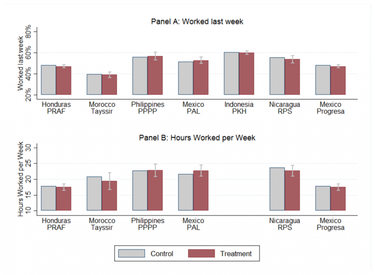
Banerjee et al. (2015)45 analyze the data from seven randomized controlled trials of government-run cash transfer programs in six developing countries in different world regions and find no systematic evidence that cash transfer programs discourage work.
The chart provides a graphical summary of their main findings. In the top panel, the authors graph the employment rate for all eligible adults in both the control and treatment arms for each evaluation. The bottom panel replicates the one above, but for hours of work.
As we can see, the overall figures for both employment and hours of work are similar across treatment and control in all of the evaluated programs and do not statistically differ.
Experimental estimates of the effect of cash transfers on work outcomes – Banerjee et al. (2015)
Growing international trade has changed our world drastically over the last couple of centuries. One particular effect has been a substantial increase in the demand for industrial manufacturing workers in low income countries, mainly due to the rise in offshoring of low-skilled jobs. A common argument put forward is that these industrial manufacturing jobs are a powerful instrument for reducing poverty, even if salaries tend to be very low by the standards of rich countries.
A more careful analysis of the argument reveals a complex reality. On the one hand, low skilled industrial jobs do provide a formal, steady source of income, so it is possible that they raise incomes and reduce poverty. Yet, on the other hand, these jobs tend to be unpleasant and very poorly paid opportunities even by the standards of low income countries.
So, what is the impact of these jobs on the welfare of the workers doing them?
To answer this question, Blattman and Dercon (2016)46 ran a policy experiment in Ethiopia. They were able to convince five factories to hire people at random from a group of consenting participants, and then tracked the effects on their incomes and health.
They find that these low-skill industrial jobs paid more than the alternatives available to a substantial fraction of workers; but at the same time, they had adverse health effects and did not offer a long-term solution—most applicants quit the formal sector quickly, finding industrial jobs unpleasant and risky. (You can read more about this study and the authors’ interpretation of the results in this press release from vox.com).
This evidence is partial, since it does not account for ‘general equilibrium effects’—that is, the potentially positive long-term effects that new manufacturing jobs have via more competition and higher salaries in other sectors of the economy. But it does suggest that while low-skilled industrial jobs may improve consumption opportunities, providing a short-term safety net, they may do so at important costs in other dimensions of well-being.
This reaffirms the importance of measuring poverty beyond just income and consumption, and of maintaining a nuanced understanding of how global living conditions change.
Cross-country correlates
Countries where more people live in extreme poverty tend to have particularly bad health outcomes. The following visualization provides evidence of this relationship. It shows life expectancy at birth on the vertical axis, against poverty rates (for a poverty line equivalent to 3.20 int.-$ per day) on the horizontal axis. The button at the bottom allows you to change the reference years, so that you can see how these two variables covary across time.
As we can see, there is a clear negative relationship: people tend to live longer in countries where poverty is less common. Yet the correlation is far from perfect—some countries such as South Africa have a relatively low life expectancy in comparison to other countries with similar poverty rates. This reinforces the importance of thinking about deprivation beyond income and consumption.

Above we showed that poverty correlates with health. Here, we provide evidence of another important correlate: education.
The following visualization plots mean years of schooling against poverty rates (again using a poverty line equivalent to 3.20 int.-$ per day). As before, the button at the bottom allows you to change the reference years, so that you can see how these two variables covary across time.
As we can see, there is once again a clear negative relationship: poverty tends to be more frequent in countries where education is less developed. As we discussed above, there is also household-level evidence of this correlation—schooling is one of the strongest predictors of economic well-being, even after controlling for other household characteristics.

- What are the main indicators used to measure poverty?
- The difference between ‘absolute’ and ‘relative’ poverty
- How do researchers reconstruct historical poverty estimates?
- How does the World Bank estimate extreme poverty?
- What are the main limitations of World Bank poverty estimates?
- How problematic are data limitations?
- What alternatives are there to estimate monetary poverty?
- What is the cost of ending extreme poverty?
What are the main indicators used to measure poverty?
The ‘poverty headcount ratio’
The most straightforward way to measure poverty is to set a poverty line and count the number of people living with incomes or consumption levels below that poverty line and divide the number of poor people by the entire population. This is the poverty headcount ratio.
Measuring poverty through the headcount ratio provides information that is straightforward to interpret; it tells us the share of the population living with consumption (or incomes) below the poverty line are.
But measuring poverty through headcount ratios fails to capture the intensity of poverty – individuals with consumption levels marginally below the poverty line are counted as being poor just as individuals with consumption levels much further below the poverty line.
The poverty gap index is an alternative way of measuring poverty that considers the intensity of deprivation.
The ‘poverty gap index’
The most common way to measure the intensity of poverty is to calculate the amount of money required by a poor person to just reach the poverty line. In other words, the most common approach is to calculate the income or consumption shortfall from the poverty line.
To produce aggregate statistics, the sum of all such shortfalls across the entire population in a country (counting the non-poor as having zero shortfall) is often expressed in per capita terms. This is the mean shortfall from the poverty line.
The ‘poverty gap index‘ takes the mean shortfall from the poverty line, and divides it by the value of the poverty line. It tells us the fraction of the poverty line that people are missing, on average, in order to escape poverty.
The poverty gap index is often used in policy discussions because it has an intuitive unit (per cent mean shortfall) that allows for meaningful comparisons regarding the relative intensity of poverty.
The difference between ‘absolute’ and ‘relative’ poverty
Absolute poverty is measured relative to a fixed standard of living; that is, an income threshold that is constant across time. Absolute poverty measures are often used to compare poverty between countries and then they are not just held constant over time, but also across countries. The International Poverty Line is the best known poverty line for measuring absolute poverty globally. Some countries also use absolute poverty measures on a national level. These measures are anchored so that comparisons relative to a minimum consumption or income level over time are possible.
Relative Poverty, on the other hand, is measured relative to living standards in a particular society, and varies both across time and between societies. The idea behind measuring poverty in relative terms is that the degree of deprivation depends on the relevant reference group; hence, people are typically considered poor by this standard if they have less income and opportunities than other individuals living in the same society.
In most cases, relative poverty is measured with respect to a poverty line that is defined relative to the median income in the corresponding country. This poverty line defines people as poor if their income is below a certain fraction of the income of the person in the middle of the income distribution. Because of this, relative poverty can be considered a metric of inequality—it measures the distance between those in the middle and those at the bottom of the income distribution.
Relative poverty can be measured using the poverty headcount ratio and the poverty gap index. Indeed, these indicators are common in Europe.47 However, it is important to bear in mind that these are not comparable to the estimates published by the World Bank—the nature of the International Poverty Line is different.
How do researchers reconstruct historical poverty estimates?
Historical estimates of poverty come from academic studies that reconstruct past income and consumption levels by estimating economic output and inequality for the time before household surveys became available.
A seminal paper following this approach and estimating global poverty figures from 1820 onward is Bourguignon and Morrison (2002).48 Their work is the source of the poverty estimates for the time 1820 to 1970 shown above. Bourguignon and Morrison’s starting point is to estimate the global distribution of incomes over time. The change in extreme poverty is then calculated via changes in the share of the world population with incomes below the poverty line, according to the corresponding estimated distribution of incomes.
Bourguignon and Morrison (2002) rely on three types of data in order to estimate the distributions of income: economic output (real GDP per capita), population, and inequality. The first two sources provide information regarding ‘the size of the pie’, while the third one provides evidence regarding the distribution of that pie.
The approach outlined above leads to a natural question: How can researchers construct economic output for the distant past? Fouquet and Broadberry (2015)49 provide a detailed account of how economic historians construct these estimates. It is painstaking work with which researchers occupy themselves for years. The generally preferred approach to estimating national income is the output approach, which relies on historical records by economic sector. For example, for agricultural production, researchers use church records for the estates of farmers, as well as accounting documents produced by farmers and kept in local record offices. Agricultural outputs are then calculated by multiplying the acreage for each crop by the yield per acre. Once this is established, prices for individual crops and animal products are used to convert the output into current prices and create weights for an ‘agricultural real output index’. Outputs related to other sectors, such as leather and food processing, are estimated using a similar approach applied to the specifics of each sector. Finally, when the output of all sectors is reconstructed, these various series are brought together and—using a set of sectoral weights that capture the changing structure of the economy—an estimate of the total historic output of the productive work of the population is reached.
How does the World Bank estimate extreme poverty?
The World Bank is the most important institution measuring the extent of global poverty for the time since 1981. The World Bank estimates of poverty are published via Povcal Net and also in the World Development Indicators.
The World Bank estimates are produced from three key ingredients: household surveys providing evidence about household consumption per head (or, in some cases as we will see, income per head); domestic price indexes and purchasing power parity rates; and an International Poverty Line based on national lines in the poorest countries for which such lines are available.
Below we provide an overview of each of these ingredients. Ferreira et al. (2016)50 provide further details.
Consumption per capita is the preferred welfare indicator for the World Bank’s analysis of global poverty.
Consumption is defined as “the use of resources whether acquired through purchase (expenditure) or through household production or provided from outside the household, such as by relatives, charities, or the government”.51
In principle, one could use household surveys to estimate
(i) resource outflows (monetary expenditures, home production and transfers);
(ii) resource inflows (earnings and other non-market sources of income such as, again, home production and transfers);
and (iii) change in assets between the beginning and end of the relevant period (including savings, owned durable goods, etc.).
Given all this information, consumption, as per the definition above, could be estimated directly from (i), or as the difference between (ii) and (iii). In theory, both approaches should give the same result. In practice, however, surveys on expenditures are different from surveys on incomes (more on this below).
For the majority of countries, the World Bank estimates consumption directly from household surveys on expenditures. For a significant minority of countries, however, World Bank estimates are based on income surveys. Notably, in both cases, the estimation methodology does include home production and transfers, by attaching monetary values to such non-market transactions.
How are monetary values placed on things like food grown at home and gifts from relatives? One common approach is to ask survey-respondents about the amount of such resources consumed over a given reference period. The aim is to then ascribe a monetary value to the reported consumption. This is done by multiplying the consumed amounts by extrapolated market prices. A second approach asks households directly about their own valuation of the amount of money they would expect to pay if they had bought such items themselves, or, the amount of money they would expect to receive if they had sold these items. The second approach is commonly used to establish a rental equivalent for housing and durable goods owned by the household.
How are income and expenditure surveys actually conducted? Different countries use different surveying instruments, and while there is much scope for harmonization (see Beegle et al 201252), there are some basic common features that allow for cross-country comparisons. In most cases, surveys are representative at the national level and record responses provided by ‘primary respondents’ such as the head of the household. Respondents report expenditures (or incomes) either by answering questions from memory (the ‘retrospective recall method’) or by relying on written records (the ‘diary method’). In the case of expenditures, different reference periods are used to record responses across different categories of goods, with longer periods for goods or services that tend to be acquired less frequently.
Income and consumption measures available from national household surveys are denominated in local currency units. This means that in order to make meaningful cross-country poverty comparisons, it is necessary to translate figures into a common currency—i.e. use a consistent ‘unit of measure’.
One possibility would be to simply use the exchange rates from currency markets to translate all national figures into one common currency—such as, for example, the US-dollar. This approach, however, would fail to account for differences in price levels: one US dollar allows you to achieve higher consumption in India than it does in the US.
If we are interested in material deprivation, any monetary income should be considered in relation to the amount of goods and services that it can buy locally. For this reason, the World Bank’s international poverty comparisons do not rely on market exchange rates but on exchange rates that are based on purchase power parity conversion factors. Angus Deaton explains it as follows: “Purchasing power parity exchange rates, or PPPs, are price indexes that summarize prices in each country relative to a numeraire country, typically the United States. These numbers are used to compare living standards across countries, by academics in studies of economic growth, particularly through the Penn World Table, by the World Bank to construct measures of global poverty, by the European Union to redistribute resources, and by the international development community to draw attention to discrepancies between rich and poor countries.”
PPP exchange rates allow us to translate monetary incomes (or consumption) from local currency units into ‘international dollars’. The idea is that a given amount of international dollars should buy roughly the same amount (and quality) of goods and services in any country.
As the graph shows for GDP per capita, assessing living standards using PPP adjusted international dollars rather than US market dollars can make a huge difference. When price levels in a country are much lower than in the US, using US dollars at market exchange rates will significantly underestimate the value of incomes.
PPP factors are estimated by the International Comparison Programme (ICP). The two last rounds of PPP factors estimated by the ICP are from 2005 and 2011 and the next one is scheduled for 2017.
You can read more about PPP adjustments in our dedicated blog entry on this topic.

Today, the International Poverty Line is 1.90 international dollars (at 2011 PPP prices). Where does this number come from?
The pioneering work that set out to count the number of people in poverty using a common global standard was published by Montek Ahluwalia, Nicholas Carter, and Hollis Chenery in 1979.53 The three authors based their estimates of global poverty figures on the Indian poverty line at the time.
To rely on the national poverty line of a low-income country is still the basic idea on which the International Poverty Line is based. But today it is not just the poverty line of India that is taken into account rather, as we can see in the following table, it is based on the national poverty lines of 15 different low-income countries.
There were several major revisions between the first formulation of a global poverty line in 1978 and today. The table shown here, taken from Ferreira et al. (2016),54 shows in detail how the International Poverty Line has been updated over time. A global ‘dollar-a-day’ poverty line was introduced in the World Development Report in 1990, and was subsequently used for the formulation of the Millennium Development Goals and the commitment to “halve, between 1990 and 2015, the proportion of people whose income is less than $1 a day.”
The International Poverty Line is intended to be a global poverty line for absolute measurement of deprivation—so it is not recurrently adjusted as low-income countries grow richer. However, it is important to bear in mind that the International Poverty Line is sometimes updated; in 2015, for example, the line was updated from 1.25 international dollars (at 2005 PPP prices), to 1.90 international dollars (at 2011 PPP prices). This last update was made in order to incorporate new evidence on relative price levels, rather than to change the underlying real welfare standard used to define deprivation. In the last couple of revisions, the guiding principle has been to incorporate new data on relative prices while attempting to minimize changes to the real welfare value of the line, so as to avoid “shifting the goalposts”.
The current methodology for choosing the set of countries used to define the International Poverty Line was first proposed by Chen and Ravallion (2001).55 They compiled a set of national poverty lines for low-income countries—drawing from the World Bank’s country-specific Poverty Assessments and from the Poverty Reduction Strategy Papers compiled by the governments of the countries concerned—and found that while there was a positive association between the value of the poverty line and national per capita consumption for the large majority of countries, the relationship was flat for the fifteen poorest countries in their sample. In other words: they found that the poorest fifteen countries in their sample used a roughly similar absolute poverty line, independent of differences in their per capita consumption levels. These are the fifteen countries that were chosen as reference.
The current methodology has been criticized because of lack of comparability in the underlying set of national poverty lines that were used to choose the fifteen reference countries. Jolliffe and Prydz (2016)56 address this issue of comparability by estimating the national poverty lines that are implied by poverty rates.57
The set of national poverty lines estimated by Jolliffe and Prydz suggests, in contrast to earlier findings by Chen and Ravallion, that there is substantial variation in poverty lines even among the poorest countries. However, this variation does not seem to contradict the choice of the International Poverty Line: if we order the poverty lines of the poorest 25 percent of countries, the value in the middle is close to 1.90 int.-$.
This is in line with a broader point made by Ferreira et al 2016: alternative approaches that were proposed for updating the International Poverty Line to 2011 PPPs end up generating lines that are either exactly or very close to 1.90 int.-$ a day.
Evolution of the World Bank’s International Poverty Line – Ferreira et al. (2016)58
| 1979 “India line” | 1990 “Dollar-a-day” | 2001 "1.08/day" | 2008 "1.25/day" | 2015 "1.90/day" | |
|---|---|---|---|---|---|
| Source | Ahluwalia et al. (1979) | World Bank (1990) | Chen and Ravallion (2000) | RCS (2009) | Ferreira et al. (2016) |
| Relative price levels (ICP data) | 1975 PPPs | 1985 PPPs | 1993 PPPs | 2005 PPPs | 2011 PPPs |
| National poverty lines used (#) | 1 (India) | 8 countries | 10 countries | 15 countries | 15 countries (same lines as 2008) |
| Method | India's poverty line (46th percentile) | Inspection (rounded) | Median | Mean | Mean (rounded) |
| Poverty line (ICP base year USD) | $0.56 | $1.01 ($1.00) | $1.08 | $1.25 | $1.88 (1.90) |
| Poverty line (Constant 1985 USD) | $1.12 | $1.01 | $0.8 | $0.69 | $0.91 |
| National poverty lines used (countries) | India | Bangladesh, Indonesia, Kenya, Morocco, Nepal, Pakistan, Phillippines, Tanzania, | Bangladesh, China, India, Indonesia, Tanzania, Thailand, Tunisia, Nepal, Pakistan, Zambia | Chad, Ethiopia, The Gambia, Ghana, Guinea-Bissau, Malawi, Mali, Mozambique, Nepal, Niger, Rwanda, Sierra Leone, Tajikistan, Tanzania, Uganda | Same as 2008 |
The following visualization shows how national poverty lines in different countries compare to the International Poverty Line. The figures come from Jolliffe and Prydz (2016),59 and correspond to the poverty lines that are implied by national poverty head-counts.60
As can be seen, there is a clear gradient: poorer countries tend to use lower poverty lines. Importantly, this chart also shows us that although the International Poverty Line is very low, it is still higher than the official poverty lines used by many low-income countries. In Malawi, for example, the national poverty line is 1.27 int.-$ per day.
For reference, in this chart we have included also OECD relative poverty lines. It should be noted that, by definition, these poverty lines change over time since they are defined relative to the median income. They are however included to give an idea of the degree of variation in standards used by countries to measure poverty. While in Malawi the national poverty line is equivalent to 1.27 int.-$ per day, in Norway it is equivalent to 35.10 int.-$ per day. A person defined as poor in Norway can be 27-times richer than a person defined as poor in Malawi, a country in which GDP per capita is 58-times lower than in Norway.
Most low-income countries define their national poverty lines by relying on a version of the ‘cost of basic needs’ method. This approach first stipulates a consumption bundle that is deemed adequate for basic consumption needs in the local context, and then estimates the cost of this specific bundle.
What is an adequate consumption bundle? One common starting point is to rely on a generic food requirement, such as 2,100 calories per person per day, and then include a nonfood component that is added to reflect costs for housing, clothing, electricity, and so on.
Another approach—less common but also employed in practice—is to set absolute lines based on asking people what minimum consumption or income level they need just to make ends meet. Above, we show that there is indeed a close relationship between the self-assessment of living conditions and the mean income in that society, both between and within countries.
You can read more about national poverty lines in the World Bank’s research report, “A Measured Approach to Ending Poverty and Boosting Shared Prosperity: Concepts, Data, and the Twin Goals”, pages 37 and 38.

What are the main limitations of World Bank poverty estimates?
Above, we discussed the methodology used by the World Bank to measure extreme poverty. Here, we focus on the various limitations of this methodology. We follow the points discussed by Ferreira et al. (2016).61
One of the key ingredients for the World Bank’s measurement of poverty are household surveys providing evidence about household consumption per head (or, in some cases, income per head).
The following map shows the availability of surveys used to construct the World Bank’s poverty estimates.
For all countries shown in grey in this map, there is not a single survey available to the World Bank in the last three decades. Many of these countries are rich countries in which extreme poverty is very low. But there is also missing data for some poorer countries, in which surely a considerable share of the population is living in extreme poverty.
As we can also see from this map, there are some countries with very few observations. This is the case for many African countries, where there is only one survey available in the last decade. This is extremely infrequent, even in comparison to Latin America and Central Asia, where many countries have almost annual surveys.
By moving the time slider below the map, you can see how many surveys are available in each decade. For individual countries, the World Bank publishes poverty estimates only for years in which household survey data is available. But for regional and global estimates, the World Bank publishes estimates every three years. Clearly, since not all countries have survey data for all years in which regional and global estimates are produced, the World Bank must rely on approximations. In their own words, they ‘line up’ country estimates to a reference year in order to produce regional and global totals.
The process of lining up estimates relies on interpolation for countries in which survey data are not available in particular years, but are available either before or after (or both). You can read more about this process in PovcalNet. The bottom line is that the accuracy of these approximations relies heavily on the availability of survey data—the more survey years are available for a country, the more accurate the approximation.62
For low and middle income countries without reliable survey data in any year (mainly countries in the Middle East and North Africa), the World Bank chooses not to publish country-specific estimates, but still includes an approximated number in the regional and global totals, by relying on alternative statistical techniques.63

Consumption per capita is the preferred welfare indicator for the World Bank’s analysis of extreme poverty. But not all national statistical agencies report consistent estimates of consumption based on expenditure surveys to the World Bank.
The issue is that national statistical agencies design and execute surveys to serve the specific needs and interests of each particular country; which means that different countries use different concepts, methods, and questionnaire designs.
Ferreira et al. (2016),64 show that approximately 75% of the countries in the PovcalNet database have data on per capita consumption, while the remaining countries—mostly in Latin America and the Caribbean—have income per capita.
Income and consumption, as measured by household surveys, are not usually perfectly comparable. Despite efforts to broaden the definition of incomes for the purpose of measuring poverty, in many countries statistical agencies still use definitions that fail to account for the consumption that occurs out of ‘non-income’ resources such as savings and assets, borrowing, and some forms of government welfare benefits.
The implication is that, by definition, zero income is a feasible value, while zero consumption is not a feasible value—people with zero consumption would starve. As one would then expect, this is reflected in the data. “There is essentially no mass point in any country with zero consumption, but many countries that use income data have a significant mass of zero incomes in the data, all of which are treated as being poor. Latin America, in particular, predominantly uses income to measure poverty, and in many countries there are at least a few percent of the observations that are zero”.65
In richer countries, where ‘non-income’ resources such as savings, borrowing, and government welfare benefits are common, this issues of comparability can be substantial. Indeed, in rich countries such as the US, the problem of comparability is so substantial that the World Bank decides not to include estimates of its extreme poverty in the global totals. This is a point we discuss below in more detail.
The following charts from Chandy and Smith (2014)66 show how income and consumption estimates differ for the US and for Malawi.
In these charts, each dot represents a household. More specifically, for each household, the chart compares income per day (horizontal axis) against expenditures per day (vertical axis). Both measures for each household come from the same survey. If incomes and expenditures are identical, then we should see all households lined up along the 45-degree blue line (where expenditure and income are equal).
The orange and red lines plot the trend that best fits the data (i.e. the lines that best describes the cross-household relationship between income and expenditure). As we can seen, in the US the best-fit line is significantly different to the blue line: at very low levels of income, expenditure is significantly higher than income; and at high levels of income, expenditure is lower than income.
In contrast, in Malawi the best-fit line is close to the blue line: households with very low income have comparably low expenditure. This is because unlike in the US, households in Malawi can rely less on savings, borrowing, and government welfare.
Post-tax income and consumption per day across households, US and Malawi – Chandy and Smith (2014)67
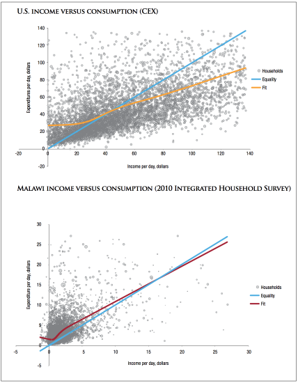
Above, we pointed out that World Bank poverty estimates for some countries come from income data, while in other countries they come from consumption data. As it turns out, comparability issues arise even among countries that rely on consumption data from expenditures, since survey questionnaires are not always standardized.
Beegle et al. (2012)68 give us a concrete idea of the extent to which survey questionnaires matter. They conduct an experiment in Tanzania, in which they randomly choose households and test eight alternative methods of measuring household consumption. They find significant differences between consumption reported by the benchmark personal diary and other diary and recall formats.
The table summarizes the differences in measured poverty that arise from the various survey designs (you can see an overview of the differences between questionnaires here, with more details in the paper). As we can see, the differences are substantial for both the headcount ratio and the poverty gap index.
These results are consistent with other studies.
Researchers have found that the recall period for food consumption matters for the assessment of food consumption in a population (for an example on India see Deaton and Kozel 2005);69 and it has also been observed that questionnaires with more food items listed report higher food consumption when compared with a questionnaire with fewer items (for an example on El Salvador see Jolliffe 2001).70
Studies also suggest that survey design matters for sampling purposes. There is theoretical and empirical evidence presented by Korinek et al. (2005)71 showing that as people become richer, they are less likely to respond to surveys. When richer individuals or households are less likely to answer surveys than poor people, survey-based estimates of consumption and income will understate the mean level of prosperity and overstate the share of people in poverty.
Poverty statistics as measured from consumption, by survey design – Experimental results from Tanzania, from Beegle et al. (2012)72
In the World Bank estimates of global extreme poverty, high-income countries are not accounted for. But how well does this simplifying omission capture the reality of people living there?
A simple look at the reality of homelessness in high-income countries suggests that we need to take this question seriously.
The first point that we need to consider here is that the standards used by rich countries to measure poverty nationally are substantially different to the standards used by the World Bank to measure extreme poverty in low- and middle-income countries.
Consider the case of the US. According to official estimates, the poverty rate in the US was 13.5 percent in 2015. This figure is not really informative about extreme poverty relative to the International Poverty Line used by the World Bank: the official US poverty estimates refer to individuals living in households with incomes below a much higher threshold than the International Poverty Line. Allowances are made for the size and composition of households so that, for example, in a household with 2 adults and 2 children, the poverty line is roughly equivalent to $16.5 per person per day. This is more than 8-fold higher than the International Poverty Line.
The second point to consider is that even if we try to apply the same standards used by the World Bank, the survey instruments in rich countries are typically not suitable to produce estimates that are comparable to those published by the World Bank. This has to do with a point we have already made above: in richer countries, where ‘non-income’ resources such as savings, borrowing, and government welfare benefits are substantial, it is not possible for these groups to approximate consumption from income.
Keeping these comparability issues in mind, the World Bank does estimate poverty rates in high income countries, but chooses not to include them in the global figures. This can be confusing for researchers—including yours truly! The World Bank uses disposable income data to calculate extreme poverty figures that are published in PovcalNet, but chooses not to include them in the global poverty estimates (and in many other reports such as those relying on the World Development Indicators), due to lack of comparability.
The visualization plots the available estimates of extreme poverty in rich countries, which can be obtained from PovcalNet with a disclaimer noting “Although there are a number of people with household incomes below $1.90 per person in rich countries, estimated per capita consumption is above this threshold for nearly everyone. Countries of this type cannot be used in aggregation.”
As we can see, the share of people living in ‘World Bank type’ extreme poverty in high-income countries is very small.
This is the same result that Bradshaw and Mayhew (2011)73 find in a study of extreme poverty in Europe using data on per capita household incomes from the EU-SILC survey to measure absolute poverty rates in Europe, using a poverty line of $2.15 PPP-dollars per person per day.74 In this visualization you can see their results; and in this scatter plot you can see how the PovcalNet estimates below compare to those by Bradshaw and Mayhew.
The conclusion is that although poverty measurement instruments in high income countries are not designed to be compatible with instruments in low and middle income countries, the available evidence suggests that extreme poverty—as defined by the World Bank’s International Poverty Line—is likely to be very low in rich countries.
You can read more about extreme poverty in rich countries in our blog post here; and you can read about the link between homelessness and poverty in rich countries here.

How problematic are data limitations?
The above discussion of data limitations in the context of World Bank poverty estimates highlights an important fact: any estimate of poverty—of either its level or change over time—is surrounded by a margin of error.
Keeping in mind that the World Bank poverty estimates are only approximations is important when making policy decisions, such as the allocation of international aid. Indeed, reviewing the many problems of poverty measurement, Deaton (2010)75 concludes that “probably the most urgent area for the poverty counts is not the [International Comparison Program], but the improvement in the consistency and timeliness of household surveys, and the upgrading of national accounts.”
The fact that the World Bank poverty estimates are only imperfect approximations does not mean that these are meaningless or useless numbers—it means that they should be used as one more source of information to assess living standards. As we point out above, there are many other complementary ways of measuring deprivation.
By virtue of being approximations, the World Bank poverty estimates can underestimate, as well as overestimate the size of the underlying problem. It’s easy to forget about this and think that inaccurate poverty estimates must necessarily underestimate true poverty figures.
As a matter of fact, there is some evidence suggesting that World Bank figures might be over-estimates. The following visualization from the World Bank’ Africa Poverty Report (2016) plots regional trends for different subsets of countries. The green series plots all countries in the PovcalNet dataset—this is the benchmark. The other lines exclude different countries, depending on whether they have comparable and good-quality data. The series for “comparable and good-quality surveys only”, for example, excludes some of the surveys from Burkina Faso, Mozambique, Tanzania, and Zambia; and replaces the poverty estimates of the two comparable but poorer-quality surveys of Nigeria (Nigeria Living Standards Surveys 2003/04 and 2009/10) with the estimate from the General Household Survey Panel 2010/11, which has been deemed of good quality.
As we can seen, the 2012 estimate of poverty in Africa including only “comparable and good-quality surveys” is 6 percentage points lower than the PovcalNet estimate (37 percent instead of 43 percent).
At Our World In Data we are particularly interested in how living conditions change over the long run. The available data suggests that the decline of poverty has been so large over the long run, that it cannot be the result of measurement error. Even if we consider realistic confidence intervals, the trends hold.
So despite limitations, the available poverty estimates are still very informative about how the world has changed.
Share of population living below the International Poverty Line in Africa, by sample of surveys, 2012 – World Bank (2016)76
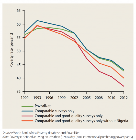
What alternatives are there to estimate monetary poverty?
The poverty figures published by the World Bank are based on ‘microeconomic data’ — specifically, household surveys. A second way of measuring poverty is to start from ‘macroeconomic data’, particularly the National Accounts, which report the aggregate total economic activity of a nation including the GDP. This second approach was first explored by Ahluwalia et al. (1979),77 and as we point out above, historical estimates of poverty, such as those from Bourguignon and Morrison (2002), also follow this approach.
In theory, measures of poverty derived from the National Accounts should match measures of poverty derived from household surveys, but in reality there are often substantial discrepancies. Deaton (2005) reviews the reasons for these discrepancies.78
Given that both approaches are subject to measurement error, it is natural to wonder which of the two methods is superior. Do National Accounts or household surveys give us a better understanding of the levels and changes of poverty? Economists in recent years have started taking this question seriously and asked how much weight should we give to National Account estimates vis-à-vis household-survey estimates?
Pinkovskiv and Sala-i-Martin (2016) try to answer this question.79
They begin by noting that economic activity around the world has been shown to correlate with satellite-recorded data on nighttime lights from the surface of the Earth, which are visible from space. We discuss this in more detail in our entry on light at night and it is shown in the two satellite images. It shows how economic activity, of which nighttime lights are a proxy measure, changed in South Asia between the years 1994 and 2010. We can see that night lights in 2010 cover areas that were unlit in 1994; and there is also a substantial increase in the intensity of lights in major cities over the same period. This is indicative of the underlying growth in economic activity that South Asia achieved during this period.
Based on this correlation between nighttime lights and economic activity, Pinkovskiv and Sala-i-Martin evaluate the relative quality of income data derived from household surveys and National Accounts. The intuition for their approach is that, as long as the measurement error in nighttime lights is unrelated to the measurement errors in either National Accounts or survey means, one can use night lights as a gauge to see how much weight to give National Accounts income estimates relative to household-survey income estimates in measuring true income.
The authors find that nighttime lights are much more closely correlated with GDP per capita than with survey means. This suggests, under their assumptions, that the optimal ‘weights’ to calculate aggregate income should be very large for national accounts and very modest for survey means.
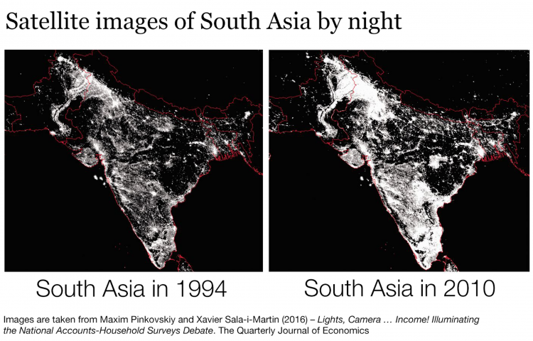
What is the cost of ending extreme poverty?
A fundamental question that cuts through this topic is whether we have a good sense of the actual cost of ending poverty. The answer to that question is no.
The size of the poverty gap is only a rough estimate, and the available empirical evidence does not provide a clear idea of how ‘rough’ is ‘rough’.
An accurate estimate of the cost of ending extreme poverty requires not only having good data on poverty rates from across the world (including in countries where there are still important gaps), but also understanding the inefficiencies that redistributive transfers typically entail. What are these inefficiencies? First, transfers are hard to target (it is hard to reach the desired population); and second, transfers have knock-on effects on economic behaviour (transfers change incentives and hence may affect, among other things, baseline income levels).
Under the assumption that these inefficiencies are not growing over time, the reduction of the total size of the poverty gap over the last few decades is good news. But it is important to note that we don’t have enough data to really understand how strong this assumption is.
In brief: It is important to have more research on the inefficiencies that arise from redistributive transfers.
- Data: Several measures of poverty and inequality
- Geographical coverage: Global – by world regions/continents
- Time span: 1820 to 1992
- Available at: The research paper is: Bourguignon and Morrisson (2002) – Inequality Among World Citizens: 1820–1992. In American Economic Review, 92, 4, 727–744.
- These data were used above in the graph showing the declining share of people living in poverty since 1820.
Economists Xavier Sala-i-Martin and Maxim Pinkovskiy estimated the share of the world population living in absolute poverty.80
An important recent paper on absolute poverty is Chen and Ravallion (2010) – The Developing World is Poorer than We Thought, But No Less Successful in the Fight Against Poverty. In The Quarterly Journal of Economics, 125, 4, 1577–1625.
- Data: Several measures of absolute poverty.
- Geographical coverage: Global – by country and world region.
- Time span: Since 1980
- Available at: World Bank’s PovcalNet – an interactive tool which visualizes absolute poverty and makes the data available for download.
Data on the sub-national level (with huge coverage!) is available from the World Bank. These are data on the poverty headcount – at national poverty line, urban poverty line, and the rural poverty line.