Summary
How people spend their time is similar in many ways across countries: we all sleep, work, eat, and enjoy leisure. But there are also important differences in the freedom people have to spend time on the things they value most. Studying how people across the world spend their time provides an important perspective for understanding living conditions, economic opportunities, and general well-being.
Sleep, work, eat, leisure – at a high level most of us spend time on similar activities. But just how similar are the daily activities of people across the world? This is something worth considering, not just to serve our curiosity but because differences in the way we spend time give us meaningful perspectives on living conditions, economic opportunities and general well-being.
Here we take a look at the data. We explore some of the key patterns that emerge from cross-country time use surveys, and then dig deeper to understand how these differences matter for people’s well-being.
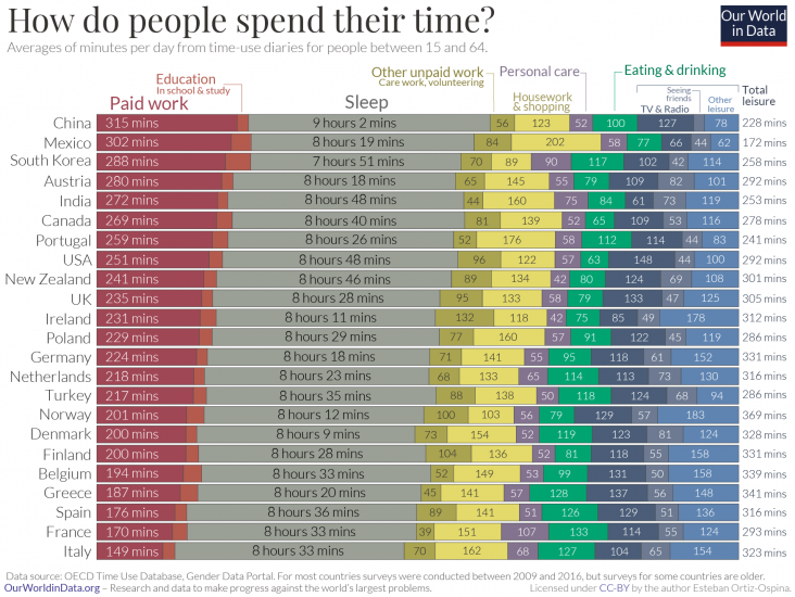
In the chart here we compare average time spent across a number of common activities. The data comes from the OECD and brings together estimates from time diaries where respondents are asked to record the sequence of what they did over a specific day, as well as from general questionnaires where respondents are asked to recall the amount of time spent on different activities on a specific day in the previous week.1
The first thing that jumps out from this chart is that there are indeed many similarities across countries.
This is not surprising – most of us try to split our days into “work, rest and fun”, and so there are some predictable patterns. We spend the most time working and sleeping; and paid work, housework, leisure, eating and sleeping take together 80-90% of the 1440 minutes that we all have available every day.
But if we look closely, we also see some important differences. Consider sleeping, for example. From this sample of countries, South Koreans sleep the least – averaging 7 hours and 51 minutes of sleep every day. In India and the US, at the other end of the spectrum, people sleep an hour more on average.
Work is another important activity where we see large differences. Countries are sorted by paid work hours in the chart – from highest to lowest. In China and Mexico people spend, on an average day, almost twice as much time on paid work as people in Italy and France do. This is a general pattern: People in richer countries can afford to work less. Keep in mind that this chart shows the average for all people in the working age bracket, from 15 to 64 years, whether they are actually employed or not.2
Differences in demographics, education and economic prosperity all contribute to these inequalities in work and time use. But what’s clear in the chart here is that there are also some differences in time use that are not well explained by economic or demographic differences. In the UK, for example, people spend more time working than in France; but in both countries people report spending a similar amount of time on leisure activities.
Cultural differences are likely to play a role here. The French seem to spend much more time eating than the British – and in this respect the data actually goes in line with stereotypes about food culture. People in France, Greece, Italy and Spain report spending more time eating than people in most other European countries. The country where people spend the least time eating and drinking is the USA (63 minutes).
Going beyond national averages reveals important within-country inequalities. The gender gap in leisure time, for example, is a key dimension along which large inequalities exist.
The chart here relies on the same time-use data described above, but shows total leisure time for men and women separately. Time for men is shown on the horizontal axis, while time for women appears on the vertical axis. The dotted diagonal line denotes ‘gender parity’, so the further away a country is from the diagonal line, the larger the difference between men and women.
As we can see, in all countries the average leisure time for men is higher than for women – all bubbles are below the diagonal line – but in some countries the gaps are much larger. In Norway the difference is very small, while in Portugal men report almost 50% more leisure time than women.
A key factor driving these differences in leisure time is the gender gap in unpaid work. As we explain in detail in a companion post, women are responsible for a disproportionate amount of unpaid work, and have less leisure as a result.4

Every single one of us has the same “time budget”: 24 hours per day and 365 days per year. But of course not all of us can choose to spend time on the activities that we enjoy most. Differences in our freedom to allocate time to the things we enjoy is the main reason why time-use data is important for studying living conditions.
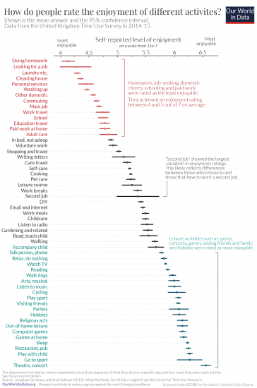
In the UK, researchers from the Centre for Time Use Research linked time-use diaries with the respondents’ assessments of enjoyment, on a scale from 1 to 7, to better understand the connection between time use and well-being. The chart here, which we’ve adapted from the book ‘What We Really Do All Day’, by professors Jonathan Gershuny and Oriel Sullivan, shows the results. The estimates correspond to average reported levels of enjoyment for each activity, with confidence intervals.5
We see that the most enjoyed activities involve rest or leisure activities such as eating out, sleeping, going to sports events, playing computer games or attending cultural performances. The activities receiving the lowest ratings include doing school homework, looking for a job, or doing housework.
The activity where people show the greatest variation in enjoyment is working a “Second Job”. This likely reflects the difference between people who work a second job because they want to, and those who work a second job because they have to.
So what do we learn from this?
First, we learn that the enjoyment of activities is, at least to some degree, predictable and stable. This means we can take activity groups and make meaningful comparisons across groups of people. Economists, for example, often classify any activity with an enjoyment level below work as a “non-leisure activity”, in order to measure trends in leisure across people and time.6
But beyond this, and more importantly, this confirms that time-use is informative about well-being.
The fact that there is a very clear and predictable pattern in the enjoyment of activities suggests that differences in time use do, indeed, give us meaningful perspectives on living conditions and economic opportunities. In countries where people do more paid and unpaid work, and have less time for leisure, their enjoyment – and happiness and life satisfaction – levels are likely to be lower.
How do people rate the enjoyment of different activities?7