This is a ‘meta-entry’ on education. The visualizations and research discussed here are also discussed in other, more specific data entries. These include:
Education is widely accepted to be a fundamental resource, both for individuals and societies. Indeed, in most countries basic education is nowadays perceived not only as a right, but also as a duty – governments are typically expected to ensure access to basic education, while citizens are often required by law to attain education up to a certain basic level.1
In this entry we begin by providing an overview of long run changes in education outcomes and outputs across the world, focusing both on quantity and quality measures of education attainment; and then provide an analysis of available evidence on the determinants and consequences of education.
From a historical perspective, the world went through a great expansion in education over the past two centuries. This can be seen across all quantity measures. Global literacy rates have been climbing over the course of the last two centuries, mainly though increasing rates of enrollment in primary education. Secondary and tertiary education have also seen drastic growth, with global average years of schooling being much higher now than a hundred years ago. Despite all these worldwide improvements, some countries have been lagging behind, mainly in sub-Saharan Africa, where there are still countries that have literacy rates below 50% among the youth.
Data on the production of education shows that schooling tends to be largely financed with public resources across the globe, although a great deal of heterogeneity is observed between countries and world regions. Since differences in national expenditure on education do not explain well cross-country differences in learning outcomes, the data suggests that generic policies that increase expenditure on standard inputs, such as the number of teachers, are unlikely to be effective to improve education outcomes.
Regarding the consequences of education, a growing body of empirical research suggests that better education yields higher individual income and contributes towards the construction of social capital and long-term economic growth.
All our charts on Global Education
Literacy
Literacy is a key skill and a key measure of a population’s education. UNESCO operationalizes the measurement of literacy as the ability to both read and write a short, simple statement about one’s own life. Literacy rates are determined by literacy questions in a census or sample survey of a population, in standardized tests of literacy, or via extrapolation from statistics about school enrollment and educational attainment.2
Statistics of literacy rates for recent decades are published by statistical offices. For earlier periods, historians have to reconstruct data from other sources. The most common method is to calculate the share of those people who could sign official documents (e.g. court documents).
Our entry on Literacy contains further in-depth information on the topic.
While the earliest forms of written communication date back to about 3,500-3,000 BCE, literacy remained for centuries a very restricted technology closely associated with the exercise of power. It was only until the Middle Ages that book production started growing and literacy among the general population slowly started becoming important in the Western World.3
In fact, while the ambition of universal literacy in Europe was a fundamental reform born from the Enlightment, it took centuries for it to happen. Even in early-industrialized countries it was only in the 19th and 20th centuries that rates of literacy approached universality.
The visualization presents estimates of world literacy for the period 1800-2014. As we can see, literacy rates grew constantly but rather slowly until the beginning of the twentieth century. And the rate of growth really climbed after the middle of the 20th century, when the expansion of basic education became a global priority. You can read more about the expansion of education systems around the world in our entry on Financing Education.

The interactive map shows literacy rates around the world, using recent estimates published in the CIA Factbook. As it can be seen, all countries outside Africa (with the exception of Afghanistan) have literacy rates above 50%.
Despite progress in the long run, however, large inequalities remain, notably between sub-Saharan Africa and the rest of the world. In Burkina Faso, Niger and South Sudan – the African countries at the bottom of the rank – literacy rates are still below 30%.

The preceding visualization shows that, despite the fact that literacy is today higher than ever, there are still important challenges in many developing countries. However, data on literacy rates by age groups shows that in most countries, and certainly in virtually all developing countries, there are large generational gaps: younger generations are progressively better educated than older generations. This indicates that in these countries the literacy rate for the overall population will continue to increase.
The visualization shows the estimates and projections of the share of individuals, across countries, who have no education. These figures, from The International Institute for Applied Systems Analysis (IIASA), suggest that we should see rates of education increasing as the world develops – and by 2050, only five countries are likely to have a rate of no education above 20%: these are Burkina Faso, Ethiopia, Guinea, Mali and Niger.
While these projections entail a number of assumptions, the conclusion seems to be that by 2050 we can hope most of the cross-country gaps in literacy to be closed.

School enrollment and attendance
School enrollment and attendance are two important measures of educational attainment. Here we focus on enrollment and attendance rates specifically at the primary level.
The rate of primary school enrollment is typically measured through administrative data, and is defined as the number of children enrolled in primary school who belong to the age group that officially corresponds to primary schooling, divided by the total population of the same age group.
The rate of attendance, on the other hand, is typically measured through household survey data, and is defined as the percentage of children in the age group that officially corresponds to primary schooling who are reported as attending primary school.
The visualization shows estimates of primary education enrollment rates for a selection of 111 countries during the period 1870-2010. You can add countries, or switch to the ‘map’ view, by selecting the corresponding options at the top of the chart.
The plotted series for the UK typifies the experience of early-industrialized countries, where enrollment in primary education grew rapidly with the spread of compulsory primary schooling in the late 18th and early 19th centuries.
And the case of Colombia is representative of the pattern observed across many developing countries, where primary education enrollment rates grew particularly fast in the second half of the 20th century.
The growth in access to primary education across developing countries was achieved through an important increase in government expenditure on education in these countries (you can read more about this in our discussion of global expansion in education expenditure).

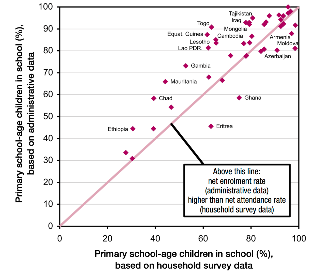
The previous visualization showed the important progress that countries around the world have made regarding access to education, as measured by enrollment rates. Here we focus on evidence of access to education, as measured by school attendance. The difference lies in the source of information regarding participation: enrollment figures come from official records, while attendance estimates comes from asking households directly.
In the majority of developing countries, net enrollment rates are higher than attendance rates. This reflects the fact that many children who are officially enrolled, do not regularly attend school. The visualization, from the UNESCO report Measuring Exclusion From Primary Education (2005), shows the relationship between these two measures. The source reports that “among the 59 countries with comparable data, in 24 countries participation rates drop by five percentage points for the primary school-age group when household surveys are used instead of administrative data.”4
The interactive map shows recent primary school attendance estimates for a selection of (mainly) low and middle income countries in Africa, where the gaps between attendance and enrollment are largest. As we can see, low attendance rates are an important problem in sub-Saharan Africa – more so than enrollment figures suggest. In Niger, Chad and Liberia, estimates suggest that less than half of the school-aged children attend primary school.
Children in school: administrative data compared to household survey data, primary school ages – Figures A1 and A2 in UNESCO (2005)5

The chart shows the number of the world’s young population who are out of school across primary- and secondary-school-age. For 1998 it is estimated that 381 million children were out of school. Until 2014 this number fell to 263 million, despite an increase in the global young population.
For 2014 it can be seen that at the primary school age the number of girls that are out of school is higher than for boys. At the secondary school age the reverse is true, more boys than girls are out of secondary school.

Years of schooling
The average number of years spent in school are another common measure of a population’s education level. It is a helpful measure, because it allows aggregation of attainment across education levels. This allows an analysis of the ‘stock of human capital’ that a population has at any given point in time.
Average, or mean years of schooling of a population, are typically calculated from data on (i) the distribution of the population by age group and highest level of education attained in a given year; and (ii) the official duration of each level of education.
In the previous section we showed, through school enrollment data, that the world went through a great expansion in education over the past two centuries. Here we show evidence of this process of education expansion using cross-country estimates of average years of schooling.
The interactive visualization shows trends in years of schooling for a selection of 111 countries during the period 1870-2017. As usual, you can add countries, or switch to the ‘map’ view, by selecting the corresponding options at the top of the chart. As we can see, the average number of years spent in school has gone up around the world. And once again, we see the pattern that has already been discussed: early-industrialized countries pioneered the expansion of education in the 19th century, but this process became a global phenomenon after the second World War.
The experience of some countries, such as South Korea, shows how remarkably quickly educational attainment can increase.
To emphasize the points above, here we see a map which shows the evolution of mean years of schooling across the globe, using a related, but different source. Specifically, these estimates come from Barro Lee (2010)6, and cover the period 1950-2010.
The rise in mean years of schooling is consistently observed in both Barro Lee (2010) and Lee & Lee (2016). It is the result of increased appreciation of the benefits of education to the individual and society, as well as and increased government provision.


In the previous interactive visualisation we showed how the average number of years spent in school has been going up constantly across the world. Here we go further and explore changes across the entire global distribution of years of schooling.
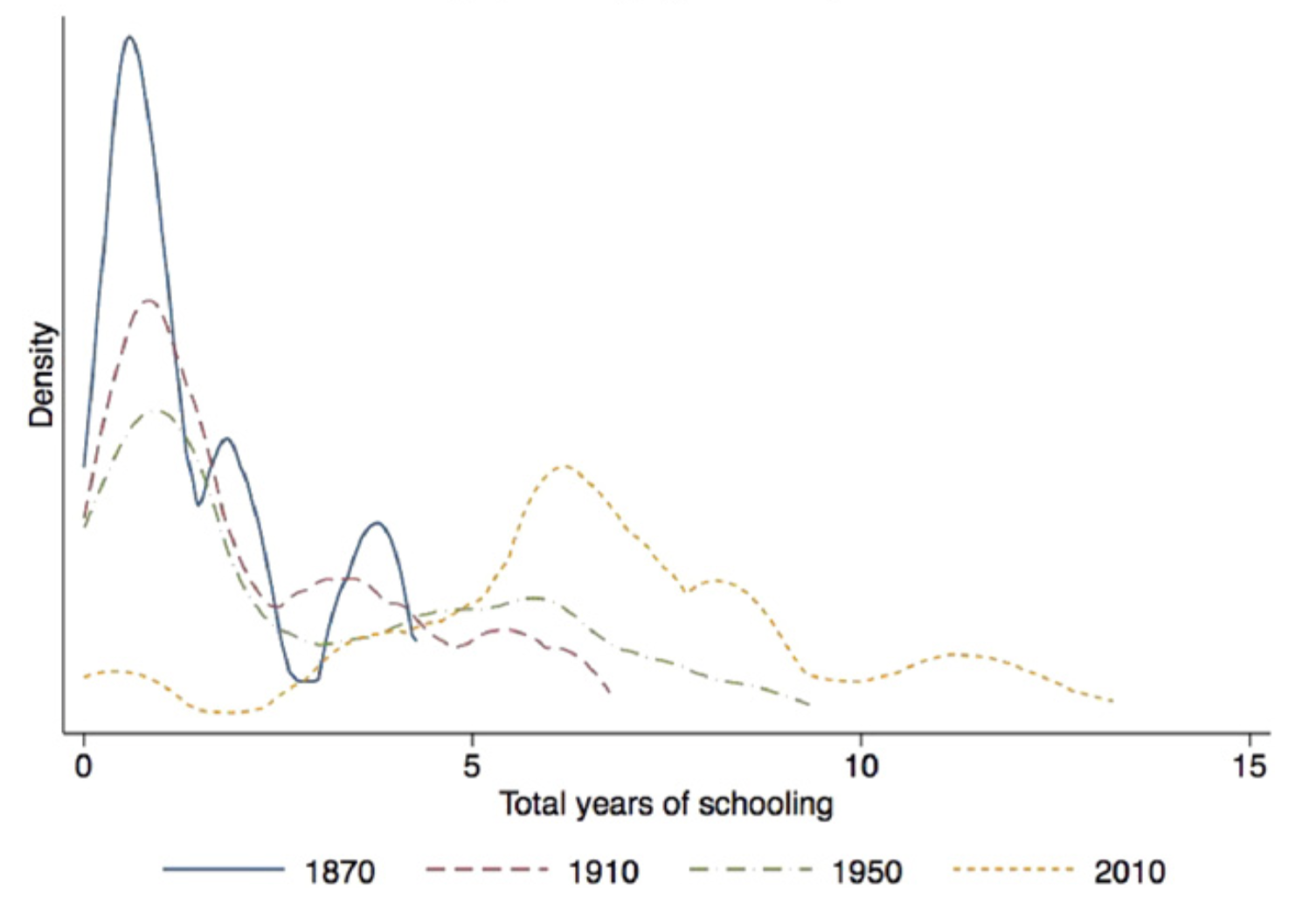
The graph, from Lee and Lee (2016)7, plots the distribution of the number of years of schooling across the entire adult population, for selected years. Roughly speaking, you can think of this graph as a ‘smooth histogram’: if all people in the world were ranked by years of education, this chart would approximately tell us, for any number of years in the horizontal axis, the proportion of the world population that achieved those years.8
We can see that in 1870, the distribution was concentrated at the left: most of the people had between 0 and 3 years of education. In contrast, by 2010 the distribution had shifted drastically to the right.
We can see that there has been a continuous rightward shift in the successive distributions of schooling across time. This reflects the fact that there has been a continuous increase in average years of schooling worldwide: as the share of the uneducated population fell over time, the concentration at the lower level became less pronounced.
The increasingly long tails that we see in the distributions, are the result of cross-country inequalities in education expansion – in the long run, we can see that there has been a considerable increase in the dispersion of the years of schooling. This is mainly the result of cross-country differences, since some nations started expanding education much later than other, and some are still lagging behind. Interestingly, however, inequality grew in the period 1870-1950, but after this point, it has slowly started going down (notice that the distribution in 2010 is ‘bulkier’ in the middle, vis-a-vis the distribution in 1950). Below we provide more detailed evidence of how education inequality has been going down since 1950.
World distribution of years of schooling for selected years – Figure 7B in Lee and Lee (2016)9
The number of years of schooling that a child of school entrance age can expect to receive if the current age-specific enrollment rates persist throughout the child’s life by country.
This is shown in the map.

The visualization shows the evolution of female-to-male ratios of educational attainment (mean years of schooling) across different world regions.
The estimates in the visualization correspond to regional averages of total year of schooling for females (15-64 years of age), divided by the corresponding regional averages for males (15-64 years of age). Regional averages are population-weighted.
Back in 1870 women in the ‘advanced economies'10 had only 0.75 years for every year of education that men had. And in other regions it was even much unequal than that, in Sub-Sahran Africa women had only 0.08 years of education for every year of education that men received.
Since then there has generally been a strong upward trend in the gender ratios across all world regions, which indicates that the inequality between men and women in access to education has been declining. In fact, Latin America and Eastern Europe caught up with the group of ‘advanced economies’ in the 1980s, and the gender gaps in these regions have already been closed almost completely (i.e. the gender ratios approximate the 100% benchmark for education gender parity).

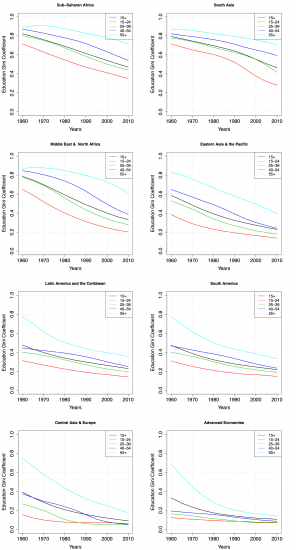
The visualization shows the recent evolution of inequality in educational attainment, through a series of graphs plotting changes in the Gini coefficient of the distribution of years of schooling across different world regions. The Gini coefficient is a measure of inequality and higher values indicate higher inequality – you can read about the definition and estimation of Gini coefficients in our entry on income inequality. The time-series chart shows inequality by age group. It can be seen that as inequality is falling over time, the level of inequality is higher for older generations than it is for younger generations. We can also see that in the period 1960-2010, education inequality went down every year, for all age groups and in all world regions.
Have gains from historical education expansion fully materialized? The breakdown by age gives us a view into the future: as the inequality is lower among today’s younger generations, we can expect the decline of inequality to continue in the future. Thus, further reductions in education inequality are still to be expected within developing countries; and if the expansion of global education can be continued, we can speed up this important process of global convergence.
Education Gini coefficients by world region for selected age groups, 1960- 2010 – Figure 4 in Crespo Cuaresma et al. (2013)11
Attainment by level
The highest level of education that individuals complete is another common measure of educational attainment. This measure is used as an input to calculating years of schooling, and allows clear comparisons across levels of education.
The estimates discussed in this section come from The International Institute for Applied Systems Analysis (IIASA). These include both historic estimates and projections. You can read more about this source of data, including details on the estimation methodology, in our entry on Projections of Future Education.
A global picture of attainment shows estimates and projections of the total world population by level of education. It shows that our world will be inhabited by more and more educated people: while in 1970 there were only around 700 million people in the world with secondary or post-secondary education, by 2100 this figure is predicted to be 10 times larger.

Learning outcomes
Throughout this entry we have discussed ‘quantity’ measures of educational attainment. Now we turn to ‘quality’ measures of education.
Measuring learning outcomes in a way that enables us to make comparisons across countries and time is difficult. There are several international standardised tests that try to measure learning outcomes in a systematic way across countries; but these tests are relatively new, and they tend to cover only specific geographical areas and skills.
One possible approach to learn from all these overlapping but disparate international and regional tests, is to put them on a consistent scale, and then pool them together across skills to maximize coverage across years and countries. This is exactly what Nadir Altinok, Noam Angrist and Harry Patrinos did in a new working paper: Global Data Set on Education Quality (1965–2015). They collected data from a large set of psychometrically-robust international and regional student achievement tests available since 1965, and they linked them together in a common measurement system.
Here we show some key charts using their data. You can read more about their approach and results in our blog post “Global education quality in 4 charts”.
This chart plots GDP per capita (after adjusting for differences in prices across countries and time), against average student test scores (after homogenizing and pooling international and regional student assessments across education levels and subjects). Each bubble in this chart is a country, where colours represent regions and bubble sizes denote population.
As we can see, learning outcomes tend to be much higher in richer countries; but differences across countries are very large, even among countries with similar income per capita.

This scatter plot compares national average learning outcomes in 1985 and 2015 (or closest years with available data).
Among these countries we see a broad positive trend: Most bubbles are above the diagonal line, which means the majority of countries have seen improvements in learning outcomes over the last couple of decades. This is a great accomplishment! It shows that policies matter and learning outcomes can, and often do improve.
The error margin on these differences is often large, so small deviations from the diagonal line are not significant.
But it is worrying that many low-performing countries are substantially below the diagonal line. Consider the comparison between Chile and Burkina Faso in the center of the chart: Both countries had similar average scores a couple of decades ago, but while Chile has improved, Burkina Faso has regressed.
You can check country by country trends over time in this line chart.

This chart shows the share of students who achieve minimum proficiency (i.e. the proportion who pass a global benchmark for minimum skills), against the share who achieve advanced proficiency (i.e. the proportion who pass a global benchmark for advanced skills).
Here we see that those countries where a larger share of students attain minimum proficiency, tend to also be countries where a larger share of students attain advanced proficiency. Better education lifts all boats.
Low-income, low-performing countries are clustered at the bottom of the global scale: the distribution of test scores within these countries is shifted down, relative to high-performing countries. The challenges are therefore much larger in these countries. Less than half of students in Sub-Saharan Africa reach the minimum global threshold of proficiency; and very, very few students achieve advanced skills.
Rich countries, on the other hand, tend to be less clustered. For example, Belgium and Canada have roughly similar average outcomes; but Canada has a higher share of students that achieve minimum proficiency, while Belgium has a larger share of students who achieve advanced proficiency. This shows that there is significant information that average scores fail to capture. The implication is that it’s not enough to focus on average outcomes to assess challenges in education quality.
You can compare achievement above minimum, intermediate, and advanced benchmarks, country by country and over time, in these three line charts:

Context
The most common way to gauge differences in the way countries ‘produce’ education, is to analyze data on expenditure.
In this section we begin by providing an overview of education expenditure around the world, and then turn to the question of how expenditure contributes to the production of education.
The main source of data on international education expenditure is UNESCO’s Institute for Statistics (UIS). The same data is also then published by the World Bank (World Bank EdStats and World Development Indicators) and Gapminder. It is also the main source of education data for most UN reports – such as the EFA Global Monitoring Report (UNESCO), the Human Development Report (UNDP), the State of the World’s Children report (UNICEF) and the Millennium Development Goals (UN).
Further in-depth information on this topic, including definitions, data sources, historical trends and much more, can be found in our dedicated entry Financing Education.
Cross-country spending patters
Governments around the world are nowadays widely perceived to be responsible for ensuring the provision of accessible quality education. The advancement of the idea to provide education for more and more children only began in the mid 19th century, when most of today’s industrialized countries started expanding primary education.
The visualization, plotting public expenditure on education as a share of Gross Domestic Product (GDP) for a number of early-industrialized countries, shows that this expansion took place mainly through public funding.12

Those countries that pioneered the expansion of primary education in the 19th century – all of which are current OECD member states – relied heavily on public funding to do so. Today, public resources still dominate funding for the primary, secondary and post-secondary non-tertiary education levels in these countries.
While in the last decade the share of public funding for these levels of education has decreased slightly, the broad pattern is remarkably stable. The visualization presents OECD-average expenditure on education institutions by source of funds.13

The last two decades have seen a small but general increase in the share of income that countries devote to education. The chart plots trends in public expenditure on education as a share of GDP. As usual, a selection of countries is shown by default, but other countries can be added by clicking on the relevant option at the top of the chart. Although the data is highly irregular due to missing observations for many countries, we can still observe a broad upward trend for the majority of countries. Specifically, it can be checked that of the 88 countries with available data for 2000/2010, three-fourths increased education spending as a share of GDP within this decade. As incomes – measured by GDP per capita – are generally increasing around the world, this means that the total amount of global resources spent on education is also increasing in absolute terms.

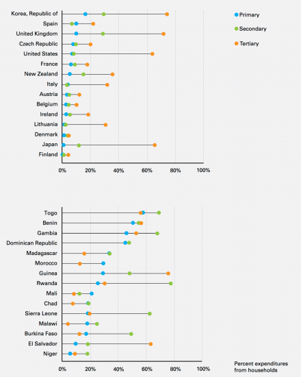
The visualization shows the percentage of total education expenditures contributed directly by households in 15 high income countries and 15 low/middle income countries (most recent data available on 2014).
The top chart in this figure, corresponding to high income countries, shows a very clear pattern: households contribute the largest share of expenses in tertiary education, and the smallest share in primary education. Roughly speaking, this pattern tends to be progressive, since students from wealthier households are more likely to attend tertiary education, and those individuals who attend tertiary education are likely to perceive large private benefits.14 In contrast, the bottom chart shows a very different picture: in several low-income countries households contribute proportionally more to primary education than to higher levels. Malawi is a notable case in point – tertiary education is almost completely subsidised by the state, yet household contribute with almost 20% of the costs in primary education. Such distribution of private household contributions to education is regressive.
Percentage of total education expenditures contributed directly by households in 30 countries, grouped by country income – Figure 32 in The Investment Case for Education and Equity (UNICEF – 2015)
The link between expenditure and outcomes
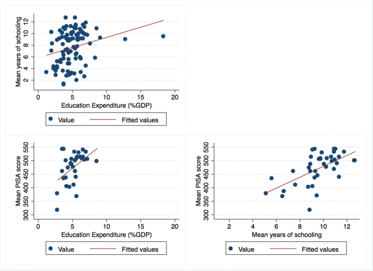
The visualization presents three scatter plots using 2010 data to show the cross-country correlation between (i) education expenditure (as a share of GDP), (ii) mean years of schooling, and (iii) mean PISA test scores. At a cross-sectional level, expenditure on education correlates positively with both quantity and quality measures; and not surprisingly, the quality and quantity measures also correlate positively with each-other. But correlation does not imply causation: there are many factors that simultaneously affect education spending and outcomes. Indeed, these scatterplots show that despite the broad positive correlation, there is substantial dispersion away from the trend line – in other words, there is substantial variation in outcomes that does not seem to be captured by differences in expenditure.
Correlation between education outcomes and education expenditure (2010 data)15
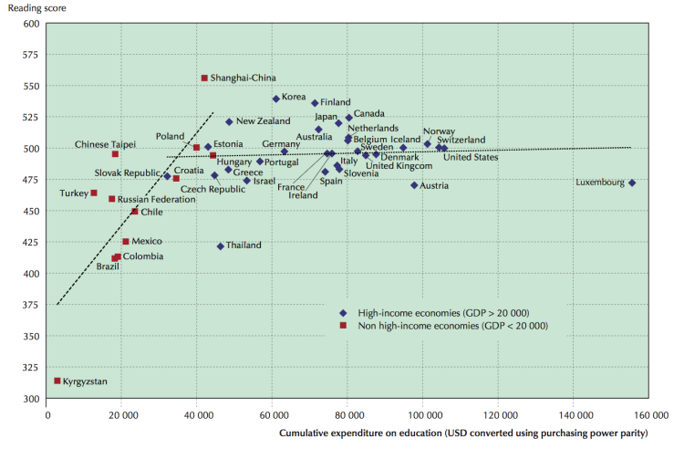
The visualization presents the relationship between PISA reading outcomes and average education spending per student, splitting the sample of countries by income levels. It shows that income is an important factor that affects both expenditure on education and education outcomes: we can see that above a certain national income level, the relationship between PISA scores and education expenditure per pupil becomes virtually inexistent. Several studies with more sophisticated econometric models corroborate the fact that expenditure on education does not explain well cross-country differences in learning outcomes.16 You can read more about test scores and learning outcomes in our entry on Quality of Education.
Average reading performance in PISA and average spending per student from the age of 6 to 15 – Figure 1 in OECD (2012)17
The fact that expenditure on education does not explain well cross-country differences in learning outcomes is indicative of the intricate nature of the process through which such outcomes are produced. The ‘production function’ provides a conceptual framework to think about the determinants of learning outcomes18:
where A is skills learned (achievement), s is years of schooling, Q is a vector of school and teacher characteristics (quality), C is a vector of child characteristics (including “innate ability”), H is a vector of household characteristics, and I is a vector of school inputs under the control of households, such as children’s daily attendance, effort in school and in doing homework, and purchases of school supplies.
This conceptualization highlights that, for any given level of expenditure, the output achieved will depend on the input mix. And consequently, this implies that in order to explain education outcomes, we must rely on information about specific inputs.
Available evidence specifically on the importance of school inputs, suggests that learning outcomes may be more sensitive to improvements in the quality of teachers, than to improvements in class sizes. And regarding household inputs, the recent experimental evidence suggests that interventions that increase the benefits of attending school (e.g. conditional cash transfers) are particularly likely to increase student time in school; and that those that incentivise academic effort (e.g. scholarships) are likely to improve learning outcomes.
Policy experiments have also shown that pre-school investment in demand-side inputs leads to large positive impacts on education – and other important outcomes later in life. The environment that children are exposed to early in life, plays a crucial role in shaping their abilities, behavior and talents.
Context
Education is a valuable investment, both individually and collectively. Here we analyse available evidence of the private (i.e. individual) and social (i.e. collective) returns to education.
The most common way to measure the private returns to education, is to study how attainment improves individual labor market outcomes – usually by attempting to measure the effect of education on wages. Regarding social returns, the most common approach is to measure the effect of education on pro-social behaviour (e.g. volunteering, political participation, interpersonal trust) and economic growth.
Most of the evidence presented below is ‘descriptive’, in the sense that it points towards correlations between education and various individuals and social outcomes, without necessarily proving causation. In each case, we provide a discussion of the robustness of the evidence.
Private returns to education
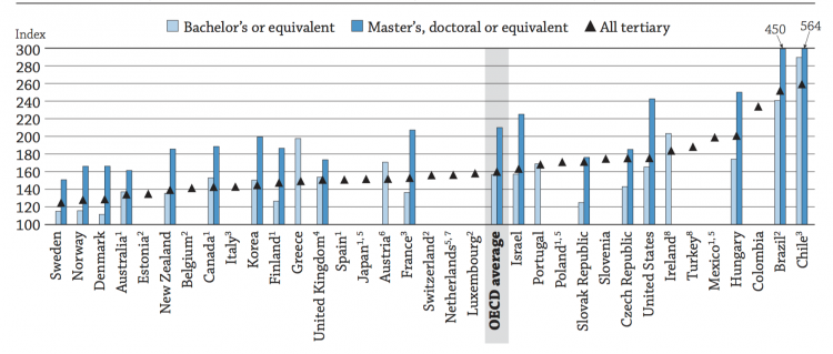
The OECD’s report Education at a Glance (2015) provides descriptive evidence of the link between individual education and income. The chart shows the earnings of tertiary-educated workers, by level of tertiary education, relative to the earnings of workers with upper secondary education. As we can see, in all OECD countries for which information is available, the higher the level of education, the greater the relative earnings.
The countries in this chart are ordered in ascending order of relative earnings. As we can see, the countries with the greatest returns to tertiary education (Brazil, Chile and Colombia) are also those where tertiary education is less prevalent among the adult population. This is indicative of the demand-and-supply dynamics that contribute to determine wage differentials across different countries.
These figures are simply correlations, and cannot be interpreted causally: individuas with more education are different in many ways to individuals with less education, so we cannot attribute wage differences solely to education choices.
The previous graph gave a cross-country comparison of earning by education level. As pointed out, those figures were difficult to interpret causally, because they failed to account for important underlying differences in things like hours worked, experience profiles, etc.
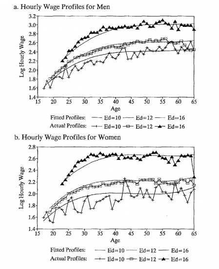
The visualization, from Card (1999)20, attempts to pin down the relationship between education and earnings, by comparing wages across education levels, genders and age groups. The data used for this figure comes from the March Current Population Surveys in the US. Education levels correspond to individuals with 10, 12 and 16 years of education. The marks show averages for each corresponding group, and the smooth lines show the predictions made by a simple econometric model explaining wages by education and experience.
The first conclusion from this charts is that for both genders, at any given age, individuals with more education receive higher wages. Moreover, these estimates suggest that the incremental benefit from additional education grows with experience: the differences in wages between people with varying degrees of education become larger as they advance in their careers. In other words, education pay-offs are not constant over the life cycle. Other studies using different data have found similar results (see, for instance, Blundell et al. 201321)
These estimates can still not be interpreted causally, because there are yet other potential sources of bias that are unaccounted for, such as innate ability. To address this issue, the economics literature has developed different strategies. For example, by contrasting the wages of genetically identical twins with different schooling level, researchers have found a way of controlling for unobservable characteristics such as family background and innate ability. The conclusion from these ‘twin studies’ is that the average estimates suggested by the figure, are not very different to those that would be obtained from more sophisticated models that control for ability. In other words, there is robust evidence supporting the causal effect of education on wages (for more details see Card 1999).
Social returns to education
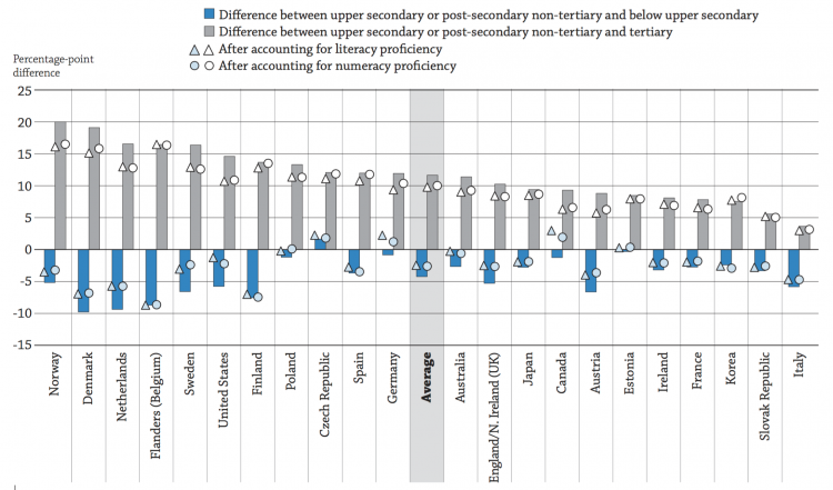
The chart uses OECD results from the Survey of Adult Skills to show how self-reported trust in others correlates with educational attainment. More precisely, this chart plots the percentage-point difference in the likelihood of reporting to trust others, by education level of respondents. Those individuals with upper secondary or post-secondary non-tertiary education are taken as the reference group, so the percentage point difference is expressed in relation to this group.
As we can see, in all countries those individuals with tertiary education were by far the group most likely to report trusting others. And in almost every country, those with post-secondary non-tertiary education were more likely to trust others than those with primary or lower secondary education. The OECD’s report Education at a Glance (2015) provides similar descriptive evidence for other social outcomes. The report concludes that adults with higher qualifications are more likely to report desirable social outcomes, including good or excellent health, participation in volunteer activities, interpersonal trust, and political efficacy. And these results hold after controlling for literacy, gender, age and monthly earnings.
As usual, correlation does not imply causation – but it does show an important pattern that supports the idea that education is indeed necessary to produce social capital.
A long-standing theory in political science stipulates that a country’s level of education attainment is a key determinant of the emergence and sustainability of democratic political institutions, both because it promotes political participation at the individual level, and because it fosters a collective sense of civic duty.
Under this hypothesis, therefore, we should expect that education levels in a country correlate positively with measures of democratisation in subsequent years. The visualization shows that this positive correlation is indeed supported by the data. As we can see, countries where adults had a higher average education level in 1970, are also more likely to have democratic political regimes today (you can read more about measures of democracy in our entry on Democracy).
As usual, these results should be interpreted carefully, because they do not imply a causal link: it does not prove that increasing education necessarily produces democratic outcomes everywhere in the world.
However, the academic research here does suggest that there is a causal link between education and democratization – indeed, a number of empirical academic papers have found that this positive relationship remains after controlling for many other country characteristics (see, for example, Lutz, Crespo-Cuaresma, and Abbasi‐Shavazi 201024).

An important body of literature stipulates that women’s education leads to lower child mortality because it contributes towards healthier habits and choices, including child spacing (see Brown and Barrett 1991 for a more detailed conceptualization of the mechanisms).25
The visualization shows the strong cross-country correlation between child mortality and educational attainment.

The economics literature has long studied whether the level of education in a country is a determinant of economic growth. This question is motivated by the notion that aggregate education (‘human capital’) generates positive spill-over effects for everyone. A classic example of a mechanism though which education may yield such positive economic externalities, is that aggregate education improves a country’s ability to innovate, as well as imitate and adapt new technologies, hence enabling ‘technological progress’ and sustained growth (see Lindahl and Krueger (2001) for an overview of further macroeconomic theories of education and growth).26
While early studies found that schooling levels were poor predictors of economic growth, more recent studies – that crucially made use of better data – confirm the expected positive link. Lutz, Creso Cuaresma, and Sanderson (2008)27 conclude that “better education does not only lead to higher individual income, but also is a necessary (although not always sufficient) precondition for long-term economic growth.”
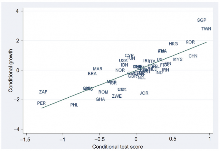
The plot, from Hanushek and Woessmann (2010),28 provides a basic representation of the association between test scores and economic growth using data over the period 1960 to 2000. This type of graph, called a ‘partial regression plot’, shows the relationship between test scores and growth after accounting for the initial level of GDP per capita and for years of schooling in 1960. As we can see, there is a strong positive relationship. What we learn from this result is that “test scores that are larger by 1 standard deviation (measured at the student level across all OECD countries in PISA) are associated with an average annual growth rate in GDP per capita that is two percentage points higher over the whole 40-year period.”29
This coincides with other studies showing that historical increases in the number of universities across countries are positively associated with subsequent growth of GDP per capita (Valero and Van Reenen 2016).30
A number of studies have found that it is actually education in the form of cognitive skills, rather than mere school attainment, what really matters for predicting individual earnings and economic growth. You can read more about this in Delgado, Henderson and Parmeter (2014)31, Hanushek (2013)32 and Pritchett (2001).33
There are two important sources of long-run cross-country data on education attainment. The most recent one is Lee and Lee (2016).35 These estimates rely on a variety of historical sources, and expand existing estimates from previous studies by using a significant number of new census observations. The authors relied on information about the years of establishment of the oldest schools at different education levels in individual countries, in order to adjust their estimates; and they also used data on repetition ratios to adjust for school repeaters.
The other main source on this topic are the estimates from the International Institute for Applied Systems Analysis (IIASA) and the Vienna Institute of Demography (VID). These institutions reconstructed educational attainment distributions by age and sex for 120 countries for the years 1970–2000. These estimates correspond to ‘back projections’: researchers used educational attainment estimates from the UN for the year 2000, and projected backwards from this single year. You can read more about this source of data and the underlying methodology in our entry on Education Projections.
You find more research, data visualisations, and detailed lists of data sources in the more specific entries: