You can download our complete Our World in Data CO2 and Greenhouse Gas Emissions database.
Carbon dioxide emissions are the primary driver of global climate change. It’s widely recognised that to avoid the worst impacts of climate change, the world needs to urgently reduce emissions. But, how this responsibility is shared between regions, countries, and individuals has been an endless point of contention in international discussions.
This debate arises from the various ways in which emissions are compared: as annual emissions by country; emissions per person; historical contributions; and whether they adjust for traded goods and services. These metrics can tell very different stories.
We teamed up with the YouTube channel, Kurzgesagt, to produce a video which explored these different metrics in detail: ‘Who is responsible for climate change? – Who needs to fix it?’. All of the data and research featured in this video is contained in this article: below we look in detail at the many ways emissions are broken down.
This page is just one in our collection of work on CO2 and Greenhouse Gas Emissions. The rest can be explored via the navigation menu at the top of this page. There you can explore emissions of other greenhouse gases; where our emissions come from; what trajectories of future emissions look like; and what is driving emissions across the world.
In the navigation menu you also find Country Profiles, so you can see how your country is doing in reducing emissions, and our CO2 Data Explorer where you can browse all of these metrics in one place.
Global CO2 emissions from fossil fuels
How have global emissions of carbon dioxide (CO2) changed over time?
In this chart we see the growth of global emissions from the mid-18th century through to today.
We see that prior to the Industrial Revolution, emissions were very low. Growth in emissions was still relatively slow until the mid-20th century. In 1950 the world emitted 6 billion tonnes of CO2.
By 1990 this had almost quadrupled, reaching more than 22 billion tonnes. Emissions have continued to grow rapidly; we now emit over 34 billion tonnes each year.
Emissions growth has slowed over the last few years, but they have yet to reach their peak.

Global CO2 emissions from fossil fuels and land use change
How have global emissions of carbon dioxide (CO2) from fossil fuels and land use changed over time?
In this chart we see the growth of global emissions from the mid-18th century through to today.
We see that while emissions from fossil fuels have increased, emissions from land use change have declined slightly in recent years. Overall, this means total emissions have roughly stabilised over the past decade.

CO2 emissions by region
This interactive chart shows the breakdown of global CO2 emissions by region.
We see that until well into the 20th century, global emissions were dominated by Europe and the United States. In 1900, more than 90% of emissions were produced in Europe or the US; even by 1950, they accounted for more than 85% of emissions each year.
But in recent decades this has changed significantly.
In the second half of the 20th century we see a significant rise in emissions in the rest of the world, particularly across Asia, and most notably, China.
The US and Europe now account for just under one-third of emissions.

Year-on-year change in global CO2 emissions
This interactive chart shows the year-on-year growth rate in global CO2 emissions.
A positive figure in a given year indicates that emissions were higher than the previous year. A negative figure indicates they were lower than the year before. For example, a change of 1.5% indicates that global emissions were 1.5% higher than the previous year [–1.5% would mean they were 1.5% lower].
This measure allows us to see the rate at which emissions are changing – whether the growth in global emissions are slowing down or accelerating.
Here you will see that there can be significant year-to-year variability, creating a ‘noisy’ time series. This was particularly true in the first half of the 20th century, where economic output was greatly impacted by key global events (we see large reductions around the World Wars, for example).
In more recent years we see more consistent year-on-year growth averaging around 2% – 3% per year, but still with significant variability. Again, we see the impact of key economic events – the 2008 Financial Crisis resulted in a 1.5% fall in emissions the following year.
Over the past few years, emissions have continued to rise but at a slightly slower rate of 0.5% – 2%.


Where in the world does the average person emit the most carbon dioxide (CO2) each year?
We can calculate the contribution of the average citizen of each country by dividing its total emissions by its population. This gives us CO2 emissions per capita. In the visualization we see the differences in per capita emissions across the world.
Here we look at production-based emissions – that is, emissions produced within a country’s boundaries without accounting for how goods are traded across the world. In our post on consumption-based emissions we look at how these figures change when we account for trade. Production figures matter – these are the numbers that are taken into account for climate targets1 – and thanks to historical reconstructions they are available for the entire world since the mid 18th century.
There are very large inequalities in per capita emissions across the world.
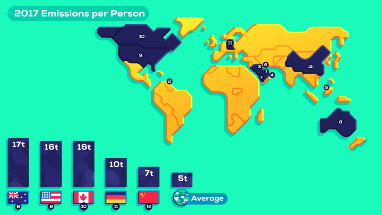
The world’s largest per capita CO2 emitters are the major oil producing countries; this is particularly true for those with relatively low population size. Most are in the Middle East: In 2017 Qatar had the highest emissions at 49 tonnes (t) per person, followed by Trinidad and Tobago (30t); Kuwait (25t); United Arab Emirates (25t); Brunei (24t); Bahrain (23t) and Saudi Arabia (19t).
However, many of the major oil producers have a relatively small population meaning their total annual emissions are low. More populous countries with some of the highest per capita emissions – and therefore high total emissions – are the United States, Australia, and Canada. Australia has an average per capita footprint of 17 tonnes, followed by the US at 16.2 tonnes, and Canada at 15.6 tonnes.
This is more than 3 times higher than the global average, which in 2017 was 4.8 tonnes per person.
Since there is such a strong relationship between income and per capita CO2 emissions, we’d expect this to be the case: that countries with high standards of living would have a high carbon footprint. But what becomes clear is that there can be large differences in per capita emissions, even between countries with similar standards of living. Many countries across Europe, for example, have much lower emissions than the US, Canada or Australia.
In fact, some European countries have emissions not far from the global average: In 2017 emissions in Portugal are 5.3 tonnes; 5.5t in France; and 5.8t per person in the UK. This is also much lower than some of their neighbours with similar standards of living, such as Germany, the Netherlands, or Belgium. The choice of energy sources plays a key role here: in the UK, Portugal and France, a much higher share of electricity is produced from nuclear and renewable sources – you can explore this electricity mix by country here. This means a much lower share of electricity is produced from fossil fuels: in 2015, only 6% of France’s electricity came from fossil fuels, compared to 55% in Germany.
Prosperity is a primary driver of CO2 emissions, but clearly policy and technological choices make a difference.
Many countries in the world still have very low per capita CO2 emissions. In many of the poorest countries in Sub-Saharan Africa – such as Chad, Niger and the Central African Republic – the average footprint is around 0.1 tonnes per year. That’s more than 160 times lower than the USA, Australia and Canada. In just 2.3 days the average American or Australian emits as much as the average Malian or Nigerien in a year.
This inequality in emissions across the world I explored in more detail in my post, ‘Who emits more than their share of CO2 emissions?’

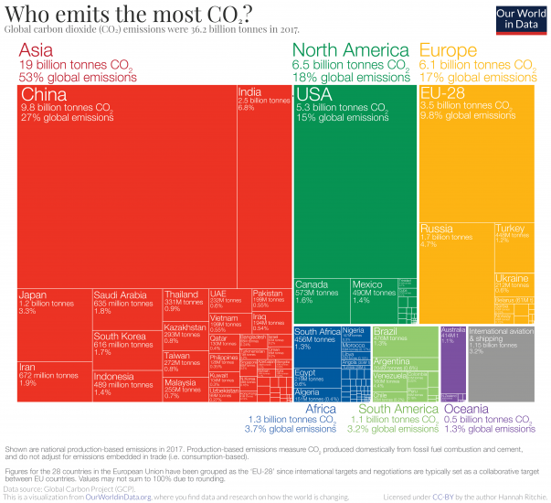
Who emits the most CO2 each year? In the treemap visualization we show annual CO2 emissions by country, and aggregated by region. Treemaps are used to compare entities (such as countries or regions) in relation to others, and relative to the total. Here each inner rectangle represents a country – which are then nested and colored by region. The size of each rectangle corresponds to its annual CO2 emissions in 2017. Combined, all rectangles represent the global total.
The emissions shown here relate to the country where CO2 is produced (i.e.production-based CO2) , not to where the goods and services that generate emissions are finally consumed. We look at the difference in each country’s production vs. consumption (trade-adjusted) emissions here.
Asia is by far the largest emitter, accounting for 53% of global emissions. As it is home to 60% of the world’s population this means that per capita emissions in Asia are slightly lower than the world average, however.
China is, by a significant margin, Asia’s and the world’s largest emitter: it emits nearly 10 billion tonnes each year, more than one-quarter of global emissions.
North America – dominated by the USA – is the second largest regional emitter at 18% of global emissions. It’s followed closely by Europe with 17%. Here we have grouped the 28 countries of the European Union together, since they typically negotiate and set targets as a collective body. You can see the data for individual EU countries in the interactive maps which follow.
Africa and South America are both fairly small emitters: accounting for 3-4% of global emissions each. Both have emissions almost equal in size to international aviation and shipping. Both aviation and shipping are not included in national or regional emissions. This is because of disagreement over how emissions which cross country borders should be allocated: do they belong to the country of departure, or country of origin? How are connecting flights accounted for? The tensions in reaching international aviation and shipping deals are discussed in detail at the Carbon Brief here.
The same data is also explorable by country and over time in the interactive map.
By clicking on any country you can see how its annual emissions have changed, and compare it with other countries.

In the interactive chart you can explore each country’s share of global emissions. Using the timeline at the bottom of the map, you can see how the global distribution has changed since 1751. By clicking on any country you can see its evolution and compare it with others.
If you’re interested in which countries emit more or less than their ‘fair share’ based on their share of global population, you can explore this here.
The distribution of emissions has changed significantly over time. The UK was – until 1888, when it was overtaken by the US – the world’s largest emitter. This was because the UK was the first country to industrialize, a transition which later contributed to in massive improvements in living standards for much of its population.
Whilst rising CO2 emissions have clear negative environmental consequences, it is also true that they have historically been a by-product of positive improvements in human living conditions. But, it’s also true that reducing CO2 emissions is important to protect the living conditions of future generations. This perspective – that we must consider both the environmental and human welfare implications of emissions – is important if we are to build a future that is both sustainable and provides high standards of living for everyone.
Rising emissions and living standards in North America and Oceania followed soon after developments in the UK.
Many of the world’s largest emitters today are in Asia. However, Asia’s rapid rise in emissions has only occurred in very recent decades. This too has been a by-product of massive improvements in living standards: since 1950 life expectancy in Asia has increased from 41 to 74 years; it has seen a dramatic fall in extreme poverty; and for the first time most of its population received formal education.
Whilst all countries must work collectively, action from the very top emitters will be essential. China, the USA and the 28 countries of the EU account for more than half of global emissions. Without commitment from these largest emitters, the world will not come close to meeting its global targets.

This interactive chart shows the year-on-year growth rate of CO2 emissions.
A positive figure in a given year indicates that emissions were higher than the previous year. A negative figure indicates they were lower than the year before. For example, a change of 1.5% indicates that global emissions were 1.5% higher than the previous year [–1.5% would mean they were 1.5% lower].
This measure allows us to see firstly where emissions are rising, and where they are falling; and secondly the rate at which emissions are changing – whether the growth in emissions are slowing down or accelerating.

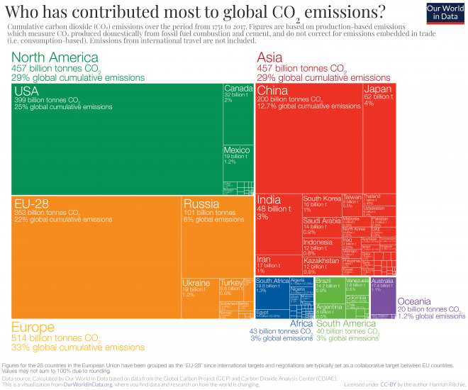
Since 1751 the world has emitted over 1.5 trillion tonnes of CO2.2 To reach our climate goal of limiting average temperature rise to 2°C, the world needs to urgently reduce emissions. One common argument is that those countries which have added most to the CO2 in our atmosphere – contributing most to the problem today – should take on the greatest responsibility in tackling it.
We can compare each country’s total contribution to global emissions by looking at cumulative CO2. We can calculate cumulative emissions by adding up each country’s annual CO2 emissions over time. We did this calculation for each country and region over the period from 1751 through to 2017.3
The distribution of cumulative emissions around the world is shown in the treemap. Treemaps are used to compare entities (such as countries or regions) in relation to others, and relative to the total. Here countries are presented as rectangles and colored by region. The size of each rectangle corresponds to the sum of CO2 emissions from a country between 1751 and 2017. Combined, all rectangles represent the global total.
There are some key points we can learn from this perspective:
- the United States has emitted more CO2 than any other country to date: at around 400 billion tonnes since 1751, it is responsible for 25% of historical emissions;
- this is twice more than China – the world’s second largest national contributor;
- the 28 countries of the European Union (EU-28) – which are grouped together here as they typically negotiate and set targets on a collaborative basis – is also a large historical contributor at 22%;
- many of the large annual emitters today – such as India and Brazil – are not large contributors in a historical context;
- Africa’s regional contribution – relative to its population size – has been very small. This is the result of very low per capita emissions – both historically and currently.
All of this data is also explorable by country and over time in the interactive map. By clicking on any country you can see the country’s cumulative emissions over time, and compare it with other countries.

In the visualizations above we focused on each country or region’s total cumulative emissions (1) in absolute terms; and (2) at a single point in time: as of 2017.
In the chart we see the change in the share of global cumulative emissions by region over time – from 1751 through to 2017.
Up until 1950, more than half of historical CO2 emissions were emitted by Europe. The vast majority of European emissions back then were emitted by the United Kingdom; as the data shows, until 1882 more than half of the world’s cumulative emissions came from the UK alone.
Over the century which followed, industrialization in the USA rapidly increased its contribution.
It’s only over the past 50 years that growth in South America, Asia and Africa have increased these regions’ share of total contribution.

In the final visualization you can explore the same cumulative CO2 emissions as you have seen above but now visualizes by country. Using the timeline at the bottom of the chart you can see how contribution across the world has evolved since 1751. By clicking on a country you can see an individual country’s cumulative contribution over time.
The map for 2017 shows the large inequalities of contribution across the world that the first treemap visualization has shown. The USA has emitted most to date: more than a quarter of all historical CO2: twice that of China which is the second largest contributor. In contrast, most countries across Africa have been responsible for less than 0.01% of all emissions over the last 266 years.
What becomes clear when we look at emissions across the world today is that the countries with the highest emissions over history are not always the biggest emitters today. The UK, for example, was responsible for only 1% of global emissions in 2017. Reductions here will have a relatively small impact on emissions at the global level – or at least fall far short of the scale of change we need. This creates tension with the argument that the largest contributors in the past should be those doing most to reduce emissions today. This is because a large fraction of CO2 remains in the atmosphere for hundreds of years once emitted.4
This inequality is one of the main reasons which makes international agreement on who should take action so challenging.

CO2 emissions are typically measured on the basis of ‘production’. This accounting method – which is sometimes referred to as ‘territorial’ emissions – is used when countries report their emissions, and set targets domestically and internationally.5
In addition to the commonly reported production-based emissions statisticians also calculate ‘consumption-based’ emissions. These emissions are adjusted for trade. To calculate consumption-based emissions we need to track which goods are traded across the world, and whenever a good was imported we need to include all CO2 emissions that were emitted in the production of that good, and vice versa to subtract all CO2 emissions that were emitted in the production of goods that were exported.
Consumption-based emissions reflect the consumption and lifestyle choices of a country’s citizens.
In the interactive map we see the emissions of traded goods. To give a perspective on the importance of trade these emissions are put in relation to the country’s domestic, production-based emissions.6
- Countries shown in red are net importers of emissions – they import more CO2 embedded in goods than they export.
For example, the USA has a value of 7.7% meaning its net import of CO2 is equivalent to 7.7% of its domestic emissions. This means emissions calculated on the basis of ‘consumption’ are 7.7% higher than their emissions based on production.
- Countries shown in blue are net exporters of emissions – they export more CO2 embedded in goods than they import.
For example, China’s value of -14% means its net export of CO2 is equivalent to 14% of its domestic emissions. The consumption-based emissions of China are 14% lower than their production-based emissions.
We see quite a regional East-West split in net exporters and importers: most of Western Europe, the Americas, and many African countries are net importers of emissions whilst most of Eastern Europe and Asia are net exporters.
You can find these figures in absolute (tonnes of CO2) and per capita terms for each country in the Additional Information section.

How did the differences between a country’s production and consumption-based emissions change over time?
In the interactive charts you can compare production- and consumption-based emissions for many countries and world regions since the first data is available in 1990.7 One chart shows total annual emissions, the other one shows the same on a per capita basis. Using the ‘change country’ toggle of the chart you can switch between them.
Individual maps of consumption-based annual and per capita emissions can also be found in the Additional Information which follows this post.
We see that the consumption-based emissions of the US are higher than production: In 2016 the two values were 5.7 billion versus 5.3 billion tonnes – a difference of 8%. This tells us that more CO2 is emitted in the production of the goods that Americans import than in those products Americans export.
The opposite is true for China: its consumption-based emissions are 14% lower than its production-based emissions. On a per capita basis, the respective measures are 6.9 and 6.2 tonnes per person in 2016. A difference, but smaller than what many expect.
Whilst China is a large CO2 emissions exporter, it is no longer a large emitter because it produces goods for the rest of the world. This was the case in the past, but today, even adjusted for trade, China now has a per capita footprint higher than the global average (which is 4.8 tonnes per capita in 2017). In the Additional Information you find an interactive map of how consumption-based emissions per capita vary across the world.
These comparisons provide the answer to the question whether countries have only achieved emissions reductions by offshoring emissions intensive production to other countries. If only production-based emissions were falling whilst consumption-based emissions were rising, this would suggest it was ‘offshoring’ emissions elsewhere.
There are some countries where this is the case. Examples where production-based emissions have stagnated whilst consumption-based CO2 steadily increased include Ireland in the early 2000s; Norway in the late 1990s and early 2000s; and Switzerland since 1990.
On the other hand there are several very rich countries where both production- and consumption-based emissions have declined. This has been true, among others, for the UK (chart), France (chart), Germany (chart), and the USA (chart). These countries have achieved some genuine reductions without outsourcing the emissions to other countries. Emissions are still too high in all of these countries, but it shows that genuine reductions are possible.
In most countries emissions increased when countries become richer, but this is also not necessarily the case: by comparing the change in consumption-based emissions and economic growth we see that many countries have become much richer while achieving a reduction of emissions.


In-depth: how much emissions are embedded in trade?


Global inequalities by production
There are two parameters that determine our collective carbon dioxide (CO2) emissions: the number of people, and quantity emitted per person. We either talk about total annual or per capita emissions. They tell very different stories and this often results in confrontation over who can really make an impact: rich countries with high per capita emissions, or those with a large population.
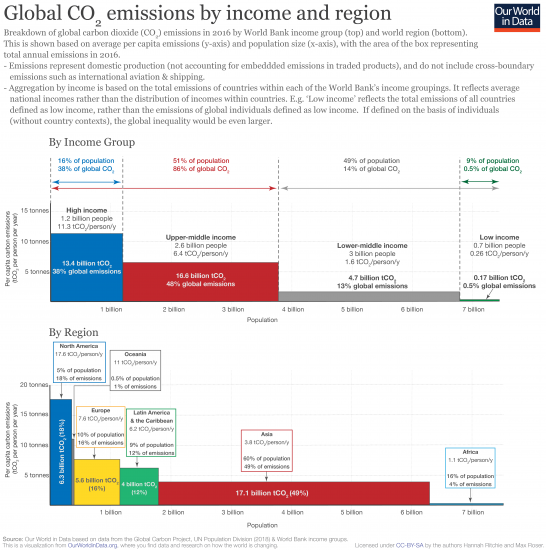
To help us understand the global distribution of per capita emissions and population, we have visualized global CO2 emissions by (1) World Bank income group and (2) by world region.
The world’s total CO2 emissions9 are shown on the basis of two axes: the height of the bar (y-axis) is the average per capita CO2 emissions and the length of the box (x-axis) is the total population. Since total emissions are equal to per capita emissions multiplied by the number of people, the area of each box represents total emissions.10
When aggregated in terms of income, we see in the visualization that the richest half (high and upper-middle income countries) emit 86 percent of global CO2 emissions. The bottom half (low and lower-middle income) only 14%. The very poorest countries (home to 9 percent of the global population) are responsible for just 0.5 percent. This provides a strong indication of the relative sensitivity of global emissions to income versus population. Even several billion additional people in low-income countries — where fertility rates and population growth is already highest — would leave global emissions almost unchanged. 3 or 4 billion low income individuals would only account for a few percent of global CO2. At the other end of the distribution however, adding only one billion high income individuals would increase global emissions by almost one-third.11
Note here that the summary by income is on the basis of country income groupings, rather than that of individuals. For example, ‘low income’ is the total emissions of all countries defined as low income, rather than the lowest income individuals in the world. These figures therefore don’t take account of inequalities in emissions within countries. It’s estimated that within-country inequalities in emissions can be as large as those between countries.12
If we were to calculate this distribution by the income of individuals, rather than countries, we’d see that the global inequalities in emissions would be even greater. The richest of the global population would be responsible for an even larger share of global emissions.
When aggregated by region we see that North America, Oceania, Europe, and Latin America have disproportionately high emissions relative to their population. North America is home to only five percent of the world population but emits nearly 18 percent of CO2 (almost four times as much). Asia and Africa are underrepresented in emissions. Asia is home to 60 percent of the population but emits just 49 percent; Africa has 16 percent of the population but emits just 4 percent of CO2. This is reflected in per capita emissions; the average North American is more than 17 times higher than the average African.
This inequality in global emissions lies at the heart of why international agreement on climate change has (and continues to be) so contentious. The richest countries of the world are home to half of the world population, and emit 86 percent of CO2 emissions. We want global incomes and living standards — especially of those in the poorest half — to rise. To do so whilst limiting climate change, it’s clear that we must shrink the emissions of high-income lifestyles. Finding the compatible pathway for levelling this inequality is one of the greatest challenges of this century.
[Clicking on the visualization will open it in higher-resolution].
Global inequalities by consumption
The initial comparison of emissions by income group and region was based on ‘territorial’ emissions (those emitted within a country’s borders) — these are termed ‘production-based’ and are the metrics by which emissions are commonly reported. However, these emissions do not account for traded goods (for which CO2 was emitted for their production). If a country is a large importer of goods its production-based emissions would underestimate the emissions required to support its standard of living. Conversely, if a country is a large goods exporter, it includes emissions within its accounts which are ultimately exported for use or consumption elsewhere.
‘Consumption-based’ emissions correct for this by adjusting for trade. Consumption-based emissions are therefore: (production-based emissions – embedded CO2 in exported goods + embedded CO2 in imported goods). The Global Carbon Project (GCP) publishes estimates of these adjustments in their carbon budget.13 You can find much more information and data on emissions in trade in our full entry here.
How do consumption-based emissions change the emission shares by income group and region? In the table I compare each group’s share of the world population, production- and consumption-based CO2 emissions.
On a production basis we had previously found that the richest (high and upper-middle income) countries in the world accounted for half of the population but 86 percent of emissions.14 On a consumption basis we find the same result, but resulting from the fact that upper-middle income countries primarily export emissions to high income countries. High income countries’ collective emissions increase from 39 to 46 percent when adjusted for trade (with only 16 percent of the population); upper-middle income countries’ emissions decrease by the same amount (7 percentage points) from 48 to 41 percent. Overall, this balances out in the top half of the world population: upper-middle income countries are net exporters whilst high income net importers.
In the bottom half, it appears that very little changes for the collective of lower-middle and low income countries: their production and consumption emissions shares are effectively the same.
By region we see that traded emissions tend to flow from Asia to North America and Europe (Asia’s share reduces when adjusted for trade whilst North America and Europe’s share increases).
Note here that consumption-based emissions are not available for all countries. Collectively, countries without consumption-based estimates due to poor data availability account for approximately 3 percent of global emissions. Many of the missing countries are at low and lower-middle incomes. With the addition of these countries, we would expect small percentage point shifts across the distribution. The challenges in accounting for carbon embedded in global trade15 mean these estimates are not perfect; nonetheless they should provide a good approximation of the global transfers across the world.
On a consumption basis, high-income countries (Europe and North America in particular) account for an even larger share of global emissions (46 percent — nearly three times their population share of 16 percent).
| Income or regional group | Share of population (%) | Share of production-based CO₂ emissions (%) | Share of consumption-based CO₂ emissions (%) |
|---|---|---|---|
| High income | 16% | 39% | 46% |
| Upper-middle income | 35% | 48% | 41% |
| Lower-middle income | 40% | 13% | 13% |
| Low income | 9% | 0.4% | 0.4% |
| North America | 5% | 17% | 19% |
| Europe | 10% | 16% | 18% |
| Latin America & the Caribbean | 9% | 6% | 6% |
| Asia | 60% | 56% | 52% |
| Africa | 16% | 4% | 3% |
| Oceania | 0.5% | 1.3% | 1.3% |
Historical fossil fuel CO2 emissions can be reconstructed back to 1751 based on energy statistics. These reconstructions detail the production quantities of various forms of fossil fuels (coal, brown coal, peat and crude oil), which when combined with trade data on imports and exports, allow for national-level reconstructions of fossil fuel production and resultant CO2 emissions. More recent energy statistics are sourced from the UN Statistical Office, which compiles data from official national statistical publications and annual questionnaires. Data on cement production and gas flaring can also be sourced from UN data, supplemented by data from the US Department of Interior Geological Survey (USGS) and US Department of Energy Information Administration. A full description of data acquisition and original sources can be found at the Carbon Dioxide Information Analysis Center (CDIAC).
As an example: how do we estimate Canada’s CO2 emissions in 1900? Let’s look at the steps involved in this estimation.
- Step 1: we gather industrial data on how much coal, brown coal, peat and crude oil Canada extracted in 1900. This tells us how much energy it could produce if it used all of this domestically.
- Step 2: we cannot assume that Canada only used fuels produced domestically—it might have imported some fuel, or exported it elsewhere. To find out how much Canada actually burned domestically, we therefore have to correct for this trade. If we take its domestic production (account for any fuel it stores as stocks), add any fuel it imported, and subtract any fuel it exported, we have an estimate of its net consumption in 1900. In other words, if we calculate: Coal extraction − Coal exported + Coal imported − Coal stored as stocks, we can estimate the amount of coal Canada burned in 1900.
- Step 3: converting energy produced to CO2 emissions. we know, based on the quality of coal, its carbon content and how much CO2 would be emitted for every kilogram burned (i.e. its emission factor). Multiplying the quantity of coal burned by its emission factor, we can estimate Canada’s CO2 emissions from coal in 1900.
- Step 4: doing this calculation for all fuel types, we can calculate Canada’s total emissions in 1900.
Providing good estimates of CO2 emissions requires reliable and extensive coverage on domestic and traded energy—the international framework and monitoring of this reporting has significantly improved through time. For this reason, our understanding of emissions in the late 20th and 21st centuries is more reliable than our long-term reconstructions. The Intergovernmental Panel on Climate Change (IPCC) provide clear guidelines on methodologies and best practice for measuring and monitoring CO2 estimates at the national level.16
There are two key ways uncertainties can be introduced: the reporting of energy consumption, and the assumption of emissions factors (i.e. the carbon content) used for fuel burning. Since energy consumption is strongly related to economic and trade figures (which are typically monitored closely), uncertainties are typically low for energy reporting. Uncertainty can be introduced in the assumptions nations make on the correct CO2 emission factor for certain fuel types.
Country size and the level of uncertainty in these calculations have a significant influence on the inaccuracy of our global emissions figures. In the most extreme example to date, Lui et al. (2015) revealed that China overestimated its annual emissions in 2013 by using global average emission factors, rather than specific figures for the carbon content of its domestic coal supply.17
As the world’s largest CO2 emitter, this inaccuracy had a significant impact on global emissions estimates, resulting in a 10% overestimation. More typically, uncertainty in global CO2 emissions ranges between 2-5%.18