The number of people in the world increased more than 4-fold during the 20th century, what will the future look like?
Summary
- The UN projects that the global population increases from a population of 7.7 billion in 2019 to 10.9 billion by the end of the century. By that time, the UN projects, fast global population growth will come to an end.
- Beneath the global level, there are of course, big differences between different world regions and countries. While in some regions the world population will likely grow rapidly for the coming decades other regions will continue to see declining population numbers.
- Global population growth is determined by the number of births and deaths. Improving health is increasing the size of the population as it is decreasing mortality. The countervailing trend are falling fertility rates – the trend of couples having fewer children is what brought rapid population growth to an end in many countries already, and what will bring an end to rapid population growth globally.
- The global population growth rate has already slowed down considerably: It reached its peak at over 2% in the late 1960s and has been falling since.
- The UN projections for the global population growth rates, which have been produced since the 1950s, have a good track record in projecting the size of the global population.
- While the UN projections are most widely know there are other very carefully produced projections. The demographers of WC-IIASA model what will happen according to different scenarios and make clear that the population growth rate tomorrow depends on what we do today. Rapid progress in getting children and especially girls into schools will result in a much smaller global population.
- The biggest disagreement between different projections is concerning the future of Africa. While the UN projects a 3.5-fold increase of the population of Africa, other researchers find a much smaller increase more likely.
All our charts on Future Population Growth
Other relevant research:
World population growth – This article is focusing on the history of population growth up to the present. We show how the world population grew over the last several thousand years and we explain what has been driving this change.
Life expectancy – Improving health leads to falling mortality and is therefore the factor that increases the size of the population. Life expectancy, which measures the age of death, has doubled in every region in the world as we show here.
Fertility rates – Rapid population growth has been a temporary phenomenon in many countries. It comes to an end when the average number of births per woman – the fertility rate – declines. In the article we show the data and explain why fertility rates declined.
Age Structure – What is the age profile of populations around the world? How did it change and what will the age structure of populations look like in the future?
Two centuries of rapid global population growth will come to an end
One of the big lessons from the demographic history of countries is that population explosions are temporary. For many countries the demographic transition has already ended, and as the global fertility rate has now halved we know that the world as a whole is approaching the end of rapid population growth.
This visualization presents this big overview of the global demographic transition – with the very latest data from the UN Population Division.
As we explore at the beginning of the entry on population growth, the global population grew only very slowly up to 1700 – only 0.04% per year. In the many millennia up to that point in history very high mortality of children counteracted high fertility. The world was in the first stage of the demographic transition.
Once health improved and mortality declined things changed quickly. Particularly over the course of the 20th century: Over the last 100 years global population more than quadrupled. As we see in the chart, the rise of the global population got steeper and steeper and you have just lived through the steepest increase of that curve. This also means that your existence is a tiny part of the reason why that curve is so steep.
The 7-fold increase of the world population over the course of two centuries amplified humanity’s impact on the natural environment. To provide space, food, and resources for a large world population in a way that is sustainable into the distant future is without question one of the large, serious challenges for our generation. We should not make the mistake of underestimating the task ahead of us. Yes, I expect new generations to contribute, but for now it is upon us to provide for them. Population growth is still fast: Every year 140 million are born and 58 million die – the difference is the number of people that we add to the world population in a year: 82 million.
Where do we go from here?
In red you see the annual population growth rate (that is, the percentage change in population per year) of the global population. It peaked around half a century ago. Peak population growth was reached in 1968 with an annual growth of 2.1%. Since then the increase of the world population has slowed and today grows by just over 1% per year. This slowdown of population growth was not only predictable, but predicted. Just as expected by demographers (here), the world as a whole is experiencing the closing of a massive demographic transition.
This chart also shows how the United Nations envision the slow ending of the global demographic transition. As population growth continues to decline, the curve representing the world population is getting less and less steep. By the end of the century – when global population growth will have fallen to 0.1% according to the UN’s projection – the world will be very close to the end of the demographic transition. It is hard to know the population dynamics beyond 2100; it will depend upon the fertility rate and as we discuss in our entry on fertility rates here fertility is first falling with development – and then rising with development. The question will be whether it will rise above an average 2 children per woman.
The world enters the last phase of the demographic transition and this means we will not repeat the past. The global population has quadrupled over the course of the 20th century, but it will not double anymore over the course of this century.
The world population will reach a size, which compared to humanity’s history, will be extraordinary; if the UN projections are accurate (they have a good track record), the world population will have increased more than 10-fold over the span of 250 years.
We are on the way to a new balance. The big global demographic transition that the world entered more than two centuries ago is then coming to an end: This new equilibrium is different from the one in the past when it was the very high mortality that kept population growth in check. In the new balance it will be low fertility keeps population changes small.
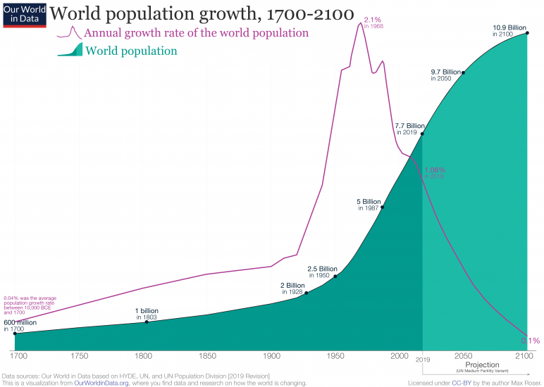
The chart shows the change of the total population since 1950 and from 2015 it shows the UN population projection until the end of the century.
This interactive visualization you can change to any other country or world region.
By switching to the map view you can explore the projection of the distribution of the global population.
As we see here, there is a significant fall in the population growth rate, particularly in the second half of the 21st century. Although the world population is still rising at the end of the century, it’s doing so very slowly. We would therefore expect growth to come to an end very soon after 2100.
In this projection the world population will be around 10.88 billion in 2100 and we would therefore expect ‘peak population’ to occur early in the 22nd century, at not much more than 10.88 billion.
The world is reaching ‘peak child’
Following decades of very fast population growth, there is often concern that population growth is out-of-control: that an end to growth is not in sight.
But we know this is not the case: population growth is slowing and will come to an end. How do we know? The moment in demographic history when the number of children in the world stops increasing is not far away. It is the moment that Hans Rosling famously called ‘peak child’ and it is pre-emptive of the moment in history when the population stops increasing.
Since 1950, the total number of children younger than 15 years of age increased rapidly, from 0.87 billion children to 1.98 billion today. The solid green and red lines in the visualization indicate the total number of children in the world. As we can see, we are not far away from the largest cohort of children that there will likely ever be. The world is approaching what the late Hans Rosling called “the age of peak child”.
The blue line shows the total world population – rising life expectancy and falling fertility rates mean that the world population of adults will increase while the number of children is stagnating.
This is an extraordinary moment in global history. In the past, child mortality was extremely high, and only two children per woman reached adulthood – if more had survived the population size would have not been stable. This also means that the extended family with many children, that we often associate with the past, was only a reality for glimpse in time. Only the few generations during the population boom lived in families with many children – before and after two children are the norm. The future will resemble our past, except that children are not dying, but are never born in the first place.
Between 1950 and today it was mostly a widening of the entire pyramid that was responsible for the increase of the world population. What is responsible for the increase of the world population from now on is not a widening of the the base, but a fill up of the population above the base. Not children will be added to the world population, but people in working age and old age. At a country level “peak child” is followed by a time in which the country benefits from a “demographic dividend”. The demographic structure of a country is reshaped so that the proportion of people in working age rises and that of the dependent young generation falls. The demographic dividend can result in a rise of productive contributions and a growing economy.1 Now there is reason to expect that the world as a whole benefits from a “demographic dividend”.
The big demographic transition that the world entered more than a century ago is coming to an end: Global population growth peaked half a century ago, the number of babies is reaching its peak, and the age profile of the women in the world is changing so that ‘population momentum’ is slowly losing its momentum. This is not to say that feeding and supporting a still rising world population will be easy, but we are certainly on the way to a new balance where it’s not high mortality keeping population growth in check, but low fertility rates.

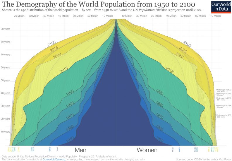
The past and future of the global age structure
In 1950 there were 2.5 billion people on the planet. Now in 2019, there are 7.7 billion. By the end of the century the UN expects a global population of 11.2 billion. This visualization of the population pyramid makes it possible to understand this enormous global transformation.
Population pyramids visualize the demographic structure of a population. The width represents the size of the population of a given age; women on the right and men to the left. The bottom layer represents the number of newborns and above it you find the numbers of older cohorts. Represented in this way the population structure of societies with high mortality rates resembled a pyramid – this is how this famous type of visualization got its name.
In the darkest blue you see the pyramid that represents the structure of the world population in 1950. Two factors are responsible for the pyramid shape in 1950: An increasing number of births broadened the base layer of the population pyramid and a continuously high risk of death throughout life is evident by the pyramid narrowing towards the top. There were many newborns relative to the number of people at older ages.
The narrowing of the pyramid just above the base is testimony to the fact that more than 1-in-5 children born in 1950 died before they reached the age of five.2
Through shades of blue and green the same visualization shows the population structure over the last decades up to 2018. You see that in each subsequent decade the population pyramid was fatter than before – in each decade more people of all ages were added to the world population.
If you look at the green pyramid for 2018 you see that the narrowing above the base is much less strong than back in 1950; the child mortality rate fell from 1-in-5 in 1950 to fewer than 1-in-20 today.
In comparing 1950 and 2018 we see that the number of children born has increased – 97 million in 1950 to 143 million today – and that the mortality of children decreased at the same time. If you now compare the base of the pyramid in 2018 with the projection for 2100 you see that the coming decades will not resemble the past: According to the projections there will be fewer children born at the end of this century than today. The base of the future population structure is narrower.
We are at a turning point in global population history. Between 1950 and today, it was a widening of the entire pyramid – an increase of the number of children – that was responsible for the increase of the world population. From now on is not a widening of the base, but a ‘fill up’ of the population above the base: the number of children will barely increase and then start to decline, but the number of people of working age and old age will increase very substantially. As global health is improving and mortality is falling, the people alive today are expected to live longer than any generation before us.
At a country level “peak child” is often followed by a time in which the country benefits from a “demographic dividend” when the proportion of the dependent young generation falls and the share of the population in working age increases.4
This is now happening at a global scale. For every child younger than 15 there were 1.8 people in working-age (15 to 64) in 1950; today there are 2.5; and by the end of the century there will be 3.4.5
Richer countries have benefited from this transition in the last decades and are now facing the demographic problem of an increasingly larger share of retired people that are not contributing to the labor market. In the coming decades it will be the poorer countries that can benefit from this demographic dividend.
The change from 1950 to today and the projections to 2100 show a world population that is becoming healthier. When the top of the pyramid becomes wider and looks less like a pyramid and instead becomes more box-shaped, the population lives through younger ages with very low risk of death and dies at an old age. The demographic structure of a healthy population at the final stage of the demographic transition is the box shape that we see for the entire world for 2100.
The Demography of the World Population from 1950 to 21003
The United Nations projects that world population growth will slow significantly over the course of the 21st century, coming close to its peak at 10.9 billion by 2100. But how is this growth distributed across the world? How does the world look in 2100 compared to today?
In this chart we see the global population split by region. This shows historical data, but also projections to 2100 based on the UN’s medium growth scenario.
The striking change between now and 2100 is the expected growth in the African population. Today, its population is around 1.3 billion; by 2100 it’s projected to more than triple to 4.3 billion.
Over the past 50 years Asia experienced rapid population growth. Today its population stands at around 4.6 billion. By 2050 it’s expected to rise to 5.3 billion, but then fall in the latter half of the century. You can read more about the driving force behind these demographic changes here. By 2100 Asia’s population is projected to fall almost back to levels we see today.
You can use the ‘relative’ toggle in the chart to see each region’s share of the world population. Here we see that today Africa has just over 17% of the global population; by 2100 this is projected to rise to 40%. Asia will see a significant fall from almost 60% today to just over 40% in 2100.
By the end of the century, more than 8 out of every 10 people in the world will live in Asia or Africa.
North, Central and South America, and Oceania, are projected to also see a rise in population this century – but this growth will be much more modest relative to growth in Africa. Europe is the only region where population is expected to fall – today its population stands at around 747 million; by 2100 this is projected to fall to 630 million.
These changes will bring new opportunities and challenges. Extreme poverty, for example, is expected to become increasingly concentrated in Africa in the decades which follow. This will represent a major shift from the century before.

China has been the world’s most populous country for a long time: back in 1750, it had a population of 225 million, around 28% of the world population.6
By 2016, China had a population larger than 1.4 billion.
But China is soon to be overtaken by India. In the chart below we see historic and projected population by country, spanning from 10,000 BCE through to 2100. The projections – made by the UN’s Population Division – suggest that by 2027, India will surpass China to become the world’s most populous country.
Projections are always associated with a degree of uncertainty and this means the crossing point could be a few years earlier or later. But even within this degree of uncertainty, it’s expected that India will become the most populous country within the next decade.
Rapidly declining fertility rates – from an average of 6 children down to 2.4 children per woman – in India means its population growth has fallen significantly over the last few decades. This means that while it will be the most populous country for the rest of the century, it’s expected to reach ‘peak population’ in the late 2050s at around 1.7 billion before slowly falling in the second half of the century.
What does the future population of other countries look like?
In the map below we see country populations across the world through to the year 2100. By clicking on any country you can see how its population has changed since 1950, and its projections over the 21st century.


Global population growth has slowed down markedly since the peak in the 1960s. This map shows the growth rate by country at the peak of global population growth in 1968.
By moving the time slider you can explore how growth rates around the world have changed over time

At the global level population growth is determined by the number of births and deaths.7 To understand the likely trajectory for population growth we need to examine how births and deaths are changing – and, one level deeper, what is happening to those factors which in turn affect them. Increasing life expectancy and falling child mortality in every country are of course increasing population numbers. The countervailing trend are falling fertility rates – the trend of couples having fewer children is what brought rapid population growth to an end in many countries already, and what will bring an end to rapid population growth globally. We are looking at all of these drivers separately.
In the entry on global population growth we are explaining how births, deaths, and migration are driving population growth. There we are also discussing the demographic transition as the central concept that explains why rapid population growth is a temporary phenomenon.
Births and deaths
The world population has grown rapidly, particularly over the past century: in 1900 there were fewer than 2 billion people on the planet; today there are 7.7 billion.
The change in the world population is determined by two metrics: the number of babies born, and the number of people dying.
The stacked area chart shows the number of births by world region from 1950 to 2015.
In 2015, there were approximately 140 million births – 43 million more than back in 1950
The line chart shows the same data, but also includes the UN projection until the end of the century. It is possible to switch this chart to any other country or world region in the world.


The first chart shows the annual number of deaths over the same period.
In 2015 around 55 million people died. The world population therefore increased by 84 million in that year (that is an increase of 1.14%).
The line chart shows the same data, but also includes the UN projection until the end of the century. Again it is possible to switch this chart to any other country or world region in the world.


How do we expect this to change in the coming decades? What does this mean for population growth?
Population projections show that the yearly number of births will remain at around 140 million per year over the coming decades. It is then expected to slowly decline in the second-half of the century. As the world population ages, the annual number of deaths is expected to continue to increase in the coming decades until it reaches a similar annual number as global births towards the end of the century.
As the number of births is expected to slowly fall and the number of deaths to rise the global population growth rate will continue to fall. This is when the world population will stop to increase in the future.
This view compares the number of annual births to the number of deaths.
From 2015 onwards it shows the UN Population Projections.
It is possible to change this view to any country or world region.

The visualization shows the total fertility rate – the number of children per woman – by the level of development and includes the UN projections through 2099.
The global average fertility rate was 5 children per woman until the end of the 1960s and has halved since then.
Until 1950, the fertility rate in the ‘more developed regions’ had already declined to less than 3 children per woman. Then, in the 1960s the fertility rate in the ‘less developed regions’ started to fall and another decade later the fertility rate in the ‘least developed regions’ followed this decline.

As health is rapidly improving around the world, life expectancy is also increasing rapidly. You can read more about life expectancy at the our life expectancy data entry.

Population growth comes to an end when fertility rates decline
In the past mortality rates were so high that they kept population growth in check. This is not the case in the 21st century.
This correlation is surprising to many: Child mortality is inversely correlated with population growth.
Where child mortality is high the population grows fast. A major reason for this correlation is that the fertility rate is high where child mortality is high. You find our research on this link here.

Where the fertility rate is high population growth is high.
Population growth comes to an end when fertility rates decline and we studied the reasons why fertility rates decline in detail in our entry on fertility rates.

The United Nations projects that global population will reach 9.7 billion people in 2050, and population growth almost coming to an end at 10.8 billion in 2100.
Should we believe these projections?
One way to gauge the credibility of UN projections for the future is to look back at its track record of predictions in the past.
Every few years the United Nations publishes its latest population statistics, covering historical and current estimates, and future projections. Each release of these statistics is called a revision, and allocated the year of publication (e.g. 1990 Revision). The latest revision in 2017 was the UN’s 25th publication.
In this chart we see comparison of various UN Revisions of world population, dating back to the 1968 publication. Shown as the solid line is the latest 2017 Revision, which we can consider to be the ‘actual’ population size up to 2015.
Here we see that although each revision provided different projections, most turned out to be relatively close. For example, it’s estimated that the global population in 1990 was 5.34 billion. Most projections were close to this value: even the earliest revision in 1968 projected a 1990 population of 5.44 billion.
In 2010, it’s estimated the global population was seven billion; previous projections were in the range of 6.8 to 7.2 billion. In 2015, the global population was estimated to be 7.4 billion; the 1990 Revision overestimated with a projection of 7.7 billion whilst the 1998 Revision underestimated at 7.2 billion.
Similar results are true for UN projections even earlier than the 1970s. Kielman (2001) looked at how UN projections from 1950 to 1995 matched with the actual population figures.8
Projections as far back as 1950 were remarkably close to the later estimates.
There are of course many factors which will influence the rate of population growth in the coming decades. Projections become increasingly uncertain (and tend to converge most) the further into the future they go. This means we’d expect higher uncertainty in projections for 2100 than those for 2050.
Future projections will continue to be refined over time. Nonetheless, the surprising accuracy of historical projections should give us confidence that although imperfect, UN population projections have usually turned out to be very close to the truth.

The UN projections
The most widely discussed projections are those published by the United Nations, the first of which were published already in 1951.
The UN projections are called ‘assessments’ and a new update is published in their World Population Prospects series every two years.
Shown here is the increase of the world population since 1750 combined with the latest projections of the UN Population Division.
The UN publishes several variants of their population projections:
- The Medium Variant is the projection that the UN researchers see as the most likely scenario. This is the source of the majority of projections shown here.
- The High- and Low-Variants are based on the Medium Variant and simply assume that the total fertility rates in each country are 0.5 higher and 0.5 lower than the Medium variant by the end of this century in every country.9
- The Constant Fertility Scenario is an illustrative scenario that plays out how the world population would change if fertility rates remained constant. It is obviously not intended to be a realistic scenario.

But there are also a number of other institutions that are preparing their own projections of the world population.
Global population projections are also published by the US Census, the Population Reference Bureau (PRB), and by the closely related Austrian research centers IIASA and the Wittgenstein Centre.
The World Bank also published projections for some time but has stopped doing so in the mid–90s.
- The WC-IIASA projections
- The size and structure of the world population under different educational scenarios
- Global demand for education: The population of school-age children
- Projections of the total population – UN vs IIASA-WC
- Fertility rate – UN vs IIASA-WC
- Population younger than 15: UN vs WC-IIASA
- Whether the world population will reach 10 billion will likely depend on Africa
- The world population by educational structure
The WC-IIASA projections
In this entry we are focusing mostly on the UN’s medium variant projections. But these are certainly not the only projections.
There are a range of projections for future population growth. These differ based on two key factors: the change in fertility rate and life expectancy over time.
All future projections of global population are uncertain. Much of the uncertainty comes from the fact that we do not know how the drivers of population growth will change. The key driver of population change in the 21st century is not mortality, but fertility, as we have seen earlier. And fertility rates are determined by a number of factors that change rapidly with development. If the world develops faster we can expect a smaller world population. Investments the world will make in those systems that determine mortality and fertility – most importantly in education, as we have just explored.
The WC-IIASA projections are a set of influential projections, published by IIASA and the Wittgenstein Centre,10 and are helpful to gauge how much smaller the world population will be if the world develops faster.
Their key difference to the UN projections are that they are scenarios – they tell us what happens tomorrow depending on what we do today. But there are other differences too.
The WC-IIASA projections differ from the work of the United Nations in a number of fundamental ways.11
The UN projections are taking into account the empirical data on each country’s demography and are building projections based on this quantitative information. In contrast to this the WC-IIASA projections are also taking into account the qualitative assessments of 550 demographers from around the world which the WC-IIASA researchers have surveyed to gather their ideas on how the population change in different parts of the world will play out. They then combine the country specific expertise of these researchers with similar quantitative information that the UN and others rely on as well.12 The work by WC-IIASA is highly respected among demographers and key publications by the researchers are regularly published in the scientific journal Nature.13
The WC-IIASA projections are taking into account the demographic structure of the educational attainment of the population. While other projections are only structuring the demographic data by sex and age-group, the WC-IIASA data is additionally breaking down the population data by the level of highest educational attainment of different parts of the population. This information on educational attainment is then used for both the output of the model – so that population projections for each country of the world by highest educational attainment are available (also on Our World in Data). And crucially the information on education is also used as an an input into the model, so that the impact of different future scenarios for education on both mortality and fertility can be modeled explicitly.
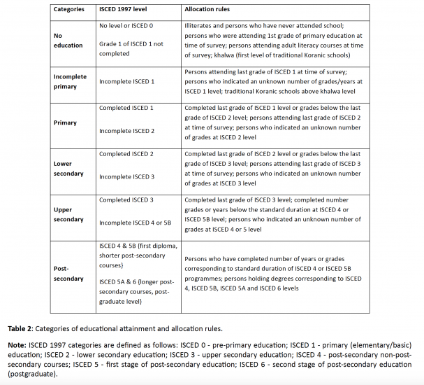
The level of highest educational attainment is categorized in a system that aims to capture the structure of populations across the different country-specific educational systems. These categorizations are based on the the International Standard Classification of Education (ISCED), which was designed by the UNESCO to make education statistics comparable across countries. WC-IIASA breaks down the educational structure into the following 6 categories and the table summarizes how the six categories are defined, how they correspond to ISCED 1997, and the main allocation rules the researchers used.
For children younger than 15 years old no educational attainment information is available as most of them are still in the process of education.
Categories of educational attainment used by IIASA-WC and how they correspond to the ISCED levels14
Projections of the global population take into account how the fertility rate will change in each country over the coming decades. The WC-IIASA projections are particularly helpful for the discussion here as they are the only projections that break down the demographic projections by the educational level of the populations and then model how different educational scenarios would affect the fertility rate in countries across the world. This then allows comparisons of how education matters for the size and distribution of the future population of the planet.
The researchers developed 4 different basic scenarios and a larger number of combinations based on these scenarios:
Constant Enrollment Numbers (CEN): This is the researcher’s most pessimistic scenario. Here it is assumed that no more schools are being opened in any place in the world so that the absolute number of people reaching a particular educational level is frozen at the current number. This means that enrollment rates are declining when the population size increases.
In practice the WC-IIASA researchers almost always consider CER as the most pessimistic scenario and only rarely discuss CEN.
Constant Enrollment Rates (CER): This is another pessimistic scenario. While in the CEN scenario the absolute number of enrolled students stagnates, the assumption in the CER scenario is that the rate of enrollment stagnates. In this scenario the most recently observed rates of educational enrollment are frozen at their current rate and no further improvement in enrollment is assumed.
This will still result in further improvements of adult education because in many countries the younger cohorts are better educated than the older ones. But in the longer run this scenario also implies stagnation.
Fast Track (FT): This scenario is the most optimistic one and here it is assumed that countries follow the most rapid education expansion achieved in recent history which is that of South Korea.
Global Education Trend (GET): This is the middle scenario and here the researchers assume that countries will follow the average path of educational expansion that other countries already further advanced in this process have experienced. In this scenario the researchers project the medium future trajectory based on the experience of all countries over the past 40 years
The researchers write: “The GET scenario is moderately optimistic, and can be considered as the most likely.”15
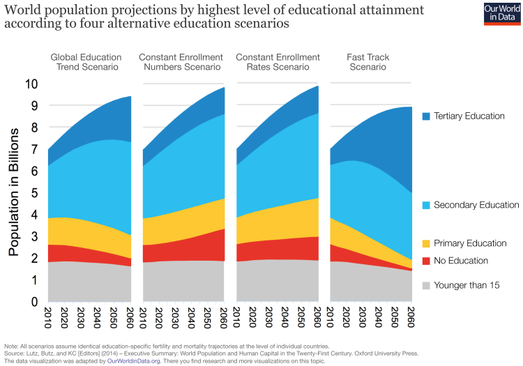
The size and structure of the world population under different educational scenarios
Now we can see how the size of the total world population and the educational achievements of this population will evolve under these four scenarios.
In this visualization we see that how fast education will become available in the short term will matter very substantially for the size of the world population in the longer-term – even for the evolution of world population over the next 5 decades.
By 2060 the world population is projected to reach 9.8 billion under the Constant Enrollment Rates (CER) scenario, which is pessimistic about improvements in global education. If we assume optimistic progress in global education, as in the Fast Track (FT) scenario, then global population is projected to increase to only 8.9 billion. A difference of almost one billion – as early as 2060 – may therefore be solely driven by differences in progress on global education.
This finding – alternative education scenarios alone make a difference of one billion for the global population over such a short time-frame – is discussed in more detail in a publication in Science by Lutz and KC (2011).16
While the differences between the educational scenarios are slow to materialize and only show up after some decades,17 they are then very substantial and matter hugely for the size of the future world population. Whether or not the world is making fast progress in making education available to more children faster will matter for the size of the global population in just a few decades.
World population projections by highest level of educational attainment according to four alternative education scenarios18
Global demand for education: The population of school-age children
And the size of the cohort of school children in turn, will of course matter how easy or hard it is to make education available for all. Let’s see how different possible scenarios in educational improvements matter for ‘peak child’ and the size of the population in school age.
For this we rely on scenarios of the WC-IIASA researchers which differ only in the assumptions on educational attainment.19
The visualization below shows the three projections of the size of the population of school-age-children until the end of this century:
- According to the projection of the pessimistic Constant Enrollment Scenario the population younger than 15 will evolve similarly to the Medium Variant projection of the UN: the number of children will continue to increase slowly and reach a plateau in the mid-21st century before the population will decline to a size similar to today’s population of under-15-year-olds.
- The medium projection of WC-IIASA – the projections they see as most likely – substantially differs from the UN’s Medium projection: In the most likely scenario – Global Education Trends (GET), which the WC-IIASA researchers see as a continuation of the recent educational trends – the size of the population younger than 15 will soon start to fall and at the end of the century the population of under-15-year-olds will be one-third smaller than today! According to this middle-of-the-road scenario by WC-IIASA the world is very close to ‘child peak’.
- Even faster will be the decline in the Fast Track scenario. If the world can achieve such a rapid expansion of education, then the size of the population of under-15-year-olds is projected to fall and decline to just one billion in 2100 (almost the same level as 1950).
What this comparison of scenarios shows us is that the size of the global population younger than 15 – the upper bound for the global demand for education – will very much depend on how rapidly access to education can be extended.20
A larger increase in the educational attainment in the short-run will mean that the size of cohorts that need investments in the long-run will be much smaller: The difference between no further improvements in the educational enrollment (CER scenario) and a continuation of the successful last decades will mean that the global population of under-15-year-olds will be half a billion smaller at the end of the century. An acceleration to the Fast Track (FT) scenario would mean that this global figure is again smaller by yet another 200 million children.

Projections of the total population – UN vs IIASA-WC
So far we have looked at the total figures for the global population. What we have not yet taken into account is how the size of the population will evolve in different regions and countries of the world.
The Medium Variant of the UN projections for all world regions until the end of this century is shown in this chart. Changes to the population size of the Americas, Oceania, and Europe are very small compared to the large expected changes in Asia and Africa. The UN expects the population of Africa to increase 3.3-fold – from 1.3 billion in 2019 to 4.28 billion by the end of the century. The population of Africa then will be as large as the population of Asia today, and the rate of this increase in the coming decades will also be very similar to the rate of population growth in Asia over the last few decades (Asia’s population increased from 1.4 billion in 1950 to 4.6 billion today).
For Asia, the UN projects an increase only until the mid-21st century when population is projected to plateau around 5.3 billion. In the second half of the 21st century, the demographers foresee a decline of the Asian population to less than 5 billion by 2100.

This visualization shows in contrast the projections of the WC-IIASA researchers. Again the projected changes in the Americas, Oceania, and Europe are modest compared to changes in Africa and Asia.
For Asia, this medium scenario by WC-IIASA projects an evolution that is very similar to the UN projection: The population will increase until the mid-21st century when the population plateaus (on a slightly lower level than in the UN projections) and then falls to well below 5 billion until the year 2100.
The big difference is Africa: While the UN projects that the population of Africa will increase 3.5-fold, the WC-IIASA researchers expect only a doubling. The demographers expect the African population to stay well below 3 billion, with population growth almost coming to a halt at the end of this century.
The projections by education scenario can be seen in this chart.

Fertility rate – UN vs IIASA-WC
As we have seen above, the crucial variable for how the world population will evolve is the total fertility rate: the number of children per woman. Let’s see how this crucial variable is projected to evolve.
There is some uncertainty about the level of the fertility rate today in some countries with poorer coverage of demographic statistics. This discrepancy in estimates today is also obvious in the comparison of the UN and WC-IIASA, where the UN mostly assumes that fertility rates today are higher than those assumed by WC-IIASA.
For the development over the next century however the changes over time are more fundamental. So let’s see what the projections of the UN and WC-IIASA entail.
The UN series shows that until 1966 women around the world had more than 5 children on average. Since then the fertility rate has halved and is now just below 2.5 children per woman. The UN projects that the fertility rate will further decline to 2.1 in 2070 and by the end of the century the fertility rate will fall below 2. A global fertility rate of 1.93 then would imply a decline of the global population over the long run.
In Africa the fertility rate only fell below 5 in 2005 – four decades later than the global average. For the 21st century the UN Medium Variant projects a slow decline of the fertility rate in Africa to 2.1 children per woman until the end of the century.

In their medium scenario – SSP2 with the GET assumptions on global education – the researchers project a much faster decline of the fertility rate than the UN. As early as the 2050s, the fertility rate will fall below 2 and by the end of the century will be 1.68 children per woman.
Africa too will reach a fertility rate below 2 by the 2070s under the medium assumptions – you can add the projections for Africa by clicking the option “add projection” below the chart.
Interestingly the projections for the total fertility rate under the pessimistic Constant Enrollment Rates (CER) scenario are again very similar to the UN Medium projection. Under this scenario the WC-IIASA researchers project a global fertility rate just below 2 and a fertility rate for Africa just above 2. The pessimistic scenario of WC-IIASA is similar to the UN Medium projection, and all of the more optimistic WC-IIASA scenarios imply lower fertility rates. In these optimistic scenarios, the global population is therefore significantly smaller at the end of the century, with smaller cohorts of school-age children throughout this period.
In past decades UN demographers have been consistently too pessimistic in their projections of the global fertility rates as we show in our assessment of the past UN projections.

Population younger than 15: UN vs WC-IIASA
To see how the number of children in school age will evolve in different parts of the world, below we look at the population younger than 15 in all world regions separately and again compare the projections by the UN with those by WC-IIASA researchers.
Shown below are the UN projections until the year 2100. Again, note the familiar picture of stagnating population sizes in Oceania, the Americas, and Europe. Due to the low fertility rates in Asia, the UN projects a substantial decrease in the number of under-15-year-olds over the coming decades, falling from 1.1 billion today to just under 0.7 billion by 2100.
For Africa the UN projects an increase from 0.5 billion under-15-year-olds today to a peak of almost 1 billion in the 2090s when the number of children at school age is projected to start to decline.

Now let us compare this with the projection of the world population by world region according to the medium projection of WC-IIASA – the SSP2 scenario with the GET assumption on global educational improvements.
For Asia the researchers project an even more substantial decline to just over half a billion in the year 2100.
An even more substantial difference is projected for Africa where they project that the increase of the school-age population comes to an end below 600 million as early as 2050. By the end of the century the researchers expect a population of under-15-year-olds that is barely larger than today.

Whether the world population will reach 10 billion will likely depend on Africa
What we have seen in the different projections of future global population is that future population growth in Africa is the most influential and contentious question. What happens in Africa now and in the coming decades will determine what size and structure the global population will have at the end of the century.21
There is considerable disagreement between UN and WC-IIASA projections. Even the medium projections vary significantly between the two institutions: The UN projects a population of 4.5 billion while WC-IIASA projects a population of only 2.6 billion. This difference of 2 billion is just as large as the difference between the projection for the global population by the UN (11.2 billion in 2100) and WC-IIASA (8.9 billion in 2100). Whether the world population increases to more than 10 billion will be decided by the speed with which Africa develops – especially how quickly women get access to better education, women’s opportunities within the job market, and how rapidly the improvements in child health continue.
This also matters significantly for some particular countries: For example, in Nigeria (currently a population of 190 million) the UN projects a population of 794 million at the end of the century. WC-IIASA, however, projects the population to be more than 25 percent smaller at 576 million.
Currently the total fertility rate in Africa still stands at 4.4 children per woman, according to the UN. It took 42 years (from 1972 to 2014) for global fertility to fall from 4.5 to 2.5 children. The UN projects that for Africa it will take longer than that – 56 years (from 2016 to 2072) – while the WC-IIASA researchers project a faster decline.
There are reasons to be optimistic that Africa could develop faster than the projections of the UN assume:
We know that falling mortality is associated with a decline of fertility. And health in Africa is improving rapidly:
– The child mortality rate in Africa has halved over the last two decades.
– HIV/AIDS is still a serious threat, but the epidemic is past its peak and the incidence rate in Sub-Saharan Africa has fallen by two thirds in the last 2 decades.
– Malaria too is in steep decline and the annual number of deaths has almost halved in just the last 15 years.
– Crucially, education has also changed substantially across Africa: The young generation is much better educated than older generations and the share of children out of school is falling rapidly.
– After decades of stagnation in many parts of Africa, economies across the continent are now growing and the share of the population in extreme poverty is now falling.
If you want to see more on how Africa is changing have a look at our slide show at AfricaInData.org.
Still, living conditions in most parts of the African continent are very poor and it would be too early to say that the changes that we are seeing now are foreshadowing the improvements which will lower fertility rates more rapidly. This will be determined only in the coming years, and the quantity and quality of education will be crucial as the visualization below shows. How quickly global population growth will slow will be decided by the chance of girls to go to school and the chances they have in life afterwards.

The world population by educational structure
What will be the result of these global demographic changes according to the WC-IIASA demographers? The middle scenario by WC-IIASA for the educational structure of the world population is shown in this chart here.
We already know that the future population will be better educated than today’s population because in the vast majority of countries the younger cohorts are much better educated than the older cohorts.22
The projection also shows that we will likely not see a rapid increase in the number of children in the world – we are likely not quite there yet, but the world is close to ‘peak child’.
‘Peak child’ is a historic turning point in global demographic history – after two centuries of rapid global population growth it will bring about the end of this era. And from the discussion of the various scenarios for the coming years we know that faster development – the access to education for women in particular and further improvements of child health are especially important – will mean that we are even closer to ‘peak child’.
