In 2017, 9.6 million people are estimated to have died from the various forms of cancer. Every sixth death in the world is due to cancer, making it the second leading cause of death – second only to cardiovascular diseases.1
Progress against many other causes of deaths and demographic drivers of increasing population size, life expectancy and — particularly in higher-income countries — aging populations mean that the total number of cancer deaths continues to increase. This is a very personal topic to many: nearly everyone knows or has lost someone dear to them from this collection of diseases.
Summary
- Cancer is one of the leading causes of death.
- Almost half – 46% in 2017 – of all people who die from cancer are 70 or older.
- As the world population is growing and aging the global number of cancer deaths is increasing.
- Adjusted for the increase and aging of the world population the rate of cancer deaths has declined slowly – the same is true for many countries. The world is making very slow progress.
- Lung cancer kills most people and smoking is largely to blame. As the share of smokers is declining the rate of lung cancer deaths is following.
- Cancer death rates for US over the last century show that we are slowly making progress against a number of different cancers.
- Five-year survival rates are rising in the US.
- Cancer survival rates differ strongly between different countries across the world.
- Cancer survival rates often much lower in poorer countries.
All our charts on Cancer
Cancers are defined by the National Cancer Institute as a collection of diseases in which abnormal cells can divide and spread to nearby tissue. Cancers can arise in many parts of the body – leading to a range of cancer types, as shown below – and in some cases spread to other parts of the body through the blood and lymph systems. In this entry we provide an overview of all types of cancer.
Cancer is one of the world’s largest health problems. The Global Burden of Disease estimates that 9.56 million people died prematurely as a result of cancer in 2017. Every sixth death in the world is due to cancer.2
The Global Burden of Disease is a major global study on the causes and risk factors for death and disease published in the medical journal The Lancet.3
Cancer is a particularly common cause of death in richer countries where people are less likely do die of infectious diseases and causes of deaths that lead to very early deaths for people in poverty.
The chart is shown for the global total, but can be explored for any country or region using the “change country” toggle. Switching to one of the richer countries shows that the share of deaths attributed to cancer is higher.
Because cancer is one of the leading causes of death, it is one of the world’s most pressing problems to make progress against this disease.

Deaths from cancer
In the chart we see the total number of deaths in 2017 attributed to the range of different cancers.
The group of tracheal, bronchus, and lung cancers claimed the largest number of lives – 1.9 million in 2017. Next follow colon and rectum, stomach and liver cancer, all claiming between 800,000 and 900,000 globally in 2017.
This chart also allows exploring deaths by country (click ‘change country’ at the bottom of the chart).
In exploring patterns across various countries, we see that tracheal, bronchus, and lung cancer is the leading form of cancer deaths across most high and middle-income countries. However, the leading form in lower income countries varies: colon and rectum; liver; cervical; stomach; breast and prostrate all top the list in several countries.

Cancer deaths by age
How are cancer deaths distributed across age groups? And how did this change over time?
In the first chart we see the breakdown of total cancer deaths by broad age category, ranging from under-5s to those over 70 years old.
Almost half – 46% in 2017 – of all people who die from cancer are 70 or older. Another 41 percent are between 50 and 69 years old – so that 87% of all cancer victims are older than 50 years.
The distribution of deaths across the age spectrum has changed notably since 1990. The share of deaths which occur in those aged over 70 has increased by 8 percentage points, whilst the share in those aged 50-69 and 15-49 has fallen.
Collectively, children and adolescents under 14 years old account for around one percent of cancer deaths — this equates to around 110,000 children per year.
The second chart shows the death rate – the number of cancer deaths of people in a certain age group per 100,000 people of the same age group. Of the people who are 70 years and older more than 1% (i.e. more than 1000 per 100,000) die from cancer each year.


What is the prevalence of cancers across the world’s population?
The charts here provide data on the share of a given population with any form of cancer. This is first shown collectively across all cancer types, followed by breakdown by cancer type.
The map shows that we tend to see a higher prevalence of cancer in higher-income countries.
Prevalence of cancer ranges from approximately 5.5 percent of the population in the US down to around 0.4 percent in the countries shown in light yellow.
Globally the share of people with cancer reached 1.3% in 2017.
Related chart – the number of people with cancer: This map shows the total number of people with cancer across all countries of the world.

When broken down by type of cancer we see that breast cancer is globally the most prevalent form. Following breast cancer are prostrate and colon & rectum cancer.
When you change this chart to another country you see that across most countries these are the top three cancer forms.
Related chart – the number of people with cancer, by type: This chart shows the numbers of people with different types of cancer. As we explored above, the prevalence of breast cancer is highest globally; an estimated 17 million had breast cancer in 2017. 10 million had prostate cancer; and 9 million had colon & rectum cancer.

Cancer prevalence by age
We see that globally the majority of cancers occur in older populations. Approximately 70% of cancer cases occur in those aged over 50.
The chart shows that in 2017, 43 percent were aged between 50 and 69 and 27 percent were over 70 years old.
Around five percent of global cancers occur in children and adolescents younger than 15. These are predominantly childhood cancers within the group of leukemia.

This bar chart compares the prevalence across ages.
Globally 6% of those over 70 years had cancer in 2017. Of the population younger than 50 the prevalence is well under 1% globally.
In all these charts it is possible to switch to any other country: In the US more than 20% of people older than 70 years are living with cancer according to the estimates of the Global Burden of Disease shown here. In Spain it is 9%.

The global disease burden from cancer
Death rates only capture the mortality of cancer. However, the impact of cancer on people’s lives is more than that. Many live with cancer for long periods and it is important to also capture the morbidity caused by cancer.
The Disability-Adjusted Life Year (DALY) is a metric that captures the total burden of disease – both from years of life lost due to premature death and from years lived with the disease. One DALY equals one lost year of healthy life.
The map shows DALYs from cancers, measured per 100,000 individuals. This is age-standardized to allow comparisons between countries and over time. This is measured across all cancer types.
Also shown are disease burden rates broken down by cancer types. We see that at a global level, the largest burden results from tracheal, bronchus and lung cancer, followed by liver, stomach, colon & rectum, and breast cancer.
Extending the timeline of this chart shows how the disease burden has changed for each type of cancer.


Almost ten million people die from cancer every year. It is the cause of every sixth death.
It is one of the largest health problems in the world. How is cancer mortality changing over time?
Three different measures allow us to understand how the mortality of cancer has changed: the number of deaths, the death rate, and the age-standardized death rate. A comparison of how these three measures have changed is shown in the visualization.
Let’s look at what we can learn from each of these.
The number of cancer deaths increased by 66%
More people than ever before die from cancer – 9.6 million in the latest data from 2017.
In 1990, 5.7 million people died from cancer. This means we have seen a 66% increase in the global number of cancer deaths. This increase is what the green line in the visualization shows.
The death rate from cancer increased by 17%
But in a world with more people, we would expect more people to die. As the world population is growing the total number of deaths is rising – since 1990, the number of deaths increased from 46 million to 56 million per year.
This of course means that the number of people who did not die of cancer has also increased. To assess whether we are making progress against cancer we cannot rely on the absolute number of deaths alone. It does not account for the increase of the world population.
This is why health statisticians study the number of deaths relative to the size of the population – the death rate. It is measured as the number of cancer deaths per 100,000 people.
The red line in the chart shows that the death rate from cancer has increased by 17% since 1990. This tells us that if the world population had not increased, then instead of the number of cancer deaths increasing by 66% (as we saw above), they would only have increased by 17%. Only a quarter as much.
The difference between the steep rise in the number of deaths and the slower rise of the death rate is due to the increase of the global population.
The age-standardized death rate from cancer declined by 15%
Cancer kills mostly older people – as the death rate by age shows, of those who are 70 years and older, 1% die from cancer every year. For people who are younger than 50, the cancer death rate is more than 40-times lower (more detail here).
We would therefore expect that many more people die from cancer in an old population than in a young population. Because health is improving and fertility rates are falling, the world is aging rapidly. This impacts the change over time that we are interested in: historically, fewer died from cancer because larger parts of the population died before they reached the age when cancer becomes a common cause of death.
Epidemiologists correct for changes in age-profile over time by relying on the so called ‘age-standardized death rate’. This metric tells us what the death rate would be if the age structure of the population had stayed the same over time and would be the same across countries.4
Once we correct for both population changes and aging we get the blue line in the visualization: the age-standardized death rate from cancer. Globally this has fallen by 15% since 1990.

The comparison of these three metrics shows that the rise in global cancer deaths is driven by two demographic changes: population growth and population aging.
Adjusted for demographic changes we find that the age-standardized death rate from cancer has fallen by 15% since 1990.
If you are interested in a particular country you can explore the IHME estimates for all countries in the world by using the “Change country” option in the chart. Cancer survival rates are higher in richer countries and many of these countries have achieved most progress: In the US and Germany the age-standardized cancer death rate has fallen by 20%; in France by 25%; and in Italy by 28%.
That the world is slowly making progress is also consistent with two other big trends we have studied before.
Almost a quarter of all cancer deaths are due to smoking. Since smoking rates are declining across the world (especially rapidly in rich countries where smoking was very common in the past), we see a strong decline of death rates from lung cancer rates in many countries.
Secondly, as we have shown here, the 5-year survival rates for cancers are increasing, and the research we covered suggests that this is due to both earlier detection of cancers and better treatment that increased survival.
Given the fact that cancer is one of the world’s largest health problems, a 15% improvement in 27 years does not represent roaring success. But it does show that the world is making slow progress against it.
The age-standardized death rate from all cancer types are shown in this visualization.
The global trend shows what we have seen in the previous section: while the number of cancer deaths is increasing, individual death rates are falling. In 1990, 143 people out of every 100,000 died from cancer globally — by 2017 this had fallen to 121 per 100,000.
It is possible to switch this chart to the map view. This shows that in 2017, most countries have age-standardized death rates of 50 to 150 deaths per 100,000 individuals.

For the purposes of assessing the total incidence of cancer, in the chart above we grouped all cancer types together to look at overall trends. However, death rates and progress in reducing mortality incidence varies across the many forms of cancer. In the chart we see the individual age-standardized death rates across cancer types. This is again measured as the number of deaths per 100,000 individuals.
As we would expect from the leading cause of cancer deaths, rates in tracheal, bronchus and lung cancer are highest globally at 24 per 100,000. This has fallen slightly from 26 per 100,000 in the early 1990s, with even greater declines in some countries (in the US, rates have fallen from 47 to 34 per 100,000).
The death rate from stomach cancer has fallen substantially – from 19 per 100,000 in 1990 to 11 per 100,000 in 2017 – and contributed to much of the slow global progress against cancer mortality.
In some cases we have seen dramatic declines over the last few decades. For some, such as stomach cancer there has been notable progress — declining from 19 to 11 deaths per 100,000.

The number of cancer deaths is increasing as the world population is growing and aging
The number of cancer deaths has increased from around 5.7 million in 1990 to 8.8 million in 2017 as this chart shows.
As we just saw, this is happening for two big reasons: The first one is that the world population is increasing and with it the number of annual deaths. In 1990 49 Million people died and since then the number of total deaths has increased by more than 7 Million – as this chart shows.
The second big reason is that the world made rapid progress against causes of death that once killed people early in life – especially infectious diseases. [See our entry on causes of death for more information.] This means that the world population is aging and more people are dying of causes that kill people at an older age, like cancer.
Because the world is getting richer and fewer are dying an early death we can expect the number of people dying from cancer to increase further.

This chart shows death rates from lung cancer in men in the US and Spain since 1950. It is possible to add many more countries to this chart.
In many countries we see a significant rise, peak and then decline in lung cancer death rates in the 20th century. In the United States, the death rate peaked in the 1980s in men. In Spain this peak was later, only in the 1990s.
These trends are driven by the trends in smoking. The other chart shows the sales of cigarettes per person. Smoking is the biggest risk factor for lung cancer and we see that the trends in lung cancer follow those in smoking with a lag of around 20 years.
In 2017 7 Million people globally died a premature death because of smoking. The fact that smoking causes lung cancer is the major reason for the high death toll of smoking.
It is possible to add the data to lung cancer in women in the US to this chart. In the US it was once much more common for men to smoke so that the peaks of lung cancer for men are much higher. Smoking became more common for women only later so that lung cancer death rates for women peaked later.


The world map shows the Global Burden of Disease estimates of the share of cancer deaths that can be attributed to smoking.
Globally more than one in five cancer deaths (22% in 2016) are attributed to smoking – switch to the chart tab to see the global estimate.
In most richer countries the share is higher – the average in high income countries is 28% in 2016.
In poor countries, where fewer people were smoking in the past, tobacco is responsible for a much smaller faction of cancer deaths.

This charts provides a long run perspective on cancer death rates, from 1930 in the United States.
In orange we see again the pronounced peaks for lung cancers in men and then later in women.
For many other forms of cancer the age-standardized death rates show a long-term decline:
- Breast cancer death rates started falling in the early 1990s.
- The death rate for prostate increased until the mid 90s and then started to decline sharply.
- Colon and rectum cancers declined over the last decades in both men and women.
- Pancreas cancer and leukemia increased until the 1970s and then remained at around the same level.
- Uterus, liver, and stomach cancers declined continuously over this 80 year period.

Cancer survival rates
Global cancer deaths are rising: in 1990 5.7 million died from cancer; by 2016 this had increased to 8.9 million. But it’s also true that the world today has more people, and more older people, who are more likely to die from cancer. To understand what is happening we therefore have to correct for the population increase and ask for the rate – the number of deaths per 100,000 people – and we have to adjust for ageing.
When we compare these metrics (shown here) we see that age-standardized cancer death rates are falling globally. Death rates which correct for ageing show a 17 percent decline from 1990 to 2016.
Why are cancer death rates falling? One hypothesis is that cancer prevalence is falling (i.e. less people have cancer). Is this true?
Globally, no. The share of people with cancer (even when corrected for ageing) has been slowly increasing in recent decades. Global cancer prevalence has risen from 0.54 percent to 0.64 percent since 1990 (largely due to smoking). In some countries – the US, for example – the age-corrected prevalence has been fairly constant in recent decades (with the rate of new cases actually falling).
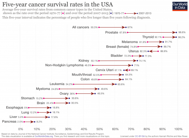
If death rates are falling but prevalence is rising or constant, then it must be the case that people with cancer have better or longer survival rates. We see this clearly in the USA when we look at the change in five-year survival rates across cancer types. This is shown in the chart as the change from 1970-77 to 2007-2013.
Here we see that on aggregate five-year survival rates for all cancers increased from 50.3 to 67 percent. But we also see significant differences not only in start or end survival rates, but the change over time. Prostate cancer has close to 99 percent five-year survival, but has also seen major progress from a rate of 69 percent in the 1970s. In contrast, pancreas has low five-year survival rates at 8.2 percent, up from 2.5 percent.
There are two key factors which could contribute to improved five-year survival rates: earlier detection and/or improved treatment. Defining the exact attribution of each is difficult, and varies depending on cancer type. But there have been some studies which have attempted to do so. Scott Alexander published a very good overview of the relative impact of detection versus treatment here.
One way to test whether survival rates only increased from early diagnosis is to look at how survival has changed for each stage of cancer: if detection was the only improvement then we would see no increase in survival rates in later cancer stages. National cancer statistics published by the US government show increases in survival rate within all stages (from very early to late-stage).5
Other studies focused on specific cancer types show similar results.6
Tumours have gotten smaller in recent decades – the result of earlier detection. Studies have shown that this can account for a significant share of survival improvements: one study attributed early detection as 61 percent and 28 percent of improved survival in localized-stage and regional-stage breast cancer, respectively7 But even when correcting for size and early detection, we have seen improvements.
This suggests better treatment has played a role too.
In both detection and treatment, we’re seeing progress. This is important because of the large toll of cancer: Globally every sixth death is due to cancer – this makes it the world’s second largest cause of death. Progress here is important for many.
–
Interactive chart: The same data shown in the chart can be viewed and downloaded in this interactive here. Cancer survival rates in the US by race can be seen here.
Cancer survival rates across the world
In this charts, we provide the widest coverage across countries of five-year survival rates by cancer type.
This data was published in the The Lancet in 2015 by Allemani et al.8
You can explore the range of countries using the “Change country” selection in the interactive chart.

The three maps below show how the five-year survival rates for lung, breast and liver cancer vary across the world. This data is again from Allemani et al. 2015 Lancet paper.9
In lung cancer Japan has the highest five-year survival rates at approximately 30 percent.
In contrast to this only 7% of lung cancer patients are alive five years after diagnosis in Chile, Bulgaria and Mongolia.

In breast cancer, higher income countries in particular across North America, Europe and Oceania tend to have five-year survival rates over 80 percent in 2009.
This is almost double that of the lowest nation with available data in 2009 – Jordan – at only 43 percent. A decade earlier the survival rate in Algeria was as low as 17%.

Compared to breast cancer the five year survival rates for liver cancer are much lower around he world.
The lowest survival rate in 2009 was in Romania with just 2.3%. In Japan the chance to survive for five years was more than 10-times higher: 27% in 2009.

In these two charts we see that the five-year survival rates – following diagnosis – are lower in poorer countries.
Especially for breast cancer survival rates are lower in poorer countries. In high income countries survival rates are above 80% while in many poor countries it is well below 80% or even 60%.
The relationship between lung cancer survival rate and average is less strong. There is significant variability in five-year survival rates between countries of a similar income, but the lowest survival rates are again reported from the poorest countries.


Are cancers caused by genetic or external factors?
Are cancers caused by genetic factors, or determined by external factors such as behavioral, lifestyle and environmental exposure?
The relative contribution of genetic factors (DNA replication and tissue type) versus external exposure has been a dominant topic within cancer research. The outcomes of such studies are highly important — if genetic factors are found to be dominant then early detection and understanding of the relative vulnerability of different DNA and tissue variations arguably present the best opportunity to reduce cancer burden. In contrast, if external and environmental risk factors dominate, then lifestyle choice which reduces risk exposure is crucial for this reduction.
In a 2015 paper Cristian Tomasetti and Bert Vogelstein, published in Science, the authors conclude that only one-third of cancers are attributable to environmental factors or inherited predispositions; the vast majority result from “bad luck” – random mutations which can occur when DNA replicates in normal non-cancerous cells.10
This study therefore argued that, beyond some cancer types which are deterministic (D-tumors) and can be reduced through lifestyle factors or vaccines, the most promising approach to reduction of cancer deaths across most cancers (replicative, R-tumors) is early detection.
This paper has been highly contest within the scientific literature. A number of later publications in Science provided a rebuttal to these conclusions, suggesting analytical flaws in the prior analysis, and epidemiological evidence which suggests otherwise.11
Such studies have argue that the role of ‘chance’ in cancer development was overstated by Tomasetti and Vogelstein, and the role of environmental exposures was understated. Wu et al. (2016) published a study in Nature which concluded that intrinsic factors (which relates to the ‘bad luck’ DNA replication) account for less than 10-30 percent of cancer development, with the majority resulting from extrinsic risk factors.12
The Global Burden of Disease (GBD) study attempt — using risk-exposure relationships — to provide attribution of certain risk factors to disease burden and mortality outcomes.13 These risk factors include a wide range, including smoking, diet and nutrition, obesity, alcohol intake, air pollution, & environmental exposures to carcinogens.
In the chart we see IHME estimates of the share of global cancer deaths which are attributed to one of these major risk factors. For example, 84 percent of tracheal, bronchus and lung cancer deaths are attributed to risk factors such as smoking and air pollution. The remaining share of deaths we would therefore assume no attribution to risk factors, and would occur naturally in the absence of such risks (i.e. deaths from lung cancer which would result if no one smoked, zero air pollution etc.).14

Cancer by income, poverty and inequality level of the country
Whilst cancer prevalence shows a positive relationship to income, death rates from cancer incorporate several factors: cancer prevalence, detection and treatment. When we compare cancer death rates across income we see no strong relationship between these measures.
There is also no correlation between the level of income inequality in a country and the cancer death rate.

In this entry we define cancer deaths in three fundamental ways:
- Absolute (total) number of cancer deaths;
- Cancer death rate: this reports the number of deaths per 100,000 individuals within a given population;
- Age-standardized death rate: this reports the number of deaths per 100,000 individuals assuming a constant and consistent age-structure of population between countries and across time.
These measures vary in the information they provide. Absolute (total) number of cancer deaths & prevalence figures provide an important indication of the total cancer burden within a given country or society. This is an important metric for a number of reasons, including the need for management and provision of adequate health services (which is dependent on the total societal burden, not just the incidence or risk for a given individual).
However, total number of cancer deaths fails to correct for population size and age. Cancer deaths can therefore rise as a result of higher cancer prevalence and/or poorer treatment, but also due to an increase in total population or an aging population. Cancer death rates correct for changes in population size, age-standardized death rates correct for population size and age structure. Age-standardization therefore gives a more indicative measure of the prevalence and incidence of underlying cancer risk factors between countries and with time without the influence of demographic and population structure changes.
- Data: Death rates, absolute number of deaths and DALYS across all cancer types
- Geographical coverage:Global, across all regions and countries
- Time span:Most metrics available from 1990 onwards
- Available at: Online here
- Data: Cancer incidence and mortality of major types of cancer by sex
- Geographical coverage: Approx. 180 countries
- Time span: 1950-2002
- Available at: IARC and WHO’s Globocan 2012 website, and at Gapminder.org
- On Gapminder, search for “cancer” in the search box to find the data files.
- Data: Cancer mortality and incidence for over 30 types of cancers by race/ethnicity, sex and age
- Geographical coverage: United States
- Time span: 1975-2010
- Available at: SEER Cancer Statistics Review website