You can download our complete Our World in Data CO2 and Greenhouse Gas Emissions database.
What drives, and ultimately determines levels of CO2 emissions – whether at global; regional; national or local levels?
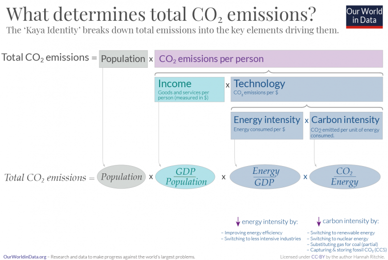
Total CO2 emissions are driven by four fundamental factors, outlined in the well-known equation: the ‘Kaya Identity‘. The breakdown of the Kaya Identity equation is shown in the graphic here. In the sections below we look at the role of these different factors in driving emissions.
Total emissions, in the simplest description, are determined by:
- Population: number of people
- Per capita impact: average emissions per person
Per capita emissions are determined by:
- Income: GDP per capita – richer people tend to emit more CO2
- Technology: how much CO2 is emitted per dollar spent
‘Technology’ is determined by two factors:
- Energy intensity: the amount of energy consumed per unit of GDP
- Carbon intensity: the amount of CO2 emitter per unit of energy
This means that total emissions are driven by the equation:

With data we can look more closely at how the four factors in the Kaya Identity are driving emissions across different countries, and over time.
This interactive chart shows the relative change in the four factors: population, GDP per capita, energy intensity (energy per unit of GDP), and carbon intensity (CO2 per unit of energy) over time. Also shown is total annual CO2 emissions – the final result. In the box below we explain how to interpret this chart.
What’s common between countries is that most have seen a large increase in GDP over this period. This has been a major driver of emissions – a stronger driver than the increase in population.
What differentiates whether CO2 emissions have greatly increased, stabilized, or fallen was whether countries could reduce their energy and carbon intensity fast enough to offset this large increase in GDP (and increases in population).
If improvements in energy or carbon intensity were slow (or in some cases non-existent), then CO2 emissions grew rapidly.
How to read and explore this chart
These figures show the percentage change in each factor since the first year shown on the timeline. For example, the percentage change in each relative to the year 1960. For example:
- If the ‘population’ value for 2016 was +25%, this would mean that the population of that country had increased by 25% between 1960 and 2018.
- If the ‘carbon intensity’ value in 2016 was –30%, this would mean that its carbon intensity was 30% lower in 2016 than in 1960.
- Note that using the blue timeline under this chart you can adjust the first and start year; you could, for example, see the relative change in each factor between 1990 and 2016 by making these the first and start years.
- Using the ‘Change country’ button in the bottom corner of the chart you can explore the data for any country.
Richer people emit more CO2

One of the four factors behind the Kaya Identity equation is affluence: GDP, or the average income per person. Why is this the case?
This chart shows the relationship between per capita CO2 emissions and GDP per capita. Overall we see a very strong correlation between CO2 emissions and income. This is true both geographically (across countries in a single year, as shown), but also over time.
If you use the blue time slider on the chart you can see this trend over time for a specific country. Countries begin in the bottom-left of the chart (at low CO2 and low GDP), then move upwards and to the right (higher CO2 and higher GDP).
Emissions tend to rise as we get richer because we gain access to, and increase our consumption of, electricity, heating, transport and other goods that require energy inputs. Many countries grow economically through a transition towards industry, manufacturing, and construction – activities that require large energy inputs.
This made increases in energy demand a fundamental part of economic growth; and historically, with such a strong reliance on fossil fuels, inevitably resulted in an increase in CO2 emissions.
CO2 emissions are sensitive to economic shocks

We know that CO2 emissions are often closely linked to economic growth because we see clearly the impacts of large economic shocks on annual emissions.
In the chart here we see the annual growth rate in total GDP (inflation-adjusted) and CO2 emissions.
Overall we see that the lines often mirror each other, particularly in years with very strong growth or contraction. For example, we see a large fall in global emissions in the aftermath of the 2008 Financial Crisis.
A more recent example is the impact of the Coronavirus pandemic – confinement measures and large declines in economic activities resulted in large (but temporary) reductions in global CO2 emissions. A paper in Nature Climate Change estimated that, at the peak of the pandemic, daily global emissions had fallen by 17% relative to the previous year.1 Depending on the length and stringency of measures against the pandemic, total emissions are expected to temporarily fall by around 5% in 2020.
CO2 emissions are therefore highly sensitive to large changes in economic output. However, as we see in the chart globally, and across countries, the trends do not completely match. This means there are additional influences – changes in industrial activities, efficiency and fuel mix (energy and carbon intensity) at play.

Related chart:

Energy intensity is a metric which reflects how energy-efficient an economy is. It is measured as the quantity of energy consumed to produce one unit of GDP. A lower energy intensity means it can generate more value added, with fewer energy inputs.
This interactive chart shows energy intensity across the world.
A country would have a lower energy intensity if:
- its economy was based on less energy-intensive industries or activities. For example, focused more on services versus the production of heavy goods such as aluminium, steel or cement.
- it was more energy efficient at producing goods in a given industry or activity (for example, improvements in the efficiency of manufacturing or construction).
Tips on how to interact with this chart
- Using the time-slider at the bottom you can see this metric change over time.
- By clicking a given country you can see how its energy intensity has changed, as a line chart.
- By switching to the ‘CHART’ tab you can add and remove countries to compare as a line chart.

Related chart:

Carbon intensity is a metric used to reflect how low- or high-carbon the energy mix is. It is measured as the amount of CO2 emitted per unit of energy production. This means it is strongly dependent on how much fossil fuels are included in the energy mix relative to low-carbon sources.
This interactive chart shows carbon intensity across the world.
A country would have a lower carbon-intensity if:
- it gets a large share of its energy from renewable sources such as hydropower, wind, solar, and biomass [this is often the case in lower-income countries where they rely heavily on biomass as a fuel source];
- it gets a large share of its energy from nuclear;
- it managed to capture and store some of the CO2 emissions generated from fossil fuels [often known as ‘Carbon Capture and Storage’ – this is often a proposed solution, but is not implemented at large scales];
- its energy mix was dominated by gas as opposed to coal – per unit of energy, gas usually produces less CO2.


The first factor in the Kaya Identity equation is population. This makes sense: we’d expect that more people would ultimately mean higher emissions.
Indeed, when we compare annual CO2 emissions across countries, they often strongly reflect population size. That’s why many prefer to compare emissions on a per capita basis.
But what becomes clear when we look at the data is that changes in CO2 emissions are typically much more sensitive to changes in GDP, energy, and carbon intensity than they are to population. We see this in the chart shown: it looks at the annual percentage change in CO2 emissions, GDP and population.
As we discussed earlier in this article, CO2 emissions strongly mirror large changes in GDP. CO2 emissions are much more sensitive to changes in GDP than they are to population. That does not mean population does not play a role in emissions, but it’s typically not the strongest driver. If we look at the Kaya Identity for China (currently the world’s most populous country), for example, we see that the growth in emissions over the last 50 to 60 years has been of a similar magnitude to the change in GDP (not the change in population).
It is commonly argued that ‘uncontrolled’ population growth lies at the root of rising CO2 emissions. There are several key points to make here:
- Total emissions of countries where the fertility rate – the average number of children per woman – is highest (at 5, 6 or even 7 children per woman) tend to be low.
- There are large inequalities in global emissions, such that countries at lower incomes (where population growth is highest) account for a very small share of global emissions; instead, high income countries (with low population growth) account for a disproportionate share;
- Population growth rates are already declining across the world as the average fertility rate falls. This tends to occur as a by-product of other human developments and improvement in living standards.