Energy production – mainly the burning of fossil fuels – accounts for around three-quarters of global greenhouse gas emissions. Not only is energy production the largest driver of climate change, the burning of fossil fuels and biomass also comes at a large cost to human health: at least five million deaths are attributed to air pollution each year.
The world therefore needs to shift away from fossil fuels to an energy mix dominated by low-carbon sources of energy – renewable technologies and nuclear power.
What does our energy mix look like today? What countries have the ‘cleanest’ energy mix? And are we making progress in shifting towards a low-carbon energy system?
This article focuses on the breakdown of energy sources: how they vary across the world and how this is changing over time.
In the energy domain, there are many different units thrown around – joules, exajoules, million tonnes of oil equivalents, barrel equivalents, British thermal units, terawatt-hours, to name a few. This can be confusing, and make comparisons difficult. So at Our World in Data we try to maintain consistency by converting all energy data to watt-hours. We do this to compare energy data across different metrics and sources.

Related chart:

Today when we think about energy mixes we think about a diverse range of sources – coal, oil, gas, nuclear, hydropower, solar, wind, biofuels. But If we look back a couple of centuries ago, our energy mixes where relatively homogeneous. And the transition from one source to another was incredibly slow.
In the chart shown we see global primary energy consumption dating back to the year 1800. This earlier data is sourced from Vaclav Smil’s work Energy Transitions: Global and National Perspectives.1 Data from 1965 onwards comes from the latest release of BP’s Statistical Review of World Energy.2
We see that until the mid-19th century, traditional biomass – the burning of solid fuels such as wood, crop waste, or charcoal – was the dominant source of energy used across the world. But with the Industrial Revolution came the rise of coal; followed by oil, gas; and by the turn of the 20th century, hydropower.
It wasn’t until the 1960s that nuclear energy was added to the mix. What are often referred to as ‘modern renewables’ – solar and wind – were only added much later, in the 1980s.
What Vaclav Smil – and other researchers studying these long-term energy transitions across countries – highlights in his work is the slow rate at which energy transitions have occurred in the past. The speed and scale of the energy transition we need today in switching from fossil fuels to low-carbon energy is therefore a new challenge, very different from the past.

Related chart:

Let’s look at our energy mix today, and explore what sources we draw upon.
In the interactive chart shown we see the primary energy mix broken down by fuel or generation source.
Globally we get the largest amount of our energy from oil, followed by coal, gas, then hydroelectric power. As we look at in more detail below – “How much of global energy comes from low-carbon sources?” – the global energy mix is still dominated by fossil fuels. They account for more than 80% of energy consumption.
How you can interact with this chart
- On these charts you see the button Change Country in the bottom left corner – with this option you can switch the chart to any other country in the world.
- By ticking the ‘Relative’ box in the bottom left corner you can switch to see each source’s share of the total.
In the charts here we see the breakdown of the energy mix by country. First with the higher-level breakdown by fossil fuels, nuclear and renewables. Then with the specific breakdown by source, including coal, gas, oil, nuclear, hydro, solar, wind and other renewables (which include bioenergy, wave and tidal).
This is given in terms of per capita consumption. Using the toggle on the interactive charts you can also see the percentage breakdown for each source using the ‘Relative’ tickbox.


Around three-quarters of global greenhouse gas emissions come from the burning of fossil fuels for energy.3 To reduce global emissions we need to shift our energy systems away from fossil fuels to low-carbon sources of energy. We need to ‘decarbonize’.
How big is this challenge? How much of our energy currently comes from low-carbon sources?
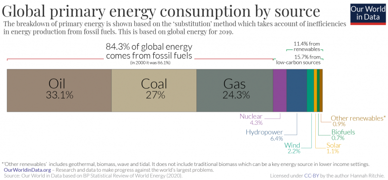
In the chart here we see the breakdown of global primary energy consumption for 2019.4
Before we look at the numbers, there are two points to note:
- Here we take primary energy based on the ‘substitution method’ for energy accounting. For those interested in energy accounting methods, at the end of this post we look at comparisons of direct versus substitution methods. The quick summary of it is that this accounting method tries to account for the energy lost from the inefficiencies in fossil fuel production and aims to provide the appropriate comparison of how much more low-carbon energy we would need to replace fossil fuels in the energy mix. It’s one of the preferred accounting method used by the Intergovernmental Panel on Climate Change (IPCC).5
- These figures don’t include energy produced from traditional biomass. This is because most international energy agencies – such as BP, IEA or EIA – only track data on commercially-traded fuels. Traditional biomass – which are solid fuels such as wood, crop residues and charcoal – can be a key source of energy for people living at lower incomes, but it is challenging to quantify and timely data is not available. Based on crude estimates from earlier data I would expect it to currently account for an additional 6% of global energy.
We see that in 2019, almost 16% (15.7% to be precise) of global primary energy came from low-carbon sources. Low-carbon sources are the sum of nuclear energy and renewables – which includes hydropower, wind, solar, bioenergy, geothermal and wave and tidal.6
11.4% came from renewables; and 4.3% came from nuclear.
Hydropower and nuclear account for most of our low-carbon energy: combined they account for 10.7%. Wind produces just 2.2%, and solar 1.1% – but both sources are growing quickly.
Despite producing more and more energy from renewables each year, the global energy mix is still dominated by coal, oil, and gas. Not only does most of our energy – 84% of it – come from fossil fuels, we continue to burn more each year: total production has increased from 116,214 to 136,761 TWh in the last 10 years.
We’ve seen the breakdown of the energy mix today. But this does tell us about how it’s changing over time. Are we making progress in decarbonization over time? We look at this question in a related post here.
Globally, just 16% of primary energy (15.7% to be precise) came from low-carbon sources – nuclear and renewables – in 2019. We are a long way away from the goal to shift towards a low-carbon energy system.
But do some countries do much better than this? Do we have examples of countries who are already paving the way towards a fossil-free energy mix?
In the interactive map here we see the world split into two categories: countries which get more of their energy from low-carbon sources than the global average of 15.7%; and those that get less.7
What immediately stands out is that there is a reasonably strong East-West divide: most Western economies get a larger share of energy from low-carbon sources, and those in East get less. Of course this boundary is not absolute: the Netherlands and Ireland, for example, are below the global average.
This divide may be in part, due to differences in income: many richer countries with a long history of fossil fuel-rich energy systems have already shifted away from them.8
For many poorer countries in our map, no data is shown. This is because the BP Statistical Review of World Energy does not cover all countries in the world – it relies on energy statistics from commercially-traded fuels. This means traditional biomass burning – a dominant source of energy at lower incomes are not included. Typically energy-related emissions from low income countries are small because access to energy – both electricity and modern cooking fuels – is low.

We have a rough categorization of countries that are above and below the global average. But let’s take a closer look at the numbers.
In the interactive map here we see the share of primary energy that comes from low-carbon sources across countries.9
In 2019, Iceland got 79% of its energy from low-carbon sources. This was the highest in the world. Most of this came from hydropower (55%) but also other renewables – mainly geothermal energy (24%). You see this breakdown in the interactive chart below. Using the “change country” toggle you can switch to see the breakdown for other countries.
But Iceland wasn’t the only country to get most of its energy from low-carbon sources: Sweden (69%); Norway (66%) France (49%) and Switzerland (49%) all got a large amount from nuclear or renewables.
Finland, and Brazil also had a high share – more than 40%.
At the other end of the scale, some countries rely almost entirely on fossil fuels. Many of the world’s oil-producing countries – Saudi Arabia, Oman, and Kuwait – got less than 1% from low-carbon sources.
Amongst the largest emerging economies, South Africa produced only 5% from low-carbon sources; India got 9%; and China, 15%. Brazil, as we mentioned earlier, achieves a much higher share – 46% in 2019.
Globally, our progress in shifting towards a low-carbon economy has been slow. That may leave us pessimistic about a path forward. But some countries – often some of the world’s richest countries who have high carbon footprints – show us that significant progress on decarbonizing our energy systems is possible. They still have a long way to go but are moving in the right direction.
Poorer countries face a bigger challenge: they must grow their economies, giving their populations access to energy, healthcare and alleviating poverty whilst avoiding the carbon-intensive pathways today’s rich countries have taken. To do this, they need clean energy to be cheap, undercutting fossil fuel alternatives. In this regard, the world’s richest countries also have a role to play: the scale-up of low-carbon energy should help to drive down costs. We have already seen this effect with the rapid decline in solar prices in recent years.


Three-quarters of global greenhouse gas emissions come from the burning of fossil fuels for energy.10 To tackle climate change, we need to transition away from fossil fuels and decarbonize our energy systems.
The world got 15.7% of its energy from low-carbon sources – either nuclear or renewables – in 2019. How has this changed over time?
Does our track record give us reason to be optimistic that we can quickly decarbonize?
In the chart we see the share of global energy that comes from low-carbon sources. We’ve certainly made progress since half a century ago: while the global consumption of energy increased 3.8-fold, the share of low carbon sources has more than doubled. In the 1960s only 6% of our energy came from renewables or nuclear [at this point in time it was mainly the former, as we’ll see later].
But our rate of progress since the 1990s has been less impressive. By 1994 we were already getting 13.5% from low-carbon sources. Today – 25 years later – we’ve only increased this by two percentage points. It’s moving in the right direction, but far too slowly – probably much more slowly than many expect.

In the chart we see the share of global energy that comes from fossil fuels, renewables and nuclear. The sum of the top two is what we want to increase. I’ve also summarised this breakdown in the table – noting each source’s’ share at various points in time since the 1970s.
Part of this slow progress is due to the fact that much of the gains made in renewables has been offset by a decline in nuclear energy. Renewables have been growing while nuclear has been rolled back.11
Overall, this means that the combined share from low-carbon sources has increased by less than we might have expected. Having both renewables and nuclear pulling in the same direction would certainly have helped. But it wouldn’t be enough: the rate of progress would still have been slow.

| Year | Fossil Fuels | Low-carbon energy (Renewables + Nuclear) | Renewables | Nuclear |
|---|---|---|---|---|
| 1970 | 94% | 6% | 5.6% | 0.4% |
| 1980 | 91.6% | 8.4% | 6% | 2.4% |
| 1990 | 88% | 12% | 6.4% | 5.6% |
| 2000 | 87% | 13% | 7% | 6% |
| 2010 | 87% | 13% | 7.8% | 5.2% |
| 2019 | 84.3% | 15.7% | 11.4% | 4.3% |
But, actually, we’re still fooling ourselves a bit in looking at this progress through the lens of what share of our energy is low-carbon.
When it comes to greenhouse gas emissions, the atmosphere does not care about shares, only absolutes. That is what ultimately determines the amount of CO2 we emit, and the rate at which it accumulates in the atmosphere.
Global energy consumption is not stagnant, but growing. And in the past years it has been growing too quickly for renewables and nuclear to keep up.
In the chart here we see primary energy consumption in absolute terms for each source. We continue to produce more energy from fossil fuels – particularly oil and gas – each year.12
Low-carbon energy is certainly growing across the world – undoubtedly a sign of progress.
Decarbonization is happening. But not nearly fast enough.To achieve the necessary progress that matters for the climate we need to see its growth not only meet our new energy demands each year, but start displacing existing fossil fuels in the energy mix at a much faster rate.

- Fossil fuels: what share of energy comes from fossil fuels?
- Coal: what share of energy comes from coal?
- Oil: what share of energy comes from oil?
- Gas: what share of energy comes from gas?
- Nuclear: what share of energy comes from nuclear?
- Renewables: how much of our energy comes from renewables?
- Hydropower: what share of energy comes from hydropower?
- Solar: what share of energy comes from solar?
- Wind: what share of energy comes from wind?
Fossil fuels: what share of energy comes from fossil fuels?

Fossil fuels are the sum of coal, oil and gas. Combined, they are the largest source of global emissions of carbon dioxide (CO2). We therefore want to shift our energy systems away from fossil fuels towards low-carbon sources of energy.
This interactive map shows the share of primary energy that comes from fossil fuels (coal, oil and gas summed together) across the world.
Three tips on how to interact with this map
- By clicking on any country on the map you see the change over time in this country.
- By moving the time slider (below the map) you can see how the global situation has changed over time.
- You can focus on a particular world region using the dropdown menu to the top-right of the map.
Coal: what share of energy comes from coal?

Coal has been a critical energy sources, and mainstay in global energy production for centuries.
But it’s also the most polluting energy source: both in terms of the amount of CO2 it produces per unit of energy, but also the amount of local air pollution it creates. Moving away from coal energy is important for climate change as well as human health.
This interactive map shows the share of primary energy that comes from coal across the world.
Oil: what share of energy comes from oil?

Oil is the world’s largest energy source today. It is the dominant source of energy for the transport sector in particular.
This interactive map shows the share of primary energy that comes from oil across the world.
Gas: what share of energy comes from gas?

Natural gas has, for decades, lagged behind coal and oil as an energy source. But today its consumption is growing rapidly – often as a replacement for coal in the energy mix. Gas is a major provider of electricity production, and a key source of heat.
This interactive map shows the share of primary energy that comes from gas across the world.
Nuclear: what share of energy comes from nuclear?

Nuclear energy – alongside hydropower – has been a key source of low-carbon energy for many countries across the world in recent decades. But there are large differences in the role of nuclear – some countries rely heavily on it for energy production; others produce no energy at all from it.
This interactive map shows the share of primary energy that comes from nuclear across the world.
Renewables: how much of our energy comes from renewables?

Renewable energy is a collective term used to capture a number of different energy sources. ‘Renewables’ typically includes hydropower, solar, wind, geothermal, biomass and wave and tidal energy.
This interactive map shows the share of primary energy that comes from renewables (the sum of all renewable energy technologies) across the world.
The share of energy we get from individual renewable technologies – solar, or wind, for example – are given in the sections below.
Hydropower: what share of energy comes from hydropower?

Related content
Hydroelectric power has been an influential low-carbon energy technology for many countries for more than half a century. Globally, it is still the largest source of renewable energy.
This interactive map shows the share of primary energy that comes from hydropower across the world.
Solar: what share of energy comes from solar?

Related content
Solar energy is often referred to as a ‘modern renewable’ – a couple of decades ago it made only a tiny contribution to global energy supply. But in recent years it has
This interactive map shows the share of primary energy that comes from solar technologies across the world.
Wind: what share of energy comes from wind?

Related content
This interactive map shows the share of primary energy that comes from wind (both onshore and offshore) across the world.
Three tips on how to interact with this map
- By clicking on any country on the map you see the change over time in this country.
- By moving the time slider (below the map) you can see how the global situation has changed over time.
- You can focus on a particular world region using the dropdown menu to the top-right of the map.


Understanding the breakdown of our energy systems – how much energy we get from coal, oil or gas, how much from nuclear, solar or wind – is crucial. It allows us to compare energy mixes across the world; track whether we are making progress on decarbonizing our energy systems; and plan and manage demands for natural resources.
But what seems like a simple exercise – adding up the produced energy from all the different sources – is in fact not straightforward at all. These difficulties result in different approaches for ‘energy accounting’ and present a different picture of the energy mix.
Below, we take a look at the two key methodologies applied to primary energy accounting: ‘direct’ primary energy and primary energy via the ‘substitution method’. These methods are discussed (or debated) often, but I couldn’t find particularly clear or simple explanations of how they differ and what this means for understanding our energy mix. The aim here is to fill that gap.
What’s important is to understand why there are two different methods and how they affect our perspective on the energy mix.
‘Primary energy’ refers to energy in its raw form, before it has been converted by humans into other forms of energy like electricity, heat or transport fuels. Think of this as inputs into an energy system: coal, oil or gas before we burn them; or solar or wind energy before we convert them to electricity.
When we are asking how much energy is consumed or what the breakdown of the sources of energy is we are asking about primary energy.
Here we look at two ways in which ‘primary energy’ is calculated: the ‘direct’ and the ‘substituted’ method. The simplest way to think of the difference between these methods is that ‘direct’ primary energy does not take account of the energy lost in the conversion of fossil fuels to usable energy. The substitution method does attempt to correct for this loss.
To understand why this distinction is important we need to first consider the process of energy production.
When we burn fuel in a thermal power plant most of the energy we put into the process is lost – primarily in the form of heat. Most fossil fuel plants run with an efficiency of around 33% to 40%.13 The remaining 60% to 67% of energy is wasted as heat. This means for every unit of energy that we can use, another two are wasted.
When we measure electricity generation from renewables or nuclear power, we’re measuring the direct output, with no losses or waste to consider.
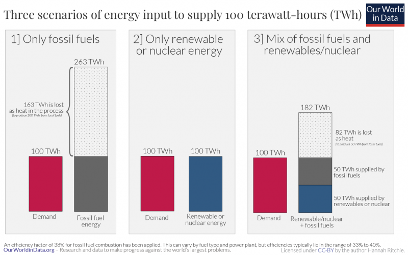
Let’s take an example – shown in the graphic here. Imagine we have a country that needs 100 terawatt-hours (TWh) of energy. We have three different energy mixes: only fossil fuels; only renewable or nuclear energy; and a mix of both.
- If we only rely on fossil fuels we need 263 TWh of energy input. This is because only around 38% of these inputs are converted into ‘useful’ energy.14 163 TWh is energy lost as heat.
- If we only rely on either renewable or nuclear energy these losses do not occur – the quantity of electricity generated is the same quantity we can use. So we only need 100 TWh.
- If we rely on renewables/nuclear and fossil fuels it depends on the mix: let’s say we produce 50 TWh from renewables or nuclear sources. We need another 50 TWh from fossil fuels. But to produce the additional 50 TWh from fossil fuels, we actually need 132 TWh, because we lose 82 TWh as heat [50 TWh / 0.38 = 132 TWh]. Combined, we need 182 TWh of energy input [50 TWh from renewables/nuclear + 50 TWh ‘useful’ fossil fuel energy + 82 TWh wasted].
Based on this example we can understand the difference between direct primary energy and the substitution method.
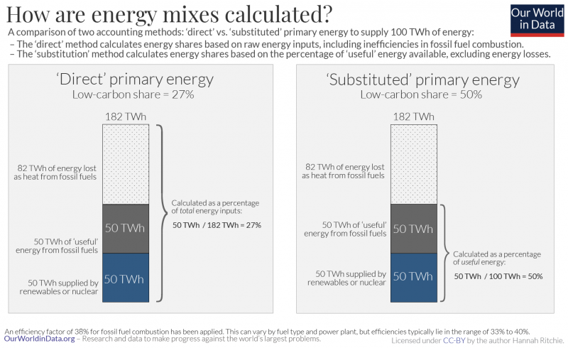
Let’s take the third scenario – a mixture of fossil fuels and low-carbon energy – and see how the low-carbon share differs between the two methods. This is shown in the figure.
From the direct method we get 50 TWh / 182 TWh = 27%. From the substitution method we get 50 TWh / 100 TWh = 50%.
I find it helpful to think of the distinction as:
- Low-carbon’s share in direct primary energy = % of total primary energy consumption (including all of the inefficiencies of fossil fuel production)
- Low carbon’s share in substituted primary energy = % of useful energy (once we subtract all of the wasted energy in the burning of fossil fuels)
A question many want the answer to is, how much of our energy comes from low-carbon sources? How close are we to getting rid of fossil fuels?
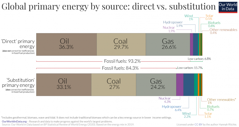
As we now know, it depends on whether we’re using the direct or substitution method. In the chart here we show the breakdown of the global primary energy mix in 2019 to compare the two methods.15
As we should expect from the example we worked through, when we calculate the share of energy from low-carbon sources via the substitution method we get a higher figure: 16% vs. only 7% from the direct method. When we strip away the differences in efficiencies between the sources, both renewables and nuclear make a larger contribution.
In the interactive charts you can also compare each source’s share of energy based on the two methods. Using the “change country” button in the bottom-left of each chart, you can also see this for different countries.
Most sources tend to prefer and report on the substitution method (or a similar approach – the ‘physical content’ method – which we don’t discuss here but which gives similar results) rather than the direct method. The substitution method is also the preferred approach of the Intergovernmental Panel on Climate Change (IPCC), for example.16


At Our World in Data we get most of our energy data from BP; each year it publishes its Statistical Review of World Energy report. It applies the substitution method to its primary energy data [you can read its methodology here].
How does it convert from direct primary energy – that we can measure – into the substitution breakdown?
In the schematic explanation above, we looked at calculating the share of energy from low-carbon energy sources by comparing it with the amount of useful energy (subtracting the wasted energy) from fossil fuels.
But we can also do the opposite of this to get the same result. In fact, this inverse approach is what is most commonly applied by BP and others who use the ‘substitution method’. So, instead of assuming fossil fuels have the same efficiency as renewables/nuclear, we do the opposite: we assume renewables/nuclear are as inefficient as fossil fuels. We calculate the equivalent amount of fossil fuels that would be required to produce the amount of electricity we get from non-fossil based sources.
So, let’s say we produce 100 TWh of electricity from wind. And we assume the efficiency of a fossil fuel plant is 38%. We would convert this wind electricity into ‘input-equivalent’ primary energy by dividing by this efficiency [100 / 0.38 = 263 TWh]. This would be the amount of primary energy that would be required from fossil fuels to produce the same amount of electricity as wind.
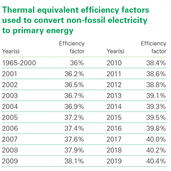
We should note that this conversion is used as an approximation – a standard ‘efficiency’ factor is applied across-the-board. But we know that some power plants have a slightly lower or higher efficiency and it can change over time. In fact, BP changed its methodology in its 2020 assessment to reflect this change over time. Previously it assumed a 38% efficiency factor consistently. But it now applies a ‘time-dependent’ model to build in improvements over time. Changes in this conversion factor are summarised in the table below.
The substitution method gives us a more accurate understanding of how low-carbon energy is competing with fossil fuels. For this reason: when we look at the breakdowns of energy mix on Our World in Data we have tried wherever possible to use primary energy measured by the substitution method.
Conversion factors applied in converting renewable and nuclear electricity outputs to primary energy17


